> ## Documentation Index
> Fetch the complete documentation index at: https://anvil.servicetitan.com/llms.txt
> Use this file to discover all available pages before exploring further.

# Update to our ghost Button visual and guidance

export const BlogMeta = ({date, author, tags}) => {
  const formatList = items => {
    if (!Array.isArray(items)) return items;
    if (items.length === 1) return items[0];
    if (items.length === 2) return `${items[0]} & ${items[1]}`;
    return `${items.slice(0, -1).join(", ")}, & ${items[items.length - 1]}`;
  };
  return <div className="flex flex-wrap items-center gap-2 text-sm text-gray-500 dark:text-gray-400">
      <span>{date}</span>
      <span>|</span>
      <span>{formatList(author)}</span>
      {tags && tags.length > 0 && <>
          <span>|</span>
          <div className="flex flex-wrap gap-1.5">
            {tags.map(tag => <span key={tag} className="px-2 py-1 rounded bg-gray-100 dark:bg-neutral-800 text-xs">
                {tag}
              </span>)}
          </div>
        </>}
    </div>;
};

<BlogMeta date="August 28, 2024" author="James Coyle" tags={["Design", "Figma", "Web"]} />

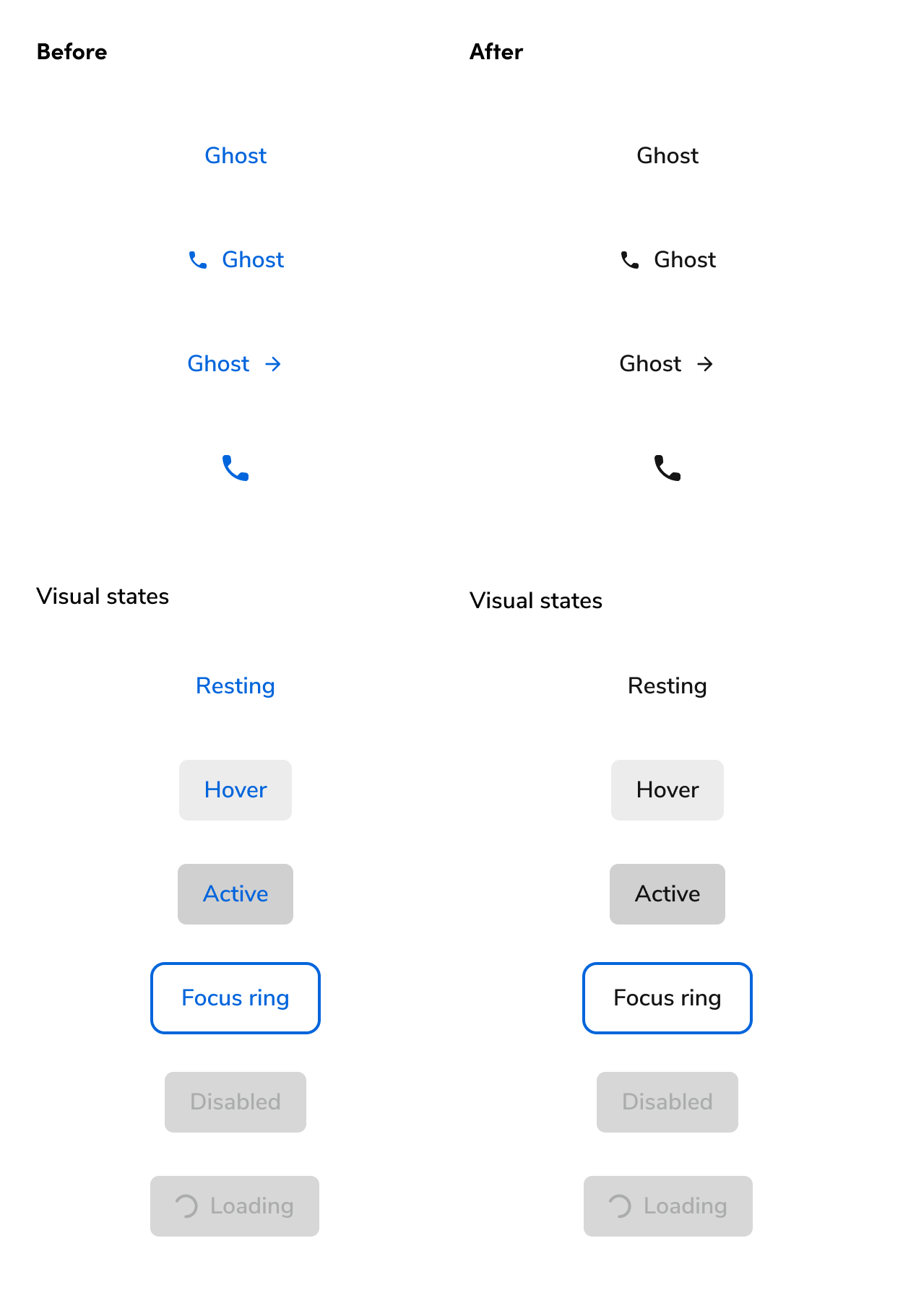
We've recently updated the visual of our lowest priority Button, ghost, from a blue color to black. We've also updated our pairing guidance to reflect the change.

We’ve updated our [ghost Button](/docs/web/components/button/design#appearances)’s color from Blue to Black. This was done as part of the [Design Standard Committee’s process](https://servicetitan.atlassian.net/wiki/spaces/DES/pages/3001876643). This change was made effective as of Anvil `v1.2.7` (Hammer `v1.4.0`).

<Frame>
  <div className="w-full h-full bg-[#FFFFFF] p-2 rounded flex items-center justify-center">
    <img
      src="https://mintcdn.com/servicetitan/3mYpUmLYXzqe3A_Z/images/blog/ghost-button-style/ghost-button-before-after.png?fit=max&auto=format&n=3mYpUmLYXzqe3A_Z&q=85&s=aa55fead86694845f10f750438e9a907"
      alt="Blog Post: ghost button before,
after"
      width="1250"
      height="1822"
      data-path="images/blog/ghost-button-style/ghost-button-before-after.png"
    />
  </div>
</Frame>

### Updates to Button guidance

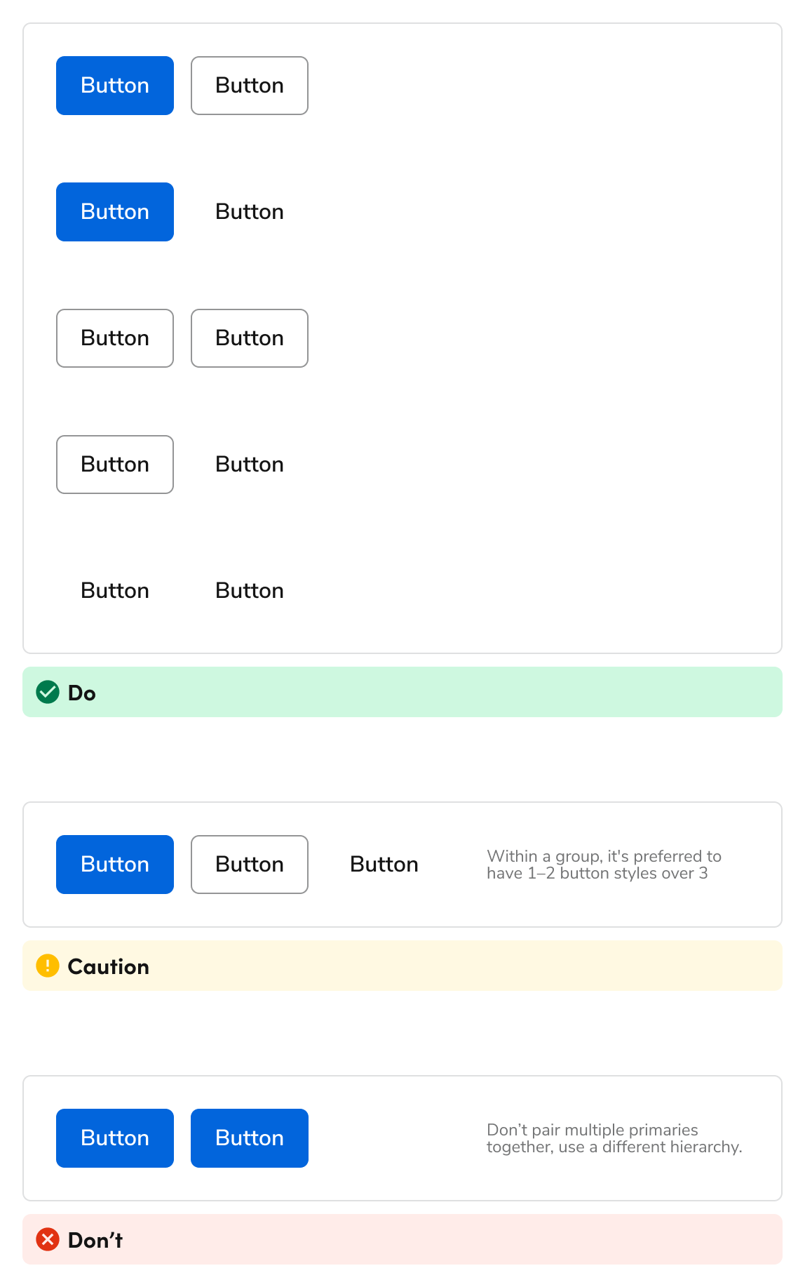
As part of this change, we updated our [Button guidance](/docs/web/components/button/design#how-to-use) to reflect these new changes. The new guidance changes allow for more combinations between primary, secondary, and ghost Buttons, where before, more restrictions existed due to visual issues across the Buttons.

<Frame>
  <div className="w-full h-full bg-[#FFFFFF] p-2 rounded flex items-center justify-center">
    <img
      src="https://mintcdn.com/servicetitan/3mYpUmLYXzqe3A_Z/images/blog/ghost-button-style/visual-guidance-of-buttons.png?fit=max&auto=format&n=3mYpUmLYXzqe3A_Z&q=85&s=7f913f493b31d07a77b8178e09b17484"
      alt="visual guidance of
Buttons"
      width="1148"
      height="1834"
      data-path="images/blog/ghost-button-style/visual-guidance-of-buttons.png"
    />
  </div>
</Frame>

### Why did we make this change?

When the ghost Button was blue, it limited the number of options available to designers to a fault. There lacked a particularly quiet Button style. Many interfaces, including Anvil itself, use a black ghost style, but was not providing one for consumers.

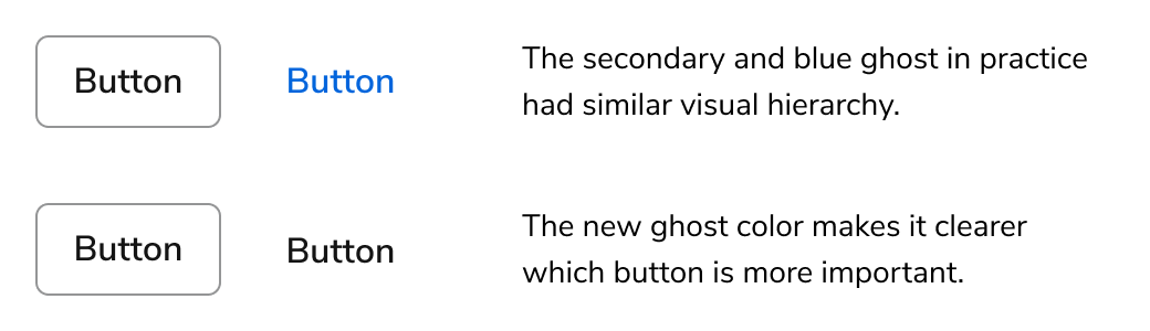
The blue ghost Button also limited the hierarchy options in a UI. You were unable to pair a secondary and ghost Button style together for example due to their similar visual weight in practice. This new style now encourages this pairing.

<Frame>
  <div className="w-full h-full bg-[#FFFFFF] p-2 rounded flex items-center justify-center">
    <img
      src="https://mintcdn.com/servicetitan/3mYpUmLYXzqe3A_Z/images/blog/ghost-button-style/ghost-button-before-pairing.png?fit=max&auto=format&n=3mYpUmLYXzqe3A_Z&q=85&s=b978b7b3ce1c4f0163322773a9f60219"
      alt="Blog Post: ghost button before
pairing"
      width="1040"
      height="300"
      data-path="images/blog/ghost-button-style/ghost-button-before-pairing.png"
    />
  </div>
</Frame>

### What actions do I need to take?

#### For designers

Make sure the A2 Figma library in your files is up-to-date to receive the changes. This change does not reduce pairing combinations, so no direct action is needed on your end. If you were looking to use ghost Buttons more often, you may refactor your files as needed.

#### For developers

No change is needed for developers, as long as the version of the design system being used is at least Anvil `v1.2.7` (Hammer `v1.4.0`).