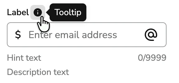
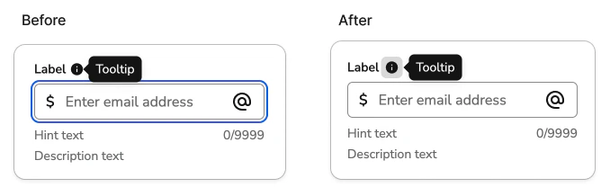
We've updated how the `moreInfo` tooltip behaves across Anvil2 field components to fix several accessibility issues and lay the groundwork for upcoming AI-powered field annotations.
Previously, the `moreInfo` tooltip opened automatically whenever the user focused the input field. The info icon in the label had no independent keyboard access — it was purely decorative, and the tooltip's open state was driven entirely by the input's focus and blur events.
## Latest Behavioral Updates
* The info icon is a proper keyboard-focusable button — it is in the tab order and has an accessible name ("More information")
* The tooltip opens on hover or focus of that button, not on interaction with the input
* A visually-hidden copy of the `moreInfo` content is associated with the input via `aria-describedby`, so screen reader users hear the description when they focus the field — without the tooltip visually opening
* The `moreInfoOpen` prop on `FieldLabel` has been deprecated and no longer has any effect
## Why we made this change
The previous pattern had several interconnected problems:
* **The info icon wasn't keyboard accessible.** There was no way to reach or activate it without a mouse, violating WCAG 2.1.1 (Keyboard).
* **The tooltip was attached to the wrong element.** Opening on input focus meant WCAG 1.4.13 (Content on Hover or Focus) — which requires tooltip content to be dismissible, hoverable, and persistent — was being evaluated against the input rather than the info button.
* **Users had no choice.** The tooltip appeared any time someone focused a field, even if they just wanted to type. There was no way to dismiss it without blurring the field.
* **On small screens, the tooltip could cover the input.** Auto-opening on focus with no reliable way to prevent obscuring the field itself.
* **It wouldn't scale to multiple tooltips.** Upcoming work will introduce AI-generated annotations on form fields, potentially adding a second info button to a label. The old single-state model tied to input focus couldn't support that without the two tooltips conflicting.
## What this means for you
**No API changes are required.** The `moreInfo` prop on Anvil2 field components works exactly as before.
The updated interaction model:
| Interaction | Behavior |
| -------------------------------- | ------------------------------------------------------------------------------------------ |
| Tab to info button | Tooltip opens; screen reader announces "More information" and reads the tooltip content |
| Escape or blur info button | Tooltip closes |
| Hover info button | Tooltip opens |
| Move cursor onto tooltip content | Tooltip stays open (WCAG 1.4.13 hoverable) |
| Move cursor away | Tooltip closes |
| Focus input | Screen reader announces the field label and the `moreInfo` description — no visual tooltip |
**Interaction tests may need updates.** If you have interaction tests that relied on tab order behavior when a `moreInfo` tooltip was present — for example, tests that tab through a form and expect the info icon to be skipped — those tests will need to be updated. The info button is now a focusable element in the tab order, so any assertions about which element receives focus after tabbing past a field label may be off by one step.
Please [share your feedback](/docs/about-anvil2#getting-help-and-sharing-feedback) if you run into any issues with the updated behavior.