> ## Documentation Index
> Fetch the complete documentation index at: https://anvil.servicetitan.com/llms.txt
> Use this file to discover all available pages before exploring further.

# AI Mark – Design

> The AI mark is the standard visual indicator for AI-powered experiences in ServiceTitan web applications.

export const DoDont = ({text, type, children}) => {
  return <>
      {type === "do" && <div className="do-dont do">
          {children && <div className="do-dont-content">{children}</div>}
          <Check>
            <p>
              <strong>Do</strong>
              {text && <span className="m-inline-start-1">{text}</span>}
            </p>
          </Check>
        </div>}
      {type === "dont" && <div className="do-dont dont">
          {children && <div className="do-dont-content">{children}</div>}
          <Danger>
            <p>
              <strong>Don't</strong>
              {text && <span className="m-inline-start-1">{text}</span>}
            </p>
          </Danger>
        </div>}
      {type === "caution" && <div className="do-dont caution">
          {children && <div className="do-dont-content">{children}</div>}
          <Warning>
            <p>
              <strong>Caution</strong>
              {text && <span className="m-inline-start-1">{text}</span>}
            </p>
          </Warning>
        </div>}
    </>;
};

export const LiveCode = ({children, customHeight, clickToLoad, example, fullWidth, fullHeight, hideCodeInLiveCode, screenshot, screenshotOnly, showCode: showCodeProp}) => {
  const SCREENSHOTS_BASE = "https://servicetitan.github.io/anvil2-docs-live-code/screenshots";
  const STACKBLITZ_BASE = "https://stackblitz.com/github/servicetitan/anvil2-docs-live-code/tree/main/examples";
  const [showCodeBlock, setShowCodeBlock] = useState(showCodeProp ?? false);
  const [isLocalOverride, setIsLocalOverride] = useState(false);
  useEffect(() => {
    const examplePath = `/images/live-code-screenshots-tmp/${example}.png`;
    fetch(examplePath, {
      method: "HEAD"
    }).then(r => {
      if (r.ok) setIsLocalOverride(true);
    }).catch(() => {});
  }, [example]);
  const screenshotBase = isLocalOverride ? "/images/live-code-screenshots-tmp" : SCREENSHOTS_BASE;
  if (screenshotOnly) {
    return <Frame className="flex flex-col">
        <div className="flex dark:hidden" style={{
      justifyContent: "center",
      alignItems: "center",
      width: fullWidth ? "100%" : "50%",
      minHeight: fullHeight ? "284px" : undefined,
      background: "#FFFFFF"
    }}>
          <img srcset={`${screenshotBase}/${example}.png, ${screenshotBase}/${example}-2x.png 2x`} src={`${screenshotBase}/${example}.png`} alt={example} noZoom />
        </div>
        <div className="hidden dark:flex" style={{
      justifyContent: "center",
      alignItems: "center",
      width: fullWidth ? "100%" : "50%",
      minHeight: fullHeight ? "284px" : undefined,
      background: "#141414"
    }}>
          <img srcset={`${screenshotBase}/${example}-dark.png, ${screenshotBase}/${example}-dark-2x.png 2x`} src={`${screenshotBase}/${example}-dark.png`} alt={example} noZoom />
        </div>
      </Frame>;
  }
  if (screenshot) {
    return <Frame className="flex flex-col -mb-2">
        <div className="flex dark:hidden bg-white dark:bg-codeblock border border-gray-950/10 dark:border-white/10 dark:twoslash-dark rounded-2xl overflow-hidden" style={{
      justifyContent: "center",
      alignItems: "center",
      width: fullWidth ? "100%" : "50%",
      minHeight: fullHeight ? "284px" : undefined
    }}>
          <img srcset={`${screenshotBase}/${example}.png, ${screenshotBase}/${example}-2x.png 2x`} src={`${screenshotBase}/${example}.png`} alt={example} noZoom />
        </div>

        <div className="hidden dark:flex bg-white dark:bg-codeblock border border-gray-950/10 dark:border-white/10 dark:twoslash-dark rounded-2xl overflow-hidden" style={{
      background: "#141414",
      justifyContent: "center",
      alignItems: "center",
      width: fullWidth ? "100%" : "50%",
      minHeight: fullHeight ? "284px" : undefined
    }}>
          <img srcset={`${screenshotBase}/${example}-dark.png, ${screenshotBase}/${example}-dark-2x.png 2x`} src={`${screenshotBase}/${example}-dark.png`} alt={example} noZoom />
        </div>

        <div className="flex justify-end items-center text-xs py-2 px-1 gap-4">
          {!showCodeProp ? <button className="inline-flex justify-end items-center text-gray-700 dark:text-gray-50 hover:text-blue-500 dark:hover:text-blue-300 transition-colors group self-end gap-1 cursor-pointer" onClick={() => setShowCodeBlock(!showCodeBlock)} style={{
      appearance: "none"
    }}>
              <Icon icon="code" size="12px" className="group-hover:bg-blue-500 dark:group-hover:bg-blue-300" />
              <span>{showCodeBlock ? "Hide code" : "Show code"}</span>
            </button> : null}

          <a className="inline-flex justify-end items-center hover:text-blue-500 dark:hover:text-blue-300 transition-colors group self-end gap-1" href={`${STACKBLITZ_BASE}/${example}?file=src/App.tsx`} target="_blank" rel="noreferrer">
            <Icon icon="bolt" size="12px" className="group-hover:bg-blue-500 dark:group-hover:bg-blue-300" />
            <span>StackBlitz demo</span>
          </a>
        </div>

        <div className="grid transition-[grid-template-rows] duration-300 ease-in-out overflow-auto overflow-y-hidden overflow-x-auto" style={showCodeBlock ? {
      gridTemplateRows: "1fr"
    } : {
      gridTemplateRows: "0fr"
    }}>
          <div style={{
      minHeight: 0,
      overflowX: "auto",
      overflowY: "hidden",
      marginBlockStart: "-1.25rem",
      marginBlockEnd: "-1.5rem"
    }}>
            {children}
          </div>
        </div>
      </Frame>;
  } else {
    return <div style={{
      display: "flex",
      width: fullWidth ? "100%" : "50%",
      minHeight: customHeight ? customHeight : "316px",
      resize: "vertical",
      overflow: "auto"
    }}>
        <iframe title={example} style={{
      flex: 1,
      width: fullWidth ? "100%" : "50%",
      minHeight: customHeight ? customHeight : "316px"
    }} src={`${STACKBLITZ_BASE}/${example}?embed=1&hideNavigation=1&hideExplorer=1&terminalHeight=0&file=src/App.tsx${clickToLoad ? "&ctl=1" : ""}${hideCodeInLiveCode ? "&view=preview" : ""}`} allow="accelerometer; ambient-light-sensor; camera; encrypted-media; geolocation; gyroscope; hid; microphone; midi; payment; usb; vr; xr-spatial-tracking" sandbox="allow-forms allow-modals allow-popups allow-presentation allow-same-origin allow-scripts" />
      </div>;
  }
};

<Note>
  Embedded AI is a rapidly developing area at ServiceTitan. For how the AI Mark fits into broader embedded AI and Atlas usage, see [Embedded AI](/docs/web/patterns/embedded-ai).
</Note>

The AI Mark signals that a control, label, or surface was touched by AI. It replaces legacy indicators so AI branding stays consistent across the product.

<LiveCode example="ai-mark-banner" fullWidth screenshot />

## Anatomy

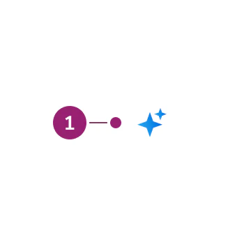
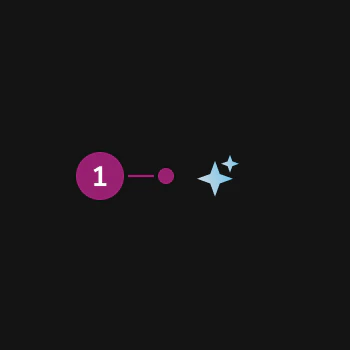
The AI Mark consists of a single element: the double-star shape that identifies AI-assisted or AI-generated content in product UI.

<img src="https://mintcdn.com/servicetitan/QifcvLALFDifjNIm/images/docs/web/components/ai-mark/ai-mark-anatomy-light.png?fit=max&auto=format&n=QifcvLALFDifjNIm&q=85&s=e9879d8203eaf32dca0dcd22e17a1687" alt="Anatomy of the AI Mark (light theme)" className="block dark:hidden" width="350" height="350" data-path="images/docs/web/components/ai-mark/ai-mark-anatomy-light.png" />

<img src="https://mintcdn.com/servicetitan/QifcvLALFDifjNIm/images/docs/web/components/ai-mark/ai-mark-anatomy-dark.png?fit=max&auto=format&n=QifcvLALFDifjNIm&q=85&s=5f8e15e119d3bcb702183a622deaf49b" alt="Anatomy of the AI Mark (dark theme)" className="hidden dark:block" width="350" height="350" data-path="images/docs/web/components/ai-mark/ai-mark-anatomy-dark.png" />

1. **Double-star shape** — AI Mark

## Options

The AI Mark supports the following configurations for color, size, and related presentation.

### Color

* **Gradient**: A blue gradient, used as the primary option for denoting something is AI.
* **Default**: A `currentColor` option, used against non-default backgrounds, such as within buttons.

<LiveCode example="ai-mark-banner" fullWidth screenshot />

### Sizing

The mark comes in four sizes aligned with Anvil icon sizing.

<LiveCode example="ai-mark-sizes" fullWidth screenshot />

* **small**: 12×12
* **medium**: 16×16
* **large**: 24×24
* **xlarge**: 32×32

## Behavior

### Animation

<LiveCode example="ai-mark-animations" fullWidth />

The AI Mark has two animation modes:

* **Pulse**: The default hover treatment for the mark.
* **Spin**: Used exclusively in situations that perform an action (such as buttons), also on hover.

### Tooltips and popovers

The AI Mark responds to hover and focus, and it supports an optional tooltip or popover disclosure when users need more context than the icon alone.

Pair the AI Mark with a tooltip or popover when short inline copy is not enough and users should be able to read more about how AI is used.

* **Tooltip**: Use for a single line or short string of explanatory text on hover or keyboard focus. Reserve tooltips for lightweight context (for example, what “AI-assisted” means in that spot).
* **Popover**: Use when the disclosure needs richer layout or actions—longer explanations, multiple lines, or controls such as feedback. Popover opens on activation (for example, click), not only on hover.

With either pattern, the mark uses an interactive treatment (including animation on hover and focus) and a larger hit target than the plain icon.

<LiveCode example="ai-mark-tooltip" fullWidth screenshot />

For configuration options and examples, see [AI Mark – Code](/docs/web/components/ai-mark/code).

### Contrast-driven style choice

Use the gradient mark by default. Switch to the monochrome mark when the primary treatment fails contrast requirements—for example, primary Button and similar cases where the gradient does not meet contrast against the background.

### Editable states

The AI Mark responds to edits. When a user starts editing a cell, remove the AI Mark immediately. After editing begins, the value is no longer purely AI-generated, and keeping the mark would misrepresent the content.

## Usage Guidelines

Use the AI Mark when you need a clear, consistent visual that an experience or control is AI-related outside of the dedicated Atlas conversational UI.

### When to use

Use the AI Mark when you need to:

* Label AI-assisted actions or fields in embedded product UI
* Pair with component-level AI affordances built into Anvil2 patterns
* Replace inconsistent legacy AI icons or emoji with the approved double-star mark

### Placement on fields

The AI Mark can sit in the field label or in the body or description area. When a field has a visible label, prefer the label. When there is no label—for example, a Data Table cell—place the mark to the right of what AI has generated. If a group of items was generated with AI (for example, a Card), place the mark to the right of the group title.

### Avoid duplicate marks

If the AI Mark already appears on a triggering element (for example, a button that starts an AI action), do not show it again in the output that element produces. One clear association per action keeps the UI honest and avoids noisy repetition.

### When not to use

Avoid using the AI Mark for:

* **Non-AI features** — Use neutral icons or no AI indicator so users are not misled
* **Atlas-only flows** — Within the centralized conversational Atlas experience, follow Atlas-specific guidance; see [Embedded AI vs Atlas](/docs/web/patterns/embedded-ai#embedded-ai-vs-atlas)
* **Repeated context** — If the mark already appears on the control that caused the content to appear, omit it from the generated content; see [Avoid duplicate marks](#avoid-duplicate-marks)

### Do and don't

<Columns cols={2}>
  <DoDont type="do" text="Use the AI Mark (double star) as the standard AI labeling indicator, replacing any single sparkle, TI logo, or sparkle emoji for consistent AI branding across the application.">
    <img src="https://mintcdn.com/servicetitan/gDHlLI8IubZTbnh1/images/docs/web/patterns/embedded-ai/mark-do.png?fit=max&auto=format&n=gDHlLI8IubZTbnh1&q=85&s=36d3b604184e78f35d5b52f672b39ec4" alt="AI mark to use" width="668" height="208" data-path="images/docs/web/patterns/embedded-ai/mark-do.png" />
  </DoDont>

  <DoDont type="dont" text="Use outdated or incorrect AI marks such as single sparkles, TI logos, or sparkle emojis. Use the AI Mark component.">
    <img src="https://mintcdn.com/servicetitan/gDHlLI8IubZTbnh1/images/docs/web/patterns/embedded-ai/mark-dont.png?fit=max&auto=format&n=gDHlLI8IubZTbnh1&q=85&s=01dbc857917b50f65455e6bd5b6bb062" alt="Outdated or incorrect AI marks" width="668" height="208" data-path="images/docs/web/patterns/embedded-ai/mark-dont.png" />
  </DoDont>
</Columns>

## Content

Content within or next to the AI Mark should keep AI disclosure clear and scannable. Prefer plain language that states what the AI does or what the user should expect.

* Pair the mark with labels or headings that describe the AI-assisted outcome, not the technology
* In complex workflows, add short explanatory text or follow-up disclosure as needed in the UI or via tooltip or popover when the mark alone does not carry enough context
* When both a label and description exist, align the mark with [Placement on fields](#placement-on-fields)

## Keyboard Interaction

Users can navigate the AI Mark using the same keyboard patterns as the surrounding control or container (for example, the button or field label that includes the mark).

<Card title="Embedded AI" icon="link" href="/docs/web/patterns/embedded-ai" cta="Read about embedded AI">
  Read more about embedded AI and how to use the AI Mark within larger workflows in the product.
</Card>