> ## Documentation Index
> Fetch the complete documentation index at: https://anvil.servicetitan.com/llms.txt
> Use this file to discover all available pages before exploring further.

# Alert – Design

> Alerts are notifications that informs a user about something.

export const LiveCode = ({children, customHeight, clickToLoad, example, fullWidth, fullHeight, hideCodeInLiveCode, screenshot, screenshotOnly, showCode: showCodeProp}) => {
  const SCREENSHOTS_BASE = "https://servicetitan.github.io/anvil2-docs-live-code/screenshots";
  const STACKBLITZ_BASE = "https://stackblitz.com/github/servicetitan/anvil2-docs-live-code/tree/main/examples";
  const [showCodeBlock, setShowCodeBlock] = useState(showCodeProp ?? false);
  const [isLocalOverride, setIsLocalOverride] = useState(false);
  useEffect(() => {
    const examplePath = `/images/live-code-screenshots-tmp/${example}.png`;
    fetch(examplePath, {
      method: "HEAD"
    }).then(r => {
      if (r.ok) setIsLocalOverride(true);
    }).catch(() => {});
  }, [example]);
  const screenshotBase = isLocalOverride ? "/images/live-code-screenshots-tmp" : SCREENSHOTS_BASE;
  if (screenshotOnly) {
    return <Frame className="flex flex-col">
        <div className="flex dark:hidden" style={{
      justifyContent: "center",
      alignItems: "center",
      width: fullWidth ? "100%" : "50%",
      minHeight: fullHeight ? "284px" : undefined,
      background: "#FFFFFF"
    }}>
          <img srcset={`${screenshotBase}/${example}.png, ${screenshotBase}/${example}-2x.png 2x`} src={`${screenshotBase}/${example}.png`} alt={example} noZoom />
        </div>
        <div className="hidden dark:flex" style={{
      justifyContent: "center",
      alignItems: "center",
      width: fullWidth ? "100%" : "50%",
      minHeight: fullHeight ? "284px" : undefined,
      background: "#141414"
    }}>
          <img srcset={`${screenshotBase}/${example}-dark.png, ${screenshotBase}/${example}-dark-2x.png 2x`} src={`${screenshotBase}/${example}-dark.png`} alt={example} noZoom />
        </div>
      </Frame>;
  }
  if (screenshot) {
    return <Frame className="flex flex-col -mb-2">
        <div className="flex dark:hidden bg-white dark:bg-codeblock border border-gray-950/10 dark:border-white/10 dark:twoslash-dark rounded-2xl overflow-hidden" style={{
      justifyContent: "center",
      alignItems: "center",
      width: fullWidth ? "100%" : "50%",
      minHeight: fullHeight ? "284px" : undefined
    }}>
          <img srcset={`${screenshotBase}/${example}.png, ${screenshotBase}/${example}-2x.png 2x`} src={`${screenshotBase}/${example}.png`} alt={example} noZoom />
        </div>

        <div className="hidden dark:flex bg-white dark:bg-codeblock border border-gray-950/10 dark:border-white/10 dark:twoslash-dark rounded-2xl overflow-hidden" style={{
      background: "#141414",
      justifyContent: "center",
      alignItems: "center",
      width: fullWidth ? "100%" : "50%",
      minHeight: fullHeight ? "284px" : undefined
    }}>
          <img srcset={`${screenshotBase}/${example}-dark.png, ${screenshotBase}/${example}-dark-2x.png 2x`} src={`${screenshotBase}/${example}-dark.png`} alt={example} noZoom />
        </div>

        <div className="flex justify-end items-center text-xs py-2 px-1 gap-4">
          {!showCodeProp ? <button className="inline-flex justify-end items-center text-gray-700 dark:text-gray-50 hover:text-blue-500 dark:hover:text-blue-300 transition-colors group self-end gap-1 cursor-pointer" onClick={() => setShowCodeBlock(!showCodeBlock)} style={{
      appearance: "none"
    }}>
              <Icon icon="code" size="12px" className="group-hover:bg-blue-500 dark:group-hover:bg-blue-300" />
              <span>{showCodeBlock ? "Hide code" : "Show code"}</span>
            </button> : null}

          <a className="inline-flex justify-end items-center hover:text-blue-500 dark:hover:text-blue-300 transition-colors group self-end gap-1" href={`${STACKBLITZ_BASE}/${example}?file=src/App.tsx`} target="_blank" rel="noreferrer">
            <Icon icon="bolt" size="12px" className="group-hover:bg-blue-500 dark:group-hover:bg-blue-300" />
            <span>StackBlitz demo</span>
          </a>
        </div>

        <div className="grid transition-[grid-template-rows] duration-300 ease-in-out overflow-auto overflow-y-hidden overflow-x-auto" style={showCodeBlock ? {
      gridTemplateRows: "1fr"
    } : {
      gridTemplateRows: "0fr"
    }}>
          <div style={{
      minHeight: 0,
      overflowX: "auto",
      overflowY: "hidden",
      marginBlockStart: "-1.25rem",
      marginBlockEnd: "-1.5rem"
    }}>
            {children}
          </div>
        </div>
      </Frame>;
  } else {
    return <div style={{
      display: "flex",
      width: fullWidth ? "100%" : "50%",
      minHeight: customHeight ? customHeight : "316px",
      resize: "vertical",
      overflow: "auto"
    }}>
        <iframe title={example} style={{
      flex: 1,
      width: fullWidth ? "100%" : "50%",
      minHeight: customHeight ? customHeight : "316px"
    }} src={`${STACKBLITZ_BASE}/${example}?embed=1&hideNavigation=1&hideExplorer=1&terminalHeight=0&file=src/App.tsx${clickToLoad ? "&ctl=1" : ""}${hideCodeInLiveCode ? "&view=preview" : ""}`} allow="accelerometer; ambient-light-sensor; camera; encrypted-media; geolocation; gyroscope; hid; microphone; midi; payment; usb; vr; xr-spatial-tracking" sandbox="allow-forms allow-modals allow-popups allow-presentation allow-same-origin allow-scripts" />
      </div>;
  }
};

export const CodePreviewPlaceholder = ({double, fullWidth}) => {
  const single = <div style={{
    width: fullWidth ? "100%" : "50%",
    borderRadius: "1rem",
    display: "flex",
    padding: "1rem",
    flexDirection: "column",
    gap: "0.5rem",
    height: "10rem",
    marginBlockEnd: "1rem"
  }} className="border-width-default border-color-subdued">
      <div className="bg-strong border-radius-large" style={{
    width: "100%",
    flexGrow: "1"
  }} />
      <div className="bg-strong border-radius-large" style={{
    width: "100%",
    flexGrow: "1"
  }} />
    </div>;
  return double ? <div style={{
    display: "flex",
    gap: "1rem"
  }}>
      {single}
      {single}
    </div> : single;
};

<Frame>
  <div className="w-full h-full bg-[#FFFFFF] p-2 rounded flex items-center justify-center">
    <img noZoom src="https://mintcdn.com/servicetitan/uz2PQSvO75TRhQ38/images/docs/web/components/shared/alert-overview.png?fit=max&auto=format&n=uz2PQSvO75TRhQ38&q=85&s=4a3dcb4826b2c61058b8db1eb2b5b906" width="1060" height="180" data-path="images/docs/web/components/shared/alert-overview.png" />
  </div>
</Frame>

## Anatomy

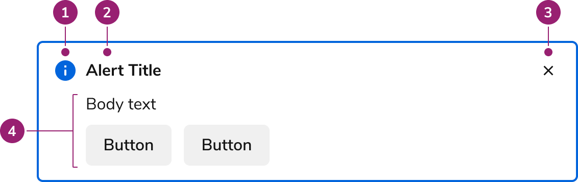
The Alert consists of four primary elements that work together to communicate important information to users.

<Frame>
  <div className="w-full h-full bg-[#FFFFFF] p-2 rounded flex items-center justify-center">
    <img
      src="https://mintcdn.com/servicetitan/ABmJyJBQtPOXixkz/images/docs/web/components/alert/design/anatomy-of-an-alert.png?fit=max&auto=format&n=ABmJyJBQtPOXixkz&q=85&s=55ecfee5c64789bc31893e4459498674"
      alt="Anatomy of an
Alert"
      width="1132"
      height="356"
      data-path="images/docs/web/components/alert/design/anatomy-of-an-alert.png"
    />
  </div>
</Frame>

1. Status icon
2. Title
3. Close action (Optional)
4. Body content (presented as text and actions) (Optional)

## Options

The Alert supports four status types and flexible content configurations to accommodate various messaging scenarios.

### Status

<LiveCode example="alert-status" screenshot fullWidth>
  ```tsx lines theme={null}
  import { Alert, Flex } from "@servicetitan/anvil2";

  function App() {
    return (
      <Flex direction="column" gap="4" flex="1">
        <Alert title="Info Alert" onClose={() => console.log("info onClose")} />
        <Alert
          title="Success Alert"
          status="success"
          onClose={() => console.log("success onClose")}
        />
        <Alert
          title="Warning Alert"
          status="warning"
          onClose={() => console.log("warning onClose")}
        />
        <Alert
          title="Danger Alert"
          status="danger"
          onClose={() => console.log("danger onClose")}
        />
      </Flex>
    );
  }

  export default App;
  ```
</LiveCode>

| Status type | Description                                                             |
| ----------- | ----------------------------------------------------------------------- |
| Info        | Used for neutral types of notification to users.                        |
| Success     | Used for positive-type confirmations to users.                          |
| Warning     | Used to convey important information that may require user action soon. |
| Danger      | Used to convey critical errors that require user action.                |

### Content Area

The Alert allows for any type of content inside below the title and icon. This is typically represented as text and 0–2 actions (as [Secondary Buttons](/docs/web/components/button/design#appearances)).

<LiveCode example="alert-content" screenshot fullWidth>
  ```tsx lines theme={null}
  import { Alert, Flex, Button } from "@servicetitan/anvil2";

  function App() {
    return (
      <Flex direction="column" gap="4" flex="1">
        <Alert title="Alert title" onClose={() => console.log("onClose")} />
        <Alert title="Alert title" onClose={() => console.log("onClose")}>
          Body text to the alert.
        </Alert>
        <Alert title="Alert title" onClose={() => console.log("onClose")}>
          Body text to the alert.
          <Flex gap="3">
            <Button>Button</Button>
            <Button>Button</Button>
          </Flex>
        </Alert>
      </Flex>
    );
  }

  export default App;
  ```
</LiveCode>

### Close

<LiveCode example="alert-onclose" screenshot fullWidth>
  ```tsx lines theme={null}
  import { Alert, Flex, Button } from "@servicetitan/anvil2";
  import { useState } from "react";

  function App() {
    const [isOpen, setIsOpen] = useState(true);

    return (
      <Flex direction="column" gap="4" flex="1">
        {isOpen ? (
          <Alert title="Closeable Alert" onClose={() => setIsOpen(false)} />
        ) : (
          <Button
            size="large"
            onClick={() => setIsOpen(true)}
            style={{ width: "100%" }}
          >
            Open Alert
          </Button>
        )}

        <Alert title="Alert without onClose" />
      </Flex>
    );
  }

  export default App;
  ```
</LiveCode>

Preserve the close action by default. Remove it only when an alert must persist, such as in warning or danger scenarios.

### AI Mark

<LiveCode example="ai-mark-alert" screenshot fullWidth>
  ```tsx lines theme={null}
  import { Alert } from "@servicetitan/anvil2";

  function App() {
    return (
      <Alert
        title="Suggested upsell"
        status="info"
        aiMark
        style={{ maxWidth: "550px" }}
      >
        Customer asked about indoor air quality—consider adding a media filter
        upgrade and UV option to this HVAC maintenance estimate.
      </Alert>
    );
  }

  export default App;
  ```
</LiveCode>

Include an [AI Mark](/docs/web/components/ai-mark/code) on an Alert when the title should indicate AI-generated content.

## Behavior

The Alert responds to content overflow by expanding vertically to accommodate longer messages while maintaining its visual structure.

### Overflow handling

<LiveCode example="alert-overflow" screenshot fullWidth>
  ```tsx lines theme={null}
  import { Alert, Flex, Button } from "@servicetitan/anvil2";

  function App() {
    return (
      <Alert
        title="An alert title will wrap when not enough space is available for it."
        style={{ maxWidth: 325 }}
      >
        Content inside the Alert will overflow depending on how it is implemented,
        with the most typical being wrapping.
        <Flex gap="3">
          <Button>Button</Button>
          <Button>Button</Button>
        </Flex>
      </Alert>
    );
  }

  export default App;
  ```
</LiveCode>

## Usage Guidelines

### When to Use

Use alerts to keep users informed of important information, such as updates, status, and errors. Alerts work across multiple layouts and scopes of notification.

### When not to use

Alerts should not be used for system-wide notifications.

Avoid overusing Alerts. Overuse can lead to an overwhelming interface.

### Alternatives

#### Alert vs Announcement

Announcements are used to convey app-wide information. They are placed as a global element on the page. Alerts are contextual to an area of an app, and are more flexible in scope and layout position.

#### Alert vs Dialog

Dialogs are interruptive by design, while an Alert is non-disruptive. Prefer using an Alert when information needs to be conveyed. Use a Dialog only when there is a clear need to interrupt a flow, such as a confirmation of destructive or irreversible actions.

#### Alert vs Toast

Alerts are used to communicate information about either part of a page or a whole page. Alerts can be used to summarize information, such as a summary of errors.

Toasts are brief pieces of information and usually appear as the result of user action.

### How to Use

#### As part of a form

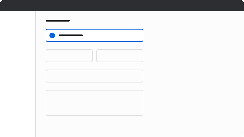
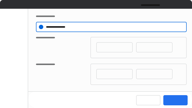
Pair alerts with forms, typically as part of an error pattern.

#### Layout positions

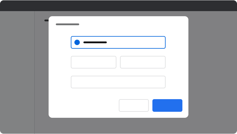
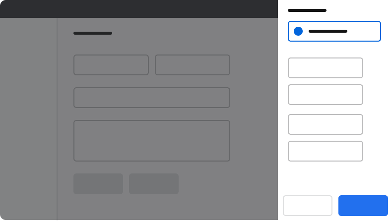
Position alerts toward the top of their related context. This includes UIs such as Pages, Drawers, and Dialogs.

<Frame>
  <div className="w-full h-full bg-[#FFFFFF] p-2 rounded flex items-center justify-center">
    <img src="https://mintcdn.com/servicetitan/ABmJyJBQtPOXixkz/images/docs/web/components/alert/design/example-of-an-alert-used-in-a-form.png?fit=max&auto=format&n=ABmJyJBQtPOXixkz&q=85&s=5e1b5f06d0c45bd30bdc70b61cee0681" alt="Example of an alert used in a form" width="790" height="445" data-path="images/docs/web/components/alert/design/example-of-an-alert-used-in-a-form.png" />
  </div>
</Frame>

<Frame>
  <div className="w-full h-full bg-[#FFFFFF] p-2 rounded flex items-center justify-center">
    <img src="https://mintcdn.com/servicetitan/ABmJyJBQtPOXixkz/images/docs/web/components/alert/design/example-of-an-alert-used-in-a-dialog.png?fit=max&auto=format&n=ABmJyJBQtPOXixkz&q=85&s=28774d8bf315dad9d98dd6fc04b51492" alt="Example of an alert used in a Dialog" width="790" height="446" data-path="images/docs/web/components/alert/design/example-of-an-alert-used-in-a-dialog.png" />
  </div>
</Frame>

<Frame>
  <div className="w-full h-full bg-[#FFFFFF] p-2 rounded flex items-center justify-center">
    <img src="https://mintcdn.com/servicetitan/ABmJyJBQtPOXixkz/images/docs/web/components/alert/design/example-of-an-alert-used-in-a-drawer.png?fit=max&auto=format&n=ABmJyJBQtPOXixkz&q=85&s=a0603be26cab235ec669e8cee5d5e9da" alt="Example of an Alert used in a Drawer" width="790" height="446" data-path="images/docs/web/components/alert/design/example-of-an-alert-used-in-a-drawer.png" />
  </div>
</Frame>

<Frame>
  <div className="w-full h-full bg-[#FFFFFF] p-2 rounded flex items-center justify-center">
    <img src="https://mintcdn.com/servicetitan/ABmJyJBQtPOXixkz/images/docs/web/components/alert/design/example-of-an-alert-used-in-a-page.png?fit=max&auto=format&n=ABmJyJBQtPOXixkz&q=85&s=ae1301e959856051eb15e722ed3cc36b" alt="Example of an Alert used in a Page" width="790" height="445" data-path="images/docs/web/components/alert/design/example-of-an-alert-used-in-a-page.png" />
  </div>
</Frame>

## Content

Content within the Alert should communicate clearly and concisely, helping users understand the situation and take appropriate action.

### Use a title that identifies the issue

Titles identify the issue clearly. Write titles in sentence case.

<LiveCode example="alert-identify-the-issue-do" screenshot fullWidth>
  ```tsx lines theme={null}
  import { Alert } from "@servicetitan/anvil2";

  function App() {
    return (
      <Alert
        status="danger"
        title="Action requires two or more active accounts"
      />
    );
  }

  export default App;
  ```
</LiveCode>

<Check>**Do**</Check>

<LiveCode example="alert-identify-the-issue-dont" screenshot fullWidth>
  ```tsx lines theme={null}
  import { Alert } from "@servicetitan/anvil2";

  function App() {
    return <Alert status="danger" title="Action cannot be completed" />;
  }

  export default App;
  ```
</LiveCode>

<Danger>**Don't**</Danger>

### Focus on a single message

The body content should focus on a single, simple message or action to avoid overwhelming the user with too much information. Avoid repeating the information in the title.

Do not use periods in short phrases or single sentences.

An exception to this rule is for a summary of errors, typically found with forms.

<LiveCode example="alert-single-message-do" screenshot fullWidth>
  ```tsx lines theme={null}
  import { Alert } from "@servicetitan/anvil2";

  function App() {
    return (
      <Alert status="danger" title="Document theme limit has been reached">
        Delete unused themes to add more
      </Alert>
    );
  }

  export default App;
  ```
</LiveCode>

<Check>**Do**</Check>

<LiveCode example="alert-single-message-exception" screenshot fullWidth>
  ```tsx lines theme={null}
  import { Alert } from "@servicetitan/anvil2";

  function App() {
    return (
      <Alert status="danger" title="Unable to process your request">
        We were unable to process your request.
        <ul>
          <li>The document template has a maximum of 20 themes.</li>
          <li>Your document title is limited to 100 characters.</li>
        </ul>
      </Alert>
    );
  }

  export default App;
  ```
</LiveCode>

<Warning>**Caution**</Warning>

### Write concise, action-oriented body content

<LiveCode example="alert-concise-do" screenshot fullWidth>
  ```tsx lines theme={null}
  import { Alert } from "@servicetitan/anvil2";

  function App() {
    return (
      <Alert status="warning" title="Document theme limit has been reached">
        Delete unused themes to add more
      </Alert>
    );
  }

  export default App;
  ```
</LiveCode>

<Check>**Do**</Check>

<LiveCode example="alert-concise-dont" screenshot fullWidth>
  ```tsx lines theme={null}
  import { Alert } from "@servicetitan/anvil2";

  function App() {
    return (
      <Alert
        status="warning"
        title="Document theme limit has been reached"
        style={{ maxWidth: "35rem" }}
      >
        You have reached your theme limit. Your document template has reached its
        maximum of 20 themes. To add more themes, delete themes you’re no longer
        using.
      </Alert>
    );
  }

  export default App;
  ```
</LiveCode>

<Danger>**Don't**</Danger>

## Keyboard Interaction

Users can navigate the Alert using standard keyboard controls.

| Key | Description                                                     |
| --- | --------------------------------------------------------------- |
| Tab | Move to the next tab-able element within the Alert or the page. |