> ## Documentation Index
> Fetch the complete documentation index at: https://anvil.servicetitan.com/llms.txt
> Use this file to discover all available pages before exploring further.

# Announcement – Design

> Announcement notifications convey app-wide information about an event.

export const LiveCode = ({children, customHeight, clickToLoad, example, fullWidth, fullHeight, hideCodeInLiveCode, screenshot, screenshotOnly, showCode: showCodeProp}) => {
  const SCREENSHOTS_BASE = "https://servicetitan.github.io/anvil2-docs-live-code/screenshots";
  const STACKBLITZ_BASE = "https://stackblitz.com/github/servicetitan/anvil2-docs-live-code/tree/main/examples";
  const [showCodeBlock, setShowCodeBlock] = useState(showCodeProp ?? false);
  const [isLocalOverride, setIsLocalOverride] = useState(false);
  useEffect(() => {
    const examplePath = `/images/live-code-screenshots-tmp/${example}.png`;
    fetch(examplePath, {
      method: "HEAD"
    }).then(r => {
      if (r.ok) setIsLocalOverride(true);
    }).catch(() => {});
  }, [example]);
  const screenshotBase = isLocalOverride ? "/images/live-code-screenshots-tmp" : SCREENSHOTS_BASE;
  if (screenshotOnly) {
    return <Frame className="flex flex-col">
        <div className="flex dark:hidden" style={{
      justifyContent: "center",
      alignItems: "center",
      width: fullWidth ? "100%" : "50%",
      minHeight: fullHeight ? "284px" : undefined,
      background: "#FFFFFF"
    }}>
          <img srcset={`${screenshotBase}/${example}.png, ${screenshotBase}/${example}-2x.png 2x`} src={`${screenshotBase}/${example}.png`} alt={example} noZoom />
        </div>
        <div className="hidden dark:flex" style={{
      justifyContent: "center",
      alignItems: "center",
      width: fullWidth ? "100%" : "50%",
      minHeight: fullHeight ? "284px" : undefined,
      background: "#141414"
    }}>
          <img srcset={`${screenshotBase}/${example}-dark.png, ${screenshotBase}/${example}-dark-2x.png 2x`} src={`${screenshotBase}/${example}-dark.png`} alt={example} noZoom />
        </div>
      </Frame>;
  }
  if (screenshot) {
    return <Frame className="flex flex-col -mb-2">
        <div className="flex dark:hidden bg-white dark:bg-codeblock border border-gray-950/10 dark:border-white/10 dark:twoslash-dark rounded-2xl overflow-hidden" style={{
      justifyContent: "center",
      alignItems: "center",
      width: fullWidth ? "100%" : "50%",
      minHeight: fullHeight ? "284px" : undefined
    }}>
          <img srcset={`${screenshotBase}/${example}.png, ${screenshotBase}/${example}-2x.png 2x`} src={`${screenshotBase}/${example}.png`} alt={example} noZoom />
        </div>

        <div className="hidden dark:flex bg-white dark:bg-codeblock border border-gray-950/10 dark:border-white/10 dark:twoslash-dark rounded-2xl overflow-hidden" style={{
      background: "#141414",
      justifyContent: "center",
      alignItems: "center",
      width: fullWidth ? "100%" : "50%",
      minHeight: fullHeight ? "284px" : undefined
    }}>
          <img srcset={`${screenshotBase}/${example}-dark.png, ${screenshotBase}/${example}-dark-2x.png 2x`} src={`${screenshotBase}/${example}-dark.png`} alt={example} noZoom />
        </div>

        <div className="flex justify-end items-center text-xs py-2 px-1 gap-4">
          {!showCodeProp ? <button className="inline-flex justify-end items-center text-gray-700 dark:text-gray-50 hover:text-blue-500 dark:hover:text-blue-300 transition-colors group self-end gap-1 cursor-pointer" onClick={() => setShowCodeBlock(!showCodeBlock)} style={{
      appearance: "none"
    }}>
              <Icon icon="code" size="12px" className="group-hover:bg-blue-500 dark:group-hover:bg-blue-300" />
              <span>{showCodeBlock ? "Hide code" : "Show code"}</span>
            </button> : null}

          <a className="inline-flex justify-end items-center hover:text-blue-500 dark:hover:text-blue-300 transition-colors group self-end gap-1" href={`${STACKBLITZ_BASE}/${example}?file=src/App.tsx`} target="_blank" rel="noreferrer">
            <Icon icon="bolt" size="12px" className="group-hover:bg-blue-500 dark:group-hover:bg-blue-300" />
            <span>StackBlitz demo</span>
          </a>
        </div>

        <div className="grid transition-[grid-template-rows] duration-300 ease-in-out overflow-auto overflow-y-hidden overflow-x-auto" style={showCodeBlock ? {
      gridTemplateRows: "1fr"
    } : {
      gridTemplateRows: "0fr"
    }}>
          <div style={{
      minHeight: 0,
      overflowX: "auto",
      overflowY: "hidden",
      marginBlockStart: "-1.25rem",
      marginBlockEnd: "-1.5rem"
    }}>
            {children}
          </div>
        </div>
      </Frame>;
  } else {
    return <div style={{
      display: "flex",
      width: fullWidth ? "100%" : "50%",
      minHeight: customHeight ? customHeight : "316px",
      resize: "vertical",
      overflow: "auto"
    }}>
        <iframe title={example} style={{
      flex: 1,
      width: fullWidth ? "100%" : "50%",
      minHeight: customHeight ? customHeight : "316px"
    }} src={`${STACKBLITZ_BASE}/${example}?embed=1&hideNavigation=1&hideExplorer=1&terminalHeight=0&file=src/App.tsx${clickToLoad ? "&ctl=1" : ""}${hideCodeInLiveCode ? "&view=preview" : ""}`} allow="accelerometer; ambient-light-sensor; camera; encrypted-media; geolocation; gyroscope; hid; microphone; midi; payment; usb; vr; xr-spatial-tracking" sandbox="allow-forms allow-modals allow-popups allow-presentation allow-same-origin allow-scripts" />
      </div>;
  }
};

export const CodePreviewPlaceholder = ({double, fullWidth}) => {
  const single = <div style={{
    width: fullWidth ? "100%" : "50%",
    borderRadius: "1rem",
    display: "flex",
    padding: "1rem",
    flexDirection: "column",
    gap: "0.5rem",
    height: "10rem",
    marginBlockEnd: "1rem"
  }} className="border-width-default border-color-subdued">
      <div className="bg-strong border-radius-large" style={{
    width: "100%",
    flexGrow: "1"
  }} />
      <div className="bg-strong border-radius-large" style={{
    width: "100%",
    flexGrow: "1"
  }} />
    </div>;
  return double ? <div style={{
    display: "flex",
    gap: "1rem"
  }}>
      {single}
      {single}
    </div> : single;
};

<Frame>
  <div className="w-full h-full bg-[#FFFFFF] p-2 rounded flex items-center justify-center">
    <img noZoom src="https://mintcdn.com/servicetitan/uz2PQSvO75TRhQ38/images/docs/web/components/shared/announcement-overview-image.png?fit=max&auto=format&n=uz2PQSvO75TRhQ38&q=85&s=3cd4b53358f439a2b8b808d1e55891b3" width="1248" height="100" data-path="images/docs/web/components/shared/announcement-overview-image.png" />
  </div>
</Frame>

## Anatomy

The Announcement consists of five primary elements that work together to communicate app-wide information to users.

<Frame>
  <div className="w-full h-full bg-[#FFFFFF] p-2 rounded flex items-center justify-center">
    <img
      src="https://mintcdn.com/servicetitan/ABmJyJBQtPOXixkz/images/docs/web/components/announcement/design/anatomy-of-an-announcement.png?fit=max&auto=format&n=ABmJyJBQtPOXixkz&q=85&s=cc3674acc609a364c42a68857b950dfd"
      alt="Anatomy of an
Announcement"
      width="1248"
      height="186"
      data-path="images/docs/web/components/announcement/design/anatomy-of-an-announcement.png"
    />
  </div>
</Frame>

1. Status background
2. Status icon
3. Title
4. Action (Optional)
5. Close action (Optional)

## Options

The Announcement supports three status types and flexible action configurations to accommodate various app-wide messaging scenarios.

### Status

<LiveCode example="announcement-status" screenshot fullWidth>
  ```tsx lines theme={null}
  import { Announcement, Flex } from "@servicetitan/anvil2";

  function App() {
    return (
      <Flex direction="column" gap={4} grow={1}>
        <Announcement status="info" title="Info announcement" />
        <Announcement status="warning" title="Warning announcement" />
        <Announcement status="danger" title="Danger announcement" />
      </Flex>
    );
  }

  export default App;
  ```
</LiveCode>

| Status type | Description                                                           |
| ----------- | --------------------------------------------------------------------- |
| Info        | Used for neutral or positive app-wide information.                    |
| Warning     | Used for important message to users, typically requiring action soon. |
| Danger      | Used to convey a major, blocking app-wide issue.                      |

### Close

<LiveCode example="announcement-onclose" screenshot fullWidth>
  ```tsx lines theme={null}
  import { Announcement, Flex, Button } from "@servicetitan/anvil2";
  import { useState } from "react";

  function App() {
    const [isOpen, setIsOpen] = useState(true);

    return (
      <Flex direction="column" gap={4}>
        <Announcement
          status="warning"
          title="You have no credit card specified. Please add it before your service is suspended in 3 days."
        />

        {isOpen ? (
          <Announcement
            status="warning"
            title="You have no credit card specified. Please add it before your service is suspended in 3 days."
            onClose={() => setIsOpen(false)}
          />
        ) : (
          <Button
            size="large"
            onClick={() => setIsOpen(true)}
            style={{ width: "100%" }}
          >
            Open Announcement
          </Button>
        )}
      </Flex>
    );
  }

  export default App;
  ```
</LiveCode>

Preserve the close action by default. Remove it only when an announcement must persist, such as in warning or danger scenarios.

### Action

<LiveCode example="announcement-button" screenshot fullWidth>
  ```tsx lines theme={null}
  import { Announcement, Flex, Button } from "@servicetitan/anvil2";

  function App() {
    return (
      <Flex direction="column" gap={4}>
        <Announcement title="Info announcement">
          <Button size="small">Button</Button>
        </Announcement>
        <Announcement status="warning" title="Warning announcement">
          <Button size="small">Button</Button>
        </Announcement>
        <Announcement status="danger" title="Danger announcement">
          <Button size="small">Button</Button>
        </Announcement>
      </Flex>
    );
  }

  export default App;
  ```
</LiveCode>

An optional, single action can be added to the Announcement. All action Buttons should use the `"default"` or `"secondary"` appearance to maintain visual hierarchy within the Announcement.

## Behavior

The Announcement responds to content overflow by truncating text while maintaining its fixed height.

### Overflow handling

<LiveCode example="announcement-overflow" screenshot fullWidth>
  ```tsx lines theme={null}
  import { Announcement, Flex, Button } from "@servicetitan/anvil2";

  function App() {
    return (
      <Flex direction="column" gap={4}>
        <Announcement title="Announcement text will truncate instead of wrap">
          <Button size="small">Button</Button>
        </Announcement>
        <div style={{ maxWidth: "450px" }}>
          <Announcement title="Announcement text will truncate instead of wrap">
            <Button size="small">Button</Button>
          </Announcement>
        </div>
      </Flex>
    );
  }

  export default App;
  ```
</LiveCode>

When space is unavailable, text truncates. The Announcement height remains constant.

## Usage Guidelines

### When to Use

Announcements convey app-wide information. Examples include feature releases, maintenance messaging, and sandbox status.

### When not to use

Announcements should not be used for specific sections of an app, or to convey normal error messaging.

### Alternatives

#### Announcement vs Alert

Announcements are used to convey app-wide information. They are placed as a global element on the page. Alerts are contextual to an area of an app, and are more flexible in scope and layout position.

#### Announcement vs Toast

Announcements are used to convey app-wide messages, such as a new release being available, application maintenance, or sandbox information.

Toasts are short pieces of information usually prompted by user action.

### How to Use

#### Layout positions

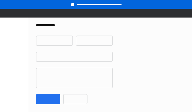
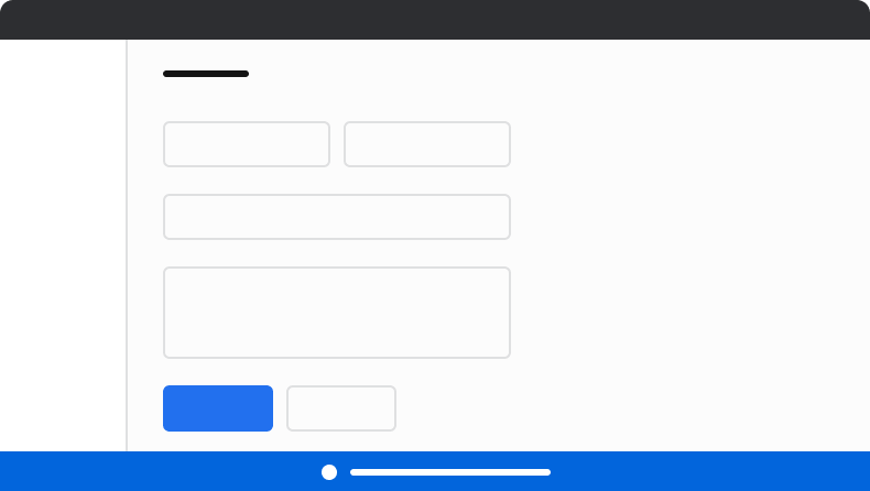
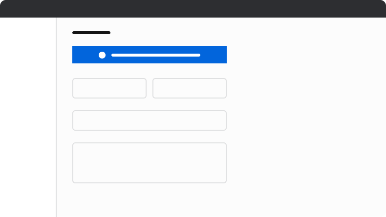
Position announcements above all other elements with sticky or fixed positioning. If top placement is not possible, bottom placement with fixed positioning is an alternative, though not recommended. Do not place announcements in other locations.

<Frame>
  <div className="w-full h-full bg-[#FFFFFF] p-2 rounded flex items-center justify-center">
    <img
      src="https://mintcdn.com/servicetitan/ABmJyJBQtPOXixkz/images/docs/web/components/announcement/design/announcement-how-placement-do.png?fit=max&auto=format&n=ABmJyJBQtPOXixkz&q=85&s=1bb4a5d5f84015cf10fb75e8fe9d68c4"
      alt="Announcement How Placement
Do"
      width="790"
      height="460"
      data-path="images/docs/web/components/announcement/design/announcement-how-placement-do.png"
    />
  </div>
</Frame>

<Check>**Do**</Check>

<Frame>
  <div className="w-full h-full bg-[#FFFFFF] p-2 rounded flex items-center justify-center">
    <img
      src="https://mintcdn.com/servicetitan/ABmJyJBQtPOXixkz/images/docs/web/components/announcement/design/announcement-how-placement-caution.png?fit=max&auto=format&n=ABmJyJBQtPOXixkz&q=85&s=82556d2ad26394ebf973950515b79c81"
      alt="Announcement How Placement
Caution"
      width="790"
      height="446"
      data-path="images/docs/web/components/announcement/design/announcement-how-placement-caution.png"
    />
  </div>
</Frame>

<Warning>**Caution**</Warning>

Place announcements at the bottom only when top placement is not possible.

<Frame>
  <div className="w-full h-full bg-[#FFFFFF] p-2 rounded flex items-center justify-center">
    <img
      src="https://mintcdn.com/servicetitan/ABmJyJBQtPOXixkz/images/docs/web/components/announcement/design/announcement-how-placement-dont.png?fit=max&auto=format&n=ABmJyJBQtPOXixkz&q=85&s=918518ed86c924182fe1291073b11041"
      alt="Announcement How Placement
Don't"
      width="790"
      height="445"
      data-path="images/docs/web/components/announcement/design/announcement-how-placement-dont.png"
    />
  </div>
</Frame>

<Danger>**Don't**</Danger>

Don't place Announcements inside normal content.

## Content

Content within the Announcement should communicate clearly and concisely, helping users understand app-wide situations and take appropriate action.

### Make clear and concise announcements that are easy to read and scan

Keep to 1 to 2 sentences where possible. Put the most critical information first. When action is required, explain the main task and why the user should do it.

Don't use periods in short phrases or single sentences, and use sentence case. This helps make the content easier to read and more scannable.

<LiveCode example="announcement-concise-do" screenshot fullWidth>
  ```tsx lines theme={null}
  import { Announcement } from "@servicetitan/anvil2";

  function App() {
    return (
      <Announcement title="Your web browser is not supported" status="danger" />
    );
  }

  export default App;
  ```
</LiveCode>

<LiveCode example="announcement-concise-dont" screenshot fullWidth>
  ```tsx lines theme={null}
  import { Announcement } from "@servicetitan/anvil2";

  function App() {
    return (
      <Announcement
        title="Your web browser is not supported at this time"
        status="danger"
      />
    );
  }

  export default App;
  ```
</LiveCode>

### Make announcements action-oriented

Provide an action when possible to allow users to resolve the issue described in the announcement.

Follow content guidelines for [Buttons](/docs/web/components/button/design#content-guidelines).

<LiveCode example="announcement-action-oriented" screenshot fullWidth>
  ```tsx lines theme={null}
  import { Announcement, Button } from "@servicetitan/anvil2";

  function App() {
    return (
      <Announcement title="Your web browser is not supported" status="danger">
        <Button size="small">Learn More</Button>
      </Announcement>
    );
  }

  export default App;
  ```
</LiveCode>

### Buttons should be clear, predictable, and action-oriented

Users should be able to predict what will happen when they click a button.

Lead with a strong verb that encourages action. Use a verb/noun pair on actions in most cases. Common actions like Save, Close, or Cancel do not require an accompanying noun.

<LiveCode example="announcement-button-action-oriented-do" screenshot fullWidth>
  ```tsx lines theme={null}
  import { Button, Grid } from "@servicetitan/anvil2";

  function App() {
    return (
      <Grid templateColumns="repeat(1, max-content)" gap="8" placeItems="center">
        <Button size="small">Create Order</Button>
        <Button size="small">Print Label</Button>
      </Grid>
    );
  }

  export default App;
  ```
</LiveCode>

<LiveCode example="announcement-button-action-oriented-dont" screenshot fullWidth>
  ```tsx lines theme={null}
  import { Button, Grid } from "@servicetitan/anvil2";

  function App() {
    return (
      <Grid templateColumns="repeat(1, max-content)" gap="8" placeItems="center">
        <Button size="small">New invoice</Button>
        <Button size="small">Schedule</Button>
      </Grid>
    );
  }

  export default App;
  ```
</LiveCode>

## Keyboard Interaction

Users can navigate the Announcement using standard keyboard controls.

If an action exists in the Announcement (the close or optional action), it will use the [Button](/docs/web/components/button/design)'s keyboard interactions, otherwise the Announcement has no keyboard interactions.