> ## Documentation Index
> Fetch the complete documentation index at: https://anvil.servicetitan.com/llms.txt
> Use this file to discover all available pages before exploring further.

# Button – Design

> Buttons are clickable UI elements that trigger an action or event.

export const LiveCode = ({children, customHeight, clickToLoad, example, fullWidth, fullHeight, hideCodeInLiveCode, screenshot, screenshotOnly, showCode: showCodeProp}) => {
  const SCREENSHOTS_BASE = "https://servicetitan.github.io/anvil2-docs-live-code/screenshots";
  const STACKBLITZ_BASE = "https://stackblitz.com/github/servicetitan/anvil2-docs-live-code/tree/main/examples";
  const [showCodeBlock, setShowCodeBlock] = useState(showCodeProp ?? false);
  const [isLocalOverride, setIsLocalOverride] = useState(false);
  useEffect(() => {
    const examplePath = `/images/live-code-screenshots-tmp/${example}.png`;
    fetch(examplePath, {
      method: "HEAD"
    }).then(r => {
      if (r.ok) setIsLocalOverride(true);
    }).catch(() => {});
  }, [example]);
  const screenshotBase = isLocalOverride ? "/images/live-code-screenshots-tmp" : SCREENSHOTS_BASE;
  if (screenshotOnly) {
    return <Frame className="flex flex-col">
        <div className="flex dark:hidden" style={{
      justifyContent: "center",
      alignItems: "center",
      width: fullWidth ? "100%" : "50%",
      minHeight: fullHeight ? "284px" : undefined,
      background: "#FFFFFF"
    }}>
          <img srcset={`${screenshotBase}/${example}.png, ${screenshotBase}/${example}-2x.png 2x`} src={`${screenshotBase}/${example}.png`} alt={example} noZoom />
        </div>
        <div className="hidden dark:flex" style={{
      justifyContent: "center",
      alignItems: "center",
      width: fullWidth ? "100%" : "50%",
      minHeight: fullHeight ? "284px" : undefined,
      background: "#141414"
    }}>
          <img srcset={`${screenshotBase}/${example}-dark.png, ${screenshotBase}/${example}-dark-2x.png 2x`} src={`${screenshotBase}/${example}-dark.png`} alt={example} noZoom />
        </div>
      </Frame>;
  }
  if (screenshot) {
    return <Frame className="flex flex-col -mb-2">
        <div className="flex dark:hidden bg-white dark:bg-codeblock border border-gray-950/10 dark:border-white/10 dark:twoslash-dark rounded-2xl overflow-hidden" style={{
      justifyContent: "center",
      alignItems: "center",
      width: fullWidth ? "100%" : "50%",
      minHeight: fullHeight ? "284px" : undefined
    }}>
          <img srcset={`${screenshotBase}/${example}.png, ${screenshotBase}/${example}-2x.png 2x`} src={`${screenshotBase}/${example}.png`} alt={example} noZoom />
        </div>

        <div className="hidden dark:flex bg-white dark:bg-codeblock border border-gray-950/10 dark:border-white/10 dark:twoslash-dark rounded-2xl overflow-hidden" style={{
      background: "#141414",
      justifyContent: "center",
      alignItems: "center",
      width: fullWidth ? "100%" : "50%",
      minHeight: fullHeight ? "284px" : undefined
    }}>
          <img srcset={`${screenshotBase}/${example}-dark.png, ${screenshotBase}/${example}-dark-2x.png 2x`} src={`${screenshotBase}/${example}-dark.png`} alt={example} noZoom />
        </div>

        <div className="flex justify-end items-center text-xs py-2 px-1 gap-4">
          {!showCodeProp ? <button className="inline-flex justify-end items-center text-gray-700 dark:text-gray-50 hover:text-blue-500 dark:hover:text-blue-300 transition-colors group self-end gap-1 cursor-pointer" onClick={() => setShowCodeBlock(!showCodeBlock)} style={{
      appearance: "none"
    }}>
              <Icon icon="code" size="12px" className="group-hover:bg-blue-500 dark:group-hover:bg-blue-300" />
              <span>{showCodeBlock ? "Hide code" : "Show code"}</span>
            </button> : null}

          <a className="inline-flex justify-end items-center hover:text-blue-500 dark:hover:text-blue-300 transition-colors group self-end gap-1" href={`${STACKBLITZ_BASE}/${example}?file=src/App.tsx`} target="_blank" rel="noreferrer">
            <Icon icon="bolt" size="12px" className="group-hover:bg-blue-500 dark:group-hover:bg-blue-300" />
            <span>StackBlitz demo</span>
          </a>
        </div>

        <div className="grid transition-[grid-template-rows] duration-300 ease-in-out overflow-auto overflow-y-hidden overflow-x-auto" style={showCodeBlock ? {
      gridTemplateRows: "1fr"
    } : {
      gridTemplateRows: "0fr"
    }}>
          <div style={{
      minHeight: 0,
      overflowX: "auto",
      overflowY: "hidden",
      marginBlockStart: "-1.25rem",
      marginBlockEnd: "-1.5rem"
    }}>
            {children}
          </div>
        </div>
      </Frame>;
  } else {
    return <div style={{
      display: "flex",
      width: fullWidth ? "100%" : "50%",
      minHeight: customHeight ? customHeight : "316px",
      resize: "vertical",
      overflow: "auto"
    }}>
        <iframe title={example} style={{
      flex: 1,
      width: fullWidth ? "100%" : "50%",
      minHeight: customHeight ? customHeight : "316px"
    }} src={`${STACKBLITZ_BASE}/${example}?embed=1&hideNavigation=1&hideExplorer=1&terminalHeight=0&file=src/App.tsx${clickToLoad ? "&ctl=1" : ""}${hideCodeInLiveCode ? "&view=preview" : ""}`} allow="accelerometer; ambient-light-sensor; camera; encrypted-media; geolocation; gyroscope; hid; microphone; midi; payment; usb; vr; xr-spatial-tracking" sandbox="allow-forms allow-modals allow-popups allow-presentation allow-same-origin allow-scripts" />
      </div>;
  }
};

export const CodePreviewPlaceholder = ({double, fullWidth}) => {
  const single = <div style={{
    width: fullWidth ? "100%" : "50%",
    borderRadius: "1rem",
    display: "flex",
    padding: "1rem",
    flexDirection: "column",
    gap: "0.5rem",
    height: "10rem",
    marginBlockEnd: "1rem"
  }} className="border-width-default border-color-subdued">
      <div className="bg-strong border-radius-large" style={{
    width: "100%",
    flexGrow: "1"
  }} />
      <div className="bg-strong border-radius-large" style={{
    width: "100%",
    flexGrow: "1"
  }} />
    </div>;
  return double ? <div style={{
    display: "flex",
    gap: "1rem"
  }}>
      {single}
      {single}
    </div> : single;
};

<Frame>
  <div className="w-full h-full bg-[#FFFFFF] p-2 rounded flex items-center justify-center">
    <img noZoom src="https://mintcdn.com/servicetitan/uz2PQSvO75TRhQ38/images/docs/web/components/shared/button-overview.png?fit=max&auto=format&n=uz2PQSvO75TRhQ38&q=85&s=3405a61b02834e79dc7a508666e93d64" width="164" height="85" data-path="images/docs/web/components/shared/button-overview.png" />
  </div>
</Frame>

## Anatomy

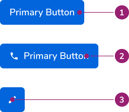
The Button consists of three primary elements that work together to trigger actions or events.

<Frame>
  <div className="w-full h-full bg-[#FFFFFF] p-2 rounded flex items-center justify-center">
    <img
      src="https://mintcdn.com/servicetitan/Ni0bXIw9diilEZPZ/images/docs/web/components/button/design/button-anatomy.png?fit=max&auto=format&n=Ni0bXIw9diilEZPZ&q=85&s=7e08db4e3de55569f51a2d8679c209b3"
      alt="Button
anatomy"
      width="438"
      height="380"
      data-path="images/docs/web/components/button/design/button-anatomy.png"
    />
  </div>
</Frame>

1. Container
2. Text label
3. Icon

## Options

The Button supports multiple appearances, sizes, and icon configurations to accommodate various action scenarios.

### Appearances

<LiveCode example="button-appearance" screenshot fullWidth>
  ```tsx lines theme={null}
  import { Button, Grid } from "@servicetitan/anvil2";

  function App() {
    return (
      <Grid templateColumns="repeat(3, max-content)" gap="8">
        <Button appearance="primary">Primary</Button>
        <Button>Secondary</Button>
        <Button appearance="ghost">Ghost</Button>
        <Button appearance="danger">Danger</Button>
        <Button appearance="danger-secondary">Danger Secondary</Button>
      </Grid>
    );
  }

  export default App;
  ```
</LiveCode>

| Appearance | When to use                                                                                                      |
| ---------- | ---------------------------------------------------------------------------------------------------------------- |
| Primary    | Reserved for important, essential actions on the page. Avoid using more than 3 primary actions in the same view. |
| Secondary  | Used as the most common style of actions.                                                                        |
| Ghost      | For less prominent actions, and a good fit for icon-only actions.                                                |

### Sizes

<LiveCode example="button-size" screenshot fullWidth>
  ```tsx lines theme={null}
  import { Button, Grid } from "@servicetitan/anvil2";

  function App() {
    return (
      <Grid templateColumns="repeat(3, max-content)" gap="8" alignItems="center">
        <Button size="xsmall">Extra Small</Button>
        <Button size="small">Small</Button>
        <Button>Medium</Button>
        <Button size="large">Large</Button>
      </Grid>
    );
  }

  export default App;
  ```
</LiveCode>

| Size        | Height |
| ----------- | ------ |
| Extra Small | 28px   |
| Small       | 32px   |
| Medium      | 40px   |
| Large       | 48px   |

Extra small buttons should only be used on desktop devices, as they do not meet the 44x44px tap target required for mobile.

### Icons

<LiveCode example="button-icon" screenshot fullWidth>
  ```tsx lines theme={null}
  import { Button, Grid } from "@servicetitan/anvil2";
  import FileUpload from "@servicetitan/anvil2/assets/icons/material/round/file_upload.svg";
  import KeyboardArrowDown from "@servicetitan/anvil2/assets/icons/material/round/keyboard_arrow_down.svg";
  import Edit from "@servicetitan/anvil2/assets/icons/material/round/edit.svg";

  function App() {
    return (
      <Grid templateColumns="repeat(1, max-content)" gap="8" placeItems="center">
        <Button icon={{ before: FileUpload }}>Prefix Icon</Button>
        <Button icon={{ after: KeyboardArrowDown }}>Suffix Icon</Button>
        <Button icon={Edit} aria-label="edit" />
      </Grid>
    );
  }

  export default App;
  ```
</LiveCode>

Icons can be placed both before and after the Button's text label, and can even replace the text label as an Icon Button.

See the [Button Icon usage guidelines](#icons-in-buttons) on when to use icons, and accessibility considerations when using icons.

### Button Compound

A Button Compound is a standalone component that provides button interactivity to another component. This can be useful for components such as anAvatar, which by themselves lack interactivity.

#### Button Compound Option Circular

<LiveCode example="button-avatar" screenshot fullWidth>
  ```tsx lines theme={null}
  import { ButtonCompound, Avatar } from "@servicetitan/anvil2";

  function App() {
    return (
      <ButtonCompound shape="circular" onClick={console.log}>
        <Avatar name="Rose Tico" size="large" status="online" />
      </ButtonCompound>
    );
  }

  export default App;
  ```
</LiveCode>

The shape of the Button Compound can be changed to conform to the shape of the component it's overlaying, such as an Avatar.

### Button Link

<LiveCode example="button-link" screenshot fullWidth>
  ```tsx lines theme={null}
  import { ButtonLink, Flex } from "@servicetitan/anvil2";

  function App() {
    return (
      <Flex>
        <ButtonLink href="/web">Link to Web</ButtonLink>
      </Flex>
    );
  }

  export default App;
  ```
</LiveCode>

The **Button Link** is a specialized Button component that uses an `<a>` tag under the hood. It gives you the visual style of a button with the correct HTML semantics of a link, making it ideal for actions that navigate to a new page.

The [**Link Button**](/docs/web/components/link/design) is its reverse: a Button component styled to look like a simple text link. Use it when an action doesn't involve navigation but you need a link's visual appearance, such as for triggering a modal.

## Behavior

The Button responds to user interaction with distinct visual states and flexible layout behaviors.

### Visual States

#### Primary

<LiveCode example="button-appearance-primary-data-interactive" screenshot fullWidth>
  ```tsx lines theme={null}
  import { Button, Grid } from "@servicetitan/anvil2";

  function App() {
    return (
      <Grid templateColumns="repeat(3, max-content)" gap="8">
        <Button appearance="primary">Rest</Button>
        <Button appearance="primary" data-interactive="hover">
          Hover
        </Button>
        <Button appearance="primary" data-interactive="active">
          Active
        </Button>
        <Button appearance="primary" data-interactive="focus-visible">
          Focus Visible
        </Button>
        <Button appearance="primary" disabled>
          Disabled
        </Button>
      </Grid>
    );
  }

  export default App;
  ```
</LiveCode>

#### Danger Secondary

<LiveCode example="button-appearance-danger-secondary-data-interactive" screenshot fullWidth>
  ```tsx lines theme={null}
  import { Button, Grid } from "@servicetitan/anvil2";

  function App() {
    return (
      <Grid templateColumns="repeat(3, max-content)" gap="8">
        <Button appearance="danger-secondary">Rest</Button>
        <Button appearance="danger-secondary" data-interactive="hover">
          Hover
        </Button>
        <Button appearance="danger-secondary" data-interactive="active">
          Active
        </Button>
        <Button appearance="danger-secondary" data-interactive="focus-visible">
          Focus Visible
        </Button>
        <Button appearance="danger-secondary" disabled>
          Disabled
        </Button>
      </Grid>
    );
  }

  export default App;
  ```
</LiveCode>

#### Secondary

<LiveCode example="button-appearance-secondary-data-interactive" screenshot fullWidth>
  ```tsx lines theme={null}
  import { Button, Grid } from "@servicetitan/anvil2";

  function App() {
    return (
      <Grid templateColumns="repeat(3, max-content)" gap="8">
        <Button>Rest</Button>
        <Button data-interactive="hover">Hover</Button>
        <Button data-interactive="active">Active</Button>
        <Button data-interactive="focus-visible">Focus Visible</Button>
        <Button disabled>Disabled</Button>
      </Grid>
    );
  }

  export default App;
  ```
</LiveCode>

#### Ghost

<LiveCode example="button-appearance-ghost-data-interactive" screenshot fullWidth>
  ```tsx lines theme={null}
  import { Button, Grid } from "@servicetitan/anvil2";

  function App() {
    return (
      <Grid templateColumns="repeat(3, max-content)" gap="8">
        <Button appearance="ghost">Rest</Button>
        <Button appearance="ghost" data-interactive="hover">
          Hover
        </Button>
        <Button appearance="ghost" data-interactive="active">
          Active
        </Button>
        <Button appearance="ghost" data-interactive="focus-visible">
          Focus Visible
        </Button>
        <Button appearance="ghost" disabled>
          Disabled
        </Button>
      </Grid>
    );
  }

  export default App;
  ```
</LiveCode>

#### Danger Primary

<LiveCode example="button-appearance-danger-data-interactive" screenshot fullWidth>
  ```tsx lines theme={null}
  import { Button, Grid } from "@servicetitan/anvil2";

  function App() {
    return (
      <Grid templateColumns="repeat(3, max-content)" gap="8">
        <Button appearance="danger">Rest</Button>
        <Button appearance="danger" data-interactive="hover">
          Hover
        </Button>
        <Button appearance="danger" data-interactive="active">
          Active
        </Button>
        <Button appearance="danger" data-interactive="focus-visible">
          Focus Visible
        </Button>
        <Button appearance="danger" disabled>
          Disabled
        </Button>
      </Grid>
    );
  }

  export default App;
  ```
</LiveCode>

#### Disabled

<LiveCode example="button-disabled" screenshot fullWidth>
  ```tsx lines theme={null}
  import { Button, Grid } from "@servicetitan/anvil2";

  function App() {
    return (
      <Grid templateColumns="repeat(2, max-content)" gap="8" placeItems="center">
        <Button appearance="primary">Primary</Button>
        <Button appearance="primary" disabled>
          Primary
        </Button>

        <Button>Secondary</Button>
        <Button disabled>Secondary</Button>

        <Button appearance="ghost">Ghost</Button>
        <Button appearance="ghost" disabled>
          Ghost
        </Button>

        <Button appearance="danger">Danger</Button>
        <Button appearance="danger" disabled>
          Danger
        </Button>

        <Button appearance="danger-secondary">Danger Secondary</Button>
        <Button appearance="danger-secondary" disabled>
          Danger Secondary
        </Button>
      </Grid>
    );
  }

  export default App;
  ```
</LiveCode>

The disabled style is consistent across each button variant. This style is useful when preventing user clicks when an action isn't available or when a submission of some kind is taking place.

### Text wrap

<LiveCode example="button-wrap" screenshot fullWidth>
  ```tsx lines theme={null}
  import { Button, Grid } from "@servicetitan/anvil2";

  function App() {
    return (
      <Grid gap="8" placeItems="center">
        <Button>Text Does Not Have A Max Width</Button>
        <Button>
          Text Will Wrap To A Second Line In Code If It Runs Out Of Space
        </Button>
      </Grid>
    );
  }

  export default App;
  ```
</LiveCode>

Buttons fill all available space, wrapping only when no space remains. Text is center-aligned when wrapping.

### Widths

<LiveCode example="button-width" screenshot fullWidth>
  ```tsx lines theme={null}
  import { Button, Grid } from "@servicetitan/anvil2";
  import Edit from "@servicetitan/anvil2/assets/icons/material/round/edit.svg";

  function App() {
    return (
      <Grid
        templateColumns="repeat(1, 1fr)"
        gap="8"
        placeItems="center"
        flexGrow="1"
      >
        <Button>Text Width</Button>
        <Button style={{ width: "180px" }}>Set Width</Button>
        <Button style={{ width: "100%" }}>Container Width</Button>
        <Button icon={Edit} aria-label="edit" />
      </Grid>
    );
  }

  export default App;
  ```
</LiveCode>

In general, Buttons should match the width of their text. Container width works well when aligning with specific layout elements. Button Icon width always equals its height.

### Left-aligned Text

<LiveCode example="button-justify-content" screenshot fullWidth>
  ```tsx lines theme={null}
  import { Button, Flex } from "@servicetitan/anvil2";

  function App() {
    return (
      <Flex direction="column" gap="2">
        <Button
          appearance="secondary"
          style={{ width: 210 }}
          justifyContent="start"
        >
          Button
        </Button>
        <Button
          appearance="secondary"
          style={{ width: 210 }}
          justifyContent="start"
        >
          A slightly longer Button
        </Button>
        <Button
          appearance="secondary"
          style={{ width: 210 }}
          justifyContent="start"
        >
          Another Button
        </Button>
      </Flex>
    );
  }

  export default App;
  ```
</LiveCode>

Button text is typically centered. Use left-aligned text when aligning with specific layout elements or when stacking multiple buttons vertically.

## Usage Guidelines

Use the Button to denote most forms of actions on the page.

### When not to use

In general, buttons should not be used for navigation. See the Link comparison below for more details related to Links. For other navigational contexts, consider the Tab or Side Nav.

### Alternatives

#### Button vs Link

In general, Buttons are used to denote an action, while a Link is used to denote navigation. This distinction in practice can be blurry.

##### When navigating

In general, Links are the preferred choice for navigating. There are a few scenarios when a Button may be used however:

* Use a Button when emphasis is needed. Sometimes a page's call to action is navigating somewhere else.
* Use a Button when navigation is mixed with actions.

##### With Actions

In general, Buttons are the preferred choice for actions. A Link however may be used when the action priority is low and space is tight.

##### With triggering overlays

Triggering an overlay UI can be treated like navigation.

### How to Use

#### Button Pairing

There are 3 levels of emphasis in our Buttons: primary, secondary, and ghost. This corresponds to an emphasis scheme of high, medium, and low emphasis.

##### Recommended pairings

<LiveCode example="button-pairing-do" screenshot fullWidth>
  ```tsx lines theme={null}
  import { Button, Grid, Flex } from "@servicetitan/anvil2";

  function App() {
    return (
      <Grid templateColumns="repeat(1, max-content)" gap="12">
        <Flex gap="3">
          <Button appearance="primary">Primary</Button>
          <Button>Secondary</Button>
        </Flex>
        <Flex gap="3">
          <Button appearance="primary">Primary</Button>
          <Button appearance="ghost">Ghost</Button>
        </Flex>
        <Flex gap="3">
          <Button>Secondary</Button>
          <Button>Secondary</Button>
        </Flex>
        <Flex gap="3">
          <Button>Secondary</Button>
          <Button appearance="ghost">Ghost</Button>
        </Flex>
        <Flex gap="3">
          <Button appearance="ghost">Ghost</Button>
          <Button appearance="ghost">Ghost</Button>
        </Flex>
      </Grid>
    );
  }

  export default App;
  ```
</LiveCode>

<Check>**Do**</Check>

Most combinations of Primary, Secondary, and Ghost are allowed. In general, use the hierarchy that best represents its relative importance on the page.

* Be consistent within a product area.
* There should never be more than 1 Primary action. There is no upper limit to how many Secondary or Ghost actions could exist.
* Some components, such as [Dialogs](/docs/web/components/dialog/design), [Drawers](/docs/web/components/drawer/design), and [Alerts](/docs/web/components/alert/design) have Button pairing standards already, and those should be used when possible.
* Icon-only actions are frequently represented as Ghost actions.
* A Cancel action is generally a Secondary action.

### Caution when pairing

<LiveCode example="button-pairing-caution" screenshot fullWidth>
  ```tsx lines theme={null}
  import { Button, Grid, Flex } from "@servicetitan/anvil2";

  function App() {
    return (
      <Grid templateColumns="repeat(1, max-content)" gap="12">
        <Flex gap="3">
          <Button appearance="primary">Primary</Button>
          <Button>Secondary</Button>
          <Button appearance="ghost">Ghost</Button>
        </Flex>
        <Flex gap="3">
          <Button appearance="primary">Primary</Button>
          <Button>Secondary</Button>
          <Button appearance="danger-secondary">Danger</Button>
        </Flex>
      </Grid>
    );
  }

  export default App;
  ```
</LiveCode>

<Warning>**Caution**</Warning>

While these pairings are allowed, caution should be used with them. Three levels of Button hierarchy in one grouping is usually excessive, consider simplifying it to two levels.

#### Don't use these pairings

<LiveCode example="button-pairing-dont" screenshot fullWidth>
  ```tsx lines theme={null}
  import { Button, Grid, Flex } from "@servicetitan/anvil2";

  function App() {
    return (
      <Grid templateColumns="repeat(1, max-content)" gap="12">
        <Flex gap="3">
          <Button appearance="primary">Primary</Button>
          <Button appearance="primary">Primary</Button>
        </Flex>
        <Flex gap="3">
          <Button appearance="danger">Danger</Button>
          <Button appearance="danger">Danger</Button>
        </Flex>
      </Grid>
    );
  }

  export default App;
  ```
</LiveCode>

<Danger>**Don't**</Danger>

These pairings should be avoided. Primary actions are meant to only occur once in a context, multiple primaries should not happen.

#### Icons in Buttons

In general, icons should only be used in Buttons when a user can easily associate the icon with the action.

##### Use caution with Icon-only Buttons

While icon-only buttons can save space on the page, the meaning behind icons is not universally understood. Often, this requires users to explore and later recall what each icon does to understand the action.

##### Always include a Tooltip with Icon-only Buttons

All Icon-only buttons should include a Tooltip that appears on hover and focus, describing what the Button would do.

#### Button Alignment

Refer to the [Button alignment guidance from the Form pattern](/docs/web/patterns/forms#button-alignment).

##### Left-aligned Buttons

In scenarios where you have several Buttons stacked vertically, use the Secondary variant and left-align the text. Each button should have the same width.

<LiveCode example="button-alignment-do" screenshot fullWidth>
  ```tsx lines theme={null}
  import { Button, Flex } from "@servicetitan/anvil2";

  function App() {
    return (
      <Flex direction="column" gap="2">
        <Button
          appearance="secondary"
          style={{ width: 210 }}
          justifyContent="start"
        >
          Button
        </Button>
        <Button
          appearance="secondary"
          style={{ width: 210 }}
          justifyContent="start"
        >
          A slightly longer Button
        </Button>
        <Button
          appearance="secondary"
          style={{ width: 210 }}
          justifyContent="start"
        >
          Another Button
        </Button>
      </Flex>
    );
  }

  export default App;
  ```
</LiveCode>

<Check>**Do**</Check>

<LiveCode example="button-alignment-dont" screenshot fullWidth>
  ```tsx lines theme={null}
  import { Button, Flex } from "@servicetitan/anvil2";

  function App() {
    return (
      <Flex direction="column" gap="2">
        <Button appearance="secondary" style={{ width: 210 }}>
          Button
        </Button>
        <Button appearance="secondary" style={{ width: 210 }}>
          A slightly longer Button
        </Button>
        <Button appearance="secondary" style={{ width: 210 }}>
          Another Button
        </Button>
      </Flex>
    );
  }

  export default App;
  ```
</LiveCode>

<Danger>**Don't**</Danger>

## Content

Content within the Button should clearly communicate the action it will perform.

### Button name should describe what it does

A user should be able to use the button name to predict what will happen when they click it.

Buttons should be action-oriented, pairing a verb and a supporting noun, and be 2 to 3 words long. Common actions like "Save", "Close", "Cancel," or "OK" don't require a supporting noun.

<LiveCode example="button-action-oriented-do" screenshot fullWidth>
  ```tsx lines theme={null}
  import { Button, Flex } from "@servicetitan/anvil2";

  function App() {
    return (
      <Flex direction="column" gap="2">
        <Button>Merge Accounts</Button>
        <Button>Save</Button>
        <Button>View Settings</Button>
      </Flex>
    );
  }

  export default App;
  ```
</LiveCode>

<Check>**Do**</Check>

<LiveCode example="button-action-oriented-dont" screenshot fullWidth>
  ```tsx lines theme={null}
  import { Button, Flex } from "@servicetitan/anvil2";

  function App() {
    return (
      <Flex direction="column" gap="2">
        <Button>Account Merge</Button>
        <Button>Save to Database</Button>
        <Button>Settings</Button>
      </Flex>
    );
  }

  export default App;
  ```
</LiveCode>

<Danger>**Don't**</Danger>

### Be concise and consistent

Avoid unnecessary words and articles such as the, an, or a. Never include punctuation in button text and avoid button text that requires punctuation. Always write button text in title case. Capitalize the first word, the last word, and all major words in between. Never use emoji or exclamation points.

<LiveCode example="button-concise-do" screenshot fullWidth>
  ```tsx lines theme={null}
  import { Button, Flex } from "@servicetitan/anvil2";

  function App() {
    return (
      <Flex direction="column" gap="2">
        <Button>Add Menu Item</Button>
        <Button>Done</Button>
      </Flex>
    );
  }

  export default App;
  ```
</LiveCode>

<Check>**Do**</Check>

<LiveCode example="button-concise-dont" screenshot fullWidth>
  ```tsx lines theme={null}
  import { Button, Flex } from "@servicetitan/anvil2";

  function App() {
    return (
      <Flex direction="column" gap="2">
        <Button>Add a menu item</Button>
        <Button>Yes, I‘m Done!</Button>
      </Flex>
    );
  }

  export default App;
  ```
</LiveCode>

<Danger>**Don't**</Danger>

### Button name should match destination

When a button opens a modal or takeover, the destination's title should match the button text.

## Keyboard Interaction

Users can navigate the Button using standard keyboard controls.

| Key            | Interaction               |
| -------------- | ------------------------- |
| Space or Enter | Engages the button action |

Buttons using an href will also use this keyboard combination.

### Accessibility

Anvil provides most of the accessibility needs for buttons out of the box, and only needs some additional considerations for library users.

#### Provide labels for Icon Buttons

<LiveCode example="button-icon-tooltip" screenshot fullWidth>
  ```tsx lines theme={null}
  import { Button, Tooltip } from "@servicetitan/anvil2";
  import Edit from "@servicetitan/anvil2/assets/icons/material/round/edit.svg";

  function App() {
    return (
      <Tooltip open>
        <Tooltip.Trigger>
          <Button icon={Edit} />
        </Tooltip.Trigger>
        <Tooltip.Content>Tooltip Content</Tooltip.Content>
      </Tooltip>
    );
  }

  export default App;
  ```
</LiveCode>

Regardless of whether or not a label is visible on the page, a label should be provided to describe the action for both screen readers and for users who focus on the element.

For more guidance on button labels and accessibility, see [button accessibility best practices](/docs/accessibility/labels-and-ctas#buttons-and-links).