> ## Documentation Index
> Fetch the complete documentation index at: https://anvil.servicetitan.com/llms.txt
> Use this file to discover all available pages before exploring further.

# Calendar – Design

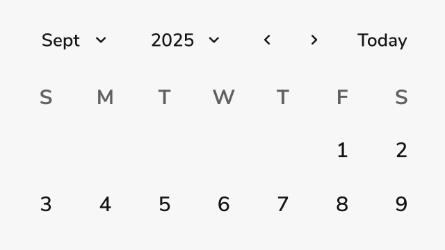
> Calendar allows users to view and select a specific date or date range.

export const DoDont = ({text, type, children}) => {
  return <>
      {type === "do" && <div className="do-dont do">
          {children && <div className="do-dont-content">{children}</div>}
          <Check>
            <p>
              <strong>Do</strong>
              {text && <span className="m-inline-start-1">{text}</span>}
            </p>
          </Check>
        </div>}
      {type === "dont" && <div className="do-dont dont">
          {children && <div className="do-dont-content">{children}</div>}
          <Danger>
            <p>
              <strong>Don't</strong>
              {text && <span className="m-inline-start-1">{text}</span>}
            </p>
          </Danger>
        </div>}
      {type === "caution" && <div className="do-dont caution">
          {children && <div className="do-dont-content">{children}</div>}
          <Warning>
            <p>
              <strong>Caution</strong>
              {text && <span className="m-inline-start-1">{text}</span>}
            </p>
          </Warning>
        </div>}
    </>;
};

export const LiveCode = ({children, customHeight, clickToLoad, example, fullWidth, fullHeight, hideCodeInLiveCode, screenshot, screenshotOnly, showCode: showCodeProp}) => {
  const SCREENSHOTS_BASE = "https://servicetitan.github.io/anvil2-docs-live-code/screenshots";
  const STACKBLITZ_BASE = "https://stackblitz.com/github/servicetitan/anvil2-docs-live-code/tree/main/examples";
  const [showCodeBlock, setShowCodeBlock] = useState(showCodeProp ?? false);
  const [isLocalOverride, setIsLocalOverride] = useState(false);
  useEffect(() => {
    const examplePath = `/images/live-code-screenshots-tmp/${example}.png`;
    fetch(examplePath, {
      method: "HEAD"
    }).then(r => {
      if (r.ok) setIsLocalOverride(true);
    }).catch(() => {});
  }, [example]);
  const screenshotBase = isLocalOverride ? "/images/live-code-screenshots-tmp" : SCREENSHOTS_BASE;
  if (screenshotOnly) {
    return <Frame className="flex flex-col">
        <div className="flex dark:hidden" style={{
      justifyContent: "center",
      alignItems: "center",
      width: fullWidth ? "100%" : "50%",
      minHeight: fullHeight ? "284px" : undefined,
      background: "#FFFFFF"
    }}>
          <img srcset={`${screenshotBase}/${example}.png, ${screenshotBase}/${example}-2x.png 2x`} src={`${screenshotBase}/${example}.png`} alt={example} noZoom />
        </div>
        <div className="hidden dark:flex" style={{
      justifyContent: "center",
      alignItems: "center",
      width: fullWidth ? "100%" : "50%",
      minHeight: fullHeight ? "284px" : undefined,
      background: "#141414"
    }}>
          <img srcset={`${screenshotBase}/${example}-dark.png, ${screenshotBase}/${example}-dark-2x.png 2x`} src={`${screenshotBase}/${example}-dark.png`} alt={example} noZoom />
        </div>
      </Frame>;
  }
  if (screenshot) {
    return <Frame className="flex flex-col -mb-2">
        <div className="flex dark:hidden bg-white dark:bg-codeblock border border-gray-950/10 dark:border-white/10 dark:twoslash-dark rounded-2xl overflow-hidden" style={{
      justifyContent: "center",
      alignItems: "center",
      width: fullWidth ? "100%" : "50%",
      minHeight: fullHeight ? "284px" : undefined
    }}>
          <img srcset={`${screenshotBase}/${example}.png, ${screenshotBase}/${example}-2x.png 2x`} src={`${screenshotBase}/${example}.png`} alt={example} noZoom />
        </div>

        <div className="hidden dark:flex bg-white dark:bg-codeblock border border-gray-950/10 dark:border-white/10 dark:twoslash-dark rounded-2xl overflow-hidden" style={{
      background: "#141414",
      justifyContent: "center",
      alignItems: "center",
      width: fullWidth ? "100%" : "50%",
      minHeight: fullHeight ? "284px" : undefined
    }}>
          <img srcset={`${screenshotBase}/${example}-dark.png, ${screenshotBase}/${example}-dark-2x.png 2x`} src={`${screenshotBase}/${example}-dark.png`} alt={example} noZoom />
        </div>

        <div className="flex justify-end items-center text-xs py-2 px-1 gap-4">
          {!showCodeProp ? <button className="inline-flex justify-end items-center text-gray-700 dark:text-gray-50 hover:text-blue-500 dark:hover:text-blue-300 transition-colors group self-end gap-1 cursor-pointer" onClick={() => setShowCodeBlock(!showCodeBlock)} style={{
      appearance: "none"
    }}>
              <Icon icon="code" size="12px" className="group-hover:bg-blue-500 dark:group-hover:bg-blue-300" />
              <span>{showCodeBlock ? "Hide code" : "Show code"}</span>
            </button> : null}

          <a className="inline-flex justify-end items-center hover:text-blue-500 dark:hover:text-blue-300 transition-colors group self-end gap-1" href={`${STACKBLITZ_BASE}/${example}?file=src/App.tsx`} target="_blank" rel="noreferrer">
            <Icon icon="bolt" size="12px" className="group-hover:bg-blue-500 dark:group-hover:bg-blue-300" />
            <span>StackBlitz demo</span>
          </a>
        </div>

        <div className="grid transition-[grid-template-rows] duration-300 ease-in-out overflow-auto overflow-y-hidden overflow-x-auto" style={showCodeBlock ? {
      gridTemplateRows: "1fr"
    } : {
      gridTemplateRows: "0fr"
    }}>
          <div style={{
      minHeight: 0,
      overflowX: "auto",
      overflowY: "hidden",
      marginBlockStart: "-1.25rem",
      marginBlockEnd: "-1.5rem"
    }}>
            {children}
          </div>
        </div>
      </Frame>;
  } else {
    return <div style={{
      display: "flex",
      width: fullWidth ? "100%" : "50%",
      minHeight: customHeight ? customHeight : "316px",
      resize: "vertical",
      overflow: "auto"
    }}>
        <iframe title={example} style={{
      flex: 1,
      width: fullWidth ? "100%" : "50%",
      minHeight: customHeight ? customHeight : "316px"
    }} src={`${STACKBLITZ_BASE}/${example}?embed=1&hideNavigation=1&hideExplorer=1&terminalHeight=0&file=src/App.tsx${clickToLoad ? "&ctl=1" : ""}${hideCodeInLiveCode ? "&view=preview" : ""}`} allow="accelerometer; ambient-light-sensor; camera; encrypted-media; geolocation; gyroscope; hid; microphone; midi; payment; usb; vr; xr-spatial-tracking" sandbox="allow-forms allow-modals allow-popups allow-presentation allow-same-origin allow-scripts" />
      </div>;
  }
};

<Frame>
  <div className="w-full h-full bg-[#FFFFFF] p-2 rounded flex items-center justify-center">
    <img noZoom src="https://mintcdn.com/servicetitan/sNURU8g7HcZmaG9s/images/docs/web/components/calendar/overview-image.png?fit=max&auto=format&n=sNURU8g7HcZmaG9s&q=85&s=57ce4e21f3396a707c4290d392984a2b" width="640" height="360" data-path="images/docs/web/components/calendar/overview-image.png" />
  </div>
</Frame>

## Anatomy

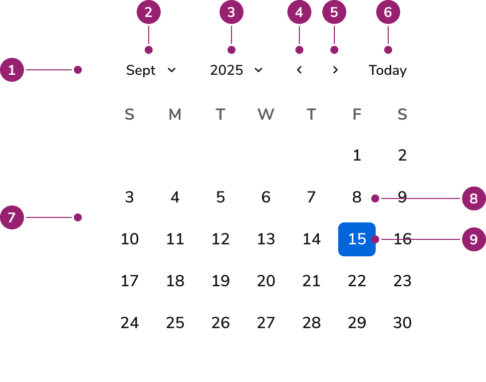
The Calendar consists of nine primary elements that work together to enable date viewing and selection.

<Frame>
  <div className="w-full h-full bg-[#FFFFFF] p-2 rounded flex items-center justify-center">
    <img
      src="https://mintcdn.com/servicetitan/66tZkkkyD48ugyZL/images/docs/web/components/calendar/design/calendar-anatomy.png?fit=max&auto=format&n=66tZkkkyD48ugyZL&q=85&s=55d8dcfb34df03dc85d241932eb7a4f9"
      alt="Anatomy of the Calendar
component"
      width="974"
      height="766"
      data-path="images/docs/web/components/calendar/design/calendar-anatomy.png"
    />
  </div>
</Frame>

1. **Header** - Navigation toolbar containing month and year controls
2. **Month button** - Opens month selection view
3. **Year button** - Opens year selection view
4. **Previous button** - Navigates to the previous month
5. **Next button** - Navigates to the next month
6. **Today button** - Navigates to today's date
7. **Month grid** - Table displaying days in a month
8. **Day cell** - A single cell in the month grid
9. **Selected day** - Selected date

## Options

The Calendar supports the following configurations to accommodate various date selection scenarios.

### Selection Mode

<LiveCode example="calendar-selection-mode" screenshot fullWidth>
  ```tsx lines theme={null}
  import { Calendar, Flex, Text } from "@servicetitan/anvil2";

  function App() {
    return (
      <Flex direction="row" gap="6" alignItems="start">
        <Flex direction="column" gap="2" alignItems="center">
          <Text size="large">
            <strong>Single Date Selection</strong>
          </Text>
          <Calendar defaultValue="2024-06-15" />
        </Flex>
        <Flex direction="column" gap="2" alignItems="center">
          <Text size="large">
            <strong>Date Range Selection</strong>
          </Text>
          <Calendar
            range
            defaultValue={{
              start: "2024-06-15",
              end: "2024-06-20",
            }}
          />
        </Flex>
      </Flex>
    );
  }

  export default App;
  ```
</LiveCode>

Calendar supports single date selection and date range selection modes. Single date mode allows selecting one date, while range mode enables selecting a start and end date.

### Start Day

<LiveCode example="calendar-startday" screenshot fullWidth>
  ```tsx lines theme={null}
  import { Calendar, Flex, Text } from "@servicetitan/anvil2";

  function App() {
    return (
      <Flex direction="row" gap="4" alignItems="start">
        <Flex direction="column" gap="2" alignItems="center">
          <Text size="large">
            <strong>Sunday Start (Default)</strong>
          </Text>
          <Calendar defaultValue="2024-06-15" startDay="Sunday" />
        </Flex>
        <Flex direction="column" gap="2" alignItems="center">
          <Text size="large">
            <strong>Monday Start</strong>
          </Text>
          <Calendar defaultValue="2024-06-15" startDay="Monday" />
        </Flex>
      </Flex>
    );
  }

  export default App;
  ```
</LiveCode>

| Start day | Description                              |
| --------- | ---------------------------------------- |
| Sunday    | Calendar week begins on Sunday (default) |
| Monday    | Calendar week begins on Monday           |

### Date Restrictions

<LiveCode example="calendar-mindatemaxdate" screenshot fullWidth>
  ```tsx lines theme={null}
  import { Calendar, Flex } from "@servicetitan/anvil2";

  function App() {
    return (
      <Flex alignItems="center" direction="column">
        <Calendar
          focusedDate="2024-06-01"
          minDate="2024-06-05"
          maxDate="2024-06-20"
        />
      </Flex>
    );
  }

  export default App;
  ```
</LiveCode>

Calendar supports date restrictions through minimum and maximum date boundaries. Dates outside the specified range are disabled and cannot be selected.

### Unavailable Dates

<LiveCode example="calendar-unavailabledates" screenshot fullWidth>
  ```tsx lines theme={null}
  import { Calendar, Flex } from "@servicetitan/anvil2";

  function App() {
    return (
      <Flex alignItems="center" direction="column">
        <Calendar
          focusedDate="2024-06-01"
          unavailable={{
            dates: [
              "2024-06-02",
              "2024-06-04",
              "2024-06-06",
              "2024-06-08",
              "2024-06-10",
            ],
          }}
        />
      </Flex>
    );
  }

  export default App;
  ```
</LiveCode>

Mark specific dates or days of the week as unavailable when they cannot be selected. Unavailable dates are visually distinct and cannot be selected.

### Locale and Timezone

Calendar adapts to different locales for date formatting and week start days. Timezone configuration ensures dates are interpreted correctly across different regions.

## Behavior

The Calendar responds to user interaction with distinct visual states and navigation patterns.

### Selection States

Selected dates display with distinct visual styling. In range mode, the start date, end date, and dates within the range are visually indicated. Hover states provide feedback during date selection.

### Navigation

Users navigate between months using Previous and Next buttons. Month and Year buttons switch to selection views for faster navigation across longer time periods. The Today button quickly returns focus to the current date.

### View Transitions

Calendar transitions between day, month, and year selection views. The header controls adapt based on the current view, showing relevant navigation options for each context.

### Date Constraints

When date restrictions or unavailable dates are configured, disabled dates are visually distinct and cannot receive focus or selection. Navigation automatically skips unavailable dates when using keyboard controls.

## Usage Guidelines

### When to Use

Use Calendar when you need to:

* Allow users to select a single date for scheduling, filtering, or data entry
* Enable date range selection for filtering data or scheduling periods
* Display dates in a familiar calendar grid format
* Provide date selection within forms or date input fields

### When not to use

Avoid using Calendar for:

* **Simple date input** - Use [DateField](/docs/web/components/date-field-single/design) for text-based date entry when users prefer typing dates
* **Time selection** - Calendar focuses on dates only; use [TimeField](/docs/web/components/time-field/design) for time selection
* **Display-only dates** - Use text or other display components when dates are not selectable

### Alternatives

#### Calendar vs DateField

DateField provides text-based date input with calendar popover support. Use DateField when space is limited or users prefer typing dates. Use Calendar when you need a persistent calendar view or when date selection is the primary interaction.

### How to Use

#### Choose single or range selection based on user needs

Use single date selection when users need to pick one specific date, such as a deadline, appointment date, or event date. Single selection provides clear focus and reduces cognitive load for straightforward date choices.

Use date range selection when users need to define a period, such as vacation dates, report date ranges, or filtering time periods. Range selection helps users visualize the span and understand the relationship between start and end dates.

<LiveCode example="calendar-uncontrolled" screenshot fullWidth>
  ```tsx lines theme={null}
  import { Calendar, Flex } from "@servicetitan/anvil2";

  function App() {
    return (
      <Flex justifyContent="center">
        <Calendar defaultValue="2024-03-14" />
      </Flex>
    );
  }

  export default App;
  ```
</LiveCode>

<DoDont type="do" />

Use single date selection for specific point-in-time selections. This pattern works well for scheduling, deadlines, and one-time events where users need clarity about a single date.

<LiveCode example="calendar-range" screenshot fullWidth>
  ```tsx lines theme={null}
  import { Calendar, Flex } from "@servicetitan/anvil2";

  function App() {
    return (
      <Flex justifyContent="center">
        <Calendar
          range
          defaultValue={{
            start: new Date().toISOString(),
            end: new Date(
              new Date().setDate(new Date().getDate() + 5),
            ).toISOString(),
          }}
        />
      </Flex>
    );
  }

  export default App;
  ```
</LiveCode>

<DoDont type="do" />

Use date range selection when users need to define periods or spans. This pattern helps users understand duration and relationships between dates, making it ideal for filtering, reporting, and multi-day activities.

#### Set date boundaries to guide user choices

Use minimum and maximum date boundaries to prevent invalid selections and guide users toward appropriate date choices. Boundaries help users understand constraints before they attempt invalid selections, reducing errors and frustration.

<LiveCode example="calendar-mindatemaxdate" screenshot fullWidth>
  ```tsx lines theme={null}
  import { Calendar, Flex } from "@servicetitan/anvil2";

  function App() {
    return (
      <Flex alignItems="center" direction="column">
        <Calendar
          focusedDate="2024-06-01"
          minDate="2024-06-05"
          maxDate="2024-06-20"
        />
      </Flex>
    );
  }

  export default App;
  ```
</LiveCode>

<DoDont type="do" />

Set date boundaries when business rules or data availability create constraints. Clear boundaries help users understand what dates are valid, preventing errors and reducing support requests.

#### Mark unavailable dates to communicate constraints

Mark specific dates or recurring days as unavailable when they cannot be selected due to business rules, holidays, or system constraints. Visual distinction helps users understand why certain dates aren't selectable and prevents confusion.

<LiveCode example="calendar-unavailabledates" screenshot fullWidth>
  ```tsx lines theme={null}
  import { Calendar, Flex } from "@servicetitan/anvil2";

  function App() {
    return (
      <Flex alignItems="center" direction="column">
        <Calendar
          focusedDate="2024-06-01"
          unavailable={{
            dates: [
              "2024-06-02",
              "2024-06-04",
              "2024-06-06",
              "2024-06-08",
              "2024-06-10",
            ],
          }}
        />
      </Flex>
    );
  }

  export default App;
  ```
</LiveCode>

<DoDont type="do" />

Mark unavailable dates clearly to communicate constraints to users. This helps users understand why certain dates aren't selectable and prevents frustration from attempting invalid selections.

## Content

Content within the Calendar should be clear and accessible, helping users understand date availability and navigate efficiently.

* Use appropriate locale settings to format dates according to user expectations
* Ensure date restrictions are clearly communicated through visual styling
* Provide clear visual feedback for selected dates and date ranges
* Maintain consistent date formatting throughout the calendar interface

## Keyboard Interaction

Users can navigate the Calendar using standard keyboard controls.

| Key         | Description                                      |
| ----------- | ------------------------------------------------ |
| Tab         | Move focus between header controls               |
| Arrow Left  | Move focus to the previous day                   |
| Arrow Right | Move focus to the next day                       |
| Arrow Up    | Move focus to the same day in the previous week  |
| Arrow Down  | Move focus to the same day in the next week      |
| Home        | Move focus to the first day of the current week  |
| End         | Move focus to the last day of the current week   |
| Page Up     | Move focus to the same day in the previous month |
| Page Down   | Move focus to the same day in the next month     |
| Enter       | Select the focused date                          |
| Space       | Select the focused date                          |
| Escape      | Close month or year selection views              |