> ## Documentation Index
> Fetch the complete documentation index at: https://anvil.servicetitan.com/llms.txt
> Use this file to discover all available pages before exploring further.

# Chip – Design

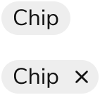
> Chips visually label and organize statuses, metadata, and objects.

export const LiveCode = ({children, customHeight, clickToLoad, example, fullWidth, fullHeight, hideCodeInLiveCode, screenshot, screenshotOnly, showCode: showCodeProp}) => {
  const SCREENSHOTS_BASE = "https://servicetitan.github.io/anvil2-docs-live-code/screenshots";
  const STACKBLITZ_BASE = "https://stackblitz.com/github/servicetitan/anvil2-docs-live-code/tree/main/examples";
  const [showCodeBlock, setShowCodeBlock] = useState(showCodeProp ?? false);
  const [isLocalOverride, setIsLocalOverride] = useState(false);
  useEffect(() => {
    const examplePath = `/images/live-code-screenshots-tmp/${example}.png`;
    fetch(examplePath, {
      method: "HEAD"
    }).then(r => {
      if (r.ok) setIsLocalOverride(true);
    }).catch(() => {});
  }, [example]);
  const screenshotBase = isLocalOverride ? "/images/live-code-screenshots-tmp" : SCREENSHOTS_BASE;
  if (screenshotOnly) {
    return <Frame className="flex flex-col">
        <div className="flex dark:hidden" style={{
      justifyContent: "center",
      alignItems: "center",
      width: fullWidth ? "100%" : "50%",
      minHeight: fullHeight ? "284px" : undefined,
      background: "#FFFFFF"
    }}>
          <img srcset={`${screenshotBase}/${example}.png, ${screenshotBase}/${example}-2x.png 2x`} src={`${screenshotBase}/${example}.png`} alt={example} noZoom />
        </div>
        <div className="hidden dark:flex" style={{
      justifyContent: "center",
      alignItems: "center",
      width: fullWidth ? "100%" : "50%",
      minHeight: fullHeight ? "284px" : undefined,
      background: "#141414"
    }}>
          <img srcset={`${screenshotBase}/${example}-dark.png, ${screenshotBase}/${example}-dark-2x.png 2x`} src={`${screenshotBase}/${example}-dark.png`} alt={example} noZoom />
        </div>
      </Frame>;
  }
  if (screenshot) {
    return <Frame className="flex flex-col -mb-2">
        <div className="flex dark:hidden bg-white dark:bg-codeblock border border-gray-950/10 dark:border-white/10 dark:twoslash-dark rounded-2xl overflow-hidden" style={{
      justifyContent: "center",
      alignItems: "center",
      width: fullWidth ? "100%" : "50%",
      minHeight: fullHeight ? "284px" : undefined
    }}>
          <img srcset={`${screenshotBase}/${example}.png, ${screenshotBase}/${example}-2x.png 2x`} src={`${screenshotBase}/${example}.png`} alt={example} noZoom />
        </div>

        <div className="hidden dark:flex bg-white dark:bg-codeblock border border-gray-950/10 dark:border-white/10 dark:twoslash-dark rounded-2xl overflow-hidden" style={{
      background: "#141414",
      justifyContent: "center",
      alignItems: "center",
      width: fullWidth ? "100%" : "50%",
      minHeight: fullHeight ? "284px" : undefined
    }}>
          <img srcset={`${screenshotBase}/${example}-dark.png, ${screenshotBase}/${example}-dark-2x.png 2x`} src={`${screenshotBase}/${example}-dark.png`} alt={example} noZoom />
        </div>

        <div className="flex justify-end items-center text-xs py-2 px-1 gap-4">
          {!showCodeProp ? <button className="inline-flex justify-end items-center text-gray-700 dark:text-gray-50 hover:text-blue-500 dark:hover:text-blue-300 transition-colors group self-end gap-1 cursor-pointer" onClick={() => setShowCodeBlock(!showCodeBlock)} style={{
      appearance: "none"
    }}>
              <Icon icon="code" size="12px" className="group-hover:bg-blue-500 dark:group-hover:bg-blue-300" />
              <span>{showCodeBlock ? "Hide code" : "Show code"}</span>
            </button> : null}

          <a className="inline-flex justify-end items-center hover:text-blue-500 dark:hover:text-blue-300 transition-colors group self-end gap-1" href={`${STACKBLITZ_BASE}/${example}?file=src/App.tsx`} target="_blank" rel="noreferrer">
            <Icon icon="bolt" size="12px" className="group-hover:bg-blue-500 dark:group-hover:bg-blue-300" />
            <span>StackBlitz demo</span>
          </a>
        </div>

        <div className="grid transition-[grid-template-rows] duration-300 ease-in-out overflow-auto overflow-y-hidden overflow-x-auto" style={showCodeBlock ? {
      gridTemplateRows: "1fr"
    } : {
      gridTemplateRows: "0fr"
    }}>
          <div style={{
      minHeight: 0,
      overflowX: "auto",
      overflowY: "hidden",
      marginBlockStart: "-1.25rem",
      marginBlockEnd: "-1.5rem"
    }}>
            {children}
          </div>
        </div>
      </Frame>;
  } else {
    return <div style={{
      display: "flex",
      width: fullWidth ? "100%" : "50%",
      minHeight: customHeight ? customHeight : "316px",
      resize: "vertical",
      overflow: "auto"
    }}>
        <iframe title={example} style={{
      flex: 1,
      width: fullWidth ? "100%" : "50%",
      minHeight: customHeight ? customHeight : "316px"
    }} src={`${STACKBLITZ_BASE}/${example}?embed=1&hideNavigation=1&hideExplorer=1&terminalHeight=0&file=src/App.tsx${clickToLoad ? "&ctl=1" : ""}${hideCodeInLiveCode ? "&view=preview" : ""}`} allow="accelerometer; ambient-light-sensor; camera; encrypted-media; geolocation; gyroscope; hid; microphone; midi; payment; usb; vr; xr-spatial-tracking" sandbox="allow-forms allow-modals allow-popups allow-presentation allow-same-origin allow-scripts" />
      </div>;
  }
};

export const CodePreviewPlaceholder = ({double, fullWidth}) => {
  const single = <div style={{
    width: fullWidth ? "100%" : "50%",
    borderRadius: "1rem",
    display: "flex",
    padding: "1rem",
    flexDirection: "column",
    gap: "0.5rem",
    height: "10rem",
    marginBlockEnd: "1rem"
  }} className="border-width-default border-color-subdued">
      <div className="bg-strong border-radius-large" style={{
    width: "100%",
    flexGrow: "1"
  }} />
      <div className="bg-strong border-radius-large" style={{
    width: "100%",
    flexGrow: "1"
  }} />
    </div>;
  return double ? <div style={{
    display: "flex",
    gap: "1rem"
  }}>
      {single}
      {single}
    </div> : single;
};

<Frame>
  <div className="w-full h-full bg-[#FFFFFF] p-2 rounded flex items-center justify-center">
    <img noZoom src="https://mintcdn.com/servicetitan/uz2PQSvO75TRhQ38/images/docs/web/components/shared/example-of-chip-component.png?fit=max&auto=format&n=uz2PQSvO75TRhQ38&q=85&s=56b818b45a3d489ea4013ea40cd6f5be" width="142" height="136" data-path="images/docs/web/components/shared/example-of-chip-component.png" />
  </div>
</Frame>

## Anatomy

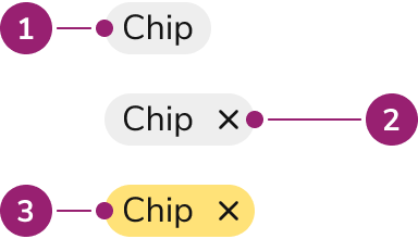
The Chip consists of three primary elements that work together to visually label and organize information.

<Frame>
  <div className="w-full h-full bg-[#FFFFFF] p-2 rounded flex items-center justify-center">
    <img
      src="https://mintcdn.com/servicetitan/Ni0bXIw9diilEZPZ/images/docs/web/components/chip/design/anatomy-of-the-chip-component.png?fit=max&auto=format&n=Ni0bXIw9diilEZPZ&q=85&s=1d3ed2a927940632db6ac7662930f976"
      alt="Anatomy of the Chip
component"
      width="384"
      height="220"
      data-path="images/docs/web/components/chip/design/anatomy-of-the-chip-component.png"
    />
  </div>
</Frame>

1. Content
2. Close action
3. Custom background

## Options

The Chip supports clickable, closeable, and customizable configurations to accommodate various labeling scenarios.

#### Clickable

<LiveCode example="chip-onclick" screenshot fullWidth>
  ```tsx lines theme={null}
  import { Chip } from "@servicetitan/anvil2";

  function App() {
    return <Chip label="Ben Ho" onClick={() => alert("chip click")} />;
  }

  export default App;
  ```
</LiveCode>

By default, a Chip is a non-clickable label. Use a clickable Chip for navigational contexts.

#### Close

<LiveCode example="chip-onclose" screenshot fullWidth>
  ```tsx lines theme={null}
  import { Chip } from "@servicetitan/anvil2";

  function App() {
    return <Chip label="Ben Ho" onClose={() => alert("chip close")} />;
  }

  export default App;
  ```
</LiveCode>

Chips can also have a close action, allowing a user to manually remove the Chip. Clickable and close can also be used together in a single Chip, but only when the size is set to medium.

#### Custom background colors

<LiveCode example="chip-color" screenshot fullWidth>
  ```tsx lines theme={null}
  import { Chip, Flex } from "@servicetitan/anvil2";
  import { core } from "@servicetitan/anvil2/token";

  function App() {
    return (
      <Flex gap={2}>
        <Chip label="Chip" color={core?.primitive?.ColorPurple200.value} />
        <Chip label="Chip" color={core?.primitive?.ColorRed500.value} />
        <Chip label="Chip" color={core?.primitive?.ColorYellow300.value} />
        <Chip label="Chip" color={core?.primitive?.ColorNeutral500.value} />
      </Flex>
    );
  }

  export default App;
  ```
</LiveCode>

Chips provide one color by default. They can accept any color or Token value. Text color is auto-calculated to be the highest available contrast. It is suggested to use a Token value that supports theming.

#### AI Mark

Chips can display an AI mark icon to indicate AI-generated content.

<LiveCode example="chip-aimark" screenshot fullWidth>
  ```tsx lines theme={null}
  import { Chip, Flex } from "@servicetitan/anvil2";

  function App() {
    return (
      <Flex gap="4" alignItems="center">
        <Chip label="AI job summary" aiMark />
        <Chip label="AI job summary" aiMark size="small" />
      </Flex>
    );
  }

  export default App;
  ```
</LiveCode>

By default, the AI mark uses a gradient treatment. When a custom background color is applied, the mark adapts to match the chip's text color for visual consistency.

<LiveCode example="chip-aimark-color" screenshot fullWidth>
  ```tsx lines theme={null}
  import { Chip, Flex } from "@servicetitan/anvil2";

  function App() {
    return (
      <Flex gap="4" alignItems="center" wrap="wrap">
        <Chip label="AI job summary" aiMark color="#3e3e5f" />
        <Chip label="AI job summary" aiMark color="#7D165B" />
        <Chip label="AI job summary" aiMark color="#83ba43" />
        <Chip label="AI job summary" aiMark color="#DE9500" />
      </Flex>
    );
  }

  export default App;
  ```
</LiveCode>

<Info>
  When a Chip is clickable, the AI mark animates on hover to draw attention to the AI-generated content.
</Info>

### Sizes

<LiveCode example="chip-size" screenshot fullWidth>
  ```tsx lines theme={null}
  import { Chip, Grid } from "@servicetitan/anvil2";

  function App() {
    return (
      <Grid templateColumns="repeat(3, max-content)" gap="2" alignItems="center">
        <Chip label="Medium Chip" size="medium" />
        <Chip label="Small Chip" size="small" />
      </Grid>
    );
  }

  export default App;
  ```
</LiveCode>

| Size   | Height | Font size |
| ------ | ------ | --------- |
| Medium | 26px   | 14px      |
| Small  | 18px   | 12px      |

Refer to the [choosing a chip size](#choosing-a-chip-size) section for more sizing recommendations.

## Behavior

The Chip responds to user interaction with distinct visual states and flexible overflow handling.

### Visual States

With custom colors, the hover background is lighter when the text is white, and darker when the text is black.

#### Without close

<LiveCode example="chip-data-interactive" screenshot fullWidth>
  ```tsx lines theme={null}
  import { Chip, Grid } from "@servicetitan/anvil2";

  function App() {
    return (
      <Grid templateColumns="repeat(3, max-content)" gap="8">
        <Chip label="Rest" onClick={() => alert("chip click")} />
        <Chip
          label="Hover"
          onClick={() => alert("chip click")}
          data-interactive="hover"
        />
        <Chip
          label="Focus Visible"
          onClick={() => alert("chip click")}
          data-interactive="focus-visible"
        />
      </Grid>
    );
  }

  export default App;
  ```
</LiveCode>

#### With close

<LiveCode example="chip-onclose-data-interactive" screenshot fullWidth>
  ```tsx lines theme={null}
  import { Chip, Grid } from "@servicetitan/anvil2";

  function App() {
    return (
      <Grid templateColumns="repeat(3, max-content)" gap="8">
        <Chip
          label="Rest"
          onClose={() => alert("chip close")}
          onClick={() => alert("chip click")}
        />
        <Chip
          label="Hover"
          onClose={() => alert("chip close")}
          onClick={() => alert("chip click")}
          data-interactive="close-hover"
        />
        <Chip
          label="Focus Visible"
          onClose={() => alert("chip close")}
          onClick={() => alert("chip click")}
          data-interactive="focus-visible"
        />
      </Grid>
    );
  }

  export default App;
  ```
</LiveCode>

### Overflow handling

#### Truncation

<LiveCode example="chip-textwrap-false" screenshot fullWidth>
  ```tsx lines theme={null}
  import { Chip, Flex } from "@servicetitan/anvil2";

  function App() {
    return (
      <Flex direction="column" gap={6} style={{ maxWidth: "455px" }}>
        <Chip
          label="Chip label that will wrap when not enough space is provided for it."
          size="medium"
        />
        <Chip
          label="Chip label that will wrap when not enough space is provided for it."
          size="medium"
          onClose={() => alert("chip close")}
        />
      </Flex>
    );
  }

  export default App;
  ```
</LiveCode>

By default, Chips will truncate, rather than wrap.

#### Wrapping

<LiveCode example="chip-textwrap" screenshot fullWidth>
  ```tsx lines theme={null}
  import { Chip, Flex } from "@servicetitan/anvil2";

  function App() {
    return (
      <Flex direction="column" gap={6}>
        <Chip
          label="Chip label that will wrap when not enough space isprovided for it."
          size="medium"
          textWrap
        />
        <Chip
          label="Chip label that will wrap when not enough space isprovided for it."
          size="medium"
          textWrap
          onClose={() => alert("chip close")}
        />
      </Flex>
    );
  }

  export default App;
  ```
</LiveCode>

Chips can be configured to individually wrap when there is not enough space.

#### Suggested group overflow

<LiveCode example="chip-group-wrap" screenshot fullWidth>
  ```tsx lines theme={null}
  import { Chip, Flex } from "@servicetitan/anvil2";

  function App() {
    return (
      <Flex direction="column" gap={8} style={{ maxWidth: "455px" }}>
        <Flex gap={2} style={{ flexWrap: "wrap" }}>
          <Chip label="Chip" size="medium" />
          <Chip label="Longer Chip name" size="medium" />
          <Chip label="Another Chip name" size="medium" />
          <Chip label="One more to show wrapping " size="medium" />
        </Flex>

        <Flex gap={2} style={{ flexWrap: "wrap" }}>
          <Chip label="Chip" size="medium" />
          <Chip
            label="This is an exceptionally long Chip in the middle that could potentially break the whole layout"
            size="medium"
            textWrap
          />
          <Chip label="Another Chip name" size="medium" />
          <Chip label="One more to show wrapping " size="medium" />
        </Flex>
      </Flex>
    );
  }

  export default App;
  ```
</LiveCode>

The Chip on its own does not provide an opinion on grouping. Wrap groups first, prioritizing group wrapping before wrapping individual Chips.

## Usage Guidelines

Use the Chip when visually labeling and organizing statuses, metadata, and objects.

### Alternatives

#### Chip vs Badge

Chips are used to categorize, label, and add context to items whereas Badges are used to indicate something requires attention, such as a notification. Additionally, Chips can be interactive while Badges are not.

### How to Use

#### Default

The default Chip visually highlights elements and provides user interaction.

<LiveCode example="chip-playground" screenshot fullWidth>
  ```tsx lines theme={null}
  import { Chip } from "@servicetitan/anvil2";

  function App() {
    return (
      <Chip
        label="Ben Ho"
        size="medium"
        color="#3e3e5f"
        onClick={() => alert("chip click")}
        onClose={() => alert("chip close")}
      />
    );
  }

  export default App;
  ```
</LiveCode>

### Chip group

Chips are frequently paired together to form a Chip group.

<LiveCode example="chip-group" screenshot fullWidth>
  ```tsx lines theme={null}
  import { Chip, Flex } from "@servicetitan/anvil2";

  function App() {
    return (
      <Flex gap={2}>
        <Chip label="Cat" />
        <Chip label="Dog" />
        <Chip label="Fish" />
      </Flex>
    );
  }

  export default App;
  ```
</LiveCode>

### Color

When implementing Chips, it is important to carefully consider what color is being used so that meaning and relationships are not implied when there is none.

For example, green is often meant to indicate "success" and red is used to indicate "danger" or "failure". Consistent usage is essential for helping users efficiently understand the status of something.

<LiveCode example="chip-color-semantic" screenshot fullWidth>
  ```tsx lines theme={null}
  import { Chip, Flex } from "@servicetitan/anvil2";
  import { core } from "@servicetitan/anvil2/token";

  function App() {
    return (
      <Flex gap={2}>
        <Chip
          label="Inspected"
          color={core.semantic?.StatusColorSuccess?.value}
        />
        <Chip label="Complete" color={core.semantic?.StatusColorWarning?.value} />
        <Chip label="Shipped" color={core.semantic?.StatusColorDanger?.value} />
      </Flex>
    );
  }

  export default App;
  ```
</LiveCode>

<Warning>**Caution**</Warning>

### Choosing a Chip size

Choose a Chip size based on its relative importance within the UI. Some general suggestions for Chips are provided below.

|                                                            | Medium Chip | Small Chip |
| ---------------------------------------------------------- | ----------- | ---------- |
| Part of a [Tab](/docs/web/components/tab/design)           | ❌           | ✅          |
| Part of a [Side Nav](/docs/web/components/side-nav/design) | ❌           | ✅          |
| Part of a [Combobox](/docs/web/components/combobox/design) | ✅           | ❌          |
| Table Cell main content                                    | ✅           | ⚠️         |
| Table Cell secondary content                               | ⚠️          | ✅          |
| Group of Chips on the page                                 | ✅           | ⚠️         |
| Chip(s) in the page header                                 | ✅           | ⚠️         |
| Needing an interactive Chip + close                        | ✅           | ❌          |

#### Legend

✅ recommended

⚠️ use with caution

❌ do not use

## Content

Content within the Chip should be short and descriptive, helping users understand context at a glance.

* Chips should be short and descriptive. Users should understand context at a glance.
* Use both color and text together to provide meaning so that color alone is not the only indicator of meaning.
* Use Chips in moderation as they add visual noise to the page.
* Chips may be used for both textual and numerical content.

## Keyboard Interaction

Users can navigate the Chip using standard keyboard controls.

#### With clickable Chip

| Key                 | Description                                                   |
| ------------------- | ------------------------------------------------------------- |
| Enter               | Engages the Chip and moves focus to the click target.         |
| Backspace or Delete | If the close action exists, removes the Chip from the screen. |

### Accessibility

The Chip provides all accessibility needs out of the box. With custom background colors, the Chip will automatically provide a text color that will be at least a 4.5:1 ratio, satisfying WCAG AA requirements.

For more guidance on accessible interaction components, see [button accessibility best practices](/docs/accessibility/labels-and-ctas#buttons-and-links).