> ## Documentation Index
> Fetch the complete documentation index at: https://anvil.servicetitan.com/llms.txt
> Use this file to discover all available pages before exploring further.

# Combobox – Design

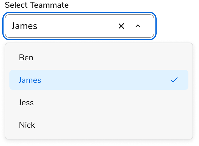
> Comboboxes are form elements that allow users to filter and select a value from a list.

export const LiveCode = ({children, customHeight, clickToLoad, example, fullWidth, fullHeight, hideCodeInLiveCode, screenshot, screenshotOnly, showCode: showCodeProp}) => {
  const SCREENSHOTS_BASE = "https://servicetitan.github.io/anvil2-docs-live-code/screenshots";
  const STACKBLITZ_BASE = "https://stackblitz.com/github/servicetitan/anvil2-docs-live-code/tree/main/examples";
  const [showCodeBlock, setShowCodeBlock] = useState(showCodeProp ?? false);
  const [isLocalOverride, setIsLocalOverride] = useState(false);
  useEffect(() => {
    const examplePath = `/images/live-code-screenshots-tmp/${example}.png`;
    fetch(examplePath, {
      method: "HEAD"
    }).then(r => {
      if (r.ok) setIsLocalOverride(true);
    }).catch(() => {});
  }, [example]);
  const screenshotBase = isLocalOverride ? "/images/live-code-screenshots-tmp" : SCREENSHOTS_BASE;
  if (screenshotOnly) {
    return <Frame className="flex flex-col">
        <div className="flex dark:hidden" style={{
      justifyContent: "center",
      alignItems: "center",
      width: fullWidth ? "100%" : "50%",
      minHeight: fullHeight ? "284px" : undefined,
      background: "#FFFFFF"
    }}>
          <img srcset={`${screenshotBase}/${example}.png, ${screenshotBase}/${example}-2x.png 2x`} src={`${screenshotBase}/${example}.png`} alt={example} noZoom />
        </div>
        <div className="hidden dark:flex" style={{
      justifyContent: "center",
      alignItems: "center",
      width: fullWidth ? "100%" : "50%",
      minHeight: fullHeight ? "284px" : undefined,
      background: "#141414"
    }}>
          <img srcset={`${screenshotBase}/${example}-dark.png, ${screenshotBase}/${example}-dark-2x.png 2x`} src={`${screenshotBase}/${example}-dark.png`} alt={example} noZoom />
        </div>
      </Frame>;
  }
  if (screenshot) {
    return <Frame className="flex flex-col -mb-2">
        <div className="flex dark:hidden bg-white dark:bg-codeblock border border-gray-950/10 dark:border-white/10 dark:twoslash-dark rounded-2xl overflow-hidden" style={{
      justifyContent: "center",
      alignItems: "center",
      width: fullWidth ? "100%" : "50%",
      minHeight: fullHeight ? "284px" : undefined
    }}>
          <img srcset={`${screenshotBase}/${example}.png, ${screenshotBase}/${example}-2x.png 2x`} src={`${screenshotBase}/${example}.png`} alt={example} noZoom />
        </div>

        <div className="hidden dark:flex bg-white dark:bg-codeblock border border-gray-950/10 dark:border-white/10 dark:twoslash-dark rounded-2xl overflow-hidden" style={{
      background: "#141414",
      justifyContent: "center",
      alignItems: "center",
      width: fullWidth ? "100%" : "50%",
      minHeight: fullHeight ? "284px" : undefined
    }}>
          <img srcset={`${screenshotBase}/${example}-dark.png, ${screenshotBase}/${example}-dark-2x.png 2x`} src={`${screenshotBase}/${example}-dark.png`} alt={example} noZoom />
        </div>

        <div className="flex justify-end items-center text-xs py-2 px-1 gap-4">
          {!showCodeProp ? <button className="inline-flex justify-end items-center text-gray-700 dark:text-gray-50 hover:text-blue-500 dark:hover:text-blue-300 transition-colors group self-end gap-1 cursor-pointer" onClick={() => setShowCodeBlock(!showCodeBlock)} style={{
      appearance: "none"
    }}>
              <Icon icon="code" size="12px" className="group-hover:bg-blue-500 dark:group-hover:bg-blue-300" />
              <span>{showCodeBlock ? "Hide code" : "Show code"}</span>
            </button> : null}

          <a className="inline-flex justify-end items-center hover:text-blue-500 dark:hover:text-blue-300 transition-colors group self-end gap-1" href={`${STACKBLITZ_BASE}/${example}?file=src/App.tsx`} target="_blank" rel="noreferrer">
            <Icon icon="bolt" size="12px" className="group-hover:bg-blue-500 dark:group-hover:bg-blue-300" />
            <span>StackBlitz demo</span>
          </a>
        </div>

        <div className="grid transition-[grid-template-rows] duration-300 ease-in-out overflow-auto overflow-y-hidden overflow-x-auto" style={showCodeBlock ? {
      gridTemplateRows: "1fr"
    } : {
      gridTemplateRows: "0fr"
    }}>
          <div style={{
      minHeight: 0,
      overflowX: "auto",
      overflowY: "hidden",
      marginBlockStart: "-1.25rem",
      marginBlockEnd: "-1.5rem"
    }}>
            {children}
          </div>
        </div>
      </Frame>;
  } else {
    return <div style={{
      display: "flex",
      width: fullWidth ? "100%" : "50%",
      minHeight: customHeight ? customHeight : "316px",
      resize: "vertical",
      overflow: "auto"
    }}>
        <iframe title={example} style={{
      flex: 1,
      width: fullWidth ? "100%" : "50%",
      minHeight: customHeight ? customHeight : "316px"
    }} src={`${STACKBLITZ_BASE}/${example}?embed=1&hideNavigation=1&hideExplorer=1&terminalHeight=0&file=src/App.tsx${clickToLoad ? "&ctl=1" : ""}${hideCodeInLiveCode ? "&view=preview" : ""}`} allow="accelerometer; ambient-light-sensor; camera; encrypted-media; geolocation; gyroscope; hid; microphone; midi; payment; usb; vr; xr-spatial-tracking" sandbox="allow-forms allow-modals allow-popups allow-presentation allow-same-origin allow-scripts" />
      </div>;
  }
};

export const CodePreviewPlaceholder = ({double, fullWidth}) => {
  const single = <div style={{
    width: fullWidth ? "100%" : "50%",
    borderRadius: "1rem",
    display: "flex",
    padding: "1rem",
    flexDirection: "column",
    gap: "0.5rem",
    height: "10rem",
    marginBlockEnd: "1rem"
  }} className="border-width-default border-color-subdued">
      <div className="bg-strong border-radius-large" style={{
    width: "100%",
    flexGrow: "1"
  }} />
      <div className="bg-strong border-radius-large" style={{
    width: "100%",
    flexGrow: "1"
  }} />
    </div>;
  return double ? <div style={{
    display: "flex",
    gap: "1rem"
  }}>
      {single}
      {single}
    </div> : single;
};

<Frame>
  <div className="w-full h-full bg-[#FFFFFF] p-2 rounded flex items-center justify-center">
    <img noZoom src="https://mintcdn.com/servicetitan/uz2PQSvO75TRhQ38/images/docs/web/components/shared/combobox-overview.png?fit=max&auto=format&n=uz2PQSvO75TRhQ38&q=85&s=076dcb8d04a6accaecba39bb4921d5d0" width="676" height="494" data-path="images/docs/web/components/shared/combobox-overview.png" />
  </div>
</Frame>

## Anatomy

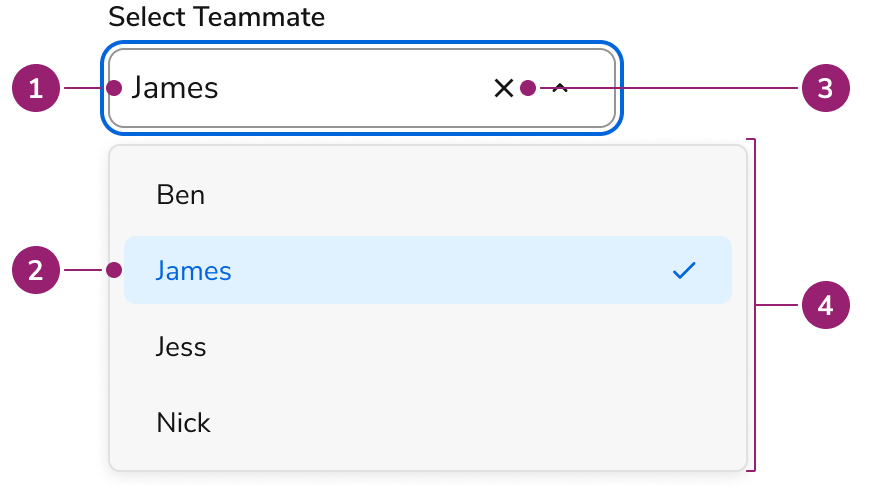
The Combobox consists of four primary elements that work together to allow users to filter and select values from a list.

<Frame>
  <div className="w-full h-full bg-[#FFFFFF] p-2 rounded flex items-center justify-center">
    <img
      src="https://mintcdn.com/servicetitan/Ni0bXIw9diilEZPZ/images/docs/web/components/combobox/design/combobox-anatomy.png?fit=max&auto=format&n=Ni0bXIw9diilEZPZ&q=85&s=a89253fc48c1f420fc6e865bb8992db2"
      alt="Combobox
anatomy"
      width="882"
      height="494"
      data-path="images/docs/web/components/combobox/design/combobox-anatomy.png"
    />
  </div>
</Frame>

1. Trigger
2. Content
3. Clear button (Optional)
4. Popover

## Options

The Combobox supports single and multi-select configurations to accommodate various selection scenarios.

<LiveCode example="combobox-multiple-false" screenshot fullWidth>
  ```tsx lines theme={null}
  import { Combobox } from "@servicetitan/anvil2";
  import { useState } from "react";

  type Item = {
    id: number;
    name: string;
  };

  const items: Item[] = [
    { id: 1, name: "Casey Maxwell" },
    { id: 2, name: "Giovanni Saunders" },
    { id: 3, name: "Harper Gonzalez" },
    { id: 4, name: "Jane Doe" },
    { id: 5, name: "Meadow Hunter" },
  ];

  function App() {
    const [, setSelected] = useState<Item | null>();

    return (
      <div style={{ minWidth: "384px", minHeight: "284px" }}>
        <Combobox
          items={items}
          itemToString={(item) => (item ? item.name : "")}
          onChange={setSelected}
          filterOptions={{ keys: ["name"] }}
          defaultIsOpen
        >
          <Combobox.SearchField label="Select Teammate" />
          <Combobox.Content>
            {({ items }) => (
              <Combobox.List>
                {items.map((item, i) => (
                  <Combobox.Item key={item.id} item={item} index={i}>
                    {item.name}
                  </Combobox.Item>
                ))}
              </Combobox.List>
            )}
          </Combobox.Content>
        </Combobox>
      </div>
    );
  }

  export default App;
  ```
</LiveCode>

### Multi Select

<LiveCode example="combobox-multiple" screenshot fullWidth>
  ```tsx lines theme={null}
  import { Combobox } from "@servicetitan/anvil2";
  import { useState } from "react";

  type Item = {
    id: number;
    name: string;
  };

  const items: Item[] = [
    { id: 1, name: "Casey Maxwell" },
    { id: 2, name: "Giovanni Saunders" },
    { id: 3, name: "Harper Gonzalez" },
    { id: 4, name: "Jane Doe" },
    { id: 5, name: "Meadow Hunter" },
  ];

  function App() {
    const [, setSelected] = useState<Item[] | null>([]);

    return (
      <div style={{ minWidth: "384px", minHeight: "300px" }}>
        <Combobox
          items={items}
          itemToString={(item) => (item ? item.name : "")}
          onChange={setSelected}
          filterOptions={{ keys: ["name"] }}
          multiple
          defaultIsOpen
        >
          <Combobox.SearchField label="Select Teammate" />
          <Combobox.Content>
            {({ items }) => (
              <Combobox.List>
                {items.map((item, i) => (
                  <Combobox.Item key={item.id} item={item} index={i}>
                    {item.name}
                  </Combobox.Item>
                ))}
              </Combobox.List>
            )}
          </Combobox.Content>
        </Combobox>
      </div>
    );
  }

  export default App;
  ```
</LiveCode>

## Behavior

The Combobox responds to user interaction with flexible selection methods and typeahead functionality.

### Single selecting

<LiveCode example="combobox-defaultselecteditem" screenshot fullWidth>
  ```tsx lines theme={null}
  import { Combobox } from "@servicetitan/anvil2";
  import { useState } from "react";

  type Item = {
    id: number;
    name: string;
  };

  const items: Item[] = [
    { id: 1, name: "Casey Maxwell" },
    { id: 2, name: "Giovanni Saunders" },
    { id: 3, name: "Harper Gonzalez" },
    { id: 4, name: "Jane Doe" },
    { id: 5, name: "Meadow Hunter" },
  ];
  const defaultItem = items[0];

  function App() {
    const [, setSelected] = useState<Item | null>();

    return (
      <Combobox
        items={items}
        itemToString={(item) => (item ? item.name : "")}
        onChange={setSelected}
        filterOptions={{ keys: ["name"] }}
        defaultSelectedItem={defaultItem}
        style={{ minWidth: "260px" }}
      >
        <Combobox.SearchField label="Select Teammate" />
        <Combobox.Content>
          {({ items }) => (
            <Combobox.List>
              {items.map((item, i) => (
                <Combobox.Item key={item.id} item={item} index={i}>
                  {item.name}
                </Combobox.Item>
              ))}
            </Combobox.List>
          )}
        </Combobox.Content>
      </Combobox>
    );
  }

  export default App;
  ```
</LiveCode>

Clicking an option updates the text field value and closes the Combobox.

When reopening the Combobox with a selected value, the option matching that value is selected.

### Multi Selecting

<LiveCode example="combobox-defaultselecteditems" screenshot fullWidth>
  ```tsx lines theme={null}
  import { Combobox } from "@servicetitan/anvil2";
  import { useState } from "react";

  type Item = {
    id: number;
    name: string;
  };

  const items: Item[] = [
    { id: 1, name: "Casey Maxwell" },
    { id: 2, name: "Giovanni Saunders" },
    { id: 3, name: "Harper Gonzalez" },
    { id: 4, name: "Jane Doe" },
    { id: 5, name: "Meadow Hunter" },
  ];
  const defaultItems = [items[1], items[4]];

  function App() {
    const [, setSelected] = useState<Item[] | null>();

    return (
      <Combobox
        items={items}
        itemToString={(item) => (item ? item.name : "")}
        onChange={setSelected}
        filterOptions={{ keys: ["name"] }}
        multiple
        defaultSelectedItems={defaultItems}
      >
        <Combobox.SearchField label="Select Teammate" />
        <Combobox.Content>
          {({ items }) => (
            <Combobox.List>
              {items.map((item, i) => (
                <Combobox.Item key={item.id} item={item} index={i}>
                  {item.name}
                </Combobox.Item>
              ))}
            </Combobox.List>
          )}
        </Combobox.Content>
      </Combobox>
    );
  }

  export default App;
  ```
</LiveCode>

#### Continuous selection

Continuous selection refers to a multiselect that stays open while users keep making selections.

Refer to the [usage guide](#continuous-multiselect) for when to use this variant.

<LiveCode example="combobox-disablecloseonselectitem" screenshot fullWidth>
  ```tsx lines theme={null}
  import { Combobox } from "@servicetitan/anvil2";
  import { useState } from "react";

  type Item = {
    id: number;
    name: string;
  };

  const items: Item[] = [
    { id: 1, name: "First item" },
    { id: 2, name: "Second item" },
    { id: 3, name: "Third item" },
    { id: 4, name: "Fourth item" },
    { id: 5, name: "Fifth item" },
  ];

  function App() {
    const [, setSelected] = useState<Item[] | null>();

    return (
      <div style={{ minWidth: "384px", minHeight: "300px" }}>
        <Combobox
          items={items}
          itemToString={(item) => (item ? item.name : "")}
          onChange={setSelected}
          filterOptions={{ keys: ["name"] }}
          multiple
          disableCloseOnSelectItem
          defaultIsOpen
        >
          <Combobox.SearchField
            label="Select items"
            description="This is a Combobox.SearchField"
          />
          <Combobox.Content>
            {({ items }) => (
              <Combobox.List>
                {items.map((item, i) => (
                  <Combobox.Item key={item.id} item={item} index={i}>
                    {item.name}
                  </Combobox.Item>
                ))}
              </Combobox.List>
            )}
          </Combobox.Content>
        </Combobox>
      </div>
    );
  }

  export default App;
  ```
</LiveCode>

#### Select All

Multi-select Comboboxes support selecting all options at once.

<LiveCode example="combobox-selectall" screenshot fullWidth>
  ```tsx lines theme={null}
  import { Combobox } from "@servicetitan/anvil2";
  import { useState } from "react";

  type Item = {
    id: number;
    name: string;
  };

  const items: Item[] = [
    { id: 1, name: "Apple" },
    { id: 2, name: "Banana" },
    { id: 3, name: "Blueberry" },
    { id: 4, name: "Grapefruit" },
    { id: 5, name: "Orange" },
    { id: 6, name: "Peach" },
    { id: 7, name: "Pomegranate" },
    { id: 8, name: "Raspberry" },
    { id: 9, name: "Strawberry" },
    { id: 10, name: "Watermelon" },
  ];

  function App() {
    const [selectedItems, setSelected] = useState<Item[] | null>();

    return (
      <div style={{ minWidth: "384px", minHeight: "300px" }}>
        <Combobox
          items={items}
          itemToString={(item) => (item ? item.name : "")}
          onChange={setSelected}
          filterOptions={{ keys: ["name"] }}
          selectAll={{
            label: "Select All",
            onSelection: () => {
              setSelected(items);
            },
            isChecked: selectedItems?.length === items.length,
          }}
          selectedItems={selectedItems ?? undefined}
          multiple
          defaultIsOpen
        >
          <Combobox.SearchField label="Select Fruit" />
          <Combobox.Content>
            {({ items }) => (
              <Combobox.List>
                {items.map((item, i) => (
                  <Combobox.Item key={item.id} item={item} index={i}>
                    {item.name}
                  </Combobox.Item>
                ))}
              </Combobox.List>
            )}
          </Combobox.Content>
        </Combobox>
      </div>
    );
  }

  export default App;
  ```
</LiveCode>

### As Select-only

Configure the Combobox for scenarios requiring an HTML select-like experience.

<LiveCode example="comboboxselect" screenshot fullWidth>
  ```tsx lines theme={null}
  import { Combobox } from "@servicetitan/anvil2";
  import { useState } from "react";

  type Item = {
    id: number;
    name: string;
  };

  const items = [
    { id: 1, name: "First item" },
    { id: 2, name: "Second item" },
    { id: 3, name: "Third item" },
    { id: 4, name: "Fourth item" },
    { id: 5, name: "Fifth item" },
    { id: 6, name: "Sixth item" },
    { id: 7, name: "Seventh item" },
    { id: 8, name: "Eighth item" },
    { id: 9, name: "Ninth item" },
    { id: 10, name: "Tenth item" },
  ];

  function App() {
    const [selectedItem, setSelectedItem] = useState<Item | null>();

    return (
      <div style={{ minWidth: "384px", minHeight: "284px" }}>
        <Combobox.Select
          items={items}
          itemToString={(item) => (item ? item.name : "")}
          itemToKey={(item) => (item ? item.id : null)}
          selectedItem={selectedItem}
          onChange={setSelectedItem}
          defaultIsOpen
        >
          <Combobox.SelectTrigger
            label="Select an item"
            description="This is a Combobox.SelectTrigger"
          />
          <Combobox.Content>
            {({ items }) => (
              <Combobox.List>
                {items.map((item, i) => (
                  <Combobox.Item key={item.id} item={item} index={i}>
                    {item.name}
                  </Combobox.Item>
                ))}
              </Combobox.List>
            )}
          </Combobox.Content>
        </Combobox.Select>
      </div>
    );
  }

  export default App;
  ```
</LiveCode>

### Typeahead

Combobox supports typeahead, narrowing options in the popup as users type.

<LiveCode example="combobox-filteroptions" screenshot fullWidth>
  ```tsx lines theme={null}
  import { Combobox } from "@servicetitan/anvil2";
  import { useState } from "react";

  type Item = {
    id: number;
    name: string;
  };

  const items: Item[] = [
    { id: 1, name: "Apple" },
    { id: 2, name: "Banana" },
    { id: 3, name: "Grapefruit" },
    { id: 4, name: "Orange" },
    { id: 5, name: "Pomegranate" },
  ];

  function App() {
    const [, setSelected] = useState<Item | null>();

    return (
      <div style={{ minWidth: "384px", minHeight: "284px" }}>
        <Combobox
          items={items}
          itemToString={(item) => (item ? item.name : "")}
          onChange={setSelected}
          filterOptions={{ keys: ["name"] }}
          defaultIsOpen
        >
          <Combobox.SearchField label="Select Fruit" />
          <Combobox.Content>
            {({ items }) => (
              <Combobox.List>
                {items.map((item, i) => (
                  <Combobox.Item key={item.id} item={item} index={i}>
                    {item.name}
                  </Combobox.Item>
                ))}
              </Combobox.List>
            )}
          </Combobox.Content>
        </Combobox>
      </div>
    );
  }

  export default App;
  ```
</LiveCode>

### Rows

Comboboxes grow as the number of selections increases. Configure the maximum number of rows.

<LiveCode example="combobox-searchfield-maxrows-false" screenshot fullWidth>
  ```tsx lines theme={null}
  import { Combobox, Flex } from "@servicetitan/anvil2";
  import { useState } from "react";

  type Item = {
    id: number;
    name: string;
  };

  const items: Item[] = [
    { id: 1, name: "Casey Maxwell" },
    { id: 2, name: "Giovanni Saunders" },
    { id: 3, name: "Harper Gonzalez" },
    { id: 4, name: "Jane Doe" },
    { id: 5, name: "Meadow Hunter" },
  ];
  const defaultItems = [items[1], items[4]];

  function App() {
    const [, setSelected] = useState<Item[] | null>();

    return (
      <Flex gap={6} direction="column" style={{ maxWidth: "500px" }}>
        <Combobox
          items={items}
          itemToString={(item) => (item ? item.name : "")}
          onChange={setSelected}
          filterOptions={{ keys: ["name"] }}
          multiple
          defaultSelectedItems={defaultItems}
        >
          <Combobox.SearchField label="Select Teammate" />
          <Combobox.Content>
            {({ items }) => (
              <Combobox.List>
                {items.map((item, i) => (
                  <Combobox.Item key={item.id} item={item} index={i}>
                    {item.name}
                  </Combobox.Item>
                ))}
              </Combobox.List>
            )}
          </Combobox.Content>
        </Combobox>

        <Combobox
          items={items}
          itemToString={(item) => (item ? item.name : "")}
          onChange={setSelected}
          filterOptions={{ keys: ["name"] }}
          multiple
          defaultSelectedItems={[items[1], items[2], items[3], items[4]]}
        >
          <Combobox.SearchField label="Select Teammate" />
          <Combobox.Content>
            {({ items }) => (
              <Combobox.List>
                {items.map((item, i) => (
                  <Combobox.Item key={item.id} item={item} index={i}>
                    {item.name}
                  </Combobox.Item>
                ))}
              </Combobox.List>
            )}
          </Combobox.Content>
        </Combobox>
      </Flex>
    );
  }

  export default App;
  ```
</LiveCode>

#### Truncated Chip

When there are more Chips than rows allowed in the Combobox, a truncated Chip will appear.

<LiveCode example="combobox-searchfield-maxrows-true" screenshot fullWidth>
  ```tsx lines theme={null}
  import { Combobox, Flex } from "@servicetitan/anvil2";
  import { useState } from "react";

  type Item = {
    id: number;
    name: string;
  };

  const items: Item[] = [
    { id: 1, name: "Apple" },
    { id: 2, name: "Banana" },
    { id: 3, name: "Blueberry" },
    { id: 4, name: "Grapefruit" },
    { id: 5, name: "Orange" },
    { id: 6, name: "Peach" },
    { id: 7, name: "Pomegranate" },
    { id: 8, name: "Raspberry" },
    { id: 9, name: "Strawberry" },
    { id: 10, name: "Watermelon" },
  ];
  const defaultItems = [
    items[0],
    items[1],
    items[2],
    items[3],
    items[4],
    items[5],
    items[6],
    items[7],
    items[8],
    items[9],
  ];

  function App() {
    const [, setSelected] = useState<Item[] | null>();

    return (
      <Flex gap={6} direction="column" style={{ maxWidth: "500px" }}>
        <Combobox
          items={items}
          itemToString={(item) => item?.name ?? ""}
          onChange={setSelected}
          filterOptions={{ keys: ["name"] }}
          multiple
          defaultSelectedItems={defaultItems}
        >
          <Combobox.SearchField label="Select Fruit" maxRows={2} />
          <Combobox.Content>
            {({ items }) => (
              <Combobox.List>
                {items.map((item, i) => (
                  <Combobox.Item key={item.id} item={item} index={i}>
                    {item.name}
                  </Combobox.Item>
                ))}
              </Combobox.List>
            )}
          </Combobox.Content>
        </Combobox>
      </Flex>
    );
  }

  export default App;
  ```
</LiveCode>

## Usage Guidelines

Use the Combobox when users need to select from many options.

### When not to use

Consider using an alternative component to the Combobox when:

* There are only a few items to choose from. A [radio](/docs/web/components/radio/design) or [checkbox](/docs/web/components/checkbox/design) group may be more appropriate.
* When a particularly complex selection interaction is needed, in which case a [Listbox](/docs/web/components/listbox/design) in a special layout may be preferred.
* In navigational contexts.

### Selection methods

The main selection method for Combobox supports searching for a particular entity to make the selection. This pattern appears in applications like Slack when adding a new member to a channel.

| Scenario                                                                            | Use a...                        |
| ----------------------------------------------------------------------------------- | ------------------------------- |
| Has 10+ options                                                                     | Regular Combobox                |
| Users are not familiar with the options                                             | Regular Combobox                |
| Has 10 or fewer options                                                             | Select-only Combobox            |
| Common user behavior is to search/filter for metadata instead of the entity's label | Continuous multiselect Combobox |
| Need for filtering, trees, secondary actions, action confirmation                   | Select Trigger + Complex Dialog |

#### Select-only

Use a Combobox as select-only in these scenarios:

* **Simple, static list**: Short lists of options (e.g., countries, states, or categories) that users easily recognize and navigate without much effort.
* **No need for search or filtering functionality**: Lists short enough that users can easily scan through all available choices.
* **Simple UX:** Select-only experiences require less complex interactions.

<LiveCode example="comboboxselect" screenshot fullWidth>
  ```tsx lines theme={null}
  import { Combobox } from "@servicetitan/anvil2";
  import { useState } from "react";

  type Item = {
    id: number;
    name: string;
  };

  const items = [
    { id: 1, name: "First item" },
    { id: 2, name: "Second item" },
    { id: 3, name: "Third item" },
    { id: 4, name: "Fourth item" },
    { id: 5, name: "Fifth item" },
    { id: 6, name: "Sixth item" },
    { id: 7, name: "Seventh item" },
    { id: 8, name: "Eighth item" },
    { id: 9, name: "Ninth item" },
    { id: 10, name: "Tenth item" },
  ];

  function App() {
    const [selectedItem, setSelectedItem] = useState<Item | null>();

    return (
      <div style={{ minWidth: "384px", minHeight: "284px" }}>
        <Combobox.Select
          items={items}
          itemToString={(item) => (item ? item.name : "")}
          itemToKey={(item) => (item ? item.id : null)}
          selectedItem={selectedItem}
          onChange={setSelectedItem}
          defaultIsOpen
        >
          <Combobox.SelectTrigger
            label="Select an item"
            description="This is a Combobox.SelectTrigger"
          />
          <Combobox.Content>
            {({ items }) => (
              <Combobox.List>
                {items.map((item, i) => (
                  <Combobox.Item key={item.id} item={item} index={i}>
                    {item.name}
                  </Combobox.Item>
                ))}
              </Combobox.List>
            )}
          </Combobox.Content>
        </Combobox.Select>
      </div>
    );
  }

  export default App;
  ```
</LiveCode>

#### Continuous multiselect

Combobox supports continuous multi-selection instead of closing after each selection. Use this pattern when users typically search for metadata to find multiple items.

* An example would be using "designer" as a search term to filter down to all designers and selecting multiple designers from that list.

<LiveCode example="combobox-disablecloseonselectitem" screenshot fullWidth>
  ```tsx lines theme={null}
  import { Combobox } from "@servicetitan/anvil2";
  import { useState } from "react";

  type Item = {
    id: number;
    name: string;
  };

  const items: Item[] = [
    { id: 1, name: "First item" },
    { id: 2, name: "Second item" },
    { id: 3, name: "Third item" },
    { id: 4, name: "Fourth item" },
    { id: 5, name: "Fifth item" },
  ];

  function App() {
    const [, setSelected] = useState<Item[] | null>();

    return (
      <div style={{ minWidth: "384px", minHeight: "300px" }}>
        <Combobox
          items={items}
          itemToString={(item) => (item ? item.name : "")}
          onChange={setSelected}
          filterOptions={{ keys: ["name"] }}
          multiple
          disableCloseOnSelectItem
          defaultIsOpen
        >
          <Combobox.SearchField
            label="Select items"
            description="This is a Combobox.SearchField"
          />
          <Combobox.Content>
            {({ items }) => (
              <Combobox.List>
                {items.map((item, i) => (
                  <Combobox.Item key={item.id} item={item} index={i}>
                    {item.name}
                  </Combobox.Item>
                ))}
              </Combobox.List>
            )}
          </Combobox.Content>
        </Combobox>
      </div>
    );
  }

  export default App;
  ```
</LiveCode>

#### Select All

The Select All feature enables users to quickly select or deselect all available options within a multi-select Combobox. This pattern improves efficiency when working with large sets of items or when selecting most of the list is common.

<LiveCode example="combobox-selectall" screenshot fullWidth>
  ```tsx lines theme={null}
  import { Combobox } from "@servicetitan/anvil2";
  import { useState } from "react";

  type Item = {
    id: number;
    name: string;
  };

  const items: Item[] = [
    { id: 1, name: "Apple" },
    { id: 2, name: "Banana" },
    { id: 3, name: "Blueberry" },
    { id: 4, name: "Grapefruit" },
    { id: 5, name: "Orange" },
    { id: 6, name: "Peach" },
    { id: 7, name: "Pomegranate" },
    { id: 8, name: "Raspberry" },
    { id: 9, name: "Strawberry" },
    { id: 10, name: "Watermelon" },
  ];

  function App() {
    const [selectedItems, setSelected] = useState<Item[] | null>();

    return (
      <div style={{ minWidth: "384px", minHeight: "300px" }}>
        <Combobox
          items={items}
          itemToString={(item) => (item ? item.name : "")}
          onChange={setSelected}
          filterOptions={{ keys: ["name"] }}
          selectAll={{
            label: "Select All",
            onSelection: () => {
              setSelected(items);
            },
            isChecked: selectedItems?.length === items.length,
          }}
          selectedItems={selectedItems ?? undefined}
          multiple
          defaultIsOpen
        >
          <Combobox.SearchField label="Select Fruit" />
          <Combobox.Content>
            {({ items }) => (
              <Combobox.List>
                {items.map((item, i) => (
                  <Combobox.Item key={item.id} item={item} index={i}>
                    {item.name}
                  </Combobox.Item>
                ))}
              </Combobox.List>
            )}
          </Combobox.Content>
        </Combobox>
      </div>
    );
  }

  export default App;
  ```
</LiveCode>

#### Complex selection alternatives

When the Combobox is insufficient for a use case, use an alternative UI. These primarily combine the [Select Trigger](/docs/web/components/select-trigger) with the [Dialog](/docs/web/components/dialog/design), [Text Field](/docs/web/components/text-field/design), [Listbox](/docs/web/components/listbox/design), and [List View](/docs/web/components/list-view/design) components, and may include others depending on need.

Rather than adding additional features to the Combobox, use the [Select Trigger](/docs/web/components/select-trigger) for scenarios such as:

* Manual applying actions
* Needing secondary actions
* Tabbed division of options
* Multiple footer actions

### Alternatives

#### Combobox vs Checkbox

Checkbox groups and the Combobox both allow multi-selection of a set of items. Checkbox groups should be used when there are only a few options. For larger options, Checkbox groups can still be used when there is space available and discovery of options is important. Comboboxes are good for 8 or more options and also when conserving space.

#### Combobox vs Menu

The Menu is used to perform actions on the page, and sometimes also a navigational context. The Combobox is used for choosing an option amongst a list, usually in the context of a Form.

#### Combobox vs Popover

When users need to select from many options, use the Combobox instead of the Popover. Avoid recreating a combobox-like or select-like interaction with a Popover.

#### Combobox vs Radio

Radio buttons and the Combobox both allow users to select a single option among a set. Use Radio buttons when there are between 2-7 options. Use a Combobox when there are 8 or more options available.

Additionally, in a group of Radio buttons all options are equally represented whereas a Combobox highlights a single option more prominently.

#### Combobox vs Search Field

Use the Combobox when selecting from options defined in an overlayed list, typically in the context of a form field. Use Search Field in situations requiring a traditional search experience, for filtering lists of items on the page, in tables, with large datasets, and for results requiring additional filtering.

#### Combobox vs Select Field

[Select Field](/docs/web/components/select-field/design) is the eventual replacement for the Combobox component. Use Select Field when looking for features such as Dialog viewing, standardized content display, secondary actions, sectioning, or lazy loading.

Consider using the Combobox if needing a stable component in your application.

### How to Use

#### Labels and help

For information around concepts like labels, placeholder, and help, refer to the [Form pattern](/docs/web/patterns/forms).

#### Sorting options

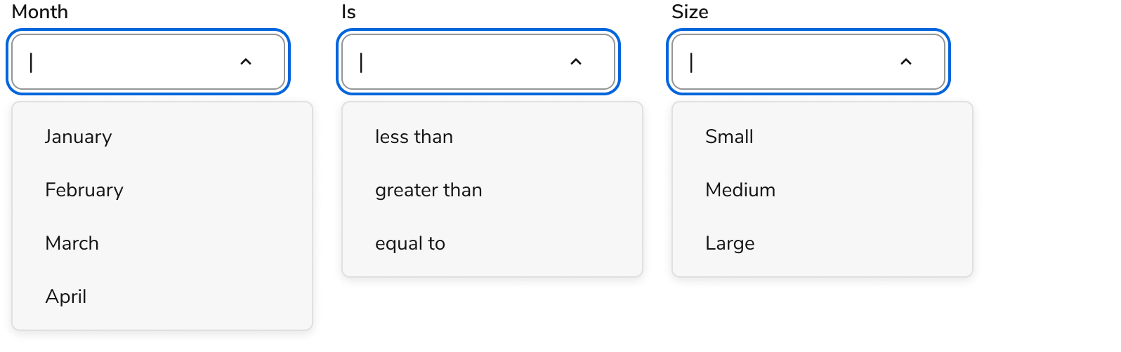
The Combobox does not prescribe how choices are sorted. Common sorting types include alphabetical, time-based, and categorical. Use a sort that matches user expectations.

<Frame>
  <div className="w-full h-full bg-[#FFFFFF] p-2 rounded flex items-center justify-center">
    <img
      src="https://mintcdn.com/servicetitan/Ni0bXIw9diilEZPZ/images/docs/web/components/combobox/design/combobox-how-sort.png?fit=max&auto=format&n=Ni0bXIw9diilEZPZ&q=85&s=882665a3fef1dcdb91e9bd096e9f26a8"
      alt="Combobox how
sort"
      width="1596"
      height="502"
      data-path="images/docs/web/components/combobox/design/combobox-how-sort.png"
    />
  </div>
</Frame>

Examples of combobox sorts other than alphabetical:

## Content

Content within the Combobox should clearly communicate available options and selection states.

For content guidance, refer to the content guidance provided in the [Form pattern](/docs/web/patterns/forms).

## Keyboard Interaction

Users can navigate the Combobox using standard keyboard controls.

### Text field

| Key                      | Interaction                                                                                                                                                                                                                                                                                                              |
| ------------------------ | ------------------------------------------------------------------------------------------------------------------------------------------------------------------------------------------------------------------------------------------------------------------------------------------------------------------------ |
| Down Arrow               | If the text field is not empty and the listbox is displayed, moves visual focus to the first suggested value.<br /><br />If the text field is empty and the listbox is not displayed, opens the listbox and moves visual focus to the first option.<br /><br />In both cases DOM focus remains on the text field.        |
| Alt(Option) + Down Arrow | Opens the listbox without moving focus or changing selection.                                                                                                                                                                                                                                                            |
| Up Arrow                 | If the text field is not empty and the listbox is displayed, moves visual focus to the last suggested value.<br /><br />If the text field is empty, first opens the listbox if it is not already displayed and then moves visual focus to the last option.<br /><br />In both cases DOM focus remains on the text field. |
| Enter                    | Closes the listbox if it is displayed.                                                                                                                                                                                                                                                                                   |
| Escape                   | If the listbox is displayed, closes the listbox.<br /><br />If the listbox is not displayed, clears the text field.                                                                                                                                                                                                      |

### Popup

NOTE: Even when the visual focus is on the listbox, DOM focus remains on the text field.

| Key         | Interaction                                                                                                                                                                                                                                          |
| ----------- | ---------------------------------------------------------------------------------------------------------------------------------------------------------------------------------------------------------------------------------------------------- |
| Enter       | Sets the text field value to the content of the focused option.<br /><br />Closes the popup.<br /><br />Sets visual focus on the text field.                                                                                                         |
| Escape      | Closes the popup.<br /><br />Sets visual focus on the text field.                                                                                                                                                                                    |
| Down Arrow  | Moves visual focus to the next option.<br /><br />If visual focus is on the last option, moves visual focus to the first option.<br /><br />Note: This wrapping behavior is useful when Home and End move the editing cursor as described below.     |
| Up Arrow    | Moves visual focus to the previous option.<br /><br />If visual focus is on the first option, moves visual focus to the last option.<br /><br />Note: This wrapping behavior is useful when Home and End move the editing cursor as described below. |
| Right Arrow | Moves visual focus to the text field and moves the editing cursor one character to the right.                                                                                                                                                        |
| Left Arrow  | Moves visual focus to the text field and moves the editing cursor one character to the left.                                                                                                                                                         |
| Home        | Moves visual focus to the text field and places the editing cursor at the beginning of the field.                                                                                                                                                    |
| End         | Moves visual focus to the text field and places the editing cursor at the end of the field.                                                                                                                                                          |

### Accessibility

Anvil provides most of the accessibility needs for Combobox out of the box, and only needs some additional considerations for library users.

For more guidance on building accessible form controls, see [custom component best practices](/docs/accessibility/custom-components).