> ## Documentation Index
> Fetch the complete documentation index at: https://anvil.servicetitan.com/llms.txt
> Use this file to discover all available pages before exploring further.

# Date Field Range – Design

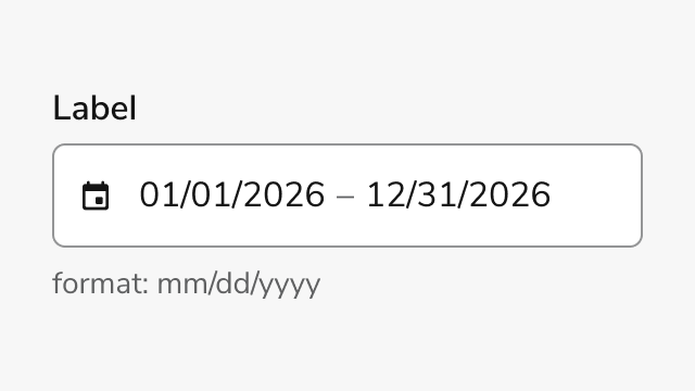
> A form field for selecting a date range with start and end dates.

export const DoDont = ({text, type, children}) => {
  return <>
      {type === "do" && <div className="do-dont do">
          {children && <div className="do-dont-content">{children}</div>}
          <Check>
            <p>
              <strong>Do</strong>
              {text && <span className="m-inline-start-1">{text}</span>}
            </p>
          </Check>
        </div>}
      {type === "dont" && <div className="do-dont dont">
          {children && <div className="do-dont-content">{children}</div>}
          <Danger>
            <p>
              <strong>Don't</strong>
              {text && <span className="m-inline-start-1">{text}</span>}
            </p>
          </Danger>
        </div>}
      {type === "caution" && <div className="do-dont caution">
          {children && <div className="do-dont-content">{children}</div>}
          <Warning>
            <p>
              <strong>Caution</strong>
              {text && <span className="m-inline-start-1">{text}</span>}
            </p>
          </Warning>
        </div>}
    </>;
};

export const LiveCode = ({children, customHeight, clickToLoad, example, fullWidth, fullHeight, hideCodeInLiveCode, screenshot, screenshotOnly, showCode: showCodeProp}) => {
  const SCREENSHOTS_BASE = "https://servicetitan.github.io/anvil2-docs-live-code/screenshots";
  const STACKBLITZ_BASE = "https://stackblitz.com/github/servicetitan/anvil2-docs-live-code/tree/main/examples";
  const [showCodeBlock, setShowCodeBlock] = useState(showCodeProp ?? false);
  const [isLocalOverride, setIsLocalOverride] = useState(false);
  useEffect(() => {
    const examplePath = `/images/live-code-screenshots-tmp/${example}.png`;
    fetch(examplePath, {
      method: "HEAD"
    }).then(r => {
      if (r.ok) setIsLocalOverride(true);
    }).catch(() => {});
  }, [example]);
  const screenshotBase = isLocalOverride ? "/images/live-code-screenshots-tmp" : SCREENSHOTS_BASE;
  if (screenshotOnly) {
    return <Frame className="flex flex-col">
        <div className="flex dark:hidden" style={{
      justifyContent: "center",
      alignItems: "center",
      width: fullWidth ? "100%" : "50%",
      minHeight: fullHeight ? "284px" : undefined,
      background: "#FFFFFF"
    }}>
          <img srcset={`${screenshotBase}/${example}.png, ${screenshotBase}/${example}-2x.png 2x`} src={`${screenshotBase}/${example}.png`} alt={example} noZoom />
        </div>
        <div className="hidden dark:flex" style={{
      justifyContent: "center",
      alignItems: "center",
      width: fullWidth ? "100%" : "50%",
      minHeight: fullHeight ? "284px" : undefined,
      background: "#141414"
    }}>
          <img srcset={`${screenshotBase}/${example}-dark.png, ${screenshotBase}/${example}-dark-2x.png 2x`} src={`${screenshotBase}/${example}-dark.png`} alt={example} noZoom />
        </div>
      </Frame>;
  }
  if (screenshot) {
    return <Frame className="flex flex-col -mb-2">
        <div className="flex dark:hidden bg-white dark:bg-codeblock border border-gray-950/10 dark:border-white/10 dark:twoslash-dark rounded-2xl overflow-hidden" style={{
      justifyContent: "center",
      alignItems: "center",
      width: fullWidth ? "100%" : "50%",
      minHeight: fullHeight ? "284px" : undefined
    }}>
          <img srcset={`${screenshotBase}/${example}.png, ${screenshotBase}/${example}-2x.png 2x`} src={`${screenshotBase}/${example}.png`} alt={example} noZoom />
        </div>

        <div className="hidden dark:flex bg-white dark:bg-codeblock border border-gray-950/10 dark:border-white/10 dark:twoslash-dark rounded-2xl overflow-hidden" style={{
      background: "#141414",
      justifyContent: "center",
      alignItems: "center",
      width: fullWidth ? "100%" : "50%",
      minHeight: fullHeight ? "284px" : undefined
    }}>
          <img srcset={`${screenshotBase}/${example}-dark.png, ${screenshotBase}/${example}-dark-2x.png 2x`} src={`${screenshotBase}/${example}-dark.png`} alt={example} noZoom />
        </div>

        <div className="flex justify-end items-center text-xs py-2 px-1 gap-4">
          {!showCodeProp ? <button className="inline-flex justify-end items-center text-gray-700 dark:text-gray-50 hover:text-blue-500 dark:hover:text-blue-300 transition-colors group self-end gap-1 cursor-pointer" onClick={() => setShowCodeBlock(!showCodeBlock)} style={{
      appearance: "none"
    }}>
              <Icon icon="code" size="12px" className="group-hover:bg-blue-500 dark:group-hover:bg-blue-300" />
              <span>{showCodeBlock ? "Hide code" : "Show code"}</span>
            </button> : null}

          <a className="inline-flex justify-end items-center hover:text-blue-500 dark:hover:text-blue-300 transition-colors group self-end gap-1" href={`${STACKBLITZ_BASE}/${example}?file=src/App.tsx`} target="_blank" rel="noreferrer">
            <Icon icon="bolt" size="12px" className="group-hover:bg-blue-500 dark:group-hover:bg-blue-300" />
            <span>StackBlitz demo</span>
          </a>
        </div>

        <div className="grid transition-[grid-template-rows] duration-300 ease-in-out overflow-auto overflow-y-hidden overflow-x-auto" style={showCodeBlock ? {
      gridTemplateRows: "1fr"
    } : {
      gridTemplateRows: "0fr"
    }}>
          <div style={{
      minHeight: 0,
      overflowX: "auto",
      overflowY: "hidden",
      marginBlockStart: "-1.25rem",
      marginBlockEnd: "-1.5rem"
    }}>
            {children}
          </div>
        </div>
      </Frame>;
  } else {
    return <div style={{
      display: "flex",
      width: fullWidth ? "100%" : "50%",
      minHeight: customHeight ? customHeight : "316px",
      resize: "vertical",
      overflow: "auto"
    }}>
        <iframe title={example} style={{
      flex: 1,
      width: fullWidth ? "100%" : "50%",
      minHeight: customHeight ? customHeight : "316px"
    }} src={`${STACKBLITZ_BASE}/${example}?embed=1&hideNavigation=1&hideExplorer=1&terminalHeight=0&file=src/App.tsx${clickToLoad ? "&ctl=1" : ""}${hideCodeInLiveCode ? "&view=preview" : ""}`} allow="accelerometer; ambient-light-sensor; camera; encrypted-media; geolocation; gyroscope; hid; microphone; midi; payment; usb; vr; xr-spatial-tracking" sandbox="allow-forms allow-modals allow-popups allow-presentation allow-same-origin allow-scripts" />
      </div>;
  }
};

<Frame>
  <div className="w-full h-full bg-[#FFFFFF] p-2 rounded flex items-center justify-center">
    <img noZoom src="https://mintcdn.com/servicetitan/66tZkkkyD48ugyZL/images/docs/web/components/date-field-range/overview-image.png?fit=max&auto=format&n=66tZkkkyD48ugyZL&q=85&s=ce95de2e1880ad0e063dcce5e3705927" width="640" height="360" data-path="images/docs/web/components/date-field-range/overview-image.png" />
  </div>
</Frame>

## Anatomy

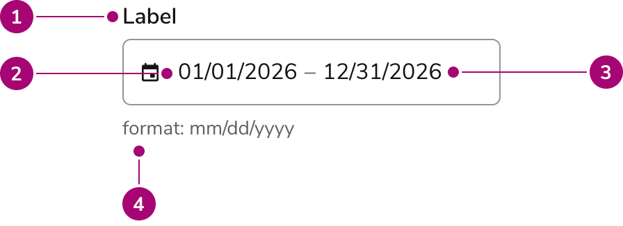
Date Field Range consists of six primary elements that enable users to select a start and end date through a single input field with calendar picker support.

<Frame>
  <div className="w-full h-full bg-[#FFFFFF] p-2 rounded flex items-center justify-center">
    <img src="https://mintcdn.com/servicetitan/66tZkkkyD48ugyZL/images/docs/web/components/date-field-range/design/date-field-range-anatomy.png?fit=max&auto=format&n=66tZkkkyD48ugyZL&q=85&s=cbc9e6b27955f4757d231ae793ded721" alt="Anatomy of the Date Field Range component" width="896" height="326" data-path="images/docs/web/components/date-field-range/design/date-field-range-anatomy.png" />
  </div>
</Frame>

1. **Label** - Identifies the field and its purpose
2. **Start date input** - Text input for manual start date entry with format mask
3. **End date input** - Text input for manual end date entry with format mask
4. **Helper text** (Optional) - Description, format hint or error message

## Options

Date Field Range supports the following configurations to accommodate different use cases and regional preferences.

### Date Format Modes

<LiveCode example="datefieldrange-mode" screenshot fullWidth>
  ```tsx lines theme={null}
  import { DateFieldRange, Flex } from "@servicetitan/anvil2";

  function App() {
    return (
      <Flex direction="column" gap="4" style={{ minWidth: "384px" }}>
        {/** US format (default) */}
        <DateFieldRange label="US Format" mode="mm/dd/yyyy" />

        {/** International format */}
        <DateFieldRange label="International Format" mode="dd/mm/yyyy" />
      </Flex>
    );
  }

  export default App;
  ```
</LiveCode>

Date Field Range supports two date format modes to match regional conventions. The default format is `mm/dd/yyyy` for US audiences, while `dd/mm/yyyy` is available for international users.

| Mode       | Format   | Use Case                  |
| ---------- | -------- | ------------------------- |
| mm/dd/yyyy | Default  | US date format            |
| dd/mm/yyyy | Optional | International date format |

### Sizes

<LiveCode example="datefieldrange-size" screenshot fullWidth>
  ```tsx lines theme={null}
  import { DateFieldRange, Flex } from "@servicetitan/anvil2";

  function App() {
    return (
      <Flex direction="column" gap="4" style={{ minWidth: "384px" }}>
        <DateFieldRange label="Small" size="small" />
        <DateFieldRange label="Medium" size="medium" />
        <DateFieldRange label="Large" size="large" />
      </Flex>
    );
  }

  export default App;
  ```
</LiveCode>

Three size options accommodate different layout densities and visual hierarchies.

| Size   | Height |
| ------ | ------ |
| Small  | 32px   |
| Medium | 40px   |
| Large  | 48px   |

## Behavior

Date Field Range responds to user interaction with distinct visual states and validation feedback.

### Visual States

<LiveCode example="datefieldrange-visual-states" screenshot fullWidth>
  ```tsx lines theme={null}
  import { DateFieldRange, Grid } from "@servicetitan/anvil2";

  function App() {
    return (
      <Grid gap="6">
        <DateFieldRange
          label="Reporting Period"
          defaultValue={{
            startDate: "2025-01-01",
            endDate: "2025-12-31",
          }}
          required
        />
        <DateFieldRange
          label="Reporting Period"
          defaultValue={{
            startDate: "2025-01-01",
            endDate: "2025-12-31",
          }}
          required
          disabled
        />
        <DateFieldRange
          label="Reporting Period"
          defaultValue={{
            startDate: "2025-12-31",
            endDate: "2025-01-01",
          }}
          required
          error="End date must be after start date"
        />
      </Grid>
    );
  }

  export default App;
  ```
</LiveCode>

The component displays different visual states to communicate field status and interactivity. Default state shows the field ready for input. Focus state highlights the active field. Error state displays validation messages when date ranges are invalid, start dates are after end dates, or required fields are empty. Disabled state prevents interaction while maintaining visual context.

### Calendar Interaction

Clicking the input field opens a popover calendar. Users can navigate months and select date ranges directly from the calendar. The calendar highlights the selected range and closes automatically after both dates are selected. Selected dates populate the input field with a separator between start and end dates.

### Validation

<LiveCode example="datefieldrange-validation" screenshot fullWidth>
  ```tsx lines theme={null}
  import { DateFieldRange } from "@servicetitan/anvil2";

  function App() {
    return (
      <DateFieldRange
        label="Reporting Period"
        error="End date must be after start date"
        required
      />
    );
  }

  export default App;
  ```
</LiveCode>

Date Field Range validates input in real time. The component checks for parseable dates, required field completion, date constraints (min/max dates), unavailable dates or days of the week, and logical range validation (start date must be before or equal to end date). Error messages appear below the field when validation fails.

## Usage Guidelines

### When to Use

Use Date Field Range when you need to:

* Capture a date span with both start and end dates
* Provide calendar visual context for range selection
* Support both manual entry and visual selection
* Validate date ranges against constraints like minimum or maximum dates

### When not to use

Avoid using Date Field Range for:

* **Single dates** - Use [Date Field Single](/docs/web/components/date-field-single/design) instead
* **Recurring date ranges without year** - Use [Date Field Yearless Range](/docs/web/components/date-field-yearless-range/design) for seasonal ranges or annual periods
* **Time selection** - Use [Time Field](/docs/web/components/time-field/design) for time-only inputs

### Alternatives

#### Date Field Range vs Date Field Yearless Range

Use Date Field Range when the year is essential to the date range selection, such as project timelines or reporting periods. Use Date Field Yearless Range when the year is irrelevant, such as recurring seasonal periods or annual date templates.

### How to Use

#### Labeling and Range Validation

Provide clear, descriptive labels that communicate the purpose of the date range selection. Labels should indicate what the range represents and establish the relationship between start and end dates. Implement validation that ensures logical date ranges and provides immediate feedback when constraints are violated.

<LiveCode example="datefieldrange-reporting-period" screenshot fullWidth>
  ```tsx lines theme={null}
  import { DateFieldRange } from "@servicetitan/anvil2";

  function App() {
    return (
      <DateFieldRange
        label="Date Range"
        description="Select the start and end dates for this period"
        required
      />
    );
  }

  export default App;
  ```
</LiveCode>

<DoDont type="do" />

* Write labels that clearly communicate the purpose of the date range selection
* Include format hints to guide users on expected input format
* Set appropriate date constraints (min/max dates) to prevent invalid selections
* Validate that start date is before or equal to end date
* Display validation errors immediately when they occur
* Use the calendar picker to provide visual range selection when helpful

#### Anti-pattern: Ambiguous Context and Invalid Ranges

Avoid creating confusion by omitting format guidance or allowing invalid date ranges without clear feedback.

<LiveCode example="datefieldrange-recurring-periods-dont" screenshot fullWidth>
  ```tsx lines theme={null}
  import { DateFieldRange } from "@servicetitan/anvil2";

  function App() {
    return <DateFieldRange label="Period" required />;
  }

  export default App;
  ```
</LiveCode>

<DoDont type="dont" />

* Use Date Field Range for recurring annual periods where year doesn't matter
* Omit format hints when the date format might be ambiguous to users
* Hide validation errors until form submission
* Allow start dates to be after end dates without clear error messaging
* Use placeholder text to show date format instead of format hints
* Create labels that don't clearly indicate what date range is being selected

## Content

Content within Date Field Range should be clear, concise, and actionable.

* Labels should clearly indicate what date range is being selected
* Error messages should explain why a date range is invalid and how to fix it
* Format hints should match the selected mode (mm/dd/yyyy or dd/mm/yyyy)
* Descriptions should provide context without overwhelming the user

## Keyboard Interaction

Users can navigate Date Field Range using standard keyboard controls.

### Input Field

| Key         | Description                            |
| ----------- | -------------------------------------- |
| Tab         | Moves focus to the next element        |
| Shift + Tab | Moves focus to the previous element    |
| Arrow Down  | Opens the calendar picker when focused |
| Esc         | Closes the calendar picker             |

### Calendar Picker

| Key               | Description                                       |
| ----------------- | ------------------------------------------------- |
| Arrow Left        | Moves focus to the previous day                   |
| Arrow Right       | Moves focus to the next day                       |
| Arrow Up          | Moves focus to the same day in the previous week  |
| Arrow Down        | Moves focus to the same day in the next week      |
| Page Up           | Moves focus to the same day in the previous month |
| Page Down         | Moves focus to the same day in the next month     |
| Shift + Page Up   | Moves focus to the same day in the previous year  |
| Shift + Page Down | Moves focus to the same day in the next year      |
| Enter             | Selects the focused date (for range selection)    |
| Space             | Selects the focused date (for range selection)    |
| Esc               | Closes the calendar picker                        |

### Accessibility

Date Field Range includes built-in accessibility features. The component supports full keyboard navigation and screen reader compatibility. Ensure labels are descriptive and error messages are clear for assistive technology users.

For more guidance on form field labels and context, see [input field context association best practices](/docs/accessibility/labels-and-ctas#input-field-context-association).