> ## Documentation Index
> Fetch the complete documentation index at: https://anvil.servicetitan.com/llms.txt
> Use this file to discover all available pages before exploring further.

# Days Of The Week – Design

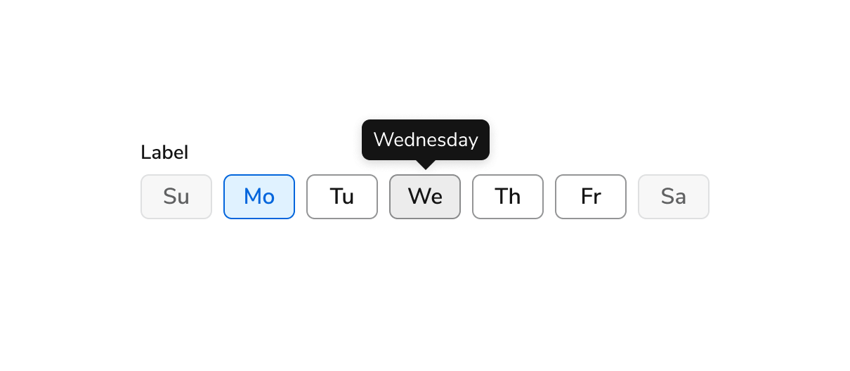
> Days of the Weeks are form elements that allow users to select days of the week.

export const LiveCode = ({children, customHeight, clickToLoad, example, fullWidth, fullHeight, hideCodeInLiveCode, screenshot, screenshotOnly, showCode: showCodeProp}) => {
  const SCREENSHOTS_BASE = "https://servicetitan.github.io/anvil2-docs-live-code/screenshots";
  const STACKBLITZ_BASE = "https://stackblitz.com/github/servicetitan/anvil2-docs-live-code/tree/main/examples";
  const [showCodeBlock, setShowCodeBlock] = useState(showCodeProp ?? false);
  const [isLocalOverride, setIsLocalOverride] = useState(false);
  useEffect(() => {
    const examplePath = `/images/live-code-screenshots-tmp/${example}.png`;
    fetch(examplePath, {
      method: "HEAD"
    }).then(r => {
      if (r.ok) setIsLocalOverride(true);
    }).catch(() => {});
  }, [example]);
  const screenshotBase = isLocalOverride ? "/images/live-code-screenshots-tmp" : SCREENSHOTS_BASE;
  if (screenshotOnly) {
    return <Frame className="flex flex-col">
        <div className="flex dark:hidden" style={{
      justifyContent: "center",
      alignItems: "center",
      width: fullWidth ? "100%" : "50%",
      minHeight: fullHeight ? "284px" : undefined,
      background: "#FFFFFF"
    }}>
          <img srcset={`${screenshotBase}/${example}.png, ${screenshotBase}/${example}-2x.png 2x`} src={`${screenshotBase}/${example}.png`} alt={example} noZoom />
        </div>
        <div className="hidden dark:flex" style={{
      justifyContent: "center",
      alignItems: "center",
      width: fullWidth ? "100%" : "50%",
      minHeight: fullHeight ? "284px" : undefined,
      background: "#141414"
    }}>
          <img srcset={`${screenshotBase}/${example}-dark.png, ${screenshotBase}/${example}-dark-2x.png 2x`} src={`${screenshotBase}/${example}-dark.png`} alt={example} noZoom />
        </div>
      </Frame>;
  }
  if (screenshot) {
    return <Frame className="flex flex-col -mb-2">
        <div className="flex dark:hidden bg-white dark:bg-codeblock border border-gray-950/10 dark:border-white/10 dark:twoslash-dark rounded-2xl overflow-hidden" style={{
      justifyContent: "center",
      alignItems: "center",
      width: fullWidth ? "100%" : "50%",
      minHeight: fullHeight ? "284px" : undefined
    }}>
          <img srcset={`${screenshotBase}/${example}.png, ${screenshotBase}/${example}-2x.png 2x`} src={`${screenshotBase}/${example}.png`} alt={example} noZoom />
        </div>

        <div className="hidden dark:flex bg-white dark:bg-codeblock border border-gray-950/10 dark:border-white/10 dark:twoslash-dark rounded-2xl overflow-hidden" style={{
      background: "#141414",
      justifyContent: "center",
      alignItems: "center",
      width: fullWidth ? "100%" : "50%",
      minHeight: fullHeight ? "284px" : undefined
    }}>
          <img srcset={`${screenshotBase}/${example}-dark.png, ${screenshotBase}/${example}-dark-2x.png 2x`} src={`${screenshotBase}/${example}-dark.png`} alt={example} noZoom />
        </div>

        <div className="flex justify-end items-center text-xs py-2 px-1 gap-4">
          {!showCodeProp ? <button className="inline-flex justify-end items-center text-gray-700 dark:text-gray-50 hover:text-blue-500 dark:hover:text-blue-300 transition-colors group self-end gap-1 cursor-pointer" onClick={() => setShowCodeBlock(!showCodeBlock)} style={{
      appearance: "none"
    }}>
              <Icon icon="code" size="12px" className="group-hover:bg-blue-500 dark:group-hover:bg-blue-300" />
              <span>{showCodeBlock ? "Hide code" : "Show code"}</span>
            </button> : null}

          <a className="inline-flex justify-end items-center hover:text-blue-500 dark:hover:text-blue-300 transition-colors group self-end gap-1" href={`${STACKBLITZ_BASE}/${example}?file=src/App.tsx`} target="_blank" rel="noreferrer">
            <Icon icon="bolt" size="12px" className="group-hover:bg-blue-500 dark:group-hover:bg-blue-300" />
            <span>StackBlitz demo</span>
          </a>
        </div>

        <div className="grid transition-[grid-template-rows] duration-300 ease-in-out overflow-auto overflow-y-hidden overflow-x-auto" style={showCodeBlock ? {
      gridTemplateRows: "1fr"
    } : {
      gridTemplateRows: "0fr"
    }}>
          <div style={{
      minHeight: 0,
      overflowX: "auto",
      overflowY: "hidden",
      marginBlockStart: "-1.25rem",
      marginBlockEnd: "-1.5rem"
    }}>
            {children}
          </div>
        </div>
      </Frame>;
  } else {
    return <div style={{
      display: "flex",
      width: fullWidth ? "100%" : "50%",
      minHeight: customHeight ? customHeight : "316px",
      resize: "vertical",
      overflow: "auto"
    }}>
        <iframe title={example} style={{
      flex: 1,
      width: fullWidth ? "100%" : "50%",
      minHeight: customHeight ? customHeight : "316px"
    }} src={`${STACKBLITZ_BASE}/${example}?embed=1&hideNavigation=1&hideExplorer=1&terminalHeight=0&file=src/App.tsx${clickToLoad ? "&ctl=1" : ""}${hideCodeInLiveCode ? "&view=preview" : ""}`} allow="accelerometer; ambient-light-sensor; camera; encrypted-media; geolocation; gyroscope; hid; microphone; midi; payment; usb; vr; xr-spatial-tracking" sandbox="allow-forms allow-modals allow-popups allow-presentation allow-same-origin allow-scripts" />
      </div>;
  }
};

export const CodePreviewPlaceholder = ({double, fullWidth}) => {
  const single = <div style={{
    width: fullWidth ? "100%" : "50%",
    borderRadius: "1rem",
    display: "flex",
    padding: "1rem",
    flexDirection: "column",
    gap: "0.5rem",
    height: "10rem",
    marginBlockEnd: "1rem"
  }} className="border-width-default border-color-subdued">
      <div className="bg-strong border-radius-large" style={{
    width: "100%",
    flexGrow: "1"
  }} />
      <div className="bg-strong border-radius-large" style={{
    width: "100%",
    flexGrow: "1"
  }} />
    </div>;
  return double ? <div style={{
    display: "flex",
    gap: "1rem"
  }}>
      {single}
      {single}
    </div> : single;
};

<Frame>
  <div className="w-full h-full bg-[#FFFFFF] p-2 rounded flex items-center justify-center">
    <img noZoom src="https://mintcdn.com/servicetitan/uz2PQSvO75TRhQ38/images/docs/web/components/shared/image-of-the-days-of-the-week-component-with-sundaysaturday-disabled-monday-selected-and-wednesday-hovered.png?fit=max&auto=format&n=uz2PQSvO75TRhQ38&q=85&s=c8e7492cf6ad70517034a7ae2f4361dd" width="1210" height="528" data-path="images/docs/web/components/shared/image-of-the-days-of-the-week-component-with-sundaysaturday-disabled-monday-selected-and-wednesday-hovered.png" />
  </div>
</Frame>

## Anatomy

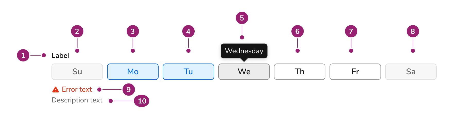
The Days of the Week consists of ten primary elements that work together to allow users to select days of the week.

<Frame>
  <div className="w-full h-full bg-[#FFFFFF] p-2 rounded flex items-center justify-center">
    <img
      src="https://mintcdn.com/servicetitan/lX6UhRsjMdTeB7y6/images/docs/web/components/days-of-the-week/design/anatomy-image-for-the-days-of-the-week-component.png?fit=max&auto=format&n=lX6UhRsjMdTeB7y6&q=85&s=1be447ed2a2a842a8be4db43b6280e17"
      alt="Anatomy image for the Days of the Week
component"
      width="1814"
      height="492"
      data-path="images/docs/web/components/days-of-the-week/design/anatomy-image-for-the-days-of-the-week-component.png"
    />
  </div>
</Frame>

1. Label
2. First day of the week (in disabled state)
3. Second day of the week (in checked state)
4. Third day of the week (in checked state)
5. Fourth day of the week (in hovered state, with tooltip with full name)
6. Fifth day of the week (in unchecked state)
7. Sixth day of the week (in unchecked state)
8. Seventh day of the week (in disabled state)
9. Hint/error text (in errored state)
10. Description text

## Options

The Days of the Week supports configurable start date configurations to accommodate various week representation scenarios.

### Default start date

<LiveCode example="daysoftheweek-playground" screenshot fullWidth>
  ```tsx lines theme={null}
  import { DaysOfTheWeek } from "@servicetitan/anvil2";
  import { useState } from "react";

  function App() {
    const [selectedDays, setSelectedDays] = useState<number[]>([]);

    return (
      <div style={{ minWidth: "20.5rem" }}>
        <DaysOfTheWeek
          selectedDays={selectedDays}
          onChange={setSelectedDays}
          label="Label text"
          hint="Hint text"
          description="Description text"
          // errorMessage="Error message"
          errorAriaLive="assertive"
          disabled={false}
          firstDay={7}
          required={false}
          moreInfo="More info"
        />
      </div>
    );
  }

  export default App;
  ```
</LiveCode>

By default, Days of the Week starts the week on Sunday.

### Configured start date

<LiveCode example="daysoftheweek-firstday" screenshot fullWidth>
  ```tsx lines theme={null}
  import { DaysOfTheWeek } from "@servicetitan/anvil2";
  import { useState } from "react";

  function App() {
    const [selectedDays, setSelectedDays] = useState<number[]>([]);

    return (
      <div style={{ minWidth: "20.5rem" }}>
        <DaysOfTheWeek
          selectedDays={selectedDays}
          onChange={setSelectedDays}
          firstDay={1}
        />
      </div>
    );
  }

  export default App;
  ```
</LiveCode>

This behavior is configurable. The first day of the week here is set to Monday.

## Behavior

The Days of the Week responds to user interaction with distinct visual states and responsive width behaviors.

### Visual States

#### Day States

Each day of the week can be unchecked, checked, or disabled. On hover, the day of the week displays the full name of the day.

<LiveCode example="daysoftheweek-data-interactive" screenshot fullWidth>
  ```tsx lines theme={null}
  import { DaysOfTheWeek, Flex } from "@servicetitan/anvil2";
  import { useState } from "react";

  function App() {
    const [selectedDaysUnchecked, setSelectedDaysUnchecked] = useState<number[]>(
      [],
    );
    const [selectedDaysChecked, setSelectedDaysChecked] = useState<number[]>([
      1, 2, 3, 4, 5, 6, 7,
    ]);
    const [selectedDaysDisabled, setSelectedDaysDisabled] = useState<number[]>(
      [],
    );

    return (
      <Flex direction="column" gap="8" style={{ minWidth: "20.5rem" }}>
        <DaysOfTheWeek
          selectedDays={selectedDaysUnchecked}
          onChange={setSelectedDaysUnchecked}
          label="All days unchecked"
          errorAriaLive="assertive"
          disabled={false}
          firstDay={7}
        />

        <DaysOfTheWeek
          selectedDays={selectedDaysChecked}
          onChange={setSelectedDaysChecked}
          label="All days checked"
          errorAriaLive="assertive"
          disabled={false}
          firstDay={7}
        />

        <DaysOfTheWeek
          selectedDays={selectedDaysDisabled}
          onChange={setSelectedDaysDisabled}
          label="All days disabled"
          errorAriaLive="assertive"
          disabled={true}
          firstDay={7}
        />
      </Flex>
    );
  }

  export default App;
  ```
</LiveCode>

### Responsive Behavior

Days of the Week shrinks to 328px wide and grows to a maximum of 748px wide.

<LiveCode example="daysoftheweek-width" screenshot fullWidth>
  ```tsx lines theme={null}
  import { DaysOfTheWeek, Flex } from "@servicetitan/anvil2";
  import { useState } from "react";

  function App() {
    const [selectedDaysSmall, setSelectedDaysSmall] = useState<number[]>([]);
    const [selectedDaysLarge, setSelectedDaysLarge] = useState<number[]>([]);

    return (
      <Flex direction="column" gap="8">
        <div style={{ width: "328px" }}>
          <DaysOfTheWeek
            selectedDays={selectedDaysSmall}
            onChange={setSelectedDaysSmall}
            label="Smallest size"
            errorAriaLive="assertive"
            moreInfo="More info"
          />
        </div>

        <div style={{ width: "748px" }}>
          <DaysOfTheWeek
            selectedDays={selectedDaysLarge}
            onChange={setSelectedDaysLarge}
            label="Largest size"
            errorAriaLive="assertive"
            moreInfo="More info"
          />
        </div>
      </Flex>
    );
  }

  export default App;
  ```
</LiveCode>

## Usage Guidelines

Use the Days of the Week when users need to select one or multiple days of the week within forms.

### When to Use

Use Days of the Week for selecting one or multiple days of the week within forms. Use for event-related scenarios that require selecting days of the week.

### How to Use

#### Accessible Labels

<Frame>
  <div className="w-full h-full bg-[#FFFFFF] p-2 rounded flex items-center justify-center">
    <img
      src="https://mintcdn.com/servicetitan/lX6UhRsjMdTeB7y6/images/docs/web/components/days-of-the-week/design/single-day-of-the-week-with-an-accessible-label-in-tooltip.png?fit=max&auto=format&n=lX6UhRsjMdTeB7y6&q=85&s=5fe0f26e8801bbe93dfc88cdb329dbb7"
      alt="Single day of the week with an accessible label in
tooltip"
      width="492"
      height="396"
      data-path="images/docs/web/components/days-of-the-week/design/single-day-of-the-week-with-an-accessible-label-in-tooltip.png"
    />
  </div>
</Frame>

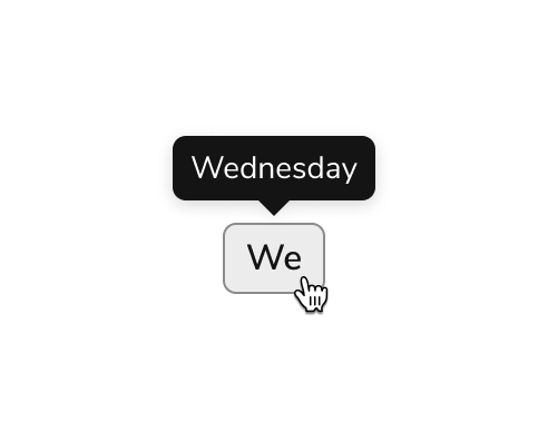
<Check>**Do**</Check>

Display the full day name on hover

<Frame>
  <div className="w-full h-full bg-[#FFFFFF] p-2 rounded flex items-center justify-center">
    <img
      src="https://mintcdn.com/servicetitan/lX6UhRsjMdTeB7y6/images/docs/web/components/days-of-the-week/design/a-hovered-single-day-without-an-accessible-label.png?fit=max&auto=format&n=lX6UhRsjMdTeB7y6&q=85&s=c267b5a694aac0a02c3121570d62d63d"
      alt="A hovered single day without an accessible
label"
      width="492"
      height="396"
      data-path="images/docs/web/components/days-of-the-week/design/a-hovered-single-day-without-an-accessible-label.png"
    />
  </div>
</Frame>

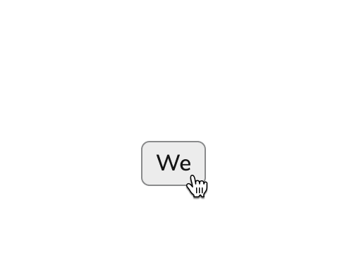
<Danger>**Don't**</Danger>

Omit an accessible label for the day on hover

#### Abbreviation

<LiveCode example="daysoftheweek-abbreviation-do" screenshot fullWidth>
  ```tsx lines theme={null}
  import { DaysOfTheWeek, Flex } from "@servicetitan/anvil2";
  import { useState } from "react";

  function App() {
    const [selectedDays, setSelectedDays] = useState<number[]>([]);

    return (
      <Flex style={{ minHeight: "97px", width: "328px" }} alignItems="center">
        <DaysOfTheWeek
          selectedDays={selectedDays}
          onChange={setSelectedDays}
          errorAriaLive="assertive"
        />
      </Flex>
    );
  }

  export default App;
  ```
</LiveCode>

<Check>**Do**</Check>

Use 2-letter abbreviations for day names (e.g., Mo, Tu, We)

<LiveCode example="daysoftheweek-abbreviation-dont" screenshot fullWidth>
  ```tsx lines theme={null}
  import { ButtonToggle, Flex } from "@servicetitan/anvil2";

  function App() {
    return (
      <Flex direction="column" gap="4">
        <Flex gap="4">
          <ButtonToggle size="medium">Sun</ButtonToggle>
          <ButtonToggle size="medium">Mon</ButtonToggle>
          <ButtonToggle size="medium">Tue</ButtonToggle>
          <ButtonToggle size="medium">Wed</ButtonToggle>
          <ButtonToggle size="medium">Thu</ButtonToggle>
          <ButtonToggle size="medium">Fri</ButtonToggle>
          <ButtonToggle size="medium">Sat</ButtonToggle>
        </Flex>

        <Flex gap="4">
          <ButtonToggle size="medium">Sunday</ButtonToggle>
          <ButtonToggle size="medium">Monday</ButtonToggle>
          <ButtonToggle size="medium">Tuesday</ButtonToggle>
          <ButtonToggle size="medium">Wednesday</ButtonToggle>
          <ButtonToggle size="medium">Thursday</ButtonToggle>
          <ButtonToggle size="medium">Friday</ButtonToggle>
          <ButtonToggle size="medium">Saturday</ButtonToggle>
        </Flex>
      </Flex>
    );
  }

  export default App;
  ```
</LiveCode>

<Danger>**Don't**</Danger>

Use three letter name abbreviations, or full day names with uneven widths.

## Content

Content within the Days of the Week should clearly communicate day selections through consistent abbreviations.

### How to abbreviate days of the week

* To keep interfaces clear and scannable, use two-letter abbreviations for days of the week (e.g., Mo, Tu, We). These are concise, easy to read at a glance, and align with how similar tools present this information.
* When possible, pair the abbreviation with a tooltip that shows the full day name on hover. This improves accessibility and helps avoid confusion, especially for less common abbreviations like "Tu" or "Th."

### Which day starts the week

* By default, weeks start on Sunday in the date recurrence picker. This setting is configurable from within the component.

## Keyboard Interaction

Users can navigate the Days of the Week using standard keyboard controls.

| Key            | Interaction           |
| -------------- | --------------------- |
| Space or Enter | Toggles checked state |

### Accessibility

Anvil provides most of the accessibility needs for Days of the Week out of the box, and only needs some additional considerations for library users.

For more guidance on form field labels and context, see [input field context association best practices](/docs/accessibility/labels-and-ctas#input-field-context-association).