> ## Documentation Index
> Fetch the complete documentation index at: https://anvil.servicetitan.com/llms.txt
> Use this file to discover all available pages before exploring further.

# Dialog – Design

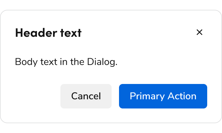
> Dialogs display content that temporarily blocks interactions within the main view of an interface.

export const LiveCode = ({children, customHeight, clickToLoad, example, fullWidth, fullHeight, hideCodeInLiveCode, screenshot, screenshotOnly, showCode: showCodeProp}) => {
  const SCREENSHOTS_BASE = "https://servicetitan.github.io/anvil2-docs-live-code/screenshots";
  const STACKBLITZ_BASE = "https://stackblitz.com/github/servicetitan/anvil2-docs-live-code/tree/main/examples";
  const [showCodeBlock, setShowCodeBlock] = useState(showCodeProp ?? false);
  const [isLocalOverride, setIsLocalOverride] = useState(false);
  useEffect(() => {
    const examplePath = `/images/live-code-screenshots-tmp/${example}.png`;
    fetch(examplePath, {
      method: "HEAD"
    }).then(r => {
      if (r.ok) setIsLocalOverride(true);
    }).catch(() => {});
  }, [example]);
  const screenshotBase = isLocalOverride ? "/images/live-code-screenshots-tmp" : SCREENSHOTS_BASE;
  if (screenshotOnly) {
    return <Frame className="flex flex-col">
        <div className="flex dark:hidden" style={{
      justifyContent: "center",
      alignItems: "center",
      width: fullWidth ? "100%" : "50%",
      minHeight: fullHeight ? "284px" : undefined,
      background: "#FFFFFF"
    }}>
          <img srcset={`${screenshotBase}/${example}.png, ${screenshotBase}/${example}-2x.png 2x`} src={`${screenshotBase}/${example}.png`} alt={example} noZoom />
        </div>
        <div className="hidden dark:flex" style={{
      justifyContent: "center",
      alignItems: "center",
      width: fullWidth ? "100%" : "50%",
      minHeight: fullHeight ? "284px" : undefined,
      background: "#141414"
    }}>
          <img srcset={`${screenshotBase}/${example}-dark.png, ${screenshotBase}/${example}-dark-2x.png 2x`} src={`${screenshotBase}/${example}-dark.png`} alt={example} noZoom />
        </div>
      </Frame>;
  }
  if (screenshot) {
    return <Frame className="flex flex-col -mb-2">
        <div className="flex dark:hidden bg-white dark:bg-codeblock border border-gray-950/10 dark:border-white/10 dark:twoslash-dark rounded-2xl overflow-hidden" style={{
      justifyContent: "center",
      alignItems: "center",
      width: fullWidth ? "100%" : "50%",
      minHeight: fullHeight ? "284px" : undefined
    }}>
          <img srcset={`${screenshotBase}/${example}.png, ${screenshotBase}/${example}-2x.png 2x`} src={`${screenshotBase}/${example}.png`} alt={example} noZoom />
        </div>

        <div className="hidden dark:flex bg-white dark:bg-codeblock border border-gray-950/10 dark:border-white/10 dark:twoslash-dark rounded-2xl overflow-hidden" style={{
      background: "#141414",
      justifyContent: "center",
      alignItems: "center",
      width: fullWidth ? "100%" : "50%",
      minHeight: fullHeight ? "284px" : undefined
    }}>
          <img srcset={`${screenshotBase}/${example}-dark.png, ${screenshotBase}/${example}-dark-2x.png 2x`} src={`${screenshotBase}/${example}-dark.png`} alt={example} noZoom />
        </div>

        <div className="flex justify-end items-center text-xs py-2 px-1 gap-4">
          {!showCodeProp ? <button className="inline-flex justify-end items-center text-gray-700 dark:text-gray-50 hover:text-blue-500 dark:hover:text-blue-300 transition-colors group self-end gap-1 cursor-pointer" onClick={() => setShowCodeBlock(!showCodeBlock)} style={{
      appearance: "none"
    }}>
              <Icon icon="code" size="12px" className="group-hover:bg-blue-500 dark:group-hover:bg-blue-300" />
              <span>{showCodeBlock ? "Hide code" : "Show code"}</span>
            </button> : null}

          <a className="inline-flex justify-end items-center hover:text-blue-500 dark:hover:text-blue-300 transition-colors group self-end gap-1" href={`${STACKBLITZ_BASE}/${example}?file=src/App.tsx`} target="_blank" rel="noreferrer">
            <Icon icon="bolt" size="12px" className="group-hover:bg-blue-500 dark:group-hover:bg-blue-300" />
            <span>StackBlitz demo</span>
          </a>
        </div>

        <div className="grid transition-[grid-template-rows] duration-300 ease-in-out overflow-auto overflow-y-hidden overflow-x-auto" style={showCodeBlock ? {
      gridTemplateRows: "1fr"
    } : {
      gridTemplateRows: "0fr"
    }}>
          <div style={{
      minHeight: 0,
      overflowX: "auto",
      overflowY: "hidden",
      marginBlockStart: "-1.25rem",
      marginBlockEnd: "-1.5rem"
    }}>
            {children}
          </div>
        </div>
      </Frame>;
  } else {
    return <div style={{
      display: "flex",
      width: fullWidth ? "100%" : "50%",
      minHeight: customHeight ? customHeight : "316px",
      resize: "vertical",
      overflow: "auto"
    }}>
        <iframe title={example} style={{
      flex: 1,
      width: fullWidth ? "100%" : "50%",
      minHeight: customHeight ? customHeight : "316px"
    }} src={`${STACKBLITZ_BASE}/${example}?embed=1&hideNavigation=1&hideExplorer=1&terminalHeight=0&file=src/App.tsx${clickToLoad ? "&ctl=1" : ""}${hideCodeInLiveCode ? "&view=preview" : ""}`} allow="accelerometer; ambient-light-sensor; camera; encrypted-media; geolocation; gyroscope; hid; microphone; midi; payment; usb; vr; xr-spatial-tracking" sandbox="allow-forms allow-modals allow-popups allow-presentation allow-same-origin allow-scripts" />
      </div>;
  }
};

export const CodePreviewPlaceholder = ({double, fullWidth}) => {
  const single = <div style={{
    width: fullWidth ? "100%" : "50%",
    borderRadius: "1rem",
    display: "flex",
    padding: "1rem",
    flexDirection: "column",
    gap: "0.5rem",
    height: "10rem",
    marginBlockEnd: "1rem"
  }} className="border-width-default border-color-subdued">
      <div className="bg-strong border-radius-large" style={{
    width: "100%",
    flexGrow: "1"
  }} />
      <div className="bg-strong border-radius-large" style={{
    width: "100%",
    flexGrow: "1"
  }} />
    </div>;
  return double ? <div style={{
    display: "flex",
    gap: "1rem"
  }}>
      {single}
      {single}
    </div> : single;
};

<Frame>
  <div className="w-full h-full bg-[#FFFFFF] p-2 rounded flex items-center justify-center">
    <img noZoom src="https://mintcdn.com/servicetitan/uz2PQSvO75TRhQ38/images/docs/web/components/shared/dialog-overview.png?fit=max&auto=format&n=uz2PQSvO75TRhQ38&q=85&s=9f61f5018d7c00d021f25afdfb70cf06" width="720" height="434" data-path="images/docs/web/components/shared/dialog-overview.png" />
  </div>
</Frame>

## Anatomy

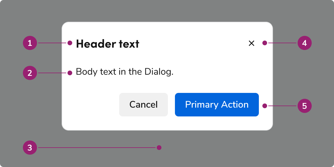
The Dialog consists of five primary elements that work together to temporarily block interactions within the main view.

<Frame>
  <div className="w-full h-full bg-[#FFFFFF] p-2 rounded flex items-center justify-center">
    <img
      src="https://mintcdn.com/servicetitan/lX6UhRsjMdTeB7y6/images/docs/web/components/dialog/design/anatomy-of-a-dialog.png?fit=max&auto=format&n=lX6UhRsjMdTeB7y6&q=85&s=0c3c39b3e3be580c6dcd431d341578aa"
      alt="Anatomy of a
Dialog"
      width="1138"
      height="568"
      data-path="images/docs/web/components/dialog/design/anatomy-of-a-dialog.png"
    />
  </div>
</Frame>

1. Header
2. Body content
3. Backdrop
4. Close action
5. Footer actions

## Options

The Dialog supports flexible content, footer actions, and sizing configurations to accommodate various modal scenarios.

### Body content

<LiveCode example="dialog-content" screenshot fullWidth>
  ```tsx lines theme={null}
  import {
    Dialog,
    Grid,
    Text,
    TextField,
    Radio,
    Flex,
    Button,
  } from "@servicetitan/anvil2";

  function App() {
    return (
      <div style={{ minWidth: "23rem", minHeight: "37rem" }}>
        <Dialog open>
          <Dialog.Header>Header text</Dialog.Header>
          <Dialog.Content>
            <Grid gap="6" flexGrow="1">
              <Text>
                Body text in the Dialog. Lorem ipsum dolor sit amet, consectetur
                adipiscing elit. Nunc nibh sem, ornare sit amet ultrices ac,
                malesuada ac nisi.
              </Text>

              <TextField label="Label" />
              <TextField label="Label" />

              <Radio.Group legend="Radio group header">
                <Radio name="role" value="designer" label="Apple" />
                <Radio name="role" value="developer" label="Banana" />
                <Radio name="role" value="pm" label="Carrot" />
              </Radio.Group>
            </Grid>
          </Dialog.Content>
          <Dialog.Footer>
            <Flex justifyContent="flex-end">
              <Flex gap="3">
                <Dialog.CancelButton>Cancel</Dialog.CancelButton>
                <Button appearance="primary">Primary Action</Button>
              </Flex>
            </Flex>
          </Dialog.Footer>
        </Dialog>
      </div>
    );
  }

  export default App;
  ```
</LiveCode>

Add any type of content into the body of a Dialog.

### Footer actions

<LiveCode example="dialog-footer" screenshot fullWidth>
  ```tsx lines theme={null}
  import { Dialog, Flex, Button } from "@servicetitan/anvil2";

  function App() {
    return (
      <div style={{ minWidth: "35rem", minHeight: "12rem" }}>
        <Dialog open size="large">
          <Dialog.Header>Header text</Dialog.Header>
          <Dialog.Content>Body text in the Dialog.</Dialog.Content>
          <Dialog.Footer>
            <Flex justifyContent="flex-end">
              <Flex gap="3">
                <Dialog.CancelButton>Cancel</Dialog.CancelButton>
                <Button appearance="primary">Primary Action</Button>
              </Flex>
            </Flex>
          </Dialog.Footer>
        </Dialog>
      </div>
    );
  }

  export default App;
  ```
</LiveCode>

<LiveCode example="dialog-footer-button-left" screenshot fullWidth>
  ```tsx lines theme={null}
  import { Dialog, Flex, Button } from "@servicetitan/anvil2";

  function App() {
    return (
      <div style={{ minWidth: "35rem", minHeight: "12rem" }}>
        <Dialog open size="large">
          <Dialog.Header>Header text</Dialog.Header>
          <Dialog.Content>Body text in the Dialog.</Dialog.Content>
          <Dialog.Footer>
            <Button>Back</Button>
            {/* spacer */}
            <Flex grow="1" />
            <Dialog.CancelButton>Cancel</Dialog.CancelButton>
            <Button appearance="primary">Next</Button>
          </Dialog.Footer>
        </Dialog>
      </div>
    );
  }

  export default App;
  ```
</LiveCode>

<LiveCode example="dialog-footer-link-left" screenshot fullWidth>
  ```tsx lines theme={null}
  import { Dialog, Link, Flex, Button } from "@servicetitan/anvil2";

  function App() {
    return (
      <div style={{ minWidth: "35rem", minHeight: "12rem" }}>
        <Dialog open size="large">
          <Dialog.Header>Header text</Dialog.Header>
          <Dialog.Content>Body text in the Dialog.</Dialog.Content>
          <Dialog.Footer style={{ flexWrap: "wrap", alignItems: "center" }}>
            <Link>Learn more</Link>
            <Flex grow="1" />
            <Flex wrap="wrap" justifyContent="flex-end" gap="2">
              <Dialog.CancelButton>Cancel</Dialog.CancelButton>
              <Button appearance="primary">Primary Action</Button>
            </Flex>
          </Dialog.Footer>
        </Dialog>
      </div>
    );
  }

  export default App;
  ```
</LiveCode>

<LiveCode example="dialog-footer-button-danger" screenshot fullWidth>
  ```tsx lines theme={null}
  import { Dialog, Flex, Button } from "@servicetitan/anvil2";

  function App() {
    return (
      <div style={{ minWidth: "35rem", minHeight: "12rem" }}>
        <Dialog open size="large">
          <Dialog.Header>Header text</Dialog.Header>
          <Dialog.Content>Body text in the Dialog.</Dialog.Content>
          <Dialog.Footer>
            <Flex justifyContent="flex-end">
              <Flex gap="3">
                <Dialog.CancelButton>Cancel</Dialog.CancelButton>
                <Button appearance="danger">Destructive Action</Button>
              </Flex>
            </Flex>
          </Dialog.Footer>
        </Dialog>
      </div>
    );
  }

  export default App;
  ```
</LiveCode>

### Sizing

The Dialog has 4 sizing options: medium (default), large, extra large, and fullscreen.

#### Default

<LiveCode example="dialog-size-medium" screenshot fullWidth>
  ```tsx lines theme={null}
  import { Dialog, Flex, Button } from "@servicetitan/anvil2";

  function App() {
    return (
      <div style={{ minWidth: "23rem", minHeight: "16rem" }}>
        <Dialog open>
          <Dialog.Header>Header text</Dialog.Header>
          <Dialog.Content>
            Body text in the Dialog. Lorem ipsum dolor sit amet, consectetur
            adipiscing elit. Nunc nibh sem, ornare sit amet ultrices ac, malesuada
            ac nisi.
          </Dialog.Content>
          <Dialog.Footer>
            <Flex justifyContent="flex-end">
              <Flex gap="3">
                <Dialog.CancelButton>Cancel</Dialog.CancelButton>
                <Button appearance="primary">Primary Action</Button>
              </Flex>
            </Flex>
          </Dialog.Footer>
        </Dialog>
      </div>
    );
  }

  export default App;
  ```
</LiveCode>

#### Large

<LiveCode example="dialog-size-large" screenshot fullWidth>
  ```tsx lines theme={null}
  import { Dialog, Flex, Button } from "@servicetitan/anvil2";

  function App() {
    return (
      <div style={{ minWidth: "35rem", minHeight: "15rem" }}>
        <Dialog open size="large">
          <Dialog.Header>Header text</Dialog.Header>
          <Dialog.Content>
            Body text in the Dialog. Lorem ipsum dolor sit amet, consectetur
            adipiscing elit. Nunc nibh sem, ornare sit amet ultrices ac, malesuada
            ac nisi.
          </Dialog.Content>
          <Dialog.Footer>
            <Flex justifyContent="flex-end">
              <Flex gap="3">
                <Dialog.CancelButton>Cancel</Dialog.CancelButton>
                <Button appearance="primary">Primary Action</Button>
              </Flex>
            </Flex>
          </Dialog.Footer>
        </Dialog>
      </div>
    );
  }

  export default App;
  ```
</LiveCode>

#### Extra Large

<LiveCode example="dialog-size-xlarge" screenshot fullWidth>
  ```tsx lines theme={null}
  import { Dialog, Flex, Button } from "@servicetitan/anvil2";

  function App() {
    return (
      <div style={{ minWidth: "70rem", minHeight: "13rem" }}>
        <Dialog open size="xlarge">
          <Dialog.Header>Header text</Dialog.Header>
          <Dialog.Content>
            Body text in the Dialog. Lorem ipsum dolor sit amet, consectetur
            adipiscing elit. Nunc nibh sem, ornare sit amet ultrices ac, malesuada
            ac nisi.
          </Dialog.Content>
          <Dialog.Footer>
            <Flex justifyContent="flex-end">
              <Flex gap="3">
                <Dialog.CancelButton>Cancel</Dialog.CancelButton>
                <Button appearance="primary">Primary Action</Button>
              </Flex>
            </Flex>
          </Dialog.Footer>
        </Dialog>
      </div>
    );
  }

  export default App;
  ```
</LiveCode>

#### Fullscreen

<LiveCode example="dialog-size-fullscreen-full-page" screenshot fullWidth>
  ```tsx lines theme={null}
  import { Dialog, Flex, Button } from "@servicetitan/anvil2";

  function App() {
    return (
      <div>
        <Dialog open fullScreen>
          <Dialog.Header>Header text</Dialog.Header>
          <Dialog.Content>
            Body text in the Dialog. Lorem ipsum dolor sit amet, consectetur
            adipiscing elit. Nunc nibh sem, ornare sit amet ultrices ac, malesuada
            ac nisi.
          </Dialog.Content>
          <Dialog.Footer>
            <Flex justifyContent="flex-end">
              <Flex gap="3">
                <Dialog.CancelButton>Cancel</Dialog.CancelButton>
                <Button appearance="primary">Primary Action</Button>
              </Flex>
            </Flex>
          </Dialog.Footer>
        </Dialog>
      </div>
    );
  }

  export default App;
  ```
</LiveCode>

### Sizing table

| Sizing           | Width           | Height | Max Height         |
| ---------------- | --------------- | ------ | ------------------ |
| Medium (default) | 22.5rem / 360px | auto   | 100% - (1rem \* 2) |
| Large            | 35rem / 560px   | auto   | 100% - (1rem \* 2) |
| Extra Large      | 70rem / 1120px  | auto   | 100% - (1rem \* 2) |
| Fullscreen       | 100%            | 100%   | –                  |

## Behavior

The Dialog responds to content overflow and scrolling requirements while maintaining focus management.

### Overflow handling

Content in the Dialog will wrap, rather than truncate. Header content will avoid colliding with the close action, while footer actions will wrap to the right, with the right-most actions being at the bottom. Footer actions can have a custom overflow behavior if needed.

<LiveCode example="dialog-footer-overflow" screenshot fullWidth>
  ```tsx lines theme={null}
  import { Dialog, Link, Flex, Button } from "@servicetitan/anvil2";

  function App() {
    return (
      <div style={{ minWidth: "23rem", minHeight: "12rem" }}>
        <Dialog open>
          <Dialog.Header>Header text</Dialog.Header>
          <Dialog.Content>Body text in the Dialog.</Dialog.Content>
          <Dialog.Footer style={{ flexWrap: "wrap", alignItems: "center" }}>
            <Link>Learn more</Link>
            <Flex grow="1" />
            <Flex wrap="wrap" justifyContent="flex-end" gap="2">
              <Dialog.CancelButton>Cancel</Dialog.CancelButton>
              <Button appearance="primary">Primary</Button>
            </Flex>
          </Dialog.Footer>
        </Dialog>
      </div>
    );
  }

  export default App;
  ```
</LiveCode>

<LiveCode example="dialog-footer-overflow-wrap-link" screenshot fullWidth>
  ```tsx lines theme={null}
  import { Dialog, Link, Flex, Button } from "@servicetitan/anvil2";
  import { core } from "@servicetitan/anvil2/token";

  function App() {
    return (
      <div style={{ minWidth: "23rem", minHeight: "15rem" }}>
        <Dialog open>
          <Dialog.Header>Header text</Dialog.Header>
          <Dialog.Content>Body text in the Dialog.</Dialog.Content>
          <Dialog.Footer style={{ flexWrap: "wrap" }}>
            <Link
              style={{
                marginTop: core.primitive?.Size2?.value,
                marginBottom: core.primitive?.Size2?.value,
              }}
            >
              Learn more
            </Link>
            <Flex wrap="wrap" justifyContent="flex-end" gap="2">
              <Dialog.CancelButton>Cancel</Dialog.CancelButton>
              <Button appearance="primary">Primary Action</Button>
            </Flex>
          </Dialog.Footer>
        </Dialog>
      </div>
    );
  }

  export default App;
  ```
</LiveCode>

<LiveCode example="dialog-footer-overflow-wrap-button" screenshot fullWidth>
  ```tsx lines theme={null}
  import { Dialog, Link, Flex, Button } from "@servicetitan/anvil2";
  import { core } from "@servicetitan/anvil2/token";

  function App() {
    return (
      <div style={{ minWidth: "23rem", minHeight: "18rem" }}>
        <Dialog open>
          <Dialog.Header>Header text</Dialog.Header>
          <Dialog.Content>Body text in the Dialog.</Dialog.Content>
          <Dialog.Footer style={{ flexWrap: "wrap" }}>
            <Link
              style={{
                marginTop: core.primitive?.Size2?.value,
                marginBottom: core.primitive?.Size2?.value,
              }}
            >
              Learn more
            </Link>
            <Flex wrap="wrap" justifyContent="flex-end" gap="2">
              <Dialog.CancelButton>A Longer Secondary Action</Dialog.CancelButton>
              <Button appearance="primary">Primary Action</Button>
            </Flex>
          </Dialog.Footer>
        </Dialog>
      </div>
    );
  }

  export default App;
  ```
</LiveCode>

### Scrolling

The body region of the Dialog will scroll when space is not available. The Dialog's height will fill the height of the browser window (minus 1 rem top and bottom margins), and scroll past that point.

<LiveCode example="dialog-scrolling" screenshot fullWidth>
  ```tsx lines theme={null}
  import { Dialog, Flex, Button } from "@servicetitan/anvil2";

  function App() {
    return (
      <div style={{ minWidth: "23rem", minHeight: "37rem" }}>
        <Dialog open>
          <Dialog.Header>Header text</Dialog.Header>
          <Dialog.Content>
            Lorem ipsum dolor sit amet, consectetur adipiscing elit. Etiam sit
            amet est eget est dapibus molestie. Phasellus ornare egestas turpis,
            sit amet auctor ligula pharetra non. Duis et tellus vel lacus
            pellentesque semper. Integer tempor, sapien maximus auctor
            pellentesque, felis nibh vehicula justo, ut consequat mauris sem a
            justo. Donec rutrum, velit bibendum condimentum ornare, eros justo
            sagittis metus, eget blandit sapien lectus eget lacus. Proin non arcu
            maximus, gravida odio et, faucibus turpis. Nam venenatis, elit at
            ultricies aliquet, nunc mi bibendum risus, et maximus tellus purus a
            eros. Aliquam vitae pulvinar velit, a accumsan magna. Maecenas aliquet
            varius augue, vitae fermentum magna suscipit et. Curabitur fringilla
            arcu sit amet lorem porttitor, vel mattis ligula dapibus. Vivamus et
            ornare quam. Curabitur sapien odio, interdum quis erat facilisis,
            convallis congue tellus. Nulla dui sem, mattis eu ornare quis,
            tristique a leo. Vivamus ac magna turpis. Vivamus tempus, metus ut
            aliquam rhoncus, leo sem lobortis arcu, sed lobortis justo mi varius
            turpis. Integer volutpat metus non elit tincidunt accumsan sed a erat.
            Proin dapibus, lectus et tempor laoreet, odio massa ullamcorper velit,
            nec luctus nisi sem at sem. Aliquam erat volutpat. Quisque egestas
            interdum urna. Vivamus ac lacus felis. Donec justo ex, convallis sit
            amet justo et, condimentum lacinia dolor. Fusce consequat iaculis
            metus eu iaculis. Duis consectetur leo id tortor luctus, quis lobortis
            lectus varius. Orci varius natoque penatibus et magnis dis parturient
            montes, nascetur ridiculus mus. Praesent vitae consectetur mi.
          </Dialog.Content>
          <Dialog.Footer sticky>
            <Flex justifyContent="flex-end">
              <Flex gap="3">
                <Dialog.CancelButton>Cancel</Dialog.CancelButton>
                <Button appearance="primary">Primary Action</Button>
              </Flex>
            </Flex>
          </Dialog.Footer>
        </Dialog>
      </div>
    );
  }

  export default App;
  ```
</LiveCode>

## Usage Guidelines

Use the Dialog to bring focus to important tasks that require user action before continuing.

### When to Use

Use Dialogs to bring focus to important tasks. Situations that require user action before continuing, confirmations, and quick, infrequent tasks are among the most common use cases.

Dialogs are interruptive UIs by design. They limit what users can do and may disorient users when used mid-flow. Use Dialogs only as needed.

#### Use Dialogs to confirm important user actions

Use Dialogs to confirm important, higher-risk actions. Destructive, hard to reverse decisions particularly benefit from Dialog usage. Not all actions require a confirmation; use only as needed.

<LiveCode example="dialog-confirm-do" screenshot fullWidth>
  ```tsx lines theme={null}
  import { Dialog, Flex, Button } from "@servicetitan/anvil2";

  function App() {
    return (
      <div style={{ minWidth: "23rem", minHeight: "12rem" }}>
        <Dialog enableScrollChaining open>
          <Dialog.Header>Discard unsaved changes?</Dialog.Header>
          <Dialog.Content>This cannot be undone.</Dialog.Content>
          <Dialog.Footer>
            <Flex justifyContent="flex-end">
              <Flex gap="3">
                <Dialog.CancelButton>Cancel</Dialog.CancelButton>
                <Button appearance="danger">Discard Changes</Button>
              </Flex>
            </Flex>
          </Dialog.Footer>
        </Dialog>
      </div>
    );
  }

  export default App;
  ```
</LiveCode>

<Check>**Do**</Check>

### When not to use

#### Don't overuse Dialogs

It is easy to overuse Dialogs in flows, particularly in complex UIs. In general, it is better to reduce Dialog usage to only what is needed, and find alternatives to surface information on the page.

Dialogs have many downsides. They:

* Restrict a user's ability to perform other tasks.
* Block other content on the screen.
* Can be difficult for users to find and relocate.
* Are difficult to directly link to.
* Add additional interaction steps to both open and close.

### Don't use Dialogs to communicate errors

Using a Dialog to convey errors is an anti-pattern. It requires a user to actively remember its contents once the Dialog is closed. See the [error pattern](/docs/web/patterns/errors-and-warnings) for alternatives.

<LiveCode example="dialog-error-dont" screenshot fullWidth>
  ```tsx lines theme={null}
  import { Dialog, Flex, Button } from "@servicetitan/anvil2";

  function App() {
    return (
      <div style={{ minWidth: "23rem", minHeight: "18rem" }}>
        <Dialog enableScrollChaining open>
          <Dialog.Header>There were errors with the submission</Dialog.Header>
          <Dialog.Content>
            <ul style={{ margin: 0 }}>
              <li>Password must be at least 8 characters.</li>
              <li>Submitted password was used in the last 6 months.</li>
            </ul>
          </Dialog.Content>
          <Dialog.Footer>
            <Flex justifyContent="flex-end">
              <Flex gap="3">
                <Dialog.CancelButton>Cancel</Dialog.CancelButton>
                <Button appearance="primary">Save</Button>
              </Flex>
            </Flex>
          </Dialog.Footer>
        </Dialog>
      </div>
    );
  }

  export default App;
  ```
</LiveCode>

<Danger>**Don't**</Danger>

### Alternatives

#### Dialog vs Alert

Dialogs are interruptive by design, while an Alert is non-disruptive. Prefer using an Alert when information needs to be conveyed, only using a Dialog when there is a clear need to interrupt a flow, such as a confirmation of destructive or irreversible actions.

#### Dialog vs Drawer

|                                                                        | Dialog                       | Drawer                                                                |
| ---------------------------------------------------------------------- | ---------------------------- | --------------------------------------------------------------------- |
| Complete a secondary task                                              | Simple, one step tasks       | 1-3 steps at most. Tasks with more steps should be on a separate page |
| Display additional information related to the context in the main page | Yes, ideal for short content | Yes, ideal for longer, more complex information                       |
| Confirm user actions                                                   | Yes                          | No                                                                    |

#### Dialog vs Popover

Both Dialogs and Popovers overlay elements on the page. Dialogs are preferable when a situation requires user attention and for more complicated flows.

|                                   | Popover                           | Dialog                      |
| --------------------------------- | --------------------------------- | --------------------------- |
| Content allowed in the container? | Any content                       | Any content                 |
| Complexity of content?            | From simple to a few interactions | From simple to high complex |
| Backdrop applied to page?         | No                                | Yes                         |

### How to Use

#### Multi-step Dialogs

Dialogs of all sizes may involve multiple steps. We recommend using the footer arrangement shown for user navigation. Adjust the final step's primary action copy as needed.

<LiveCode example="dialog-multistep-do" screenshot fullWidth>
  ```tsx lines theme={null}
  import { Dialog, Flex, Button } from "@servicetitan/anvil2";

  function App() {
    return (
      <div style={{ minWidth: "35rem", minHeight: "12rem" }}>
        <Dialog enableScrollChaining open size="large">
          <Dialog.Header>Header text</Dialog.Header>
          <Dialog.Content>Body text in the Dialog.</Dialog.Content>
          <Dialog.Footer>
            <Button>Back</Button>
            {/* spacer */}
            <Flex grow="1" />
            <Dialog.CancelButton>Cancel</Dialog.CancelButton>
            <Button appearance="primary">Next</Button>
          </Dialog.Footer>
        </Dialog>
      </div>
    );
  }

  export default App;
  ```
</LiveCode>

<Check>**Do**</Check>

<LiveCode example="dialog-multistep-final-do" screenshot fullWidth>
  ```tsx lines theme={null}
  import { Dialog, Flex, Button } from "@servicetitan/anvil2";

  function App() {
    return (
      <div style={{ minWidth: "35rem", minHeight: "12rem" }}>
        <Dialog enableScrollChaining open size="large">
          <Dialog.Header>Header text</Dialog.Header>
          <Dialog.Content>Body text in the Dialog.</Dialog.Content>
          <Dialog.Footer>
            <Button>Back</Button>
            {/* spacer */}
            <Flex grow="1" />
            <Dialog.CancelButton>Cancel</Dialog.CancelButton>
            <Button appearance="primary">Done</Button>
          </Dialog.Footer>
        </Dialog>
      </div>
    );
  }

  export default App;
  ```
</LiveCode>

<Check>**Do**</Check>

#### Forms in Dialogs

A form can exist within a Dialog. Beyond the [standard usage guidance to Forms](/docs/web/patterns/forms), small Dialogs should especially keep form length low, and make use of multi-steps when needed. Fullscreen Dialogs may use forms as complex as an ordinary page.

<LiveCode example="dialog-form-do" screenshot fullWidth>
  ```tsx lines theme={null}
  import {
    Dialog,
    Grid,
    TextField,
    Radio,
    Flex,
    Button,
  } from "@servicetitan/anvil2";

  function App() {
    return (
      <div style={{ minWidth: "23rem", minHeight: "22rem" }}>
        <Dialog enableScrollChaining open>
          <Dialog.Header>Header text</Dialog.Header>
          <Dialog.Content>
            <Grid gap="6">
              <TextField label="Email Address" />

              <Radio.Group legend="Permissions">
                <Radio name="role" value="edit" label="Can view" checked />
                <Radio name="role" value="view" label="Can edit" />
              </Radio.Group>
            </Grid>
          </Dialog.Content>
          <Dialog.Footer>
            <Flex justifyContent="flex-end">
              <Flex gap="3">
                <Dialog.CancelButton>Cancel</Dialog.CancelButton>
                <Button appearance="primary">Share</Button>
              </Flex>
            </Flex>
          </Dialog.Footer>
        </Dialog>
      </div>
    );
  }

  export default App;
  ```
</LiveCode>

<Check>**Do**</Check>

#### Avoid stacking smaller Dialogs together

<LiveCode example="dialog-nested-dont" screenshot fullWidth>
  ```tsx lines theme={null}
  import { Dialog, Flex, Button } from "@servicetitan/anvil2";

  function App() {
    return (
      <div style={{ minWidth: "35rem", minHeight: "19rem" }}>
        <Dialog enableScrollChaining open size="large">
          <Dialog.Header>Header text</Dialog.Header>
          <Dialog.Content>
            Body text in the Dialog. Lorem ipsum dolor sit amet, consectetur
            adipiscing elit. Nunc nibh sem, ornare sit amet ultrices ac, malesuada
            ac nisi.
            <br />
            Body text in the Dialog. Lorem ipsum dolor sit amet, consectetur
            adipiscing elit. Nunc nibh sem, ornare sit amet ultrices ac, malesuada
            ac nisi.
          </Dialog.Content>
          <Dialog.Footer>
            <Button>Back</Button>
            {/* spacer */}
            <Flex grow="1" />
            <Dialog.CancelButton>Cancel</Dialog.CancelButton>
            <Button appearance="primary">Next</Button>
          </Dialog.Footer>
        </Dialog>
        <Dialog enableScrollChaining open>
          <Dialog.Header>Discard unsaved changes?</Dialog.Header>
          <Dialog.Content>This cannot be undone.</Dialog.Content>
          <Dialog.Footer sticky>
            <Flex justifyContent="flex-end">
              <Flex gap="3">
                <Dialog.CancelButton>Cancel</Dialog.CancelButton>
                <Button appearance="danger">Discard Changes</Button>
              </Flex>
            </Flex>
          </Dialog.Footer>
        </Dialog>
      </div>
    );
  }

  export default App;
  ```
</LiveCode>

<Danger>**Don't**</Danger>

#### Stacking a Dialog with a fullscreen Dialog

Since a fullscreen Dialog mimics a standard page, stack a smaller Dialog as needed.

<LiveCode example="dialog-nested-fullscreen-do-full-page" screenshot fullWidth>
  ```tsx lines theme={null}
  import { Dialog, Flex, Button } from "@servicetitan/anvil2";

  function App() {
    return (
      <div>
        <Dialog enableScrollChaining open fullScreen>
          <Dialog.Header>Header text</Dialog.Header>
          <Dialog.Content>
            Body text in the Dialog. Lorem ipsum dolor sit amet, consectetur
            adipiscing elit. Nunc nibh sem, ornare sit amet ultrices ac, malesuada
            ac nisi.
            <br />
            Body text in the Dialog. Lorem ipsum dolor sit amet, consectetur
            adipiscing elit. Nunc nibh sem, ornare sit amet ultrices ac, malesuada
            ac nisi.
            <br />
            Body text in the Dialog. Lorem ipsum dolor sit amet, consectetur
            adipiscing elit. Nunc nibh sem, ornare sit amet ultrices ac, malesuada
            ac nisi.
            <br />
            Body text in the Dialog. Lorem ipsum dolor sit amet, consectetur
            adipiscing elit. Nunc nibh sem, ornare sit amet ultrices ac, malesuada
            ac nisi.
          </Dialog.Content>
          <Dialog.Footer>
            <Button>Back</Button>
            {/* spacer */}
            <Flex grow="1" />
            <Dialog.CancelButton>Cancel</Dialog.CancelButton>
            <Button appearance="primary">Next</Button>
          </Dialog.Footer>
        </Dialog>
        <Dialog enableScrollChaining open>
          <Dialog.Header>Discard unsaved changes?</Dialog.Header>
          <Dialog.Content>This cannot be undone.</Dialog.Content>
          <Dialog.Footer sticky>
            <Flex justifyContent="flex-end">
              <Flex gap="3">
                <Dialog.CancelButton>Cancel</Dialog.CancelButton>
                <Button appearance="danger">Discard Changes</Button>
              </Flex>
            </Flex>
          </Dialog.Footer>
        </Dialog>
      </div>
    );
  }

  export default App;
  ```
</LiveCode>

<Check>**Do**</Check>

## Content

Content within the Dialog should be concise, actionable, and clearly communicate the task or information.

### Write titles as verbs

Titles should have a clear verb + noun question or statement.

<LiveCode example="dialog-header-verb-do" screenshot fullWidth>
  ```tsx lines theme={null}
  import { Text, Grid } from "@servicetitan/anvil2";

  function App() {
    return (
      <Grid gap="6" placeContent="center">
        <Text variant="headline" el="h1">
          Edit customer information
        </Text>
        <Text variant="headline" el="h1">
          Delete message?
        </Text>
        <Text variant="headline" el="h1">
          Discard unsaved changes?
        </Text>
      </Grid>
    );
  }

  export default App;
  ```
</LiveCode>

<Check>**Do**</Check>

<LiveCode example="dialog-header-verb-dont" screenshot fullWidth>
  ```tsx lines theme={null}
  import { Text, Grid } from "@servicetitan/anvil2";

  function App() {
    return (
      <Grid gap="6" placeContent="center">
        <Text variant="headline" el="h1">
          Edit the service agreement for this customer
        </Text>
        <Text variant="headline" el="h1">
          Are you sure you want to remove the invoice?
        </Text>
        <Text variant="headline" el="h1">
          Delete?
        </Text>
      </Grid>
    );
  }

  export default App;
  ```
</LiveCode>

<Danger>**Don't**</Danger>

### Make body content concise and actionable

Use imperative verbs when telling users what they need to know or do. Don't use permissive language like "you can".

<LiveCode example="dialog-content-concise-do" screenshot fullWidth>
  ```tsx lines theme={null}
  import { Text, Grid } from "@servicetitan/anvil2";

  function App() {
    return (
      <Grid gap="6" placeContent="center">
        <Text>Notification emails will be sent to this address.</Text>
        <Text>This cannot be undone.</Text>
      </Grid>
    );
  }

  export default App;
  ```
</LiveCode>

<Check>**Do**</Check>

<LiveCode example="dialog-content-concise-dont" screenshot fullWidth>
  ```tsx lines theme={null}
  import { Text, Grid } from "@servicetitan/anvil2";

  function App() {
    return (
      <Grid gap="6" placeContent="center">
        <Text>You can edit the email address where emails will be sent.</Text>
        <Text>
          Are you sure you want to delete this job? You can’t reverse this.
        </Text>
      </Grid>
    );
  }

  export default App;
  ```
</LiveCode>

<Danger>**Don't**</Danger>

### Buttons should be clear, predictable, and action-oriented

Users should be able to predict what will happen when they click a button.

Lead with a strong verb that encourages action. Use a verb/noun pair on actions in most cases. Common actions like Save, Close, or Cancel do not require an accompanying noun.

<LiveCode example="dialog-footer-action-oriented-do" screenshot fullWidth>
  ```tsx lines theme={null}
  import { Button, Grid } from "@servicetitan/anvil2";

  function App() {
    return (
      <Grid gap="6" placeContent="center">
        <Button appearance="primary">Create Order</Button>
        <Button appearance="primary">Print Label</Button>
      </Grid>
    );
  }

  export default App;
  ```
</LiveCode>

<Check>**Do**</Check>

<LiveCode example="dialog-footer-action-oriented-dont" screenshot fullWidth>
  ```tsx lines theme={null}
  import { Button, Grid } from "@servicetitan/anvil2";

  function App() {
    return (
      <Grid gap="6" placeContent="center">
        <Button appearance="primary">New Invoice</Button>
        <Button appearance="primary">Schedule</Button>
      </Grid>
    );
  }

  export default App;
  ```
</LiveCode>

<Danger>**Don't**</Danger>

## Keyboard Interaction

Users can navigate the Dialog using standard keyboard controls.

| Key    | Interaction                                        |
| ------ | -------------------------------------------------- |
| Tab    | Cycles through tab-able elements within the Dialog |
| Escape | Closes the Dialog                                  |

### Accessibility

#### Focus management

There are a few different things to keep in mind with the Dialog's focus / keyboard behavior.

##### Trap focus within the Dialog

By default, the Dialog will trap focus within itself. Elements outside of the Dialog would not be accessible by keyboard, unless another element itself took the focus.

##### First focus management

What element the Dialog focuses on open is dependent on a few factors:

* If the body content has a focus-able element, the Dialog will focus on the first of these elements.
* If the body does not have have an element, then the following is the preferred first-focus element:
  * With no actions at all, focus first on the close action.
  * When a primary action exists, focus first on the primary action.
  * When a primary destructive action exists, focus first on the secondary cancel action.

##### Return focus on close

When a Dialog is closed and the original context that triggered the Dialog is still present, focus should return to the element that triggered the Dialog.

For more guidance on focus management with dynamic content, see [changing content best practices](/docs/accessibility/changing-content).