> ## Documentation Index
> Fetch the complete documentation index at: https://anvil.servicetitan.com/llms.txt
> Use this file to discover all available pages before exploring further.

# Divider – Design

> Dividers are thin lines that separate content.

export const LiveCode = ({children, customHeight, clickToLoad, example, fullWidth, fullHeight, hideCodeInLiveCode, screenshot, screenshotOnly, showCode: showCodeProp}) => {
  const SCREENSHOTS_BASE = "https://servicetitan.github.io/anvil2-docs-live-code/screenshots";
  const STACKBLITZ_BASE = "https://stackblitz.com/github/servicetitan/anvil2-docs-live-code/tree/main/examples";
  const [showCodeBlock, setShowCodeBlock] = useState(showCodeProp ?? false);
  const [isLocalOverride, setIsLocalOverride] = useState(false);
  useEffect(() => {
    const examplePath = `/images/live-code-screenshots-tmp/${example}.png`;
    fetch(examplePath, {
      method: "HEAD"
    }).then(r => {
      if (r.ok) setIsLocalOverride(true);
    }).catch(() => {});
  }, [example]);
  const screenshotBase = isLocalOverride ? "/images/live-code-screenshots-tmp" : SCREENSHOTS_BASE;
  if (screenshotOnly) {
    return <Frame className="flex flex-col">
        <div className="flex dark:hidden" style={{
      justifyContent: "center",
      alignItems: "center",
      width: fullWidth ? "100%" : "50%",
      minHeight: fullHeight ? "284px" : undefined,
      background: "#FFFFFF"
    }}>
          <img srcset={`${screenshotBase}/${example}.png, ${screenshotBase}/${example}-2x.png 2x`} src={`${screenshotBase}/${example}.png`} alt={example} noZoom />
        </div>
        <div className="hidden dark:flex" style={{
      justifyContent: "center",
      alignItems: "center",
      width: fullWidth ? "100%" : "50%",
      minHeight: fullHeight ? "284px" : undefined,
      background: "#141414"
    }}>
          <img srcset={`${screenshotBase}/${example}-dark.png, ${screenshotBase}/${example}-dark-2x.png 2x`} src={`${screenshotBase}/${example}-dark.png`} alt={example} noZoom />
        </div>
      </Frame>;
  }
  if (screenshot) {
    return <Frame className="flex flex-col -mb-2">
        <div className="flex dark:hidden bg-white dark:bg-codeblock border border-gray-950/10 dark:border-white/10 dark:twoslash-dark rounded-2xl overflow-hidden" style={{
      justifyContent: "center",
      alignItems: "center",
      width: fullWidth ? "100%" : "50%",
      minHeight: fullHeight ? "284px" : undefined
    }}>
          <img srcset={`${screenshotBase}/${example}.png, ${screenshotBase}/${example}-2x.png 2x`} src={`${screenshotBase}/${example}.png`} alt={example} noZoom />
        </div>

        <div className="hidden dark:flex bg-white dark:bg-codeblock border border-gray-950/10 dark:border-white/10 dark:twoslash-dark rounded-2xl overflow-hidden" style={{
      background: "#141414",
      justifyContent: "center",
      alignItems: "center",
      width: fullWidth ? "100%" : "50%",
      minHeight: fullHeight ? "284px" : undefined
    }}>
          <img srcset={`${screenshotBase}/${example}-dark.png, ${screenshotBase}/${example}-dark-2x.png 2x`} src={`${screenshotBase}/${example}-dark.png`} alt={example} noZoom />
        </div>

        <div className="flex justify-end items-center text-xs py-2 px-1 gap-4">
          {!showCodeProp ? <button className="inline-flex justify-end items-center text-gray-700 dark:text-gray-50 hover:text-blue-500 dark:hover:text-blue-300 transition-colors group self-end gap-1 cursor-pointer" onClick={() => setShowCodeBlock(!showCodeBlock)} style={{
      appearance: "none"
    }}>
              <Icon icon="code" size="12px" className="group-hover:bg-blue-500 dark:group-hover:bg-blue-300" />
              <span>{showCodeBlock ? "Hide code" : "Show code"}</span>
            </button> : null}

          <a className="inline-flex justify-end items-center hover:text-blue-500 dark:hover:text-blue-300 transition-colors group self-end gap-1" href={`${STACKBLITZ_BASE}/${example}?file=src/App.tsx`} target="_blank" rel="noreferrer">
            <Icon icon="bolt" size="12px" className="group-hover:bg-blue-500 dark:group-hover:bg-blue-300" />
            <span>StackBlitz demo</span>
          </a>
        </div>

        <div className="grid transition-[grid-template-rows] duration-300 ease-in-out overflow-auto overflow-y-hidden overflow-x-auto" style={showCodeBlock ? {
      gridTemplateRows: "1fr"
    } : {
      gridTemplateRows: "0fr"
    }}>
          <div style={{
      minHeight: 0,
      overflowX: "auto",
      overflowY: "hidden",
      marginBlockStart: "-1.25rem",
      marginBlockEnd: "-1.5rem"
    }}>
            {children}
          </div>
        </div>
      </Frame>;
  } else {
    return <div style={{
      display: "flex",
      width: fullWidth ? "100%" : "50%",
      minHeight: customHeight ? customHeight : "316px",
      resize: "vertical",
      overflow: "auto"
    }}>
        <iframe title={example} style={{
      flex: 1,
      width: fullWidth ? "100%" : "50%",
      minHeight: customHeight ? customHeight : "316px"
    }} src={`${STACKBLITZ_BASE}/${example}?embed=1&hideNavigation=1&hideExplorer=1&terminalHeight=0&file=src/App.tsx${clickToLoad ? "&ctl=1" : ""}${hideCodeInLiveCode ? "&view=preview" : ""}`} allow="accelerometer; ambient-light-sensor; camera; encrypted-media; geolocation; gyroscope; hid; microphone; midi; payment; usb; vr; xr-spatial-tracking" sandbox="allow-forms allow-modals allow-popups allow-presentation allow-same-origin allow-scripts" />
      </div>;
  }
};

export const CodePreviewPlaceholder = ({double, fullWidth}) => {
  const single = <div style={{
    width: fullWidth ? "100%" : "50%",
    borderRadius: "1rem",
    display: "flex",
    padding: "1rem",
    flexDirection: "column",
    gap: "0.5rem",
    height: "10rem",
    marginBlockEnd: "1rem"
  }} className="border-width-default border-color-subdued">
      <div className="bg-strong border-radius-large" style={{
    width: "100%",
    flexGrow: "1"
  }} />
      <div className="bg-strong border-radius-large" style={{
    width: "100%",
    flexGrow: "1"
  }} />
    </div>;
  return double ? <div style={{
    display: "flex",
    gap: "1rem"
  }}>
      {single}
      {single}
    </div> : single;
};

<Frame>
  <div className="w-full h-full bg-[#FFFFFF] p-2 rounded flex items-center justify-center">
    <img noZoom src="https://mintcdn.com/servicetitan/uz2PQSvO75TRhQ38/images/docs/web/components/shared/overview-of-a-divider.png?fit=max&auto=format&n=uz2PQSvO75TRhQ38&q=85&s=b4cdc850a6c9d21527ece20e43ef029a" width="544" height="194" data-path="images/docs/web/components/shared/overview-of-a-divider.png" />
  </div>
</Frame>

## Anatomy

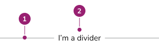
The Divider consists of two primary elements that work together to separate content.

<Frame>
  <div className="w-full h-full bg-[#FFFFFF] p-2 rounded flex items-center justify-center">
    <img
      src="https://mintcdn.com/servicetitan/CekIMDXcDEhGoN_I/images/docs/web/components/divider/design/divider-anatomy.png?fit=max&auto=format&n=CekIMDXcDEhGoN_I&q=85&s=7ae362bfbfb2adbc0c32cd7ab8558e52"
      alt="Divider
Anatomy"
      width="322"
      height="89"
      data-path="images/docs/web/components/divider/design/divider-anatomy.png"
    />
  </div>
</Frame>

1. Divider line
2. Content

## Options

The Divider supports spacing, orientation, and content alignment configurations to accommodate various separation scenarios.

### Spacing

<LiveCode example="divider-spacing" screenshot fullWidth>
  ```tsx lines theme={null}
  import { Divider, Flex } from "@servicetitan/anvil2";

  function App() {
    return (
      <Flex direction="column">
        <Divider spacing="0">
          <code>&quot;0&quot;</code>
        </Divider>
        <Divider
          spacing="half"
          style={{
            background:
              "light-dark(var(--color-orange-100), var(--color-orange-600))",
          }}
        >
          <code>&quot;half&quot;</code>
        </Divider>
        <Divider
          spacing="1"
          style={{
            background:
              "light-dark(var(--color-purple-100), var(--color-purple-600))",
          }}
        >
          <code>&quot;1&quot;</code>
        </Divider>
        <Divider
          spacing="2"
          style={{
            background:
              "light-dark(var(--color-orange-100), var(--color-orange-600))",
          }}
        >
          <code>&quot;2&quot;</code>
        </Divider>
        <Divider
          spacing="3"
          style={{
            background:
              "light-dark(var(--color-purple-100), var(--color-purple-600))",
          }}
        >
          <code>&quot;3&quot;</code>
        </Divider>
        <Divider
          spacing="4"
          style={{
            background:
              "light-dark(var(--color-orange-100), var(--color-orange-600))",
          }}
        >
          <code>&quot;4&quot;</code>
        </Divider>
        <Divider
          spacing="5"
          style={{
            background:
              "light-dark(var(--color-purple-100), var(--color-purple-600))",
          }}
        >
          <code>&quot;5&quot;</code>
        </Divider>
      </Flex>
    );
  }

  export default App;
  ```
</LiveCode>

| Spacing option | Value          |
| -------------- | -------------- |
| 0              | 0px / 0rem     |
| half           | 2px / 0.125rem |
| 1              | 4px / 0.25rem  |
| 2              | 8px / 0.5rem   |
| 3              | 12px / 0.75rem |
| 4              | 16px / 1rem    |
| 5              | 20px / 1.25rem |

### Vertical

Divider supports vertical orientation for separating content horizontally.

<LiveCode example="divider-vertical-true" screenshot fullWidth>
  ```tsx lines theme={null}
  import { Divider, Flex, Card } from "@servicetitan/anvil2";

  function App() {
    return (
      <Flex style={{ height: "101px" }}>
        <Card background="strong" flexGrow="1" />
        <Divider vertical spacing="2" />
        <Card background="strong" flexGrow="1" />
      </Flex>
    );
  }

  export default App;
  ```
</LiveCode>

### Content

Divider supports content to provide additional information to users.

<LiveCode example="divider-children" screenshot fullWidth>
  ```tsx lines theme={null}
  import { Divider } from "@servicetitan/anvil2";

  function App() {
    return <Divider spacing={2}>Hello world</Divider>;
  }

  export default App;
  ```
</LiveCode>

### Content Alignment

Content aligns to start, end, or center.

<LiveCode example="divider-aligncontent" screenshot fullWidth>
  ```tsx lines theme={null}
  import { Divider } from "@servicetitan/anvil2";

  function App() {
    return (
      <div>
        <div style={{ display: "flex", flexDirection: "column" }}>
          <Divider spacing="2" alignContent="start">
            Start
          </Divider>
          <Divider spacing="2" alignContent="center">
            Center
          </Divider>
          <Divider spacing="2" alignContent="end">
            End
          </Divider>
        </div>
        <div
          style={{
            display: "flex",
            flexDirection: "row",
            height: "10rem",
            justifyContent: "space-between",
          }}
        >
          <Divider spacing="2" vertical alignContent="start">
            Start
          </Divider>
          <Divider spacing="2" vertical alignContent="center">
            Center
          </Divider>
          <Divider spacing="2" vertical alignContent="end">
            End
          </Divider>
        </div>
      </div>
    );
  }

  export default App;
  ```
</LiveCode>

## Behavior

The Divider responds to spacing and orientation requirements while maintaining consistent visual separation.

## Usage Guidelines

Use the Divider when separating content that needs visual distinction.

### When to Use

#### Group related content

Dividers reinforce grouping between elements while contrasting them against other elements on the page. Use dividers on high-density UIs and lists where whitespace alone does not provide sufficient grouping.

<LiveCode example="divider-group-do" screenshot fullWidth>
  ```tsx lines theme={null}
  import { Divider, Text } from "@servicetitan/anvil2";

  function App() {
    return (
      <div
        style={{
          display: "grid",
          margin: 24,
        }}
      >
        <Text variant="headline" size="medium" el="h3">
          Headline text
        </Text>
        <Text variant="body">
          Lorem ipsum dolor sit amet, consectetur adipiscing elit.
        </Text>
        <Divider spacing="3" />
        <Text variant="headline" size="medium" el="h3">
          Headline text
        </Text>
        <Text variant="body">
          Lorem ipsum dolor sit amet, consectetur adipiscing elit.
        </Text>
        <Divider spacing="3" />
        <Text variant="headline" size="medium" el="h3">
          Headline text
        </Text>
        <Text variant="body">
          Lorem ipsum dolor sit amet, consectetur adipiscing elit.
        </Text>
      </div>
    );
  }

  export default App;
  ```
</LiveCode>

<Check>**Do**</Check>

Use dividers to separate sections.

### When not to use

Overuse of dividers can create a cluttered UI. White space is often sufficient at creating separation between elements.

Dividers should not be used as decoration within already grouped content.

<LiveCode example="divider-group-dont" screenshot fullWidth>
  ```tsx lines theme={null}
  import { Divider, Checkbox } from "@servicetitan/anvil2";

  function App() {
    return (
      <Checkbox.Group legend="What support do you need?">
        <Divider />
        <Checkbox name="support" value="software" label="Software" />
        <Divider />
        <Checkbox name="support" value="hardware" label="Hardware" />
        <Divider />
        <Checkbox name="support" value="report" label="Expense Report" />
        <Divider />
      </Checkbox.Group>
    );
  }

  export default App;
  ```
</LiveCode>

<Danger>**Don't**</Danger>

Don't add excessive amounts of Dividers.

### How to Use

#### Spacing considerations

Divider supports multiple spacing configurations. Follow these general principles:

* If used within a Form, spacing conforms to the [Form pattern](/docs/web/patterns/forms).
* Maintain internal consistency within the product area for spacing choices.
* When interactive elements exist near Dividers, use more spacing to meet [WCAG guidance on touch target size minimums](https://www.w3.org/WAI/WCAG22/Understanding/target-size-minimum.html).

## Content

Content within the Divider should provide additional context when needed, keeping it concise and informative.

## Keyboard Interaction

Users can navigate the Divider using standard keyboard controls.