> ## Documentation Index
> Fetch the complete documentation index at: https://anvil.servicetitan.com/llms.txt
> Use this file to discover all available pages before exploring further.

# Dnd Sort – Design

> Dnd Sort is a collection of components built for the purpose of solving bucketing and sorting, two very common applications of the drag-and-drop interaction.

export const LiveCode = ({children, customHeight, clickToLoad, example, fullWidth, fullHeight, hideCodeInLiveCode, screenshot, screenshotOnly, showCode: showCodeProp}) => {
  const SCREENSHOTS_BASE = "https://servicetitan.github.io/anvil2-docs-live-code/screenshots";
  const STACKBLITZ_BASE = "https://stackblitz.com/github/servicetitan/anvil2-docs-live-code/tree/main/examples";
  const [showCodeBlock, setShowCodeBlock] = useState(showCodeProp ?? false);
  const [isLocalOverride, setIsLocalOverride] = useState(false);
  useEffect(() => {
    const examplePath = `/images/live-code-screenshots-tmp/${example}.png`;
    fetch(examplePath, {
      method: "HEAD"
    }).then(r => {
      if (r.ok) setIsLocalOverride(true);
    }).catch(() => {});
  }, [example]);
  const screenshotBase = isLocalOverride ? "/images/live-code-screenshots-tmp" : SCREENSHOTS_BASE;
  if (screenshotOnly) {
    return <Frame className="flex flex-col">
        <div className="flex dark:hidden" style={{
      justifyContent: "center",
      alignItems: "center",
      width: fullWidth ? "100%" : "50%",
      minHeight: fullHeight ? "284px" : undefined,
      background: "#FFFFFF"
    }}>
          <img srcset={`${screenshotBase}/${example}.png, ${screenshotBase}/${example}-2x.png 2x`} src={`${screenshotBase}/${example}.png`} alt={example} noZoom />
        </div>
        <div className="hidden dark:flex" style={{
      justifyContent: "center",
      alignItems: "center",
      width: fullWidth ? "100%" : "50%",
      minHeight: fullHeight ? "284px" : undefined,
      background: "#141414"
    }}>
          <img srcset={`${screenshotBase}/${example}-dark.png, ${screenshotBase}/${example}-dark-2x.png 2x`} src={`${screenshotBase}/${example}-dark.png`} alt={example} noZoom />
        </div>
      </Frame>;
  }
  if (screenshot) {
    return <Frame className="flex flex-col -mb-2">
        <div className="flex dark:hidden bg-white dark:bg-codeblock border border-gray-950/10 dark:border-white/10 dark:twoslash-dark rounded-2xl overflow-hidden" style={{
      justifyContent: "center",
      alignItems: "center",
      width: fullWidth ? "100%" : "50%",
      minHeight: fullHeight ? "284px" : undefined
    }}>
          <img srcset={`${screenshotBase}/${example}.png, ${screenshotBase}/${example}-2x.png 2x`} src={`${screenshotBase}/${example}.png`} alt={example} noZoom />
        </div>

        <div className="hidden dark:flex bg-white dark:bg-codeblock border border-gray-950/10 dark:border-white/10 dark:twoslash-dark rounded-2xl overflow-hidden" style={{
      background: "#141414",
      justifyContent: "center",
      alignItems: "center",
      width: fullWidth ? "100%" : "50%",
      minHeight: fullHeight ? "284px" : undefined
    }}>
          <img srcset={`${screenshotBase}/${example}-dark.png, ${screenshotBase}/${example}-dark-2x.png 2x`} src={`${screenshotBase}/${example}-dark.png`} alt={example} noZoom />
        </div>

        <div className="flex justify-end items-center text-xs py-2 px-1 gap-4">
          {!showCodeProp ? <button className="inline-flex justify-end items-center text-gray-700 dark:text-gray-50 hover:text-blue-500 dark:hover:text-blue-300 transition-colors group self-end gap-1 cursor-pointer" onClick={() => setShowCodeBlock(!showCodeBlock)} style={{
      appearance: "none"
    }}>
              <Icon icon="code" size="12px" className="group-hover:bg-blue-500 dark:group-hover:bg-blue-300" />
              <span>{showCodeBlock ? "Hide code" : "Show code"}</span>
            </button> : null}

          <a className="inline-flex justify-end items-center hover:text-blue-500 dark:hover:text-blue-300 transition-colors group self-end gap-1" href={`${STACKBLITZ_BASE}/${example}?file=src/App.tsx`} target="_blank" rel="noreferrer">
            <Icon icon="bolt" size="12px" className="group-hover:bg-blue-500 dark:group-hover:bg-blue-300" />
            <span>StackBlitz demo</span>
          </a>
        </div>

        <div className="grid transition-[grid-template-rows] duration-300 ease-in-out overflow-auto overflow-y-hidden overflow-x-auto" style={showCodeBlock ? {
      gridTemplateRows: "1fr"
    } : {
      gridTemplateRows: "0fr"
    }}>
          <div style={{
      minHeight: 0,
      overflowX: "auto",
      overflowY: "hidden",
      marginBlockStart: "-1.25rem",
      marginBlockEnd: "-1.5rem"
    }}>
            {children}
          </div>
        </div>
      </Frame>;
  } else {
    return <div style={{
      display: "flex",
      width: fullWidth ? "100%" : "50%",
      minHeight: customHeight ? customHeight : "316px",
      resize: "vertical",
      overflow: "auto"
    }}>
        <iframe title={example} style={{
      flex: 1,
      width: fullWidth ? "100%" : "50%",
      minHeight: customHeight ? customHeight : "316px"
    }} src={`${STACKBLITZ_BASE}/${example}?embed=1&hideNavigation=1&hideExplorer=1&terminalHeight=0&file=src/App.tsx${clickToLoad ? "&ctl=1" : ""}${hideCodeInLiveCode ? "&view=preview" : ""}`} allow="accelerometer; ambient-light-sensor; camera; encrypted-media; geolocation; gyroscope; hid; microphone; midi; payment; usb; vr; xr-spatial-tracking" sandbox="allow-forms allow-modals allow-popups allow-presentation allow-same-origin allow-scripts" />
      </div>;
  }
};

export const DoDont = ({text, type, children}) => {
  return <>
      {type === "do" && <div className="do-dont do">
          {children && <div className="do-dont-content">{children}</div>}
          <Check>
            <p>
              <strong>Do</strong>
              {text && <span className="m-inline-start-1">{text}</span>}
            </p>
          </Check>
        </div>}
      {type === "dont" && <div className="do-dont dont">
          {children && <div className="do-dont-content">{children}</div>}
          <Danger>
            <p>
              <strong>Don't</strong>
              {text && <span className="m-inline-start-1">{text}</span>}
            </p>
          </Danger>
        </div>}
      {type === "caution" && <div className="do-dont caution">
          {children && <div className="do-dont-content">{children}</div>}
          <Warning>
            <p>
              <strong>Caution</strong>
              {text && <span className="m-inline-start-1">{text}</span>}
            </p>
          </Warning>
        </div>}
    </>;
};

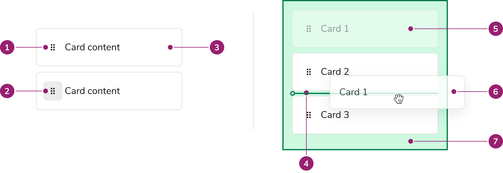
## Anatomy

<Frame>
  <div className="w-full h-full bg-[#FFFFFF] p-2 rounded flex items-center justify-center">
    <img src="https://mintcdn.com/servicetitan/gaitSLKK1iHwa_zv/images/docs/web/components/dnd-sort/anatomy.png?fit=max&auto=format&n=gaitSLKK1iHwa_zv&q=85&s=8bb9623fe3151d0c2c8bd695e32c777d" alt="Anatomy of Drag and Drop sort" width="1678" height="578" data-path="images/docs/web/components/dnd-sort/anatomy.png" />
  </div>
</Frame>

1. Drag Handle
2. Drag Handle Button
3. Draggable Card
4. Sort Line
5. Drag Ghost
6. Drag Preview
7. Drop Zone

## Options

### Draggable Card

Besides the handle, the Draggle Card's content is highly customizable. Draggable Card can use many of the features of the base Card component.

<LiveCode example="dnd-sort-card" screenshot fullWidth>
  ```tsx lines theme={null}
  import { useState } from "react";
  import { DndSort } from "@servicetitan/anvil2";

  type Items = {
    [key: string | number]: { name: string; type: string };
  };

  type Order = (string | number)[];

  const teams: Items = {
    A: { name: "Card Content", type: "item" },
  };

  function App() {
    const [order, _setOrder] = useState<Order>(["A"]);

    return (
      <DndSort>
        {order.map((itemId) => (
          <DndSort.Card
            key={itemId}
            label={teams[itemId].name}
            id={itemId}
            alignItems="center"
          >
            {teams[itemId].name}
          </DndSort.Card>
        ))}
      </DndSort>
    );
  }

  export default App;
  ```
</LiveCode>

### Draggable Target

Where a user can grab a Card is configurable to the whole card or only on the drag handle.

#### Whole Card

<LiveCode example="dnd-sort-whole-card" screenshot>
  ```tsx lines theme={null}
  import { useState } from "react";
  import { DndSort, type DndSortChangeEvent } from "@servicetitan/anvil2";

  type Items = {
    [key: string | number]: { name: string; type: string };
  };

  const teams: Items = {
    A: { name: "Whole Card Target #1", type: "item" },
    B: { name: "Whole Card Target #2", type: "item" },
  };

  function App() {
    const [_mostRecentEvent, setMostRecentEvent] = useState<DndSortChangeEvent>();
    const [order, setOrder] = useState<(string | number)[]>(["A", "B"]);

    const handleDrop = (event: DndSortChangeEvent) => {
      setMostRecentEvent(event);
      setOrder((previousOrder) => event.zoneSort || previousOrder);
    };

    return (
      <DndSort onDrop={handleDrop}>
        <DndSort.Zone
          sortable
          id="zone-1"
          orientation="vertical"
          sortedIds={order}
          label="Zone 1"
          defaultDropPosition="end"
        >
          {order.map((itemId) => (
            <DndSort.Card
              key={itemId}
              label={teams[itemId].name}
              id={itemId}
              alignItems="center"
            >
              {teams[itemId].name}
            </DndSort.Card>
          ))}
        </DndSort.Zone>
      </DndSort>
    );
  }

  export default App;
  ```
</LiveCode>

Use the whole Card as a draggable region when:

* Users do NOT need to select the text of the Card
* D\&D is a major feature of the content
* Outside of an overflow menu, other inner Card actions are not present

#### Drag handle only

<LiveCode example="dnd-sort-handle-only" screenshot>
  ```tsx lines theme={null}
  import { useState } from "react";
  import { DndSort, type DndSortChangeEvent } from "@servicetitan/anvil2";

  type Items = {
    [key: string | number]: { name: string; type: string };
  };

  type Order = (string | number)[];

  const teams: Items = {
    A: { name: "Drag Handle Only Target #1", type: "item" },
    B: { name: "Drag Handle Only Target #2", type: "item" },
  };

  function App() {
    const [_mostRecentEvent, setMostRecentEvent] = useState<DndSortChangeEvent>();
    const [order, setOrder] = useState<Order>(["A", "B"]);

    const handleDrop = (event: DndSortChangeEvent) => {
      setMostRecentEvent(event);
      setOrder((previousOrder) => event.zoneSort || previousOrder);
    };

    return (
      <DndSort onDrop={handleDrop}>
        <DndSort.Zone
          sortable
          id="zone-1"
          orientation="vertical"
          sortedIds={order}
          label="Zone 1"
          defaultDropPosition="end"
        >
          {order.map((itemId) => (
            <DndSort.Card
              key={itemId}
              label={teams[itemId].name}
              id={itemId}
              alignItems="center"
              dragOnlyWithHandle
            >
              {teams[itemId].name}
            </DndSort.Card>
          ))}
        </DndSort.Zone>
      </DndSort>
    );
  }

  export default App;
  ```
</LiveCode>

Use the Drag Handle only as the draggable region when:

* A user should be able to select the text of the Card
* The Card is very large
* There are other, non-overflow menu actions a user can take in the Card. This could be something as simple as a Checkbox.

### Drag Preview

Drag Previews, what is displayed while dragging, can be customized.

<LiveCode example="dnd-sort-preview" screenshot>
  ```tsx lines theme={null}
  import { useState } from "react";
  import {
    DndSort,
    Card,
    Flex,
    Avatar,
    Text,
    Chip,
    type DndSortChangeEvent,
  } from "@servicetitan/anvil2";

  type Order = (string | number)[];

  function App() {
    const [_mostRecentEvent, setMostRecentEvent] = useState<DndSortChangeEvent>();
    const [order, setOrder] = useState<Order>(["A", "B", "C"]);

    const handleDrop = (event: DndSortChangeEvent) => {
      setMostRecentEvent(event);
      setOrder((previousOrder) => event.zoneSort || previousOrder);
    };

    return (
      <DndSort onDrop={handleDrop}>
        <DndSort.Zone
          sortable
          id="zone-1"
          orientation="vertical"
          sortedIds={order}
          label="Zone 1"
          defaultDropPosition="end"
        >
          <DndSort.Card label="label" id="A" alignItems="center">
            No custom drag preview
          </DndSort.Card>
          <DndSort.Card
            label="label"
            id="B"
            alignItems="center"
            previewRenderer={() => <Card>Small drag preview</Card>}
          >
            Small drag preview
          </DndSort.Card>
          <DndSort.Card
            label="label"
            id="C"
            alignItems="center"
            previewRenderer={() => (
              <Card>
                <Flex alignItems="center" gap={3}>
                  <Avatar image="/dog-01.png" name="Dog01" />
                  <Flex direction="column">
                    <Flex alignItems="center" gap={3}>
                      <Text variant="headline" el="h4" size="small">
                        Maximilian the Magnificent
                      </Text>
                    </Flex>
                    <Text size="small" variant="body">
                      Director of Plumber Operations
                    </Text>
                  </Flex>
                  <Chip label="Admin" />
                </Flex>
              </Card>
            )}
          >
            Highly custom preview
          </DndSort.Card>
        </DndSort.Zone>
      </DndSort>
    );
  }

  export default App;
  ```
</LiveCode>

### Drop Zone

<LiveCode example="dnd-sort-drop-zone" screenshot fullWidth>
  ```tsx lines theme={null}
  import { Flex, Dnd } from "@servicetitan/anvil2";

  function App() {
    return (
      <Flex gap={4}>
        <Dnd.Zone style={{ width: "25%" }} className="p-3">
          Resting Drop Zone
        </Dnd.Zone>
        <Dnd.Zone isDragging style={{ width: "25%" }} className="p-3">
          Visible Drop Zone while dragging
        </Dnd.Zone>
        <Dnd.Zone
          isDragging
          isOver
          isValid
          style={{ width: "25%" }}
          className="p-3"
        >
          Valid Drop Zone, user is over the Drop Zone
        </Dnd.Zone>
        <Dnd.Zone isDragging isOver style={{ width: "25%" }} className="p-3">
          Invalid drop zone, user is over the Drop Zone
        </Dnd.Zone>
      </Flex>
    );
  }

  export default App;
  ```
</LiveCode>

### Sort Line

<LiveCode example="dnd-sort-line-vertical" screenshot fullWidth>
  ```tsx lines theme={null}
  import { Dnd } from "@servicetitan/anvil2";

  function App() {
    return (
      <div style={{ width: "100%", position: "relative" }}>
        <Dnd.SortLine orientation="vertical" position="before" offset="0" />
      </div>
    );
  }

  export default App;
  ```
</LiveCode>

<LiveCode example="dnd-sort-line-horizontal" screenshot fullWidth>
  ```tsx lines theme={null}
  import { Dnd } from "@servicetitan/anvil2";

  function App() {
    return (
      <div style={{ height: "40px", position: "relative" }}>
        <Dnd.SortLine orientation="horizontal" position="before" offset="0" />
      </div>
    );
  }

  export default App;
  ```
</LiveCode>

## Behavior

### Drag handle alignment

The drag handle is always top-aligned in the Draggable Card. The rest of the card content can be vertically aligned as desired.

<LiveCode example="dnd-sort-handle-alignment" screenshot fullWidth>
  ```tsx lines theme={null}
  import { useState } from "react";
  import { DndSort } from "@servicetitan/anvil2";

  type Items = {
    [key: string | number]: { name: string; type: string };
  };

  type Order = (string | number)[];

  const teams: Items = {
    A: {
      name: "Lorem ipsum dolor sit amet, consectetur adipiscing elit. Phasellus semper vitae metus ut venenatis. Morbi commodo ante nec faucibus porta. Etiam dignissim neque id libero mollis pretium. Cras vitae mattis mauris. Ut ut enim porta, blandit nibh et, finibus massa. Ut tincidunt nibh risus, et dictum felis tristique non.",
      type: "item",
    },
  };

  function App() {
    const [order, _setOrder] = useState<Order>(["A"]);

    return (
      <DndSort>
        {order.map((itemId) => (
          <DndSort.Card
            key={itemId}
            label={teams[itemId].name}
            id={itemId}
            alignItems="center"
            style={{ width: "400px" }}
          >
            {teams[itemId].name}
          </DndSort.Card>
        ))}
      </DndSort>
    );
  }

  export default App;
  ```
</LiveCode>

## Accessibility

### Provide alternatives to Drag and Drop

While Dnd Sort is keyboard navigable, it is still preferable that users have alternatives to using drag and drop functionality to complete a task.

## When to use

Dnd Sort is a collection used for a few sub-categories of possible Drag and Drop scenarios. Such situations include:

* Sorting a vertical or horizontal list of items
* Bucketing and sorting items, such as a kanban UI.

### When not to use

Dnd Sort only covers a handful of drag and drop scenarios, alternative scenarios should not be forced to use this approach. In such cases, use the individual components found in Dnd to assemble your custom scenario.

### Examples of DND Sort

#### Sorting a List

Sorting a list is the primary usage of Dnd Sort. This can be done vertically and horizontally.

<LiveCode example="dnd-sort-list-vertical" customHeight="500px" fullWidth>
  ```tsx lines theme={null}
  import { useState } from "react";
  import { DndSort, type DndSortChangeEvent } from "@servicetitan/anvil2";

  type Items = {
    [key: string | number]: { name: string; type: string };
  };

  type Order = (string | number)[];

  const teams: Items = {
    A: { name: "Card of List #1", type: "item" },
    B: { name: "Card of List #2", type: "item" },
    C: { name: "Card of List #3", type: "item" },
    D: { name: "Card of List #4", type: "item" },
    E: { name: "Card of List #5", type: "item" },
  };

  function App() {
    const [_mostRecentEvent, setMostRecentEvent] = useState<DndSortChangeEvent>();
    const [order, setOrder] = useState<Order>(["A", "B", "C", "D", "E"]);

    const handleDrop = (event: DndSortChangeEvent) => {
      setMostRecentEvent(event);
      setOrder((previousOrder) => event.zoneSort || previousOrder);
    };

    return (
      <DndSort onDrop={handleDrop}>
        <DndSort.Zone
          sortable
          id="zone-1"
          orientation="vertical"
          sortedIds={order}
          label="Zone 1"
          defaultDropPosition="end"
          gap={3}
        >
          {order.map((itemId) => (
            <DndSort.Card
              key={itemId}
              label={teams[itemId].name}
              id={itemId}
              alignItems="center"
              padding="small"
            >
              {teams[itemId].name}
            </DndSort.Card>
          ))}
        </DndSort.Zone>
      </DndSort>
    );
  }

  export default App;
  ```
</LiveCode>

<br />

<LiveCode example="dnd-sort-list-horizontal" fullWidth>
  ```tsx lines theme={null}
  import { useState } from "react";
  import { DndSort, type DndSortChangeEvent } from "@servicetitan/anvil2";

  type Items = {
    [key: string | number]: { name: string; type: string };
  };

  type Order = (string | number)[];

  const teams: Items = {
    A: { name: "Card #1", type: "item" },
    B: { name: "Card #2", type: "item" },
    C: { name: "Card #3", type: "item" },
    D: { name: "Card #4", type: "item" },
  };

  function App() {
    const [_mostRecentEvent, setMostRecentEvent] = useState<DndSortChangeEvent>();
    const [order, setOrder] = useState<Order>(["A", "B", "C", "D"]);

    const handleDrop = (event: DndSortChangeEvent) => {
      setMostRecentEvent(event);
      setOrder((previousOrder) => event.zoneSort || previousOrder);
    };

    return (
      <DndSort onDrop={handleDrop}>
        <DndSort.Zone
          sortable
          id="zone-1"
          orientation="horizontal"
          sortedIds={order}
          label="Zone 1"
          defaultDropPosition="end"
          gap={3}
        >
          {order.map((itemId) => (
            <DndSort.Card
              key={itemId}
              label={teams[itemId].name}
              id={itemId}
              alignItems="center"
              padding="small"
            >
              {teams[itemId].name}
            </DndSort.Card>
          ))}
        </DndSort.Zone>
      </DndSort>
    );
  }

  export default App;
  ```
</LiveCode>

#### Kanban-style sort

Also known as bucketing. Note that the Card containers & text are not explicitly part of the Dnd Sort component.

<LiveCode example="dnd-sort-kanban" fullWidth screenshot>
  ```tsx lines theme={null}
  import { useState } from "react";
  import {
    DndSort,
    Flex,
    Grid,
    Card,
    Text,
    type DndSortChangeEvent,
  } from "@servicetitan/anvil2";

  type Buckets = {
    [key: string]: (string | number)[];
  };

  function App() {
    const [_mostRecentEvent, setMostRecentEvent] = useState<DndSortChangeEvent>();
    const [buckets, setBuckets] = useState<Buckets>({
      "zone-1": ["A", "B", "C"],
      "zone-2": ["D", "E"],
      "zone-3": ["F"],
    });

    const someStylesOfYourChoosing = {
      flexDirection: "column",
      width: "100%",
      borderRadius: "12px",
    } as const;

    const handleDrop = (event: DndSortChangeEvent) => {
      setMostRecentEvent(event);
      setBuckets((prevBuckets) => {
        // If the item wasn't dropped in a zone, do nothing
        if (!event.zoneId) return prevBuckets;

        // If the item was dropped in an invalid zone, do nothing
        if (!event.valid) return prevBuckets;

        // If the item was dropped in the zone it was already in, do nothing
        if (event.zoneId === event.previousZoneId) return prevBuckets;

        // Create a copy of the current buckets
        const newBuckets = { ...prevBuckets };

        // Remove the item from its previous bucket
        const prevKey = event.previousZoneId;
        if (prevKey) {
          newBuckets[prevKey] = newBuckets[prevKey].filter(
            (id) => id !== event.draggableId,
          );
        }

        // Add the item to the target bucket
        newBuckets[event.zoneId] = newBuckets[event.zoneId].concat(
          event.draggableId,
        );

        return newBuckets;
      });
    };

    return (
      <DndSort onDrop={handleDrop}>
        <Flex direction="column" gap="8" style={{ width: "100%" }}>
          <Grid templateColumns="repeat(3, 1fr)" gap="4">
            <Card padding="0" background="strong">
              <DndSort.Zone
                id="zone-1"
                label="Zone 1"
                style={someStylesOfYourChoosing}
                gap={3}
              >
                <Text>
                  <b>Todo</b>
                </Text>
                {buckets["zone-1"].map((itemId) => (
                  <DndSort.Card
                    key={itemId}
                    label={`Item ${itemId}`}
                    id={itemId}
                    alignItems="center"
                  >
                    Item {itemId}
                  </DndSort.Card>
                ))}
              </DndSort.Zone>
            </Card>
            <Card padding="0" background="strong">
              <DndSort.Zone
                id="zone-2"
                label="Zone 2"
                style={someStylesOfYourChoosing}
                gap={3}
              >
                <Text>
                  <b>In Progress</b>
                </Text>
                {buckets["zone-2"].map((itemId) => (
                  <DndSort.Card
                    key={itemId}
                    label={`Item ${itemId}`}
                    id={itemId}
                    alignItems="center"
                  >
                    Item {itemId}
                  </DndSort.Card>
                ))}
              </DndSort.Zone>
            </Card>
            <Card padding="0" background="strong">
              <DndSort.Zone
                id="zone-3"
                label="Zone 3"
                style={someStylesOfYourChoosing}
                gap={3}
              >
                <Text>
                  <b>Done</b>
                </Text>
                {buckets["zone-3"].map((itemId) => (
                  <DndSort.Card
                    key={itemId}
                    label={`Item ${itemId}`}
                    id={itemId}
                    alignItems="center"
                  >
                    Item {itemId}
                  </DndSort.Card>
                ))}
              </DndSort.Zone>
            </Card>
          </Grid>
        </Flex>
      </DndSort>
    );
  }

  export default App;
  ```
</LiveCode>

#### Dashboard-type arrangements

<LiveCode example="dnd-sort-dashboard" fullWidth screenshot>
  ```tsx lines theme={null}
  import { useState } from "react";
  import { DndSort, Grid, type DndSortChangeEvent } from "@servicetitan/anvil2";

  type Buckets = {
    [key: string]: (string | number)[];
  };

  function App() {
    const [_mostRecentEvent, setMostRecentEvent] = useState<DndSortChangeEvent>();
    const [buckets, setBuckets] = useState<Buckets>({
      "zone-1": ["A"],
      "zone-2": ["B"],
      "zone-3": ["C"],
      "zone-4": ["D"],
    });

    const someStylesOfYourChoosing = {
      flexDirection: "column",
      width: "100%",
    } as const;

    const handleDrop = (event: DndSortChangeEvent) => {
      console.info(event);
      setMostRecentEvent(event);
      setBuckets((prevBuckets) => {
        // If the item wasn't dropped in a zone, do nothing
        if (!event.zoneId) return prevBuckets;

        // If the item was dropped in an invalid zone, do nothing
        if (!event.valid) return prevBuckets;

        // If the item was dropped in the zone it was already in, do nothing
        if (event.zoneId === event.previousZoneId) return prevBuckets;

        // Create a copy of the current buckets
        const newBuckets = { ...prevBuckets };

        const targetBucketItems = newBuckets[event.zoneId];
        const draggableId = event.draggableId;
        const previousZoneId = event.previousZoneId;

        // Check if there's an item in the target zone and it's not the item being dragged
        if (
          targetBucketItems &&
          targetBucketItems.length > 0 &&
          targetBucketItems[0] !== draggableId
        ) {
          const itemToSwapOut = targetBucketItems[0]; // Assuming only one item per zone for simplicity or taking the first one
          // Remove the item from its previous bucket (the draggableId)
          if (previousZoneId) {
            newBuckets[previousZoneId] = newBuckets[previousZoneId].filter(
              (id) => id !== draggableId,
            );
          }
          // Add the item that was in the target bucket to the previous bucket
          if (previousZoneId) {
            // Only if there was a previous zone
            newBuckets[previousZoneId] =
              newBuckets[previousZoneId].concat(itemToSwapOut);
          }

          // Replace the item in the target bucket with the draggableId
          newBuckets[event.zoneId] = [draggableId]; // Assuming only one item per zone
        } else {
          // --- Original logic if no swap or if target bucket is empty ---

          // Remove the item from its previous bucket
          if (previousZoneId) {
            newBuckets[previousZoneId] = newBuckets[previousZoneId].filter(
              (id) => id !== draggableId,
            );
          }

          // Add the item to the target bucket
          newBuckets[event.zoneId] = newBuckets[event.zoneId].concat(draggableId);
        }

        return newBuckets;
      });
    };

    return (
      <DndSort onDrop={handleDrop}>
        <Grid templateColumns="repeat(2, 1fr)" gap="0">
          <DndSort.Zone
            id="zone-1"
            label="Zone 1"
            style={someStylesOfYourChoosing}
            gap={2}
          >
            {buckets["zone-1"].map((itemId) => (
              <DndSort.Card
                key={itemId}
                label={`Item ${itemId}`}
                id={itemId}
                style={{ height: "150px" }}
              >
                Dashboard item {itemId}
              </DndSort.Card>
            ))}
          </DndSort.Zone>

          <DndSort.Zone
            id="zone-2"
            label="Zone 2"
            style={someStylesOfYourChoosing}
            gap={2}
          >
            {buckets["zone-2"].map((itemId) => (
              <DndSort.Card
                key={itemId}
                label={`Item ${itemId}`}
                id={itemId}
                style={{ height: "150px" }}
              >
                Dashboard item {itemId}
              </DndSort.Card>
            ))}
          </DndSort.Zone>
          <DndSort.Zone
            id="zone-3"
            label="Zone 3"
            style={someStylesOfYourChoosing}
            gap={2}
          >
            {buckets["zone-3"].map((itemId) => (
              <DndSort.Card
                key={itemId}
                label={`Item ${itemId}`}
                id={itemId}
                style={{ height: "150px" }}
              >
                Dashboard item {itemId}
              </DndSort.Card>
            ))}
          </DndSort.Zone>

          <DndSort.Zone
            id="zone-4"
            label="Zone 4"
            style={someStylesOfYourChoosing}
            gap={2}
          >
            {buckets["zone-4"].map((itemId) => (
              <DndSort.Card
                key={itemId}
                label={`Item ${itemId}`}
                id={itemId}
                style={{ height: "150px" }}
              >
                Dashboard item {itemId}
              </DndSort.Card>
            ))}
          </DndSort.Zone>
        </Grid>
      </DndSort>
    );
  }

  export default App;
  ```
</LiveCode>

## How to Use

Use the base configurations of icons, drop zones

<Columns cols={2} className="p-b-4">
  <DoDont type="do" text="use the provided icon for drag and drop">
    <LiveCode example="dnd-sort-handle-icon" screenshot fullWidth>
      ```tsx lines theme={null}
      import { Dnd } from "@servicetitan/anvil2";

      function App() {
        return <Dnd.Handle />;
      }

      export default App;
      ```
    </LiveCode>
  </DoDont>

  <DoDont type="dont" text="use alternative icons for drag and drop">
    <LiveCode example="dnd-sort-handle-dont" screenshot fullWidth>
      ```tsx lines theme={null}
      function App() {
        return (
          <svg
            width="120"
            height="24"
            viewBox="0 0 240 48"
            xmlns="http://www.w3.org/2000/svg"
            fill="var(--foreground-color-subdued)"
          >
            <g clipPath="url(#clip0_2833_38276)">
              <path d="M24 16C26.21 16 28 14.21 28 12C28 9.79 26.21 8 24 8C21.79 8 20 9.79 20 12C20 14.21 21.79 16 24 16ZM24 20C21.79 20 20 21.79 20 24C20 26.21 21.79 28 24 28C26.21 28 28 26.21 28 24C28 21.79 26.21 20 24 20ZM24 32C21.79 32 20 33.79 20 36C20 38.21 21.79 40 24 40C26.21 40 28 38.21 28 36C28 33.79 26.21 32 24 32Z" />
            </g>
            <path d="M104 18H72V22H104V18ZM72 30H104V26H72V30Z" />
            <path d="M152 44L143.5 35.5L146.35 32.65L150 36.3V26H139.75L143.4 29.6L140.5 32.5L132 24L140.45 15.55L143.3 18.4L139.7 22H150V11.7L146.35 15.35L143.5 12.5L152 4L160.5 12.5L157.65 15.35L154 11.7V22H164.25L160.6 18.4L163.5 15.5L172 24L163.5 32.5L160.65 29.65L164.3 26H154V36.25L157.6 32.6L160.5 35.5L152 44Z" />
            <path d="M206 34L196 24L206 14L208.8 16.8L203.65 22H228.35L223.2 16.8L226 14L236 24L226 34L223.2 31.2L228.35 26H203.65L208.8 31.2L206 34Z" />
            <defs>
              <clipPath id="clip0_2833_38276">
                <rect width="48" height="48" />
              </clipPath>
            </defs>
          </svg>
        );
      }

      export default App;
      ```
    </LiveCode>
  </DoDont>
</Columns>

***

<Columns cols={2}>
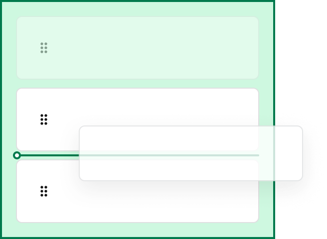
  <DoDont type="do" text="use the provided default styles of Drop Zone, sort line">
    <Frame>
      <div className="w-full h-full bg-[#FFFFFF] p-2 rounded flex items-center justify-center">
        <img src="https://mintcdn.com/servicetitan/gaitSLKK1iHwa_zv/images/docs/web/components/dnd-sort/do-use-drop-zone.png?fit=max&auto=format&n=gaitSLKK1iHwa_zv&q=85&s=bc441fa242dda32f414fe178a68ea91f" alt="Do use the provided default styles of Drop Zone, sort line" width="656" height="480" data-path="images/docs/web/components/dnd-sort/do-use-drop-zone.png" />
      </div>
    </Frame>
  </DoDont>

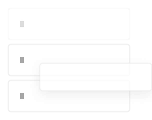
  <DoDont type="dont" text="simplify the styling of drag and drop. The default styling provides clarity on where a user can drop in a complicated app.">
    <Frame>
      <div className="w-full h-full bg-[#FFFFFF] p-2 rounded flex items-center justify-center">
        <img src="https://mintcdn.com/servicetitan/gaitSLKK1iHwa_zv/images/docs/web/components/dnd-sort/dont-simplify-drop-zone.png?fit=max&auto=format&n=gaitSLKK1iHwa_zv&q=85&s=70b195b42e7487c66a54060d92d1c816" alt="Don't simplify the styling of drag and drop" width="608" height="480" data-path="images/docs/web/components/dnd-sort/dont-simplify-drop-zone.png" />
      </div>
    </Frame>
  </DoDont>
</Columns>