> ## Documentation Index
> Fetch the complete documentation index at: https://anvil.servicetitan.com/llms.txt
> Use this file to discover all available pages before exploring further.

# Dnd – Design

> Dnd is a collection of low-level UI components that can be assembled into a drag and drop UI.

export const LiveCode = ({children, customHeight, clickToLoad, example, fullWidth, fullHeight, hideCodeInLiveCode, screenshot, screenshotOnly, showCode: showCodeProp}) => {
  const SCREENSHOTS_BASE = "https://servicetitan.github.io/anvil2-docs-live-code/screenshots";
  const STACKBLITZ_BASE = "https://stackblitz.com/github/servicetitan/anvil2-docs-live-code/tree/main/examples";
  const [showCodeBlock, setShowCodeBlock] = useState(showCodeProp ?? false);
  const [isLocalOverride, setIsLocalOverride] = useState(false);
  useEffect(() => {
    const examplePath = `/images/live-code-screenshots-tmp/${example}.png`;
    fetch(examplePath, {
      method: "HEAD"
    }).then(r => {
      if (r.ok) setIsLocalOverride(true);
    }).catch(() => {});
  }, [example]);
  const screenshotBase = isLocalOverride ? "/images/live-code-screenshots-tmp" : SCREENSHOTS_BASE;
  if (screenshotOnly) {
    return <Frame className="flex flex-col">
        <div className="flex dark:hidden" style={{
      justifyContent: "center",
      alignItems: "center",
      width: fullWidth ? "100%" : "50%",
      minHeight: fullHeight ? "284px" : undefined,
      background: "#FFFFFF"
    }}>
          <img srcset={`${screenshotBase}/${example}.png, ${screenshotBase}/${example}-2x.png 2x`} src={`${screenshotBase}/${example}.png`} alt={example} noZoom />
        </div>
        <div className="hidden dark:flex" style={{
      justifyContent: "center",
      alignItems: "center",
      width: fullWidth ? "100%" : "50%",
      minHeight: fullHeight ? "284px" : undefined,
      background: "#141414"
    }}>
          <img srcset={`${screenshotBase}/${example}-dark.png, ${screenshotBase}/${example}-dark-2x.png 2x`} src={`${screenshotBase}/${example}-dark.png`} alt={example} noZoom />
        </div>
      </Frame>;
  }
  if (screenshot) {
    return <Frame className="flex flex-col -mb-2">
        <div className="flex dark:hidden bg-white dark:bg-codeblock border border-gray-950/10 dark:border-white/10 dark:twoslash-dark rounded-2xl overflow-hidden" style={{
      justifyContent: "center",
      alignItems: "center",
      width: fullWidth ? "100%" : "50%",
      minHeight: fullHeight ? "284px" : undefined
    }}>
          <img srcset={`${screenshotBase}/${example}.png, ${screenshotBase}/${example}-2x.png 2x`} src={`${screenshotBase}/${example}.png`} alt={example} noZoom />
        </div>

        <div className="hidden dark:flex bg-white dark:bg-codeblock border border-gray-950/10 dark:border-white/10 dark:twoslash-dark rounded-2xl overflow-hidden" style={{
      background: "#141414",
      justifyContent: "center",
      alignItems: "center",
      width: fullWidth ? "100%" : "50%",
      minHeight: fullHeight ? "284px" : undefined
    }}>
          <img srcset={`${screenshotBase}/${example}-dark.png, ${screenshotBase}/${example}-dark-2x.png 2x`} src={`${screenshotBase}/${example}-dark.png`} alt={example} noZoom />
        </div>

        <div className="flex justify-end items-center text-xs py-2 px-1 gap-4">
          {!showCodeProp ? <button className="inline-flex justify-end items-center text-gray-700 dark:text-gray-50 hover:text-blue-500 dark:hover:text-blue-300 transition-colors group self-end gap-1 cursor-pointer" onClick={() => setShowCodeBlock(!showCodeBlock)} style={{
      appearance: "none"
    }}>
              <Icon icon="code" size="12px" className="group-hover:bg-blue-500 dark:group-hover:bg-blue-300" />
              <span>{showCodeBlock ? "Hide code" : "Show code"}</span>
            </button> : null}

          <a className="inline-flex justify-end items-center hover:text-blue-500 dark:hover:text-blue-300 transition-colors group self-end gap-1" href={`${STACKBLITZ_BASE}/${example}?file=src/App.tsx`} target="_blank" rel="noreferrer">
            <Icon icon="bolt" size="12px" className="group-hover:bg-blue-500 dark:group-hover:bg-blue-300" />
            <span>StackBlitz demo</span>
          </a>
        </div>

        <div className="grid transition-[grid-template-rows] duration-300 ease-in-out overflow-auto overflow-y-hidden overflow-x-auto" style={showCodeBlock ? {
      gridTemplateRows: "1fr"
    } : {
      gridTemplateRows: "0fr"
    }}>
          <div style={{
      minHeight: 0,
      overflowX: "auto",
      overflowY: "hidden",
      marginBlockStart: "-1.25rem",
      marginBlockEnd: "-1.5rem"
    }}>
            {children}
          </div>
        </div>
      </Frame>;
  } else {
    return <div style={{
      display: "flex",
      width: fullWidth ? "100%" : "50%",
      minHeight: customHeight ? customHeight : "316px",
      resize: "vertical",
      overflow: "auto"
    }}>
        <iframe title={example} style={{
      flex: 1,
      width: fullWidth ? "100%" : "50%",
      minHeight: customHeight ? customHeight : "316px"
    }} src={`${STACKBLITZ_BASE}/${example}?embed=1&hideNavigation=1&hideExplorer=1&terminalHeight=0&file=src/App.tsx${clickToLoad ? "&ctl=1" : ""}${hideCodeInLiveCode ? "&view=preview" : ""}`} allow="accelerometer; ambient-light-sensor; camera; encrypted-media; geolocation; gyroscope; hid; microphone; midi; payment; usb; vr; xr-spatial-tracking" sandbox="allow-forms allow-modals allow-popups allow-presentation allow-same-origin allow-scripts" />
      </div>;
  }
};

export const CodePreviewPlaceholder = ({double, fullWidth}) => {
  const single = <div style={{
    width: fullWidth ? "100%" : "50%",
    borderRadius: "1rem",
    display: "flex",
    padding: "1rem",
    flexDirection: "column",
    gap: "0.5rem",
    height: "10rem",
    marginBlockEnd: "1rem"
  }} className="border-width-default border-color-subdued">
      <div className="bg-strong border-radius-large" style={{
    width: "100%",
    flexGrow: "1"
  }} />
      <div className="bg-strong border-radius-large" style={{
    width: "100%",
    flexGrow: "1"
  }} />
    </div>;
  return double ? <div style={{
    display: "flex",
    gap: "1rem"
  }}>
      {single}
      {single}
    </div> : single;
};

## Anatomy

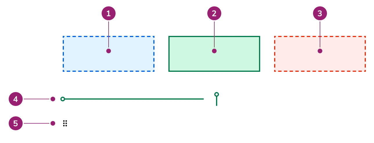
Dnd consists of three primary components that work together to create drag and drop interfaces.

<Frame>
  <div className="w-full h-full bg-[#FFFFFF] p-2 rounded flex items-center justify-center">
    <img
      src="https://mintcdn.com/servicetitan/gLoz1MFH6ICVCCBs/images/docs/web/components/dnd/dnd_anatomy.png?fit=max&auto=format&n=gLoz1MFH6ICVCCBs&q=85&s=c9e2af9e8d7c30bb40de98b164d2cc50"
      alt="Dnd
anatomy"
      width="1288"
      height="494"
      data-path="images/docs/web/components/dnd/dnd_anatomy.png"
    />
  </div>
</Frame>

1. **Drop Zone** - Active but not over
2. **Drop Zone** - Over and valid
3. **Drop Zone** - Over and invalid
4. **Sort Line**
5. **Handle**

## Options

Dnd supports the following configurations to accommodate various drag and drop scenarios.

### Drop Zone

<LiveCode example="dnd-sort-drop-zone" screenshot fullWidth>
  ```tsx lines theme={null}
  import { Flex, Dnd } from "@servicetitan/anvil2";

  function App() {
    return (
      <Flex gap={4}>
        <Dnd.Zone style={{ width: "25%" }} className="p-3">
          Resting Drop Zone
        </Dnd.Zone>
        <Dnd.Zone isDragging style={{ width: "25%" }} className="p-3">
          Visible Drop Zone while dragging
        </Dnd.Zone>
        <Dnd.Zone
          isDragging
          isOver
          isValid
          style={{ width: "25%" }}
          className="p-3"
        >
          Valid Drop Zone, user is over the Drop Zone
        </Dnd.Zone>
        <Dnd.Zone isDragging isOver style={{ width: "25%" }} className="p-3">
          Invalid drop zone, user is over the Drop Zone
        </Dnd.Zone>
      </Flex>
    );
  }

  export default App;
  ```
</LiveCode>

Drop Zone displays different visual states based on drag conditions:

* **Active but not over** - Shows a dashed border when an item is being dragged but not over the drop zone
* **Over and valid** - Shows a solid border with success styling when a valid item is over the drop zone
* **Over and invalid** - Shows a dashed border with danger styling when an invalid item is over the drop zone

### Handle

<LiveCode example="dnd-handle" screenshot fullWidth>
  ```tsx lines theme={null}
  import { Dnd } from "@servicetitan/anvil2";

  function App() {
    return <Dnd.Handle />;
  }

  export default App;
  ```
</LiveCode>

The Handle displays an icon to indicate that an item is draggable. It can be configured to be decorative or interactive, depending on the use case.

### Sort Line

<LiveCode example="dnd-sort-line-vertical" screenshot fullWidth>
  ```tsx lines theme={null}
  import { Dnd } from "@servicetitan/anvil2";

  function App() {
    return (
      <div style={{ width: "100%", position: "relative" }}>
        <Dnd.SortLine orientation="vertical" position="before" offset="0" />
      </div>
    );
  }

  export default App;
  ```
</LiveCode>

<LiveCode example="dnd-sort-line-horizontal" screenshot fullWidth>
  ```tsx lines theme={null}
  import { Dnd } from "@servicetitan/anvil2";

  function App() {
    return (
      <div style={{ height: "40px", position: "relative" }}>
        <Dnd.SortLine orientation="horizontal" position="before" offset="0" />
      </div>
    );
  }

  export default App;
  ```
</LiveCode>

Sort Line indicates where an item will be dropped in a sortable list. The line width is based on its nearest relatively positioned ancestor. Use Sort Line for one-dimensional sorting in vertical or horizontal lists. Sort Line is not suitable for two-dimensional sorting such as grids.

## Usage Guidelines

Dnd is a collection of UI components, rather than a complete drag and drop solution. Additional work is needed in design to make it a complete drag and drop solution.

### When to Use

Use Dnd when you need:

* Custom drag and drop interactions not covered by DndSort
* Specific visual feedback for drag states
* Integration with external drag and drop libraries
* Fine-grained control over drag and drop behavior

### When not to use

Avoid using Dnd when:

* Basic sorting or grouping needs can be met by [Dnd Sort](/docs/web/components/dnd-sort/design)
* You need a complete drag and drop solution without implementing interactions yourself

### Alternatives

#### Dnd vs DndSort

DndSort is a pre-built composition that uses all Dnd components to cover many basic cases including sorting a list, arranging items into groups, or both. Use DndSort when it meets your needs. Use Dnd when you require custom drag and drop behavior beyond what DndSort provides.

#### Provide alternatives to Drag and Drop

While Dnd is keyboard navigable, alternative interactions should be provided for users who cannot or do not want to use drag and drop.

## Content

Content within Dnd components should clearly communicate drag and drop capabilities and provide appropriate visual feedback.

* Drop Zone content should indicate what can be dropped in the area
* Handle and Handle Button should be clearly visible and indicate draggability
* Sort Line should appear at the precise drop location to guide users

## Keyboard Interaction

Users can navigate Dnd components using standard keyboard controls.

Dnd components provide visual styling only and do not implement keyboard interactions. Implement keyboard navigation using your chosen drag and drop library or custom keyboard handlers to ensure accessibility.