> ## Documentation Index
> Fetch the complete documentation index at: https://anvil.servicetitan.com/llms.txt
> Use this file to discover all available pages before exploring further.

# Drawer – Design

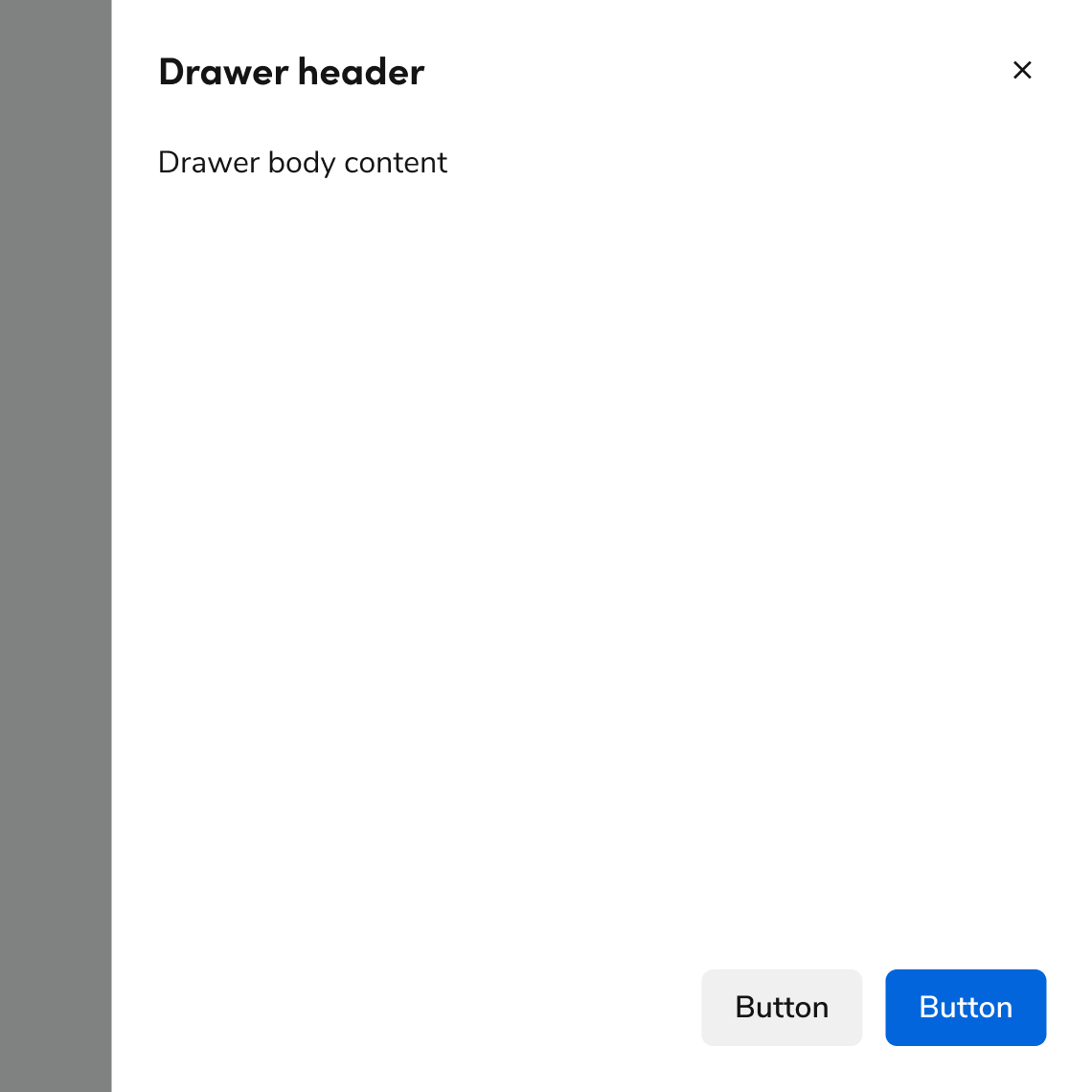
> Drawers are flyouts that slide onto the page. All drawers slide in from the right.

export const LiveCode = ({children, customHeight, clickToLoad, example, fullWidth, fullHeight, hideCodeInLiveCode, screenshot, screenshotOnly, showCode: showCodeProp}) => {
  const SCREENSHOTS_BASE = "https://servicetitan.github.io/anvil2-docs-live-code/screenshots";
  const STACKBLITZ_BASE = "https://stackblitz.com/github/servicetitan/anvil2-docs-live-code/tree/main/examples";
  const [showCodeBlock, setShowCodeBlock] = useState(showCodeProp ?? false);
  const [isLocalOverride, setIsLocalOverride] = useState(false);
  useEffect(() => {
    const examplePath = `/images/live-code-screenshots-tmp/${example}.png`;
    fetch(examplePath, {
      method: "HEAD"
    }).then(r => {
      if (r.ok) setIsLocalOverride(true);
    }).catch(() => {});
  }, [example]);
  const screenshotBase = isLocalOverride ? "/images/live-code-screenshots-tmp" : SCREENSHOTS_BASE;
  if (screenshotOnly) {
    return <Frame className="flex flex-col">
        <div className="flex dark:hidden" style={{
      justifyContent: "center",
      alignItems: "center",
      width: fullWidth ? "100%" : "50%",
      minHeight: fullHeight ? "284px" : undefined,
      background: "#FFFFFF"
    }}>
          <img srcset={`${screenshotBase}/${example}.png, ${screenshotBase}/${example}-2x.png 2x`} src={`${screenshotBase}/${example}.png`} alt={example} noZoom />
        </div>
        <div className="hidden dark:flex" style={{
      justifyContent: "center",
      alignItems: "center",
      width: fullWidth ? "100%" : "50%",
      minHeight: fullHeight ? "284px" : undefined,
      background: "#141414"
    }}>
          <img srcset={`${screenshotBase}/${example}-dark.png, ${screenshotBase}/${example}-dark-2x.png 2x`} src={`${screenshotBase}/${example}-dark.png`} alt={example} noZoom />
        </div>
      </Frame>;
  }
  if (screenshot) {
    return <Frame className="flex flex-col -mb-2">
        <div className="flex dark:hidden bg-white dark:bg-codeblock border border-gray-950/10 dark:border-white/10 dark:twoslash-dark rounded-2xl overflow-hidden" style={{
      justifyContent: "center",
      alignItems: "center",
      width: fullWidth ? "100%" : "50%",
      minHeight: fullHeight ? "284px" : undefined
    }}>
          <img srcset={`${screenshotBase}/${example}.png, ${screenshotBase}/${example}-2x.png 2x`} src={`${screenshotBase}/${example}.png`} alt={example} noZoom />
        </div>

        <div className="hidden dark:flex bg-white dark:bg-codeblock border border-gray-950/10 dark:border-white/10 dark:twoslash-dark rounded-2xl overflow-hidden" style={{
      background: "#141414",
      justifyContent: "center",
      alignItems: "center",
      width: fullWidth ? "100%" : "50%",
      minHeight: fullHeight ? "284px" : undefined
    }}>
          <img srcset={`${screenshotBase}/${example}-dark.png, ${screenshotBase}/${example}-dark-2x.png 2x`} src={`${screenshotBase}/${example}-dark.png`} alt={example} noZoom />
        </div>

        <div className="flex justify-end items-center text-xs py-2 px-1 gap-4">
          {!showCodeProp ? <button className="inline-flex justify-end items-center text-gray-700 dark:text-gray-50 hover:text-blue-500 dark:hover:text-blue-300 transition-colors group self-end gap-1 cursor-pointer" onClick={() => setShowCodeBlock(!showCodeBlock)} style={{
      appearance: "none"
    }}>
              <Icon icon="code" size="12px" className="group-hover:bg-blue-500 dark:group-hover:bg-blue-300" />
              <span>{showCodeBlock ? "Hide code" : "Show code"}</span>
            </button> : null}

          <a className="inline-flex justify-end items-center hover:text-blue-500 dark:hover:text-blue-300 transition-colors group self-end gap-1" href={`${STACKBLITZ_BASE}/${example}?file=src/App.tsx`} target="_blank" rel="noreferrer">
            <Icon icon="bolt" size="12px" className="group-hover:bg-blue-500 dark:group-hover:bg-blue-300" />
            <span>StackBlitz demo</span>
          </a>
        </div>

        <div className="grid transition-[grid-template-rows] duration-300 ease-in-out overflow-auto overflow-y-hidden overflow-x-auto" style={showCodeBlock ? {
      gridTemplateRows: "1fr"
    } : {
      gridTemplateRows: "0fr"
    }}>
          <div style={{
      minHeight: 0,
      overflowX: "auto",
      overflowY: "hidden",
      marginBlockStart: "-1.25rem",
      marginBlockEnd: "-1.5rem"
    }}>
            {children}
          </div>
        </div>
      </Frame>;
  } else {
    return <div style={{
      display: "flex",
      width: fullWidth ? "100%" : "50%",
      minHeight: customHeight ? customHeight : "316px",
      resize: "vertical",
      overflow: "auto"
    }}>
        <iframe title={example} style={{
      flex: 1,
      width: fullWidth ? "100%" : "50%",
      minHeight: customHeight ? customHeight : "316px"
    }} src={`${STACKBLITZ_BASE}/${example}?embed=1&hideNavigation=1&hideExplorer=1&terminalHeight=0&file=src/App.tsx${clickToLoad ? "&ctl=1" : ""}${hideCodeInLiveCode ? "&view=preview" : ""}`} allow="accelerometer; ambient-light-sensor; camera; encrypted-media; geolocation; gyroscope; hid; microphone; midi; payment; usb; vr; xr-spatial-tracking" sandbox="allow-forms allow-modals allow-popups allow-presentation allow-same-origin allow-scripts" />
      </div>;
  }
};

export const CodePreviewPlaceholder = ({double, fullWidth}) => {
  const single = <div style={{
    width: fullWidth ? "100%" : "50%",
    borderRadius: "1rem",
    display: "flex",
    padding: "1rem",
    flexDirection: "column",
    gap: "0.5rem",
    height: "10rem",
    marginBlockEnd: "1rem"
  }} className="border-width-default border-color-subdued">
      <div className="bg-strong border-radius-large" style={{
    width: "100%",
    flexGrow: "1"
  }} />
      <div className="bg-strong border-radius-large" style={{
    width: "100%",
    flexGrow: "1"
  }} />
    </div>;
  return double ? <div style={{
    display: "flex",
    gap: "1rem"
  }}>
      {single}
      {single}
    </div> : single;
};

<Frame>
  <div className="w-full h-full bg-[#FFFFFF] p-2 rounded flex items-center justify-center">
    <img noZoom src="https://mintcdn.com/servicetitan/uz2PQSvO75TRhQ38/images/docs/web/components/shared/example-of-a-drawer.png?fit=max&auto=format&n=uz2PQSvO75TRhQ38&q=85&s=cd0b735286e9497cafc5b94de6a88b89" width="1140" height="1140" data-path="images/docs/web/components/shared/example-of-a-drawer.png" />
  </div>
</Frame>

## Anatomy

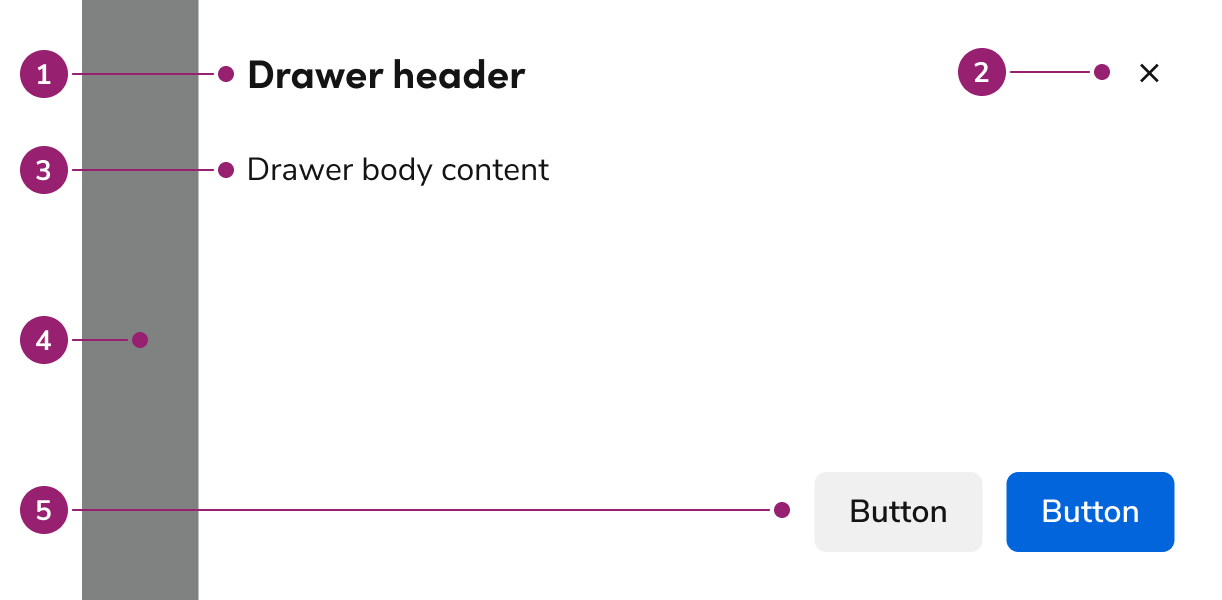
The Drawer consists of five primary elements that work together to slide content onto the page from the right.

<Frame>
  <div className="w-full h-full bg-[#FFFFFF] p-2 rounded flex items-center justify-center">
    <img
      src="https://mintcdn.com/servicetitan/CekIMDXcDEhGoN_I/images/docs/web/components/drawer/design/anatomy-of-a-drawer.png?fit=max&auto=format&n=CekIMDXcDEhGoN_I&q=85&s=36f7b52443326989cfe6d96da9532c85"
      alt="Anatomy of a
Drawer"
      width="1222"
      height="600"
      data-path="images/docs/web/components/drawer/design/anatomy-of-a-drawer.png"
    />
  </div>
</Frame>

1. Header
2. Close action
3. Body content
4. Backdrop
5. Footer actions

## Options

The Drawer supports flexible content, footer actions, and sizing configurations to accommodate various flyout scenarios.

### Body content

Drawer supports any type of content in the body.

<LiveCode example="drawer-content-full-page" screenshot fullWidth>
  ```tsx lines theme={null}
  import { Drawer, Flex, TextField, Radio, Button } from "@servicetitan/anvil2";

  function App() {
    return (
      <Drawer open>
        <Drawer.Header>Header text</Drawer.Header>
        <Drawer.Content>
          <Flex direction="column" gap="6">
            <TextField label="First Name" />
            <TextField label="Last Name" />
            <TextField label="Email Address" />
            <Radio.Group legend="My function is">
              <Radio name="role" value="designer" label="Designer" />
              <Radio name="role" value="developer" label="Developer" />
              <Radio name="role" value="pm" label="Product Manager" />
            </Radio.Group>
          </Flex>
        </Drawer.Content>
        <Drawer.Footer sticky>
          <Drawer.CancelButton>Cancel</Drawer.CancelButton>
          <Button appearance="primary">Primary Action</Button>
        </Drawer.Footer>
      </Drawer>
    );
  }

  export default App;
  ```
</LiveCode>

### Footer actions

Drawer supports several types of action groupings. These typically include one primary action and may include elements such as links or destructive actions.

<LiveCode example="drawer-footer-full-page" screenshot fullWidth>
  ```tsx lines theme={null}
  import { Drawer, Button } from "@servicetitan/anvil2";

  function App() {
    return (
      <Drawer open>
        <Drawer.Content></Drawer.Content>
        <Drawer.Footer sticky>
          <Drawer.CancelButton>Cancel</Drawer.CancelButton>
          <Button appearance="primary">Primary Action</Button>
        </Drawer.Footer>
      </Drawer>
    );
  }

  export default App;
  ```
</LiveCode>

<LiveCode example="drawer-footer-button-left-full-page" screenshot fullWidth>
  ```tsx lines theme={null}
  import { Drawer, Button, Flex } from "@servicetitan/anvil2";

  function App() {
    return (
      <Drawer open>
        <Drawer.Content></Drawer.Content>
        <Drawer.Footer sticky>
          <Button>Back</Button>
          {/* spacer */}
          <Flex grow="1" />
          <Drawer.CancelButton>Cancel</Drawer.CancelButton>
          <Button appearance="primary">Primary Action</Button>
        </Drawer.Footer>
      </Drawer>
    );
  }

  export default App;
  ```
</LiveCode>

<LiveCode example="drawer-footer-link-left-full-page" screenshot fullWidth>
  ```tsx lines theme={null}
  import { Drawer, Link, Flex, Button } from "@servicetitan/anvil2";

  function App() {
    return (
      <Drawer open>
        <Drawer.Content></Drawer.Content>
        <Drawer.Footer sticky>
          <Link style={{ alignSelf: "center" }}>Learn more</Link>
          {/* spacer */}
          <Flex grow="1" />
          <Drawer.CancelButton>Cancel</Drawer.CancelButton>
          <Button appearance="primary">Primary Action</Button>
        </Drawer.Footer>
      </Drawer>
    );
  }

  export default App;
  ```
</LiveCode>

<LiveCode example="drawer-footer-button-danger-full-page" screenshot fullWidth>
  ```tsx lines theme={null}
  import { Drawer, Button } from "@servicetitan/anvil2";

  function App() {
    return (
      <Drawer open>
        <Drawer.Content></Drawer.Content>
        <Drawer.Footer sticky>
          <Drawer.CancelButton>Cancel</Drawer.CancelButton>
          <Button appearance="danger">Destructive Action</Button>
        </Drawer.Footer>
      </Drawer>
    );
  }

  export default App;
  ```
</LiveCode>

### Sizing

Drawer supports 4 sizing options: small, medium (default), large, and extra large.

<LiveCode example="drawer-size-small-full-page" screenshot fullWidth>
  ```tsx lines theme={null}
  import { Drawer, Button } from "@servicetitan/anvil2";

  function App() {
    return (
      <Drawer open size="small">
        <Drawer.Header>Header text</Drawer.Header>
        <Drawer.Content>Body text in the Drawer.</Drawer.Content>
        <Drawer.Footer sticky>
          <Drawer.CancelButton>Cancel</Drawer.CancelButton>
          <Button appearance="primary">Primary Action</Button>
        </Drawer.Footer>
      </Drawer>
    );
  }

  export default App;
  ```
</LiveCode>

<LiveCode example="drawer-size-medium-full-page" screenshot fullWidth>
  ```tsx lines theme={null}
  import { Drawer, Button } from "@servicetitan/anvil2";

  function App() {
    return (
      <Drawer open>
        <Drawer.Header>Header text</Drawer.Header>
        <Drawer.Content>Body text in the Drawer.</Drawer.Content>
        <Drawer.Footer sticky>
          <Drawer.CancelButton>Cancel</Drawer.CancelButton>
          <Button appearance="primary">Primary Action</Button>
        </Drawer.Footer>
      </Drawer>
    );
  }

  export default App;
  ```
</LiveCode>

<LiveCode example="drawer-size-large-full-page" screenshot fullWidth>
  ```tsx lines theme={null}
  import { Drawer, Button } from "@servicetitan/anvil2";

  function App() {
    return (
      <Drawer open size="large">
        <Drawer.Header>Header text</Drawer.Header>
        <Drawer.Content>Body text in the Drawer.</Drawer.Content>
        <Drawer.Footer sticky>
          <Drawer.CancelButton>Cancel</Drawer.CancelButton>
          <Button appearance="primary">Primary Action</Button>
        </Drawer.Footer>
      </Drawer>
    );
  }

  export default App;
  ```
</LiveCode>

<LiveCode example="drawer-size-xlarge-full-page" screenshot fullWidth>
  ```tsx lines theme={null}
  import { Drawer, Button } from "@servicetitan/anvil2";

  function App() {
    return (
      <Drawer open size="xlarge">
        <Drawer.Header>Header text</Drawer.Header>
        <Drawer.Content>Body text in the Drawer.</Drawer.Content>
        <Drawer.Footer sticky>
          <Drawer.CancelButton>Cancel</Drawer.CancelButton>
          <Button appearance="primary">Primary Action</Button>
        </Drawer.Footer>
      </Drawer>
    );
  }

  export default App;
  ```
</LiveCode>

| Sizing           | Width           | Height |
| ---------------- | --------------- | ------ |
| Small            | 22.5rem / 360px | 100%   |
| Medium (default) | 35rem / 560px   | 100%   |
| Large            | 48rem / 768px   | 100%   |
| Extra Large      | 70rem / 1120px  | 100%   |

## Behavior

The Drawer responds to content overflow and scrolling requirements while maintaining focus management.

### Overflow handling

Header and footer content in Drawer wraps rather than truncates. Footer actions support custom overflow behavior when needed.

<LiveCode example="drawer-overflow-full-page" screenshot fullWidth>
  ```tsx lines theme={null}
  import { Drawer, Link, Flex, Button } from "@servicetitan/anvil2";
  import { core } from "@servicetitan/anvil2/token";

  function App() {
    return (
      <Drawer open>
        <Drawer.Header>
          Drawer Title that Will Overflow to Another Line with Enough Words
        </Drawer.Header>
        <Drawer.Content>Body text in the Drawer.</Drawer.Content>
        <Drawer.Footer
          style={{
            flexWrap: "wrap",
            alignItems: "center",
          }}
          sticky
        >
          <Link
            style={{
              marginTop: core.primitive?.Size2?.value,
              marginBottom: core.primitive?.Size2?.value,
            }}
          >
            Learn more
          </Link>
          <Flex wrap="wrap" justifyContent="flex-end" gap="2">
            <Drawer.CancelButton>
              A Very Long Secondary Action that Wraps
            </Drawer.CancelButton>
            <Button appearance="primary">A Longer Primary Action</Button>
          </Flex>
        </Drawer.Footer>
      </Drawer>
    );
  }

  export default App;
  ```
</LiveCode>

### Scrolling

The body region of Drawer scrolls when space is not available. The footer can be configured to scroll with the body but is typically sticky.

<LiveCode example="drawer-scrolling-full-page" screenshot fullWidth>
  ```tsx lines theme={null}
  import { Drawer, Button } from "@servicetitan/anvil2";

  function App() {
    return (
      <Drawer open>
        <Drawer.Header>Header text</Drawer.Header>
        <Drawer.Content>
          Lorem ipsum dolor sit amet, consectetur adipiscing elit. Sed interdum
          justo id eros interdum, quis malesuada diam malesuada. Etiam auctor
          pharetra nisl vitae aliquet. Curabitur gravida diam eros, nec pharetra
          augue convallis non. Maecenas nibh felis, blandit ac congue at, cursus
          sed odio. Cras quam risus, suscipit eget velit id, varius faucibus est.
          Integer in quam eget lacus consectetur posuere consectetur mollis quam.
          Morbi sapien felis, venenatis ac dui a, laoreet placerat velit. Nam
          luctus eu lectus sed consequat. Nam mi elit, auctor ut magna et,
          accumsan facilisis sapien.
          <br />
          <br />
          Donec a mi eu mauris dignissim dictum non at erat. Sed hendrerit metus
          dolor, in congue ligula vestibulum nec. Quisque ac velit sollicitudin,
          laoreet mauris quis, rutrum urna. Nam euismod nisi vitae mi commodo, id
          dapibus arcu convallis. Quisque tincidunt aliquam elit. Donec porttitor
          lacus eget tellus finibus, luctus dapibus mi auctor. Praesent sed
          tincidunt tortor. Aliquam non orci at nisl tincidunt dapibus. Mauris a
          interdum augue. Nunc ac augue ornare, mattis orci eu, tempus tortor. Ut
          dignissim velit sit amet lorem tempus, a dictum mi commodo.
          <br />
          <br />
          Maecenas neque nulla, fringilla vel risus sit amet, placerat accumsan
          tortor. Nam consequat massa non laoreet posuere. Cras at massa in leo
          varius tempus. Nam sed convallis sapien. Integer pretium risus vel
          fermentum consequat. Integer convallis in massa sit amet posuere. Cras
          gravida ut odio eget laoreet. Pellentesque lobortis enim nec orci
          venenatis, in auctor enim molestie. Nullam felis lectus, dictum ut magna
          vel, dignissim ultricies erat. Suspendisse potenti. Morbi non lacinia
          dui, at fermentum velit. Aenean sodales ullamcorper lectus, in mollis
          lacus vulputate vel. Vivamus accumsan lorem odio, et lacinia nunc
          rhoncus sed. Quisque dapibus nisl at orci sodales, vitae volutpat nulla
          tincidunt. Fusce tristique sed erat in ullamcorper. In porttitor lectus
          nec est porttitor, eget dignissim ex finibus.
          <br />
          <br />
          Nulla facilisi. Phasellus mollis iaculis nisi sed pulvinar. Ut id
          vehicula enim, eget euismod nibh. Vestibulum egestas facilisis mauris
          sit amet porttitor. Morbi at laoreet sem. Fusce eu mauris a dui
          efficitur tristique. Integer ultrices, leo nec bibendum sodales, neque
          sem congue ipsum, non molestie metus tortor ac ligula. Sed cursus diam
          sed odio cursus commodo eu nec ex. Donec sed lacus nec felis vehicula
          hendrerit. Curabitur consectetur ultricies odio eu suscipit.
          <br />
          <br />
          Cras eu blandit tortor, a semper nibh. Proin vel felis tellus.
          Vestibulum dignissim diam eget sem tincidunt, sit amet vehicula justo
          bibendum. Interdum et malesuada fames ac ante ipsum primis in faucibus.
          Phasellus tortor diam, viverra in mattis ac, lobortis id tellus.
          Praesent laoreet condimentum magna ac venenatis. Etiam massa libero,
          volutpat in erat a, venenatis varius lorem.
        </Drawer.Content>
        <Drawer.Footer sticky>
          <Drawer.CancelButton>Cancel</Drawer.CancelButton>
          <Button appearance="primary">Primary Action</Button>
        </Drawer.Footer>
      </Drawer>
    );
  }

  export default App;
  ```
</LiveCode>

## Usage Guidelines

### When to Use

Use Drawer to show information or a task without navigating to another page.

#### Consider placing content on-page over a Drawer

Directly integrating content that would be in a Drawer on the page allows users to continue to both see and interact with the rest of the content on the page.

### When not to use

#### Don't use for exclusive, essential flows

Drawers should not be used for steps essential to a flow. The exception is if the Drawer is acting as a supplemental, redundant place for those steps.

#### Don't use to communicate page errors

Using a Drawer to convey errors is an anti-pattern. It requires a user to actively remember its contents once the Drawer is closed. See the error pattern for alternatives.

#### Don't use to confirm actions

Use the [Dialog](/docs/web/components/dialog/design) for confirmations instead.

### Alternatives

#### Drawer vs Dialog

|                                                                        | Dialog                       | Drawer                                                                |
| ---------------------------------------------------------------------- | ---------------------------- | --------------------------------------------------------------------- |
| Complete a secondary task                                              | Simple, one step tasks       | 1-3 steps at most. Tasks with more steps should be on a separate page |
| Display additional information related to the context in the main page | Yes, ideal for short content | Yes, ideal for longer, more complex information                       |
| Confirm user actions                                                   | Yes                          | No                                                                    |

### How to Use

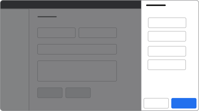
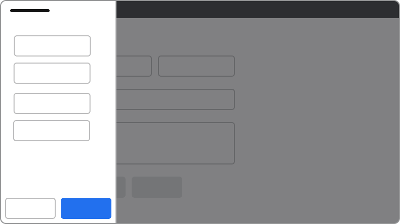
#### Position the Drawer on the right

Drawers always appear on the right side of the page.

<Frame>
  <div className="w-full h-full bg-[#FFFFFF] p-2 rounded flex items-center justify-center">
    <img
      src="https://mintcdn.com/servicetitan/Q18b5kAebhFUEruT/images/docs/web/components/drawer/shared/drawer-how-position-right-do.png?fit=max&auto=format&n=Q18b5kAebhFUEruT&q=85&s=b81d60357d8a83faaed3896b224f7ba7"
      alt="Drawer How Position Right
Do"
      width="790"
      height="444"
      data-path="images/docs/web/components/drawer/shared/drawer-how-position-right-do.png"
    />
  </div>
</Frame>

<Check>**Do**</Check>

<img src="https://mintcdn.com/servicetitan/CekIMDXcDEhGoN_I/images/docs/web/components/drawer/design/drawer-how-position-left-dont.png?fit=max&auto=format&n=CekIMDXcDEhGoN_I&q=85&s=02b3aede2f58a763667f7c9d16adbf88" alt="Drawer How Position Left Don't" width="790" height="444" data-path="images/docs/web/components/drawer/design/drawer-how-position-left-dont.png" />

<Danger>**Don't**</Danger>

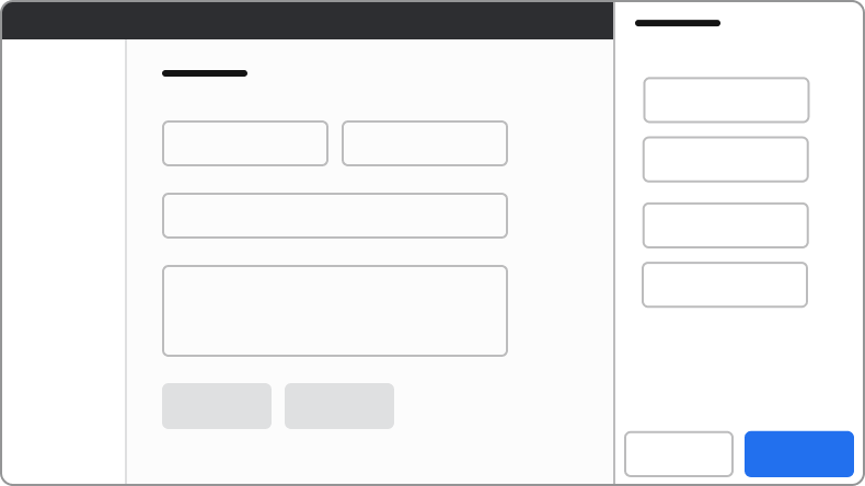
#### Always use a backdrop

The backdrop reinforces the focused nature of Drawer and prevents de-synced states. If side content must not have a backdrop, integrate the content directly on the page instead.

<Frame>
  <div className="w-full h-full bg-[#FFFFFF] p-2 rounded flex items-center justify-center">
    <img
      src="https://mintcdn.com/servicetitan/CekIMDXcDEhGoN_I/images/docs/web/components/drawer/design/drawer-use-a-backdrop.png?fit=max&auto=format&n=CekIMDXcDEhGoN_I&q=85&s=cd4f979690e83041d9215ff6ad461d79"
      alt="Drawer use a
backdrop"
      width="790"
      height="445"
      data-path="images/docs/web/components/drawer/design/drawer-use-a-backdrop.png"
    />
  </div>
</Frame>

<Check>**Do**</Check>

<Frame>
  <div className="w-full h-full bg-[#FFFFFF] p-2 rounded flex items-center justify-center">
    <img
      src="https://mintcdn.com/servicetitan/CekIMDXcDEhGoN_I/images/docs/web/components/drawer/design/drawer-dont-exclude-the-backdrop.png?fit=max&auto=format&n=CekIMDXcDEhGoN_I&q=85&s=8659f3ff46cf647f847acba26cec2c22"
      alt="Drawer don't exclude the
backdrop"
      width="790"
      height="444"
      data-path="images/docs/web/components/drawer/design/drawer-dont-exclude-the-backdrop.png"
    />
  </div>
</Frame>

<Danger>**Don't**</Danger>

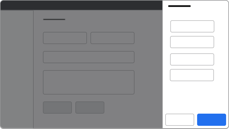
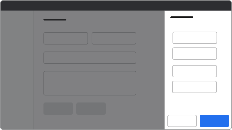
#### Always extend the Drawer to the screen's full height

Drawers will always extend to 100% the height of the browser window. Don't offset the Drawer to fit below other elements on the page.

<Frame>
  <div className="w-full h-full bg-[#FFFFFF] p-2 rounded flex items-center justify-center">
    <img
      src="https://mintcdn.com/servicetitan/Q18b5kAebhFUEruT/images/docs/web/components/drawer/shared/drawer-how-position-right-do.png?fit=max&auto=format&n=Q18b5kAebhFUEruT&q=85&s=b81d60357d8a83faaed3896b224f7ba7"
      alt="Drawer How Position Right
Do"
      width="790"
      height="444"
      data-path="images/docs/web/components/drawer/shared/drawer-how-position-right-do.png"
    />
  </div>
</Frame>

<Check>**Do**</Check>

<Frame>
  <div className="w-full h-full bg-[#FFFFFF] p-2 rounded flex items-center justify-center">
    <img
      src="https://mintcdn.com/servicetitan/CekIMDXcDEhGoN_I/images/docs/web/components/drawer/design/drawer-how-height-dont.png?fit=max&auto=format&n=CekIMDXcDEhGoN_I&q=85&s=626f7fa0f6e6cc047393fff099b0613b"
      alt="Drawer How Height
Don't"
      width="790"
      height="444"
      data-path="images/docs/web/components/drawer/design/drawer-how-height-dont.png"
    />
  </div>
</Frame>

<Danger>**Don't**</Danger>

#### Dialogs on top of Drawers

Avoid stacking overlay elements. A confirmation message through a Dialog is an exception. If a confirmation Dialog is needed within a Drawer, use an alternative to Drawer.

## Content

Content within the Drawer should be clear, organized, and support the task or information being displayed.

## Keyboard Interaction

Users can navigate the Drawer using standard keyboard controls.

| Key    | Interaction                                        |
| ------ | -------------------------------------------------- |
| Tab    | Cycles through tab-able elements within the Drawer |
| Escape | Closes the Drawer                                  |

### Accessibility

#### Focus management

There are a few different things to keep in mind with the Drawer's focus behavior.

##### Trap focus within the Drawer

By default, the Drawer will trap focus within itself. Elements outside of the Drawer would not be accessible by keyboard.

##### First focus management

What elements Drawer focuses on open depends on a few factors:

* If the body content has a focusable element, Drawer focuses on the first of these elements.
* If the body does not have a focusable element, the following is the preferred first-focus element:
  * With no actions at all, focus first on the close action.
  * When a primary action exists, focus first on the primary action.
  * When a primary destructive action exists, focus first on the secondary cancel action.

##### Return focus on close

When a Drawer is closed and the original context that triggered the Drawer is still present, focus should return to the element that triggered the Drawer.

For more guidance on focus management with dynamic content, see [changing content best practices](/docs/accessibility/changing-content).