> ## Documentation Index
> Fetch the complete documentation index at: https://anvil.servicetitan.com/llms.txt
> Use this file to discover all available pages before exploring further.

# Drilldown – Design

> A Drilldown is a navigation pattern that allows users to view additional information within the same container. Drilldown is a helper that works with the Drawer, Dialog, and Page Panel components.

export const DoDont = ({text, type, children}) => {
  return <>
      {type === "do" && <div className="do-dont do">
          {children && <div className="do-dont-content">{children}</div>}
          <Check>
            <p>
              <strong>Do</strong>
              {text && <span className="m-inline-start-1">{text}</span>}
            </p>
          </Check>
        </div>}
      {type === "dont" && <div className="do-dont dont">
          {children && <div className="do-dont-content">{children}</div>}
          <Danger>
            <p>
              <strong>Don't</strong>
              {text && <span className="m-inline-start-1">{text}</span>}
            </p>
          </Danger>
        </div>}
      {type === "caution" && <div className="do-dont caution">
          {children && <div className="do-dont-content">{children}</div>}
          <Warning>
            <p>
              <strong>Caution</strong>
              {text && <span className="m-inline-start-1">{text}</span>}
            </p>
          </Warning>
        </div>}
    </>;
};

export const LiveCode = ({children, customHeight, clickToLoad, example, fullWidth, fullHeight, hideCodeInLiveCode, screenshot, screenshotOnly, showCode: showCodeProp}) => {
  const SCREENSHOTS_BASE = "https://servicetitan.github.io/anvil2-docs-live-code/screenshots";
  const STACKBLITZ_BASE = "https://stackblitz.com/github/servicetitan/anvil2-docs-live-code/tree/main/examples";
  const [showCodeBlock, setShowCodeBlock] = useState(showCodeProp ?? false);
  const [isLocalOverride, setIsLocalOverride] = useState(false);
  useEffect(() => {
    const examplePath = `/images/live-code-screenshots-tmp/${example}.png`;
    fetch(examplePath, {
      method: "HEAD"
    }).then(r => {
      if (r.ok) setIsLocalOverride(true);
    }).catch(() => {});
  }, [example]);
  const screenshotBase = isLocalOverride ? "/images/live-code-screenshots-tmp" : SCREENSHOTS_BASE;
  if (screenshotOnly) {
    return <Frame className="flex flex-col">
        <div className="flex dark:hidden" style={{
      justifyContent: "center",
      alignItems: "center",
      width: fullWidth ? "100%" : "50%",
      minHeight: fullHeight ? "284px" : undefined,
      background: "#FFFFFF"
    }}>
          <img srcset={`${screenshotBase}/${example}.png, ${screenshotBase}/${example}-2x.png 2x`} src={`${screenshotBase}/${example}.png`} alt={example} noZoom />
        </div>
        <div className="hidden dark:flex" style={{
      justifyContent: "center",
      alignItems: "center",
      width: fullWidth ? "100%" : "50%",
      minHeight: fullHeight ? "284px" : undefined,
      background: "#141414"
    }}>
          <img srcset={`${screenshotBase}/${example}-dark.png, ${screenshotBase}/${example}-dark-2x.png 2x`} src={`${screenshotBase}/${example}-dark.png`} alt={example} noZoom />
        </div>
      </Frame>;
  }
  if (screenshot) {
    return <Frame className="flex flex-col -mb-2">
        <div className="flex dark:hidden bg-white dark:bg-codeblock border border-gray-950/10 dark:border-white/10 dark:twoslash-dark rounded-2xl overflow-hidden" style={{
      justifyContent: "center",
      alignItems: "center",
      width: fullWidth ? "100%" : "50%",
      minHeight: fullHeight ? "284px" : undefined
    }}>
          <img srcset={`${screenshotBase}/${example}.png, ${screenshotBase}/${example}-2x.png 2x`} src={`${screenshotBase}/${example}.png`} alt={example} noZoom />
        </div>

        <div className="hidden dark:flex bg-white dark:bg-codeblock border border-gray-950/10 dark:border-white/10 dark:twoslash-dark rounded-2xl overflow-hidden" style={{
      background: "#141414",
      justifyContent: "center",
      alignItems: "center",
      width: fullWidth ? "100%" : "50%",
      minHeight: fullHeight ? "284px" : undefined
    }}>
          <img srcset={`${screenshotBase}/${example}-dark.png, ${screenshotBase}/${example}-dark-2x.png 2x`} src={`${screenshotBase}/${example}-dark.png`} alt={example} noZoom />
        </div>

        <div className="flex justify-end items-center text-xs py-2 px-1 gap-4">
          {!showCodeProp ? <button className="inline-flex justify-end items-center text-gray-700 dark:text-gray-50 hover:text-blue-500 dark:hover:text-blue-300 transition-colors group self-end gap-1 cursor-pointer" onClick={() => setShowCodeBlock(!showCodeBlock)} style={{
      appearance: "none"
    }}>
              <Icon icon="code" size="12px" className="group-hover:bg-blue-500 dark:group-hover:bg-blue-300" />
              <span>{showCodeBlock ? "Hide code" : "Show code"}</span>
            </button> : null}

          <a className="inline-flex justify-end items-center hover:text-blue-500 dark:hover:text-blue-300 transition-colors group self-end gap-1" href={`${STACKBLITZ_BASE}/${example}?file=src/App.tsx`} target="_blank" rel="noreferrer">
            <Icon icon="bolt" size="12px" className="group-hover:bg-blue-500 dark:group-hover:bg-blue-300" />
            <span>StackBlitz demo</span>
          </a>
        </div>

        <div className="grid transition-[grid-template-rows] duration-300 ease-in-out overflow-auto overflow-y-hidden overflow-x-auto" style={showCodeBlock ? {
      gridTemplateRows: "1fr"
    } : {
      gridTemplateRows: "0fr"
    }}>
          <div style={{
      minHeight: 0,
      overflowX: "auto",
      overflowY: "hidden",
      marginBlockStart: "-1.25rem",
      marginBlockEnd: "-1.5rem"
    }}>
            {children}
          </div>
        </div>
      </Frame>;
  } else {
    return <div style={{
      display: "flex",
      width: fullWidth ? "100%" : "50%",
      minHeight: customHeight ? customHeight : "316px",
      resize: "vertical",
      overflow: "auto"
    }}>
        <iframe title={example} style={{
      flex: 1,
      width: fullWidth ? "100%" : "50%",
      minHeight: customHeight ? customHeight : "316px"
    }} src={`${STACKBLITZ_BASE}/${example}?embed=1&hideNavigation=1&hideExplorer=1&terminalHeight=0&file=src/App.tsx${clickToLoad ? "&ctl=1" : ""}${hideCodeInLiveCode ? "&view=preview" : ""}`} allow="accelerometer; ambient-light-sensor; camera; encrypted-media; geolocation; gyroscope; hid; microphone; midi; payment; usb; vr; xr-spatial-tracking" sandbox="allow-forms allow-modals allow-popups allow-presentation allow-same-origin allow-scripts" />
      </div>;
  }
};

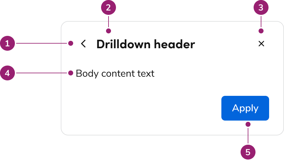
## Anatomy

<Frame>
  <div className="w-full h-full bg-[#FFFFFF] p-2 rounded flex items-center justify-center">
    <img
      src="https://mintcdn.com/servicetitan/nw2E57CNdMOAsG36/images/docs/web/components/drilldown/drilldown_anatomy.png?fit=max&auto=format&n=nw2E57CNdMOAsG36&q=85&s=d2d83582e8012198464eac5c16cb1c35"
      alt="Anatomy of a
Drilldown"
      width="916"
      height="524"
      data-path="images/docs/web/components/drilldown/drilldown_anatomy.png"
    />
  </div>
</Frame>

1. Back action
2. Drilldown header
3. Close action (optional)
4. Drilldown content
5. Drilldown footer (optional)

## Options

### In a Dialog

<LiveCode example="drilldown-options-dialog" screenshot customHeight="316px" fullWidth />

### In a Drawer

<LiveCode example="drilldown-options-drawer" screenshot fullWidth />

### In a Page Panel

<LiveCode example="drilldown-options-panel" screenshot fullWidth />

## Behaviors

### How the Drilldown gets opened

Drilldowns are opened by clicking on a trigger element within the parent UI.

### Dismissal

If the container is dismissed (e.g., clicking the backdrop or a close control), the entire UI closes. It does **not** step back; going back is reserved for the back action.

### Focus Management

Focus should mimic the corresponding UI which the Drilldown is present in. Refer to focus management documentation for Dialogs and Drawers for more information.

## Keyboard Interactions

Drilldown does not have any specific keyboard interactions. It should follow the keyboard conventions of the UI it is in.

## When to use

* Use as progressive disclosure in constrained layouts or smaller UIs.
* Use for less critical, less complex tasks.
* Use when preserving the context of the parent view adds value.
* Use when wanting to navigate to a child item from a parent view.

<LiveCode example="drilldown-usage-drawer" fullWidth />

An example of a Drilldown within a Drawer that allows the user to quickly edit individual values from the parent view.

### When not to use

* Avoid when content is unrelated to the parent UI.
* Avoid when needing to use a new parent UI in the flow.

### Where Drilldown can be used

Drilldown is allowed in the following UIs:

* [Drawer](/docs/web/components/drawer)
* [Dialog](/docs/web/components/dialog)
* [Page Panel](/docs/web/components/page)

#### Where Drilldown cannot be used

Drilldown is explicitly not allowed in the following UIs:

* [Popover](/docs/web/components/popover)
* [Combobox](/docs/web/components/combobox)

These are not allowed for a few reasons:

* They are not easily accessible to implement in the component.
* They are an unstable place to interact with for users (e.g., accidental Popover closing, uncontrollable resizes that get cut off).

In place of the Drilldown, use a Dialog instead.

#### Fullscreen Drilldown + Dialog vs A1 Takeover

The [A1 Takeover](https://v1.anvil.servicetitan.com/components/takeover/) contained in its header a "back to" element. While on the surface this seems the same as a Drilldown in a fullscreen Dialog, there is a notable difference. An A1 Takeover can be triggered from any UI interaction. The Drilldown + Fullscreen Dialog can only be triggered from another fullscreen Dialog, consistent with how Drilldown works in all other scenarios.

If looking for the closest approximation to the A1 Takeover, use the normal Fullscreen Dialog without a Drilldown.

## How to use

* Use the same container the Drilldown came from (e.g., a Drawer-triggered Drilldown remains in that Drawer).
* Avoid using the [confirmation pattern](/docs/web/patterns/confirmation) when using the Drilldown. If the actions being taken are important enough to warrant a confirmation, consider using a different UI pattern besides the Drilldown.
* If the Drilldown context is closed in some way, such as clicking on an x or a Backdrop, the whole UI is closed. It should not go back, that action is reserved for the back action. You may optionally remove these close actions in a Drilldown.
* Do not use [Breadcrumbs](/docs/web/components/breadcrumbs) within a Drilldown. Breadcrumbs create a competing hierarchy with the Drilldown's back action. Breadcrumbs are not traditionally used in Panels, Drawers, or Dialogs either.

<Columns cols={2}>
  <DoDont type="do" text="Example of a properly triggered Drilldown">
    <div className="p-4">Dialog $\rightarrow$ User clicks on item $\rightarrow$ Drilldown in same Dialog</div>
  </DoDont>

  <DoDont type="dont" text="Drilldown must come from the same parent UI">
    <div className="p-4">Any UI in the app $\rightarrow$ User clicks on item $\rightarrow$ Drilldown in a new Dialog</div>
  </DoDont>
</Columns>

### Actions within a Drilldown

When using a Drilldown, it is recommended to adjust the actions to the following:

**Header**

* Always include the back action provided by Drilldown.
* Optionally remove the close action to reduce ambiguity.

**Footer**

* Use **Apply** or similarly a named action when users modify content within the Drilldown.
* Omit **Cancel**, as its scope is ambiguous in this context.