> ## Documentation Index
> Fetch the complete documentation index at: https://anvil.servicetitan.com/llms.txt
> Use this file to discover all available pages before exploring further.

# Field Label – Design

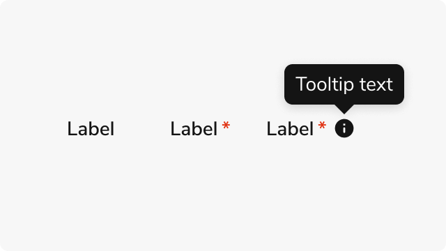
> Field Label provides accessible form labels with optional required indicators and help tooltips.

export const DoDont = ({text, type, children}) => {
  return <>
      {type === "do" && <div className="do-dont do">
          {children && <div className="do-dont-content">{children}</div>}
          <Check>
            <p>
              <strong>Do</strong>
              {text && <span className="m-inline-start-1">{text}</span>}
            </p>
          </Check>
        </div>}
      {type === "dont" && <div className="do-dont dont">
          {children && <div className="do-dont-content">{children}</div>}
          <Danger>
            <p>
              <strong>Don't</strong>
              {text && <span className="m-inline-start-1">{text}</span>}
            </p>
          </Danger>
        </div>}
      {type === "caution" && <div className="do-dont caution">
          {children && <div className="do-dont-content">{children}</div>}
          <Warning>
            <p>
              <strong>Caution</strong>
              {text && <span className="m-inline-start-1">{text}</span>}
            </p>
          </Warning>
        </div>}
    </>;
};

export const LiveCode = ({children, customHeight, clickToLoad, example, fullWidth, fullHeight, hideCodeInLiveCode, screenshot, screenshotOnly, showCode: showCodeProp}) => {
  const SCREENSHOTS_BASE = "https://servicetitan.github.io/anvil2-docs-live-code/screenshots";
  const STACKBLITZ_BASE = "https://stackblitz.com/github/servicetitan/anvil2-docs-live-code/tree/main/examples";
  const [showCodeBlock, setShowCodeBlock] = useState(showCodeProp ?? false);
  const [isLocalOverride, setIsLocalOverride] = useState(false);
  useEffect(() => {
    const examplePath = `/images/live-code-screenshots-tmp/${example}.png`;
    fetch(examplePath, {
      method: "HEAD"
    }).then(r => {
      if (r.ok) setIsLocalOverride(true);
    }).catch(() => {});
  }, [example]);
  const screenshotBase = isLocalOverride ? "/images/live-code-screenshots-tmp" : SCREENSHOTS_BASE;
  if (screenshotOnly) {
    return <Frame className="flex flex-col">
        <div className="flex dark:hidden" style={{
      justifyContent: "center",
      alignItems: "center",
      width: fullWidth ? "100%" : "50%",
      minHeight: fullHeight ? "284px" : undefined,
      background: "#FFFFFF"
    }}>
          <img srcset={`${screenshotBase}/${example}.png, ${screenshotBase}/${example}-2x.png 2x`} src={`${screenshotBase}/${example}.png`} alt={example} noZoom />
        </div>
        <div className="hidden dark:flex" style={{
      justifyContent: "center",
      alignItems: "center",
      width: fullWidth ? "100%" : "50%",
      minHeight: fullHeight ? "284px" : undefined,
      background: "#141414"
    }}>
          <img srcset={`${screenshotBase}/${example}-dark.png, ${screenshotBase}/${example}-dark-2x.png 2x`} src={`${screenshotBase}/${example}-dark.png`} alt={example} noZoom />
        </div>
      </Frame>;
  }
  if (screenshot) {
    return <Frame className="flex flex-col -mb-2">
        <div className="flex dark:hidden bg-white dark:bg-codeblock border border-gray-950/10 dark:border-white/10 dark:twoslash-dark rounded-2xl overflow-hidden" style={{
      justifyContent: "center",
      alignItems: "center",
      width: fullWidth ? "100%" : "50%",
      minHeight: fullHeight ? "284px" : undefined
    }}>
          <img srcset={`${screenshotBase}/${example}.png, ${screenshotBase}/${example}-2x.png 2x`} src={`${screenshotBase}/${example}.png`} alt={example} noZoom />
        </div>

        <div className="hidden dark:flex bg-white dark:bg-codeblock border border-gray-950/10 dark:border-white/10 dark:twoslash-dark rounded-2xl overflow-hidden" style={{
      background: "#141414",
      justifyContent: "center",
      alignItems: "center",
      width: fullWidth ? "100%" : "50%",
      minHeight: fullHeight ? "284px" : undefined
    }}>
          <img srcset={`${screenshotBase}/${example}-dark.png, ${screenshotBase}/${example}-dark-2x.png 2x`} src={`${screenshotBase}/${example}-dark.png`} alt={example} noZoom />
        </div>

        <div className="flex justify-end items-center text-xs py-2 px-1 gap-4">
          {!showCodeProp ? <button className="inline-flex justify-end items-center text-gray-700 dark:text-gray-50 hover:text-blue-500 dark:hover:text-blue-300 transition-colors group self-end gap-1 cursor-pointer" onClick={() => setShowCodeBlock(!showCodeBlock)} style={{
      appearance: "none"
    }}>
              <Icon icon="code" size="12px" className="group-hover:bg-blue-500 dark:group-hover:bg-blue-300" />
              <span>{showCodeBlock ? "Hide code" : "Show code"}</span>
            </button> : null}

          <a className="inline-flex justify-end items-center hover:text-blue-500 dark:hover:text-blue-300 transition-colors group self-end gap-1" href={`${STACKBLITZ_BASE}/${example}?file=src/App.tsx`} target="_blank" rel="noreferrer">
            <Icon icon="bolt" size="12px" className="group-hover:bg-blue-500 dark:group-hover:bg-blue-300" />
            <span>StackBlitz demo</span>
          </a>
        </div>

        <div className="grid transition-[grid-template-rows] duration-300 ease-in-out overflow-auto overflow-y-hidden overflow-x-auto" style={showCodeBlock ? {
      gridTemplateRows: "1fr"
    } : {
      gridTemplateRows: "0fr"
    }}>
          <div style={{
      minHeight: 0,
      overflowX: "auto",
      overflowY: "hidden",
      marginBlockStart: "-1.25rem",
      marginBlockEnd: "-1.5rem"
    }}>
            {children}
          </div>
        </div>
      </Frame>;
  } else {
    return <div style={{
      display: "flex",
      width: fullWidth ? "100%" : "50%",
      minHeight: customHeight ? customHeight : "316px",
      resize: "vertical",
      overflow: "auto"
    }}>
        <iframe title={example} style={{
      flex: 1,
      width: fullWidth ? "100%" : "50%",
      minHeight: customHeight ? customHeight : "316px"
    }} src={`${STACKBLITZ_BASE}/${example}?embed=1&hideNavigation=1&hideExplorer=1&terminalHeight=0&file=src/App.tsx${clickToLoad ? "&ctl=1" : ""}${hideCodeInLiveCode ? "&view=preview" : ""}`} allow="accelerometer; ambient-light-sensor; camera; encrypted-media; geolocation; gyroscope; hid; microphone; midi; payment; usb; vr; xr-spatial-tracking" sandbox="allow-forms allow-modals allow-popups allow-presentation allow-same-origin allow-scripts" />
      </div>;
  }
};

<Frame>
  <div className="w-full h-full bg-[#FFFFFF] p-2 rounded flex items-center justify-center">
    <img noZoom src="https://mintcdn.com/servicetitan/gLoz1MFH6ICVCCBs/images/docs/web/components/field-label/overview-image.png?fit=max&auto=format&n=gLoz1MFH6ICVCCBs&q=85&s=f157603987ad2a1d617c7690c92b0e3b" width="640" height="360" data-path="images/docs/web/components/field-label/overview-image.png" />
  </div>
</Frame>

## Anatomy

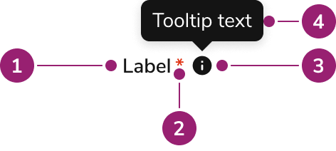
The Field Label consists of three primary elements that work together to provide clear, accessible labels for form fields.

<Frame>
  <div className="w-full h-full bg-[#FFFFFF] p-2 rounded flex items-center justify-center">
    <img src="https://mintcdn.com/servicetitan/gLoz1MFH6ICVCCBs/images/docs/web/components/field-label/design/field-label-anatomy.png?fit=max&auto=format&n=gLoz1MFH6ICVCCBs&q=85&s=e11346fce08a9186f2a5d4a6b7e0c839" alt="Anatomy of the Field Label component" width="472" height="212" data-path="images/docs/web/components/field-label/design/field-label-anatomy.png" />
  </div>
</Frame>

1. **Label text** - The primary label content that identifies the form field
2. **Required indicator** (Optional) - A red asterisk displayed when the field is required, with screen reader announcement
3. **More info icon** (Optional) - An information icon that displays additional context in a tooltip when hovered or focused
4. **More info tooltip** (Optional) - A tooltip that displays additional context about the form field when hovered or focused

## Options

The Field Label supports the following configurations to accommodate various form labeling scenarios.

### Required Indicator

<LiveCode example="fieldlabel-required" screenshot fullWidth>
  ```tsx lines theme={null}
  import { FieldLabel, Flex } from "@servicetitan/anvil2";

  function App() {
    return (
      <Flex direction="column" gap="2">
        <FieldLabel htmlFor="name" required>
          Full Name
        </FieldLabel>
        <input id="name" type="text" required />
      </Flex>
    );
  }

  export default App;
  ```
</LiveCode>

When a form field is required, Field Label displays a red asterisk after the label text. The asterisk provides a visual indicator for sighted users, while screen readers announce "Required" to ensure accessibility.

### More Info Tooltip

<LiveCode example="fieldlabel-moreinfo" screenshot fullWidth>
  ```tsx lines theme={null}
  import { FieldLabel, Flex } from "@servicetitan/anvil2";
  import { useState } from "react";

  function App() {
    const [isOpen, _setIsOpen] = useState(true);

    return (
      <Flex direction="column" gap="2">
        <FieldLabel
          htmlFor="password"
          required
          moreInfo="Password must be at least 8 characters and include a number."
          moreInfoOpen={isOpen}
        >
          Password
        </FieldLabel>
        <input id="password" type="password" required />
      </Flex>
    );
  }

  export default App;
  ```
</LiveCode>

Field Label supports an optional help tooltip that displays additional context about the form field. The tooltip appears when users hover over or focus the information icon, providing guidance without cluttering the label area.

## Behavior

The Field Label responds to user interaction with distinct visual states and tooltip interactions.

### Visual States

<LiveCode example="fieldlabel-visual-states" screenshot fullWidth>
  ```tsx lines theme={null}
  import { FieldLabel, Flex } from "@servicetitan/anvil2";

  function App() {
    return (
      <Flex direction="column" gap="4">
        <Flex direction="column" gap="2">
          <FieldLabel htmlFor="email">Email Address</FieldLabel>
          <input id="email" type="email" />
        </Flex>

        <Flex direction="column" gap="2">
          <FieldLabel htmlFor="name" required>
            Full Name
          </FieldLabel>
          <input id="name" type="text" required />
        </Flex>

        <Flex direction="column" gap="2">
          <FieldLabel
            htmlFor="password"
            required
            moreInfo="Password must be at least 8 characters and include a number."
          >
            Password
          </FieldLabel>
          <input id="password" type="password" required />
        </Flex>
      </Flex>
    );
  }

  export default App;
  ```
</LiveCode>

Field Label maintains consistent typography and spacing across all states. The required indicator uses a danger color to draw attention, while the more info icon remains visually distinct but unobtrusive. When the more info tooltip is present, the icon becomes interactive and responds to hover and focus states.

### Tooltip Interaction

<LiveCode example="fieldlabel-moreinfo" screenshot fullWidth>
  ```tsx lines theme={null}
  import { FieldLabel, Flex } from "@servicetitan/anvil2";
  import { useState } from "react";

  function App() {
    const [isOpen, _setIsOpen] = useState(true);

    return (
      <Flex direction="column" gap="2">
        <FieldLabel
          htmlFor="password"
          required
          moreInfo="Password must be at least 8 characters and include a number."
          moreInfoOpen={isOpen}
        >
          Password
        </FieldLabel>
        <input id="password" type="password" required />
      </Flex>
    );
  }

  export default App;
  ```
</LiveCode>

The more info tooltip opens on hover or focus of the information icon. The tooltip positions itself above the icon by default, with fallback placements to ensure visibility when space is limited. Tooltip content is also available to screen readers through a screen reader-only element, ensuring all users receive the additional context.

## Usage Guidelines

### When to Use

Use the Field Label when you need to:

* Associate labels with form inputs using semantic HTML
* Indicate required fields with a visual and accessible indicator
* Provide additional context about form fields through help tooltips
* Create fieldset legends for grouping related form controls
* Build custom form components that require explicit label control

### When not to use

Avoid using the Field Label for:

* **Built-in form components** - Many Anvil2 form components like CheckboxGroup, DateFieldYearless, NumberField, and ProgressBar already include Field Label functionality through their `label` prop
* **Non-form contexts** - Use text components for labels that don't associate with form inputs
* **Decorative text** - Use appropriate text components for non-functional label text

### Alternatives

#### Field Label vs Built-in Labels

Many Anvil2 form components include label functionality through props like `label` and `required`. Use these built-in options when available, as they handle label association and styling automatically. Use Field Label directly when building custom form components or when you need explicit control over label rendering and positioning.

### How to Use

#### Show required indicators consistently

Use the required indicator to help users understand which fields are mandatory before they start filling out the form. Consistent use of required indicators across all forms creates predictable patterns that reduce user confusion and form abandonment.

<LiveCode example="fieldlabel-required-do" screenshot fullWidth>
  ```tsx lines theme={null}
  import { FieldLabel, Flex } from "@servicetitan/anvil2";

  function App() {
    return (
      <Flex direction="column" gap="2">
        <FieldLabel htmlFor="name" required>
          Full Name
        </FieldLabel>
        <input id="name" type="text" required />
      </Flex>
    );
  }

  export default App;
  ```
</LiveCode>

<DoDont type="do" />

Use required indicators consistently across all forms. When some fields are required, clearly mark all required fields to help users understand form expectations at a glance.

#### Use more info for supplementary information only

More info tooltips are best for supplemental information that enhances understanding but isn't essential to complete the field. Essential information should be visible in the label, hint text, or description rather than hidden in a tooltip.

<LiveCode example="fieldlabel-moreinfo-supplementary-do" screenshot fullWidth>
  ```tsx lines theme={null}
  import { FieldLabel, Flex } from "@servicetitan/anvil2";
  import { useState } from "react";

  function App() {
    const [isOpen, _setIsOpen] = useState(true);

    return (
      <Flex direction="column" gap="2">
        <FieldLabel
          htmlFor="tax-id"
          required
          moreInfo="Your tax ID is used for reporting purposes and may be required for certain transactions."
          moreInfoOpen={isOpen}
        >
          Tax ID
        </FieldLabel>
        <input id="tax-id" type="text" required />
      </Flex>
    );
  }

  export default App;
  ```
</LiveCode>

<DoDont type="do" />

Use more info for supplementary context, definitions, or examples that help users understand the field better. Keep tooltip content to 1-2 lines and avoid repeating information already visible in the label.

<LiveCode example="fieldlabel-moreinfo-essential-dont" screenshot fullWidth>
  ```tsx lines theme={null}
  import { FieldLabel, Flex } from "@servicetitan/anvil2";
  import { useState } from "react";

  function App() {
    const [isOpen, _setIsOpen] = useState(true);

    return (
      <Flex direction="column" gap="2">
        <FieldLabel
          htmlFor="password"
          required
          moreInfo="Must be at least 8 characters and include a number."
          moreInfoOpen={isOpen}
        >
          Password
        </FieldLabel>
        <input id="password" type="password" required />
      </Flex>
    );
  }

  export default App;
  ```
</LiveCode>

<DoDont type="dont" />

Don't put essential information in more info tooltips. Users must recall tooltip content when completing the field, which creates cognitive load. Use hint text or descriptions for information users need to see while filling out the form.

<LiveCode example="fieldlabel-moreinfo-essential-do" screenshot fullWidth>
  ```tsx lines theme={null}
  import { FieldLabel, FieldMessage, Flex } from "@servicetitan/anvil2";

  function App() {
    return (
      <Flex direction="column" gap="2">
        <FieldLabel htmlFor="password" required>
          Password
        </FieldLabel>
        <input
          id="password"
          type="password"
          required
          aria-describedby="password-hint"
        />
        <FieldMessage
          id="password-hint"
          hint="Must be at least 8 characters and include a number."
        />
      </Flex>
    );
  }

  export default App;
  ```
</LiveCode>

<DoDont type="do" />

Put essential information like requirements and formatting rules in hint text or descriptions where users can see it while filling out the form. This reduces cognitive load and helps users complete fields correctly.

## Content

Content within the Field Label should be clear, concise, and descriptive.

* Use sentence case for label text
* Keep labels brief but descriptive enough to identify the field purpose
* Write tooltip content that provides actionable guidance or clarifies field requirements
* Ensure required indicators are used consistently across forms
* Match label terminology with the form field's purpose and expected input

## Keyboard Interaction

Users can navigate the Field Label using standard keyboard controls.

| Key    | Description                                                                                                                        |
| ------ | ---------------------------------------------------------------------------------------------------------------------------------- |
| Tab    | Moves focus to the associated form input. When more info icon is present and the input is focused, the tooltip opens automatically |
| Escape | Closes the more info tooltip when open                                                                                             |

### Accessibility

Field Label implements accessibility features to ensure all users receive proper form field context. The component uses semantic HTML elements (`label` or `legend`) to create proper associations with form controls. Required fields include both visual indicators and screen reader announcements. The more info tooltip content is available to screen readers through a screen reader-only element, ensuring assistive technology users receive the same contextual information as sighted users.