> ## Documentation Index
> Fetch the complete documentation index at: https://anvil.servicetitan.com/llms.txt
> Use this file to discover all available pages before exploring further.

# Field Message – Design

> Field Message is a subcomponent used by form field components to show hint, error, warning, and description text to a user.

export const LiveCode = ({children, customHeight, clickToLoad, example, fullWidth, fullHeight, hideCodeInLiveCode, screenshot, screenshotOnly, showCode: showCodeProp}) => {
  const SCREENSHOTS_BASE = "https://servicetitan.github.io/anvil2-docs-live-code/screenshots";
  const STACKBLITZ_BASE = "https://stackblitz.com/github/servicetitan/anvil2-docs-live-code/tree/main/examples";
  const [showCodeBlock, setShowCodeBlock] = useState(showCodeProp ?? false);
  const [isLocalOverride, setIsLocalOverride] = useState(false);
  useEffect(() => {
    const examplePath = `/images/live-code-screenshots-tmp/${example}.png`;
    fetch(examplePath, {
      method: "HEAD"
    }).then(r => {
      if (r.ok) setIsLocalOverride(true);
    }).catch(() => {});
  }, [example]);
  const screenshotBase = isLocalOverride ? "/images/live-code-screenshots-tmp" : SCREENSHOTS_BASE;
  if (screenshotOnly) {
    return <Frame className="flex flex-col">
        <div className="flex dark:hidden" style={{
      justifyContent: "center",
      alignItems: "center",
      width: fullWidth ? "100%" : "50%",
      minHeight: fullHeight ? "284px" : undefined,
      background: "#FFFFFF"
    }}>
          <img srcset={`${screenshotBase}/${example}.png, ${screenshotBase}/${example}-2x.png 2x`} src={`${screenshotBase}/${example}.png`} alt={example} noZoom />
        </div>
        <div className="hidden dark:flex" style={{
      justifyContent: "center",
      alignItems: "center",
      width: fullWidth ? "100%" : "50%",
      minHeight: fullHeight ? "284px" : undefined,
      background: "#141414"
    }}>
          <img srcset={`${screenshotBase}/${example}-dark.png, ${screenshotBase}/${example}-dark-2x.png 2x`} src={`${screenshotBase}/${example}-dark.png`} alt={example} noZoom />
        </div>
      </Frame>;
  }
  if (screenshot) {
    return <Frame className="flex flex-col -mb-2">
        <div className="flex dark:hidden bg-white dark:bg-codeblock border border-gray-950/10 dark:border-white/10 dark:twoslash-dark rounded-2xl overflow-hidden" style={{
      justifyContent: "center",
      alignItems: "center",
      width: fullWidth ? "100%" : "50%",
      minHeight: fullHeight ? "284px" : undefined
    }}>
          <img srcset={`${screenshotBase}/${example}.png, ${screenshotBase}/${example}-2x.png 2x`} src={`${screenshotBase}/${example}.png`} alt={example} noZoom />
        </div>

        <div className="hidden dark:flex bg-white dark:bg-codeblock border border-gray-950/10 dark:border-white/10 dark:twoslash-dark rounded-2xl overflow-hidden" style={{
      background: "#141414",
      justifyContent: "center",
      alignItems: "center",
      width: fullWidth ? "100%" : "50%",
      minHeight: fullHeight ? "284px" : undefined
    }}>
          <img srcset={`${screenshotBase}/${example}-dark.png, ${screenshotBase}/${example}-dark-2x.png 2x`} src={`${screenshotBase}/${example}-dark.png`} alt={example} noZoom />
        </div>

        <div className="flex justify-end items-center text-xs py-2 px-1 gap-4">
          {!showCodeProp ? <button className="inline-flex justify-end items-center text-gray-700 dark:text-gray-50 hover:text-blue-500 dark:hover:text-blue-300 transition-colors group self-end gap-1 cursor-pointer" onClick={() => setShowCodeBlock(!showCodeBlock)} style={{
      appearance: "none"
    }}>
              <Icon icon="code" size="12px" className="group-hover:bg-blue-500 dark:group-hover:bg-blue-300" />
              <span>{showCodeBlock ? "Hide code" : "Show code"}</span>
            </button> : null}

          <a className="inline-flex justify-end items-center hover:text-blue-500 dark:hover:text-blue-300 transition-colors group self-end gap-1" href={`${STACKBLITZ_BASE}/${example}?file=src/App.tsx`} target="_blank" rel="noreferrer">
            <Icon icon="bolt" size="12px" className="group-hover:bg-blue-500 dark:group-hover:bg-blue-300" />
            <span>StackBlitz demo</span>
          </a>
        </div>

        <div className="grid transition-[grid-template-rows] duration-300 ease-in-out overflow-auto overflow-y-hidden overflow-x-auto" style={showCodeBlock ? {
      gridTemplateRows: "1fr"
    } : {
      gridTemplateRows: "0fr"
    }}>
          <div style={{
      minHeight: 0,
      overflowX: "auto",
      overflowY: "hidden",
      marginBlockStart: "-1.25rem",
      marginBlockEnd: "-1.5rem"
    }}>
            {children}
          </div>
        </div>
      </Frame>;
  } else {
    return <div style={{
      display: "flex",
      width: fullWidth ? "100%" : "50%",
      minHeight: customHeight ? customHeight : "316px",
      resize: "vertical",
      overflow: "auto"
    }}>
        <iframe title={example} style={{
      flex: 1,
      width: fullWidth ? "100%" : "50%",
      minHeight: customHeight ? customHeight : "316px"
    }} src={`${STACKBLITZ_BASE}/${example}?embed=1&hideNavigation=1&hideExplorer=1&terminalHeight=0&file=src/App.tsx${clickToLoad ? "&ctl=1" : ""}${hideCodeInLiveCode ? "&view=preview" : ""}`} allow="accelerometer; ambient-light-sensor; camera; encrypted-media; geolocation; gyroscope; hid; microphone; midi; payment; usb; vr; xr-spatial-tracking" sandbox="allow-forms allow-modals allow-popups allow-presentation allow-same-origin allow-scripts" />
      </div>;
  }
};

export const CodePreviewPlaceholder = ({double, fullWidth}) => {
  const single = <div style={{
    width: fullWidth ? "100%" : "50%",
    borderRadius: "1rem",
    display: "flex",
    padding: "1rem",
    flexDirection: "column",
    gap: "0.5rem",
    height: "10rem",
    marginBlockEnd: "1rem"
  }} className="border-width-default border-color-subdued">
      <div className="bg-strong border-radius-large" style={{
    width: "100%",
    flexGrow: "1"
  }} />
      <div className="bg-strong border-radius-large" style={{
    width: "100%",
    flexGrow: "1"
  }} />
    </div>;
  return double ? <div style={{
    display: "flex",
    gap: "1rem"
  }}>
      {single}
      {single}
    </div> : single;
};

## Anatomy

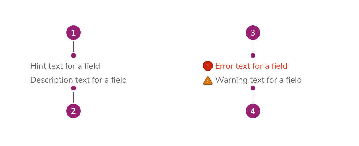
The Field Message consists of primary elements that work together to show hint, error, warning, and description text to users.

<Frame>
  <div className="w-full h-full bg-[#FFFFFF] p-2 rounded flex items-center justify-center">
    <img
      src="https://mintcdn.com/servicetitan/j3rmC6LC2VZf-6y6/images/docs/web/components/field-message/design/field-message-anatomy-diagram.png?fit=max&auto=format&n=j3rmC6LC2VZf-6y6&q=85&s=3b6eba7b604136ee42e5a75c8f8782af"
      alt="Field Message anatomy
diagram"
      width="1192"
      height="484"
      data-path="images/docs/web/components/field-message/design/field-message-anatomy-diagram.png"
    />
  </div>
</Frame>

1. Hint text (always visible, persists alongside errors and warnings)
2. Description text (max 3 lines of content)
3. Error message
4. Warning message

## Options

The Field Message supports hint, error, warning, and description text configurations to accommodate various form field messaging scenarios.

<LiveCode example="fieldmessage-props" screenshot fullWidth>
  ```tsx lines theme={null}
  import { FieldMessage, Flex, Divider } from "@servicetitan/anvil2";

  function App() {
    return (
      <Flex direction="column" gap="6">
        <FieldMessage
          hint="Hint text, should be max 1 line"
          description="Description text, can be max 3 lines explaining what the purpose of the field is to the user"
        />

        <Divider />

        <FieldMessage
          hint="Hint text"
          description="Description text, can be max 3 lines explaining what the purpose of the field is to the user"
          error="Field message in error state"
        />

        <Divider />

        <FieldMessage hint="Hint text" warning="Field message in warning state" />

        <Divider />

        <FieldMessage hint="Hint text only" />
      </Flex>
    );
  }

  export default App;
  ```
</LiveCode>

## Behavior

The Field Message displays all messages simultaneously in a consistent order: hint, description, error(s), then warning(s). No message type replaces another.

<LiveCode example="fieldmessage-behavior" screenshot fullWidth>
  ```tsx lines theme={null}
  import { FieldMessage } from "@servicetitan/anvil2";

  function App() {
    return (
      <FieldMessage
        hint="Hint text"
        description="Description text, can be max 3 lines explaining what the purpose of the field is to the user"
        error="Field message in error state"
        warning="This email is associated with another account"
      />
    );
  }

  export default App;
  ```
</LiveCode>

Hint text always remains visible, even when error or warning messages are present. Description text appears between the hint and any error or warning messages. All messages are displayed in a consistent order: hint, description, error(s), then warning(s).

## Usage Guidelines

Use the Field Message as a subcomponent in custom field components that are not part of Anvil.

### When to Use

Field Message is a subcomponent, meaning it is built into a number of Anvil field components already. Text Field is an example, as shown below:

<LiveCode example="fieldmessage-avoid" screenshot fullWidth>
  ```tsx lines theme={null}
  import {
    TextField,
    DateFieldSingle,
    Flex,
    Divider,
  } from "@servicetitan/anvil2";

  function App() {
    return (
      <Flex direction="column" gap="6">
        <TextField
          label="TextField Label"
          placeholder="Placeholder"
          hint="Hint text"
          description="TextField already has this built in!"
        />

        <Divider />

        <DateFieldSingle
          defaultValue={new Date().toISOString()}
          label="DateField Label"
          description="DateField has this built in too!"
          error="Please enter a valid date."
        />
      </Flex>
    );
  }

  export default App;
  ```
</LiveCode>

Use Field Message in custom field components that are not part of Anvil.

### How to Use

Field Message is a subcomponent built into a number of our field components that handles communicating to users how to fill out a form, what the form field is for, and when relevant, why a field has errored.

Field Message has four inputs:

* Hint text
* Description text
* Error text
* Warning text

Each serves a different use case for users:

* **Hint text:** Communicates how a user should fill out a field. For example, "Enter time in increments of 30 minutes, e.g., 9:30 AM." Always visible, even when errors or warnings are present.
* **Description text:** Communicates the way a field will be used. For example, "Sets the appointment time for the customer. Communicated out by SMS 24 hours before appointment time."
* **Error text:** Communicates what the user has done wrong in filling out the field. For example, "Time entered not in an increment of 30 minutes." Supports multiple error messages.
* **Warning text:** Communicates non-blocking issues that the user should be aware of. For example, "This email is associated with another account."

#### How not to use

When using Anvil form field components such as `Combobox`, `DateField`, `DaysOfTheWeek`, `TextField`, or `Textarea`, you don't need to use Field Message—Field Message is already built into the component.

Please look to our [Form Patterns](https://beta.anvil.servicetitan.com/web/patterns/forms#relationship-between-hint-description-and-error-text) page for guidance on how to use hints, descriptions, and errors for your use case.

## Content

Content within the Field Message should clearly communicate how to fill out the field, what the field is for, and when relevant, why a field has errored or what the user should be cautious about.

## Keyboard Interaction

Users can navigate the Field Message using standard keyboard controls.