> ## Documentation Index
> Fetch the complete documentation index at: https://anvil.servicetitan.com/llms.txt
> Use this file to discover all available pages before exploring further.

# Filter Bar – Design

> Standalone filter bar component for filtering content

export const LiveCode = ({children, customHeight, clickToLoad, example, fullWidth, fullHeight, hideCodeInLiveCode, screenshot, screenshotOnly, showCode: showCodeProp}) => {
  const SCREENSHOTS_BASE = "https://servicetitan.github.io/anvil2-docs-live-code/screenshots";
  const STACKBLITZ_BASE = "https://stackblitz.com/github/servicetitan/anvil2-docs-live-code/tree/main/examples";
  const [showCodeBlock, setShowCodeBlock] = useState(showCodeProp ?? false);
  const [isLocalOverride, setIsLocalOverride] = useState(false);
  useEffect(() => {
    const examplePath = `/images/live-code-screenshots-tmp/${example}.png`;
    fetch(examplePath, {
      method: "HEAD"
    }).then(r => {
      if (r.ok) setIsLocalOverride(true);
    }).catch(() => {});
  }, [example]);
  const screenshotBase = isLocalOverride ? "/images/live-code-screenshots-tmp" : SCREENSHOTS_BASE;
  if (screenshotOnly) {
    return <Frame className="flex flex-col">
        <div className="flex dark:hidden" style={{
      justifyContent: "center",
      alignItems: "center",
      width: fullWidth ? "100%" : "50%",
      minHeight: fullHeight ? "284px" : undefined,
      background: "#FFFFFF"
    }}>
          <img srcset={`${screenshotBase}/${example}.png, ${screenshotBase}/${example}-2x.png 2x`} src={`${screenshotBase}/${example}.png`} alt={example} noZoom />
        </div>
        <div className="hidden dark:flex" style={{
      justifyContent: "center",
      alignItems: "center",
      width: fullWidth ? "100%" : "50%",
      minHeight: fullHeight ? "284px" : undefined,
      background: "#141414"
    }}>
          <img srcset={`${screenshotBase}/${example}-dark.png, ${screenshotBase}/${example}-dark-2x.png 2x`} src={`${screenshotBase}/${example}-dark.png`} alt={example} noZoom />
        </div>
      </Frame>;
  }
  if (screenshot) {
    return <Frame className="flex flex-col -mb-2">
        <div className="flex dark:hidden bg-white dark:bg-codeblock border border-gray-950/10 dark:border-white/10 dark:twoslash-dark rounded-2xl overflow-hidden" style={{
      justifyContent: "center",
      alignItems: "center",
      width: fullWidth ? "100%" : "50%",
      minHeight: fullHeight ? "284px" : undefined
    }}>
          <img srcset={`${screenshotBase}/${example}.png, ${screenshotBase}/${example}-2x.png 2x`} src={`${screenshotBase}/${example}.png`} alt={example} noZoom />
        </div>

        <div className="hidden dark:flex bg-white dark:bg-codeblock border border-gray-950/10 dark:border-white/10 dark:twoslash-dark rounded-2xl overflow-hidden" style={{
      background: "#141414",
      justifyContent: "center",
      alignItems: "center",
      width: fullWidth ? "100%" : "50%",
      minHeight: fullHeight ? "284px" : undefined
    }}>
          <img srcset={`${screenshotBase}/${example}-dark.png, ${screenshotBase}/${example}-dark-2x.png 2x`} src={`${screenshotBase}/${example}-dark.png`} alt={example} noZoom />
        </div>

        <div className="flex justify-end items-center text-xs py-2 px-1 gap-4">
          {!showCodeProp ? <button className="inline-flex justify-end items-center text-gray-700 dark:text-gray-50 hover:text-blue-500 dark:hover:text-blue-300 transition-colors group self-end gap-1 cursor-pointer" onClick={() => setShowCodeBlock(!showCodeBlock)} style={{
      appearance: "none"
    }}>
              <Icon icon="code" size="12px" className="group-hover:bg-blue-500 dark:group-hover:bg-blue-300" />
              <span>{showCodeBlock ? "Hide code" : "Show code"}</span>
            </button> : null}

          <a className="inline-flex justify-end items-center hover:text-blue-500 dark:hover:text-blue-300 transition-colors group self-end gap-1" href={`${STACKBLITZ_BASE}/${example}?file=src/App.tsx`} target="_blank" rel="noreferrer">
            <Icon icon="bolt" size="12px" className="group-hover:bg-blue-500 dark:group-hover:bg-blue-300" />
            <span>StackBlitz demo</span>
          </a>
        </div>

        <div className="grid transition-[grid-template-rows] duration-300 ease-in-out overflow-auto overflow-y-hidden overflow-x-auto" style={showCodeBlock ? {
      gridTemplateRows: "1fr"
    } : {
      gridTemplateRows: "0fr"
    }}>
          <div style={{
      minHeight: 0,
      overflowX: "auto",
      overflowY: "hidden",
      marginBlockStart: "-1.25rem",
      marginBlockEnd: "-1.5rem"
    }}>
            {children}
          </div>
        </div>
      </Frame>;
  } else {
    return <div style={{
      display: "flex",
      width: fullWidth ? "100%" : "50%",
      minHeight: customHeight ? customHeight : "316px",
      resize: "vertical",
      overflow: "auto"
    }}>
        <iframe title={example} style={{
      flex: 1,
      width: fullWidth ? "100%" : "50%",
      minHeight: customHeight ? customHeight : "316px"
    }} src={`${STACKBLITZ_BASE}/${example}?embed=1&hideNavigation=1&hideExplorer=1&terminalHeight=0&file=src/App.tsx${clickToLoad ? "&ctl=1" : ""}${hideCodeInLiveCode ? "&view=preview" : ""}`} allow="accelerometer; ambient-light-sensor; camera; encrypted-media; geolocation; gyroscope; hid; microphone; midi; payment; usb; vr; xr-spatial-tracking" sandbox="allow-forms allow-modals allow-popups allow-presentation allow-same-origin allow-scripts" />
      </div>;
  }
};

export const DoDont = ({text, type, children}) => {
  return <>
      {type === "do" && <div className="do-dont do">
          {children && <div className="do-dont-content">{children}</div>}
          <Check>
            <p>
              <strong>Do</strong>
              {text && <span className="m-inline-start-1">{text}</span>}
            </p>
          </Check>
        </div>}
      {type === "dont" && <div className="do-dont dont">
          {children && <div className="do-dont-content">{children}</div>}
          <Danger>
            <p>
              <strong>Don't</strong>
              {text && <span className="m-inline-start-1">{text}</span>}
            </p>
          </Danger>
        </div>}
      {type === "caution" && <div className="do-dont caution">
          {children && <div className="do-dont-content">{children}</div>}
          <Warning>
            <p>
              <strong>Caution</strong>
              {text && <span className="m-inline-start-1">{text}</span>}
            </p>
          </Warning>
        </div>}
    </>;
};

export const CodePreviewPlaceholder = ({double, fullWidth}) => {
  const single = <div style={{
    width: fullWidth ? "100%" : "50%",
    borderRadius: "1rem",
    display: "flex",
    padding: "1rem",
    flexDirection: "column",
    gap: "0.5rem",
    height: "10rem",
    marginBlockEnd: "1rem"
  }} className="border-width-default border-color-subdued">
      <div className="bg-strong border-radius-large" style={{
    width: "100%",
    flexGrow: "1"
  }} />
      <div className="bg-strong border-radius-large" style={{
    width: "100%",
    flexGrow: "1"
  }} />
    </div>;
  return double ? <div style={{
    display: "flex",
    gap: "1rem"
  }}>
      {single}
      {single}
    </div> : single;
};

## Live Demo

<LiveCode example="toolbar-filter-how-instant" fullWidth hideCodeInLiveCode>
  ```tsx lines theme={null}
  import {
    FilterBar,
    type Filter,
    type CustomFilter,
  } from "@servicetitan/anvil2/beta";
  import { Radio, Combobox, Flex } from "@servicetitan/anvil2";
  import { useState, useEffect } from "react";

  type ComboboxItem = {
    id: string;
    label: string;
  };

  const comboboxItems: ComboboxItem[] = [
    { id: "is", label: "Is" },
    { id: "isNot", label: "Is Not" },
  ];

  type CustomFilterValue = {
    id: number;
    label: string;
  };

  const filterOptions = [
    { id: 1, label: "Option 1" },
    { id: 2, label: "Option 2" },
    { id: 3, label: "Option 3" },
  ];

  type SelectItem = { id: string; label: string };

  const categoryOptions: SelectItem[] = [
    { id: "option1", label: "Option 1" },
    { id: "option2", label: "Option 2" },
    { id: "option3", label: "Option 3" },
  ];

  const multiSelectCategoryOptions: SelectItem[] = [
    { id: "option1", label: "Option 1" },
    { id: "option2", label: "Option 2" },
    { id: "option3", label: "Option 3" },
    { id: "option4", label: "Option 4" },
    { id: "option5", label: "Option 5" },
  ];

  function OperatorCombobox() {
    const [selectedItem, setSelectedItem] = useState<ComboboxItem | null>(
      comboboxItems[0],
    );

    return (
      <Combobox.Select
        disableClearSelection
        items={comboboxItems}
        itemToString={(item) => (item ? item.label : "")}
        itemToKey={(item) => (item ? item.id : null)}
        selectedItem={selectedItem}
        onChange={setSelectedItem}
      >
        <Combobox.SelectTrigger label="Custom Filter" />
        <Combobox.Content>
          {({ items }) => (
            <Combobox.List>
              {items.map((item, i) => (
                <Combobox.Item key={item.id} item={item} index={i}>
                  {item.label}
                </Combobox.Item>
              ))}
            </Combobox.List>
          )}
        </Combobox.Content>
      </Combobox.Select>
    );
  }

  function App() {
    const customFilter: CustomFilter<CustomFilterValue> = {
      id: "customFilterId",
      type: "custom",
      label: "Custom filter",
      buttonRender: ({ value, onChange }) => (
        <Flex direction="column" gap={3} style={{ padding: "0.5rem" }}>
          <OperatorCombobox />
          <Radio.Group legend="Custom filter button">
            {filterOptions.map((option) => (
              <Radio
                key={option.id}
                name="custom-filter-radio-popover"
                value={option.id.toString()}
                label={option.label}
                checked={value?.id === option.id}
                onChange={(e) => {
                  if (!e?.target) return;
                  const selected = filterOptions.find(
                    (opt) => opt.id.toString() === e.target.value,
                  );
                  onChange(selected);
                }}
              />
            ))}
          </Radio.Group>
        </Flex>
      ),
      drawerRender: ({ value, onChange }) => (
        <Flex direction="column" gap={2}>
          <OperatorCombobox />
          <Radio.Group legend="Custom filter drawer">
            {filterOptions.map((option) => (
              <Radio
                key={option.id}
                name="custom-filter-radio-drawer"
                value={option.id.toString()}
                label={option.label}
                checked={value?.id === option.id}
                onChange={(e) => {
                  if (!e?.target) return;
                  const selected = filterOptions.find(
                    (opt) => opt.id.toString() === e.target.value,
                  );
                  onChange(selected);
                }}
              />
            ))}
          </Radio.Group>
        </Flex>
      ),
    };

    const [filters, setFilters] = useState<Filter[]>([
      // Boolean filter
      {
        type: "boolean",
        id: "booleanFilterId",
        label: "Boolean",
        checked: true,
      },
      // Single select filter
      {
        id: "categoryFilter",
        type: "singleSelect",
        label: "Single select",
        items: categoryOptions,
        selectedItem: { id: "option2", label: "Option 2" },
      },
      // Multi select filter
      {
        id: "categoryMultiSelectFilter",
        type: "multiSelect",
        label: "Multi select",
        items: multiSelectCategoryOptions,
        selectedItems: [
          { id: "option2", label: "Option 2" },
          { id: "option4", label: "Option 4" },
        ],
      },
      // Date filter
      {
        id: "dateFilter",
        type: "date",
        label: "Single date",
        mode: "mm/dd/yyyy",
        value: "2026-01-01",
      },
      // Date range filter
      {
        id: "dateRangeFilter",
        type: "dateRange",
        label: "Multi date",
        mode: "mm/dd/yyyy",
        value: {
          startDate: "2026-01-01",
          endDate: "2026-01-14",
        },
      },
      // Custom filter
      {
        ...customFilter,
        value: { id: 2, label: "Option 2" },
      },
    ]);

    // Update label based on current filter value for custom filter
    useEffect(() => {
      const currentFilter = filters.find((f) => f.id === "customFilterId") as
        | CustomFilter<CustomFilterValue>
        | undefined;
      if (currentFilter) {
        const currentValue = currentFilter.value;
        const newLabel = currentValue
          ? `Custom filter: ${currentValue.label}`
          : "Custom filter";
        if (currentFilter.label !== newLabel) {
          setFilters((prev) =>
            prev.map((f) =>
              f.id === "customFilterId" ? { ...f, label: newLabel } : f,
            ),
          );
        }
      }
    }, [filters]);

    return (
      <div style={{ minWidth: "800px" }}>
        <FilterBar
          associatedContent="example"
          filters={filters}
          onFilterChange={setFilters}
          flexGrow={1}
        />
      </div>
    );
  }

  export default App;
  ```
</LiveCode>

## Anatomy

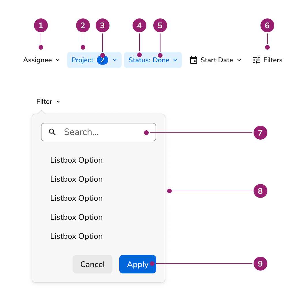
The **Filter Bar** consists of several elements that work together to provide filtering capabilities.

<Frame>
  <div className="w-full h-full bg-[#FFFFFF] p-2 rounded flex items-center justify-center">
    <img src="https://mintcdn.com/servicetitan/ONtkJXRpB2x7ch2s/images/docs/web/components/toolbar-filter/toolbar_filter_anatomy.png?fit=max&auto=format&n=ONtkJXRpB2x7ch2s&q=85&s=1ee021fb4291c1d7269458d1b2903d0e" alt="Image of the anatomy of the toolbar filters" width="1062" height="1002" data-path="images/docs/web/components/toolbar-filter/toolbar_filter_anatomy.png" />
  </div>
</Frame>

1. **Filter Button** - Interactive button that opens a popover or drawer containing filter options
2. **Selected Filter** - Visual indicator showing when a filter has an active selection
3. **Selected Item (for multi select)** - Displays the count of selected items in a multi-select filter, using a chip
4. **Label** - Text identifier that describes what the filter controls
5. **Selected Item (for single select)** - Displays the currently selected option for single-select filters
6. **All Filters** - Button that opens the filter drawer for batch editing of all filters. Appears whenever at least one filter is unreachable from the toolbar.
7. **Search Field (Optional)** - Input field for filtering available options within single-select and multi-select filters
8. **Popover of filter items** - Dropdown panel that appears when a filter button is clicked, containing the filter's selection interface
9. **Apply and cancel filter (Optional)** - Action buttons that appear at the bottom of filter popovers when controlled filtering is enabled

## Options

The **Filter Bar** supports the following configurations to accommodate various filtering scenarios and user interaction patterns.

### Types of Filters

#### Boolean

<LiveCode example="toolbar-filter-option-boolean" fullWidth screenshot>
  ```tsx lines theme={null}
  import { Toolbar } from "@servicetitan/anvil2";
  import { useState } from "react";

  function App() {
    const [filters, setFilters] = useState([
      {
        type: "boolean",
        id: "booleanFilterId",
        label: "Boolean Filter",
        checked: false,
      },
      {
        type: "boolean",
        id: "booleanFilterId2",
        label: "Boolean Filter 2",
        checked: true,
      },
    ]);

    return (
      <Toolbar associatedContent="name">
        {filters.map((filter) => (
          <Toolbar.ButtonToggle
            key={filter.id}
            checked={filter.checked}
            onClick={() => {
              setFilters((prev) =>
                prev.map((f) =>
                  f.id === filter.id ? { ...f, checked: !f.checked } : f,
                ),
              );
              console.log("Filter toggled:", filter.id);
            }}
          >
            {filter.label}
          </Toolbar.ButtonToggle>
        ))}
      </Toolbar>
    );
  }

  export default App;
  ```
</LiveCode>

Boolean filters provide a simple toggle mechanism for on/off states. Users click the filter button to activate or deactivate the filter, with the button's visual state indicating the current selection.

##### Content Guidelines

* The boolean label stays the same across states. Think of this like the label of a Checkbox, which does not change when it is checked or unchecked.

#### Single Select

<LiveCode example="toolbar-filter-option-single-select" fullWidth screenshot>
  ```tsx lines theme={null}
  import { Flex } from "@servicetitan/anvil2";
  import { FilterBar, type Filter } from "@servicetitan/anvil2/beta";
  import { useState, useEffect } from "react";

  type SelectItem = { id: string; label: string };

  function App() {
    const categoryOptions: SelectItem[] = [
      { id: "option1", label: "Option 1" },
      { id: "option2", label: "Option 2" },
      { id: "option3", label: "Option 3" },
    ];

    const statusOptions: SelectItem[] = [
      { id: "option1", label: "Option 1" },
      { id: "option2", label: "Option 2" },
      { id: "option3", label: "Option 3" },
    ];

    const [filters, setFilters] = useState<Filter[]>([
      {
        id: "categoryFilter",
        type: "singleSelect",
        label: "Label",
        items: categoryOptions,
        selectedItem: { id: "option2", label: "Option 2" },
      },
      {
        id: "statusFilter",
        type: "singleSelect",
        label: "Label",
        items: statusOptions,
      },
    ]);

    useEffect(() => {
      // Small delay to ensure the button is rendered
      const timer = setTimeout(() => {
        const button = document.querySelector(
          `button[data-id="categoryFilter"]`,
        ) as HTMLButtonElement;
        if (button) {
          button.click();
        }
      }, 100);

      return () => clearTimeout(timer);
    }, []);

    return (
      <Flex
        style={{ minWidth: "800px", height: "200px" }}
        alignItems="flex-start"
      >
        <FilterBar
          associatedContent="example"
          filters={filters}
          onFilterChange={setFilters}
          flexGrow={1}
        />
      </Flex>
    );
  }

  export default App;
  ```
</LiveCode>

Single select filters display a dropdown list of options where users can choose one item. The selected option appears in the filter button label, and clicking the button opens a popover with the full list of available options.

##### Content Guidelines

* Single selection contains a label, followed by a : , a space, then the selected item. A Chip does not appear in any single selection scenario.
* Example "Group by", "Group by: Job"

#### Multi Select

<LiveCode example="toolbar-filter-option-multi-select" fullWidth screenshot>
  ```tsx lines theme={null}
  import { Flex } from "@servicetitan/anvil2";
  import { FilterBar, type Filter } from "@servicetitan/anvil2/beta";
  import { useState, useEffect } from "react";

  type SelectItem = { id: string; label: string };

  function App() {
    const categoryOptions: SelectItem[] = [
      { id: "option1", label: "Option 1" },
      { id: "option2", label: "Option 2" },
      { id: "option3", label: "Option 3" },
      { id: "option4", label: "Option 4" },
      { id: "option5", label: "Option 5" },
    ];

    const statusOptions: SelectItem[] = [
      { id: "option1", label: "Option 1" },
      { id: "option2", label: "Option 2" },
      { id: "option3", label: "Option 3" },
      { id: "option4", label: "Option 4" },
      { id: "option5", label: "Option 5" },
    ];

    const [filters, setFilters] = useState<Filter[]>([
      {
        id: "categoryFilter",
        type: "multiSelect",
        label: "Label",
        items: categoryOptions,
        selectedItems: [
          { id: "option2", label: "Option 2" },
          { id: "option4", label: "Option 4" },
        ],
      },
      {
        id: "statusFilter",
        type: "multiSelect",
        label: "Label",
        items: statusOptions,
        selectedItems: [],
      },
    ]);

    useEffect(() => {
      // Small delay to ensure the button is rendered
      const timer = setTimeout(() => {
        const button = document.querySelector(
          `button[data-id="categoryFilter"]`,
        ) as HTMLButtonElement;
        if (button) {
          button.click();
        }
      }, 100);

      return () => clearTimeout(timer);
    }, []);

    return (
      <Flex
        style={{ minWidth: "800px", height: "300px" }}
        alignItems="flex-start"
      >
        <FilterBar
          associatedContent="example"
          filters={filters}
          onFilterChange={setFilters}
          flexGrow={1}
        />
      </Flex>
    );
  }

  export default App;
  ```
</LiveCode>

Multi select filters allow users to select multiple options from a list. The filter button displays a chip with the count of selected items when selections are active. Clicking the button opens a popover where users can select or deselect multiple options.

##### Content Guidelines

* Multi selection contains a label, followed by a Chip. Multi selection never shows the selected items in the Toolbar itself.
* Example "Group by", "Group by (1)", "Group by (2)"

#### Date

<LiveCode example="toolbar-filter-option-single-date" fullWidth screenshot>
  ```tsx lines theme={null}
  import { Flex } from "@servicetitan/anvil2";
  import { FilterBar, type Filter } from "@servicetitan/anvil2/beta";
  import { useState, useEffect } from "react";

  function App() {
    const [filters, setFilters] = useState<Filter[]>([
      {
        id: "categoryFilter",
        type: "date",
        label: "Label",
        mode: "mm/dd/yyyy",
        value: "2026-01-01",
      },
      {
        id: "statusFilter",
        type: "date",
        label: "Label",
        mode: "mm/dd/yyyy",
      },
    ]);

    useEffect(() => {
      // Small delay to ensure the button is rendered
      const timer = setTimeout(() => {
        const button = document.querySelector(
          `button[data-id="categoryFilter"]`,
        ) as HTMLButtonElement;
        if (button) {
          button.click();
        }
      }, 100);

      return () => clearTimeout(timer);
    }, []);

    return (
      <Flex
        style={{ minWidth: "800px", height: "500px" }}
        alignItems="flex-start"
      >
        <FilterBar
          associatedContent="example"
          filters={filters}
          onFilterChange={setFilters}
          flexGrow={1}
        />
      </Flex>
    );
  }

  export default App;
  ```
</LiveCode>

Date filters provide a calendar interface for selecting a single date. The filter button displays the selected date in the configured format, and clicking it opens a popover with a calendar picker.

##### Date Range

<LiveCode example="toolbar-filter-option-multi-date" fullWidth screenshot>
  ```tsx lines theme={null}
  import { Flex } from "@servicetitan/anvil2";
  import { FilterBar, type Filter } from "@servicetitan/anvil2/beta";
  import { useState, useEffect } from "react";

  function App() {
    const [filters, setFilters] = useState<Filter[]>([
      {
        id: "categoryFilter",
        type: "dateRange",
        label: "Label",
        mode: "mm/dd/yyyy",
        value: {
          startDate: "2026-01-01",
          endDate: "2026-01-14",
        },
      },
      {
        id: "statusFilter",
        type: "dateRange",
        label: "Label",
        mode: "mm/dd/yyyy",
      },
    ]);

    useEffect(() => {
      // Small delay to ensure the button is rendered
      const timer = setTimeout(() => {
        const button = document.querySelector(
          `button[data-id="categoryFilter"]`,
        ) as HTMLButtonElement;
        if (button) {
          button.click();
        }
      }, 100);

      return () => clearTimeout(timer);
    }, []);

    return (
      <Flex
        style={{ minWidth: "800px", height: "500px" }}
        alignItems="flex-start"
      >
        <FilterBar
          associatedContent="example"
          filters={filters}
          onFilterChange={setFilters}
          flexGrow={1}
        />
      </Flex>
    );
  }

  export default App;
  ```
</LiveCode>

Date range filters enable users to select a start date and an end date. The filter button displays both dates when selected, and clicking it opens a popover with dual calendar pickers for selecting the range.

##### Date List

<LiveCode example="toolbar-filter-option-date-list" fullWidth screenshot>
  ```tsx lines theme={null}
  import { Flex } from "@servicetitan/anvil2";
  import {
    FilterBar,
    type Filter,
    type DateListOption,
  } from "@servicetitan/anvil2/beta";
  import { DateTime } from "luxon";
  import { useState, useEffect } from "react";

  function App() {
    const today = DateTime.local().startOf("day");
    const dateListOptions: DateListOption[] = [
      { id: "today", label: "Today", value: today.toISODate() },
      {
        id: "yesterday",
        label: "Yesterday",
        value: today.minus({ days: 1 }).toISODate(),
      },
      {
        id: "last7Days",
        label: "Last 7 days",
        value: {
          startDate: today.minus({ days: 6 }).toISODate() ?? "",
          endDate: today.toISODate() ?? "",
        },
      },
    ];

    const [filters, setFilters] = useState<Filter[]>([
      {
        id: "dueDateFilter",
        type: "dateList",
        label: "Due date",
        mode: "mm/dd/yyyy",
        options: dateListOptions,
      },
    ]);

    useEffect(() => {
      // Small delay to ensure the button is rendered
      const timer = setTimeout(() => {
        const button = document.querySelector(
          `button[data-id="dueDateFilter"]`,
        ) as HTMLButtonElement;
        if (button) {
          button.click();
        }
      }, 100);

      return () => clearTimeout(timer);
    }, []);

    return (
      <Flex
        style={{ minWidth: "800px", height: "500px" }}
        alignItems="flex-start"
      >
        <FilterBar
          associatedContent="example"
          filters={filters}
          onFilterChange={setFilters}
          flexGrow={1}
        />
      </Flex>
    );
  }

  export default App;
  ```
</LiveCode>

A Date List filter renders a single-select list of date "buckets" (e.g.
"Today", "Last 7 days") followed by four menu options (`On…`, `Before…`,
`After…`, `Custom Range…`). Consumer-supplied options resolve to a date or
range and commit immediately on click; menu options open a Dialog with the
appropriate date picker. The popover never shows Apply/Cancel since picking
an option is itself the confirming action.

##### Content Guidelines

* The Calendar icon and label are always present.
* For the label, use "Date" if there is no specific name that would be more descriptive.
* Single selection examples:
  * "Date", "Date: Jan 3, 2025"
  * "Last Modifed On", "Last Modified On: Nov 1, 2026"
* Date range examples:
  * "Date", "Date: Jan 3 – Jan 10, 2025"
  * "Date", "Date: Dec 31, 2025 – Jan 1, 2026"
* Date list examples:
  * "Due date" (no selection)
  * "Today: Jan 28, 2026" (consumer single-date option)
  * "Last 7 days: Jan 28 – Feb 4, 2026" (consumer range option)
  * "On: Sept 12, 2026" (menu `On…`, `Before…`, `After…` after dialog)
  * "Jan 28 – Feb 4, 2026" (menu `Custom Range…` after dialog — no label prefix since the range is self-explanatory)

###### Date Format guidelines

* Month as 3 letter abbreviation
* Date without a leading zero
* Comma separation
* Full numeric year, omitted if a date range for the first value and both dates are in the same year.
* An en dash (–) between dates

###### Why does the format not use MM/DD/YYYY?

Accessibility standards require explanation of the format on the page when using ambiguous formats like 01/05/2026. Filter Button avoids this requirement by spelling out the month part. Users do not type directly into Filter Button, so the format remains clear and accessible.

###### Why does the format not spell out the whole month?

Filter Bar prioritizes horizontal space efficiency over verbosity. In context, the date icon further emphasizes a user is reading a month.

#### Custom

<LiveCode example="toolbar-filter-option-custom" fullWidth screenshot>
  ```tsx lines theme={null}
  import {
    FilterBar,
    type Filter,
    type CustomFilter,
  } from "@servicetitan/anvil2/beta";
  import { Radio, Combobox, Flex } from "@servicetitan/anvil2";
  import { useState, useEffect } from "react";

  type ComboboxItem = {
    id: string;
    label: string;
  };

  const comboboxItems: ComboboxItem[] = [
    { id: "is", label: "Is" },
    { id: "isNot", label: "Is Not" },
  ];

  type CustomFilterValue = {
    id: number;
    label: string;
  };

  const filterOptions = [
    { id: 1, label: "Option 1" },
    { id: 2, label: "Option 2" },
    { id: 3, label: "Option 3" },
  ];

  function OperatorCombobox() {
    const [selectedItem, setSelectedItem] = useState<ComboboxItem | null>(
      comboboxItems[0],
    );

    return (
      <Combobox.Select
        disableClearSelection
        items={comboboxItems}
        itemToString={(item) => (item ? item.label : "")}
        itemToKey={(item) => (item ? item.id : null)}
        selectedItem={selectedItem}
        onChange={setSelectedItem}
      >
        <Combobox.SelectTrigger label="Custom Filter" />
        <Combobox.Content>
          {({ items }) => (
            <Combobox.List>
              {items.map((item, i) => (
                <Combobox.Item key={item.id} item={item} index={i}>
                  {item.label}
                </Combobox.Item>
              ))}
            </Combobox.List>
          )}
        </Combobox.Content>
      </Combobox.Select>
    );
  }

  function App() {
    const customFilter: CustomFilter<CustomFilterValue> = {
      id: "customFilterId",
      type: "custom",
      label: "Custom Filter",
      buttonRender: ({ value, onChange }) => (
        <Flex direction="column" gap={3} style={{ padding: "0.5rem" }}>
          <OperatorCombobox />
          <Radio.Group legend="Custom filter button">
            {filterOptions.map((option) => (
              <Radio
                key={option.id}
                name="custom-filter-radio-popover"
                value={option.id.toString()}
                label={option.label}
                checked={value?.id === option.id}
                onChange={(e) => {
                  if (!e?.target) return;
                  const selected = filterOptions.find(
                    (opt) => opt.id.toString() === e.target.value,
                  );
                  onChange(selected);
                }}
              />
            ))}
          </Radio.Group>
        </Flex>
      ),
      drawerRender: ({ value, onChange }) => (
        <Flex direction="column" gap={2}>
          <OperatorCombobox />
          <Radio.Group legend="Custom filter drawer">
            {filterOptions.map((option) => (
              <Radio
                key={option.id}
                name="custom-filter-radio-drawer"
                value={option.id.toString()}
                label={option.label}
                checked={value?.id === option.id}
                onChange={(e) => {
                  if (!e?.target) return;
                  const selected = filterOptions.find(
                    (opt) => opt.id.toString() === e.target.value,
                  );
                  onChange(selected);
                }}
              />
            ))}
          </Radio.Group>
        </Flex>
      ),
    };

    const [filters, setFilters] = useState<Filter[]>([customFilter]);

    // Update label based on current filter value
    useEffect(() => {
      const currentFilter = filters.find((f) => f.id === "customFilterId") as
        | CustomFilter<CustomFilterValue>
        | undefined;
      if (currentFilter) {
        const currentValue = currentFilter.value;
        const newLabel = currentValue
          ? `Custom Filter: ${currentValue.label}`
          : "Custom Filter";
        if (currentFilter.label !== newLabel) {
          setFilters((prev) =>
            prev.map((f) =>
              f.id === "customFilterId" ? { ...f, label: newLabel } : f,
            ),
          );
        }
      }
    }, [filters]);

    useEffect(() => {
      // Small delay to ensure the button is rendered
      const timer = setTimeout(() => {
        const button = document.querySelector(
          `button[data-id="customFilterId"]`,
        ) as HTMLButtonElement;
        if (button) {
          button.click();
        }
      }, 100);

      return () => clearTimeout(timer);
    }, []);

    return (
      <Flex
        style={{ minWidth: "800px", height: "290px" }}
        alignItems="flex-start"
      >
        <FilterBar
          associatedContent="example"
          filters={filters}
          onFilterChange={(updatedFilters) => {
            setFilters(updatedFilters);
          }}
          flexGrow={1}
        />
      </Flex>
    );
  }

  export default App;
  ```
</LiveCode>

Custom filters provide complete flexibility for implementing specialized filtering interfaces. Developers define custom render functions for both the popover and drawer views, allowing any type of filter control to be integrated into the toolbar.

##### Content Guidelines

* Custom filters must use a label. It may either use selection text or a Chip, depending on the intent of the custom filter.

### Apply and Cancel

<LiveCode example="toolbar-filter-option-apply" fullWidth screenshot>
  ```tsx lines theme={null}
  import { Flex } from "@servicetitan/anvil2";
  import { FilterBar, type Filter } from "@servicetitan/anvil2/beta";
  import { useState, useEffect } from "react";

  type SelectItem = { id: string; label: string };

  function App() {
    const categoryOptions: SelectItem[] = [
      { id: "option1", label: "Option 1" },
      { id: "option2", label: "Option 2" },
      { id: "option3", label: "Option 3" },
    ];

    const [filters, setFilters] = useState<Filter[]>([
      {
        id: "categoryFilter",
        type: "singleSelect",
        label: "Label",
        items: categoryOptions,
      },
    ]);

    useEffect(() => {
      // Small delay to ensure the button is rendered
      const timer = setTimeout(() => {
        const button = document.querySelector(
          `button[data-id="categoryFilter"]`,
        ) as HTMLButtonElement;
        if (button) {
          button.click();
        }
      }, 100);

      return () => clearTimeout(timer);
    }, []);

    return (
      <Flex
        style={{ minWidth: "800px", height: "245px" }}
        alignItems="flex-start"
      >
        <FilterBar
          associatedContent="example"
          filters={filters}
          onFilterChange={setFilters}
          controlledFiltering={true}
          flexGrow={1}
        />
      </Flex>
    );
  }

  export default App;
  ```
</LiveCode>

By default, filter selections apply immediately when a user makes a choice. When controlled filtering is enabled, Apply and Cancel buttons appear at the bottom of filter popovers. Users can make multiple changes in draft state, then click Apply to submit all changes at once or Cancel to discard them. The filter drawer always operates in controlled mode with Apply and Cancel buttons in the footer. See [Filter Fetching](#filter-fetching) for more information on when to use Apply and Cancel.

### Search

<LiveCode example="toolbar-filter-option-search" fullWidth screenshot>
  ```tsx lines theme={null}
  import { Flex } from "@servicetitan/anvil2";
  import { FilterBar, type Filter } from "@servicetitan/anvil2/beta";
  import { useState, useEffect } from "react";

  type SelectItem = { id: string; label: string };

  function App() {
    const allCategoryOptions: SelectItem[] = [
      { id: "option1", label: "Option 1" },
      { id: "option2", label: "Option 2" },
      { id: "option3", label: "Option 3" },
      { id: "option4", label: "Option 4" },
      { id: "option5", label: "Option 5" },
    ];

    const [categoryOptions, setCategoryOptions] =
      useState<SelectItem[]>(allCategoryOptions);

    const [filters, setFilters] = useState<Filter[]>([
      {
        id: "categoryFilter",
        type: "singleSelect",
        label: "Label",
        items: categoryOptions,
        hasSearch: true,
        onSearch: (searchTerm: string) => {
          if (!searchTerm) {
            setCategoryOptions(allCategoryOptions);
          } else {
            const filtered = allCategoryOptions.filter((option) =>
              option.label.toLowerCase().includes(searchTerm.toLowerCase()),
            );
            setCategoryOptions(filtered);
          }
        },
        onSearchClear: () => {
          setCategoryOptions(allCategoryOptions);
        },
      },
    ]);

    // Update filters when categoryOptions change
    useEffect(() => {
      setFilters((prev) =>
        prev.map((filter) =>
          filter.id === "categoryFilter"
            ? { ...filter, items: categoryOptions }
            : filter,
        ),
      );
    }, [categoryOptions]);

    useEffect(() => {
      // Small delay to ensure the button is rendered
      const timer = setTimeout(() => {
        const button = document.querySelector(
          `button[data-id="categoryFilter"]`,
        ) as HTMLButtonElement;
        if (button) {
          button.click();
        }
      }, 100);

      return () => clearTimeout(timer);
    }, []);

    return (
      <Flex
        style={{ minWidth: "800px", height: "320px" }}
        alignItems="flex-start"
      >
        <FilterBar
          associatedContent="example"
          filters={filters}
          onFilterChange={setFilters}
          flexGrow={1}
        />
      </Flex>
    );
  }

  export default App;
  ```
</LiveCode>

Single select and multi select filters can include an optional search field at the top of their popovers. The search field allows users to filter the available options by typing, making it easier to find specific items in large lists. The implementing team controls how the search filters the items through callback functions.

## Behavior

The **Filter Bar** responds to user interaction and space constraints with distinct behaviors for filter management and layout adaptation.

### All Filters

<LiveCode example="toolbar-filter-behavior-drawer-full-page" fullWidth screenshot>
  ```tsx lines theme={null}
  import {
    FilterBar,
    type Filter,
    type CustomFilter,
  } from "@servicetitan/anvil2/beta";
  import { Radio, Combobox, Flex } from "@servicetitan/anvil2";
  import { useState, useEffect } from "react";

  type ComboboxItem = {
    id: string;
    label: string;
  };

  const comboboxItems: ComboboxItem[] = [
    { id: "is", label: "Is" },
    { id: "isNot", label: "Is Not" },
  ];

  type CustomFilterValue = {
    id: number;
    label: string;
  };

  const filterOptions = [
    { id: 1, label: "Option 1" },
    { id: 2, label: "Option 2" },
    { id: 3, label: "Option 3" },
  ];

  type SelectItem = { id: string; label: string };

  const categoryOptions: SelectItem[] = [
    { id: "option1", label: "Option 1" },
    { id: "option2", label: "Option 2" },
    { id: "option3", label: "Option 3" },
  ];

  const multiSelectCategoryOptions: SelectItem[] = [
    { id: "option1", label: "Option 1" },
    { id: "option2", label: "Option 2" },
    { id: "option3", label: "Option 3" },
    { id: "option4", label: "Option 4" },
    { id: "option5", label: "Option 5" },
  ];

  function OperatorCombobox() {
    const [selectedItem, setSelectedItem] = useState<ComboboxItem | null>(
      comboboxItems[0],
    );

    return (
      <Combobox.Select
        disableClearSelection
        items={comboboxItems}
        itemToString={(item) => (item ? item.label : "")}
        itemToKey={(item) => (item ? item.id : null)}
        selectedItem={selectedItem}
        onChange={setSelectedItem}
      >
        <Combobox.SelectTrigger label="Custom Filter" />
        <Combobox.Content>
          {({ items }) => (
            <Combobox.List>
              {items.map((item, i) => (
                <Combobox.Item key={item.id} item={item} index={i}>
                  {item.label}
                </Combobox.Item>
              ))}
            </Combobox.List>
          )}
        </Combobox.Content>
      </Combobox.Select>
    );
  }

  function App() {
    const customFilter: CustomFilter<CustomFilterValue> = {
      id: "customFilterId",
      type: "custom",
      label: "Custom filter",
      buttonRender: ({ value, onChange }) => (
        <Flex direction="column" gap={3} style={{ padding: "0.5rem" }}>
          <OperatorCombobox />
          <Radio.Group legend="Custom filter button">
            {filterOptions.map((option) => (
              <Radio
                key={option.id}
                name="custom-filter-radio-popover"
                value={option.id.toString()}
                label={option.label}
                checked={value?.id === option.id}
                onChange={(e) => {
                  if (!e?.target) return;
                  const selected = filterOptions.find(
                    (opt) => opt.id.toString() === e.target.value,
                  );
                  onChange(selected);
                }}
              />
            ))}
          </Radio.Group>
        </Flex>
      ),
      drawerRender: ({ value, onChange }) => (
        <Flex direction="column" gap={2}>
          <OperatorCombobox />
          <Radio.Group legend="Custom filter drawer">
            {filterOptions.map((option) => (
              <Radio
                key={option.id}
                name="custom-filter-radio-drawer"
                value={option.id.toString()}
                label={option.label}
                checked={value?.id === option.id}
                onChange={(e) => {
                  if (!e?.target) return;
                  const selected = filterOptions.find(
                    (opt) => opt.id.toString() === e.target.value,
                  );
                  onChange(selected);
                }}
              />
            ))}
          </Radio.Group>
        </Flex>
      ),
    };

    const [filters, setFilters] = useState<Filter[]>([
      // Boolean filter
      {
        type: "boolean",
        id: "booleanFilterId",
        label: "Boolean",
        checked: true,
      },
      // Single select filter
      {
        id: "categoryFilter",
        type: "singleSelect",
        label: "Single select",
        items: categoryOptions,
        selectedItem: { id: "option2", label: "Option 2" },
      },
      // Multi select filter
      {
        id: "categoryMultiSelectFilter",
        type: "multiSelect",
        label: "Multi select",
        items: multiSelectCategoryOptions,
        selectedItems: [
          { id: "option2", label: "Option 2" },
          { id: "option4", label: "Option 4" },
        ],
      },
      // Date filter
      {
        id: "dateFilter",
        type: "date",
        label: "Single date",
        mode: "mm/dd/yyyy",
        value: "2026-01-01",
      },
      // Date range filter
      {
        id: "dateRangeFilter",
        type: "dateRange",
        label: "Multi date",
        mode: "mm/dd/yyyy",
        value: {
          startDate: "2026-01-01",
          endDate: "2026-01-14",
        },
      },
      // Custom filter
      {
        ...customFilter,
        value: { id: 2, label: "Option 2" },
      },
    ]);

    // Update label based on current filter value for custom filter
    useEffect(() => {
      const currentFilter = filters.find((f) => f.id === "customFilterId") as
        | CustomFilter<CustomFilterValue>
        | undefined;
      if (currentFilter) {
        const currentValue = currentFilter.value;
        const newLabel = currentValue
          ? `Custom filter: ${currentValue.label}`
          : "Custom filter";
        if (currentFilter.label !== newLabel) {
          setFilters((prev) =>
            prev.map((f) =>
              f.id === "customFilterId" ? { ...f, label: newLabel } : f,
            ),
          );
        }
      }
    }, [filters]);

    useEffect(() => {
      // Small delay to ensure the button is rendered
      const timer = setTimeout(() => {
        const button = document.querySelector(
          `button[data-anv="filter-group-drawer-trigger"]`,
        ) as HTMLButtonElement;
        if (button) {
          button.click();
        }
      }, 100);

      return () => clearTimeout(timer);
    }, []);

    return (
      <Flex style={{ minWidth: "800px", height: "775px" }}>
        <FilterBar
          associatedContent="example"
          filters={filters}
          onFilterChange={setFilters}
          flexGrow={1}
        />
      </Flex>
    );
  }

  export default App;
  ```
</LiveCode>

The **Filter Bar** surfaces an "All Filters" button that opens the filter drawer for managing multiple filters at once. The button only appears when at least one filter is unreachable from the toolbar — that is, when a filter is configured as drawer-only, when an inline filter has overflowed, or when the container is too narrow to show inline filters at all. When every filter fits inline and none are drawer-only, the button does not render. While present, the button shows a chip with the count of active filters that need the drawer to access.

### Drawer of Filters

The filter drawer is a side panel that displays all available filters in a unified interface. It maintains draft state for all filters until the user clicks Apply, enabling batch updates. The drawer includes a Clear All button that resets all filters to their default states. This batch filtering approach allows users to make multiple filter changes before committing them.

### Drawer-only Filters

Setting `drawerOnly: true` on a filter keeps it accessible only through the filter drawer; it never renders inline in the toolbar, even when there is room for it. Use this to surface lower-priority filters or filters whose UI does not fit the toolbar shape without crowding the primary filters. The flag applies to every filter type — boolean, single select, multi select, date, date range, date list, and custom.

A drawer-only custom filter only requires `drawerRender` — `buttonRender` is forbidden, since the filter never appears inline.

### Overflow

#### Wrapping

<LiveCode example="toolbar-filter-behavior-wrap" fullWidth screenshot>
  ```tsx lines theme={null}
  import {
    FilterBar,
    type Filter,
    type CustomFilter,
  } from "@servicetitan/anvil2/beta";
  import { Radio, Combobox, Flex } from "@servicetitan/anvil2";
  import { useState, useEffect } from "react";

  type ComboboxItem = {
    id: string;
    label: string;
  };

  const comboboxItems: ComboboxItem[] = [
    { id: "is", label: "Is" },
    { id: "isNot", label: "Is Not" },
  ];

  type CustomFilterValue = {
    id: number;
    label: string;
  };

  const filterOptions = [
    { id: 1, label: "Option 1" },
    { id: 2, label: "Option 2" },
    { id: 3, label: "Option 3" },
  ];

  type SelectItem = { id: string; label: string };

  const categoryOptions: SelectItem[] = [
    { id: "option1", label: "Option 1" },
    { id: "option2", label: "Option 2" },
    { id: "option3", label: "Option 3" },
  ];

  const multiSelectCategoryOptions: SelectItem[] = [
    { id: "option1", label: "Option 1" },
    { id: "option2", label: "Option 2" },
    { id: "option3", label: "Option 3" },
    { id: "option4", label: "Option 4" },
    { id: "option5", label: "Option 5" },
  ];

  function OperatorCombobox() {
    const [selectedItem, setSelectedItem] = useState<ComboboxItem | null>(
      comboboxItems[0],
    );

    return (
      <Combobox.Select
        disableClearSelection
        items={comboboxItems}
        itemToString={(item) => (item ? item.label : "")}
        itemToKey={(item) => (item ? item.id : null)}
        selectedItem={selectedItem}
        onChange={setSelectedItem}
      >
        <Combobox.SelectTrigger label="Custom Filter" />
        <Combobox.Content>
          {({ items }) => (
            <Combobox.List>
              {items.map((item, i) => (
                <Combobox.Item key={item.id} item={item} index={i}>
                  {item.label}
                </Combobox.Item>
              ))}
            </Combobox.List>
          )}
        </Combobox.Content>
      </Combobox.Select>
    );
  }

  function App() {
    const customFilter: CustomFilter<CustomFilterValue> = {
      id: "customFilterId",
      type: "custom",
      label: "Custom filter",
      buttonRender: ({ value, onChange }) => (
        <Flex direction="column" gap={3} style={{ padding: "0.5rem" }}>
          <OperatorCombobox />
          <Radio.Group legend="Custom filter button">
            {filterOptions.map((option) => (
              <Radio
                key={option.id}
                name="custom-filter-radio-popover"
                value={option.id.toString()}
                label={option.label}
                checked={value?.id === option.id}
                onChange={(e) => {
                  if (!e?.target) return;
                  const selected = filterOptions.find(
                    (opt) => opt.id.toString() === e.target.value,
                  );
                  onChange(selected);
                }}
              />
            ))}
          </Radio.Group>
        </Flex>
      ),
      drawerRender: ({ value, onChange }) => (
        <Flex direction="column" gap={2}>
          <OperatorCombobox />
          <Radio.Group legend="Custom filter drawer">
            {filterOptions.map((option) => (
              <Radio
                key={option.id}
                name="custom-filter-radio-drawer"
                value={option.id.toString()}
                label={option.label}
                checked={value?.id === option.id}
                onChange={(e) => {
                  if (!e?.target) return;
                  const selected = filterOptions.find(
                    (opt) => opt.id.toString() === e.target.value,
                  );
                  onChange(selected);
                }}
              />
            ))}
          </Radio.Group>
        </Flex>
      ),
    };

    const [filters, setFilters] = useState<Filter[]>([
      // Boolean filter
      {
        type: "boolean",
        id: "booleanFilterId",
        label: "Boolean",
        checked: true,
      },
      // Single select filter
      {
        id: "categoryFilter",
        type: "singleSelect",
        label: "Single select",
        items: categoryOptions,
        selectedItem: { id: "option2", label: "Option 2" },
      },
      // Multi select filter
      {
        id: "categoryMultiSelectFilter",
        type: "multiSelect",
        label: "Multi select",
        items: multiSelectCategoryOptions,
        selectedItems: [
          { id: "option2", label: "Option 2" },
          { id: "option4", label: "Option 4" },
        ],
      },
      // Date filter
      {
        id: "dateFilter",
        type: "date",
        label: "Single date",
        mode: "mm/dd/yyyy",
        value: "2026-01-01",
      },
      // Date range filter
      {
        id: "dateRangeFilter",
        type: "dateRange",
        label: "Multi date",
        mode: "mm/dd/yyyy",
        value: {
          startDate: "2026-01-01",
          endDate: "2026-01-14",
        },
      },
      // Custom filter
      {
        ...customFilter,
        value: { id: 2, label: "Option 2" },
      },
    ]);

    // Update label based on current filter value for custom filter
    useEffect(() => {
      const currentFilter = filters.find((f) => f.id === "customFilterId") as
        | CustomFilter<CustomFilterValue>
        | undefined;
      if (currentFilter) {
        const currentValue = currentFilter.value;
        const newLabel = currentValue
          ? `Custom filter: ${currentValue.label}`
          : "Custom filter";
        if (currentFilter.label !== newLabel) {
          setFilters((prev) =>
            prev.map((f) =>
              f.id === "customFilterId" ? { ...f, label: newLabel } : f,
            ),
          );
        }
      }
    }, [filters]);

    return (
      <div style={{ minWidth: "800px" }}>
        <FilterBar
          associatedContent="example"
          filters={filters}
          onFilterChange={setFilters}
          flexGrow={1}
        />
      </div>
    );
  }

  export default App;
  ```
</LiveCode>

In wrap mode, filters that don't fit on a single line automatically wrap to the next line. This ensures all filters remain visible while adapting to the available horizontal space. Wrap mode is the default overflow behavior.

#### Collapsed

<LiveCode example="toolbar-filter-behavior-collapse" fullWidth screenshot>
  ```tsx lines theme={null}
  import {
    FilterBar,
    type Filter,
    type CustomFilter,
  } from "@servicetitan/anvil2/beta";
  import { Radio, Combobox, Flex } from "@servicetitan/anvil2";
  import { useState, useEffect } from "react";

  type ComboboxItem = {
    id: string;
    label: string;
  };

  const comboboxItems: ComboboxItem[] = [
    { id: "is", label: "Is" },
    { id: "isNot", label: "Is Not" },
  ];

  type CustomFilterValue = {
    id: number;
    label: string;
  };

  const filterOptions = [
    { id: 1, label: "Option 1" },
    { id: 2, label: "Option 2" },
    { id: 3, label: "Option 3" },
  ];

  type SelectItem = { id: string; label: string };

  const categoryOptions: SelectItem[] = [
    { id: "option1", label: "Option 1" },
    { id: "option2", label: "Option 2" },
    { id: "option3", label: "Option 3" },
  ];

  const multiSelectCategoryOptions: SelectItem[] = [
    { id: "option1", label: "Option 1" },
    { id: "option2", label: "Option 2" },
    { id: "option3", label: "Option 3" },
    { id: "option4", label: "Option 4" },
    { id: "option5", label: "Option 5" },
  ];

  function OperatorCombobox() {
    const [selectedItem, setSelectedItem] = useState<ComboboxItem | null>(
      comboboxItems[0],
    );

    return (
      <Combobox.Select
        disableClearSelection
        items={comboboxItems}
        itemToString={(item) => (item ? item.label : "")}
        itemToKey={(item) => (item ? item.id : null)}
        selectedItem={selectedItem}
        onChange={setSelectedItem}
      >
        <Combobox.SelectTrigger label="Custom Filter" />
        <Combobox.Content>
          {({ items }) => (
            <Combobox.List>
              {items.map((item, i) => (
                <Combobox.Item key={item.id} item={item} index={i}>
                  {item.label}
                </Combobox.Item>
              ))}
            </Combobox.List>
          )}
        </Combobox.Content>
      </Combobox.Select>
    );
  }

  function App() {
    const customFilter: CustomFilter<CustomFilterValue> = {
      id: "customFilterId",
      type: "custom",
      label: "Custom filter",
      buttonRender: ({ value, onChange }) => (
        <Flex direction="column" gap={3} style={{ padding: "0.5rem" }}>
          <OperatorCombobox />
          <Radio.Group legend="Custom filter popover">
            {filterOptions.map((option) => (
              <Radio
                key={option.id}
                name="custom-filter-radio-popover"
                value={option.id.toString()}
                label={option.label}
                checked={value?.id === option.id}
                onChange={(e) => {
                  if (!e?.target) return;
                  const selected = filterOptions.find(
                    (opt) => opt.id.toString() === e.target.value,
                  );
                  onChange(selected);
                }}
              />
            ))}
          </Radio.Group>
        </Flex>
      ),
      drawerRender: ({ value, onChange }) => (
        <Flex direction="column" gap={2}>
          <OperatorCombobox />
          <Radio.Group legend="Custom filter drawer">
            {filterOptions.map((option) => (
              <Radio
                key={option.id}
                name="custom-filter-radio-drawer"
                value={option.id.toString()}
                label={option.label}
                checked={value?.id === option.id}
                onChange={(e) => {
                  if (!e?.target) return;
                  const selected = filterOptions.find(
                    (opt) => opt.id.toString() === e.target.value,
                  );
                  onChange(selected);
                }}
              />
            ))}
          </Radio.Group>
        </Flex>
      ),
    };

    const [filters, setFilters] = useState<Filter[]>([
      // Boolean filter
      {
        type: "boolean",
        id: "booleanFilterId",
        label: "Boolean",
        checked: true,
      },
      // Single select filter
      {
        id: "categoryFilter",
        type: "singleSelect",
        label: "Single select",
        items: categoryOptions,
        selectedItem: { id: "option2", label: "Option 2" },
      },
      // Multi select filter
      {
        id: "categoryMultiSelectFilter",
        type: "multiSelect",
        label: "Multi select",
        items: multiSelectCategoryOptions,
        selectedItems: [
          { id: "option2", label: "Option 2" },
          { id: "option4", label: "Option 4" },
        ],
      },
      // Date filter
      {
        id: "dateFilter",
        type: "date",
        label: "Single date",
        mode: "mm/dd/yyyy",
        value: "2026-01-01",
      },
      // Date range filter
      {
        id: "dateRangeFilter",
        type: "dateRange",
        label: "Multi date",
        mode: "mm/dd/yyyy",
        value: {
          startDate: "2026-01-01",
          endDate: "2026-01-14",
        },
      },
      // Custom filter
      {
        ...customFilter,
        value: { id: 2, label: "Option 2" },
      },
    ]);

    // Update label based on current filter value for custom filter
    useEffect(() => {
      const currentFilter = filters.find((f) => f.id === "customFilterId") as
        | CustomFilter<CustomFilterValue>
        | undefined;
      if (currentFilter) {
        const currentValue = currentFilter.value;
        const newLabel = currentValue
          ? `Custom filter: ${currentValue.label}`
          : "Custom filter";
        if (currentFilter.label !== newLabel) {
          setFilters((prev) =>
            prev.map((f) =>
              f.id === "customFilterId" ? { ...f, label: newLabel } : f,
            ),
          );
        }
      }
    }, [filters]);

    return (
      <div style={{ minWidth: "800px" }}>
        <FilterBar
          associatedContent="example"
          overflow="collapse"
          filters={filters}
          onFilterChange={setFilters}
          flexGrow={1}
        />
      </div>
    );
  }

  export default App;
  ```
</LiveCode>

In collapse mode, filters that don't fit within the available space are removed from view. Unlike other toolbar items that move to an overflow menu, hidden filters are simply not displayed. All filters remain accessible through the filter drawer regardless of overflow mode. The filters group takes priority over other toolbar groups, meaning filters wrap or collapse before secondary toolbar actions.

### Responsive Behavior

At smaller breakpoints (xs and sm), inline filters automatically hide and only the "All Filters" drawer trigger button remains visible. This responsive behavior uses container queries to detect available space and adapts the interface to ensure usability on mobile devices. The drawer provides full access to all filters regardless of screen size.

## Keyboard Interaction

Users can navigate the **Filter Bar** using standard keyboard controls.

| Key        | Description                                                              |
| ---------- | ------------------------------------------------------------------------ |
| Tab        | Moves focus between filter buttons and the "All Filters" button          |
| Enter      | Opens the focused filter's popover or activates a boolean filter toggle  |
| Escape     | Closes an open Popover or Drawer and returns focus to the trigger button |
| Arrow Keys | Navigate through options within filter Popovers and Drawers              |
| Space      | Activates focused filter controls within popovers and drawers            |

## When to use

Use the Filter Bar when needing to apply the filter pattern to content.

## How to use

### Where and how filters are represented

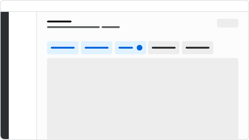
<DoDont type="do" text="place filters toward the top of a page's content, below the page header arranged horizontally.">
  <div className="w-full h-full border-1 border-gray-200 rounded flex items-center justify-center">
    <img src="https://mintcdn.com/servicetitan/ONtkJXRpB2x7ch2s/images/docs/web/components/toolbar-filter/placement.png?fit=max&auto=format&n=ONtkJXRpB2x7ch2s&q=85&s=877b4a6c6ba9d7aaa467d8b03b0594ff" alt="Image of the anatomy of the toolbar filters" width="794" height="449" data-path="images/docs/web/components/toolbar-filter/placement.png" />
  </div>
</DoDont>

The All Filter acts as a central hub for all the available filters for end users. It always opens into a Drawer. It's always labeled as 'Filters'.

### Grouping Filters

On the page, filters exists as part of a larger Toolbar

* In general, show most-used filters first.
* Rarely used filters do not have to be shown on the page and may be placed within the Drawer layout instead.
* If a filter group is used consistently within a product area, consider consistency in ordering across the area.
* Avoid changing the placement or conditions of actions such as the 'Clear All', 'Filters', and search bar.
* Multiple filter groups may exist if a page contains multiple layers of filterable content and each section needs its own unique filtering.

### Filter Fetching

Filter fetching refers to when filters get applied to an area. There are three types of filter fetching: instant, apply per-filter, and batch.

#### Instant filter

Instant filtering begins the process of filtering results the moment a user makes a selection within a filter. This can only occur in the Toolbar filter view and not in the Drawer. This is the generally preferred option for filtering as it reduces the amount of steps users must take.

<LiveCode example="toolbar-filter-how-instant" customHeight="500px" fullWidth hideCodeInLiveCode>
  ```tsx lines theme={null}
  import {
    FilterBar,
    type Filter,
    type CustomFilter,
  } from "@servicetitan/anvil2/beta";
  import { Radio, Combobox, Flex } from "@servicetitan/anvil2";
  import { useState, useEffect } from "react";

  type ComboboxItem = {
    id: string;
    label: string;
  };

  const comboboxItems: ComboboxItem[] = [
    { id: "is", label: "Is" },
    { id: "isNot", label: "Is Not" },
  ];

  type CustomFilterValue = {
    id: number;
    label: string;
  };

  const filterOptions = [
    { id: 1, label: "Option 1" },
    { id: 2, label: "Option 2" },
    { id: 3, label: "Option 3" },
  ];

  type SelectItem = { id: string; label: string };

  const categoryOptions: SelectItem[] = [
    { id: "option1", label: "Option 1" },
    { id: "option2", label: "Option 2" },
    { id: "option3", label: "Option 3" },
  ];

  const multiSelectCategoryOptions: SelectItem[] = [
    { id: "option1", label: "Option 1" },
    { id: "option2", label: "Option 2" },
    { id: "option3", label: "Option 3" },
    { id: "option4", label: "Option 4" },
    { id: "option5", label: "Option 5" },
  ];

  function OperatorCombobox() {
    const [selectedItem, setSelectedItem] = useState<ComboboxItem | null>(
      comboboxItems[0],
    );

    return (
      <Combobox.Select
        disableClearSelection
        items={comboboxItems}
        itemToString={(item) => (item ? item.label : "")}
        itemToKey={(item) => (item ? item.id : null)}
        selectedItem={selectedItem}
        onChange={setSelectedItem}
      >
        <Combobox.SelectTrigger label="Custom Filter" />
        <Combobox.Content>
          {({ items }) => (
            <Combobox.List>
              {items.map((item, i) => (
                <Combobox.Item key={item.id} item={item} index={i}>
                  {item.label}
                </Combobox.Item>
              ))}
            </Combobox.List>
          )}
        </Combobox.Content>
      </Combobox.Select>
    );
  }

  function App() {
    const customFilter: CustomFilter<CustomFilterValue> = {
      id: "customFilterId",
      type: "custom",
      label: "Custom filter",
      buttonRender: ({ value, onChange }) => (
        <Flex direction="column" gap={3} style={{ padding: "0.5rem" }}>
          <OperatorCombobox />
          <Radio.Group legend="Custom filter button">
            {filterOptions.map((option) => (
              <Radio
                key={option.id}
                name="custom-filter-radio-popover"
                value={option.id.toString()}
                label={option.label}
                checked={value?.id === option.id}
                onChange={(e) => {
                  if (!e?.target) return;
                  const selected = filterOptions.find(
                    (opt) => opt.id.toString() === e.target.value,
                  );
                  onChange(selected);
                }}
              />
            ))}
          </Radio.Group>
        </Flex>
      ),
      drawerRender: ({ value, onChange }) => (
        <Flex direction="column" gap={2}>
          <OperatorCombobox />
          <Radio.Group legend="Custom filter drawer">
            {filterOptions.map((option) => (
              <Radio
                key={option.id}
                name="custom-filter-radio-drawer"
                value={option.id.toString()}
                label={option.label}
                checked={value?.id === option.id}
                onChange={(e) => {
                  if (!e?.target) return;
                  const selected = filterOptions.find(
                    (opt) => opt.id.toString() === e.target.value,
                  );
                  onChange(selected);
                }}
              />
            ))}
          </Radio.Group>
        </Flex>
      ),
    };

    const [filters, setFilters] = useState<Filter[]>([
      // Boolean filter
      {
        type: "boolean",
        id: "booleanFilterId",
        label: "Boolean",
        checked: true,
      },
      // Single select filter
      {
        id: "categoryFilter",
        type: "singleSelect",
        label: "Single select",
        items: categoryOptions,
        selectedItem: { id: "option2", label: "Option 2" },
      },
      // Multi select filter
      {
        id: "categoryMultiSelectFilter",
        type: "multiSelect",
        label: "Multi select",
        items: multiSelectCategoryOptions,
        selectedItems: [
          { id: "option2", label: "Option 2" },
          { id: "option4", label: "Option 4" },
        ],
      },
      // Date filter
      {
        id: "dateFilter",
        type: "date",
        label: "Single date",
        mode: "mm/dd/yyyy",
        value: "2026-01-01",
      },
      // Date range filter
      {
        id: "dateRangeFilter",
        type: "dateRange",
        label: "Multi date",
        mode: "mm/dd/yyyy",
        value: {
          startDate: "2026-01-01",
          endDate: "2026-01-14",
        },
      },
      // Custom filter
      {
        ...customFilter,
        value: { id: 2, label: "Option 2" },
      },
    ]);

    // Update label based on current filter value for custom filter
    useEffect(() => {
      const currentFilter = filters.find((f) => f.id === "customFilterId") as
        | CustomFilter<CustomFilterValue>
        | undefined;
      if (currentFilter) {
        const currentValue = currentFilter.value;
        const newLabel = currentValue
          ? `Custom filter: ${currentValue.label}`
          : "Custom filter";
        if (currentFilter.label !== newLabel) {
          setFilters((prev) =>
            prev.map((f) =>
              f.id === "customFilterId" ? { ...f, label: newLabel } : f,
            ),
          );
        }
      }
    }, [filters]);

    return (
      <div style={{ minWidth: "800px" }}>
        <FilterBar
          associatedContent="example"
          filters={filters}
          onFilterChange={setFilters}
          flexGrow={1}
        />
      </div>
    );
  }

  export default App;
  ```
</LiveCode>

#### Apply per-filter

Apply per-filter sets individual Apply + Cancel actions onto each individual filter. This is a useful method when performance is particularly important.

<LiveCode example="toolbar-filter-how-apply-per-filter" customHeight="500px" fullWidth hideCodeInLiveCode>
  ```tsx lines theme={null}
  import {
    FilterBar,
    type Filter,
    type CustomFilter,
  } from "@servicetitan/anvil2/beta";
  import { Radio, Combobox, Flex } from "@servicetitan/anvil2";
  import { useState, useEffect } from "react";

  type ComboboxItem = {
    id: string;
    label: string;
  };

  const comboboxItems: ComboboxItem[] = [
    { id: "is", label: "Is" },
    { id: "isNot", label: "Is Not" },
  ];

  type CustomFilterValue = {
    id: number;
    label: string;
  };

  const filterOptions = [
    { id: 1, label: "Option 1" },
    { id: 2, label: "Option 2" },
    { id: 3, label: "Option 3" },
  ];

  type SelectItem = { id: string; label: string };

  const categoryOptions: SelectItem[] = [
    { id: "option1", label: "Option 1" },
    { id: "option2", label: "Option 2" },
    { id: "option3", label: "Option 3" },
  ];

  const multiSelectCategoryOptions: SelectItem[] = [
    { id: "option1", label: "Option 1" },
    { id: "option2", label: "Option 2" },
    { id: "option3", label: "Option 3" },
    { id: "option4", label: "Option 4" },
    { id: "option5", label: "Option 5" },
  ];

  function OperatorCombobox() {
    const [selectedItem, setSelectedItem] = useState<ComboboxItem | null>(
      comboboxItems[0],
    );

    return (
      <Combobox.Select
        disableClearSelection
        items={comboboxItems}
        itemToString={(item) => (item ? item.label : "")}
        itemToKey={(item) => (item ? item.id : null)}
        selectedItem={selectedItem}
        onChange={setSelectedItem}
      >
        <Combobox.SelectTrigger label="Custom Filter" />
        <Combobox.Content>
          {({ items }) => (
            <Combobox.List>
              {items.map((item, i) => (
                <Combobox.Item key={item.id} item={item} index={i}>
                  {item.label}
                </Combobox.Item>
              ))}
            </Combobox.List>
          )}
        </Combobox.Content>
      </Combobox.Select>
    );
  }

  function App() {
    const customFilter: CustomFilter<CustomFilterValue> = {
      id: "customFilterId",
      type: "custom",
      label: "Custom filter",
      buttonRender: ({ value, onChange }) => (
        <Flex direction="column" gap={3} style={{ padding: "0.5rem" }}>
          <OperatorCombobox />
          <Radio.Group legend="Custom filter button">
            {filterOptions.map((option) => (
              <Radio
                key={option.id}
                name="custom-filter-radio-popover"
                value={option.id.toString()}
                label={option.label}
                checked={value?.id === option.id}
                onChange={(e) => {
                  if (!e?.target) return;
                  const selected = filterOptions.find(
                    (opt) => opt.id.toString() === e.target.value,
                  );
                  onChange(selected);
                }}
              />
            ))}
          </Radio.Group>
        </Flex>
      ),
      drawerRender: ({ value, onChange }) => (
        <Flex direction="column" gap={2}>
          <OperatorCombobox />
          <Radio.Group legend="Custom filter drawer">
            {filterOptions.map((option) => (
              <Radio
                key={option.id}
                name="custom-filter-radio-drawer"
                value={option.id.toString()}
                label={option.label}
                checked={value?.id === option.id}
                onChange={(e) => {
                  if (!e?.target) return;
                  const selected = filterOptions.find(
                    (opt) => opt.id.toString() === e.target.value,
                  );
                  onChange(selected);
                }}
              />
            ))}
          </Radio.Group>
        </Flex>
      ),
    };

    const [filters, setFilters] = useState<Filter[]>([
      // Boolean filter
      {
        type: "boolean",
        id: "booleanFilterId",
        label: "Boolean",
        checked: true,
      },
      // Single select filter
      {
        id: "categoryFilter",
        type: "singleSelect",
        label: "Single select",
        items: categoryOptions,
        selectedItem: { id: "option2", label: "Option 2" },
      },
      // Multi select filter
      {
        id: "categoryMultiSelectFilter",
        type: "multiSelect",
        label: "Multi select",
        items: multiSelectCategoryOptions,
        selectedItems: [
          { id: "option2", label: "Option 2" },
          { id: "option4", label: "Option 4" },
        ],
      },
      // Date filter
      {
        id: "dateFilter",
        type: "date",
        label: "Single date",
        mode: "mm/dd/yyyy",
        value: "2026-01-01",
      },
      // Date range filter
      {
        id: "dateRangeFilter",
        type: "dateRange",
        label: "Multi date",
        mode: "mm/dd/yyyy",
        value: {
          startDate: "2026-01-01",
          endDate: "2026-01-14",
        },
      },
      // Custom filter
      {
        ...customFilter,
        value: { id: 2, label: "Option 2" },
      },
    ]);

    // Update label based on current filter value for custom filter
    useEffect(() => {
      const currentFilter = filters.find((f) => f.id === "customFilterId") as
        | CustomFilter<CustomFilterValue>
        | undefined;
      if (currentFilter) {
        const currentValue = currentFilter.value;
        const newLabel = currentValue
          ? `Custom filter: ${currentValue.label}`
          : "Custom filter";
        if (currentFilter.label !== newLabel) {
          setFilters((prev) =>
            prev.map((f) =>
              f.id === "customFilterId" ? { ...f, label: newLabel } : f,
            ),
          );
        }
      }
    }, [filters]);

    return (
      <div style={{ minWidth: "800px" }}>
        <FilterBar
          associatedContent="example"
          filters={filters}
          onFilterChange={setFilters}
          controlledFiltering={true}
          flexGrow={1}
        />
      </div>
    );
  }

  export default App;
  ```
</LiveCode>

#### Batch filter

Batch filtering waits to apply a filter only after clicking a standalone Apply action. Batch filtering is not made available in the standard Toolbar view, while being the only method used in the Drawer view.

<LiveCode example="toolbar-filter-behavior-drawer" customHeight="775px" fullWidth hideCodeInLiveCode>
  ```tsx lines theme={null}
  import {
    Toolbar,
    type Filter,
    type CustomFilter,
  } from "@servicetitan/anvil2/beta";
  import { Radio, Combobox, Flex } from "@servicetitan/anvil2";
  import { useState, useEffect } from "react";

  type ComboboxItem = {
    id: string;
    label: string;
  };

  const comboboxItems: ComboboxItem[] = [
    { id: "is", label: "Is" },
    { id: "isNot", label: "Is Not" },
  ];

  type CustomFilterValue = {
    id: number;
    label: string;
  };

  const filterOptions = [
    { id: 1, label: "Option 1" },
    { id: 2, label: "Option 2" },
    { id: 3, label: "Option 3" },
  ];

  type SelectItem = { id: string; label: string };

  const categoryOptions: SelectItem[] = [
    { id: "option1", label: "Option 1" },
    { id: "option2", label: "Option 2" },
    { id: "option3", label: "Option 3" },
  ];

  const multiSelectCategoryOptions: SelectItem[] = [
    { id: "option1", label: "Option 1" },
    { id: "option2", label: "Option 2" },
    { id: "option3", label: "Option 3" },
    { id: "option4", label: "Option 4" },
    { id: "option5", label: "Option 5" },
  ];

  function OperatorCombobox() {
    const [selectedItem, setSelectedItem] = useState<ComboboxItem | null>(
      comboboxItems[0],
    );

    return (
      <Combobox.Select
        disableClearSelection
        items={comboboxItems}
        itemToString={(item) => (item ? item.label : "")}
        itemToKey={(item) => (item ? item.id : null)}
        selectedItem={selectedItem}
        onChange={setSelectedItem}
      >
        <Combobox.SelectTrigger label="Custom Filter" />
        <Combobox.Content>
          {({ items }) => (
            <Combobox.List>
              {items.map((item, i) => (
                <Combobox.Item key={item.id} item={item} index={i}>
                  {item.label}
                </Combobox.Item>
              ))}
            </Combobox.List>
          )}
        </Combobox.Content>
      </Combobox.Select>
    );
  }

  function App() {
    const customFilter: CustomFilter<CustomFilterValue> = {
      id: "customFilterId",
      type: "custom",
      label: "Custom filter",
      buttonRender: ({ value, onChange }) => (
        <Flex direction="column" gap={3} style={{ padding: "0.5rem" }}>
          <OperatorCombobox />
          <Radio.Group legend="Custom filter button">
            {filterOptions.map((option) => (
              <Radio
                key={option.id}
                name="custom-filter-radio-popover"
                value={option.id.toString()}
                label={option.label}
                checked={value?.id === option.id}
                onChange={(e) => {
                  if (!e?.target) return;
                  const selected = filterOptions.find(
                    (opt) => opt.id.toString() === e.target.value,
                  );
                  onChange(selected);
                }}
              />
            ))}
          </Radio.Group>
        </Flex>
      ),
      drawerRender: ({ value, onChange }) => (
        <Flex direction="column" gap={2}>
          <OperatorCombobox />
          <Radio.Group legend="Custom filter drawer">
            {filterOptions.map((option) => (
              <Radio
                key={option.id}
                name="custom-filter-radio-drawer"
                value={option.id.toString()}
                label={option.label}
                checked={value?.id === option.id}
                onChange={(e) => {
                  if (!e?.target) return;
                  const selected = filterOptions.find(
                    (opt) => opt.id.toString() === e.target.value,
                  );
                  onChange(selected);
                }}
              />
            ))}
          </Radio.Group>
        </Flex>
      ),
    };

    const [filters, setFilters] = useState<Filter[]>([
      // Boolean filter
      {
        type: "boolean",
        id: "booleanFilterId",
        label: "Boolean",
        checked: true,
      },
      // Single select filter
      {
        id: "categoryFilter",
        type: "singleSelect",
        label: "Single select",
        items: categoryOptions,
        selectedItem: { id: "option2", label: "Option 2" },
      },
      // Multi select filter
      {
        id: "categoryMultiSelectFilter",
        type: "multiSelect",
        label: "Multi select",
        items: multiSelectCategoryOptions,
        selectedItems: [
          { id: "option2", label: "Option 2" },
          { id: "option4", label: "Option 4" },
        ],
      },
      // Date filter
      {
        id: "dateFilter",
        type: "date",
        label: "Single date",
        mode: "mm/dd/yyyy",
        value: "2026-01-01",
      },
      // Date range filter
      {
        id: "dateRangeFilter",
        type: "dateRange",
        label: "Multi date",
        mode: "mm/dd/yyyy",
        value: {
          startDate: "2026-01-01",
          endDate: "2026-01-14",
        },
      },
      // Custom filter
      {
        ...customFilter,
        value: { id: 2, label: "Option 2" },
      },
    ]);

    // Update label based on current filter value for custom filter
    useEffect(() => {
      const currentFilter = filters.find((f) => f.id === "customFilterId") as
        | CustomFilter<CustomFilterValue>
        | undefined;
      if (currentFilter) {
        const currentValue = currentFilter.value;
        const newLabel = currentValue
          ? `Custom filter: ${currentValue.label}`
          : "Custom filter";
        if (currentFilter.label !== newLabel) {
          setFilters((prev) =>
            prev.map((f) =>
              f.id === "customFilterId" ? { ...f, label: newLabel } : f,
            ),
          );
        }
      }
    }, [filters]);

    useEffect(() => {
      // Small delay to ensure the button is rendered
      const timer = setTimeout(() => {
        const button = document.querySelector(
          `button[data-anv="filter-group-drawer-trigger"]`,
        ) as HTMLButtonElement;
        if (button) {
          button.click();
        }
      }, 100);

      return () => clearTimeout(timer);
    }, []);

    return (
      <Flex style={{ width: "800px", height: "775px" }}>
        <Toolbar associatedContent="name">
          <Toolbar.Filters filters={filters} onFilterChange={setFilters} />
        </Toolbar>
      </Flex>
    );
  }

  export default App;
  ```
</LiveCode>

#### Which fetching type is best for your case?

* Instant filtering is the generally preferred method, as it provides real-time feedback to users.
* Apply per-filter is preferred when performance is an issue, or if a user needs to build out a filter before needing to apply it.
* Instant and apply per-filter fetching should not be mixed. If per-filter is ever needed in one filter, the whole filter set should also use this method.
* Filters in the Drawer always use batch apply. No individual filter in the Drawer should have its own apply action.
* Batch filtering on the page is considered an edge case that requires a custom implementation.

### Content Guidelines

* All Filters need to have a label. This is the equivalent of a label found in traditional form elements.
* See each [individual filter type](#types-of-filters) for specific content guidelines.
