> ## Documentation Index
> Fetch the complete documentation index at: https://anvil.servicetitan.com/llms.txt
> Use this file to discover all available pages before exploring further.

# Interactive Card – Design

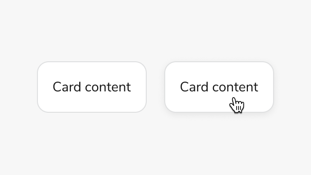
> Interactive Card creates clickable cards that support nested interactive elements without accessibility violations.

export const LiveCode = ({children, customHeight, clickToLoad, example, fullWidth, fullHeight, hideCodeInLiveCode, screenshot, screenshotOnly, showCode: showCodeProp}) => {
  const SCREENSHOTS_BASE = "https://servicetitan.github.io/anvil2-docs-live-code/screenshots";
  const STACKBLITZ_BASE = "https://stackblitz.com/github/servicetitan/anvil2-docs-live-code/tree/main/examples";
  const [showCodeBlock, setShowCodeBlock] = useState(showCodeProp ?? false);
  const [isLocalOverride, setIsLocalOverride] = useState(false);
  useEffect(() => {
    const examplePath = `/images/live-code-screenshots-tmp/${example}.png`;
    fetch(examplePath, {
      method: "HEAD"
    }).then(r => {
      if (r.ok) setIsLocalOverride(true);
    }).catch(() => {});
  }, [example]);
  const screenshotBase = isLocalOverride ? "/images/live-code-screenshots-tmp" : SCREENSHOTS_BASE;
  if (screenshotOnly) {
    return <Frame className="flex flex-col">
        <div className="flex dark:hidden" style={{
      justifyContent: "center",
      alignItems: "center",
      width: fullWidth ? "100%" : "50%",
      minHeight: fullHeight ? "284px" : undefined,
      background: "#FFFFFF"
    }}>
          <img srcset={`${screenshotBase}/${example}.png, ${screenshotBase}/${example}-2x.png 2x`} src={`${screenshotBase}/${example}.png`} alt={example} noZoom />
        </div>
        <div className="hidden dark:flex" style={{
      justifyContent: "center",
      alignItems: "center",
      width: fullWidth ? "100%" : "50%",
      minHeight: fullHeight ? "284px" : undefined,
      background: "#141414"
    }}>
          <img srcset={`${screenshotBase}/${example}-dark.png, ${screenshotBase}/${example}-dark-2x.png 2x`} src={`${screenshotBase}/${example}-dark.png`} alt={example} noZoom />
        </div>
      </Frame>;
  }
  if (screenshot) {
    return <Frame className="flex flex-col -mb-2">
        <div className="flex dark:hidden bg-white dark:bg-codeblock border border-gray-950/10 dark:border-white/10 dark:twoslash-dark rounded-2xl overflow-hidden" style={{
      justifyContent: "center",
      alignItems: "center",
      width: fullWidth ? "100%" : "50%",
      minHeight: fullHeight ? "284px" : undefined
    }}>
          <img srcset={`${screenshotBase}/${example}.png, ${screenshotBase}/${example}-2x.png 2x`} src={`${screenshotBase}/${example}.png`} alt={example} noZoom />
        </div>

        <div className="hidden dark:flex bg-white dark:bg-codeblock border border-gray-950/10 dark:border-white/10 dark:twoslash-dark rounded-2xl overflow-hidden" style={{
      background: "#141414",
      justifyContent: "center",
      alignItems: "center",
      width: fullWidth ? "100%" : "50%",
      minHeight: fullHeight ? "284px" : undefined
    }}>
          <img srcset={`${screenshotBase}/${example}-dark.png, ${screenshotBase}/${example}-dark-2x.png 2x`} src={`${screenshotBase}/${example}-dark.png`} alt={example} noZoom />
        </div>

        <div className="flex justify-end items-center text-xs py-2 px-1 gap-4">
          {!showCodeProp ? <button className="inline-flex justify-end items-center text-gray-700 dark:text-gray-50 hover:text-blue-500 dark:hover:text-blue-300 transition-colors group self-end gap-1 cursor-pointer" onClick={() => setShowCodeBlock(!showCodeBlock)} style={{
      appearance: "none"
    }}>
              <Icon icon="code" size="12px" className="group-hover:bg-blue-500 dark:group-hover:bg-blue-300" />
              <span>{showCodeBlock ? "Hide code" : "Show code"}</span>
            </button> : null}

          <a className="inline-flex justify-end items-center hover:text-blue-500 dark:hover:text-blue-300 transition-colors group self-end gap-1" href={`${STACKBLITZ_BASE}/${example}?file=src/App.tsx`} target="_blank" rel="noreferrer">
            <Icon icon="bolt" size="12px" className="group-hover:bg-blue-500 dark:group-hover:bg-blue-300" />
            <span>StackBlitz demo</span>
          </a>
        </div>

        <div className="grid transition-[grid-template-rows] duration-300 ease-in-out overflow-auto overflow-y-hidden overflow-x-auto" style={showCodeBlock ? {
      gridTemplateRows: "1fr"
    } : {
      gridTemplateRows: "0fr"
    }}>
          <div style={{
      minHeight: 0,
      overflowX: "auto",
      overflowY: "hidden",
      marginBlockStart: "-1.25rem",
      marginBlockEnd: "-1.5rem"
    }}>
            {children}
          </div>
        </div>
      </Frame>;
  } else {
    return <div style={{
      display: "flex",
      width: fullWidth ? "100%" : "50%",
      minHeight: customHeight ? customHeight : "316px",
      resize: "vertical",
      overflow: "auto"
    }}>
        <iframe title={example} style={{
      flex: 1,
      width: fullWidth ? "100%" : "50%",
      minHeight: customHeight ? customHeight : "316px"
    }} src={`${STACKBLITZ_BASE}/${example}?embed=1&hideNavigation=1&hideExplorer=1&terminalHeight=0&file=src/App.tsx${clickToLoad ? "&ctl=1" : ""}${hideCodeInLiveCode ? "&view=preview" : ""}`} allow="accelerometer; ambient-light-sensor; camera; encrypted-media; geolocation; gyroscope; hid; microphone; midi; payment; usb; vr; xr-spatial-tracking" sandbox="allow-forms allow-modals allow-popups allow-presentation allow-same-origin allow-scripts" />
      </div>;
  }
};

export const CodePreviewPlaceholder = ({double, fullWidth}) => {
  const single = <div style={{
    width: fullWidth ? "100%" : "50%",
    borderRadius: "1rem",
    display: "flex",
    padding: "1rem",
    flexDirection: "column",
    gap: "0.5rem",
    height: "10rem",
    marginBlockEnd: "1rem"
  }} className="border-width-default border-color-subdued">
      <div className="bg-strong border-radius-large" style={{
    width: "100%",
    flexGrow: "1"
  }} />
      <div className="bg-strong border-radius-large" style={{
    width: "100%",
    flexGrow: "1"
  }} />
    </div>;
  return double ? <div style={{
    display: "flex",
    gap: "1rem"
  }}>
      {single}
      {single}
    </div> : single;
};

<Note>
  **Beta Feature**

  This feature is currently in beta, and needs to be imported from `@servicetitan/anvil2/beta`.

  While we hope to minimize breaking changes, they may occur due to feedback we receive or other improvements. These will always be documented in the changelog and communicated in Slack.

  Please reach out in the [#ask-designsystem](https://servicetitan.enterprise.slack.com/archives/CBSRGHTRS) channel with any questions or feedback!
</Note>

<Frame>
  <div className="w-full h-full max-w-[320px] max-h-[180px] bg-[#FFFFFF] p-2 rounded flex items-center justify-center">
    <img
      src="https://mintcdn.com/servicetitan/NkSrIaHzJjwUU4IF/images/docs/web/components/interactive-card/overview-image.png?fit=max&auto=format&n=NkSrIaHzJjwUU4IF&q=85&s=1a66fc85c1a813ba2b5e4736d6df056f"
      alt="Anatomy of the Interactive Card
component"
      width="640"
      height="360"
      data-path="images/docs/web/components/interactive-card/overview-image.png"
    />
  </div>
</Frame>

## Anatomy

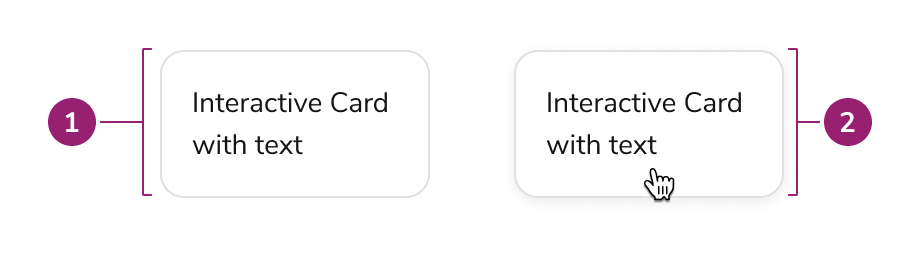
Interactive Card consists of three primary elements that work together to create clickable cards with nested interactive elements.

<Frame>
  <div className="w-full h-full bg-[#FFFFFF] p-2 rounded flex items-center justify-center">
    <img
      src="https://mintcdn.com/servicetitan/NkSrIaHzJjwUU4IF/images/docs/web/components/interactive-card/anatomy.png?fit=max&auto=format&n=NkSrIaHzJjwUU4IF&q=85&s=b8a067c8ec70992a39433c4f0d83b7c1"
      alt="Anatomy of the Interactive Card
component"
      width="920"
      height="256"
      data-path="images/docs/web/components/interactive-card/anatomy.png"
    />
  </div>
</Frame>

1. **Card** - Interactive card is a [Card](/docs/web/components/card/design) under the hood.
2. **Card (hover)** - Interacting with the card enables clickable behavior

## Options

Interactive Card uses a Card under the hood to provide the base styling and layout. Refer to the [Card design docs](/docs/web/components/card/design) for all available options.

### Simple interactive card

<LiveCode example="interactivecard-demo" fullWidth>
  ```tsx lines theme={null}
  import { Text } from "@servicetitan/anvil2";
  import { InteractiveCard } from "@servicetitan/anvil2/beta";

  function App() {
    return (
      <InteractiveCard
        wrapperProps={{ "aria-label": "Interactive Card Demo" }}
        actionProps={{
          "aria-label": "Navigate to ServiceTitan",
          href: "https://servicetitan.com",
          target: "_blank",
          rel: "noopener noreferrer",
        }}
        contentProps={{ padding: "large", flexDirection: "column", gap: "2" }}
      >
        <Text variant="headline" el="h2" size="medium">
          Basic Interactive Card
        </Text>
        <Text>Basic text content in an interactive card.</Text>
      </InteractiveCard>
    );
  }

  export default App;
  ```
</LiveCode>

## Behavior

Interactive Card responds to user interaction with distinct visual feedback while maintaining support for nested interactive elements.

### Hover, focus, and disabled states

<LiveCode example="interactivecard-states" fullWidth screenshot>
  ```tsx lines theme={null}
  import { Flex, Text } from "@servicetitan/anvil2";
  import { InteractiveCard } from "@servicetitan/anvil2/beta";

  function App() {
    return (
      <Flex gap="4">
        <InteractiveCard
          wrapperProps={{ "aria-label": "Hover state card" }}
          actionProps={{
            "aria-label": "View hover example",
            onClick: () => {},
          }}
          contentProps={{ padding: "large", flexDirection: "column", gap: "2" }}
          data-interactive="hover"
        >
          <Text>Hover state</Text>
        </InteractiveCard>

        <InteractiveCard
          wrapperProps={{ "aria-label": "Focus state card" }}
          actionProps={{
            "aria-label": "View focus example",
            onClick: () => {},
          }}
          contentProps={{ padding: "large", flexDirection: "column", gap: "2" }}
          data-interactive="focus-visible"
        >
          <Text>Focus state</Text>
        </InteractiveCard>

        <InteractiveCard
          wrapperProps={{ "aria-label": "Disabled state card" }}
          actionProps={{
            "aria-label": "View disabled example",
            onClick: () => {},
            disabled: true,
          }}
          contentProps={{ padding: "large", flexDirection: "column", gap: "2" }}
        >
          <Text>Disabled state</Text>
        </InteractiveCard>
      </Flex>
    );
  }

  export default App;
  ```
</LiveCode>

Disabled state does not apply disabled styling to nested interactive elements. Apply disabled styling manually to nested elements when needed.

### Nested interactive elements

Interactive Card can support nested interactions within the card layout itself. This can be useful when both the Card itself and nested interactive elements have different behaviors.

<LiveCode example="interactivecard-playground" fullWidth screenshot>
  ```tsx lines theme={null}
  import { Button, Flex, Text } from "@servicetitan/anvil2";
  import { InteractiveCard } from "@servicetitan/anvil2/beta";

  function App() {
    return (
      <InteractiveCard
        wrapperProps={{ "aria-label": "Basic Interactive Card" }}
        actionProps={{
          "aria-label": "Select basic interactive card",
          onClick: console.log,
        }}
        contentProps={{ padding: "large", flexDirection: "column", gap: "2" }}
      >
        <Text variant="headline" el="h2" size="medium">
          Basic Interactive Card
        </Text>
        <Text>Basic text content in an interactive card.</Text>
        <Flex gap="2">
          <Button onClick={console.log}>Action </Button>
        </Flex>
      </InteractiveCard>
    );
  }

  export default App;
  ```
</LiveCode>

## Usage Guidelines

Use Interactive Card when you need clickable cards that contain nested interactive elements such as buttons or links.

### When to Use

Use Interactive Card when you need:

* Clickable cards with nested interactive elements
* Cards that trigger actions (button variant)
* Cards that navigate to other pages (link variant)
* WCAG AA 2.2 compliant clickable card implementations

### When not to use

Avoid using Interactive Card when the card itself does not need an interaction.

### Alternatives

#### Interactive Card vs Card

Use Interactive Card when the card itself needs an interaction. If no interaction is needed, or only an inner element needs an interaction, use Card instead.

#### Interactive Card vs Select Card

[Select Card](/docs/web/components/select-card/design) provides a card-like checkbox or radio input for selection scenarios. Use Select Card when users need to select one or more options from a group of cards, such as choosing services or items. Use Interactive Card when the card triggers an action or navigates to another page, especially when the card contains nested interactive elements like buttons or links.

## Content

Content within Interactive Card should be clearly organized and include required ARIA labels for accessibility.

### Content organization

* Use a heading to make the card's purpose clear, following heading structure for the page
* Avoid too many call-to-actions in a single card
* Cards should have an intentional focus - avoid overloading a single card with too much or unrelated information
* Cards of similar importance should be structured in the same way

## Keyboard Interaction

Users can navigate Interactive Card using standard keyboard controls.

| Key   | Description                                |
| ----- | ------------------------------------------ |
| Tab   | Moves focus to the card or nested elements |
| Enter | Activates the card action (button variant) |
| Space | Activates the card action (button variant) |

Interactive Card provides full keyboard support for both the card action and nested interactive elements. Tab navigation moves focus between the card and its nested elements, while Enter and Space activate button variant cards.