> ## Documentation Index
> Fetch the complete documentation index at: https://anvil.servicetitan.com/llms.txt
> Use this file to discover all available pages before exploring further.
# Layout – Design
> Define page layout structure and columns.
export const CodePreviewPlaceholder = ({double, fullWidth}) => {
const single = ;
return double ?
{single}
{single}
: single;
};
## Anatomy
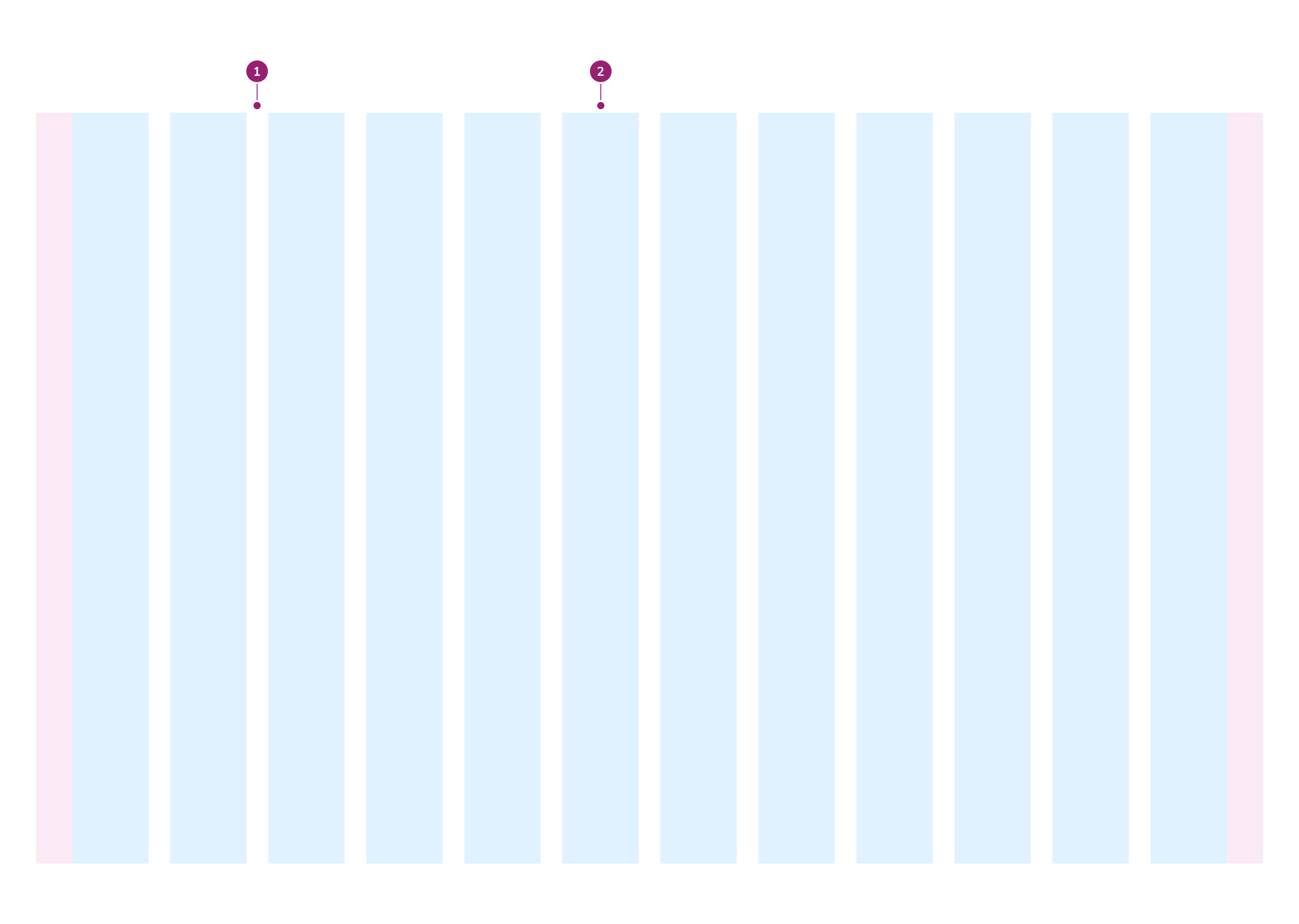
The Layout consists of two primary elements that work together to define page structure and columns.
1. Gutter
2. Column
## Options
The Layout supports responsive column configurations, width options, and gutter variants to accommodate various page structure scenarios.
### Columns per breakpoint
| Breakpoint | # of columns |
| -------------- | ------------ |
| SM `>=640px` | 4 |
| MD `>=768px` | 6 |
| LG `>=1024px` | 12 |
| XL `>=1280px` | 12 |
| XXL `>=1536px` | 12 |
### Width
There are two width options available: Default and Fluid.
#### Default
By default, Layout has a max width of 1280px.
#### Fluid
When fluid is true, Layout will fill the available area.
### Variants
There are three variants of Layout: Default, Wide, and Narrow. Each variant has different gutter values. Gutters are the spacing between columns.
#### Default
| Breakpoint | Gutter |
| -------------- | ------------------------ |
| SM `>=640px` | \$size-4 / 1rem / 16px |
| MD `>=768px` | \$size-6 / 1.5rem / 24px |
| LG `>=1024px` | \$size-6 / 1.5rem / 24px |
| XL `>=1280px` | \$size-6 / 1.5rem / 24px |
| XXL `>=1536px` | \$size-6 / 1.5rem / 24px |
#### Wide
| Breakpoint | Gutter |
| -------------- | ------------------------- |
| SM `>=640px` | \$size-6 / 1.5rem / 24px |
| MD `>=768px` | \$size-8 / 2rem / 32px |
| LG `>=1024px` | \$size-10 / 2.5rem / 40px |
| XL `>=1280px` | \$size-10 / 2.5rem / 40px |
| XXL `>=1536px` | \$size-10 / 2.5rem / 40px |
#### Narrow
| Breakpoint | Gutter |
| -------------- | ----------------------- |
| SM `>=640px` | \$size-2 / 0.5rem / 8px |
| MD `>=768px` | \$size-4 / 1rem / 16px |
| LG `>=1024px` | \$size-4 / 1rem / 16px |
| XL `>=1280px` | \$size-4 / 1rem / 16px |
| XXL `>=1536px` | \$size-4 / 1rem / 16px |
## Behavior
The Layout responds to different breakpoints and content requirements while maintaining consistent column structure.
## Usage Guidelines
Use the Layout to construct the overall structure of a page. It is not used for organizing elements within other containers.
### Fluid or Fixed Width
Choose between fluid and fixed layouts based on user goals, content density, and design requirements.
#### Fluid Layout
Use a fluid layout when the design needs to be fully responsive across different screen sizes, particularly for layouts exceeding 1280px. Fluid layouts maximize available screen space and work well for high-density interfaces. They adjust proportionally to the viewport size and require less adjustment when adding or modifying content.
#### Fixed Layout
Use a fixed layout to guide users through specific tasks without distraction. Fixed layouts optimize readability on larger screens by limiting line lengths and provide greater design control. They work well for low-density interfaces where focused task completion is important.
#### Considerations
Consider how users interact with content: fluid layouts work well when users need to review extensive information, while fixed layouts enhance focused tasks with limited information. Ensure a design strategy for each layout type, especially for complex designs with heavy content, and maintain accessibility standards across devices and screen sizes.
### Default, Narrow, or Wide Gutters
#### Default Gutters
Use the default gutter variant for balanced layouts with standard spacing between columns. This variant provides a neutral aesthetic that works well across content types and screen sizes, ensuring consistent visual flow and stable visual hierarchy.
#### Narrow Gutters
Choose the narrow gutter variant for compact, dense layouts where maximizing content visibility is crucial. Narrow gutters focus user attention on specific content elements and help create cohesive groupings. They work well for mobile-friendly designs where screen space is limited.
#### Wide Gutters
Use the wide gutter variant to create spacious layouts with larger gutters between columns. Wide gutters provide breathing room around content elements, visually separate different sections, and enhance readability for text-heavy interfaces or long-form content.
#### Considerations
Consider user context and content type when selecting a gutter variant. Ensure the chosen variant adapts responsively across devices and screen sizes, and test layouts to confirm designs remain effective on both desktop and mobile devices.
## Content
Content within the Layout should be organized using the column structure to create clear visual hierarchy.
## Keyboard Interaction
Users can navigate the Layout using standard keyboard controls.