> ## Documentation Index
> Fetch the complete documentation index at: https://anvil.servicetitan.com/llms.txt
> Use this file to discover all available pages before exploring further.

# Link – Design

> Links are clickable elements that navigate users to another webpage, document, or section.

export const LiveCode = ({children, customHeight, clickToLoad, example, fullWidth, fullHeight, hideCodeInLiveCode, screenshot, screenshotOnly, showCode: showCodeProp}) => {
  const SCREENSHOTS_BASE = "https://servicetitan.github.io/anvil2-docs-live-code/screenshots";
  const STACKBLITZ_BASE = "https://stackblitz.com/github/servicetitan/anvil2-docs-live-code/tree/main/examples";
  const [showCodeBlock, setShowCodeBlock] = useState(showCodeProp ?? false);
  const [isLocalOverride, setIsLocalOverride] = useState(false);
  useEffect(() => {
    const examplePath = `/images/live-code-screenshots-tmp/${example}.png`;
    fetch(examplePath, {
      method: "HEAD"
    }).then(r => {
      if (r.ok) setIsLocalOverride(true);
    }).catch(() => {});
  }, [example]);
  const screenshotBase = isLocalOverride ? "/images/live-code-screenshots-tmp" : SCREENSHOTS_BASE;
  if (screenshotOnly) {
    return <Frame className="flex flex-col">
        <div className="flex dark:hidden" style={{
      justifyContent: "center",
      alignItems: "center",
      width: fullWidth ? "100%" : "50%",
      minHeight: fullHeight ? "284px" : undefined,
      background: "#FFFFFF"
    }}>
          <img srcset={`${screenshotBase}/${example}.png, ${screenshotBase}/${example}-2x.png 2x`} src={`${screenshotBase}/${example}.png`} alt={example} noZoom />
        </div>
        <div className="hidden dark:flex" style={{
      justifyContent: "center",
      alignItems: "center",
      width: fullWidth ? "100%" : "50%",
      minHeight: fullHeight ? "284px" : undefined,
      background: "#141414"
    }}>
          <img srcset={`${screenshotBase}/${example}-dark.png, ${screenshotBase}/${example}-dark-2x.png 2x`} src={`${screenshotBase}/${example}-dark.png`} alt={example} noZoom />
        </div>
      </Frame>;
  }
  if (screenshot) {
    return <Frame className="flex flex-col -mb-2">
        <div className="flex dark:hidden bg-white dark:bg-codeblock border border-gray-950/10 dark:border-white/10 dark:twoslash-dark rounded-2xl overflow-hidden" style={{
      justifyContent: "center",
      alignItems: "center",
      width: fullWidth ? "100%" : "50%",
      minHeight: fullHeight ? "284px" : undefined
    }}>
          <img srcset={`${screenshotBase}/${example}.png, ${screenshotBase}/${example}-2x.png 2x`} src={`${screenshotBase}/${example}.png`} alt={example} noZoom />
        </div>

        <div className="hidden dark:flex bg-white dark:bg-codeblock border border-gray-950/10 dark:border-white/10 dark:twoslash-dark rounded-2xl overflow-hidden" style={{
      background: "#141414",
      justifyContent: "center",
      alignItems: "center",
      width: fullWidth ? "100%" : "50%",
      minHeight: fullHeight ? "284px" : undefined
    }}>
          <img srcset={`${screenshotBase}/${example}-dark.png, ${screenshotBase}/${example}-dark-2x.png 2x`} src={`${screenshotBase}/${example}-dark.png`} alt={example} noZoom />
        </div>

        <div className="flex justify-end items-center text-xs py-2 px-1 gap-4">
          {!showCodeProp ? <button className="inline-flex justify-end items-center text-gray-700 dark:text-gray-50 hover:text-blue-500 dark:hover:text-blue-300 transition-colors group self-end gap-1 cursor-pointer" onClick={() => setShowCodeBlock(!showCodeBlock)} style={{
      appearance: "none"
    }}>
              <Icon icon="code" size="12px" className="group-hover:bg-blue-500 dark:group-hover:bg-blue-300" />
              <span>{showCodeBlock ? "Hide code" : "Show code"}</span>
            </button> : null}

          <a className="inline-flex justify-end items-center hover:text-blue-500 dark:hover:text-blue-300 transition-colors group self-end gap-1" href={`${STACKBLITZ_BASE}/${example}?file=src/App.tsx`} target="_blank" rel="noreferrer">
            <Icon icon="bolt" size="12px" className="group-hover:bg-blue-500 dark:group-hover:bg-blue-300" />
            <span>StackBlitz demo</span>
          </a>
        </div>

        <div className="grid transition-[grid-template-rows] duration-300 ease-in-out overflow-auto overflow-y-hidden overflow-x-auto" style={showCodeBlock ? {
      gridTemplateRows: "1fr"
    } : {
      gridTemplateRows: "0fr"
    }}>
          <div style={{
      minHeight: 0,
      overflowX: "auto",
      overflowY: "hidden",
      marginBlockStart: "-1.25rem",
      marginBlockEnd: "-1.5rem"
    }}>
            {children}
          </div>
        </div>
      </Frame>;
  } else {
    return <div style={{
      display: "flex",
      width: fullWidth ? "100%" : "50%",
      minHeight: customHeight ? customHeight : "316px",
      resize: "vertical",
      overflow: "auto"
    }}>
        <iframe title={example} style={{
      flex: 1,
      width: fullWidth ? "100%" : "50%",
      minHeight: customHeight ? customHeight : "316px"
    }} src={`${STACKBLITZ_BASE}/${example}?embed=1&hideNavigation=1&hideExplorer=1&terminalHeight=0&file=src/App.tsx${clickToLoad ? "&ctl=1" : ""}${hideCodeInLiveCode ? "&view=preview" : ""}`} allow="accelerometer; ambient-light-sensor; camera; encrypted-media; geolocation; gyroscope; hid; microphone; midi; payment; usb; vr; xr-spatial-tracking" sandbox="allow-forms allow-modals allow-popups allow-presentation allow-same-origin allow-scripts" />
      </div>;
  }
};

export const CodePreviewPlaceholder = ({double, fullWidth}) => {
  const single = <div style={{
    width: fullWidth ? "100%" : "50%",
    borderRadius: "1rem",
    display: "flex",
    padding: "1rem",
    flexDirection: "column",
    gap: "0.5rem",
    height: "10rem",
    marginBlockEnd: "1rem"
  }} className="border-width-default border-color-subdued">
      <div className="bg-strong border-radius-large" style={{
    width: "100%",
    flexGrow: "1"
  }} />
      <div className="bg-strong border-radius-large" style={{
    width: "100%",
    flexGrow: "1"
  }} />
    </div>;
  return double ? <div style={{
    display: "flex",
    gap: "1rem"
  }}>
      {single}
      {single}
    </div> : single;
};

<Frame>
  <div className="w-full h-full bg-[#FFFFFF] p-2 rounded flex items-center justify-center">
    <img noZoom src="https://mintcdn.com/servicetitan/uz2PQSvO75TRhQ38/images/docs/web/components/shared/link-overview.png?fit=max&auto=format&n=uz2PQSvO75TRhQ38&q=85&s=b633d7d6c2e0bc5a38cd928e51f93633" width="168" height="77" data-path="images/docs/web/components/shared/link-overview.png" />
  </div>
</Frame>

## Anatomy

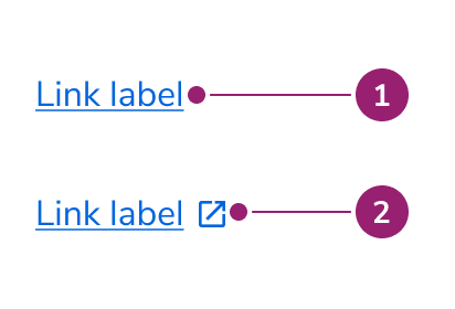
The Link consists of two primary elements that work together to navigate users to another webpage, document, or section.

<Frame>
  <div className="w-full h-full bg-[#FFFFFF] p-2 rounded flex items-center justify-center">
    <img
      src="https://mintcdn.com/servicetitan/aip5_7K1pHSn1Axn/images/docs/web/components/link/design/link-anatomy.png?fit=max&auto=format&n=aip5_7K1pHSn1Axn&q=85&s=c75d7ebd19abb178b91d52b6ef0e8bee"
      alt="Link
anatomy"
      width="412"
      height="280"
      data-path="images/docs/web/components/link/design/link-anatomy.png"
    />
  </div>
</Frame>

1. Text label
2. Open in new / external icon

## Options

The Link supports multiple appearances and external link configurations to accommodate various navigation scenarios.

<Frame>
  <div className="w-full h-full bg-[#FFFFFF] p-2 rounded flex items-center justify-center">
    <img
      src="https://mintcdn.com/servicetitan/aip5_7K1pHSn1Axn/images/docs/web/components/link/design/link-options-appearances.png?fit=max&auto=format&n=aip5_7K1pHSn1Axn&q=85&s=1125b6239374c74a8603cbbc799cd893"
      alt="Link options
appearances"
      width="1002"
      height="109"
      data-path="images/docs/web/components/link/design/link-options-appearances.png"
    />
  </div>
</Frame>

| Appearance | When to use                                                                 |
| ---------- | --------------------------------------------------------------------------- |
| Primary    | For prominent, important links on the page.                                 |
| Secondary  | For inline text that does not need a lot of prominence.                     |
| Ghost      | For standalone situations where a user can clearly understand it is a link. |

### With open in new Icon

<Frame>
  <div className="w-full h-full bg-[#FFFFFF] p-2 rounded flex items-center justify-center">
    <img
      src="https://mintcdn.com/servicetitan/Q18b5kAebhFUEruT/images/docs/web/components/link/shared/link-options-external-icon.png?fit=max&auto=format&n=Q18b5kAebhFUEruT&q=85&s=eba963f10c50632a640bae9b8a42cbff"
      alt="Link options external
icon"
      width="240"
      height="280"
      data-path="images/docs/web/components/link/shared/link-options-external-icon.png"
    />
  </div>
</Frame>

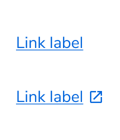
When denoting that a link will open in a new tab, or when the link opens an external site, use the "open in new" icon, regardless of which appearance the link uses.

### Link Button

<LiveCode example="link-button" screenshot fullWidth>
  ```tsx lines theme={null}
  import { LinkButton, Flex } from "@servicetitan/anvil2";

  function App() {
    return (
      <Flex gap={4} justifyContent="space-around">
        <LinkButton>Primary Link Button</LinkButton>
        <LinkButton appearance="secondary">Secondary Link Button</LinkButton>
        <LinkButton ghost>Quiet Link Button</LinkButton>
      </Flex>
    );
  }

  export default App;
  ```
</LiveCode>

The **Link Button** is a specialized Button component styled to look like a simple text link. It provides the visual appearance of a link with the correct HTML semantics of a button, making it ideal for actions that do not navigate to a new page.

The [**Button Link**](/docs/web/components/button/design#button-link) is its reverse: a Button component that uses an anchor tag under the hood. Use it when an action involves navigation but you need a button's visual style.

## Behavior

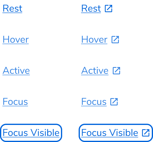
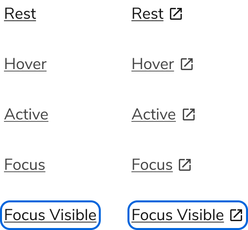
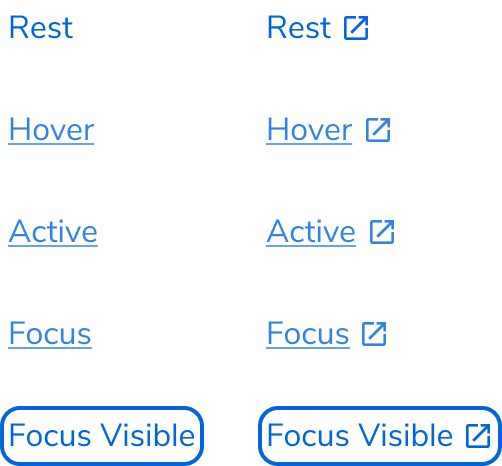
The Link responds to user interaction with distinct visual states for different appearances.

### Visual States

#### Primary link

<Frame>
  <div className="w-full h-full bg-[#FFFFFF] p-2 rounded flex items-center justify-center">
    <img
      src="https://mintcdn.com/servicetitan/aip5_7K1pHSn1Axn/images/docs/web/components/link/design/link-visual-primary.png?fit=max&auto=format&n=aip5_7K1pHSn1Axn&q=85&s=bc8ee169137c57ea5cbbe5a39c6a0c53"
      alt="Link visual
primary"
      width="502"
      height="466"
      data-path="images/docs/web/components/link/design/link-visual-primary.png"
    />
  </div>
</Frame>

#### Secondary link

<Frame>
  <div className="w-full h-full bg-[#FFFFFF] p-2 rounded flex items-center justify-center">
    <img
      src="https://mintcdn.com/servicetitan/aip5_7K1pHSn1Axn/images/docs/web/components/link/design/link-visual-secondary.png?fit=max&auto=format&n=aip5_7K1pHSn1Axn&q=85&s=0203d468da79ef697b8f47a455a6183c"
      alt="Link visual
secondary"
      width="502"
      height="466"
      data-path="images/docs/web/components/link/design/link-visual-secondary.png"
    />
  </div>
</Frame>

#### Ghost link

<Frame>
  <div className="w-full h-full bg-[#FFFFFF] p-2 rounded flex items-center justify-center">
    <img
      src="https://mintcdn.com/servicetitan/aip5_7K1pHSn1Axn/images/docs/web/components/link/design/link-visual-ghost.png?fit=max&auto=format&n=aip5_7K1pHSn1Axn&q=85&s=7d2da796fec1a5f8aa2329e2f756247f"
      alt="Link Visual
Ghost"
      width="502"
      height="466"
      data-path="images/docs/web/components/link/design/link-visual-ghost.png"
    />
  </div>
</Frame>

## Usage Guidelines

Use the Link when navigating users to another webpage, document, or section.

### When to Use

Links are typically used in navigation to new pages, new sites, moving to another element on the same page, emails, and phone numbers.

The Link component in the design system is limited in scope to being a standalone component. Components that have similar navigational behaviors, such as a side nav, tabs, or footer links do not use this Link component, either under the hood or visually.

### Alternatives

#### Link vs Button

In general, Buttons are used to denote an action, while a Link is used to denote navigation. This distinction in practice is sometimes blurry.

##### When navigating

In general, Links are the preferred choice for navigating. Use a Button in these scenarios:

* Use a Button when emphasis is needed. Sometimes a page's call to action is navigating somewhere else.
* Use a Button when navigation is mixed with actions.

##### With Actions

In general, Buttons are the preferred choice for actions. Use a Link when the action priority is low and space is tight.

##### With triggering overlays

Treat triggering an overlay UI like navigation.

### How to Use

#### External links

When a link goes to a site outside of the current domain, it should utilize the external icon, and also open in a new tab. This can be used with all link styles.

<Frame>
  <div className="w-full h-full bg-[#FFFFFF] p-2 rounded flex items-center justify-center">
    <img
      src="https://mintcdn.com/servicetitan/Q18b5kAebhFUEruT/images/docs/web/components/link/shared/link-options-external-icon.png?fit=max&auto=format&n=Q18b5kAebhFUEruT&q=85&s=eba963f10c50632a640bae9b8a42cbff"
      alt="Link options external
icon"
      width="240"
      height="280"
      data-path="images/docs/web/components/link/shared/link-options-external-icon.png"
    />
  </div>
</Frame>

#### Underline vs no underline links

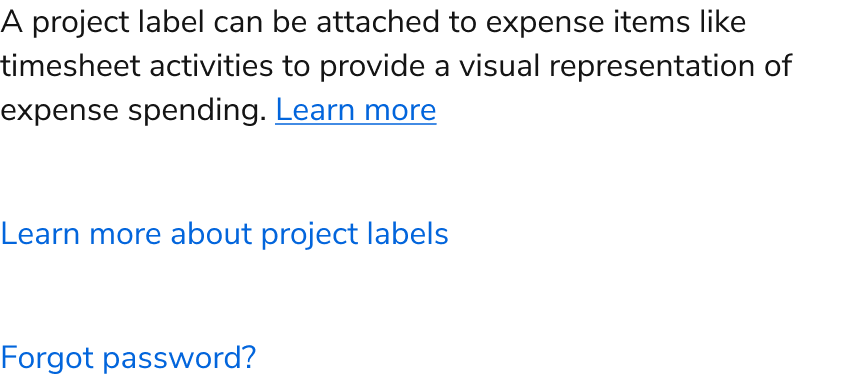
The underline variant of links is used when the link is part of a sentence or paragraph. When a link is a standalone element, omit the underline.

<Frame>
  <div className="w-full h-full bg-[#FFFFFF] p-2 rounded flex items-center justify-center">
    <img
      src="https://mintcdn.com/servicetitan/aip5_7K1pHSn1Axn/images/docs/web/components/link/design/how-to-use-link-underline-example.png?fit=max&auto=format&n=aip5_7K1pHSn1Axn&q=85&s=e1e06bfa2dbe51a41aa7e0aaf6064caa"
      alt="How to use link underline
example"
      width="860"
      height="134"
      data-path="images/docs/web/components/link/design/how-to-use-link-underline-example.png"
    />
  </div>
</Frame>

<Check>**Do**</Check>

<Frame>
  <div className="w-full h-full bg-[#FFFFFF] p-2 rounded flex items-center justify-center">
    <img
      src="https://mintcdn.com/servicetitan/aip5_7K1pHSn1Axn/images/docs/web/components/link/design/how-to-use-link-underline-example.png?fit=max&auto=format&n=aip5_7K1pHSn1Axn&q=85&s=e1e06bfa2dbe51a41aa7e0aaf6064caa"
      alt="How to use link underline
example"
      width="860"
      height="134"
      data-path="images/docs/web/components/link/design/how-to-use-link-underline-example.png"
    />
  </div>
</Frame>

<Danger>**Don't**</Danger>

<Frame>
  <div className="w-full h-full bg-[#FFFFFF] p-2 rounded flex items-center justify-center">
    <img
      src="https://mintcdn.com/servicetitan/aip5_7K1pHSn1Axn/images/docs/web/components/link/design/how-to-use-link-without-underline-example.png?fit=max&auto=format&n=aip5_7K1pHSn1Axn&q=85&s=8320530bac9281c279d18e40d65efc5b"
      alt="How to use link without underline
example"
      width="490"
      height="528"
      data-path="images/docs/web/components/link/design/how-to-use-link-without-underline-example.png"
    />
  </div>
</Frame>

<Check>**Do**</Check>

#### Primary vs Secondary styling

Use the primary link style when attention should be called upon itself. Use the secondary link when there are many links on the page, or when less emphasis should be placed on the links. Use caution when mixing both styles in one area, and don't use both in the same body of text.

<Frame>
  <div className="w-full h-full bg-[#FFFFFF] p-2 rounded flex items-center justify-center">
    <img
      src="https://mintcdn.com/servicetitan/CekIMDXcDEhGoN_I/images/docs/web/components/link/design/how-to-use-link-secondary.png?fit=max&auto=format&n=CekIMDXcDEhGoN_I&q=85&s=c3a96e127735bd48b043886ddf6bd797"
      alt="How to use Link
secondary"
      width="854"
      height="144"
      data-path="images/docs/web/components/link/design/how-to-use-link-secondary.png"
    />
  </div>
</Frame>

<Check>**Do**</Check>

<Frame>
  <div className="w-full h-full bg-[#FFFFFF] p-2 rounded flex items-center justify-center">
    <img
      src="https://mintcdn.com/servicetitan/CekIMDXcDEhGoN_I/images/docs/web/components/link/design/how-to-use-link-secondary.png?fit=max&auto=format&n=CekIMDXcDEhGoN_I&q=85&s=c3a96e127735bd48b043886ddf6bd797"
      alt="How to use Link
secondary"
      width="854"
      height="144"
      data-path="images/docs/web/components/link/design/how-to-use-link-secondary.png"
    />
  </div>
</Frame>

<Check>**Do**</Check>

<Frame>
  <div className="w-full h-full bg-[#FFFFFF] p-2 rounded flex items-center justify-center">
    <img
      src="https://mintcdn.com/servicetitan/CekIMDXcDEhGoN_I/images/docs/web/components/link/design/how-not-to-use-link-secondary-example.png?fit=max&auto=format&n=CekIMDXcDEhGoN_I&q=85&s=03a4602af96ef9d2c22292e261bda5b5"
      alt="How not to use Link secondary
example"
      width="854"
      height="144"
      data-path="images/docs/web/components/link/design/how-not-to-use-link-secondary-example.png"
    />
  </div>
</Frame>

<Danger>**Don't**</Danger>

## Content

Content within the Link should clearly communicate the destination and provide enough context for users to understand what to expect.

### Standalone links

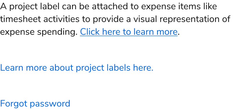
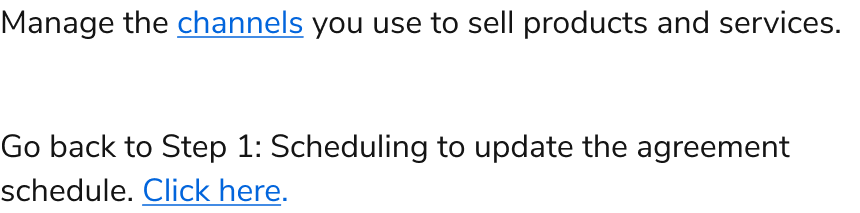
Standalone links are written similarly to calls to action: They are not full sentences, have no punctuation except question marks, and use short action-oriented phrases.

Users typically see links as optional or supplemental content because they often appear at the end of a sentence or paragraph.

Links should never use "click here" or "here" as link text.

<Frame>
  <div className="w-full h-full bg-[#FFFFFF] p-2 rounded flex items-center justify-center">
    <img
      src="https://mintcdn.com/servicetitan/aip5_7K1pHSn1Axn/images/docs/web/components/link/design/how-to-use-standalone-link.png?fit=max&auto=format&n=aip5_7K1pHSn1Axn&q=85&s=da6fee5d9d923ff1495c63e9656d12d9"
      alt="How to use standalone
Link"
      width="860"
      height="380"
      data-path="images/docs/web/components/link/design/how-to-use-standalone-link.png"
    />
  </div>
</Frame>

<Check>**Do**</Check>

<Frame>
  <div className="w-full h-full bg-[#FFFFFF] p-2 rounded flex items-center justify-center">
    <img
      src="https://mintcdn.com/servicetitan/CekIMDXcDEhGoN_I/images/docs/web/components/link/design/how-not-to-use-link-standalone.png?fit=max&auto=format&n=CekIMDXcDEhGoN_I&q=85&s=5f29282b8dfbbb28aff203fd49e50dca"
      alt="How not to use Link
standalone"
      width="860"
      height="380"
      data-path="images/docs/web/components/link/design/how-not-to-use-link-standalone.png"
    />
  </div>
</Frame>

<Danger>**Don't**</Danger>

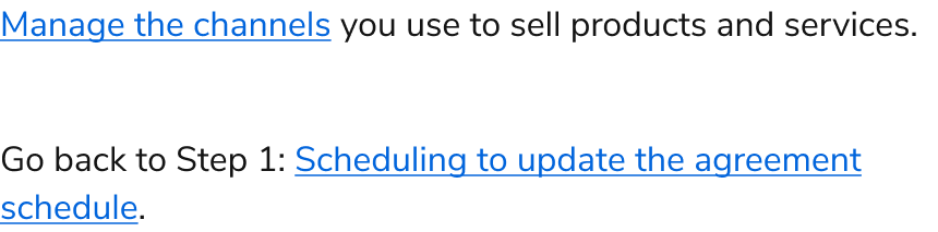
### Links in sentences

The link should only include text that refers directly to the destination. Include enough context about the destination in the link text to allow the user to understand the value and know what to expect when they click.

Links in sentences are part of a paragraph. Include enough context in the link text to communicate the value and expectation of the landing experience.

<Frame>
  <div className="w-full h-full bg-[#FFFFFF] p-2 rounded flex items-center justify-center">
    <img
      src="https://mintcdn.com/servicetitan/CekIMDXcDEhGoN_I/images/docs/web/components/link/design/how-to-use-link-in-sentences.png?fit=max&auto=format&n=CekIMDXcDEhGoN_I&q=85&s=d972f8cc6b2c99b647c5fd828a866c7b"
      alt="How to use Link in
sentences"
      width="860"
      height="213"
      data-path="images/docs/web/components/link/design/how-to-use-link-in-sentences.png"
    />
  </div>
</Frame>

<Check>**Do**</Check>

<Frame>
  <div className="w-full h-full bg-[#FFFFFF] p-2 rounded flex items-center justify-center">
    <img
      src="https://mintcdn.com/servicetitan/CekIMDXcDEhGoN_I/images/docs/web/components/link/design/how-not-to-use-link-in-sentences.png?fit=max&auto=format&n=CekIMDXcDEhGoN_I&q=85&s=7bd8e4b0aa02e63de7ff5fc1492be6c6"
      alt="How not to use Link in
sentences"
      width="860"
      height="213"
      data-path="images/docs/web/components/link/design/how-not-to-use-link-in-sentences.png"
    />
  </div>
</Frame>

<Danger>**Don't**</Danger>

## Keyboard Interaction

Users can navigate the Link using standard keyboard controls.

| Key   | Interaction                                          |
| ----- | ---------------------------------------------------- |
| Enter | Engages the link and moves focus to the link target. |

### Accessibility

#### Annotate generic links

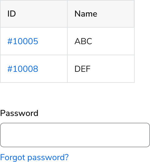
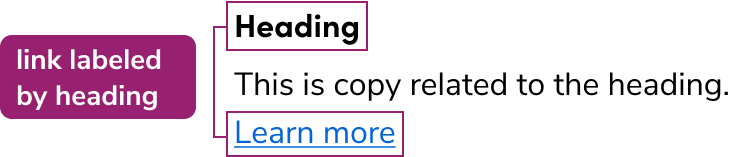
It is generally preferable the link does not use generic labels. If it does, an annotation for the link should be made in handoffs, either to a heading if one is available or as a custom label if there is not one.

<Frame>
  <div className="w-full h-full bg-[#FFFFFF] p-2 rounded flex items-center justify-center">
    <img
      src="https://mintcdn.com/servicetitan/aip5_7K1pHSn1Axn/images/docs/web/components/link/design/link-accessibility-labelledby.png?fit=max&auto=format&n=aip5_7K1pHSn1Axn&q=85&s=b838b3a097368123864dde2351bda875"
      alt="Link accessibility
labelledby"
      width="736"
      height="157"
      data-path="images/docs/web/components/link/design/link-accessibility-labelledby.png"
    />
  </div>
</Frame>

#### Annotate a generic link using a headline

When a link is generic and a headline (or table column) is available, associate it with the heading. In development, the link is given an aria-labelledby. [Refer to W3C's guidelines on how to implement this](https://www.w3.org/WAI/WCAG21/Techniques/aria/ARIA7).

<Frame>
  <div className="w-full h-full bg-[#FFFFFF] p-2 rounded flex items-center justify-center">
    <img
      src="https://mintcdn.com/servicetitan/aip5_7K1pHSn1Axn/images/docs/web/components/link/design/link-accessibility-label.png?fit=max&auto=format&n=aip5_7K1pHSn1Axn&q=85&s=37efdaeedcbd0f2b55a1370e20f508f0"
      alt="Link accessibility
label"
      width="736"
      height="117"
      data-path="images/docs/web/components/link/design/link-accessibility-label.png"
    />
  </div>
</Frame>

#### Annotate a generic link using a custom label

When a link is generic and has no label available, annotate a custom label for the link for screenreaders. In development, the link is given an aria-label. [Refer to W3C's guidelines on how to implement this](https://www.w3.org/WAI/WCAG21/Techniques/aria/ARIA8).

For more guidance on link labels and context association, see [link accessibility best practices](/docs/accessibility/labels-and-ctas#buttons-and-links).