> ## Documentation Index
> Fetch the complete documentation index at: https://anvil.servicetitan.com/llms.txt
> Use this file to discover all available pages before exploring further.

# List View – Design

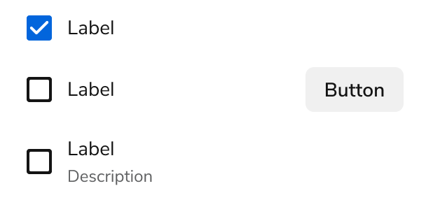
> ListViews display a selectable list that can be customized, including displaying secondary actions and information.

export const LiveCode = ({children, customHeight, clickToLoad, example, fullWidth, fullHeight, hideCodeInLiveCode, screenshot, screenshotOnly, showCode: showCodeProp}) => {
  const SCREENSHOTS_BASE = "https://servicetitan.github.io/anvil2-docs-live-code/screenshots";
  const STACKBLITZ_BASE = "https://stackblitz.com/github/servicetitan/anvil2-docs-live-code/tree/main/examples";
  const [showCodeBlock, setShowCodeBlock] = useState(showCodeProp ?? false);
  const [isLocalOverride, setIsLocalOverride] = useState(false);
  useEffect(() => {
    const examplePath = `/images/live-code-screenshots-tmp/${example}.png`;
    fetch(examplePath, {
      method: "HEAD"
    }).then(r => {
      if (r.ok) setIsLocalOverride(true);
    }).catch(() => {});
  }, [example]);
  const screenshotBase = isLocalOverride ? "/images/live-code-screenshots-tmp" : SCREENSHOTS_BASE;
  if (screenshotOnly) {
    return <Frame className="flex flex-col">
        <div className="flex dark:hidden" style={{
      justifyContent: "center",
      alignItems: "center",
      width: fullWidth ? "100%" : "50%",
      minHeight: fullHeight ? "284px" : undefined,
      background: "#FFFFFF"
    }}>
          <img srcset={`${screenshotBase}/${example}.png, ${screenshotBase}/${example}-2x.png 2x`} src={`${screenshotBase}/${example}.png`} alt={example} noZoom />
        </div>
        <div className="hidden dark:flex" style={{
      justifyContent: "center",
      alignItems: "center",
      width: fullWidth ? "100%" : "50%",
      minHeight: fullHeight ? "284px" : undefined,
      background: "#141414"
    }}>
          <img srcset={`${screenshotBase}/${example}-dark.png, ${screenshotBase}/${example}-dark-2x.png 2x`} src={`${screenshotBase}/${example}-dark.png`} alt={example} noZoom />
        </div>
      </Frame>;
  }
  if (screenshot) {
    return <Frame className="flex flex-col -mb-2">
        <div className="flex dark:hidden bg-white dark:bg-codeblock border border-gray-950/10 dark:border-white/10 dark:twoslash-dark rounded-2xl overflow-hidden" style={{
      justifyContent: "center",
      alignItems: "center",
      width: fullWidth ? "100%" : "50%",
      minHeight: fullHeight ? "284px" : undefined
    }}>
          <img srcset={`${screenshotBase}/${example}.png, ${screenshotBase}/${example}-2x.png 2x`} src={`${screenshotBase}/${example}.png`} alt={example} noZoom />
        </div>

        <div className="hidden dark:flex bg-white dark:bg-codeblock border border-gray-950/10 dark:border-white/10 dark:twoslash-dark rounded-2xl overflow-hidden" style={{
      background: "#141414",
      justifyContent: "center",
      alignItems: "center",
      width: fullWidth ? "100%" : "50%",
      minHeight: fullHeight ? "284px" : undefined
    }}>
          <img srcset={`${screenshotBase}/${example}-dark.png, ${screenshotBase}/${example}-dark-2x.png 2x`} src={`${screenshotBase}/${example}-dark.png`} alt={example} noZoom />
        </div>

        <div className="flex justify-end items-center text-xs py-2 px-1 gap-4">
          {!showCodeProp ? <button className="inline-flex justify-end items-center text-gray-700 dark:text-gray-50 hover:text-blue-500 dark:hover:text-blue-300 transition-colors group self-end gap-1 cursor-pointer" onClick={() => setShowCodeBlock(!showCodeBlock)} style={{
      appearance: "none"
    }}>
              <Icon icon="code" size="12px" className="group-hover:bg-blue-500 dark:group-hover:bg-blue-300" />
              <span>{showCodeBlock ? "Hide code" : "Show code"}</span>
            </button> : null}

          <a className="inline-flex justify-end items-center hover:text-blue-500 dark:hover:text-blue-300 transition-colors group self-end gap-1" href={`${STACKBLITZ_BASE}/${example}?file=src/App.tsx`} target="_blank" rel="noreferrer">
            <Icon icon="bolt" size="12px" className="group-hover:bg-blue-500 dark:group-hover:bg-blue-300" />
            <span>StackBlitz demo</span>
          </a>
        </div>

        <div className="grid transition-[grid-template-rows] duration-300 ease-in-out overflow-auto overflow-y-hidden overflow-x-auto" style={showCodeBlock ? {
      gridTemplateRows: "1fr"
    } : {
      gridTemplateRows: "0fr"
    }}>
          <div style={{
      minHeight: 0,
      overflowX: "auto",
      overflowY: "hidden",
      marginBlockStart: "-1.25rem",
      marginBlockEnd: "-1.5rem"
    }}>
            {children}
          </div>
        </div>
      </Frame>;
  } else {
    return <div style={{
      display: "flex",
      width: fullWidth ? "100%" : "50%",
      minHeight: customHeight ? customHeight : "316px",
      resize: "vertical",
      overflow: "auto"
    }}>
        <iframe title={example} style={{
      flex: 1,
      width: fullWidth ? "100%" : "50%",
      minHeight: customHeight ? customHeight : "316px"
    }} src={`${STACKBLITZ_BASE}/${example}?embed=1&hideNavigation=1&hideExplorer=1&terminalHeight=0&file=src/App.tsx${clickToLoad ? "&ctl=1" : ""}${hideCodeInLiveCode ? "&view=preview" : ""}`} allow="accelerometer; ambient-light-sensor; camera; encrypted-media; geolocation; gyroscope; hid; microphone; midi; payment; usb; vr; xr-spatial-tracking" sandbox="allow-forms allow-modals allow-popups allow-presentation allow-same-origin allow-scripts" />
      </div>;
  }
};

export const CodePreviewPlaceholder = ({double, fullWidth}) => {
  const single = <div style={{
    width: fullWidth ? "100%" : "50%",
    borderRadius: "1rem",
    display: "flex",
    padding: "1rem",
    flexDirection: "column",
    gap: "0.5rem",
    height: "10rem",
    marginBlockEnd: "1rem"
  }} className="border-width-default border-color-subdued">
      <div className="bg-strong border-radius-large" style={{
    width: "100%",
    flexGrow: "1"
  }} />
      <div className="bg-strong border-radius-large" style={{
    width: "100%",
    flexGrow: "1"
  }} />
    </div>;
  return double ? <div style={{
    display: "flex",
    gap: "1rem"
  }}>
      {single}
      {single}
    </div> : single;
};

<Frame>
  <div className="w-full h-full bg-[#FFFFFF] p-2 rounded flex items-center justify-center">
    <img noZoom src="https://mintcdn.com/servicetitan/uz2PQSvO75TRhQ38/images/docs/web/components/shared/listview-main-image.png?fit=max&auto=format&n=uz2PQSvO75TRhQ38&q=85&s=883e5949d1e37902cd422d2730066e23" width="608" height="286" data-path="images/docs/web/components/shared/listview-main-image.png" />
  </div>
</Frame>

## Anatomy

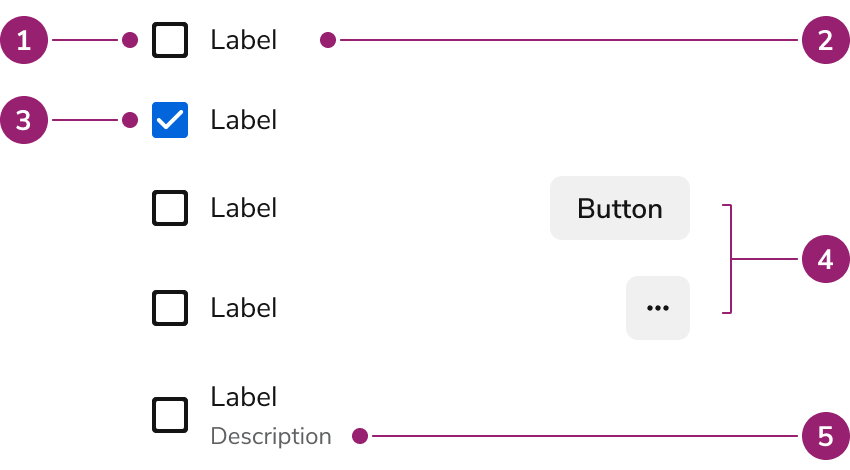
The List View consists of five primary elements that work together to display a selectable list with customization options.

<Frame>
  <div className="w-full h-full bg-[#FFFFFF] p-2 rounded flex items-center justify-center">
    <img
      src="https://mintcdn.com/servicetitan/aip5_7K1pHSn1Axn/images/docs/web/components/list-view/design/listview-anatomy.png?fit=max&auto=format&n=aip5_7K1pHSn1Axn&q=85&s=9c54d65543a6b2f7c8187adfd8154e9f"
      alt="ListView
Anatomy"
      width="850"
      height="470"
      data-path="images/docs/web/components/list-view/design/listview-anatomy.png"
    />
  </div>
</Frame>

1. Unselected
2. Label
3. Selected
4. Secondary Actions
5. Description

## Options

The List View supports selection, secondary actions, disabled states, menus, and custom content configurations to accommodate various list scenarios.

### Selection

<LiveCode example="listview-defaultselected" screenshot fullWidth>
  ```tsx lines theme={null}
  import { ListView, Text } from "@servicetitan/anvil2";

  function App() {
    return (
      <ListView onSelectionChange={console.log} defaultSelected={["Option2"]}>
        <ListView.Option label="Option">
          <Text flexGrow={1}>Option</Text>
        </ListView.Option>
        <ListView.Option label="Option2">
          <Text flexGrow={1}>Option 2</Text>
          <ListView.OptionCell></ListView.OptionCell>
        </ListView.Option>
      </ListView>
    );
  }

  export default App;
  ```
</LiveCode>

### Secondary action

<LiveCode example="listview-optioncell-button" screenshot fullWidth>
  ```tsx lines theme={null}
  import { ListView, Text, Button } from "@servicetitan/anvil2";

  function App() {
    return (
      <ListView onSelectionChange={console.log} defaultSelected={["Option2"]}>
        <ListView.Option label="Option">
          <Text flexGrow={1}>Option</Text>
          <Button onClick={console.log}>Button</Button>
        </ListView.Option>
        <ListView.Option label="Option2">
          <Text flexGrow={1}>Option 2</Text>
          <ListView.OptionCell>
            <Button onClick={console.log}>Button</Button>
          </ListView.OptionCell>
        </ListView.Option>
      </ListView>
    );
  }

  export default App;
  ```
</LiveCode>

### Disabled

<LiveCode example="listview-disabled" screenshot fullWidth>
  ```tsx lines theme={null}
  import { ListView, Text, Button } from "@servicetitan/anvil2";

  function App() {
    return (
      <ListView onSelectionChange={console.log} defaultSelected={["Option2"]}>
        <ListView.Option label="Option">
          <Text flexGrow={1}>Option</Text>
          <Button onClick={console.log}>Button</Button>
        </ListView.Option>
        <ListView.Option label="Option2" disabled>
          <Text flexGrow={1}>Option 2</Text>
          <ListView.OptionCell>
            <Button onClick={console.log}>Button</Button>
          </ListView.OptionCell>
        </ListView.Option>
        <ListView.Option label="Option3">
          <Text flexGrow={1}>Option 3</Text>
          <ListView.OptionCell>
            <Button onClick={console.log}>Button</Button>
          </ListView.OptionCell>
        </ListView.Option>
      </ListView>
    );
  }

  export default App;
  ```
</LiveCode>

### Menu

<LiveCode example="listview-optioncell-menu" screenshot fullWidth>
  ```tsx lines theme={null}
  import { ListView, Flex, Menu } from "@servicetitan/anvil2";
  import MenuIcon from "@servicetitan/anvil2/assets/icons/material/round/menu.svg";

  function App() {
    return (
      <ListView>
        <ListView.Option label="Luke Skywalker">
          <Flex direction="column" grow="1">
            Luke Skywalker
          </Flex>
          <ListView.OptionCell>
            <Menu icon={MenuIcon} aria-label="menu">
              <Menu.Item label="Edit" onClick={() => console.log("Edit")} />
              <Menu.Item label="Delete" onClick={() => console.log("Delete")} />
            </Menu>
          </ListView.OptionCell>
        </ListView.Option>
        <ListView.Option label="Obi-wan Kenobi">
          <Flex direction="column" grow="1">
            Obi-wan Kenobi
          </Flex>
          <ListView.OptionCell>
            <Menu icon={MenuIcon} aria-label="menu">
              <Menu.Item label="Edit" onClick={() => console.log("Edit")} />
              <Menu.Item label="Delete" onClick={() => console.log("Delete")} />
            </Menu>
          </ListView.OptionCell>
        </ListView.Option>
        <ListView.Option label="Din Djarin">
          <Flex direction="column" grow="1">
            Din Djarin
          </Flex>
          <ListView.OptionCell>
            <Menu icon={MenuIcon} aria-label="menu">
              <Menu.Item label="Edit" onClick={() => console.log("Edit")} />
              <Menu.Item label="Delete" onClick={() => console.log("Delete")} />
            </Menu>
          </ListView.OptionCell>
        </ListView.Option>
      </ListView>
    );
  }

  export default App;
  ```
</LiveCode>

### Custom content

#### Avatar

<LiveCode example="listview-option-avatar" screenshot fullWidth>
  ```tsx lines theme={null}
  import { ListView, Avatar } from "@servicetitan/anvil2";

  function App() {
    return (
      <ListView onSelectionChange={console.log}>
        <ListView.Option label="Luke Skywalker">
          <Avatar name="Luke Skywalker" />
          Luke Skywalker
        </ListView.Option>
        <ListView.Option label="Obi-wan Kenobi">
          <Avatar name="Obi-wan Kenobi" />
          Obi-wan Kenobi
        </ListView.Option>
        <ListView.Option label="Din Djarin">
          <Avatar name="Din Djarin" />
          Din Djarin
        </ListView.Option>
      </ListView>
    );
  }

  export default App;
  ```
</LiveCode>

#### Description

<LiveCode example="listview-option-description" screenshot fullWidth>
  ```tsx lines theme={null}
  import { ListView, Flex, Text } from "@servicetitan/anvil2";

  function App() {
    return (
      <ListView onSelectionChange={console.log}>
        <ListView.Option label="Luke Skywalker">
          <Flex direction="column" grow="1">
            Luke Skywalker
            <Text size="small" subdued>
              luke@servicetitan.com
            </Text>
          </Flex>
        </ListView.Option>
        <ListView.Option label="Obi-wan Kenobi">
          <Flex direction="column" grow="1">
            Obi-wan Kenobi
            <Text size="small" subdued>
              kenobi@servicetitan.com
            </Text>
          </Flex>
        </ListView.Option>
        <ListView.Option label="Din Djarin">
          <Flex direction="column" grow="1">
            Din Djarin
            <Text size="small" subdued>
              mando@servicetitan.com
            </Text>
          </Flex>
        </ListView.Option>
      </ListView>
    );
  }

  export default App;
  ```
</LiveCode>

## Behavior

The List View responds to content overflow by wrapping labels to new lines while maintaining consistent list structure.

### Overflow

<LiveCode example="listview-option-overflow" screenshot fullWidth>
  ```tsx lines theme={null}
  import { ListView, Text } from "@servicetitan/anvil2";

  function App() {
    return (
      <div style={{ width: "23rem" }}>
        <ListView onSelectionChange={console.log} defaultSelected={["Option2"]}>
          <ListView.Option label="Option">
            <Text flexGrow={1}>
              Here is an example of how overflow is handled for ListView.
            </Text>
          </ListView.Option>
          <ListView.Option label="Option2">
            <Text flexGrow={1}>
              Here is another example of how overflow is handled for ListView.
            </Text>
            <ListView.OptionCell></ListView.OptionCell>
          </ListView.Option>
        </ListView>
      </div>
    );
  }

  export default App;
  ```
</LiveCode>

When a List View label is too long for the available space, it wraps to a new line.

## Usage Guidelines

Use the List View when constructing lists of selectable items that require customization or secondary actions.

### When to Use

List Views are used to construct lists of selectable items. They create lists of actions, navigation, and selections.

List Views are useful for emphasizing multiple selection with checkboxes.

#### Secondary action

<LiveCode example="listview-optioncell-button" screenshot fullWidth>
  ```tsx lines theme={null}
  import { ListView, Text, Button } from "@servicetitan/anvil2";

  function App() {
    return (
      <ListView onSelectionChange={console.log} defaultSelected={["Option2"]}>
        <ListView.Option label="Option">
          <Text flexGrow={1}>Option</Text>
          <Button onClick={console.log}>Button</Button>
        </ListView.Option>
        <ListView.Option label="Option2">
          <Text flexGrow={1}>Option 2</Text>
          <ListView.OptionCell>
            <Button onClick={console.log}>Button</Button>
          </ListView.OptionCell>
        </ListView.Option>
      </ListView>
    );
  }

  export default App;
  ```
</LiveCode>

Use List View when your list requires secondary actions, in addition to selecting multiple items or interacting with checkboxes. Unlike other options such as Listboxes, Comboboxes, or Side Nav menus, List View provides the functionality for these additional actions.

### Alternatives

#### List View vs Listbox

Use Listbox when using simple selections that do not require any customization. Use List View when requiring customized styling or secondary actions. List View may also be used when emphasizing to users that multi-selection is possible.

### How to Use

#### Choosing between secondary actions and menus

Choose secondary actions or menus based on the number of actions per item and their frequency of use.

<LiveCode example="listview-optioncell-button" screenshot fullWidth>
  ```tsx lines theme={null}
  import { ListView, Text, Button } from "@servicetitan/anvil2";

  function App() {
    return (
      <ListView onSelectionChange={console.log} defaultSelected={["Option2"]}>
        <ListView.Option label="Option">
          <Text flexGrow={1}>Option</Text>
          <Button onClick={console.log}>Button</Button>
        </ListView.Option>
        <ListView.Option label="Option2">
          <Text flexGrow={1}>Option 2</Text>
          <ListView.OptionCell>
            <Button onClick={console.log}>Button</Button>
          </ListView.OptionCell>
        </ListView.Option>
      </ListView>
    );
  }

  export default App;
  ```
</LiveCode>

Use secondary actions when each item has one or two common actions that users access frequently. Secondary actions provide immediate access without additional clicks, making them ideal for primary workflows like editing or deleting items.

<LiveCode example="listview-optioncell-menu" screenshot fullWidth>
  ```tsx lines theme={null}
  import { ListView, Flex, Menu } from "@servicetitan/anvil2";
  import MenuIcon from "@servicetitan/anvil2/assets/icons/material/round/menu.svg";

  function App() {
    return (
      <ListView>
        <ListView.Option label="Luke Skywalker">
          <Flex direction="column" grow="1">
            Luke Skywalker
          </Flex>
          <ListView.OptionCell>
            <Menu icon={MenuIcon} aria-label="menu">
              <Menu.Item label="Edit" onClick={() => console.log("Edit")} />
              <Menu.Item label="Delete" onClick={() => console.log("Delete")} />
            </Menu>
          </ListView.OptionCell>
        </ListView.Option>
        <ListView.Option label="Obi-wan Kenobi">
          <Flex direction="column" grow="1">
            Obi-wan Kenobi
          </Flex>
          <ListView.OptionCell>
            <Menu icon={MenuIcon} aria-label="menu">
              <Menu.Item label="Edit" onClick={() => console.log("Edit")} />
              <Menu.Item label="Delete" onClick={() => console.log("Delete")} />
            </Menu>
          </ListView.OptionCell>
        </ListView.Option>
        <ListView.Option label="Din Djarin">
          <Flex direction="column" grow="1">
            Din Djarin
          </Flex>
          <ListView.OptionCell>
            <Menu icon={MenuIcon} aria-label="menu">
              <Menu.Item label="Edit" onClick={() => console.log("Edit")} />
              <Menu.Item label="Delete" onClick={() => console.log("Delete")} />
            </Menu>
          </ListView.OptionCell>
        </ListView.Option>
      </ListView>
    );
  }

  export default App;
  ```
</LiveCode>

Use menus when items have multiple actions or when actions are less frequently used. Menus reduce visual clutter and organize actions hierarchically, making them suitable for complex item management scenarios.

#### Organizing lists with custom content

<LiveCode example="listview-option-avatar" screenshot fullWidth>
  ```tsx lines theme={null}
  import { ListView, Avatar } from "@servicetitan/anvil2";

  function App() {
    return (
      <ListView onSelectionChange={console.log}>
        <ListView.Option label="Luke Skywalker">
          <Avatar name="Luke Skywalker" />
          Luke Skywalker
        </ListView.Option>
        <ListView.Option label="Obi-wan Kenobi">
          <Avatar name="Obi-wan Kenobi" />
          Obi-wan Kenobi
        </ListView.Option>
        <ListView.Option label="Din Djarin">
          <Avatar name="Din Djarin" />
          Din Djarin
        </ListView.Option>
      </ListView>
    );
  }

  export default App;
  ```
</LiveCode>

Use custom content to provide visual context and additional information within list items. Avatars, descriptions, and other custom elements help users quickly identify and understand each option. Keep custom content focused and scannable to maintain list clarity and usability.

## Content

Content within the List View should clearly communicate each option and provide necessary context through labels and descriptions.

## Keyboard Interaction

Users can navigate the List View using standard keyboard controls.