> ## Documentation Index
> Fetch the complete documentation index at: https://anvil.servicetitan.com/llms.txt
> Use this file to discover all available pages before exploring further.

# Listbox – Design

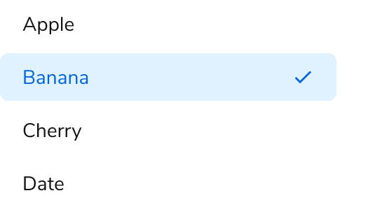
> Listboxes allow a user to select one or more items from a list of options.

export const LiveCode = ({children, customHeight, clickToLoad, example, fullWidth, fullHeight, hideCodeInLiveCode, screenshot, screenshotOnly, showCode: showCodeProp}) => {
  const SCREENSHOTS_BASE = "https://servicetitan.github.io/anvil2-docs-live-code/screenshots";
  const STACKBLITZ_BASE = "https://stackblitz.com/github/servicetitan/anvil2-docs-live-code/tree/main/examples";
  const [showCodeBlock, setShowCodeBlock] = useState(showCodeProp ?? false);
  const [isLocalOverride, setIsLocalOverride] = useState(false);
  useEffect(() => {
    const examplePath = `/images/live-code-screenshots-tmp/${example}.png`;
    fetch(examplePath, {
      method: "HEAD"
    }).then(r => {
      if (r.ok) setIsLocalOverride(true);
    }).catch(() => {});
  }, [example]);
  const screenshotBase = isLocalOverride ? "/images/live-code-screenshots-tmp" : SCREENSHOTS_BASE;
  if (screenshotOnly) {
    return <Frame className="flex flex-col">
        <div className="flex dark:hidden" style={{
      justifyContent: "center",
      alignItems: "center",
      width: fullWidth ? "100%" : "50%",
      minHeight: fullHeight ? "284px" : undefined,
      background: "#FFFFFF"
    }}>
          <img srcset={`${screenshotBase}/${example}.png, ${screenshotBase}/${example}-2x.png 2x`} src={`${screenshotBase}/${example}.png`} alt={example} noZoom />
        </div>
        <div className="hidden dark:flex" style={{
      justifyContent: "center",
      alignItems: "center",
      width: fullWidth ? "100%" : "50%",
      minHeight: fullHeight ? "284px" : undefined,
      background: "#141414"
    }}>
          <img srcset={`${screenshotBase}/${example}-dark.png, ${screenshotBase}/${example}-dark-2x.png 2x`} src={`${screenshotBase}/${example}-dark.png`} alt={example} noZoom />
        </div>
      </Frame>;
  }
  if (screenshot) {
    return <Frame className="flex flex-col -mb-2">
        <div className="flex dark:hidden bg-white dark:bg-codeblock border border-gray-950/10 dark:border-white/10 dark:twoslash-dark rounded-2xl overflow-hidden" style={{
      justifyContent: "center",
      alignItems: "center",
      width: fullWidth ? "100%" : "50%",
      minHeight: fullHeight ? "284px" : undefined
    }}>
          <img srcset={`${screenshotBase}/${example}.png, ${screenshotBase}/${example}-2x.png 2x`} src={`${screenshotBase}/${example}.png`} alt={example} noZoom />
        </div>

        <div className="hidden dark:flex bg-white dark:bg-codeblock border border-gray-950/10 dark:border-white/10 dark:twoslash-dark rounded-2xl overflow-hidden" style={{
      background: "#141414",
      justifyContent: "center",
      alignItems: "center",
      width: fullWidth ? "100%" : "50%",
      minHeight: fullHeight ? "284px" : undefined
    }}>
          <img srcset={`${screenshotBase}/${example}-dark.png, ${screenshotBase}/${example}-dark-2x.png 2x`} src={`${screenshotBase}/${example}-dark.png`} alt={example} noZoom />
        </div>

        <div className="flex justify-end items-center text-xs py-2 px-1 gap-4">
          {!showCodeProp ? <button className="inline-flex justify-end items-center text-gray-700 dark:text-gray-50 hover:text-blue-500 dark:hover:text-blue-300 transition-colors group self-end gap-1 cursor-pointer" onClick={() => setShowCodeBlock(!showCodeBlock)} style={{
      appearance: "none"
    }}>
              <Icon icon="code" size="12px" className="group-hover:bg-blue-500 dark:group-hover:bg-blue-300" />
              <span>{showCodeBlock ? "Hide code" : "Show code"}</span>
            </button> : null}

          <a className="inline-flex justify-end items-center hover:text-blue-500 dark:hover:text-blue-300 transition-colors group self-end gap-1" href={`${STACKBLITZ_BASE}/${example}?file=src/App.tsx`} target="_blank" rel="noreferrer">
            <Icon icon="bolt" size="12px" className="group-hover:bg-blue-500 dark:group-hover:bg-blue-300" />
            <span>StackBlitz demo</span>
          </a>
        </div>

        <div className="grid transition-[grid-template-rows] duration-300 ease-in-out overflow-auto overflow-y-hidden overflow-x-auto" style={showCodeBlock ? {
      gridTemplateRows: "1fr"
    } : {
      gridTemplateRows: "0fr"
    }}>
          <div style={{
      minHeight: 0,
      overflowX: "auto",
      overflowY: "hidden",
      marginBlockStart: "-1.25rem",
      marginBlockEnd: "-1.5rem"
    }}>
            {children}
          </div>
        </div>
      </Frame>;
  } else {
    return <div style={{
      display: "flex",
      width: fullWidth ? "100%" : "50%",
      minHeight: customHeight ? customHeight : "316px",
      resize: "vertical",
      overflow: "auto"
    }}>
        <iframe title={example} style={{
      flex: 1,
      width: fullWidth ? "100%" : "50%",
      minHeight: customHeight ? customHeight : "316px"
    }} src={`${STACKBLITZ_BASE}/${example}?embed=1&hideNavigation=1&hideExplorer=1&terminalHeight=0&file=src/App.tsx${clickToLoad ? "&ctl=1" : ""}${hideCodeInLiveCode ? "&view=preview" : ""}`} allow="accelerometer; ambient-light-sensor; camera; encrypted-media; geolocation; gyroscope; hid; microphone; midi; payment; usb; vr; xr-spatial-tracking" sandbox="allow-forms allow-modals allow-popups allow-presentation allow-same-origin allow-scripts" />
      </div>;
  }
};

export const CodePreviewPlaceholder = ({double, fullWidth}) => {
  const single = <div style={{
    width: fullWidth ? "100%" : "50%",
    borderRadius: "1rem",
    display: "flex",
    padding: "1rem",
    flexDirection: "column",
    gap: "0.5rem",
    height: "10rem",
    marginBlockEnd: "1rem"
  }} className="border-width-default border-color-subdued">
      <div className="bg-strong border-radius-large" style={{
    width: "100%",
    flexGrow: "1"
  }} />
      <div className="bg-strong border-radius-large" style={{
    width: "100%",
    flexGrow: "1"
  }} />
    </div>;
  return double ? <div style={{
    display: "flex",
    gap: "1rem"
  }}>
      {single}
      {single}
    </div> : single;
};

<Frame>
  <div className="w-full h-full bg-[#FFFFFF] p-2 rounded flex items-center justify-center">
    <img noZoom src="https://mintcdn.com/servicetitan/uz2PQSvO75TRhQ38/images/docs/web/components/shared/listbox-overview.png?fit=max&auto=format&n=uz2PQSvO75TRhQ38&q=85&s=e6e8cd9080f3c666cdbbc33c3a374818" width="532" height="296" data-path="images/docs/web/components/shared/listbox-overview.png" />
  </div>
</Frame>

## Anatomy

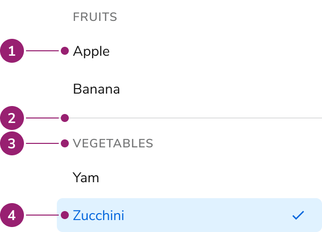
The Listbox consists of four primary elements that work together to allow users to select one or more items from a list of options.

<Frame>
  <div className="w-full h-full bg-[#FFFFFF] p-2 rounded flex items-center justify-center">
    <img
      src="https://mintcdn.com/servicetitan/aip5_7K1pHSn1Axn/images/docs/web/components/listbox/design/listbox-anatomy.png?fit=max&auto=format&n=aip5_7K1pHSn1Axn&q=85&s=59e3173b834c66af93649d145b1dde61"
      alt="Listbox
anatomy"
      width="646"
      height="466"
      data-path="images/docs/web/components/listbox/design/listbox-anatomy.png"
    />
  </div>
</Frame>

1. Option
2. Group divider
3. Group header
4. Selected option

## Options

The Listbox supports grouping and multiple selection configurations to accommodate various selection scenarios.

### Grouping

<LiveCode example="listbox-optiongroup" screenshot fullWidth>
  ```tsx lines theme={null}
  import { Listbox } from "@servicetitan/anvil2";

  type Item = {
    id: number;
    label: string;
    disabled?: boolean;
  };

  function App() {
    const itemGroups: Item[][] = [
      [
        { id: 1, label: "Apple" },
        { id: 2, label: "Banana" },
      ],
      [
        { id: 1, label: "Yam" },
        { id: 2, label: "Zucchini" },
      ],
    ];

    return (
      <Listbox
        aria-label="Single select example"
        defaultSelected={itemGroups[0][1].label}
      >
        <Listbox.OptionGroup label="Fruits">
          {itemGroups[0].map((item, i) => {
            return (
              <Listbox.Option
                key={i}
                label={`${item.label}`}
                disabled={item.disabled}
              >
                {item.label}
              </Listbox.Option>
            );
          })}
        </Listbox.OptionGroup>
        <Listbox.OptionGroup label="Vegetables">
          {itemGroups[1].map((item, i) => {
            return (
              <Listbox.Option key={i} label={`${item.label}`}>
                {item.label}
              </Listbox.Option>
            );
          })}
        </Listbox.OptionGroup>
      </Listbox>
    );
  }

  export default App;
  ```
</LiveCode>

### Multiple selection

<LiveCode example="listbox-selectionmode-multiple" screenshot fullWidth>
  ```tsx lines theme={null}
  import { Listbox } from "@servicetitan/anvil2";

  type Item = {
    id: number;
    label: string;
    disabled?: boolean;
  };

  function App() {
    const itemGroups: Item[][] = [
      [
        { id: 1, label: "Apple" },
        { id: 2, label: "Banana" },
      ],
      [
        { id: 1, label: "Yam" },
        { id: 2, label: "Zucchini" },
      ],
    ];

    return (
      <Listbox
        selectionMode="multiple"
        aria-label="Single select example"
        defaultSelected={[
          itemGroups[0][1].label,
          itemGroups[1][0].label,
          itemGroups[1][1].label,
        ]}
      >
        <Listbox.OptionGroup label="Fruits">
          {itemGroups[0].map((item, i) => {
            return (
              <Listbox.Option
                key={i}
                label={`${item.label}`}
                disabled={item.disabled}
              >
                {item.label}
              </Listbox.Option>
            );
          })}
        </Listbox.OptionGroup>
        <Listbox.OptionGroup label="Vegetables">
          {itemGroups[1].map((item, i) => {
            return (
              <Listbox.Option key={i} label={`${item.label}`}>
                {item.label}
              </Listbox.Option>
            );
          })}
        </Listbox.OptionGroup>
      </Listbox>
    );
  }

  export default App;
  ```
</LiveCode>

## Behavior

The Listbox responds to user interaction with typeahead focus functionality and overflow handling.

#### Typeahead focus

When the Listbox is in focus, a user can type a character to move focus to the next item that starts with that character. If typed quickly (750ms), focus will move to the next item that matches the string of characters typed.

#### Overflow handling

<LiveCode example="listbox-overflow" screenshot fullWidth>
  ```tsx lines theme={null}
  import { Listbox } from "@servicetitan/anvil2";

  type Item = {
    id: number;
    label: string;
    disabled?: boolean;
    "data-interactive"?: string;
  };

  function App() {
    const itemGroups: Item[][] = [
      [
        { id: 1, label: "This is a really long option that will wrap" },
        { id: 2, label: "This is a really long selected option that will wrap" },
      ],
      [{ id: 1, label: "Option" }],
    ];

    return (
      <Listbox
        aria-label="Single select example"
        defaultSelected={itemGroups[0][1].label}
        style={{ maxWidth: "280px" }}
      >
        <Listbox.OptionGroup label="Group">
          {itemGroups[0].map((item, i) => {
            return (
              <Listbox.Option
                key={i}
                label={`${item.label}`}
                disabled={item.disabled}
              >
                {item.label}
              </Listbox.Option>
            );
          })}
        </Listbox.OptionGroup>
        <Listbox.OptionGroup label="This is a really long group that will wrap">
          {itemGroups[1].map((item, i) => {
            return (
              <Listbox.Option key={i} label={`${item.label}`}>
                {item.label}
              </Listbox.Option>
            );
          })}
        </Listbox.OptionGroup>
      </Listbox>
    );
  }

  export default App;
  ```
</LiveCode>

#### Visual States

<LiveCode example="listbox-data-interactive" screenshot fullWidth>
  ```tsx lines theme={null}
  import { Listbox, Flex } from "@servicetitan/anvil2";

  type Item = {
    id: number;
    label: string;
    disabled?: boolean;
    "data-interactive"?: string;
  };

  function App() {
    const itemsList: Item[] = [
      { id: 1, label: "Rest" },
      { id: 2, label: "Hover", "data-interactive": "hover" },
      { id: 3, label: "Focus", "data-interactive": "focus-visible" },
      { id: 4, label: "Disabled", disabled: true },
    ];

    return (
      <Flex gap={4}>
        <Listbox items={itemsList} gap={4} flex="1">
          {({ items }) =>
            items.map((item) => (
              <Listbox.Option
                key={item.label}
                item={item}
                disabled={item.disabled}
                {...(item["data-interactive"]
                  ? { "data-interactive": item["data-interactive"] }
                  : {})}
              >
                {item.label}
              </Listbox.Option>
            ))
          }
        </Listbox>
        <Listbox<Item>
          selectionMode="multiple"
          items={itemsList}
          gap={4}
          defaultSelected={itemsList}
          flex="1"
        >
          {({ items }) =>
            items.map((item) => (
              <Listbox.Option
                key={item.label}
                item={item}
                disabled={item.disabled}
                {...(item["data-interactive"]
                  ? { "data-interactive": item["data-interactive"] }
                  : {})}
              >
                Selected {item.label}
              </Listbox.Option>
            ))
          }
        </Listbox>
      </Flex>
    );
  }

  export default App;
  ```
</LiveCode>

## Usage Guidelines

Use the Listbox when providing a set of selectable items in an overlay.

### When to Use

Listboxes are used as a set of selectable items in an overlay. It is most commonly used for the options in a Combobox or when building a custom menu.

### Alternatives

#### Listbox vs List View

Use Listbox when using simple selections that do not require any customization. Use List View when requiring customized styling or secondary actions. List View may also be used when emphasizing to users that multi-selection is possible.

#### Listbox vs Radio

For simple selection lists in a form, use a Radio.

For selection lists that need to be an overlay, use a Listbox with a Combobox.

## Content

Content within the Listbox should clearly communicate each option through descriptive labels.

## Keyboard Interaction

Users can navigate the Listbox using standard keyboard controls.

| Key                 | Description                                                                                                                                                                                                                                                                                               |
| ------------------- | --------------------------------------------------------------------------------------------------------------------------------------------------------------------------------------------------------------------------------------------------------------------------------------------------------- |
| Tab                 | Moves to the next tab-able element outside of the Listbox.                                                                                                                                                                                                                                                |
| Arrow keys          | Navigates through the available list items                                                                                                                                                                                                                                                                |
| Space               | Activates or deactivates the focused Listbox item.                                                                                                                                                                                                                                                        |
| Home                | Moves focus to the first item in the Listbox.                                                                                                                                                                                                                                                             |
| End                 | Moves focus to the last item in the Listbox.                                                                                                                                                                                                                                                              |
| Printable character | Moves focus to the next item that has the character typed. If multiple characters are typed quickly (\<750ms), focus moves to the next item with that combination of characters. If the next character takes longer than 750ms, focus is moved to the next item that starts with the new character typed. |

### Accessibility

Listbox provides all of the necessary accessibility functionality.

#### Don't add additional interactive elements to the Listbox

The Listbox is designed for simple interactions, and cannot handle additional interactions, such as secondary actions. If designing for this, consider adopting similar accessibility guidance found in [W3C ARIA's Data Grid pattern](https://www.w3.org/WAI/ARIA/apg/patterns/grid/).

For more guidance on building accessible interactive lists, see [custom components best practices](/docs/accessibility/custom-components).