> ## Documentation Index
> Fetch the complete documentation index at: https://anvil.servicetitan.com/llms.txt
> Use this file to discover all available pages before exploring further.

# Menu – Design

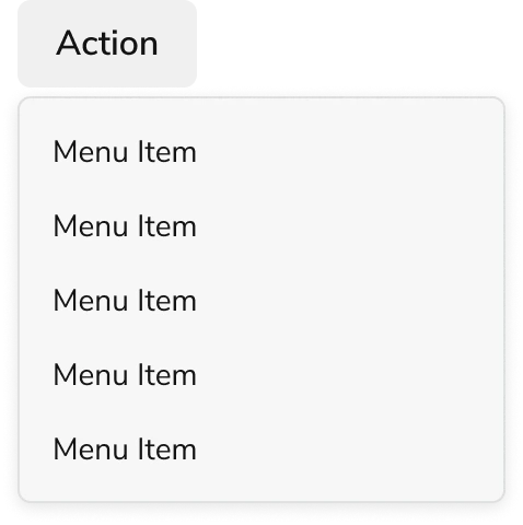
> Menus provide the user with an actionable list of options.

export const CodePreviewPlaceholder = ({double, fullWidth}) => {
  const single = <div style={{
    width: fullWidth ? "100%" : "50%",
    borderRadius: "1rem",
    display: "flex",
    padding: "1rem",
    flexDirection: "column",
    gap: "0.5rem",
    height: "10rem",
    marginBlockEnd: "1rem"
  }} className="border-width-default border-color-subdued">
      <div className="bg-strong border-radius-large" style={{
    width: "100%",
    flexGrow: "1"
  }} />
      <div className="bg-strong border-radius-large" style={{
    width: "100%",
    flexGrow: "1"
  }} />
    </div>;
  return double ? <div style={{
    display: "flex",
    gap: "1rem"
  }}>
      {single}
      {single}
    </div> : single;
};

<Frame>
  <div className="w-full h-full bg-[#FFFFFF] p-2 rounded flex items-center justify-center">
    <img noZoom src="https://mintcdn.com/servicetitan/uz2PQSvO75TRhQ38/images/docs/web/components/shared/menu-overview.png?fit=max&auto=format&n=uz2PQSvO75TRhQ38&q=85&s=d450225fadad56cfb3401a0bc915fcc8" width="478" height="480" data-path="images/docs/web/components/shared/menu-overview.png" />
  </div>
</Frame>

## Anatomy

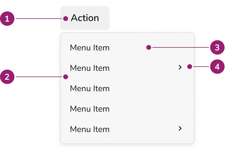
The Menu consists of four primary elements that work together to provide users with an actionable list of options.

<Frame>
  <div className="w-full h-full bg-[#FFFFFF] p-2 rounded flex items-center justify-center">
    <img
      src="https://mintcdn.com/servicetitan/aip5_7K1pHSn1Axn/images/docs/web/components/menu/design/menu-anatomy.png?fit=max&auto=format&n=aip5_7K1pHSn1Axn&q=85&s=51d1bf25691ecac804215f6618502f57"
      alt="Menu
anatomy"
      width="754"
      height="500"
      data-path="images/docs/web/components/menu/design/menu-anatomy.png"
    />
  </div>
</Frame>

1. Trigger
2. Popover
3. Menu item
4. Nested Menu item

## Options

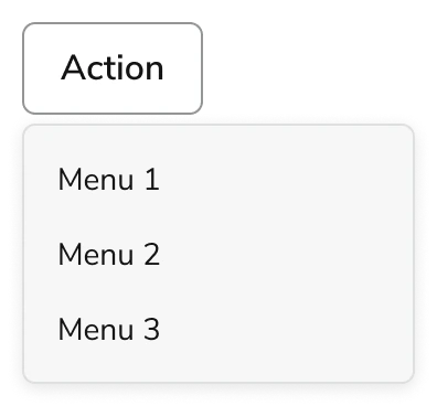
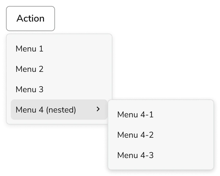
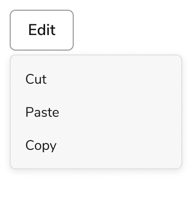
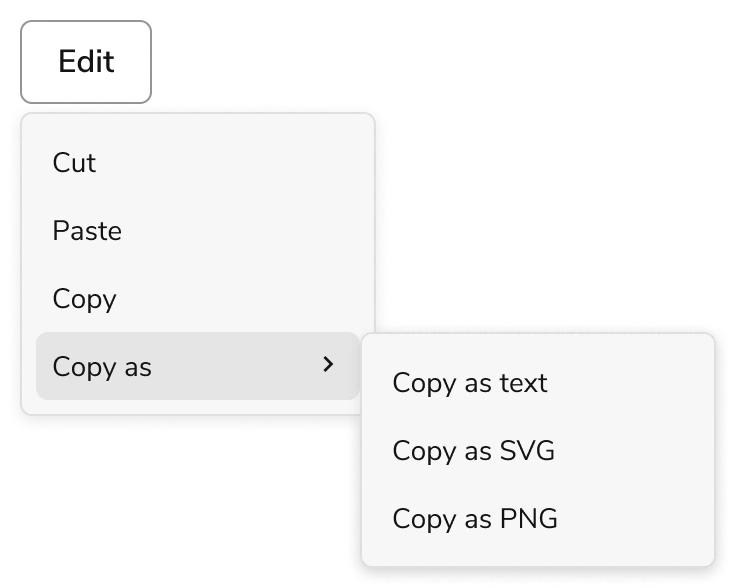
The Menu supports flat and nested configurations to accommodate various action list scenarios.

### Flat

<Frame>
  <div className="w-full h-full bg-[#FFFFFF] p-2 rounded flex items-center justify-center">
    <img
      src="https://mintcdn.com/servicetitan/uz2PQSvO75TRhQ38/images/docs/web/components/menu/shared/menu-options-default.png?fit=max&auto=format&n=uz2PQSvO75TRhQ38&q=85&s=a8d646827f4826866f4216f3eee65c26"
      alt="Menu options
default"
      width="396"
      height="368"
      data-path="images/docs/web/components/menu/shared/menu-options-default.png"
    />
  </div>
</Frame>

### Nested

<Frame>
  <div className="w-full h-full bg-[#FFFFFF] p-2 rounded flex items-center justify-center">
    <img
      src="https://mintcdn.com/servicetitan/aip5_7K1pHSn1Axn/images/docs/web/components/menu/design/menu-options-nested.png?fit=max&auto=format&n=aip5_7K1pHSn1Axn&q=85&s=ed09b2a2b269923c31cf54c6a29f7076"
      alt="Menu options
nested"
      width="736"
      height="588"
      data-path="images/docs/web/components/menu/design/menu-options-nested.png"
    />
  </div>
</Frame>

## Behavior

The Menu responds to user interaction with distinct visual states and synchronized focus and hover behaviors.

### Visual States

#### Default

<Frame>
  <div className="w-full h-full bg-[#FFFFFF] p-2 rounded flex items-center justify-center">
    <img
      src="https://mintcdn.com/servicetitan/uz2PQSvO75TRhQ38/images/docs/web/components/menu/shared/menu-options-default.png?fit=max&auto=format&n=uz2PQSvO75TRhQ38&q=85&s=a8d646827f4826866f4216f3eee65c26"
      alt="Menu states
default"
      width="396"
      height="368"
      data-path="images/docs/web/components/menu/shared/menu-options-default.png"
    />
  </div>
</Frame>

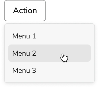
#### Hover

<Frame>
  <div className="w-full h-full bg-[#FFFFFF] p-2 rounded flex items-center justify-center">
    <img
      src="https://mintcdn.com/servicetitan/aip5_7K1pHSn1Axn/images/docs/web/components/menu/design/menu-states-hover.png?fit=max&auto=format&n=aip5_7K1pHSn1Axn&q=85&s=93700de09f2422574eedc3abda18e900"
      alt="Menu states
hover"
      width="388"
      height="348"
      data-path="images/docs/web/components/menu/design/menu-states-hover.png"
    />
  </div>
</Frame>

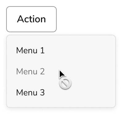
#### Disabled

<Frame>
  <div className="w-full h-full bg-[#FFFFFF] p-2 rounded flex items-center justify-center">
    <img
      src="https://mintcdn.com/servicetitan/aip5_7K1pHSn1Axn/images/docs/web/components/menu/design/menu-states-disabled.png?fit=max&auto=format&n=aip5_7K1pHSn1Axn&q=85&s=210d9290af6d303252544e5ab76f43aa"
      alt="Menu states
disabled"
      width="396"
      height="368"
      data-path="images/docs/web/components/menu/design/menu-states-disabled.png"
    />
  </div>
</Frame>

### Focusing

Focus and hover states are synchronized. Moving the mouse over a menu item will automatically set focus to that item. Similarly, navigating through the menu with keyboard focus will trigger the hover state on the focused item.

## Usage Guidelines

Use the Menu to provide multiple actions to the user.

### When not to use

Use individual Buttons when there are fewer than five actions and they fit in the available space. [Page Header](/docs/web/components/page/design) is an exception to this, as it explicitly disallows this.

### Alternatives

#### Menu vs Combobox

The Menu is used to perform actions on the page, and sometimes also a navigational context. The Combobox is used for choosing an option amongst a list, usually in the context of a Form.

#### Menu vs Popover

When a list of actions need to take place, the Menu should be used. It is not recommended to recreate menu-like interactions through a Popover.

### How to Use

#### Parent and Children

Menu trigger should have direct relationship to its children. This also applies to the nested version of the Menu.

<Frame>
  <div className="w-full h-full bg-[#FFFFFF] p-2 rounded flex items-center justify-center">
    <img
      src="https://mintcdn.com/servicetitan/aip5_7K1pHSn1Axn/images/docs/web/components/menu/design/menu-parent-children-example.png?fit=max&auto=format&n=aip5_7K1pHSn1Axn&q=85&s=9e772f29cb0ec23ef6bc835570b93fc5"
      alt="Menu parent children
example"
      width="396"
      height="442"
      data-path="images/docs/web/components/menu/design/menu-parent-children-example.png"
    />
  </div>
</Frame>

<Frame>
  <div className="w-full h-full bg-[#FFFFFF] p-2 rounded flex items-center justify-center">
    <img
      src="https://mintcdn.com/servicetitan/aip5_7K1pHSn1Axn/images/docs/web/components/menu/design/nested-menu-example.png?fit=max&auto=format&n=aip5_7K1pHSn1Axn&q=85&s=32a9092febeb1319c77fb8958236ed28"
      alt="Nested Menu
example"
      width="736"
      height="588"
      data-path="images/docs/web/components/menu/design/nested-menu-example.png"
    />
  </div>
</Frame>

Nested menu example

#### Disabled Handling

* When an action is temporarily unavailable, use disabled state
* When a user does not have the credentials to take action, do not display these unavailable actions to them. This avoids cluttering the UI and confusing the user when they are unable to take action. When a component is disabled, it is not interactive, meaning tooltips are not available to inform more.

#### Grouping

Menu does not allow for grouping. To group elements, use the Nested Menu.

## Content

Content within the Menu should clearly communicate each action through descriptive labels.

For content guidance, refer to the content guidance provided in the [Button](/docs/web/components/button/design).

## Keyboard Interaction

Users can navigate the Menu using standard keyboard controls.

### Trigger

| Key         | Interaction                                             |
| ----------- | ------------------------------------------------------- |
| Enter/Space | Opens the menu and places focus on the first menu item. |
| Arrow Down  | Opens the menu and moves focus to the first menu item.  |
| Arrow up    | Opens the menu and moves focus to the last menu item.   |

### Menu Item

| Key         | Interaction                                                                                    |
| ----------- | ---------------------------------------------------------------------------------------------- |
| Arrow Down  | Focuses next menu item.                                                                        |
| Arrow Up    | Focuses previous menu item.                                                                    |
| Arrow Right | If nested, opens the nested menu and places focus on the first nested menu item.               |
| Arrow Left  | If focus is inside nested menu, closes the nested menu and places focus on the root menu item. |