> ## Documentation Index
> Fetch the complete documentation index at: https://anvil.servicetitan.com/llms.txt
> Use this file to discover all available pages before exploring further.

# Overflow Text – Design

> OverflowText provides row-based text truncation with optional expand/collapse functionality for text content.

export const LiveCode = ({children, customHeight, clickToLoad, example, fullWidth, fullHeight, hideCodeInLiveCode, screenshot, screenshotOnly, showCode: showCodeProp}) => {
  const SCREENSHOTS_BASE = "https://servicetitan.github.io/anvil2-docs-live-code/screenshots";
  const STACKBLITZ_BASE = "https://stackblitz.com/github/servicetitan/anvil2-docs-live-code/tree/main/examples";
  const [showCodeBlock, setShowCodeBlock] = useState(showCodeProp ?? false);
  const [isLocalOverride, setIsLocalOverride] = useState(false);
  useEffect(() => {
    const examplePath = `/images/live-code-screenshots-tmp/${example}.png`;
    fetch(examplePath, {
      method: "HEAD"
    }).then(r => {
      if (r.ok) setIsLocalOverride(true);
    }).catch(() => {});
  }, [example]);
  const screenshotBase = isLocalOverride ? "/images/live-code-screenshots-tmp" : SCREENSHOTS_BASE;
  if (screenshotOnly) {
    return <Frame className="flex flex-col">
        <div className="flex dark:hidden" style={{
      justifyContent: "center",
      alignItems: "center",
      width: fullWidth ? "100%" : "50%",
      minHeight: fullHeight ? "284px" : undefined,
      background: "#FFFFFF"
    }}>
          <img srcset={`${screenshotBase}/${example}.png, ${screenshotBase}/${example}-2x.png 2x`} src={`${screenshotBase}/${example}.png`} alt={example} noZoom />
        </div>
        <div className="hidden dark:flex" style={{
      justifyContent: "center",
      alignItems: "center",
      width: fullWidth ? "100%" : "50%",
      minHeight: fullHeight ? "284px" : undefined,
      background: "#141414"
    }}>
          <img srcset={`${screenshotBase}/${example}-dark.png, ${screenshotBase}/${example}-dark-2x.png 2x`} src={`${screenshotBase}/${example}-dark.png`} alt={example} noZoom />
        </div>
      </Frame>;
  }
  if (screenshot) {
    return <Frame className="flex flex-col -mb-2">
        <div className="flex dark:hidden bg-white dark:bg-codeblock border border-gray-950/10 dark:border-white/10 dark:twoslash-dark rounded-2xl overflow-hidden" style={{
      justifyContent: "center",
      alignItems: "center",
      width: fullWidth ? "100%" : "50%",
      minHeight: fullHeight ? "284px" : undefined
    }}>
          <img srcset={`${screenshotBase}/${example}.png, ${screenshotBase}/${example}-2x.png 2x`} src={`${screenshotBase}/${example}.png`} alt={example} noZoom />
        </div>

        <div className="hidden dark:flex bg-white dark:bg-codeblock border border-gray-950/10 dark:border-white/10 dark:twoslash-dark rounded-2xl overflow-hidden" style={{
      background: "#141414",
      justifyContent: "center",
      alignItems: "center",
      width: fullWidth ? "100%" : "50%",
      minHeight: fullHeight ? "284px" : undefined
    }}>
          <img srcset={`${screenshotBase}/${example}-dark.png, ${screenshotBase}/${example}-dark-2x.png 2x`} src={`${screenshotBase}/${example}-dark.png`} alt={example} noZoom />
        </div>

        <div className="flex justify-end items-center text-xs py-2 px-1 gap-4">
          {!showCodeProp ? <button className="inline-flex justify-end items-center text-gray-700 dark:text-gray-50 hover:text-blue-500 dark:hover:text-blue-300 transition-colors group self-end gap-1 cursor-pointer" onClick={() => setShowCodeBlock(!showCodeBlock)} style={{
      appearance: "none"
    }}>
              <Icon icon="code" size="12px" className="group-hover:bg-blue-500 dark:group-hover:bg-blue-300" />
              <span>{showCodeBlock ? "Hide code" : "Show code"}</span>
            </button> : null}

          <a className="inline-flex justify-end items-center hover:text-blue-500 dark:hover:text-blue-300 transition-colors group self-end gap-1" href={`${STACKBLITZ_BASE}/${example}?file=src/App.tsx`} target="_blank" rel="noreferrer">
            <Icon icon="bolt" size="12px" className="group-hover:bg-blue-500 dark:group-hover:bg-blue-300" />
            <span>StackBlitz demo</span>
          </a>
        </div>

        <div className="grid transition-[grid-template-rows] duration-300 ease-in-out overflow-auto overflow-y-hidden overflow-x-auto" style={showCodeBlock ? {
      gridTemplateRows: "1fr"
    } : {
      gridTemplateRows: "0fr"
    }}>
          <div style={{
      minHeight: 0,
      overflowX: "auto",
      overflowY: "hidden",
      marginBlockStart: "-1.25rem",
      marginBlockEnd: "-1.5rem"
    }}>
            {children}
          </div>
        </div>
      </Frame>;
  } else {
    return <div style={{
      display: "flex",
      width: fullWidth ? "100%" : "50%",
      minHeight: customHeight ? customHeight : "316px",
      resize: "vertical",
      overflow: "auto"
    }}>
        <iframe title={example} style={{
      flex: 1,
      width: fullWidth ? "100%" : "50%",
      minHeight: customHeight ? customHeight : "316px"
    }} src={`${STACKBLITZ_BASE}/${example}?embed=1&hideNavigation=1&hideExplorer=1&terminalHeight=0&file=src/App.tsx${clickToLoad ? "&ctl=1" : ""}${hideCodeInLiveCode ? "&view=preview" : ""}`} allow="accelerometer; ambient-light-sensor; camera; encrypted-media; geolocation; gyroscope; hid; microphone; midi; payment; usb; vr; xr-spatial-tracking" sandbox="allow-forms allow-modals allow-popups allow-presentation allow-same-origin allow-scripts" />
      </div>;
  }
};

<Frame>
  <div className="w-full h-full bg-[#FFFFFF] p-2 rounded flex items-center justify-center">
    <img noZoom src="https://mintcdn.com/servicetitan/mUSuIbu4js-UtGZd/images/docs/web/components/overflow-text/overview-image.png?fit=max&auto=format&n=mUSuIbu4js-UtGZd&q=85&s=e484077a32ebb36738e4b67674a725d4" width="640" height="360" data-path="images/docs/web/components/overflow-text/overview-image.png" />
  </div>
</Frame>

## Anatomy

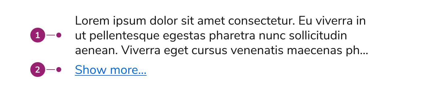
The OverflowText consists of two primary elements that work together to manage text content with row-based truncation.

<Frame>
  <div className="w-full h-full bg-[#FFFFFF] p-2 rounded flex items-center justify-center">
    <img src="https://mintcdn.com/servicetitan/NkSrIaHzJjwUU4IF/images/docs/web/components/overflow-text/design/overflow-text-anatomy.png?fit=max&auto=format&n=NkSrIaHzJjwUU4IF&q=85&s=c657a0531bb76e9356952adffb424007" alt="Anatomy of the OverflowText component" width="1390" height="312" data-path="images/docs/web/components/overflow-text/design/overflow-text-anatomy.png" />
  </div>
</Frame>

1. **Content area** - The text container that holds the content with row-based truncation
2. **Expand button** (Optional) - A button that appears when expandable is enabled and content exceeds the specified row limit

## Options

The OverflowText supports the following configurations to accommodate various text truncation scenarios.

### Rows

<LiveCode example="overflowtext-rows-3" screenshot fullWidth>
  ```tsx lines theme={null}
  import { Flex, OverflowText, Text } from "@servicetitan/anvil2";

  function App() {
    return (
      <Flex style={{ maxWidth: "400px" }}>
        <OverflowText rows={3}>
          <Text>
            <strong>Truncation</strong> - Do duis consequat esse consequat eu
            consectetur culpa incididunt magna sit. Laboris ad dolor fugiat anim
            veniam ullamco aliquip eiusmod. Officia pariatur ad sint elit sint eu
            elit fugiat magna voluptate commodo fugiat. Do duis consequat esse
            consequat eu consectetur culpa incididunt magna sit. Laboris ad dolor
            fugiat anim veniam ullamco aliquip eiusmod. Officia pariatur ad sint
            elit sint eu elit fugiat magna voluptate commodo fugiat.
          </Text>
        </OverflowText>
      </Flex>
    );
  }

  export default App;
  ```
</LiveCode>

OverflowText limits text content to a specified number of rows, defaulting to one row. Set the rows prop to control how many lines of text are visible before truncation. Use "unlimited" to display all content without row restrictions. When expandable is enabled, content exceeding the row limit displays an expand button.

### Expandable

<LiveCode example="overflowtext-expandable" screenshot fullWidth>
  ```tsx lines theme={null}
  import { Flex, OverflowText, Text } from "@servicetitan/anvil2";

  function App() {
    return (
      <Flex style={{ maxWidth: "400px" }}>
        <OverflowText rows={3} expandable>
          <Text>
            <strong>Truncation</strong> - Do duis consequat esse consequat eu
            consectetur culpa incididunt magna sit. Laboris ad dolor fugiat anim
            veniam ullamco aliquip eiusmod. Officia pariatur ad sint elit sint eu
            elit fugiat magna voluptate commodo fugiat. Do duis consequat esse
            consequat eu consectetur culpa incididunt magna sit. Laboris ad dolor
            fugiat anim veniam ullamco aliquip eiusmod. Officia pariatur ad sint
            elit sint eu elit fugiat magna voluptate commodo fugiat.
          </Text>
        </OverflowText>
      </Flex>
    );
  }

  export default App;
  ```
</LiveCode>

When expandable is enabled, OverflowText displays a "Show more..." button when content exceeds the specified row limit. Users can expand to view full content or collapse to return to the truncated view. Custom expand and collapse text can be configured, along with optional callbacks for expand and collapse events.

## Usage Guidelines

### When to Use

Use the OverflowText when you need to:

* Truncate text content to a specific number of rows
* Provide expandable text sections with row-based limits
* Display text previews that expand to show full content
* Control text truncation with precise line counting

### When not to use

Avoid using the OverflowText for:

* **Non-text content** - Use Overflow for complex content with multiple elements
* **Content requiring scrolling** - Use Overflow when you need scrollable areas instead of expandable sections
* **Single-line text** - Simple text truncation may not require the full OverflowText component

### Alternatives

#### OverflowText vs Overflow

OverflowText provides row-based truncation specifically for text content, while Overflow provides scrollable areas for any content type with height or width-based constraints. Use OverflowText when you need precise control over text line limits and row-based expansion. Use Overflow for complex content, horizontal scrolling, or when you need shadow indicators.

## Content

OverflowText works best with text content wrapped in Text components. The component automatically handles line breaks and text wrapping based on the specified row limit. Ensure that important information appears in the first few rows when expandable is enabled, as users may not expand to view all content.

## Keyboard Interaction

Users can navigate the OverflowText using standard keyboard controls.

| Key            | Description                                                     |
| -------------- | --------------------------------------------------------------- |
| Tab            | Moves focus to the next focusable element                       |
| Space or Enter | Activates the expand/collapse button when expandable is enabled |