> ## Documentation Index
> Fetch the complete documentation index at: https://anvil.servicetitan.com/llms.txt
> Use this file to discover all available pages before exploring further.

# Overflow – Design

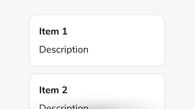
> Overflow manages excess content with scrollable areas and optional expand/collapse functionality.

export const LiveCode = ({children, customHeight, clickToLoad, example, fullWidth, fullHeight, hideCodeInLiveCode, screenshot, screenshotOnly, showCode: showCodeProp}) => {
  const SCREENSHOTS_BASE = "https://servicetitan.github.io/anvil2-docs-live-code/screenshots";
  const STACKBLITZ_BASE = "https://stackblitz.com/github/servicetitan/anvil2-docs-live-code/tree/main/examples";
  const [showCodeBlock, setShowCodeBlock] = useState(showCodeProp ?? false);
  const [isLocalOverride, setIsLocalOverride] = useState(false);
  useEffect(() => {
    const examplePath = `/images/live-code-screenshots-tmp/${example}.png`;
    fetch(examplePath, {
      method: "HEAD"
    }).then(r => {
      if (r.ok) setIsLocalOverride(true);
    }).catch(() => {});
  }, [example]);
  const screenshotBase = isLocalOverride ? "/images/live-code-screenshots-tmp" : SCREENSHOTS_BASE;
  if (screenshotOnly) {
    return <Frame className="flex flex-col">
        <div className="flex dark:hidden" style={{
      justifyContent: "center",
      alignItems: "center",
      width: fullWidth ? "100%" : "50%",
      minHeight: fullHeight ? "284px" : undefined,
      background: "#FFFFFF"
    }}>
          <img srcset={`${screenshotBase}/${example}.png, ${screenshotBase}/${example}-2x.png 2x`} src={`${screenshotBase}/${example}.png`} alt={example} noZoom />
        </div>
        <div className="hidden dark:flex" style={{
      justifyContent: "center",
      alignItems: "center",
      width: fullWidth ? "100%" : "50%",
      minHeight: fullHeight ? "284px" : undefined,
      background: "#141414"
    }}>
          <img srcset={`${screenshotBase}/${example}-dark.png, ${screenshotBase}/${example}-dark-2x.png 2x`} src={`${screenshotBase}/${example}-dark.png`} alt={example} noZoom />
        </div>
      </Frame>;
  }
  if (screenshot) {
    return <Frame className="flex flex-col -mb-2">
        <div className="flex dark:hidden bg-white dark:bg-codeblock border border-gray-950/10 dark:border-white/10 dark:twoslash-dark rounded-2xl overflow-hidden" style={{
      justifyContent: "center",
      alignItems: "center",
      width: fullWidth ? "100%" : "50%",
      minHeight: fullHeight ? "284px" : undefined
    }}>
          <img srcset={`${screenshotBase}/${example}.png, ${screenshotBase}/${example}-2x.png 2x`} src={`${screenshotBase}/${example}.png`} alt={example} noZoom />
        </div>

        <div className="hidden dark:flex bg-white dark:bg-codeblock border border-gray-950/10 dark:border-white/10 dark:twoslash-dark rounded-2xl overflow-hidden" style={{
      background: "#141414",
      justifyContent: "center",
      alignItems: "center",
      width: fullWidth ? "100%" : "50%",
      minHeight: fullHeight ? "284px" : undefined
    }}>
          <img srcset={`${screenshotBase}/${example}-dark.png, ${screenshotBase}/${example}-dark-2x.png 2x`} src={`${screenshotBase}/${example}-dark.png`} alt={example} noZoom />
        </div>

        <div className="flex justify-end items-center text-xs py-2 px-1 gap-4">
          {!showCodeProp ? <button className="inline-flex justify-end items-center text-gray-700 dark:text-gray-50 hover:text-blue-500 dark:hover:text-blue-300 transition-colors group self-end gap-1 cursor-pointer" onClick={() => setShowCodeBlock(!showCodeBlock)} style={{
      appearance: "none"
    }}>
              <Icon icon="code" size="12px" className="group-hover:bg-blue-500 dark:group-hover:bg-blue-300" />
              <span>{showCodeBlock ? "Hide code" : "Show code"}</span>
            </button> : null}

          <a className="inline-flex justify-end items-center hover:text-blue-500 dark:hover:text-blue-300 transition-colors group self-end gap-1" href={`${STACKBLITZ_BASE}/${example}?file=src/App.tsx`} target="_blank" rel="noreferrer">
            <Icon icon="bolt" size="12px" className="group-hover:bg-blue-500 dark:group-hover:bg-blue-300" />
            <span>StackBlitz demo</span>
          </a>
        </div>

        <div className="grid transition-[grid-template-rows] duration-300 ease-in-out overflow-auto overflow-y-hidden overflow-x-auto" style={showCodeBlock ? {
      gridTemplateRows: "1fr"
    } : {
      gridTemplateRows: "0fr"
    }}>
          <div style={{
      minHeight: 0,
      overflowX: "auto",
      overflowY: "hidden",
      marginBlockStart: "-1.25rem",
      marginBlockEnd: "-1.5rem"
    }}>
            {children}
          </div>
        </div>
      </Frame>;
  } else {
    return <div style={{
      display: "flex",
      width: fullWidth ? "100%" : "50%",
      minHeight: customHeight ? customHeight : "316px",
      resize: "vertical",
      overflow: "auto"
    }}>
        <iframe title={example} style={{
      flex: 1,
      width: fullWidth ? "100%" : "50%",
      minHeight: customHeight ? customHeight : "316px"
    }} src={`${STACKBLITZ_BASE}/${example}?embed=1&hideNavigation=1&hideExplorer=1&terminalHeight=0&file=src/App.tsx${clickToLoad ? "&ctl=1" : ""}${hideCodeInLiveCode ? "&view=preview" : ""}`} allow="accelerometer; ambient-light-sensor; camera; encrypted-media; geolocation; gyroscope; hid; microphone; midi; payment; usb; vr; xr-spatial-tracking" sandbox="allow-forms allow-modals allow-popups allow-presentation allow-same-origin allow-scripts" />
      </div>;
  }
};

<Frame>
  <div className="w-full h-full bg-[#FFFFFF] p-2 rounded flex items-center justify-center">
    <img noZoom src="https://mintcdn.com/servicetitan/mUSuIbu4js-UtGZd/images/docs/web/components/overflow/overview-image.png?fit=max&auto=format&n=mUSuIbu4js-UtGZd&q=85&s=1cc3a051ab19cf7f33e2cd8d427f1287" width="640" height="360" data-path="images/docs/web/components/overflow/overview-image.png" />
  </div>
</Frame>

## Anatomy

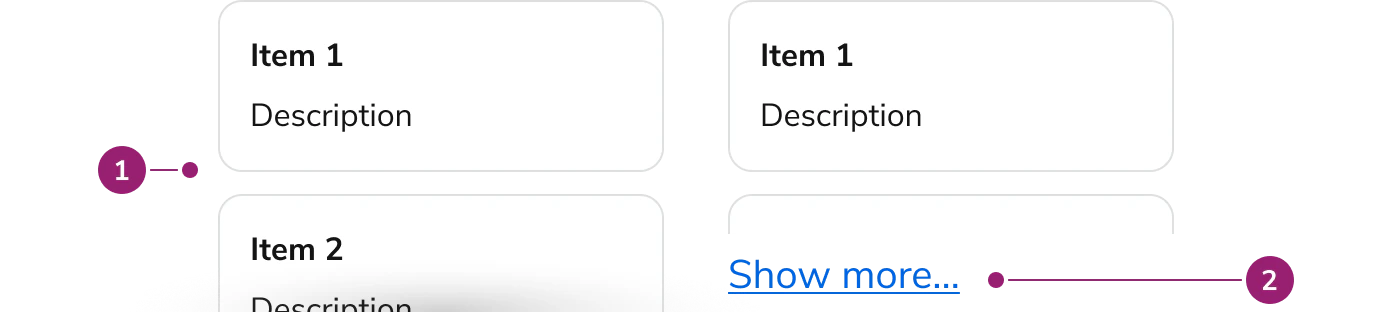
The Overflow consists of three primary elements that work together to manage content that exceeds available space.

<Frame>
  <div className="w-full h-full bg-[#FFFFFF] p-2 rounded flex items-center justify-center">
    <img src="https://mintcdn.com/servicetitan/mUSuIbu4js-UtGZd/images/docs/web/components/overflow/design/overflow-anatomy.png?fit=max&auto=format&n=mUSuIbu4js-UtGZd&q=85&s=f7816fc6dfcd9669adc0d770edf7455a" alt="Anatomy of the Overflow component" width="1390" height="312" data-path="images/docs/web/components/overflow/design/overflow-anatomy.png" />
  </div>
</Frame>

1. **Content area** - The scrollable container that holds the overflow content
2. **Expand button** (Optional) - A button that appears when truncation is enabled, allowing users to expand or collapse content

## Options

The Overflow supports the following configurations to accommodate various content overflow scenarios.

### Direction

<LiveCode example="overflow-direction-column" screenshot fullWidth>
  ```tsx lines theme={null}
  import { Overflow, Card, Text } from "@servicetitan/anvil2";

  function App() {
    return (
      <Overflow gap="4" height={200}>
        {[0, 1, 2, 3, 4, 5, 6, 7, 8, 9].map((i) => (
          <Card
            key={i}
            justifyContent="center"
            alignItems="center"
            style={{ minWidth: 100, minHeight: 100 }}
          >
            <Text el="h4" variant="headline" size="xlarge">
              {i + 1}
            </Text>
          </Card>
        ))}
      </Overflow>
    );
  }

  export default App;
  ```
</LiveCode>

<LiveCode example="overflow-direction-row" screenshot fullWidth>
  ```tsx lines theme={null}
  import { Overflow, Card, Text } from "@servicetitan/anvil2";

  function App() {
    return (
      <div style={{ maxWidth: "calc(100vw - 4rem)" }}>
        <Overflow direction="row" gap="4">
          {[
            0, 1, 2, 3, 4, 5, 6, 7, 8, 9, 10, 11, 12, 13, 14, 15, 16, 17, 18, 19,
          ].map((i) => (
            <Card
              key={i}
              justifyContent="center"
              alignItems="center"
              style={{ minWidth: 100, minHeight: 100 }}
            >
              <Text el="h4" variant="headline" size="xlarge">
                {i + 1}
              </Text>
            </Card>
          ))}
        </Overflow>
      </div>
    );
  }

  export default App;
  ```
</LiveCode>

Overflow supports both vertical and horizontal scrolling. Vertical scrolling is the default, suitable for most content that exceeds available height. Horizontal scrolling displays content in a row layout, useful for wide content that exceeds available width.

### Truncation

<LiveCode example="overflow-truncate" screenshot fullWidth>
  ```tsx lines theme={null}
  import { Overflow, Card, Text } from "@servicetitan/anvil2";

  function App() {
    return (
      <Overflow direction="column" gap="4" height={200} truncate>
        {[0, 1, 2, 3, 4, 5, 6, 7, 8, 9].map((i) => (
          <Card
            key={i}
            justifyContent="center"
            alignItems="center"
            style={{ minWidth: 100, minHeight: 100 }}
          >
            <Text el="h4" variant="headline" size="xlarge">
              {i + 1}
            </Text>
          </Card>
        ))}
      </Overflow>
    );
  }

  export default App;
  ```
</LiveCode>

When truncation is enabled, Overflow displays a "Show more..." button when content exceeds the visible area. Users can expand to view full content or collapse to return to the truncated view. Truncation is only available when direction is set to column. Custom expand and collapse text can be configured, along with optional callbacks for expand and collapse events.

## Behavior

The Overflow responds to content overflow with scrollable areas and visual indicators that adapt to the scroll position.

<CodePreviewPlaceholder fullWidth />

### Scrollable content

The content area becomes scrollable when content exceeds the specified height or width. Users can scroll using mouse, touch, or keyboard navigation. The scrollable area maintains focus for keyboard accessibility, allowing users to navigate through overflow content using arrow keys.

## Usage Guidelines

### When to Use

Use the Overflow when you need to:

* Display long content within a constrained space without breaking the page layout
* Provide scrollable areas for content that varies in length
* Offer expandable content sections that users can reveal on demand
* Handle horizontal content overflow, such as wide tables or lists

### When not to use

Avoid using the Overflow for:

* **Critical content** - Essential information should be immediately visible without requiring scrolling or expansion
* **Short content** - Content that fits naturally within available space does not need overflow handling
* **Navigation elements** - Use dedicated navigation components like Tabs or Side Nav for organizing navigation content

### Alternatives

#### Overflow vs Details

Overflow provides scrollable areas for content that exceeds space, while Details provides collapsible sections for showing or hiding supplementary information. Use Overflow when content must remain accessible through scrolling. Use Details when content can be completely hidden until the user chooses to reveal it.

## Content

Content within the Overflow should be structured to work effectively within scrollable or expandable containers. Ensure that important information appears early in the content when truncation is enabled, as users may not expand to view all content.

## Keyboard Interaction

Users can navigate the Overflow using standard keyboard controls.

| Key            | Description                                                     |
| -------------- | --------------------------------------------------------------- |
| Tab            | Moves focus to the next focusable element                       |
| Arrow keys     | Scrolls the content area when the Overflow container has focus  |
| Space or Enter | Activates the expand/collapse button when truncation is enabled |