> ## Documentation Index
> Fetch the complete documentation index at: https://anvil.servicetitan.com/llms.txt
> Use this file to discover all available pages before exploring further.

# Page – Design

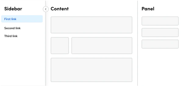
> The foundation for creating page layouts in Anvil2.

export const LiveCode = ({children, customHeight, clickToLoad, example, fullWidth, fullHeight, hideCodeInLiveCode, screenshot, screenshotOnly, showCode: showCodeProp}) => {
  const SCREENSHOTS_BASE = "https://servicetitan.github.io/anvil2-docs-live-code/screenshots";
  const STACKBLITZ_BASE = "https://stackblitz.com/github/servicetitan/anvil2-docs-live-code/tree/main/examples";
  const [showCodeBlock, setShowCodeBlock] = useState(showCodeProp ?? false);
  const [isLocalOverride, setIsLocalOverride] = useState(false);
  useEffect(() => {
    const examplePath = `/images/live-code-screenshots-tmp/${example}.png`;
    fetch(examplePath, {
      method: "HEAD"
    }).then(r => {
      if (r.ok) setIsLocalOverride(true);
    }).catch(() => {});
  }, [example]);
  const screenshotBase = isLocalOverride ? "/images/live-code-screenshots-tmp" : SCREENSHOTS_BASE;
  if (screenshotOnly) {
    return <Frame className="flex flex-col">
        <div className="flex dark:hidden" style={{
      justifyContent: "center",
      alignItems: "center",
      width: fullWidth ? "100%" : "50%",
      minHeight: fullHeight ? "284px" : undefined,
      background: "#FFFFFF"
    }}>
          <img srcset={`${screenshotBase}/${example}.png, ${screenshotBase}/${example}-2x.png 2x`} src={`${screenshotBase}/${example}.png`} alt={example} noZoom />
        </div>
        <div className="hidden dark:flex" style={{
      justifyContent: "center",
      alignItems: "center",
      width: fullWidth ? "100%" : "50%",
      minHeight: fullHeight ? "284px" : undefined,
      background: "#141414"
    }}>
          <img srcset={`${screenshotBase}/${example}-dark.png, ${screenshotBase}/${example}-dark-2x.png 2x`} src={`${screenshotBase}/${example}-dark.png`} alt={example} noZoom />
        </div>
      </Frame>;
  }
  if (screenshot) {
    return <Frame className="flex flex-col -mb-2">
        <div className="flex dark:hidden bg-white dark:bg-codeblock border border-gray-950/10 dark:border-white/10 dark:twoslash-dark rounded-2xl overflow-hidden" style={{
      justifyContent: "center",
      alignItems: "center",
      width: fullWidth ? "100%" : "50%",
      minHeight: fullHeight ? "284px" : undefined
    }}>
          <img srcset={`${screenshotBase}/${example}.png, ${screenshotBase}/${example}-2x.png 2x`} src={`${screenshotBase}/${example}.png`} alt={example} noZoom />
        </div>

        <div className="hidden dark:flex bg-white dark:bg-codeblock border border-gray-950/10 dark:border-white/10 dark:twoslash-dark rounded-2xl overflow-hidden" style={{
      background: "#141414",
      justifyContent: "center",
      alignItems: "center",
      width: fullWidth ? "100%" : "50%",
      minHeight: fullHeight ? "284px" : undefined
    }}>
          <img srcset={`${screenshotBase}/${example}-dark.png, ${screenshotBase}/${example}-dark-2x.png 2x`} src={`${screenshotBase}/${example}-dark.png`} alt={example} noZoom />
        </div>

        <div className="flex justify-end items-center text-xs py-2 px-1 gap-4">
          {!showCodeProp ? <button className="inline-flex justify-end items-center text-gray-700 dark:text-gray-50 hover:text-blue-500 dark:hover:text-blue-300 transition-colors group self-end gap-1 cursor-pointer" onClick={() => setShowCodeBlock(!showCodeBlock)} style={{
      appearance: "none"
    }}>
              <Icon icon="code" size="12px" className="group-hover:bg-blue-500 dark:group-hover:bg-blue-300" />
              <span>{showCodeBlock ? "Hide code" : "Show code"}</span>
            </button> : null}

          <a className="inline-flex justify-end items-center hover:text-blue-500 dark:hover:text-blue-300 transition-colors group self-end gap-1" href={`${STACKBLITZ_BASE}/${example}?file=src/App.tsx`} target="_blank" rel="noreferrer">
            <Icon icon="bolt" size="12px" className="group-hover:bg-blue-500 dark:group-hover:bg-blue-300" />
            <span>StackBlitz demo</span>
          </a>
        </div>

        <div className="grid transition-[grid-template-rows] duration-300 ease-in-out overflow-auto overflow-y-hidden overflow-x-auto" style={showCodeBlock ? {
      gridTemplateRows: "1fr"
    } : {
      gridTemplateRows: "0fr"
    }}>
          <div style={{
      minHeight: 0,
      overflowX: "auto",
      overflowY: "hidden",
      marginBlockStart: "-1.25rem",
      marginBlockEnd: "-1.5rem"
    }}>
            {children}
          </div>
        </div>
      </Frame>;
  } else {
    return <div style={{
      display: "flex",
      width: fullWidth ? "100%" : "50%",
      minHeight: customHeight ? customHeight : "316px",
      resize: "vertical",
      overflow: "auto"
    }}>
        <iframe title={example} style={{
      flex: 1,
      width: fullWidth ? "100%" : "50%",
      minHeight: customHeight ? customHeight : "316px"
    }} src={`${STACKBLITZ_BASE}/${example}?embed=1&hideNavigation=1&hideExplorer=1&terminalHeight=0&file=src/App.tsx${clickToLoad ? "&ctl=1" : ""}${hideCodeInLiveCode ? "&view=preview" : ""}`} allow="accelerometer; ambient-light-sensor; camera; encrypted-media; geolocation; gyroscope; hid; microphone; midi; payment; usb; vr; xr-spatial-tracking" sandbox="allow-forms allow-modals allow-popups allow-presentation allow-same-origin allow-scripts" />
      </div>;
  }
};

export const CodePreviewPlaceholder = ({double, fullWidth}) => {
  const single = <div style={{
    width: fullWidth ? "100%" : "50%",
    borderRadius: "1rem",
    display: "flex",
    padding: "1rem",
    flexDirection: "column",
    gap: "0.5rem",
    height: "10rem",
    marginBlockEnd: "1rem"
  }} className="border-width-default border-color-subdued">
      <div className="bg-strong border-radius-large" style={{
    width: "100%",
    flexGrow: "1"
  }} />
      <div className="bg-strong border-radius-large" style={{
    width: "100%",
    flexGrow: "1"
  }} />
    </div>;
  return double ? <div style={{
    display: "flex",
    gap: "1rem"
  }}>
      {single}
      {single}
    </div> : single;
};

<Frame>
  <div className="w-full h-full bg-[#FFFFFF] p-2 rounded flex items-center justify-center">
    <img noZoom src="https://mintcdn.com/servicetitan/uz2PQSvO75TRhQ38/images/docs/web/components/shared/overview-of-a-page-component.png?fit=max&auto=format&n=uz2PQSvO75TRhQ38&q=85&s=c2cd1bd6b8988636a9f9b80aa7704599" width="600" height="283" data-path="images/docs/web/components/shared/overview-of-a-page-component.png" />
  </div>
</Frame>

## Anatomy

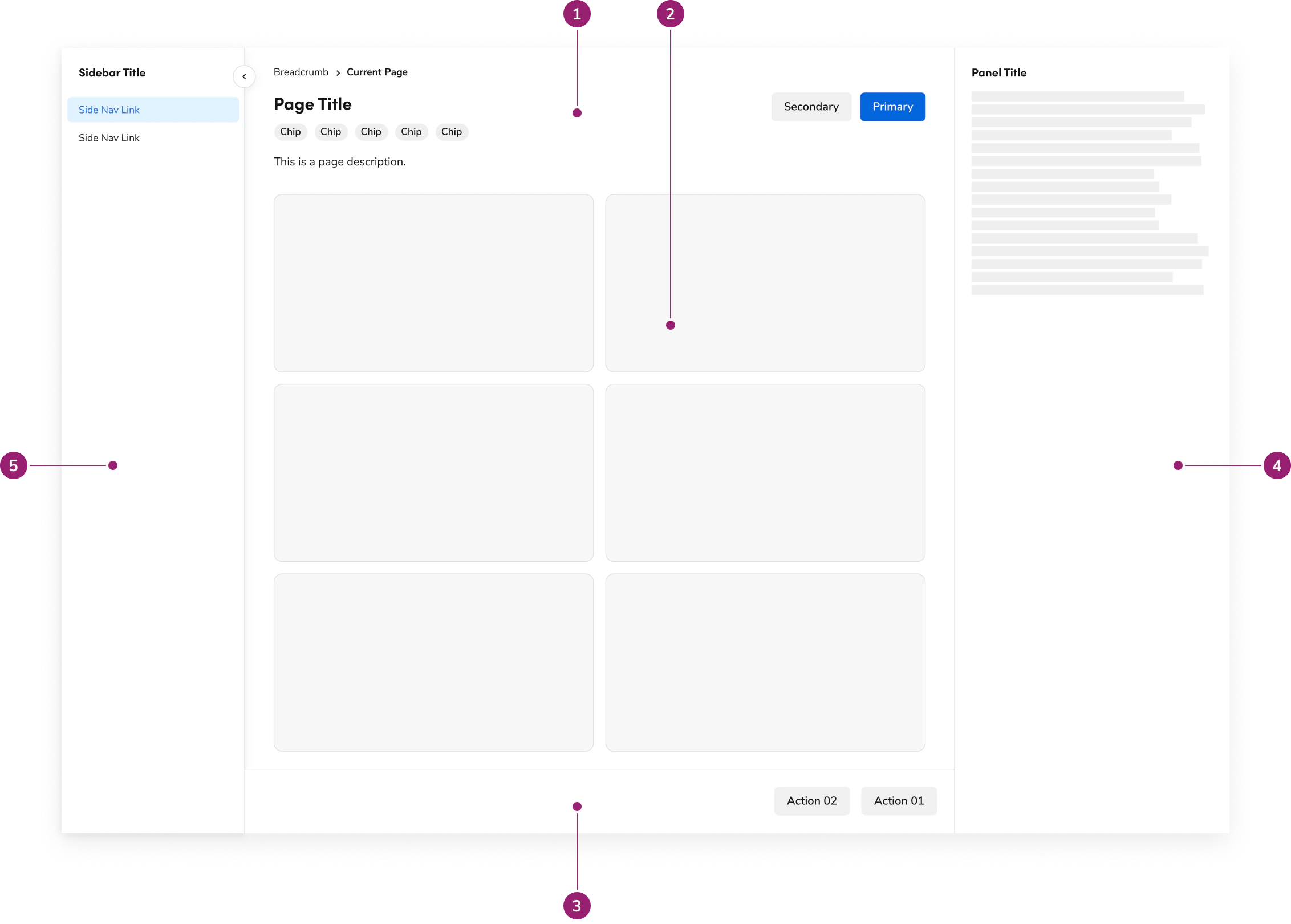
The Page consists of five primary elements that work together to create page layouts in Anvil2.

<Frame>
  <div className="w-full h-full bg-[#FFFFFF] p-2 rounded flex items-center justify-center">
    <img
      src="https://mintcdn.com/servicetitan/aip5_7K1pHSn1Axn/images/docs/web/components/page/design/page-annotation.png?fit=max&auto=format&n=aip5_7K1pHSn1Axn&q=85&s=9ca74f6483c2313aedc193117feb645b"
      alt="Page
Annotation"
      width="2264"
      height="1620"
      data-path="images/docs/web/components/page/design/page-annotation.png"
    />
  </div>
</Frame>

1. Header
2. Main content
3. Footer
4. Panel
5. Sidebar

## Options

The Page supports the following configurations to accommodate various page layout scenarios.

### Header

#### Title

<LiveCode example="page-header" screenshot fullWidth>
  ```tsx lines theme={null}
  import { Page } from "@servicetitan/anvil2";

  function App() {
    return (
      <div style={{ minWidth: "23rem" }}>
        <Page.Header title="Page Title" />
      </div>
    );
  }

  export default App;
  ```
</LiveCode>

#### With description

<LiveCode example="page-header-description" screenshot fullWidth>
  ```tsx lines theme={null}
  import { Page, Text, Link } from "@servicetitan/anvil2";

  function App() {
    return (
      <div style={{ minWidth: "23rem" }}>
        <Page.Header
          title="Page Title"
          description={
            <Text>
              This page demonstrates all header elements with{" "}
              <Link href="#" appearance="primary">
                standard actions
              </Link>
            </Text>
          }
        />
      </div>
    );
  }

  export default App;
  ```
</LiveCode>

#### With breadcrumb

<LiveCode example="page-header-breadcrumbs" screenshot fullWidth>
  ```tsx lines theme={null}
  import { Page } from "@servicetitan/anvil2";

  function App() {
    return (
      <div style={{ minWidth: "23rem" }}>
        <Page.Header
          title="Page Title"
          breadcrumbs={[
            { href: "/", children: "Home" },
            { children: "Current Page" },
          ]}
        />
      </div>
    );
  }

  export default App;
  ```
</LiveCode>

#### With chips

<LiveCode example="page-header-chips" screenshot fullWidth>
  ```tsx lines theme={null}
  import { Page } from "@servicetitan/anvil2";
  import { core } from "@servicetitan/anvil2/token";

  function App() {
    return (
      <div style={{ minWidth: "23rem" }}>
        <Page.Header
          title="Page Title"
          chips={[
            { label: "Status" },
            {
              label: "Draft",
              color: core?.primitive?.ColorPurple200.value,
            },
          ]}
        />
      </div>
    );
  }

  export default App;
  ```
</LiveCode>

#### With actions

<LiveCode example="page-header-actions" screenshot fullWidth>
  ```tsx lines theme={null}
  import { Page } from "@servicetitan/anvil2";

  function App() {
    return (
      <div style={{ minWidth: "23rem" }}>
        <Page.Header
          title="Page Title"
          actions={{
            primary: {
              label: "Primary Action",
              onClick: () => console.log("Primary clicked"),
            },
            secondary: [
              {
                label: "Secondary Action",
                onClick: () => console.log("Secondary clicked"),
              },
            ],
          }}
        />
      </div>
    );
  }

  export default App;
  ```
</LiveCode>

### Main content

The main content area handles your primary content and, on its own, doesn't have any specific options. You'll always use it with a [Layout](/docs/web/components/layout/design) component to get that consistent design you're looking for. Plus, its padding dynamically adjusts based on available space for the best experience.

### Footer

The Footer is designed as a sticky element, ensuring it's always at the bottom of your page's main content for a consistent user experience. Keep in mind, it doesn't come with any individual options.

### Panel

The Panel offers two distinct choices: a persistent option and a toggleable option. Each is designed for different use cases and should be implemented according to specific [guidelines](/docs/web/components/page/design#panel). It's also important to note that the Panel behaves differently based on [responsiveness](#panel-responsiveness).

### Sidebar

The Sidebar itself doesn't have individual options, but you can configure its openness. This is done by using its own state, which is stored with a `localStorageKey`. It's designed specifically to house [SideNav](/docs/web/components/side-nav/design) components.

## Behavior

The Page responds to different screen sizes with responsive behaviors for header, panel, and sidebar while maintaining consistent layout structure.

### Header responsiveness

The Header is designed to conform to the width of your page content, typically using a `max-width` of 1280px or a fluid setting from the `Layout` component. It will always fit within the padding provided by the `Page` component.

On larger screens, if content overflows, each section of the header will wrap as needed, but this happens after reaching a maximum of 6 columns.

### Panel responsiveness

The Panel behaves differently in responsive mode depending on the option you choose. In persistent mode, the Panel moves below the main content, becoming a sequential part of the flow. However, in toggleable mode, its content shifts into a [Dialog](/docs/web/components/dialog/design) that appears on top of the page.

### Sidebar responsiveness

On smaller screens, the Sidebar adapts by transforming into a dropdown that appears at the top of the page.

## Usage Guidelines

Use the Page as the foundation for all ServiceTitan application pages.

### When to Use

The Page component is the foundation for all ServiceTitan application pages, ensuring a unified look and feel across the entire platform. With built-in features like a collapsible Sidebar for SideNavigation, and both toggleable and persistent panels, it gives you the functions needed to create robust applications while maintaining that consistent, unified design.

#### Header

The PageHeader component is a required element for all ServiceTitan application pages with a header. It was created to eliminate inconsistencies and ensure a uniform appearance.

At its core, the PageHeader requires a title. However, it also includes various features to cover common use cases, such as:

* A description to provide additional context.
* Breadcrumbs for easy navigation.
* Chips to display statuses.
* Action sets to house primary and secondary page actions.

#### Footer

The Page footer is designed as a sticky element, positioned at the bottom of the screen to remain visible at all times. This makes it ideal for providing key page actions, such as "Save" or "Submit" buttons, that users need constant access to.

#### Panel

The Page panel gives you two options: a toggleable panel to provide details for a selected item in your main content, and a persistent panel to display additional content for the page itself. For instance, you would use a persistent panel to display a live activity feed or a tool palette that users need constant access to while they work on the main content.

#### Sidebar

The Page sidebar is built to host navigation, specifically using a [SideNav](/docs/web/components/side-nav/design) component. It can also include a sidebar header for clear context. While you aren't strictly restricted from adding other content, it's highly recommended to use it for navigation and titles only. This helps maintain a consistent experience and ensures users can easily recognize its purpose.

### How to Use

#### Panel

The persistent panel is designed to be self-contained and doesn't require any additional methods to be used. However, a toggleable panel must be opened through an action on the page's main content, such as clicking a button or a specific item. This ensures the panel only appears when it's directly relevant to the user's task.

## Content

Content within the Page should be organized using the header, main content, footer, panel, and sidebar structure to create clear page hierarchy.

## Keyboard Interaction

Users can navigate the Page using standard keyboard controls.