> ## Documentation Index
> Fetch the complete documentation index at: https://anvil.servicetitan.com/llms.txt
> Use this file to discover all available pages before exploring further.

# Popover – Design

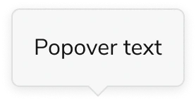
> Popovers are floating containers that open on demand.

export const LiveCode = ({children, customHeight, clickToLoad, example, fullWidth, fullHeight, hideCodeInLiveCode, screenshot, screenshotOnly, showCode: showCodeProp}) => {
  const SCREENSHOTS_BASE = "https://servicetitan.github.io/anvil2-docs-live-code/screenshots";
  const STACKBLITZ_BASE = "https://stackblitz.com/github/servicetitan/anvil2-docs-live-code/tree/main/examples";
  const [showCodeBlock, setShowCodeBlock] = useState(showCodeProp ?? false);
  const [isLocalOverride, setIsLocalOverride] = useState(false);
  useEffect(() => {
    const examplePath = `/images/live-code-screenshots-tmp/${example}.png`;
    fetch(examplePath, {
      method: "HEAD"
    }).then(r => {
      if (r.ok) setIsLocalOverride(true);
    }).catch(() => {});
  }, [example]);
  const screenshotBase = isLocalOverride ? "/images/live-code-screenshots-tmp" : SCREENSHOTS_BASE;
  if (screenshotOnly) {
    return <Frame className="flex flex-col">
        <div className="flex dark:hidden" style={{
      justifyContent: "center",
      alignItems: "center",
      width: fullWidth ? "100%" : "50%",
      minHeight: fullHeight ? "284px" : undefined,
      background: "#FFFFFF"
    }}>
          <img srcset={`${screenshotBase}/${example}.png, ${screenshotBase}/${example}-2x.png 2x`} src={`${screenshotBase}/${example}.png`} alt={example} noZoom />
        </div>
        <div className="hidden dark:flex" style={{
      justifyContent: "center",
      alignItems: "center",
      width: fullWidth ? "100%" : "50%",
      minHeight: fullHeight ? "284px" : undefined,
      background: "#141414"
    }}>
          <img srcset={`${screenshotBase}/${example}-dark.png, ${screenshotBase}/${example}-dark-2x.png 2x`} src={`${screenshotBase}/${example}-dark.png`} alt={example} noZoom />
        </div>
      </Frame>;
  }
  if (screenshot) {
    return <Frame className="flex flex-col -mb-2">
        <div className="flex dark:hidden bg-white dark:bg-codeblock border border-gray-950/10 dark:border-white/10 dark:twoslash-dark rounded-2xl overflow-hidden" style={{
      justifyContent: "center",
      alignItems: "center",
      width: fullWidth ? "100%" : "50%",
      minHeight: fullHeight ? "284px" : undefined
    }}>
          <img srcset={`${screenshotBase}/${example}.png, ${screenshotBase}/${example}-2x.png 2x`} src={`${screenshotBase}/${example}.png`} alt={example} noZoom />
        </div>

        <div className="hidden dark:flex bg-white dark:bg-codeblock border border-gray-950/10 dark:border-white/10 dark:twoslash-dark rounded-2xl overflow-hidden" style={{
      background: "#141414",
      justifyContent: "center",
      alignItems: "center",
      width: fullWidth ? "100%" : "50%",
      minHeight: fullHeight ? "284px" : undefined
    }}>
          <img srcset={`${screenshotBase}/${example}-dark.png, ${screenshotBase}/${example}-dark-2x.png 2x`} src={`${screenshotBase}/${example}-dark.png`} alt={example} noZoom />
        </div>

        <div className="flex justify-end items-center text-xs py-2 px-1 gap-4">
          {!showCodeProp ? <button className="inline-flex justify-end items-center text-gray-700 dark:text-gray-50 hover:text-blue-500 dark:hover:text-blue-300 transition-colors group self-end gap-1 cursor-pointer" onClick={() => setShowCodeBlock(!showCodeBlock)} style={{
      appearance: "none"
    }}>
              <Icon icon="code" size="12px" className="group-hover:bg-blue-500 dark:group-hover:bg-blue-300" />
              <span>{showCodeBlock ? "Hide code" : "Show code"}</span>
            </button> : null}

          <a className="inline-flex justify-end items-center hover:text-blue-500 dark:hover:text-blue-300 transition-colors group self-end gap-1" href={`${STACKBLITZ_BASE}/${example}?file=src/App.tsx`} target="_blank" rel="noreferrer">
            <Icon icon="bolt" size="12px" className="group-hover:bg-blue-500 dark:group-hover:bg-blue-300" />
            <span>StackBlitz demo</span>
          </a>
        </div>

        <div className="grid transition-[grid-template-rows] duration-300 ease-in-out overflow-auto overflow-y-hidden overflow-x-auto" style={showCodeBlock ? {
      gridTemplateRows: "1fr"
    } : {
      gridTemplateRows: "0fr"
    }}>
          <div style={{
      minHeight: 0,
      overflowX: "auto",
      overflowY: "hidden",
      marginBlockStart: "-1.25rem",
      marginBlockEnd: "-1.5rem"
    }}>
            {children}
          </div>
        </div>
      </Frame>;
  } else {
    return <div style={{
      display: "flex",
      width: fullWidth ? "100%" : "50%",
      minHeight: customHeight ? customHeight : "316px",
      resize: "vertical",
      overflow: "auto"
    }}>
        <iframe title={example} style={{
      flex: 1,
      width: fullWidth ? "100%" : "50%",
      minHeight: customHeight ? customHeight : "316px"
    }} src={`${STACKBLITZ_BASE}/${example}?embed=1&hideNavigation=1&hideExplorer=1&terminalHeight=0&file=src/App.tsx${clickToLoad ? "&ctl=1" : ""}${hideCodeInLiveCode ? "&view=preview" : ""}`} allow="accelerometer; ambient-light-sensor; camera; encrypted-media; geolocation; gyroscope; hid; microphone; midi; payment; usb; vr; xr-spatial-tracking" sandbox="allow-forms allow-modals allow-popups allow-presentation allow-same-origin allow-scripts" />
      </div>;
  }
};

export const CodePreviewPlaceholder = ({double, fullWidth}) => {
  const single = <div style={{
    width: fullWidth ? "100%" : "50%",
    borderRadius: "1rem",
    display: "flex",
    padding: "1rem",
    flexDirection: "column",
    gap: "0.5rem",
    height: "10rem",
    marginBlockEnd: "1rem"
  }} className="border-width-default border-color-subdued">
      <div className="bg-strong border-radius-large" style={{
    width: "100%",
    flexGrow: "1"
  }} />
      <div className="bg-strong border-radius-large" style={{
    width: "100%",
    flexGrow: "1"
  }} />
    </div>;
  return double ? <div style={{
    display: "flex",
    gap: "1rem"
  }}>
      {single}
      {single}
    </div> : single;
};

<Frame>
  <div className="w-full h-full bg-[#FFFFFF] p-2 rounded flex items-center justify-center">
    <img noZoom src="https://mintcdn.com/servicetitan/uz2PQSvO75TRhQ38/images/docs/web/components/shared/example-of-a-popover.png?fit=max&auto=format&n=uz2PQSvO75TRhQ38&q=85&s=25b03b3992dc525ebccf0e36bb67c7b5" width="278" height="144" data-path="images/docs/web/components/shared/example-of-a-popover.png" />
  </div>
</Frame>

## Anatomy

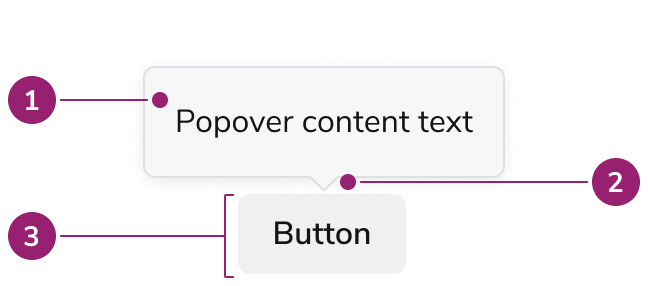
The Popover consists of three primary elements that work together to create floating containers that open on demand.

<Frame>
  <div className="w-full h-full bg-[#FFFFFF] p-2 rounded flex items-center justify-center">
    <img
      src="https://mintcdn.com/servicetitan/aip5_7K1pHSn1Axn/images/docs/web/components/popover/design/anatomy-of-a-popover.png?fit=max&auto=format&n=aip5_7K1pHSn1Axn&q=85&s=45ccf1cd0d44e7fca5c518f28b271c54"
      alt="Anatomy of a
Popover"
      width="648"
      height="286"
      data-path="images/docs/web/components/popover/design/anatomy-of-a-popover.png"
    />
  </div>
</Frame>

1. Popover background, content
2. Caret
3. Trigger

## Options

The Popover supports the following configurations to accommodate various overlay scenarios.

### Content

Popovers can accept both text and custom content.

<LiveCode example="popover-content" screenshot fullWidth>
  ```tsx lines theme={null}
  import { Popover, Flex, Grid } from "@servicetitan/anvil2";

  function App() {
    return (
      <div>
        <Flex justifyContent="center">
          <Grid
            placeItems="center"
            templateColumns="repeat(2, 1fr)"
            style={{
              paddingTop: "100px",
              gap: "150px",
            }}
          >
            <Popover open placement="top" disableShift disableFlip modal>
              <Popover.Button>Trigger</Popover.Button>
              <Popover.Content>Popover content </Popover.Content>
            </Popover>

            <Popover open placement="top" disableShift disableFlip modal>
              <Popover.Button>Trigger</Popover.Button>
              <Popover.Content>
                <Flex direction="column">
                  <b>Headline content</b>
                  Popover content
                </Flex>
              </Popover.Content>
            </Popover>
          </Grid>
        </Flex>
      </div>
    );
  }

  export default App;
  ```
</LiveCode>

### Placement

Note that placement of a Popover will adjust when not enough space is available.

<LiveCode example="popover-placement-top" screenshot fullWidth>
  ```tsx lines theme={null}
  import { Popover, Flex } from "@servicetitan/anvil2";

  function App() {
    const placements = ["top-end", "top", "top-start"] as const;
    return (
      <Flex
        gap="2"
        direction="column"
        style={{
          padding: "0 16px",
        }}
      >
        {placements.map((placement) => {
          return (
            <Flex
              key={placement}
              alignItems="flex-end"
              justifyContent="center"
              style={{ minHeight: "120px", minWidth: "240px" }}
            >
              <Popover
                disableShift
                disableFlip
                modal
                open
                placement={placement}
                key={placement}
              >
                <Popover.Button style={{ gridArea: placement }}>
                  Button
                </Popover.Button>
                <Popover.Content>{placement} placement</Popover.Content>
              </Popover>
            </Flex>
          );
        })}
      </Flex>
    );
  }

  export default App;
  ```
</LiveCode>

<LiveCode example="popover-placement-bottom" screenshot fullWidth>
  ```tsx lines theme={null}
  import { Popover, Flex } from "@servicetitan/anvil2";

  function App() {
    const placements = ["bottom-end", "bottom", "bottom-start"] as const;
    return (
      <Flex
        gap="2"
        direction="column"
        style={{
          padding: "0 16px",
        }}
      >
        {placements.map((placement) => {
          return (
            <Flex
              key={placement}
              alignItems="flex-start"
              justifyContent="center"
              style={{ minHeight: "120px", minWidth: "240px" }}
            >
              <Popover
                disableShift
                disableFlip
                modal
                open
                placement={placement}
                key={placement}
              >
                <Popover.Button style={{ gridArea: placement }}>
                  Button
                </Popover.Button>
                <Popover.Content>{placement} placement</Popover.Content>
              </Popover>
            </Flex>
          );
        })}
      </Flex>
    );
  }

  export default App;
  ```
</LiveCode>

<LiveCode example="popover-placement-left" screenshot fullWidth>
  ```tsx lines theme={null}
  import { Popover, Flex } from "@servicetitan/anvil2";

  function App() {
    const placements = ["left-end", "left", "left-start"] as const;
    return (
      <Flex
        gap="2"
        direction="column"
        style={{
          padding: "0 16px",
        }}
      >
        {placements.map((placement) => {
          return (
            <Flex
              key={placement}
              alignItems="center"
              justifyContent="center"
              style={{ minHeight: "120px", minWidth: "240px" }}
            >
              <Popover
                disableShift
                disableFlip
                modal
                open
                placement={placement}
                key={placement}
              >
                <Popover.Button style={{ gridArea: placement }}>
                  Button
                </Popover.Button>
                <Popover.Content>
                  {placement} {"\n"} placement
                </Popover.Content>
              </Popover>
            </Flex>
          );
        })}
      </Flex>
    );
  }

  export default App;
  ```
</LiveCode>

<LiveCode example="popover-placement-right" screenshot fullWidth>
  ```tsx lines theme={null}
  import { Popover, Flex } from "@servicetitan/anvil2";

  function App() {
    const placements = ["right-end", "right", "right-start"] as const;
    return (
      <Flex
        gap="2"
        direction="column"
        style={{
          padding: "0 16px",
        }}
      >
        {placements.map((placement) => {
          return (
            <Flex
              key={placement}
              alignItems="center"
              justifyContent="center"
              style={{ minHeight: "120px", minWidth: "240px" }}
            >
              <Popover
                disableShift
                disableFlip
                modal
                open
                placement={placement}
                key={placement}
              >
                <Popover.Button style={{ gridArea: placement }}>
                  Button
                </Popover.Button>
                <Popover.Content>
                  {placement} {"\n"} placement
                </Popover.Content>
              </Popover>
            </Flex>
          );
        })}
      </Flex>
    );
  }

  export default App;
  ```
</LiveCode>

## Behavior

The Popover responds to space constraints with automatic positioning adjustments and flexible opening/closing behaviors.

### Positioning Adjustments

The Popover makes automatic adjustments to its placement and dimensions when space is limited. It will:

* Auto flip when not enough space in the viewport is present.
* Resize the Popover when not enough space is present.
* Shift the Popover when scrolling to keep it in view.

These options can be turned off as needed.

### Opening a Popover

Popovers can be configured to open in multiple ways.

#### Open on click

<LiveCode example="popover-openonhover-false" screenshot fullWidth>
  ```tsx lines theme={null}
  import { Popover, Grid } from "@servicetitan/anvil2";

  function App() {
    return (
      <Grid
        placeItems="center"
        style={{
          paddingTop: "70px",
        }}
      >
        <Popover placement="top">
          <Popover.Button>Click to open</Popover.Button>
          <Popover.Content>Popover content </Popover.Content>
        </Popover>
      </Grid>
    );
  }

  export default App;
  ```
</LiveCode>

#### Open on hover

<LiveCode example="popover-openonhover-true" screenshot fullWidth>
  ```tsx lines theme={null}
  import { Popover, Grid } from "@servicetitan/anvil2";

  function App() {
    return (
      <Grid
        placeItems="center"
        style={{
          paddingTop: "70px",
        }}
      >
        <Popover placement="top" openOnHover>
          <Popover.Button>Hover to open</Popover.Button>
          <Popover.Content>Popover content </Popover.Content>
        </Popover>
      </Grid>
    );
  }

  export default App;
  ```
</LiveCode>

### Closing a Popover

Popovers can be configured to close in multiple ways.

#### Close on click outside

By default Popovers close on click outside. Override this behavior as needed.

<LiveCode example="popover-disablecloseonclickoutside-false" screenshot fullWidth>
  ```tsx lines theme={null}
  import { Popover, Grid } from "@servicetitan/anvil2";

  function App() {
    return (
      <Grid
        placeItems="center"
        style={{
          paddingTop: "70px",
        }}
      >
        <Popover placement="top">
          <Popover.Button>Close on click outside</Popover.Button>
          <Popover.Content>Popover content </Popover.Content>
        </Popover>
      </Grid>
    );
  }

  export default App;
  ```
</LiveCode>

#### Close action in the Popover

An action inside the Popover can close it. The Popover itself does not provide a set style for showing this.

<LiveCode example="popover-close-button" screenshot fullWidth>
  ```tsx lines theme={null}
  import { Popover, Grid } from "@servicetitan/anvil2";

  function App() {
    return (
      <Grid
        placeItems="center"
        style={{
          paddingTop: "100px",
        }}
      >
        <Popover placement="top">
          <Popover.Button>Close with apply button</Popover.Button>
          <Popover.Content
            style={{ display: "flex", gap: 20, flexDirection: "column" }}
          >
            Popover content <Popover.Close>Apply</Popover.Close>
          </Popover.Content>
        </Popover>
      </Grid>
    );
  }

  export default App;
  ```
</LiveCode>

## Usage Guidelines

Use the Popover when providing additional information or actions related to the element that triggers it, for use cases not covered by other components.

### When to Use

Popovers are small overlays that provide additional information or actions related to the element that triggers it. Most potential use cases for Popovers are solved through other components. When a use case isn't covered, Popovers can be used to create a UI pattern that the design system has not yet established, such as a tour flow.

### When not to use

Popovers as a rule are not recommended to be used directly. The [Menu](/docs/web/components/menu/design) and [Combobox](/docs/web/components/combobox/design), both of which use Popover directly, cover most use cases for a Popover. Other overlay-type components, such as [Tooltips](/docs/web/components/tooltip/design) and [Dialogs](/docs/web/components/dialog/design), also cover use cases that a Popover could potentially use.

### Alternatives

#### Popover vs Combobox

When a user needs to selects from many options, the Combobox should be used over the Popover. It is not recommended to recreate a combobox-like or select-like interaction with a Popover.

#### Popover vs Dialog

Both Dialogs and Popovers overlay elements on the page. In general, Dialogs are preferable when a situation requires user attention, and for more complicated flows.

|                                   | Popover                           | Dialog                      |
| --------------------------------- | --------------------------------- | --------------------------- |
| Content allowed in the container? | Any content                       | Any content                 |
| Complexity of content?            | From simple to a few interactions | From simple to high complex |
| Backdrop applied to page?         | No                                | Yes                         |

#### Popover vs Menu

When a list of actions need to take place, the Menu should be used. It is not recommended to recreate menu-like interactions through a Popover.

#### Popover vs Tooltip

Tooltip is the component of choice for tips and other informational overlays. Popovers may be used in place of a Tooltip when actions are needed.

| Usage                                | Tooltip                              | Popover                                |
| ------------------------------------ | ------------------------------------ | -------------------------------------- |
| Can have a link?                     | Should not have interactive elements | Yes                                    |
| Can have other interactive elements? | Should not have interactive elements | Yes                                    |
| Open mechanic?                       | Hover or Focus                       | Click/Press, option for Hover or Focus |
| Can trap user focus?                 | No                                   | Yes                                    |

### How to Use

#### Positioning a Popover

* Popovers will auto flip and shift by default in order to stay in view. Define a starting position based on element placement: when elements are near a screen edge, position the Popover to open in the opposite direction.
* Position Popovers in a way that minimizes obstruction of important elements.
* If the above are not relevant, a top position is considered the default placement.

<LiveCode example="popover-placement-do" screenshot fullWidth>
  ```tsx lines theme={null}
  import { Popover, Flex, Grid, Button } from "@servicetitan/anvil2";

  function App() {
    return (
      <div>
        <Flex justifyContent="center" style={{ margin: "0 3rem" }}>
          <Grid
            columnGap="2"
            templateColumns="repeat(3, max-content)"
            placeContent="center"
            style={{
              paddingBottom: 100,
              rowGap: "150px",
            }}
          >
            <Popover placement="bottom-start" open modal>
              <Popover.Button data-interactive="active">Button</Popover.Button>
              <Popover.Content
                style={{ display: "flex", flexDirection: "column" }}
              >
                <b>Bottom start position</b>
                Popover content
              </Popover.Content>
            </Popover>
            <Button>Button</Button>
            <Button>Button</Button>

            <Button>Button</Button>
            <Button>Button</Button>
            <Popover placement="bottom-end" open modal>
              <Popover.Button data-interactive="active">Button</Popover.Button>
              <Popover.Content
                style={{ display: "flex", flexDirection: "column" }}
              >
                <b>Bottom end position</b>
                Popover content
              </Popover.Content>
            </Popover>
          </Grid>
        </Flex>
      </div>
    );
  }

  export default App;
  ```
</LiveCode>

<Check>**Do**</Check>

An example where the Popover position aligns with the position of a larger group of actions.

#### Don't add Popovers to non-interactive elements

Popovers cannot be accessed by keyboard when behind a non-interactive element. Consider adding this information on the page itself, or providing a dedicated help Button Icon.

<LiveCode example="popover-content-interactive-dont" screenshot fullWidth>
  ```tsx lines theme={null}
  import { Popover, Flex, Grid, Button } from "@servicetitan/anvil2";

  function App() {
    return (
      <div>
        <Flex justifyContent="center" style={{ margin: "0 3rem" }}>
          <Grid
            columnGap="2"
            templateColumns="repeat(3, max-content)"
            placeContent="center"
            style={{
              display: "grid",
              paddingTop: 120,
              rowGap: "150px",
            }}
          >
            <Button>Cancel</Button>
            <Popover placement="top-end" open modal>
              <Popover.Button disabled appearance="primary">
                Submit
              </Popover.Button>
              <Popover.Content
                style={{
                  display: "flex",
                  flexDirection: "column",
                  maxWidth: "14rem",
                }}
              >
                Popover content that is explaining why the Submit button is
                disabled.
              </Popover.Content>
            </Popover>
          </Grid>
        </Flex>
      </div>
    );
  }

  export default App;
  ```
</LiveCode>

<Danger>**Don't**</Danger>

## Content

Content within the Popover should clearly communicate the additional information or actions available.

## Keyboard Interaction

Users can navigate the Popover using standard keyboard controls.

| Key            | Description                                                                                                                         |
| -------------- | ----------------------------------------------------------------------------------------------------------------------------------- |
| Space or Enter | When focusing on the trigger, opens the Popover                                                                                     |
| Escape         | Closes the Popover when focus is on or inside the trigger or the content                                                            |
| Tab            | When the Popover is `modal`, it cycles through all tab-able elements between the trigger and Popover, otherwise it behaves normally |

### Accessibility

#### Trapping Focus

Popovers by default do not trap focus. Content of the Popover maintains the DOM order, unlike portaling, which allows natural tab behavior to work accessibly without trapping the focus. Enable focus trapping by using the `modal` prop.

<LiveCode example="popover-focus" screenshot fullWidth>
  ```tsx lines theme={null}
  import { Popover, Grid, Button } from "@servicetitan/anvil2";

  function App() {
    return (
      <Grid
        placeItems="center"
        gap="1"
        templateColumns="repeat(3, 1fr)"
        style={{
          paddingTop: 100,
        }}
      >
        <Button>Unrelated Button</Button>
        <Popover placement="top" modal>
          <Popover.Button appearance="primary">Open to trap focus</Popover.Button>
          <Popover.Content style={{ display: "flex", gap: 20 }}>
            <Button>Button 1</Button>
            <Button>Button 2</Button>
            <Button>Button 3</Button>
          </Popover.Content>
        </Popover>
        <Button>Unrelated Button</Button>
      </Grid>
    );
  }

  export default App;
  ```
</LiveCode>

For more guidance on managing focus with changing content, see [changing content best practices](/docs/accessibility/changing-content).