> ## Documentation Index
> Fetch the complete documentation index at: https://anvil.servicetitan.com/llms.txt
> Use this file to discover all available pages before exploring further.

# Radio – Design

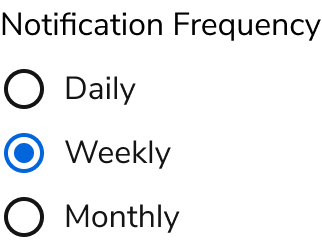
> Radio buttons are form elements for selecting one option from a set of choices.

export const LiveCode = ({children, customHeight, clickToLoad, example, fullWidth, fullHeight, hideCodeInLiveCode, screenshot, screenshotOnly, showCode: showCodeProp}) => {
  const SCREENSHOTS_BASE = "https://servicetitan.github.io/anvil2-docs-live-code/screenshots";
  const STACKBLITZ_BASE = "https://stackblitz.com/github/servicetitan/anvil2-docs-live-code/tree/main/examples";
  const [showCodeBlock, setShowCodeBlock] = useState(showCodeProp ?? false);
  const [isLocalOverride, setIsLocalOverride] = useState(false);
  useEffect(() => {
    const examplePath = `/images/live-code-screenshots-tmp/${example}.png`;
    fetch(examplePath, {
      method: "HEAD"
    }).then(r => {
      if (r.ok) setIsLocalOverride(true);
    }).catch(() => {});
  }, [example]);
  const screenshotBase = isLocalOverride ? "/images/live-code-screenshots-tmp" : SCREENSHOTS_BASE;
  if (screenshotOnly) {
    return <Frame className="flex flex-col">
        <div className="flex dark:hidden" style={{
      justifyContent: "center",
      alignItems: "center",
      width: fullWidth ? "100%" : "50%",
      minHeight: fullHeight ? "284px" : undefined,
      background: "#FFFFFF"
    }}>
          <img srcset={`${screenshotBase}/${example}.png, ${screenshotBase}/${example}-2x.png 2x`} src={`${screenshotBase}/${example}.png`} alt={example} noZoom />
        </div>
        <div className="hidden dark:flex" style={{
      justifyContent: "center",
      alignItems: "center",
      width: fullWidth ? "100%" : "50%",
      minHeight: fullHeight ? "284px" : undefined,
      background: "#141414"
    }}>
          <img srcset={`${screenshotBase}/${example}-dark.png, ${screenshotBase}/${example}-dark-2x.png 2x`} src={`${screenshotBase}/${example}-dark.png`} alt={example} noZoom />
        </div>
      </Frame>;
  }
  if (screenshot) {
    return <Frame className="flex flex-col -mb-2">
        <div className="flex dark:hidden bg-white dark:bg-codeblock border border-gray-950/10 dark:border-white/10 dark:twoslash-dark rounded-2xl overflow-hidden" style={{
      justifyContent: "center",
      alignItems: "center",
      width: fullWidth ? "100%" : "50%",
      minHeight: fullHeight ? "284px" : undefined
    }}>
          <img srcset={`${screenshotBase}/${example}.png, ${screenshotBase}/${example}-2x.png 2x`} src={`${screenshotBase}/${example}.png`} alt={example} noZoom />
        </div>

        <div className="hidden dark:flex bg-white dark:bg-codeblock border border-gray-950/10 dark:border-white/10 dark:twoslash-dark rounded-2xl overflow-hidden" style={{
      background: "#141414",
      justifyContent: "center",
      alignItems: "center",
      width: fullWidth ? "100%" : "50%",
      minHeight: fullHeight ? "284px" : undefined
    }}>
          <img srcset={`${screenshotBase}/${example}-dark.png, ${screenshotBase}/${example}-dark-2x.png 2x`} src={`${screenshotBase}/${example}-dark.png`} alt={example} noZoom />
        </div>

        <div className="flex justify-end items-center text-xs py-2 px-1 gap-4">
          {!showCodeProp ? <button className="inline-flex justify-end items-center text-gray-700 dark:text-gray-50 hover:text-blue-500 dark:hover:text-blue-300 transition-colors group self-end gap-1 cursor-pointer" onClick={() => setShowCodeBlock(!showCodeBlock)} style={{
      appearance: "none"
    }}>
              <Icon icon="code" size="12px" className="group-hover:bg-blue-500 dark:group-hover:bg-blue-300" />
              <span>{showCodeBlock ? "Hide code" : "Show code"}</span>
            </button> : null}

          <a className="inline-flex justify-end items-center hover:text-blue-500 dark:hover:text-blue-300 transition-colors group self-end gap-1" href={`${STACKBLITZ_BASE}/${example}?file=src/App.tsx`} target="_blank" rel="noreferrer">
            <Icon icon="bolt" size="12px" className="group-hover:bg-blue-500 dark:group-hover:bg-blue-300" />
            <span>StackBlitz demo</span>
          </a>
        </div>

        <div className="grid transition-[grid-template-rows] duration-300 ease-in-out overflow-auto overflow-y-hidden overflow-x-auto" style={showCodeBlock ? {
      gridTemplateRows: "1fr"
    } : {
      gridTemplateRows: "0fr"
    }}>
          <div style={{
      minHeight: 0,
      overflowX: "auto",
      overflowY: "hidden",
      marginBlockStart: "-1.25rem",
      marginBlockEnd: "-1.5rem"
    }}>
            {children}
          </div>
        </div>
      </Frame>;
  } else {
    return <div style={{
      display: "flex",
      width: fullWidth ? "100%" : "50%",
      minHeight: customHeight ? customHeight : "316px",
      resize: "vertical",
      overflow: "auto"
    }}>
        <iframe title={example} style={{
      flex: 1,
      width: fullWidth ? "100%" : "50%",
      minHeight: customHeight ? customHeight : "316px"
    }} src={`${STACKBLITZ_BASE}/${example}?embed=1&hideNavigation=1&hideExplorer=1&terminalHeight=0&file=src/App.tsx${clickToLoad ? "&ctl=1" : ""}${hideCodeInLiveCode ? "&view=preview" : ""}`} allow="accelerometer; ambient-light-sensor; camera; encrypted-media; geolocation; gyroscope; hid; microphone; midi; payment; usb; vr; xr-spatial-tracking" sandbox="allow-forms allow-modals allow-popups allow-presentation allow-same-origin allow-scripts" />
      </div>;
  }
};

export const CodePreviewPlaceholder = ({double, fullWidth}) => {
  const single = <div style={{
    width: fullWidth ? "100%" : "50%",
    borderRadius: "1rem",
    display: "flex",
    padding: "1rem",
    flexDirection: "column",
    gap: "0.5rem",
    height: "10rem",
    marginBlockEnd: "1rem"
  }} className="border-width-default border-color-subdued">
      <div className="bg-strong border-radius-large" style={{
    width: "100%",
    flexGrow: "1"
  }} />
      <div className="bg-strong border-radius-large" style={{
    width: "100%",
    flexGrow: "1"
  }} />
    </div>;
  return double ? <div style={{
    display: "flex",
    gap: "1rem"
  }}>
      {single}
      {single}
    </div> : single;
};

<Frame>
  <div className="w-full h-full bg-[#FFFFFF] p-2 rounded flex items-center justify-center">
    <img noZoom src="https://mintcdn.com/servicetitan/H5FwKyiqhPVZ1UJQ/images/docs/web/components/shared/radio-group-overview.png?fit=max&auto=format&n=H5FwKyiqhPVZ1UJQ&q=85&s=af6f547acca3adda1c5484e3308ae78a" width="322" height="241" data-path="images/docs/web/components/shared/radio-group-overview.png" />
  </div>
</Frame>

## Anatomy

The Radio uses two primary elements to help users select one option from a set of choices, the radio itself, and its corresponding label.

<Frame>
  <div className="w-full h-full bg-[#FFFFFF] p-2 rounded flex items-center justify-center">
    <img
      src="https://mintcdn.com/servicetitan/aip5_7K1pHSn1Axn/images/docs/web/components/radio/design/anatomy-of-a-radio-group.png?fit=max&auto=format&n=aip5_7K1pHSn1Axn&q=85&s=ec500ad8507ffe21bec91f336bd8148f"
      alt="Anatomy of a Radio
Group"
      width="620"
      height="114"
      data-path="images/docs/web/components/radio/design/anatomy-of-a-radio-group.png"
    />
  </div>
</Frame>

1. Radio button
2. Label

## Options

Configure the Radio to accommodate the following scenarios:

### States

#### Default

<LiveCode example="radio-defaultchecked" screenshot fullWidth>
  ```tsx lines theme={null}
  import { Radio } from "@servicetitan/anvil2";

  function App() {
    return (
      <Radio.Group legend="Notification Frequency">
        <Radio name="ex1" value="daily" label="Daily" />
        <Radio name="ex1" value="weekly" label="Weekly" defaultChecked />
        <Radio name="ex1" value="monthly" label="Monthly" />
      </Radio.Group>
    );
  }

  export default App;
  ```
</LiveCode>

#### Disabled

<LiveCode example="radio-disabled" screenshot fullWidth>
  ```tsx lines theme={null}
  import { Radio } from "@servicetitan/anvil2";

  function App() {
    return (
      <Radio.Group legend="Notification Frequency">
        <Radio name="ex2" value="daily" label="Daily" disabled />
        <Radio name="ex2" value="weekly" label="Weekly" disabled defaultChecked />
        <Radio name="ex2" value="monthly" label="Monthly" disabled />
      </Radio.Group>
    );
  }

  export default App;
  ```
</LiveCode>

### Description

<LiveCode example="radio-description" screenshot fullWidth>
  ```tsx lines theme={null}
  import { Radio } from "@servicetitan/anvil2";

  function App() {
    return <Radio label="Label" description="This is a description" />;
  }

  export default App;
  ```
</LiveCode>

Descriptions provide information to help the user avoid errors.

## Behavior

The Radio uses standard form control behaviors.

## Usage Guidelines

Use the Radio when users must select one option from a mutually exclusive set.

### When to Use

Use Radio buttons to choose between small sets of items, usually 5 or fewer. Since all options are always visible, users can quickly scan and compare them. You can provide additional context through helper text or a help tooltip to help users choose accurately.

### Alternatives

#### Radio vs Combobox

Both Radio buttons and the Combobox allow users to select a single option from a set. Generally use Radio buttons when there are 2–7 options and a Combobox when there are 8 or more.

In a Radio Group, all options are equally visible, whereas a Combobox highlights only the selected option.

#### Radio vs Listbox

For simple selection lists in a form, use a Radio.

For selection lists that need to be an overlay, use a Listbox with a Combobox.

#### Radio vs Segmented Control

Radio buttons are form controls that require explicit submission. Segmented Controls apply selection immediately to the UI.

#### Radio vs Switch

A Switch toggles between two states and takes effect immediately. Radio buttons let users choose from two or more options and require form submission. Use Radio buttons in form layouts when users select between multiple options.

#### Radio vs Checkbox vs Switch

Use Radio buttons to select a single option from mutually exclusive choices. Use Checkboxes to make zero to many selections from available options.

|                                                                              | Checkbox                            | Switch                    | Radio                               |
| ---------------------------------------------------------------------------- | ----------------------------------- | ------------------------- | ----------------------------------- |
| When is the selection executed?                                              | After a user clicks a submit button | Immediately               | After a user clicks a submit button |
| How many options are available?                                              | 1 or more                           | 1                         | 2 or more                           |
| Must an option be reducible to an on or off context?                         | No, it can be other things.         | Yes                       | No, it can be other things.         |
| If I had a group of this UI, what is the relation of each item in the group? | Independent of each other           | Independent of each other | Mutually exclusive                  |
| Indeterminate state possible?                                                | Yes                                 | No                        | No                                  |

### How to Use

#### Radio Groups

Group related Radio buttons together in a Radio Group. In most cases, include a label.

#### Default selection

Provide a default option in a Radio Group when possible. This:

* Signals that a selection is required
* Can expedite tasks
* Guides users toward a recommended option

Avoid a default selection when it could lead to unexpected downstream effects.

Source: [Nielsen Norman](https://www.nngroup.com/articles/radio-buttons-default-selection/)

<LiveCode example="radio-defaultchecked-do" screenshot fullWidth>
  ```tsx lines theme={null}
  import { Radio } from "@servicetitan/anvil2";

  function App() {
    return (
      <Radio.Group legend="Default checked example">
        <Radio name="ex4" value="a" label="Option A" defaultChecked />
        <Radio name="ex4" value="b" label="Option B" />
        <Radio name="ex4" value="c" label="Option C" />
        <Radio name="ex4" value="d" label="Option D" />
      </Radio.Group>
    );
  }

  export default App;
  ```
</LiveCode>

#### Inclusion of an "Other" selection

When a Radio Group includes an "Other" option, selecting it should reveal a Text Field so users can enter custom text.

<LiveCode example="radio-other-do" screenshot fullWidth>
  ```tsx lines theme={null}
  import { Radio, TextField, Flex } from "@servicetitan/anvil2";
  import { useState, useId } from "react";

  function App() {
    const [selectedValue, setSelectedValue] = useState("other");
    const [otherValue, setOtherValue] = useState("");
    const otherInputId = useId();

    return (
      <Radio.Group legend="How did you hear about us?">
        <Radio
          name="exampleRadioOther"
          value="search"
          label="Search engine"
          checked={selectedValue === "search"}
          onChange={() => setSelectedValue("search")}
        />
        <Radio
          name="exampleRadioOther"
          value="social"
          label="Social media"
          checked={selectedValue === "social"}
          onChange={() => setSelectedValue("social")}
        />
        <Radio
          name="exampleRadioOther"
          value="recommendation"
          label="Friend or colleague"
          checked={selectedValue === "recommendation"}
          onChange={() => setSelectedValue("recommendation")}
        />
        <Flex gap="2" alignItems="start" direction="column">
          <Radio
            name="exampleRadioOther"
            value="other"
            label="Other"
            checked={selectedValue === "other"}
            onChange={() => setSelectedValue("other")}
            aria-describedby={
              selectedValue === "other" ? otherInputId : undefined
            }
          />
          {selectedValue === "other" && (
            <TextField
              id={otherInputId}
              aria-label="Please specify"
              value={otherValue}
              onChange={(e) => setOtherValue(e.target.value)}
              disabled={selectedValue !== "other"}
              style={{
                marginInlineStart: "2rem",
              }}
            />
          )}
        </Flex>
      </Radio.Group>
    );
  }

  export default App;
  ```
</LiveCode>

## Content

Radio content should clearly communicate options and provide context for informed decisions.

### The Radio Group's title and description communicate its main purpose

Titles should clearly communicate the Radio Group's purpose at a glance. Descriptions provide additional context about the decision users need to make.

<LiveCode example="radio-legend-do" screenshot fullWidth>
  ```tsx lines theme={null}
  import { Radio, Flex, Text } from "@servicetitan/anvil2";

  function App() {
    return (
      <Radio.Group
        legend={
          <Flex direction="column" gap="0">
            <Text variant="headline" el="h3" size="small">
              Assign geofence tracking to vehicles
            </Text>
            <Text>
              A geofence can be applied to a selection of individual vehicles or
              assigned to one or more vehicle groups.
            </Text>
          </Flex>
        }
      >
        <Radio
          name="c1"
          value="a"
          label="Apply to individual vehicles"
          defaultChecked
        />
        <Radio name="c1" value="b" label="Apply to vehicle groups" />
      </Radio.Group>
    );
  }

  export default App;
  ```
</LiveCode>

<Check>**Do**</Check>

<LiveCode example="radio-legend-dont" screenshot fullWidth>
  ```tsx lines theme={null}
  import { Radio } from "@servicetitan/anvil2";

  function App() {
    return (
      <Radio.Group legend="Select vehicles to monitor">
        <Radio
          name="c1"
          value="a"
          label="Apply to individual vehicles"
          defaultChecked
        />
        <Radio name="c1" value="b" label="Apply to vehicle groups" />
      </Radio.Group>
    );
  }

  export default App;
  ```
</LiveCode>

<Danger>**Don't**</Danger>

### Use descriptive Radio input labels

Users rely on labels to understand what each Radio input controls. Use positive, active wording for Radio input labels.

Use sentence case (capitalize only the first word and proper nouns) so control labels are easy to scan. Do not use periods for short phrases or single sentences.

"Leaky bathroom faucet"\
"Clogged kitchen drain"\
"No hot water"\
"Slow shower drain"\
"Overflowing toilet"

<Check>**Do**</Check>

"Fix water problem"\
"Plumbing emergency"\
"Water not working"\
"Broken pipe"\
"Plumbing issue"

<Danger>**Don't**</Danger>

### Give users the information they need to make an informed decision

When a label doesn't provide enough context, use descriptions to give users the relevant details they need to decide.

Don't add descriptions when unneeded or solely to match other inputs.

Use sentence case, and only include period if more than one sentence is used.

Follow the inline help content guidelines.

<LiveCode example="radio-description-do" screenshot fullWidth>
  ```tsx lines theme={null}
  import { Radio } from "@servicetitan/anvil2";

  function App() {
    return (
      <Radio.Group legend="Update auto-renew setting">
        <Radio
          name="c3"
          id="ex-c3-1"
          value="a"
          label="Enabled"
          description="Agreement will be automatically renewed on its end date"
        />
        <Radio
          name="c3"
          id="ex-ce-2"
          value="b"
          label="Disabled"
          description="Agreement will expire on its end date unless renewed manually"
        />
      </Radio.Group>
    );
  }

  export default App;
  ```
</LiveCode>

<Check>**Do**</Check>

<LiveCode example="radio-description-dont" screenshot fullWidth>
  ```tsx lines theme={null}
  import { Radio } from "@servicetitan/anvil2";

  function App() {
    return (
      <Radio.Group legend="Update auto-renew setting">
        <Radio
          name="c3"
          id="ex-c3-1"
          value="a"
          label="Enabled"
          description="Agreement will automatically renew"
        />
        <Radio
          name="c3"
          id="ex-ce-2"
          value="b"
          label="Disabled"
          description="Agreement will not automatically renew"
        />
      </Radio.Group>
    );
  }

  export default App;
  ```
</LiveCode>

<Danger>**Don't**</Danger>

## Keyboard Interaction

Navigate the Radio using standard keyboard controls.

| Key        | Interaction                 |
| ---------- | --------------------------- |
| Arrow keys | Navigate and selects Radios |

### Accessibility

* Include Radio buttons in a Radio Group with multiple mutually exclusive options.
* Provide a visible label for each Radio button.
* When a Radio button has an error, include helper text to describe the error.

For more guidance on form field labels and context, see [input field context association best practices](/docs/accessibility/labels-and-ctas#input-field-context-association).