> ## Documentation Index
> Fetch the complete documentation index at: https://anvil.servicetitan.com/llms.txt
> Use this file to discover all available pages before exploring further.

# Search Field – Design

> Search Fields are text inputs that allow users to search for specific content.

export const LiveCode = ({children, customHeight, clickToLoad, example, fullWidth, fullHeight, hideCodeInLiveCode, screenshot, screenshotOnly, showCode: showCodeProp}) => {
  const SCREENSHOTS_BASE = "https://servicetitan.github.io/anvil2-docs-live-code/screenshots";
  const STACKBLITZ_BASE = "https://stackblitz.com/github/servicetitan/anvil2-docs-live-code/tree/main/examples";
  const [showCodeBlock, setShowCodeBlock] = useState(showCodeProp ?? false);
  const [isLocalOverride, setIsLocalOverride] = useState(false);
  useEffect(() => {
    const examplePath = `/images/live-code-screenshots-tmp/${example}.png`;
    fetch(examplePath, {
      method: "HEAD"
    }).then(r => {
      if (r.ok) setIsLocalOverride(true);
    }).catch(() => {});
  }, [example]);
  const screenshotBase = isLocalOverride ? "/images/live-code-screenshots-tmp" : SCREENSHOTS_BASE;
  if (screenshotOnly) {
    return <Frame className="flex flex-col">
        <div className="flex dark:hidden" style={{
      justifyContent: "center",
      alignItems: "center",
      width: fullWidth ? "100%" : "50%",
      minHeight: fullHeight ? "284px" : undefined,
      background: "#FFFFFF"
    }}>
          <img srcset={`${screenshotBase}/${example}.png, ${screenshotBase}/${example}-2x.png 2x`} src={`${screenshotBase}/${example}.png`} alt={example} noZoom />
        </div>
        <div className="hidden dark:flex" style={{
      justifyContent: "center",
      alignItems: "center",
      width: fullWidth ? "100%" : "50%",
      minHeight: fullHeight ? "284px" : undefined,
      background: "#141414"
    }}>
          <img srcset={`${screenshotBase}/${example}-dark.png, ${screenshotBase}/${example}-dark-2x.png 2x`} src={`${screenshotBase}/${example}-dark.png`} alt={example} noZoom />
        </div>
      </Frame>;
  }
  if (screenshot) {
    return <Frame className="flex flex-col -mb-2">
        <div className="flex dark:hidden bg-white dark:bg-codeblock border border-gray-950/10 dark:border-white/10 dark:twoslash-dark rounded-2xl overflow-hidden" style={{
      justifyContent: "center",
      alignItems: "center",
      width: fullWidth ? "100%" : "50%",
      minHeight: fullHeight ? "284px" : undefined
    }}>
          <img srcset={`${screenshotBase}/${example}.png, ${screenshotBase}/${example}-2x.png 2x`} src={`${screenshotBase}/${example}.png`} alt={example} noZoom />
        </div>

        <div className="hidden dark:flex bg-white dark:bg-codeblock border border-gray-950/10 dark:border-white/10 dark:twoslash-dark rounded-2xl overflow-hidden" style={{
      background: "#141414",
      justifyContent: "center",
      alignItems: "center",
      width: fullWidth ? "100%" : "50%",
      minHeight: fullHeight ? "284px" : undefined
    }}>
          <img srcset={`${screenshotBase}/${example}-dark.png, ${screenshotBase}/${example}-dark-2x.png 2x`} src={`${screenshotBase}/${example}-dark.png`} alt={example} noZoom />
        </div>

        <div className="flex justify-end items-center text-xs py-2 px-1 gap-4">
          {!showCodeProp ? <button className="inline-flex justify-end items-center text-gray-700 dark:text-gray-50 hover:text-blue-500 dark:hover:text-blue-300 transition-colors group self-end gap-1 cursor-pointer" onClick={() => setShowCodeBlock(!showCodeBlock)} style={{
      appearance: "none"
    }}>
              <Icon icon="code" size="12px" className="group-hover:bg-blue-500 dark:group-hover:bg-blue-300" />
              <span>{showCodeBlock ? "Hide code" : "Show code"}</span>
            </button> : null}

          <a className="inline-flex justify-end items-center hover:text-blue-500 dark:hover:text-blue-300 transition-colors group self-end gap-1" href={`${STACKBLITZ_BASE}/${example}?file=src/App.tsx`} target="_blank" rel="noreferrer">
            <Icon icon="bolt" size="12px" className="group-hover:bg-blue-500 dark:group-hover:bg-blue-300" />
            <span>StackBlitz demo</span>
          </a>
        </div>

        <div className="grid transition-[grid-template-rows] duration-300 ease-in-out overflow-auto overflow-y-hidden overflow-x-auto" style={showCodeBlock ? {
      gridTemplateRows: "1fr"
    } : {
      gridTemplateRows: "0fr"
    }}>
          <div style={{
      minHeight: 0,
      overflowX: "auto",
      overflowY: "hidden",
      marginBlockStart: "-1.25rem",
      marginBlockEnd: "-1.5rem"
    }}>
            {children}
          </div>
        </div>
      </Frame>;
  } else {
    return <div style={{
      display: "flex",
      width: fullWidth ? "100%" : "50%",
      minHeight: customHeight ? customHeight : "316px",
      resize: "vertical",
      overflow: "auto"
    }}>
        <iframe title={example} style={{
      flex: 1,
      width: fullWidth ? "100%" : "50%",
      minHeight: customHeight ? customHeight : "316px"
    }} src={`${STACKBLITZ_BASE}/${example}?embed=1&hideNavigation=1&hideExplorer=1&terminalHeight=0&file=src/App.tsx${clickToLoad ? "&ctl=1" : ""}${hideCodeInLiveCode ? "&view=preview" : ""}`} allow="accelerometer; ambient-light-sensor; camera; encrypted-media; geolocation; gyroscope; hid; microphone; midi; payment; usb; vr; xr-spatial-tracking" sandbox="allow-forms allow-modals allow-popups allow-presentation allow-same-origin allow-scripts" />
      </div>;
  }
};

export const CodePreviewPlaceholder = ({double, fullWidth}) => {
  const single = <div style={{
    width: fullWidth ? "100%" : "50%",
    borderRadius: "1rem",
    display: "flex",
    padding: "1rem",
    flexDirection: "column",
    gap: "0.5rem",
    height: "10rem",
    marginBlockEnd: "1rem"
  }} className="border-width-default border-color-subdued">
      <div className="bg-strong border-radius-large" style={{
    width: "100%",
    flexGrow: "1"
  }} />
      <div className="bg-strong border-radius-large" style={{
    width: "100%",
    flexGrow: "1"
  }} />
    </div>;
  return double ? <div style={{
    display: "flex",
    gap: "1rem"
  }}>
      {single}
      {single}
    </div> : single;
};

<Frame>
  <div className="w-full h-full bg-[#FFFFFF] p-2 rounded flex items-center justify-center">
    <img noZoom src="https://mintcdn.com/servicetitan/H5FwKyiqhPVZ1UJQ/images/docs/web/components/shared/search-field-main-image.png?fit=max&auto=format&n=H5FwKyiqhPVZ1UJQ&q=85&s=0c8d705828f29386ed2382c7fbab4390" width="520" height="80" data-path="images/docs/web/components/shared/search-field-main-image.png" />
  </div>
</Frame>

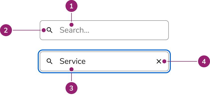
## Anatomy

Four elements work together in the Search Field:

<Frame>
  <div className="w-full h-full bg-[#FFFFFF] p-2 rounded flex items-center justify-center">
    <img
      src="https://mintcdn.com/servicetitan/Z-EIF5iqj0kJVjT1/images/docs/web/components/search-field/design/search-field-anatomy.png?fit=max&auto=format&n=Z-EIF5iqj0kJVjT1&q=85&s=7bc0e9fb6cba1e438ed578d691b16c22"
      alt="search field
anatomy"
      width="846"
      height="388"
      data-path="images/docs/web/components/search-field/design/search-field-anatomy.png"
    />
  </div>
</Frame>

1. Placeholder text
2. Search icon
3. Search value
4. Clear button

## Options

Configure Search Field for different scenarios:

### Sizes

<LiveCode example="searchfield-size" screenshot fullWidth>
  ```tsx lines theme={null}
  import { SearchField, Flex } from "@servicetitan/anvil2";

  function App() {
    return (
      <Flex gap="6" direction="column">
        <SearchField size="small" />
        <SearchField size="medium" />
        <SearchField size="large" />
      </Flex>
    );
  }

  export default App;
  ```
</LiveCode>

| Size   | Height |
| ------ | ------ |
| Small  | 32px   |
| Medium | 40px   |
| Large  | 48px   |

## Behavior

Search Field has distinct visual states and handles clearing and overflow.

### Visual States

<LiveCode example="searchfield-data-interactive" screenshot fullWidth>
  ```tsx lines theme={null}
  import { SearchField, Flex } from "@servicetitan/anvil2";

  function App() {
    return (
      <Flex gap="6" direction="column">
        <SearchField />
        <SearchField disabled />
      </Flex>
    );
  }

  export default App;
  ```
</LiveCode>

### Clearing

The clear button follows web standards:

* Shows when there is an input value
* Not focusable, only clickable

<LiveCode example="searchfield-clear" screenshot fullWidth>
  ```tsx lines theme={null}
  import { SearchField } from "@servicetitan/anvil2";

  function App() {
    return <SearchField defaultValue="Sample value" />;
  }

  export default App;
  ```
</LiveCode>

### Overflow

<LiveCode example="searchfield-overflow" screenshot fullWidth>
  ```tsx lines theme={null}
  import { SearchField } from "@servicetitan/anvil2";

  function App() {
    return (
      <SearchField defaultValue="This is an example of overflow text inside of a searchfield to showcase what happens" />
    );
  }

  export default App;
  ```
</LiveCode>

Long text scrolls horizontally within the container. The visible portion follows the cursor.

## Usage Guidelines

Use Search Field for search or filter experiences.

### When to Use

Use Search Field for search or filter experiences.

* As part of a Table
* For a catalog of items
* As part of the complex Dialog selection pattern

#### When not to use

Avoid search for small datasets or content easily found on the page.

### Alternatives

#### Search Field vs Combobox

Use Combobox when users select from an overlayed list of options, typically in a form field. Use Search Field for traditional search experiences, filtering lists on the page, tables, large datasets, or results that need additional filtering.

### How to Use

Combine Search Field with other UI elements for a complete search experience. Customize it to fit your needs.

#### General search results guidance

* Keep the search term present after running search
* Show the number of results when possible
* Show filters when possible
* Leverage [Skeleton](/docs/web/components/skeleton/design) loaders when waiting for results to populate
* Include a "no results" empty state when possible

##### Show the number of results when possible

<LiveCode example="searchfield-listbox-do" screenshot fullWidth>
  ```tsx lines theme={null}
  import { SearchField, Flex, Text, Listbox } from "@servicetitan/anvil2";
  import { useState, type ChangeEvent } from "react";

  type Item = { id: number; label: string };

  function App() {
    const items: Item[] = [
      { id: 1, label: "Apple" },
      { id: 2, label: "Banana" },
      { id: 3, label: "Cherry" },
      { id: 4, label: "Grape" },
      { id: 5, label: "Kiwi" },
      { id: 6, label: "Mango" },
      { id: 7, label: "Orange" },
      { id: 8, label: "Peach" },
      { id: 9, label: "Pineapple" },
      { id: 10, label: "Strawberry" },
    ];

    const [selected, setSelected] = useState<Item>(items[1]);
    const [result, setResult] = useState<Item[]>(items);

    const handleChange = (e: ChangeEvent<HTMLInputElement>) => {
      if (!e.target.value) {
        setResult(items);
        return;
      }
      const newResult = items.filter((item) =>
        item.label.toLowerCase().includes(e.target.value.toLowerCase()),
      );
      setResult(newResult);
    };

    return (
      <Flex direction="column">
        <Text el="h1" variant="headline">
          Fruit
        </Text>
        <Flex gap="6" direction="column">
          <Text variant="body">
            This is description text talking about the fruit.
          </Text>
          <SearchField
            onChange={handleChange}
            placeholder="Search for fruits..."
          />
          <Text el="h3" variant="headline" size="small">
            {result.length} results
          </Text>
          <Listbox
            style={{ padding: 0 }}
            defaultSelected={items[2]}
            items={result}
            selected={selected}
            onSelectionChange={(selection: Item | undefined) => {
              setSelected(
                items.find(
                  (item) => item?.label === selection?.label,
                ) as (typeof items)[number],
              );
            }}
          >
            {({ items }) =>
              items.map((item) => (
                <Listbox.Option key={item.label} item={item}>
                  {item.label}
                </Listbox.Option>
              ))
            }
          </Listbox>
        </Flex>
      </Flex>
    );
  }

  export default App;
  ```
</LiveCode>

#### Dropdown with results

* Consider creating sections to organize results.
* Consider adding filters to narrow down results.
* If there are additional results that are not shown, consider adding a link to a page with all available results.
* If the results become too complicated, consider using a [Dialog](/docs/web/components/dialog/design) over a [Popover](/docs/web/components/popover/design).

<LiveCode example="searchfield-popover-do" screenshot fullWidth>
  ```tsx lines theme={null}
  import {
    SearchField,
    Popover,
    Flex,
    ButtonToggle,
    Text,
    Link,
    Avatar,
  } from "@servicetitan/anvil2";
  import { useState, type ChangeEvent } from "react";

  type Item = { id: number; label: string; type: string };

  function App() {
    const websiteItems: Item[] = [
      { id: 1, label: "Anvil1 web documentation", type: "Website" },
      { id: 2, label: "Anvil2 web documentation", type: "Website" },
      { id: 3, label: "ServiceTitan", type: "Website" },
      { id: 4, label: "Confluence", type: "Website" },
      { id: 5, label: "Jira Board", type: "Website" },
    ];

    const documentationItems: Item[] = [
      { id: 6, label: "Anvil Backlog", type: "Documentation" },
      { id: 7, label: "Anvil Design System Confluence", type: "Documentation" },
      { id: 8, label: "Anvil Design Work Process", type: "Documentation" },
      { id: 9, label: "Anvil Figma Library", type: "Documentation" },
    ];

    const peopleItems: Item[] = [
      { id: 11, label: "Alice Johnson", type: "People" },
      { id: 12, label: "Bob Smith", type: "People" },
      { id: 13, label: "Charlie Brown", type: "People" },
      { id: 14, label: "David Wilson", type: "People" },
      { id: 15, label: "Eve Davis", type: "People" },
      { id: 16, label: "Fiona Taylor", type: "People" },
      { id: 17, label: "George Miller", type: "People" },
      { id: 18, label: "Hannah Clark", type: "People" },
    ];

    const items = websiteItems.concat(documentationItems, peopleItems);
    const [result, setResult] = useState<Item[]>(items);

    const [isWebsiteChecked, setIsWebsiteChecked] = useState(false);
    const [isDocumentationChecked, setIsDocumentationChecked] = useState(false);
    const [isPeopleChecked, setIsPeopleChecked] = useState(false);

    const getAllFilter = () => {
      if (!isWebsiteChecked && !isDocumentationChecked && !isPeopleChecked)
        return true;
      return false;
    };

    const handleChange = (e: ChangeEvent<HTMLInputElement>) => {
      if (!e.target.value) {
        setResult(items);
        return;
      }
      const newResult = items.filter((item) =>
        item.label.toLowerCase().includes(e.target.value.toLowerCase()),
      );
      setResult(newResult);
    };

    const hasWebsiteId = websiteItems.filter((item) =>
      result.some((resultItem) => resultItem.id === item.id),
    );

    const hasDocumentationId = documentationItems.filter((item) =>
      result.some((resultItem) => resultItem.id === item.id),
    );

    const hasPeopleId = peopleItems.filter((item) =>
      result.some((resultItem) => resultItem.id === item.id),
    );

    const showNoResults = () => {
      if (result.length === 0) return true;
      const filterState = [
        isWebsiteChecked,
        isDocumentationChecked,
        isPeopleChecked,
      ].filter((value) => value === true).length;
      const website = isWebsiteChecked && hasWebsiteId.length === 0;
      const documentation =
        isDocumentationChecked && hasDocumentationId.length === 0;
      const people = isPeopleChecked && hasPeopleId.length === 0;

      if (
        filterState === 2 &&
        ((website && documentation) ||
          (website && people) ||
          (documentation && people))
      )
        return true;
      if (filterState === 1 && (website || people || documentation)) return true;
      return false;
    };

    return (
      <div style={{ width: "500px", height: "672px" }}>
        <Popover open placement="bottom-start" disableShift disableFlip modal>
          <Popover.Button>Trigger</Popover.Button>
          <Popover.Content>
            <Flex gap="3" direction="column">
              <SearchField onChange={handleChange} />
              <Flex gap="2">
                <ButtonToggle
                  checked={isWebsiteChecked}
                  onClick={() => setIsWebsiteChecked((prev) => !prev)}
                >
                  Websites {hasWebsiteId.length}
                </ButtonToggle>
                <ButtonToggle
                  checked={isDocumentationChecked}
                  onClick={() => setIsDocumentationChecked((prev) => !prev)}
                >
                  Documentation {hasDocumentationId.length}
                </ButtonToggle>
                <ButtonToggle
                  checked={isPeopleChecked}
                  onClick={() => setIsPeopleChecked((prev) => !prev)}
                >
                  People {hasPeopleId.length}
                </ButtonToggle>
              </Flex>
              {(getAllFilter() || isWebsiteChecked) &&
                hasWebsiteId.length > 0 && (
                  <Text variant="eyebrow" style={{ marginTop: "1rem" }}>
                    Websites
                  </Text>
                )}
              {(getAllFilter() || isWebsiteChecked) &&
                hasWebsiteId &&
                websiteItems.map((item) => {
                  const idExistsInResult = result.some(
                    (resultItem) => resultItem.id === item.id,
                  );
                  return idExistsInResult && <Link ghost>{item.label}</Link>;
                })}

              {(getAllFilter() || isDocumentationChecked) &&
                hasDocumentationId.length > 0 && (
                  <Text variant="eyebrow" style={{ marginTop: "1rem" }}>
                    Documentation
                  </Text>
                )}
              {(getAllFilter() || isDocumentationChecked) &&
                hasDocumentationId &&
                documentationItems.map((item) => {
                  const idExistsInResult = result.some(
                    (resultItem) => resultItem.id === item.id,
                  );
                  return idExistsInResult && <Link ghost>{item.label}</Link>;
                })}

              {(getAllFilter() || isPeopleChecked) && hasPeopleId.length > 0 && (
                <Text variant="eyebrow" style={{ marginTop: "1rem" }}>
                  People
                </Text>
              )}
              <Flex gap="2">
                {(getAllFilter() || isPeopleChecked) &&
                  hasPeopleId &&
                  peopleItems.map((item) => {
                    const idExistsInResult = result.some(
                      (resultItem) => resultItem.id === item.id,
                    );
                    return idExistsInResult && <Avatar name={item.label} />;
                  })}
              </Flex>
              {showNoResults() && <Text subdued>No results found</Text>}
            </Flex>
          </Popover.Content>
        </Popover>
      </div>
    );
  }

  export default App;
  ```
</LiveCode>

## Content

Placeholder text and search results should clearly communicate the search context.

## Keyboard Interaction

Navigate the Search Field using standard keyboard controls.

### Accessibility

Search Field doesn't have a label, so place it near related content to make its purpose clear.

For more guidance on form field labels and context, see [input field context association best practices](/docs/accessibility/labels-and-ctas#input-field-context-association).