> ## Documentation Index
> Fetch the complete documentation index at: https://anvil.servicetitan.com/llms.txt
> Use this file to discover all available pages before exploring further.

# Select Card – Design

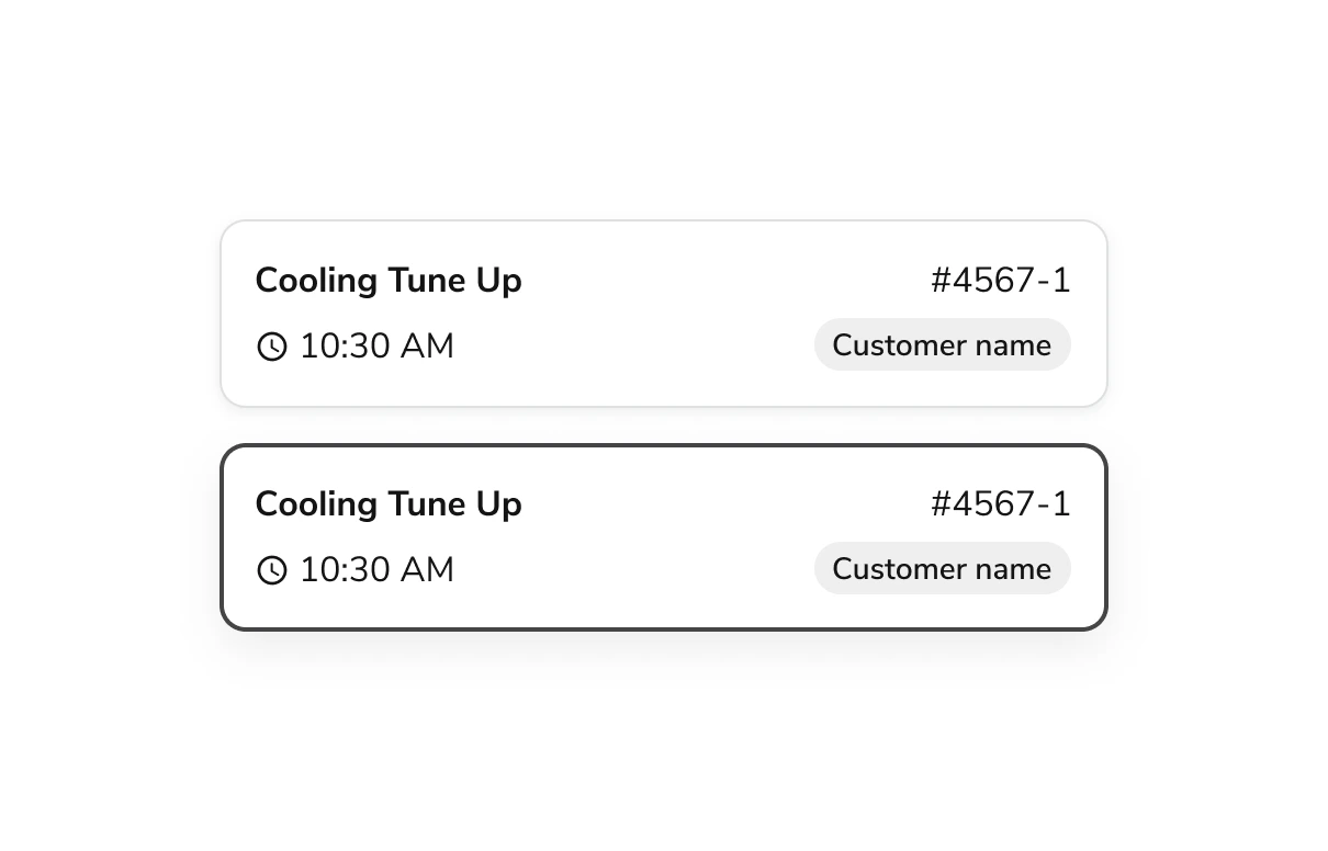
> Select Cards are card-like checkboxes or radios with customizable inner content.

export const LiveCode = ({children, customHeight, clickToLoad, example, fullWidth, fullHeight, hideCodeInLiveCode, screenshot, screenshotOnly, showCode: showCodeProp}) => {
  const SCREENSHOTS_BASE = "https://servicetitan.github.io/anvil2-docs-live-code/screenshots";
  const STACKBLITZ_BASE = "https://stackblitz.com/github/servicetitan/anvil2-docs-live-code/tree/main/examples";
  const [showCodeBlock, setShowCodeBlock] = useState(showCodeProp ?? false);
  const [isLocalOverride, setIsLocalOverride] = useState(false);
  useEffect(() => {
    const examplePath = `/images/live-code-screenshots-tmp/${example}.png`;
    fetch(examplePath, {
      method: "HEAD"
    }).then(r => {
      if (r.ok) setIsLocalOverride(true);
    }).catch(() => {});
  }, [example]);
  const screenshotBase = isLocalOverride ? "/images/live-code-screenshots-tmp" : SCREENSHOTS_BASE;
  if (screenshotOnly) {
    return <Frame className="flex flex-col">
        <div className="flex dark:hidden" style={{
      justifyContent: "center",
      alignItems: "center",
      width: fullWidth ? "100%" : "50%",
      minHeight: fullHeight ? "284px" : undefined,
      background: "#FFFFFF"
    }}>
          <img srcset={`${screenshotBase}/${example}.png, ${screenshotBase}/${example}-2x.png 2x`} src={`${screenshotBase}/${example}.png`} alt={example} noZoom />
        </div>
        <div className="hidden dark:flex" style={{
      justifyContent: "center",
      alignItems: "center",
      width: fullWidth ? "100%" : "50%",
      minHeight: fullHeight ? "284px" : undefined,
      background: "#141414"
    }}>
          <img srcset={`${screenshotBase}/${example}-dark.png, ${screenshotBase}/${example}-dark-2x.png 2x`} src={`${screenshotBase}/${example}-dark.png`} alt={example} noZoom />
        </div>
      </Frame>;
  }
  if (screenshot) {
    return <Frame className="flex flex-col -mb-2">
        <div className="flex dark:hidden bg-white dark:bg-codeblock border border-gray-950/10 dark:border-white/10 dark:twoslash-dark rounded-2xl overflow-hidden" style={{
      justifyContent: "center",
      alignItems: "center",
      width: fullWidth ? "100%" : "50%",
      minHeight: fullHeight ? "284px" : undefined
    }}>
          <img srcset={`${screenshotBase}/${example}.png, ${screenshotBase}/${example}-2x.png 2x`} src={`${screenshotBase}/${example}.png`} alt={example} noZoom />
        </div>

        <div className="hidden dark:flex bg-white dark:bg-codeblock border border-gray-950/10 dark:border-white/10 dark:twoslash-dark rounded-2xl overflow-hidden" style={{
      background: "#141414",
      justifyContent: "center",
      alignItems: "center",
      width: fullWidth ? "100%" : "50%",
      minHeight: fullHeight ? "284px" : undefined
    }}>
          <img srcset={`${screenshotBase}/${example}-dark.png, ${screenshotBase}/${example}-dark-2x.png 2x`} src={`${screenshotBase}/${example}-dark.png`} alt={example} noZoom />
        </div>

        <div className="flex justify-end items-center text-xs py-2 px-1 gap-4">
          {!showCodeProp ? <button className="inline-flex justify-end items-center text-gray-700 dark:text-gray-50 hover:text-blue-500 dark:hover:text-blue-300 transition-colors group self-end gap-1 cursor-pointer" onClick={() => setShowCodeBlock(!showCodeBlock)} style={{
      appearance: "none"
    }}>
              <Icon icon="code" size="12px" className="group-hover:bg-blue-500 dark:group-hover:bg-blue-300" />
              <span>{showCodeBlock ? "Hide code" : "Show code"}</span>
            </button> : null}

          <a className="inline-flex justify-end items-center hover:text-blue-500 dark:hover:text-blue-300 transition-colors group self-end gap-1" href={`${STACKBLITZ_BASE}/${example}?file=src/App.tsx`} target="_blank" rel="noreferrer">
            <Icon icon="bolt" size="12px" className="group-hover:bg-blue-500 dark:group-hover:bg-blue-300" />
            <span>StackBlitz demo</span>
          </a>
        </div>

        <div className="grid transition-[grid-template-rows] duration-300 ease-in-out overflow-auto overflow-y-hidden overflow-x-auto" style={showCodeBlock ? {
      gridTemplateRows: "1fr"
    } : {
      gridTemplateRows: "0fr"
    }}>
          <div style={{
      minHeight: 0,
      overflowX: "auto",
      overflowY: "hidden",
      marginBlockStart: "-1.25rem",
      marginBlockEnd: "-1.5rem"
    }}>
            {children}
          </div>
        </div>
      </Frame>;
  } else {
    return <div style={{
      display: "flex",
      width: fullWidth ? "100%" : "50%",
      minHeight: customHeight ? customHeight : "316px",
      resize: "vertical",
      overflow: "auto"
    }}>
        <iframe title={example} style={{
      flex: 1,
      width: fullWidth ? "100%" : "50%",
      minHeight: customHeight ? customHeight : "316px"
    }} src={`${STACKBLITZ_BASE}/${example}?embed=1&hideNavigation=1&hideExplorer=1&terminalHeight=0&file=src/App.tsx${clickToLoad ? "&ctl=1" : ""}${hideCodeInLiveCode ? "&view=preview" : ""}`} allow="accelerometer; ambient-light-sensor; camera; encrypted-media; geolocation; gyroscope; hid; microphone; midi; payment; usb; vr; xr-spatial-tracking" sandbox="allow-forms allow-modals allow-popups allow-presentation allow-same-origin allow-scripts" />
      </div>;
  }
};

export const CodePreviewPlaceholder = ({double, fullWidth}) => {
  const single = <div style={{
    width: fullWidth ? "100%" : "50%",
    borderRadius: "1rem",
    display: "flex",
    padding: "1rem",
    flexDirection: "column",
    gap: "0.5rem",
    height: "10rem",
    marginBlockEnd: "1rem"
  }} className="border-width-default border-color-subdued">
      <div className="bg-strong border-radius-large" style={{
    width: "100%",
    flexGrow: "1"
  }} />
      <div className="bg-strong border-radius-large" style={{
    width: "100%",
    flexGrow: "1"
  }} />
    </div>;
  return double ? <div style={{
    display: "flex",
    gap: "1rem"
  }}>
      {single}
      {single}
    </div> : single;
};

<Frame>
  <div className="w-full h-full bg-[#FFFFFF] p-2 rounded flex items-center justify-center">
    <img noZoom src="https://mintcdn.com/servicetitan/H5FwKyiqhPVZ1UJQ/images/docs/web/components/shared/selectcard-example-with-inner-contents-showing-jobs-with-times-chips-and-a-label.png?fit=max&auto=format&n=H5FwKyiqhPVZ1UJQ&q=85&s=1bedf739996ec9657e7f992ae94f5ed0" width="1210" height="776" data-path="images/docs/web/components/shared/selectcard-example-with-inner-contents-showing-jobs-with-times-chips-and-a-label.png" />
  </div>
</Frame>

## Anatomy

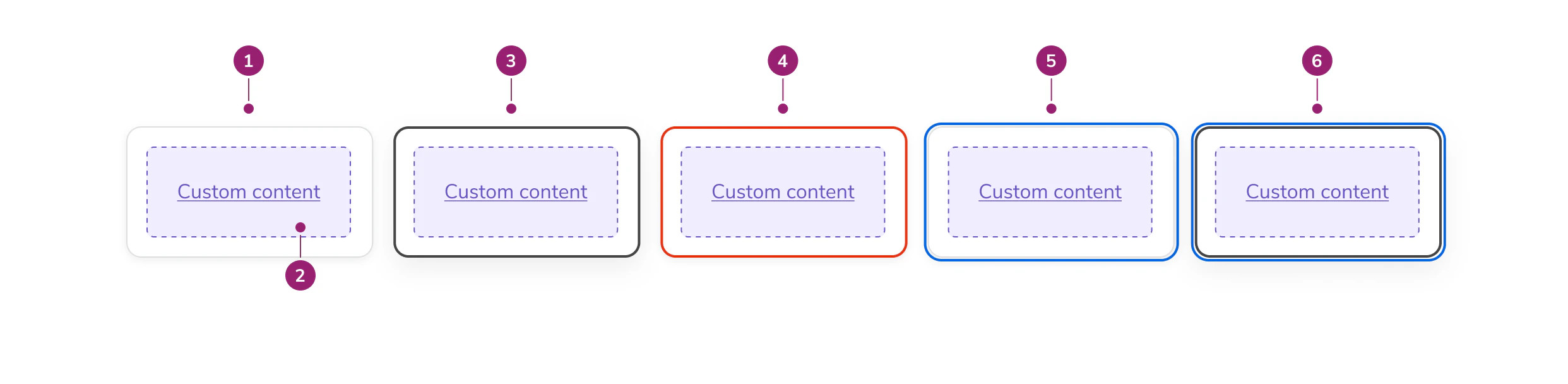
The Select Card consists of six primary elements that work together to create a card-like checkbox or radio with customizable inner content.

<Frame>
  <div className="w-full h-full bg-[#FFFFFF] p-2 rounded flex items-center justify-center">
    <img
      src="https://mintcdn.com/servicetitan/Z-EIF5iqj0kJVjT1/images/docs/web/components/select-card/design/selectcard-sub-elements-detailed-below.png?fit=max&auto=format&n=Z-EIF5iqj0kJVjT1&q=85&s=0b8bc34806f4998254550976bd596907"
      alt="SelectCard sub elements, detailed
below"
      width="2484"
      height="608"
      data-path="images/docs/web/components/select-card/design/selectcard-sub-elements-detailed-below.png"
    />
  </div>
</Frame>

1. **Card surface** - The interactive container that responds to user selection
2. **Inner contents** - Customizable content area for labels, descriptions, chips, or other elements
3. **Selected state** - Visual indicator showing the card is currently chosen
4. **Errored state** - Visual treatment indicating validation or selection errors
5. **Focused state** - Visual indicator showing keyboard focus
6. **Focused & selected state** - Combined visual treatment for focus and selection

## Options

The Select Card supports the following configurations to accommodate various selection scenarios.

### States

#### Default

<LiveCode example="selectcard-playground" screenshot fullWidth>
  ```tsx lines theme={null}
  import { SelectCard, Grid, Text, Chip } from "@servicetitan/anvil2";

  function App() {
    return (
      <SelectCard id="1" onChange={() => console.log("clicked")}>
        <Grid templateColumns="repeat(2, 1fr)" gap="4">
          <Text>Cooling Tune Up</Text>

          <Text style={{ textAlign: "right" }}>#4567-1</Text>

          <Text>10:30 AM</Text>

          <Chip label="Customer name" />
        </Grid>
      </SelectCard>
    );
  }

  export default App;
  ```
</LiveCode>

#### Selected

<LiveCode example="selectcard-defaultchecked" screenshot fullWidth>
  ```tsx lines theme={null}
  import { SelectCard, Grid, Text, Chip } from "@servicetitan/anvil2";

  function App() {
    return (
      <SelectCard
        id="1"
        onChange={() => {
          console.log("clicked");
        }}
        defaultChecked
      >
        <Grid templateColumns="repeat(2, 1fr)" gap="4">
          <Text>Cooling Tune Up</Text>

          <Text style={{ textAlign: "right" }}>#4567-1</Text>

          <Text>10:30 AM</Text>

          <Chip label="Customer name" />
        </Grid>
      </SelectCard>
    );
  }

  export default App;
  ```
</LiveCode>

#### Disabled

<LiveCode example="selectcard-disabled" screenshot fullWidth>
  ```tsx lines theme={null}
  import { SelectCard, Grid, Text, Chip } from "@servicetitan/anvil2";

  function App() {
    return (
      <SelectCard
        id="1"
        onChange={() => {
          console.log("clicked");
        }}
        disabled
      >
        <Grid templateColumns="repeat(2, 1fr)" gap="4">
          <Text>Cooling Tune Up</Text>

          <Text style={{ textAlign: "right" }}>#4567-1</Text>

          <Text>10:30 AM</Text>

          <Chip label="Customer name" />
        </Grid>
      </SelectCard>
    );
  }

  export default App;
  ```
</LiveCode>

#### Errored

<LiveCode example="selectcard-errored" screenshot fullWidth>
  ```tsx lines theme={null}
  import { SelectCard, Grid, Text, Chip } from "@servicetitan/anvil2";

  function App() {
    return (
      <SelectCard id="2" onChange={() => console.log("clicked")} errored>
        <Grid templateColumns="repeat(2, 1fr)" gap="4">
          <Text>Cooling Tune Up</Text>

          <Text style={{ textAlign: "right" }}>#4567-1</Text>

          <Text>10:30 AM</Text>

          <Chip label="Customer name" />
        </Grid>
      </SelectCard>
    );
  }

  export default App;
  ```
</LiveCode>

### Drop Shadows

SelectCard has a drop shadow by default. You can optionally remove it for use in galleries and other dense layouts where shadows may create visual noise.

### Select Indicator

Display a checkbox or radio indicator in a separate column on the left side of the card. The indicator type is automatically determined by the selection mode of the parent group.

<LiveCode example="selectcard-group-selectindicator" screenshot fullWidth>
  ```tsx lines theme={null}
  import { Chip, Grid, SelectCard, Text } from "@servicetitan/anvil2";

  function App() {
    return (
      <SelectCard.Group
        legend="Choose an option"
        selectionMode="single"
        showSelectIndicator
      >
        <Grid gap="4" templateColumns="repeat(3, 1fr)">
          {[
            {
              id: "1",
              label: "Cooling Tune Up",
              cost: "$100",
              timeEstimate: "1 hour",
            },
            {
              id: "2",
              label: "Heating Tune Up",
              cost: "$150",
              timeEstimate: "2 hours",
            },
            {
              id: "3",
              label: "Air Duct Cleaning",
              cost: "$200",
              timeEstimate: "3 hours",
            },
          ].map((item) => (
            <SelectCard key={item.id} id={item.id}>
              <Grid templateColumns="repeat(2, 1fr)" gap="4">
                <Text variant="headline" size="small" el="h2">
                  {item.label}
                </Text>
                <Chip label={item.cost} justifySelf="end" />
                <Text variant="body" size="small" subdued>
                  ~{item.timeEstimate}
                </Text>
              </Grid>
            </SelectCard>
          ))}
        </Grid>
      </SelectCard.Group>
    );
  }

  export default App;
  ```
</LiveCode>

## Behavior

The Select Card responds to user interaction with distinct visual states for selection, error, and focus.

## Usage Guidelines

Use the Select Card when providing card-like checkbox or radio options with customizable inner content.

### When to Use

#### As Checkbox Group

Use Select Cards within a checkbox group when users can select zero to many options.

<LiveCode example="selectcard-selectionmode-multiple" screenshot fullWidth>
  ```tsx lines theme={null}
  import { SelectCard, Flex, Text } from "@servicetitan/anvil2";

  function App() {
    return (
      <SelectCard.Group
        legend="Which method(s) of travel do you prefer?"
        required={false}
        selectionMode="multiple"
        onChange={(e) => {
          console.log(e);
        }}
      >
        <Flex alignItems="center" gap="2">
          <SelectCard
            onChange={() => {
              console.log("clicked");
            }}
            id="A"
          >
            <Text>Walking</Text>
          </SelectCard>
          <SelectCard
            onChange={() => {
              console.log("clicked");
            }}
            id="B"
          >
            <Text>Biking</Text>
          </SelectCard>
          <SelectCard
            onChange={() => {
              console.log("clicked");
            }}
            id="C"
          >
            <Text>Driving</Text>
          </SelectCard>
        </Flex>
      </SelectCard.Group>
    );
  }

  export default App;
  ```
</LiveCode>

#### As Radio Group

Use Select Cards as options in a radio group where users must make a single selection from mutually exclusive options.

<LiveCode example="selectcard-selectionmode-single" screenshot fullWidth>
  ```tsx lines theme={null}
  import { SelectCard, Flex, Text } from "@servicetitan/anvil2";

  function App() {
    return (
      <SelectCard.Group
        legend="Select your preferred pet"
        required={false}
        selectionMode="single"
        onChange={(e) => {
          console.log(e);
        }}
      >
        <Flex alignItems="center" gap="2">
          <SelectCard
            onChange={() => {
              console.log("clicked");
            }}
            id="A"
          >
            <Text>Cat</Text>
          </SelectCard>
          <SelectCard
            onChange={() => {
              console.log("clicked");
            }}
            id="B"
          >
            <Text>Dog</Text>
          </SelectCard>
          <SelectCard
            onChange={() => {
              console.log("clicked");
            }}
            id="C"
          >
            <Text>Bird</Text>
          </SelectCard>
        </Flex>
      </SelectCard.Group>
    );
  }

  export default App;
  ```
</LiveCode>

### Alternatives

#### Select Card vs Radio

Use Select Card when options require rich content like descriptions, images, or chips. Use Radio for simple text-only options in compact layouts.

#### Select Card vs Checkbox

Use Select Card when individual options need visual prominence and additional context. Use Checkbox for simple lists where space efficiency is important.

### How to Use

#### Default Selection in Radio Group

Provide a default option when using Select Card within a Radio Group. Default selections:

* Signal that a selection is required
* Expedite task completion
* Guide users toward a particular option

Avoid default selections when they could result in unexpected downstream effects.

## Content

Content within the Select Card should clearly communicate the option being selected. Keep inner content concise and scannable. Use labels, descriptions, chips, or other elements that help users quickly compare options.

### Using Drop Shadows

* In galleries and dense layouts, remove the drop shadow
* In other contexts, keep the drop shadow for visual separation

## Keyboard Interaction

Users can navigate the Select Card using standard keyboard controls.

| Key             | Interaction                                                           |
| --------------- | --------------------------------------------------------------------- |
| Keyboard arrows | Move between Select Cards when implemented as a Radio Group           |
| Tab             | Move to the next Select Card when implemented as a Checkbox Group     |
| Shift Tab       | Move to the previous Select Card when implemented as a Checkbox Group |
| Space           | Select card with focus when implemented as a Checkbox Group           |

### Accessibility

* Include Select Cards in a group with a descriptive legend
* Provide clear, distinct content for each card to help users differentiate options
* When a Select Card group has an error, include helper text to describe the error