> ## Documentation Index
> Fetch the complete documentation index at: https://anvil.servicetitan.com/llms.txt
> Use this file to discover all available pages before exploring further.

# Single Select Field – Design

> Select Field is a form element that allows users to search, filter, and select a single value from a list of options.

export const LiveCode = ({children, customHeight, clickToLoad, example, fullWidth, fullHeight, hideCodeInLiveCode, screenshot, screenshotOnly, showCode: showCodeProp}) => {
  const SCREENSHOTS_BASE = "https://servicetitan.github.io/anvil2-docs-live-code/screenshots";
  const STACKBLITZ_BASE = "https://stackblitz.com/github/servicetitan/anvil2-docs-live-code/tree/main/examples";
  const [showCodeBlock, setShowCodeBlock] = useState(showCodeProp ?? false);
  const [isLocalOverride, setIsLocalOverride] = useState(false);
  useEffect(() => {
    const examplePath = `/images/live-code-screenshots-tmp/${example}.png`;
    fetch(examplePath, {
      method: "HEAD"
    }).then(r => {
      if (r.ok) setIsLocalOverride(true);
    }).catch(() => {});
  }, [example]);
  const screenshotBase = isLocalOverride ? "/images/live-code-screenshots-tmp" : SCREENSHOTS_BASE;
  if (screenshotOnly) {
    return <Frame className="flex flex-col">
        <div className="flex dark:hidden" style={{
      justifyContent: "center",
      alignItems: "center",
      width: fullWidth ? "100%" : "50%",
      minHeight: fullHeight ? "284px" : undefined,
      background: "#FFFFFF"
    }}>
          <img srcset={`${screenshotBase}/${example}.png, ${screenshotBase}/${example}-2x.png 2x`} src={`${screenshotBase}/${example}.png`} alt={example} noZoom />
        </div>
        <div className="hidden dark:flex" style={{
      justifyContent: "center",
      alignItems: "center",
      width: fullWidth ? "100%" : "50%",
      minHeight: fullHeight ? "284px" : undefined,
      background: "#141414"
    }}>
          <img srcset={`${screenshotBase}/${example}-dark.png, ${screenshotBase}/${example}-dark-2x.png 2x`} src={`${screenshotBase}/${example}-dark.png`} alt={example} noZoom />
        </div>
      </Frame>;
  }
  if (screenshot) {
    return <Frame className="flex flex-col -mb-2">
        <div className="flex dark:hidden bg-white dark:bg-codeblock border border-gray-950/10 dark:border-white/10 dark:twoslash-dark rounded-2xl overflow-hidden" style={{
      justifyContent: "center",
      alignItems: "center",
      width: fullWidth ? "100%" : "50%",
      minHeight: fullHeight ? "284px" : undefined
    }}>
          <img srcset={`${screenshotBase}/${example}.png, ${screenshotBase}/${example}-2x.png 2x`} src={`${screenshotBase}/${example}.png`} alt={example} noZoom />
        </div>

        <div className="hidden dark:flex bg-white dark:bg-codeblock border border-gray-950/10 dark:border-white/10 dark:twoslash-dark rounded-2xl overflow-hidden" style={{
      background: "#141414",
      justifyContent: "center",
      alignItems: "center",
      width: fullWidth ? "100%" : "50%",
      minHeight: fullHeight ? "284px" : undefined
    }}>
          <img srcset={`${screenshotBase}/${example}-dark.png, ${screenshotBase}/${example}-dark-2x.png 2x`} src={`${screenshotBase}/${example}-dark.png`} alt={example} noZoom />
        </div>

        <div className="flex justify-end items-center text-xs py-2 px-1 gap-4">
          {!showCodeProp ? <button className="inline-flex justify-end items-center text-gray-700 dark:text-gray-50 hover:text-blue-500 dark:hover:text-blue-300 transition-colors group self-end gap-1 cursor-pointer" onClick={() => setShowCodeBlock(!showCodeBlock)} style={{
      appearance: "none"
    }}>
              <Icon icon="code" size="12px" className="group-hover:bg-blue-500 dark:group-hover:bg-blue-300" />
              <span>{showCodeBlock ? "Hide code" : "Show code"}</span>
            </button> : null}

          <a className="inline-flex justify-end items-center hover:text-blue-500 dark:hover:text-blue-300 transition-colors group self-end gap-1" href={`${STACKBLITZ_BASE}/${example}?file=src/App.tsx`} target="_blank" rel="noreferrer">
            <Icon icon="bolt" size="12px" className="group-hover:bg-blue-500 dark:group-hover:bg-blue-300" />
            <span>StackBlitz demo</span>
          </a>
        </div>

        <div className="grid transition-[grid-template-rows] duration-300 ease-in-out overflow-auto overflow-y-hidden overflow-x-auto" style={showCodeBlock ? {
      gridTemplateRows: "1fr"
    } : {
      gridTemplateRows: "0fr"
    }}>
          <div style={{
      minHeight: 0,
      overflowX: "auto",
      overflowY: "hidden",
      marginBlockStart: "-1.25rem",
      marginBlockEnd: "-1.5rem"
    }}>
            {children}
          </div>
        </div>
      </Frame>;
  } else {
    return <div style={{
      display: "flex",
      width: fullWidth ? "100%" : "50%",
      minHeight: customHeight ? customHeight : "316px",
      resize: "vertical",
      overflow: "auto"
    }}>
        <iframe title={example} style={{
      flex: 1,
      width: fullWidth ? "100%" : "50%",
      minHeight: customHeight ? customHeight : "316px"
    }} src={`${STACKBLITZ_BASE}/${example}?embed=1&hideNavigation=1&hideExplorer=1&terminalHeight=0&file=src/App.tsx${clickToLoad ? "&ctl=1" : ""}${hideCodeInLiveCode ? "&view=preview" : ""}`} allow="accelerometer; ambient-light-sensor; camera; encrypted-media; geolocation; gyroscope; hid; microphone; midi; payment; usb; vr; xr-spatial-tracking" sandbox="allow-forms allow-modals allow-popups allow-presentation allow-same-origin allow-scripts" />
      </div>;
  }
};

<Note>
  Not sure if you should use Select Field or Combobox? Select Field is in beta and is the planned replacement for [Combobox](/docs/web/components/combobox/design). See the [Select Field vs Combobox](#select-field-vs-combobox) comparison for guidance on which to use.
</Note>

<LiveCode example="selectfield-playground" screenshot fullWidth>
  ```tsx lines theme={null}
  import { useEffect, useRef, useState } from "react";
  import { SelectFieldSync, SelectFieldOption } from "@servicetitan/anvil2/beta";

  const options: SelectFieldOption[] = [
    { id: 1, label: "The Martian by Andy Weir" },
    { id: 2, label: "Gone Girl by Gillian Flynn" },
    { id: 3, label: "Mistborn: The Final Empire by Brandon Sanderson" },
    { id: 4, label: "Murder on the Orient Express by Agatha Christie" },
    { id: 5, label: "Dune by Frank Herbert" },
    { id: 6, label: "Beloved by Toni Morrison" },
    { id: 7, label: "Atomic Habits by James Clear" },
    { id: 8, label: "Sapiens by Yuval Noah Harari" },
  ];

  function App() {
    const [value, setValue] = useState<SelectFieldOption | null>(null);
    const containerRef = useRef<HTMLDivElement>(null);

    useEffect(() => {
      const trigger = containerRef.current?.querySelector("input");
      trigger?.click();
    }, []);

    return (
      <div ref={containerRef} style={{ minWidth: "384px", minHeight: "380px" }}>
        <SelectFieldSync
          label="Favorite book"
          placeholder="Search books..."
          options={options}
          value={value}
          onSelectedOptionChange={setValue}
        />
      </div>
    );
  }

  export default App;
  ```
</LiveCode>

## Anatomy

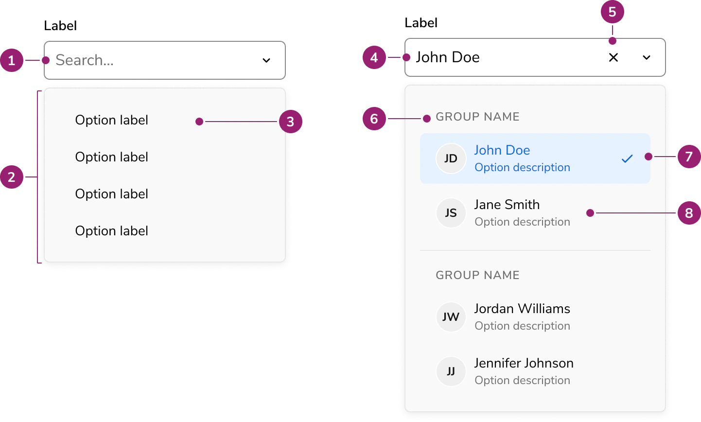
The Select Field consists of eight elements that work together to allow users to search and select a single value from a list of options.

<Frame>
  <div className="w-full h-full bg-[#FFFFFF] p-2 rounded flex items-center justify-center">
    <img src="https://mintcdn.com/servicetitan/yMyP2mRFjq4alcb1/images/docs/web/components/select-field/single/Anatomy.png?fit=max&auto=format&n=yMyP2mRFjq4alcb1&q=85&s=cf22794d9dbeb7360e96463fa9c1fd46" alt="Select Field anatomy" width="1442" height="868" data-path="images/docs/web/components/select-field/single/Anatomy.png" />
  </div>
</Frame>

1. Placeholder text
2. Popover
3. Option
4. Selected value
5. Selected options overflow
6. Clear button (Optional)
7. Section header
8. Rich content option

## Options

The Select Field supports the following configurations to accommodate a wide range of selection scenarios.

### Selection options

#### Search

<LiveCode example="selectfield-search" screenshot fullWidth>
  ```tsx lines theme={null}
  import { useEffect, useRef, useState } from "react";
  import { SelectFieldSync, SelectFieldOption } from "@servicetitan/anvil2/beta";

  const options: SelectFieldOption[] = [
    { id: 1, label: "The Martian by Andy Weir" },
    { id: 2, label: "Gone Girl by Gillian Flynn" },
    { id: 3, label: "Mistborn: The Final Empire by Brandon Sanderson" },
    { id: 4, label: "Murder on the Orient Express by Agatha Christie" },
    { id: 5, label: "Dune by Frank Herbert" },
    { id: 6, label: "Beloved by Toni Morrison" },
    { id: 7, label: "Atomic Habits by James Clear" },
    { id: 8, label: "Sapiens by Yuval Noah Harari" },
  ];

  function App() {
    const [value, setValue] = useState<SelectFieldOption | null>(null);
    const containerRef = useRef<HTMLDivElement>(null);

    useEffect(() => {
      const trigger = containerRef.current?.querySelector("input");
      trigger?.click();
    }, []);

    return (
      <div ref={containerRef} style={{ minWidth: "384px", minHeight: "380px" }}>
        <SelectFieldSync
          label="Favorite book"
          placeholder="Search books..."
          options={options}
          value={value}
          onSelectedOptionChange={setValue}
        />
      </div>
    );
  }

  export default App;
  ```
</LiveCode>

By default, Select Field provides a searchable text input that filters options as users type.

#### Select-only

<LiveCode example="selectfield-select-only" screenshot fullWidth>
  ```tsx lines theme={null}
  import { useEffect, useRef, useState } from "react";
  import { SelectFieldSync, SelectFieldOption } from "@servicetitan/anvil2/beta";

  const options: SelectFieldOption[] = [
    { id: 1, label: "The Martian by Andy Weir" },
    { id: 2, label: "Gone Girl by Gillian Flynn" },
    { id: 3, label: "Mistborn: The Final Empire by Brandon Sanderson" },
    { id: 4, label: "Murder on the Orient Express by Agatha Christie" },
    { id: 5, label: "Dune by Frank Herbert" },
    { id: 6, label: "Beloved by Toni Morrison" },
    { id: 7, label: "Atomic Habits by James Clear" },
    { id: 8, label: "Sapiens by Yuval Noah Harari" },
  ];

  function App() {
    const [value, setValue] = useState<SelectFieldOption | null>(null);
    const containerRef = useRef<HTMLDivElement>(null);

    useEffect(() => {
      const trigger = containerRef.current?.querySelector('[role="combobox"]');
      if (trigger instanceof HTMLElement) trigger.click();
    }, []);

    return (
      <div ref={containerRef} style={{ minWidth: "384px", minHeight: "380px" }}>
        <SelectFieldSync
          disableSearch
          label="Favorite book"
          placeholder="Select a book..."
          options={options}
          value={value}
          onSelectedOptionChange={setValue}
        />
      </div>
    );
  }

  export default App;
  ```
</LiveCode>

When search adds no value — such as with short, well-known option lists — disable it to present a simpler select-only trigger. The select-only mode uses the listbox ARIA pattern instead of combobox.

### Menu display options

Select Field displays options in a popover by default on desktop and a dialog on mobile. Override this adaptive behavior by setting the display mode explicitly to always use a popover or always use a dialog.

#### In a Popover

<LiveCode example="selectfield-display-popover" screenshot fullWidth>
  ```tsx lines theme={null}
  import { useEffect, useRef, useState } from "react";
  import { SelectFieldSync, SelectFieldOption } from "@servicetitan/anvil2/beta";

  const options: SelectFieldOption[] = [
    { id: 1, label: "The Martian by Andy Weir" },
    { id: 2, label: "Gone Girl by Gillian Flynn" },
    { id: 3, label: "Mistborn: The Final Empire by Brandon Sanderson" },
    { id: 4, label: "Murder on the Orient Express by Agatha Christie" },
    { id: 5, label: "Dune by Frank Herbert" },
  ];

  function App() {
    const [value, setValue] = useState<SelectFieldOption | null>(null);
    const containerRef = useRef<HTMLDivElement>(null);

    useEffect(() => {
      const timer = setTimeout(() => {
        const trigger = containerRef.current?.querySelector("input");
        trigger?.focus();
        trigger?.click();
      }, 100);
      return () => clearTimeout(timer);
    }, []);

    return (
      <div ref={containerRef} style={{ minWidth: "384px", minHeight: "380px" }}>
        <SelectFieldSync
          displayMenuAs="popover"
          label="Favorite book"
          placeholder="Search books..."
          options={options}
          value={value}
          onSelectedOptionChange={setValue}
        />
      </div>
    );
  }

  export default App;
  ```
</LiveCode>

#### In a Dialog

<LiveCode example="selectfield-display-dialog" screenshot fullWidth>
  ```tsx lines theme={null}
  import { useEffect, useRef, useState } from "react";
  import { SelectFieldSync, SelectFieldOption } from "@servicetitan/anvil2/beta";

  const options: SelectFieldOption[] = [
    { id: 1, label: "The Martian by Andy Weir" },
    { id: 2, label: "Gone Girl by Gillian Flynn" },
    { id: 3, label: "Mistborn: The Final Empire by Brandon Sanderson" },
    { id: 4, label: "Murder on the Orient Express by Agatha Christie" },
    { id: 5, label: "Dune by Frank Herbert" },
    { id: 6, label: "Beloved by Toni Morrison" },
    { id: 7, label: "Atomic Habits by James Clear" },
    { id: 8, label: "Sapiens by Yuval Noah Harari" },
  ];

  function App() {
    const [value, setValue] = useState<SelectFieldOption | null>(null);
    const containerRef = useRef<HTMLDivElement>(null);

    useEffect(() => {
      const timer = setTimeout(() => {
        const trigger = containerRef.current?.querySelector("input");
        trigger?.focus();
        trigger?.click();
      }, 100);
      return () => clearTimeout(timer);
    }, []);

    return (
      <div ref={containerRef} style={{ minWidth: "384px", minHeight: "380px" }}>
        <SelectFieldSync
          displayMenuAs="dialog"
          label="Favorite book"
          placeholder="Search books..."
          options={options}
          value={value}
          onSelectedOptionChange={setValue}
        />
      </div>
    );
  }

  export default App;
  ```
</LiveCode>

### Sections

<LiveCode example="selectfield-sections" screenshot fullWidth>
  ```tsx lines theme={null}
  import { useEffect, useRef, useState } from "react";
  import { SelectFieldSync, SelectFieldOption } from "@servicetitan/anvil2/beta";

  const options: SelectFieldOption[] = [
    { id: 1, label: "The Great Gatsby", group: "fiction" },
    { id: 2, label: "To Kill a Mockingbird", group: "fiction" },
    { id: 3, label: "1984", group: "fiction" },
    { id: 4, label: "Sapiens", group: "non-fiction" },
    { id: 5, label: "Thinking, Fast and Slow", group: "non-fiction" },
    { id: 6, label: "The Martian", group: "sci-fi" },
    { id: 7, label: "Dune", group: "sci-fi" },
    { id: 8, label: "Foundation", group: "sci-fi" },
  ];

  const groupLabels: Record<string, string> = {
    fiction: "Fiction",
    "non-fiction": "Non-Fiction",
    "sci-fi": "Science Fiction",
  };

  function App() {
    const [value, setValue] = useState<SelectFieldOption | null>(null);
    const containerRef = useRef<HTMLDivElement>(null);

    useEffect(() => {
      const timer = setTimeout(() => {
        const trigger = containerRef.current?.querySelector("input");
        trigger?.focus();
        trigger?.click();
      }, 100);
      return () => clearTimeout(timer);
    }, []);

    return (
      <div ref={containerRef} style={{ minWidth: "384px", minHeight: "560px" }}>
        <SelectFieldSync
          label="Books by genre"
          placeholder="Search books..."
          options={options}
          groupToString={(group) => groupLabels[group as string] ?? String(group)}
          value={value}
          onSelectedOptionChange={setValue}
        />
      </div>
    );
  }

  export default App;
  ```
</LiveCode>

Sections divide options into labeled groups, helping users scan and identify related items. Every section requires a label.

#### Pinned sections

Sections can be pinned to the top of the list. Pinned sections are useful for surfacing frequently used options, recent selections, or AI-powered suggestions without requiring the user to search for them.

### Rich content

<LiveCode example="selectfield-rich-content" screenshot fullWidth>
  ```tsx lines theme={null}
  import { useEffect, useRef, useState } from "react";
  import { SelectField, SelectFieldOption } from "@servicetitan/anvil2/beta";

  const options: SelectFieldOption[] = [
    {
      id: 1,
      label: "Label only",
    },
    {
      id: 2,
      label: "Title + description",
      content: {
        title: "Title + description",
        description: "A short description providing extra context",
      },
    },
    {
      id: 3,
      label: "Title + chips",
      content: {
        title: "Title + chips",
        chips: [{ label: "Tag A" }, { label: "Tag B", color: "#F97316" }],
      },
    },
    {
      id: 4,
      label: "Title + description + avatar",
      content: {
        title: "Title + description + avatar",
        description: "Option with an avatar",
        avatar: { name: "Jane Doe", color: "#6366F1" },
      },
    },
    {
      id: 5,
      label: "Title + description + chips",
      content: {
        title: "Title + description + chips",
        description: "Option with chip tags",
        chips: [{ label: "Tag A" }, { label: "Tag B", color: "#F97316" }],
      },
    },
  ];

  function App() {
    const [value, setValue] = useState<SelectFieldOption | null>(null);
    const containerRef = useRef<HTMLDivElement>(null);

    useEffect(() => {
      const timer = setTimeout(() => {
        const trigger = containerRef.current?.querySelector("input");
        trigger?.focus();
        trigger?.click();
      }, 100);
      return () => clearTimeout(timer);
    }, []);

    return (
      <div ref={containerRef} style={{ minWidth: "384px", minHeight: "420px" }}>
        <SelectField
          label="Rich content options"
          placeholder="Search options..."
          loadOptions={() => options}
          value={value}
          onSelectedOptionChange={setValue}
        />
      </div>
    );
  }

  export default App;
  ```
</LiveCode>

Options support rich content including titles, descriptions, avatars, icons, and chips. Rich content helps users distinguish between similarly named items or convey additional metadata at a glance.

### Lazy loading options

<LiveCode example="selectfield-lazy-loading" screenshot fullWidth>
  ```tsx lines theme={null}
  import { useEffect, useRef, useState } from "react";
  import { SelectField, SelectFieldOption } from "@servicetitan/anvil2/beta";

  const allBooks = Array.from({ length: 100 }, (_, i) => ({
    id: `book-${i + 1}`,
    label: `Book ${i + 1}`,
  }));

  function App() {
    const [value, setValue] = useState<SelectFieldOption | null>(null);
    const containerRef = useRef<HTMLDivElement>(null);

    useEffect(() => {
      const trigger = containerRef.current?.querySelector("input");
      trigger?.click();
    }, []);

    return (
      <div ref={containerRef} style={{ minWidth: "384px", minHeight: "420px" }}>
        <SelectField
          lazy="page"
          lazyOptions={{ pageSize: 10 }}
          loadOptions={async (searchValue, pageNumber, pageSize) => {
            await new Promise((r) => setTimeout(r, 300));

            const filtered = allBooks.filter((b) =>
              b.label.toLowerCase().includes(searchValue.toLowerCase()),
            );
            const start = pageNumber * pageSize;
            const page = filtered.slice(start, start + pageSize);

            return {
              options: page,
              hasMore: start + page.length < filtered.length,
            };
          }}
          label="Books (lazy loading)"
          placeholder="Search books..."
          value={value}
          onSelectedOptionChange={setValue}
        />
      </div>
    );
  }

  export default App;
  ```
</LiveCode>

For large datasets, options load on demand as users scroll through the list. Three pagination strategies are supported: page-based, offset-based, and group-based. Results are cached by default to avoid redundant requests.

### Field Options

#### Sizes

<LiveCode example="selectfield-sizes" screenshot fullWidth>
  ```tsx lines theme={null}
  import { useState } from "react";
  import { Flex } from "@servicetitan/anvil2";
  import { SelectFieldSync, SelectFieldOption } from "@servicetitan/anvil2/beta";

  const options: SelectFieldOption[] = [
    { id: 1, label: "The Martian by Andy Weir" },
    { id: 2, label: "Gone Girl by Gillian Flynn" },
    { id: 3, label: "Dune by Frank Herbert" },
    { id: 4, label: "Beloved by Toni Morrison" },
    { id: 5, label: "Atomic Habits by James Clear" },
  ];

  function App() {
    const [smallValue, setSmallValue] = useState<SelectFieldOption | null>(null);
    const [mediumValue, setMediumValue] = useState<SelectFieldOption | null>(
      null,
    );
    const [largeValue, setLargeValue] = useState<SelectFieldOption | null>(null);

    return (
      <Flex direction="column" gap="6" style={{ maxWidth: 320 }}>
        <SelectFieldSync
          size="small"
          label="Small"
          placeholder="Search books..."
          options={options}
          value={smallValue}
          onSelectedOptionChange={setSmallValue}
        />
        <SelectFieldSync
          size="medium"
          label="Medium (default)"
          placeholder="Search books..."
          options={options}
          value={mediumValue}
          onSelectedOptionChange={setMediumValue}
        />
        <SelectFieldSync
          size="large"
          label="Large"
          placeholder="Search books..."
          options={options}
          value={largeValue}
          onSelectedOptionChange={setLargeValue}
        />
      </Flex>
    );
  }

  export default App;
  ```
</LiveCode>

Three sizes are available: small, medium, and large. Choose a size that aligns with the surrounding form layout and density.

#### Prefix and suffix

<LiveCode example="selectfield-prefix-suffix" screenshot fullWidth>
  ```tsx lines theme={null}
  import { useState } from "react";
  import { SelectFieldSync, SelectFieldOption } from "@servicetitan/anvil2/beta";

  const options: SelectFieldOption[] = [
    { id: 1, label: "0-25" },
    { id: 2, label: "25-50" },
    { id: 3, label: "50-100" },
    { id: 4, label: "100+" },
  ];

  function App() {
    const [value, setValue] = useState<SelectFieldOption | null>(null);

    return (
      <div style={{ width: 320 }}>
        <SelectFieldSync
          label="Price range"
          placeholder="Select price range..."
          options={options}
          prefix="$"
          suffix="USD"
          value={value}
          onSelectedOptionChange={setValue}
        />
      </div>
    );
  }

  export default App;
  ```
</LiveCode>

Add content before or after the input to provide additional context, such as currency symbols or units.

## Behavior

The Select Field responds to user interaction with search filtering and distinct visual states.

### Visual states

<LiveCode example="selectfield-visual-states" screenshot fullWidth>
  ```tsx lines theme={null}
  import { useState } from "react";
  import { Flex } from "@servicetitan/anvil2";
  import { SelectFieldSync, SelectFieldOption } from "@servicetitan/anvil2/beta";

  const options: SelectFieldOption[] = [
    { id: 1, label: "The Martian by Andy Weir" },
    { id: 2, label: "Gone Girl by Gillian Flynn" },
    { id: 3, label: "Dune by Frank Herbert" },
    { id: 4, label: "Beloved by Toni Morrison" },
    { id: 5, label: "Atomic Habits by James Clear" },
  ];

  function App() {
    const [value, setValue] = useState<SelectFieldOption | null>(null);

    return (
      <Flex direction="column" gap="6" style={{ width: 320 }}>
        <SelectFieldSync
          label="Disabled"
          placeholder="Search books..."
          options={options}
          value={options[0]}
          onSelectedOptionChange={setValue}
          disabled
        />
        <SelectFieldSync
          label="Read-only"
          placeholder="Search books..."
          options={options}
          value={options[0]}
          onSelectedOptionChange={setValue}
          readOnly
        />
        <SelectFieldSync
          label="Error"
          placeholder="Search books..."
          options={options}
          value={value}
          onSelectedOptionChange={setValue}
          error="Please select a book"
        />
      </Flex>
    );
  }

  export default App;
  ```
</LiveCode>

Select Field supports standard form field states. Disabled prevents all interaction. Read-only allows viewing options without changing the selection. Error highlights validation issues with a message. Required marks the field as mandatory with a visual indicator.

### Search and filtering

<LiveCode example="selectfield-search-filtering" screenshot fullWidth>
  ```tsx lines theme={null}
  import { useEffect, useRef, useState } from "react";
  import { SelectFieldSync, SelectFieldOption } from "@servicetitan/anvil2/beta";

  const options: SelectFieldOption[] = [
    { id: 1, label: "The Martian by Andy Weir" },
    { id: 2, label: "Gone Girl by Gillian Flynn" },
    { id: 3, label: "Mistborn: The Final Empire by Brandon Sanderson" },
    { id: 4, label: "Murder on the Orient Express by Agatha Christie" },
    { id: 5, label: "Dune by Frank Herbert" },
    { id: 6, label: "Beloved by Toni Morrison" },
    { id: 7, label: "Atomic Habits by James Clear" },
    { id: 8, label: "Sapiens by Yuval Noah Harari" },
  ];

  function App() {
    const [value, setValue] = useState<SelectFieldOption | null>(null);
    const containerRef = useRef<HTMLDivElement>(null);

    useEffect(() => {
      const trigger = containerRef.current?.querySelector("input");
      trigger?.click();
    }, []);

    return (
      <div ref={containerRef} style={{ minWidth: "384px", minHeight: "380px" }}>
        <SelectFieldSync
          label="Favorite book"
          placeholder="Try typing to filter..."
          options={options}
          value={value}
          onSelectedOptionChange={setValue}
        />
      </div>
    );
  }

  export default App;
  ```
</LiveCode>

In combobox mode, typing in the input filters options in real time. Results are ranked by match quality so the most relevant options appear first. Search input is automatically debounced to reduce unnecessary requests when loading options asynchronously.

## Usage Guidelines

### When to Use

Use the Select Field when you need to:

* Select a single option from a medium-to-large set of options
* Provide typeahead search to help users narrow results
* Load options from a server with pagination support
* Organize options into groups or pinned sections
* Display a simplified, opinionated select experience in a form

### When not to use

Avoid using the Select Field for:

* There are only a few items to choose from. A [radio](/docs/web/components/radio/design) or [checkbox](/docs/web/components/checkbox/design) group may be more appropriate.
* When a particularly complex selection interaction is needed, in which case a [Listbox](/docs/web/components/listbox/design) in a special layout may be preferred.
* In navigational contexts.

### Alternatives

#### Select Field vs Combobox

Select Field is the eventual replacement for the [Combobox](/docs/web/components/combobox/design) component. Use Select Field when looking for features such as Dialog viewing, standardized content display, secondary actions, sectioning, or lazy loading.

Consider using the Combobox if needing a stable component in your application.

#### Select Field vs Select Trigger

Select Field displays options in a built-in Popover or Dialog with integrated search and filtering. [Select Trigger](/docs/web/components/select-trigger/design) opens a custom overlay — typically a Dialog — that the implementor fully controls.

### How to Use

#### Labels and help

For guidance on labels, placeholders, and help text, refer to the [Form pattern](/docs/web/patterns/forms).

#### Sorting options

Select Field does not prescribe how options are sorted. Common sorting strategies include alphabetical, time-based, and categorical. Choose a sort order that matches user expectations for the data.

## Content

Content within the Select Field should clearly communicate available options and help users identify the correct selection.

* Use clear, concise option labels that users recognize immediately
* Add descriptions to rich content options when labels alone are insufficient to distinguish items
* Use pinned sections to surface frequently used or contextually relevant options

For additional content guidance, refer to the [Form pattern](/docs/web/patterns/forms).

## Keyboard Interaction

Users can navigate the Select Field using standard keyboard controls. Keyboard behavior differs between combobox mode (search enabled) and select mode (search disabled).

### Search enabled

#### Text field

| Key        | Interaction                                                                                                                                                                                     |
| ---------- | ----------------------------------------------------------------------------------------------------------------------------------------------------------------------------------------------- |
| Down Arrow | If the listbox is displayed, moves visual focus to the first option. If the listbox is not displayed, opens it and moves visual focus to the first option. DOM focus remains on the text field. |
| Up Arrow   | If the listbox is displayed, moves visual focus to the last option. If the listbox is not displayed, opens it and moves visual focus to the last option. DOM focus remains on the text field.   |
| Enter      | Closes the listbox if displayed.                                                                                                                                                                |
| Escape     | If the listbox is displayed, closes it. If the listbox is not displayed, clears the text field.                                                                                                 |

#### Popup

| Key        | Interaction                                                           |
| ---------- | --------------------------------------------------------------------- |
| Enter      | Sets the text field value to the focused option and closes the popup. |
| Escape     | Closes the popup and returns visual focus to the text field.          |
| Down Arrow | Moves visual focus to the next option. Wraps from last to first.      |
| Up Arrow   | Moves visual focus to the previous option. Wraps from first to last.  |

### Search disabled

| Key           | Interaction                                            |
| ------------- | ------------------------------------------------------ |
| Enter / Space | Opens the listbox.                                     |
| Down Arrow    | Opens the listbox and moves focus to the first option. |
| Up Arrow      | Opens the listbox and moves focus to the last option.  |
| Escape        | Closes the listbox.                                    |

### Accessibility

Anvil provides accessibility support for Select Field out of the box. In combobox mode, the component follows the combobox ARIA pattern. In select mode, it follows the listbox ARIA pattern.

For more guidance on building accessible form controls, see [custom component best practices](/docs/accessibility/custom-components).