> ## Documentation Index
> Fetch the complete documentation index at: https://anvil.servicetitan.com/llms.txt
> Use this file to discover all available pages before exploring further.

# Side Nav – Design

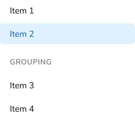
> Side Navs are used to display a list of links to move between pages.

export const LiveCode = ({children, customHeight, clickToLoad, example, fullWidth, fullHeight, hideCodeInLiveCode, screenshot, screenshotOnly, showCode: showCodeProp}) => {
  const SCREENSHOTS_BASE = "https://servicetitan.github.io/anvil2-docs-live-code/screenshots";
  const STACKBLITZ_BASE = "https://stackblitz.com/github/servicetitan/anvil2-docs-live-code/tree/main/examples";
  const [showCodeBlock, setShowCodeBlock] = useState(showCodeProp ?? false);
  const [isLocalOverride, setIsLocalOverride] = useState(false);
  useEffect(() => {
    const examplePath = `/images/live-code-screenshots-tmp/${example}.png`;
    fetch(examplePath, {
      method: "HEAD"
    }).then(r => {
      if (r.ok) setIsLocalOverride(true);
    }).catch(() => {});
  }, [example]);
  const screenshotBase = isLocalOverride ? "/images/live-code-screenshots-tmp" : SCREENSHOTS_BASE;
  if (screenshotOnly) {
    return <Frame className="flex flex-col">
        <div className="flex dark:hidden" style={{
      justifyContent: "center",
      alignItems: "center",
      width: fullWidth ? "100%" : "50%",
      minHeight: fullHeight ? "284px" : undefined,
      background: "#FFFFFF"
    }}>
          <img srcset={`${screenshotBase}/${example}.png, ${screenshotBase}/${example}-2x.png 2x`} src={`${screenshotBase}/${example}.png`} alt={example} noZoom />
        </div>
        <div className="hidden dark:flex" style={{
      justifyContent: "center",
      alignItems: "center",
      width: fullWidth ? "100%" : "50%",
      minHeight: fullHeight ? "284px" : undefined,
      background: "#141414"
    }}>
          <img srcset={`${screenshotBase}/${example}-dark.png, ${screenshotBase}/${example}-dark-2x.png 2x`} src={`${screenshotBase}/${example}-dark.png`} alt={example} noZoom />
        </div>
      </Frame>;
  }
  if (screenshot) {
    return <Frame className="flex flex-col -mb-2">
        <div className="flex dark:hidden bg-white dark:bg-codeblock border border-gray-950/10 dark:border-white/10 dark:twoslash-dark rounded-2xl overflow-hidden" style={{
      justifyContent: "center",
      alignItems: "center",
      width: fullWidth ? "100%" : "50%",
      minHeight: fullHeight ? "284px" : undefined
    }}>
          <img srcset={`${screenshotBase}/${example}.png, ${screenshotBase}/${example}-2x.png 2x`} src={`${screenshotBase}/${example}.png`} alt={example} noZoom />
        </div>

        <div className="hidden dark:flex bg-white dark:bg-codeblock border border-gray-950/10 dark:border-white/10 dark:twoslash-dark rounded-2xl overflow-hidden" style={{
      background: "#141414",
      justifyContent: "center",
      alignItems: "center",
      width: fullWidth ? "100%" : "50%",
      minHeight: fullHeight ? "284px" : undefined
    }}>
          <img srcset={`${screenshotBase}/${example}-dark.png, ${screenshotBase}/${example}-dark-2x.png 2x`} src={`${screenshotBase}/${example}-dark.png`} alt={example} noZoom />
        </div>

        <div className="flex justify-end items-center text-xs py-2 px-1 gap-4">
          {!showCodeProp ? <button className="inline-flex justify-end items-center text-gray-700 dark:text-gray-50 hover:text-blue-500 dark:hover:text-blue-300 transition-colors group self-end gap-1 cursor-pointer" onClick={() => setShowCodeBlock(!showCodeBlock)} style={{
      appearance: "none"
    }}>
              <Icon icon="code" size="12px" className="group-hover:bg-blue-500 dark:group-hover:bg-blue-300" />
              <span>{showCodeBlock ? "Hide code" : "Show code"}</span>
            </button> : null}

          <a className="inline-flex justify-end items-center hover:text-blue-500 dark:hover:text-blue-300 transition-colors group self-end gap-1" href={`${STACKBLITZ_BASE}/${example}?file=src/App.tsx`} target="_blank" rel="noreferrer">
            <Icon icon="bolt" size="12px" className="group-hover:bg-blue-500 dark:group-hover:bg-blue-300" />
            <span>StackBlitz demo</span>
          </a>
        </div>

        <div className="grid transition-[grid-template-rows] duration-300 ease-in-out overflow-auto overflow-y-hidden overflow-x-auto" style={showCodeBlock ? {
      gridTemplateRows: "1fr"
    } : {
      gridTemplateRows: "0fr"
    }}>
          <div style={{
      minHeight: 0,
      overflowX: "auto",
      overflowY: "hidden",
      marginBlockStart: "-1.25rem",
      marginBlockEnd: "-1.5rem"
    }}>
            {children}
          </div>
        </div>
      </Frame>;
  } else {
    return <div style={{
      display: "flex",
      width: fullWidth ? "100%" : "50%",
      minHeight: customHeight ? customHeight : "316px",
      resize: "vertical",
      overflow: "auto"
    }}>
        <iframe title={example} style={{
      flex: 1,
      width: fullWidth ? "100%" : "50%",
      minHeight: customHeight ? customHeight : "316px"
    }} src={`${STACKBLITZ_BASE}/${example}?embed=1&hideNavigation=1&hideExplorer=1&terminalHeight=0&file=src/App.tsx${clickToLoad ? "&ctl=1" : ""}${hideCodeInLiveCode ? "&view=preview" : ""}`} allow="accelerometer; ambient-light-sensor; camera; encrypted-media; geolocation; gyroscope; hid; microphone; midi; payment; usb; vr; xr-spatial-tracking" sandbox="allow-forms allow-modals allow-popups allow-presentation allow-same-origin allow-scripts" />
      </div>;
  }
};

export const CodePreviewPlaceholder = ({double, fullWidth}) => {
  const single = <div style={{
    width: fullWidth ? "100%" : "50%",
    borderRadius: "1rem",
    display: "flex",
    padding: "1rem",
    flexDirection: "column",
    gap: "0.5rem",
    height: "10rem",
    marginBlockEnd: "1rem"
  }} className="border-width-default border-color-subdued">
      <div className="bg-strong border-radius-large" style={{
    width: "100%",
    flexGrow: "1"
  }} />
      <div className="bg-strong border-radius-large" style={{
    width: "100%",
    flexGrow: "1"
  }} />
    </div>;
  return double ? <div style={{
    display: "flex",
    gap: "1rem"
  }}>
      {single}
      {single}
    </div> : single;
};

<Frame>
  <div className="w-full h-full bg-[#FFFFFF] p-2 rounded flex items-center justify-center">
    <img noZoom src="https://mintcdn.com/servicetitan/uz2PQSvO75TRhQ38/images/docs/web/components/shared/overview-of-a-side-nav.png?fit=max&auto=format&n=uz2PQSvO75TRhQ38&q=85&s=27b02db811499bfd0a371a67db6e855d" width="440" height="388" data-path="images/docs/web/components/shared/overview-of-a-side-nav.png" />
  </div>
</Frame>

## Anatomy

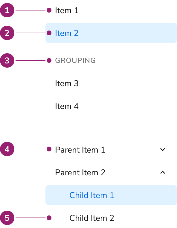
The Side Nav consists of five primary elements that work together to display a list of links to move between pages.

<Frame>
  <div className="w-full h-full bg-[#FFFFFF] p-2 rounded flex items-center justify-center">
    <img
      src="https://mintcdn.com/servicetitan/usDdQzJfkl6jYYLR/images/docs/web/components/side-nav/design/anatomy-of-a-side-nav.png?fit=max&auto=format&n=usDdQzJfkl6jYYLR&q=85&s=38257bf447e6a72c682ba383d70bc903"
      alt="Anatomy of a Side
Nav"
      width="592"
      height="762"
      data-path="images/docs/web/components/side-nav/design/anatomy-of-a-side-nav.png"
    />
  </div>
</Frame>

1. Item
2. Selected item
3. Group section
4. Collapsible parent item
5. Nested item

## Options

The Side Nav supports flat list, grouping, and collapsible configurations to accommodate various navigation scenarios.

### Flat List

<LiveCode example="sidenav-group-false" screenshot fullWidth>
  ```tsx lines theme={null}
  import { SideNav, type SideNavLinkProps } from "@servicetitan/anvil2";
  import { useState, type MouseEvent } from "react";

  function App() {
    const [active, setActive] = useState("2");
    const handleOnClick = (
      _e: MouseEvent<HTMLAnchorElement>,
      id: SideNavLinkProps["id"],
    ) => {
      setActive(id);
    };

    return (
      <SideNav>
        <SideNav.Link id="1" onClick={handleOnClick} active={active === "1"}>
          Side Nav Item 1
        </SideNav.Link>
        <SideNav.Link id="2" onClick={handleOnClick} active={active === "2"}>
          Side Nav Item 2
        </SideNav.Link>
        <SideNav.Link id="3" onClick={handleOnClick} active={active === "3"}>
          Side Nav Item 3
        </SideNav.Link>
        <SideNav.Link id="4" onClick={handleOnClick} active={active === "4"}>
          Side Nav Item 4
        </SideNav.Link>
        <SideNav.Link id="5" onClick={handleOnClick} active={active === "5"}>
          Side Nav Item 5
        </SideNav.Link>
        <SideNav.Link id="6" onClick={handleOnClick} active={active === "6"}>
          Side Nav Item 6
        </SideNav.Link>
      </SideNav>
    );
  }

  export default App;
  ```
</LiveCode>

### Grouping

<LiveCode example="sidenav-group" screenshot fullWidth>
  ```tsx lines theme={null}
  import { SideNav, type SideNavLinkProps } from "@servicetitan/anvil2";
  import { useState, type MouseEvent } from "react";

  function App() {
    const [active, setActive] = useState("2");
    const handleOnClick = (
      _e: MouseEvent<HTMLAnchorElement>,
      id: SideNavLinkProps["id"],
    ) => {
      setActive(id);
    };

    return (
      <SideNav aria-label="Side Nav Title">
        <SideNav.Group label="Group Item 1">
          <SideNav.Link id="1" onClick={handleOnClick} active={active === "1"}>
            Side Nav Item 1
          </SideNav.Link>
          <SideNav.Link id="2" onClick={handleOnClick} active={active === "2"}>
            Side Nav Item 2
          </SideNav.Link>
          <SideNav.Link id="3" onClick={handleOnClick} active={active === "3"}>
            Side Nav Item 3
          </SideNav.Link>
        </SideNav.Group>
        <SideNav.Group label="Group Item 2">
          <SideNav.Link id="4" onClick={handleOnClick} active={active === "4"}>
            Side Nav Item 4
          </SideNav.Link>
          <SideNav.Link id="5" onClick={handleOnClick} active={active === "5"}>
            Side Nav Item 5
          </SideNav.Link>
          <SideNav.Link id="6" onClick={handleOnClick} active={active === "6"}>
            Side Nav Item 6
          </SideNav.Link>
        </SideNav.Group>
      </SideNav>
    );
  }

  export default App;
  ```
</LiveCode>

### Collapsible

Parent items are purely accordions, and are not links themselves.

<LiveCode example="sidenav-collapsible" screenshot fullWidth>
  ```tsx lines theme={null}
  import { SideNav, type SideNavLinkProps } from "@servicetitan/anvil2";
  import { useState, type MouseEvent } from "react";

  function App() {
    const [active, setActive] = useState("2");
    const handleOnClick = (
      _e: MouseEvent<HTMLAnchorElement>,
      id: SideNavLinkProps["id"],
    ) => {
      setActive(id);
    };

    return (
      <SideNav aria-label="Side Nav Title">
        <SideNav.Collapsible defaultExpanded label="Parent Item 1">
          <SideNav.Link id="1" onClick={handleOnClick} active={active === "1"}>
            Child Item 1
          </SideNav.Link>
          <SideNav.Link id="2" onClick={handleOnClick} active={active === "2"}>
            Child Item 2
          </SideNav.Link>
          <SideNav.Link id="3" onClick={handleOnClick} active={active === "3"}>
            Child Item 3
          </SideNav.Link>
        </SideNav.Collapsible>

        <SideNav.Collapsible label="Parent Item 2">
          <SideNav.Link id="4" onClick={handleOnClick} active={active === "4"}>
            Child Item 1
          </SideNav.Link>
          <SideNav.Link id="5" onClick={handleOnClick} active={active === "5"}>
            Child Item 2
          </SideNav.Link>
          <SideNav.Link id="6" onClick={handleOnClick} active={active === "6"}>
            Child Item 3
          </SideNav.Link>
        </SideNav.Collapsible>

        <SideNav.Collapsible defaultExpanded label="Parent Item 3">
          <SideNav.Link id="7" onClick={handleOnClick} active={active === "7"}>
            Child Item 1
          </SideNav.Link>
          <SideNav.Link id="8" onClick={handleOnClick} active={active === "8"}>
            Child Item 2
          </SideNav.Link>
          <SideNav.Link id="9" onClick={handleOnClick} active={active === "9"}>
            Child Item 3
          </SideNav.Link>
        </SideNav.Collapsible>
      </SideNav>
    );
  }

  export default App;
  ```
</LiveCode>

## Behavior

The Side Nav responds to user interaction with distinct visual states and text overflow handling.

### Visual States

<LiveCode example="sidenav-data-interactive" screenshot fullWidth>
  ```tsx lines theme={null}
  import { SideNav } from "@servicetitan/anvil2";

  function App() {
    return (
      <SideNav>
        <SideNav.Link id="1">Rest</SideNav.Link>
        <SideNav.Link id="1" data-interactive="hover">
          Hover
        </SideNav.Link>
        <SideNav.Link id="1" data-interactive="active">
          Active
        </SideNav.Link>
        <SideNav.Link id="1" data-interactive="focus-visible">
          Focus Visible
        </SideNav.Link>
        <SideNav.Link id="1" disabled>
          Disabled
        </SideNav.Link>
      </SideNav>
    );
  }

  export default App;
  ```
</LiveCode>

<LiveCode example="sidenav-data-interactive-selected" screenshot fullWidth>
  ```tsx lines theme={null}
  import { SideNav } from "@servicetitan/anvil2";

  function App() {
    return (
      <SideNav>
        <SideNav.Link id="1" active>
          Selected Rest
        </SideNav.Link>
        <SideNav.Link id="1" data-interactive="hover" active>
          Selected Hover
        </SideNav.Link>
        <SideNav.Link id="1" data-interactive="active" active>
          Selected Active
        </SideNav.Link>
        <SideNav.Link id="1" data-interactive="focus-visible" active>
          Selected Focus Visible
        </SideNav.Link>
        <SideNav.Link id="1" disabled active>
          Selected Disabled
        </SideNav.Link>
      </SideNav>
    );
  }

  export default App;
  ```
</LiveCode>

### Text Overflow

Each item in the Side Nav will wrap when not enough space is available.

<LiveCode example="sidenav-group-overflow" screenshot fullWidth>
  ```tsx lines theme={null}
  import { SideNav, type SideNavLinkProps } from "@servicetitan/anvil2";
  import { useState, type MouseEvent } from "react";

  function App() {
    const [active, setActive] = useState("2");
    const handleOnClick = (
      _e: MouseEvent<HTMLAnchorElement>,
      id: SideNavLinkProps["id"],
    ) => {
      setActive(id);
    };

    return (
      <SideNav style={{ maxWidth: "200px" }} aria-label="Side Nav Title">
        <SideNav.Group label="Group item that will wrap when not enough space is available">
          <SideNav.Collapsible
            defaultExpanded
            label="Parent item that will wrap when not enough space is available"
          >
            <SideNav.Link id="7" onClick={handleOnClick} active={active === "1"}>
              Child Item 1
            </SideNav.Link>
            <SideNav.Link id="8" onClick={handleOnClick} active={active === "2"}>
              Child item that will wrap when not enough space is available
            </SideNav.Link>
            <SideNav.Link id="9" onClick={handleOnClick} active={active === "3"}>
              Child Item 3
            </SideNav.Link>
          </SideNav.Collapsible>
        </SideNav.Group>
      </SideNav>
    );
  }

  export default App;
  ```
</LiveCode>

## Usage Guidelines

Use the Side Nav to display a list of links for moving between pages.

### When to Use

Use the Side Nav based on how the larger app organizes its navigation structure. In some cases this means the Side Nav is the top-level navigation tool, in others it may be a secondary system.

#### Use a collapsible Side Nav when users understand the hierarchy

Use a collapsible Side Nav when users understand the categorization, helping them find items more effectively. Avoid this structure if there's no clear parent-child relation in the nav, especially if users cannot perceive it.

#### Use a flat Side Nav for fewer or semi-related items

Use a flat Side Nav when items in a group lack a clear hierarchy. A flattened Side Nav is easier for users to navigate in this situation.

### Alternatives

#### Side Nav vs Tab

Side Navs and Tabs perform similar tasks of organizing content. In most situations, Side Navs are a higher level of the navigation structure compared to Tabs. Side Navs are also able to organize less related items together compared to Tabs.

### How to Use

#### Pair subheaders and collapsible in complex navs

Navigations with nuanced levels of hierarchy can use both subheaders and nesting at once. Simpler navigations should consider using only one grouping method.

<LiveCode example="sidenav-complex-do" screenshot fullWidth>
  ```tsx lines theme={null}
  import { SideNav, type SideNavLinkProps } from "@servicetitan/anvil2";
  import { useState, type MouseEvent } from "react";

  function App() {
    const [active, setActive] = useState("2");
    const handleOnClick = (
      _e: MouseEvent<HTMLAnchorElement>,
      id: SideNavLinkProps["id"],
    ) => {
      setActive(id);
    };

    return (
      <SideNav aria-label="Side Nav Title">
        <SideNav.Group label="Food">
          <SideNav.Collapsible defaultExpanded label="Fruits">
            <SideNav.Link id="1" onClick={handleOnClick} active={active === "1"}>
              Apple
            </SideNav.Link>
            <SideNav.Link id="2" onClick={handleOnClick} active={active === "2"}>
              Bananna
            </SideNav.Link>
            <SideNav.Link id="3" onClick={handleOnClick} active={active === "3"}>
              Orange
            </SideNav.Link>
          </SideNav.Collapsible>
          <SideNav.Collapsible
            defaultExpanded
            label="Vegetables"
          ></SideNav.Collapsible>
        </SideNav.Group>

        <SideNav.Group label="Kitchenware">
          <SideNav.Collapsible
            defaultExpanded
            label="Cutlery"
          ></SideNav.Collapsible>
          <SideNav.Collapsible
            defaultExpanded
            label="Dinnerware"
          ></SideNav.Collapsible>
        </SideNav.Group>
      </SideNav>
    );
  }

  export default App;
  ```
</LiveCode>

#### Parent nav items can only be collapsible actions

The Side Nav's parent item can never be a link. If a parent item link is needed, a child item at the top may be used in its place, e.g., Overview.

<LiveCode example="sidenav-link-dont" screenshot fullWidth>
  ```tsx lines theme={null}
  import { SideNav, type SideNavLinkProps } from "@servicetitan/anvil2";
  import { useState, type MouseEvent } from "react";

  function App() {
    const [active, setActive] = useState("1");
    const handleOnClick = (
      _e: MouseEvent<HTMLAnchorElement>,
      id: SideNavLinkProps["id"],
    ) => {
      setActive(id);
    };

    return (
      <SideNav aria-label="Side Nav Title">
        <SideNav.Collapsible defaultExpanded label="Components">
          <SideNav.Link id="1" onClick={handleOnClick} active={active === "1"}>
            Overview
          </SideNav.Link>
          <SideNav.Link id="2" onClick={handleOnClick} active={active === "2"}>
            Button
          </SideNav.Link>
          <SideNav.Link id="3" onClick={handleOnClick} active={active === "3"}>
            Link
          </SideNav.Link>
        </SideNav.Collapsible>
      </SideNav>
    );
  }

  export default App;
  ```
</LiveCode>

#### Don't use multi-nested Navs

The Side Nav does not support deep navigation. Simplify the navigation structure first. If it cannot be simplified, a custom solution is needed.

<LiveCode example="sidenav-nesting-dont" screenshot fullWidth>
  ```tsx lines theme={null}
  import { SideNav, type SideNavLinkProps } from "@servicetitan/anvil2";
  import { useState, type MouseEvent } from "react";

  function App() {
    const [active, setActive] = useState("2");
    const handleOnClick = (
      _e: MouseEvent<HTMLAnchorElement>,
      id: SideNavLinkProps["id"],
    ) => {
      setActive(id);
    };

    return (
      <SideNav aria-label="Side Nav Title">
        <SideNav.Collapsible defaultExpanded label="Parent Item 1">
          <SideNav.Link id="1" onClick={handleOnClick} active={active === "1"}>
            Child Item 1
          </SideNav.Link>
          <SideNav.Collapsible
            defaultExpanded
            label="Child Item 2"
          ></SideNav.Collapsible>

          <SideNav.Link
            id="2"
            onClick={handleOnClick}
            active={active === "2"}
            style={{ marginLeft: "1.5rem" }}
          >
            Grandchild Item 1
          </SideNav.Link>
          <SideNav.Link
            id="4"
            onClick={handleOnClick}
            active={active === "4"}
            style={{ marginLeft: "1.5rem" }}
          >
            Grandchild Item 2
          </SideNav.Link>
        </SideNav.Collapsible>

        <SideNav.Collapsible label="Parent Item 2">
          <SideNav.Link id="5" onClick={handleOnClick} active={active === "5"}>
            Child Item 1
          </SideNav.Link>
          <SideNav.Link id="6" onClick={handleOnClick} active={active === "6"}>
            Child Item 2
          </SideNav.Link>
          <SideNav.Link id="7" onClick={handleOnClick} active={active === "7"}>
            Child Item 3
          </SideNav.Link>
        </SideNav.Collapsible>
      </SideNav>
    );
  }

  export default App;
  ```
</LiveCode>

<Danger>**Don't**</Danger>

#### Don't add secondary actions

The Side Nav does not support secondary actions for accessibility reasons. Consider placing these actions elsewhere, such as on the page the Side Nav item goes to.

<LiveCode example="sidenav-secondary-dont" screenshot fullWidth>
  ```tsx lines theme={null}
  import { SideNav, Button, type SideNavLinkProps } from "@servicetitan/anvil2";
  import Edit from "@servicetitan/anvil2/assets/icons/material/round/edit.svg";
  import { useState, type MouseEvent } from "react";

  function App() {
    const [active, setActive] = useState("2");
    const handleOnClick = (
      _e: MouseEvent<HTMLAnchorElement>,
      id: SideNavLinkProps["id"],
    ) => {
      setActive(id);
    };

    return (
      <SideNav aria-label="Side Nav Title">
        <SideNav.Link id="1" onClick={handleOnClick} active={active === "1"}>
          Side Nav Item 1 <Button size="small" icon={Edit} />
        </SideNav.Link>
        <SideNav.Link id="2" onClick={handleOnClick} active={active === "2"}>
          Side Nav Item 2 <Button size="small" icon={Edit} />
        </SideNav.Link>
        <SideNav.Link id="3" onClick={handleOnClick} active={active === "3"}>
          Side Nav Item 3 <Button size="small" icon={Edit} />
        </SideNav.Link>
        <SideNav.Link id="4" onClick={handleOnClick} active={active === "4"}>
          Side Nav Item 4 <Button size="small" icon={Edit} />
        </SideNav.Link>
        <SideNav.Link id="5" onClick={handleOnClick} active={active === "5"}>
          Side Nav Item 5 <Button size="small" icon={Edit} />
        </SideNav.Link>
        <SideNav.Link id="6" onClick={handleOnClick} active={active === "6"}>
          Side Nav Item 6 <Button size="small" icon={Edit} />
        </SideNav.Link>
      </SideNav>
    );
  }

  export default App;
  ```
</LiveCode>

<Danger>**Don't**</Danger>

#### Showing metadata with Chips

A [Chip](/docs/web/components/chip/design) can be paired with the Side Nav. It can be used to provide metadata such as beta or new status, or a numerical value related to the Side Nav item.

<LiveCode example="sidenav-chip-do" screenshot fullWidth>
  ```tsx lines theme={null}
  import {
    SideNav,
    Flex,
    Chip,
    type SideNavLinkProps,
  } from "@servicetitan/anvil2";
  import { core } from "@servicetitan/anvil2/token";
  import { useState, type MouseEvent } from "react";

  function App() {
    const [active, setActive] = useState("2");
    const handleOnClick = (
      _e: MouseEvent<HTMLAnchorElement>,
      id: SideNavLinkProps["id"],
    ) => {
      setActive(id);
    };

    return (
      <SideNav>
        <SideNav.Link id="1" onClick={handleOnClick} active={active === "1"}>
          <Flex
            gap={2}
            alignItems="center"
            justifyContent="space-between"
            style={{ width: "100%" }}
          >
            Side Nav Item
            <Chip label="55" size="small" />
          </Flex>
        </SideNav.Link>
        <SideNav.Link id="2" onClick={handleOnClick} active={active === "2"}>
          Side Nav Item
        </SideNav.Link>
        <SideNav.Link id="3" onClick={handleOnClick} active={active === "3"}>
          <Flex
            gap={2}
            alignItems="center"
            justifyContent="space-between"
            style={{ width: "100%" }}
          >
            Side Nav Item
            <Chip
              label="Beta"
              size="small"
              color={core?.primitive?.ColorPurple100.value}
            />
          </Flex>
        </SideNav.Link>
        <SideNav.Link id="4" onClick={handleOnClick} active={active === "4"}>
          Side Nav Item
        </SideNav.Link>
        <SideNav.Link id="5" onClick={handleOnClick} active={active === "5"}>
          Side Nav Item
        </SideNav.Link>
      </SideNav>
    );
  }

  export default App;
  ```
</LiveCode>

## Content

Content within the Side Nav should clearly communicate navigation destinations through descriptive labels.

## Keyboard Interaction

Users can navigate the Side Nav using standard keyboard controls.

| Key            | Interaction                                                |
| -------------- | ---------------------------------------------------------- |
| Down Arrow     | Moves focus to next item                                   |
| Up Arrow       | Moves focus to previous item                               |
| Enter or Space | Selects item, expands/collapses. Focus stays on that item. |