> ## Documentation Index
> Fetch the complete documentation index at: https://anvil.servicetitan.com/llms.txt
> Use this file to discover all available pages before exploring further.

# Skeleton – Design

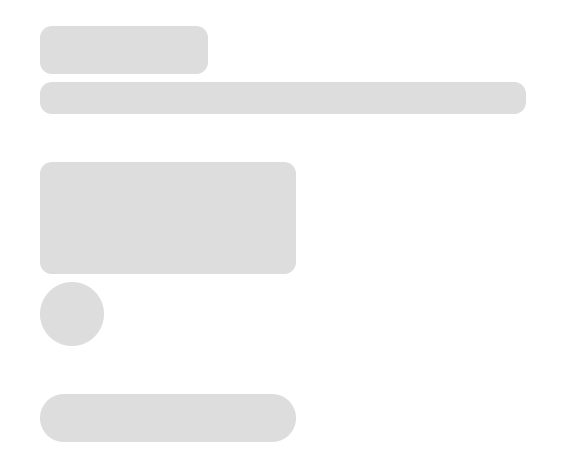
> Skeletons are placeholders for content which hasn't yet loaded.

export const LiveCode = ({children, customHeight, clickToLoad, example, fullWidth, fullHeight, hideCodeInLiveCode, screenshot, screenshotOnly, showCode: showCodeProp}) => {
  const SCREENSHOTS_BASE = "https://servicetitan.github.io/anvil2-docs-live-code/screenshots";
  const STACKBLITZ_BASE = "https://stackblitz.com/github/servicetitan/anvil2-docs-live-code/tree/main/examples";
  const [showCodeBlock, setShowCodeBlock] = useState(showCodeProp ?? false);
  const [isLocalOverride, setIsLocalOverride] = useState(false);
  useEffect(() => {
    const examplePath = `/images/live-code-screenshots-tmp/${example}.png`;
    fetch(examplePath, {
      method: "HEAD"
    }).then(r => {
      if (r.ok) setIsLocalOverride(true);
    }).catch(() => {});
  }, [example]);
  const screenshotBase = isLocalOverride ? "/images/live-code-screenshots-tmp" : SCREENSHOTS_BASE;
  if (screenshotOnly) {
    return <Frame className="flex flex-col">
        <div className="flex dark:hidden" style={{
      justifyContent: "center",
      alignItems: "center",
      width: fullWidth ? "100%" : "50%",
      minHeight: fullHeight ? "284px" : undefined,
      background: "#FFFFFF"
    }}>
          <img srcset={`${screenshotBase}/${example}.png, ${screenshotBase}/${example}-2x.png 2x`} src={`${screenshotBase}/${example}.png`} alt={example} noZoom />
        </div>
        <div className="hidden dark:flex" style={{
      justifyContent: "center",
      alignItems: "center",
      width: fullWidth ? "100%" : "50%",
      minHeight: fullHeight ? "284px" : undefined,
      background: "#141414"
    }}>
          <img srcset={`${screenshotBase}/${example}-dark.png, ${screenshotBase}/${example}-dark-2x.png 2x`} src={`${screenshotBase}/${example}-dark.png`} alt={example} noZoom />
        </div>
      </Frame>;
  }
  if (screenshot) {
    return <Frame className="flex flex-col -mb-2">
        <div className="flex dark:hidden bg-white dark:bg-codeblock border border-gray-950/10 dark:border-white/10 dark:twoslash-dark rounded-2xl overflow-hidden" style={{
      justifyContent: "center",
      alignItems: "center",
      width: fullWidth ? "100%" : "50%",
      minHeight: fullHeight ? "284px" : undefined
    }}>
          <img srcset={`${screenshotBase}/${example}.png, ${screenshotBase}/${example}-2x.png 2x`} src={`${screenshotBase}/${example}.png`} alt={example} noZoom />
        </div>

        <div className="hidden dark:flex bg-white dark:bg-codeblock border border-gray-950/10 dark:border-white/10 dark:twoslash-dark rounded-2xl overflow-hidden" style={{
      background: "#141414",
      justifyContent: "center",
      alignItems: "center",
      width: fullWidth ? "100%" : "50%",
      minHeight: fullHeight ? "284px" : undefined
    }}>
          <img srcset={`${screenshotBase}/${example}-dark.png, ${screenshotBase}/${example}-dark-2x.png 2x`} src={`${screenshotBase}/${example}-dark.png`} alt={example} noZoom />
        </div>

        <div className="flex justify-end items-center text-xs py-2 px-1 gap-4">
          {!showCodeProp ? <button className="inline-flex justify-end items-center text-gray-700 dark:text-gray-50 hover:text-blue-500 dark:hover:text-blue-300 transition-colors group self-end gap-1 cursor-pointer" onClick={() => setShowCodeBlock(!showCodeBlock)} style={{
      appearance: "none"
    }}>
              <Icon icon="code" size="12px" className="group-hover:bg-blue-500 dark:group-hover:bg-blue-300" />
              <span>{showCodeBlock ? "Hide code" : "Show code"}</span>
            </button> : null}

          <a className="inline-flex justify-end items-center hover:text-blue-500 dark:hover:text-blue-300 transition-colors group self-end gap-1" href={`${STACKBLITZ_BASE}/${example}?file=src/App.tsx`} target="_blank" rel="noreferrer">
            <Icon icon="bolt" size="12px" className="group-hover:bg-blue-500 dark:group-hover:bg-blue-300" />
            <span>StackBlitz demo</span>
          </a>
        </div>

        <div className="grid transition-[grid-template-rows] duration-300 ease-in-out overflow-auto overflow-y-hidden overflow-x-auto" style={showCodeBlock ? {
      gridTemplateRows: "1fr"
    } : {
      gridTemplateRows: "0fr"
    }}>
          <div style={{
      minHeight: 0,
      overflowX: "auto",
      overflowY: "hidden",
      marginBlockStart: "-1.25rem",
      marginBlockEnd: "-1.5rem"
    }}>
            {children}
          </div>
        </div>
      </Frame>;
  } else {
    return <div style={{
      display: "flex",
      width: fullWidth ? "100%" : "50%",
      minHeight: customHeight ? customHeight : "316px",
      resize: "vertical",
      overflow: "auto"
    }}>
        <iframe title={example} style={{
      flex: 1,
      width: fullWidth ? "100%" : "50%",
      minHeight: customHeight ? customHeight : "316px"
    }} src={`${STACKBLITZ_BASE}/${example}?embed=1&hideNavigation=1&hideExplorer=1&terminalHeight=0&file=src/App.tsx${clickToLoad ? "&ctl=1" : ""}${hideCodeInLiveCode ? "&view=preview" : ""}`} allow="accelerometer; ambient-light-sensor; camera; encrypted-media; geolocation; gyroscope; hid; microphone; midi; payment; usb; vr; xr-spatial-tracking" sandbox="allow-forms allow-modals allow-popups allow-presentation allow-same-origin allow-scripts" />
      </div>;
  }
};

export const CodePreviewPlaceholder = ({double, fullWidth}) => {
  const single = <div style={{
    width: fullWidth ? "100%" : "50%",
    borderRadius: "1rem",
    display: "flex",
    padding: "1rem",
    flexDirection: "column",
    gap: "0.5rem",
    height: "10rem",
    marginBlockEnd: "1rem"
  }} className="border-width-default border-color-subdued">
      <div className="bg-strong border-radius-large" style={{
    width: "100%",
    flexGrow: "1"
  }} />
      <div className="bg-strong border-radius-large" style={{
    width: "100%",
    flexGrow: "1"
  }} />
    </div>;
  return double ? <div style={{
    display: "flex",
    gap: "1rem"
  }}>
      {single}
      {single}
    </div> : single;
};

<Frame>
  <div className="w-full h-full bg-[#FFFFFF] p-2 rounded flex items-center justify-center">
    <img noZoom src="https://mintcdn.com/servicetitan/H5FwKyiqhPVZ1UJQ/images/docs/web/components/shared/skeleton-main-image.png?fit=max&auto=format&n=H5FwKyiqhPVZ1UJQ&q=85&s=a8a097a29aa59772106190189df6a4c7" width="566" height="468" data-path="images/docs/web/components/shared/skeleton-main-image.png" />
  </div>
</Frame>

## Anatomy

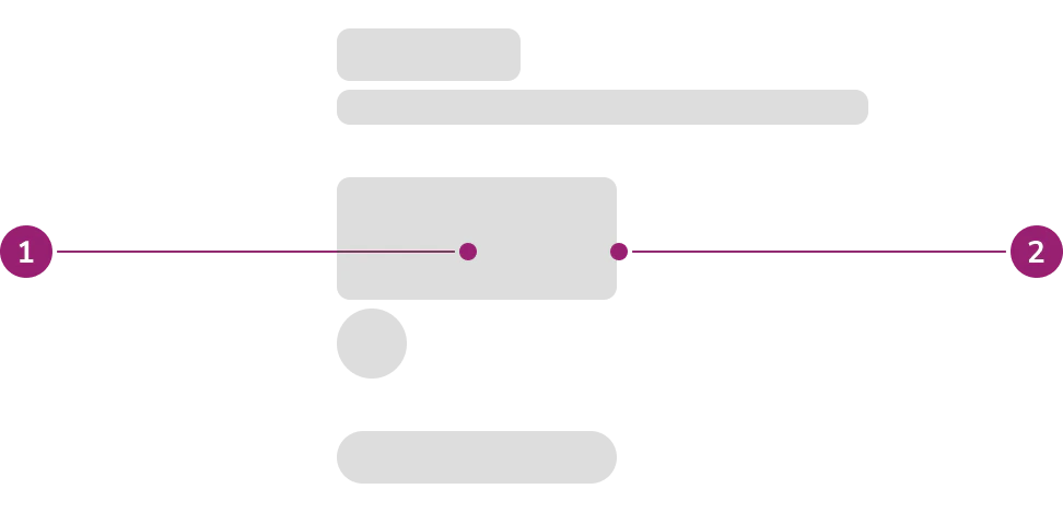
The Skeleton consists of two primary elements that work together to create placeholders for content which hasn't yet loaded.

<Frame>
  <div className="w-full h-full bg-[#FFFFFF] p-2 rounded flex items-center justify-center">
    <img
      src="https://mintcdn.com/servicetitan/usDdQzJfkl6jYYLR/images/docs/web/components/skeleton/design/skeleton-anatomy.png?fit=max&auto=format&n=usDdQzJfkl6jYYLR&q=85&s=a47a1c7aae45f7d2a21918634ec499d2"
      alt="skeleton
anatomy"
      width="972"
      height="468"
      data-path="images/docs/web/components/skeleton/design/skeleton-anatomy.png"
    />
  </div>
</Frame>

1. Fill
2. Container

## Options

The Skeleton supports text and shape configurations to accommodate various content placeholder scenarios.

### Text

#### Headline

Use the headline option to indicate loading of a title.

<LiveCode example="skeleton-text-headline" screenshot fullWidth>
  ```tsx lines theme={null}
  import { Skeleton } from "@servicetitan/anvil2";

  function App() {
    return <Skeleton.Text variant="headline" style={{ width: "300px" }} />;
  }

  export default App;
  ```
</LiveCode>

#### Body Text

Use the body text option to indicate loading of a sentence, string of text, or a paragraph.

<LiveCode example="skeleton-text-body" screenshot fullWidth>
  ```tsx lines theme={null}
  import { Skeleton, Flex } from "@servicetitan/anvil2";

  function App() {
    return (
      <Flex direction="column" gap="5" style={{ width: "300px" }}>
        <Skeleton.Text />
        <Skeleton.Text rows={5} />
      </Flex>
    );
  }

  export default App;
  ```
</LiveCode>

### Shape

#### Rectangle

Use the rectangle option to indicate loading of card, button, image, or sectional content.

<LiveCode example="skeleton-rectangle" screenshot fullWidth>
  ```tsx lines theme={null}
  import { Skeleton, Flex } from "@servicetitan/anvil2";

  function App() {
    return (
      <Flex direction="column" gap="5" style={{ width: "300px" }}>
        <Skeleton.Rectangle />
        <Skeleton.Rectangle height="4rem" />
        <Skeleton.Rectangle height="100px" />
      </Flex>
    );
  }

  export default App;
  ```
</LiveCode>

#### Circle

Use the circle option to indicate loading of an avatar.

<LiveCode example="skeleton-circle" screenshot fullWidth>
  ```tsx lines theme={null}
  import { Skeleton, Flex } from "@servicetitan/anvil2";

  function App() {
    return (
      <Flex direction="row" gap="5">
        <Skeleton.Circle />
        <Skeleton.Circle diameter="50px" />
        <Skeleton.Circle diameter="4rem" />
      </Flex>
    );
  }

  export default App;
  ```
</LiveCode>

#### Pill

Use the pill option to indicate loading of a chip.

<LiveCode example="skeleton-pill" screenshot fullWidth>
  ```tsx lines theme={null}
  import { Skeleton, Flex } from "@servicetitan/anvil2";

  function App() {
    return (
      <Flex direction="column" gap="5">
        <Skeleton.Pill />
        <Skeleton.Pill width="50px" />
        <Skeleton.Pill width="6rem" />
      </Flex>
    );
  }

  export default App;
  ```
</LiveCode>

### AI

Use the AI option to indicate loading of AI-generated content. All Skeleton variants support an AI style that replaces the default gray gradient with blue gradient colors.

<LiveCode example="skeleton-ai" screenshot fullWidth>
  ```tsx lines theme={null}
  import { Skeleton, Flex } from "@servicetitan/anvil2";

  function App() {
    return (
      <Flex direction="column" gap="5" style={{ width: "300px" }}>
        <Flex direction="row" gap="3" alignItems="center">
          <Skeleton.Circle ai diameter="2.5rem" />
          <Flex direction="column" gap="2" grow={1}>
            <Skeleton.Text ai variant="headline" />
            <Skeleton.Pill ai width="4rem" />
          </Flex>
        </Flex>
        <Skeleton.Text ai rows={3} />
        <Skeleton.Rectangle ai height="6rem" />
      </Flex>
    );
  }

  export default App;
  ```
</LiveCode>

## Usage Guidelines

Use the Skeleton when the implementation knows the approximate UI that is to be loaded.

### When to Use

* When the implementation knows the approximate UI that is to be loaded
* When loading page initially
* When loading content through pagination, filtering, or searching
* When loading dynamic content initially
  * Dynamic content requires an external service to provide the content
  * Examples include:
    * Combobox items
    * Table
    * Card grid

### When not to use

* Do not show Skeleton or any loading state if loading takes less than 1 second. Content loading in less than 1 second [keeps the user's flow of thought seamless](https://www.nngroup.com/articles/response-times-3-important-limits/).
* Use Spinner for loading additional content, for example in infinite scrolling experiences

### How to Use

Skeletonized UI should be an approximation of the UI that is loading and not meant to recreate every element that will load.

#### Scope of skeleton

Apply Skeleton to everything in the same scope. In this context, scope refers to component that is awaiting for the data to be fetched.

* Full Skeleton
  * Fetching data to render grid of cards → everything inside the Card is skeletonized
  * Fetching table data → table is skeletonized everything inside the Table is skeletonized
* Partial Skeleton
  * Card as a section containing title and content that requires fetch
    * Title is not part of the fetch scope, so this is static and not to be skeletonized
    * Example of fetch content: Listbox with dynamic options, data visualization, score card (label + data number)
    * Note that if there is higher level fetch that affects other sibling, this Card can also be fully skeletonized. Example: Jira ticket type of page level loading

#### Repeated content

For **repeated** content, use skeleton to fill up **3/4** of the available space. For example, even if a grid of Cards are expected to overflow, only fill 3/4 of the available space with the skeleton.

#### Non-repeated content

For **non-repeated** content, keep it above the fold as much as possible

* This is to reduce unnecessary scrolling of the page while contents are still loading in
* Approximation of the UI can be minified to keep things above the fold
  * Example: Even if we expect a long blog post, it can be reduced to a two-paragraph skeleton to keep it above the fold.

#### Example

<LiveCode example="skeleton-playground" screenshot fullWidth>
  ```tsx lines theme={null}
  import {
    Skeleton,
    Button,
    Flex,
    Card,
    Avatar,
    Text,
  } from "@servicetitan/anvil2";
  import { useState } from "react";

  function App() {
    const [loading, setLoading] = useState(true);

    return (
      <Flex direction="column" gap="4">
        <Card
          flexGrow="1"
          flexDirection="column"
          gap="2"
          style={{ width: "200px" }}
        >
          {loading ? (
            <>
              <Skeleton.Circle diameter="3rem" />
              <Skeleton.Text variant="headline" />
              <Skeleton.Text rows={2} />
            </>
          ) : (
            <>
              <Avatar name="Ben Ho" size="large" />
              <Text variant="headline" el="h6" size="small">
                Ben Ho
              </Text>
              <Text>Lorem ipsum dolor sit amet.</Text>
            </>
          )}
        </Card>
        <Button
          style={{ alignSelf: "start" }}
          onClick={() => setLoading(!loading)}
        >
          Toggle loading
        </Button>
      </Flex>
    );
  }

  export default App;
  ```
</LiveCode>

## Content

Content within the Skeleton should approximate the UI that is loading without recreating every element.

## Keyboard Interaction

Skeletons are not focusable and do not support keyboard interaction.