> ## Documentation Index
> Fetch the complete documentation index at: https://anvil.servicetitan.com/llms.txt
> Use this file to discover all available pages before exploring further.
# Spinner – Design
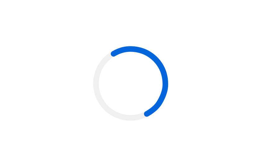
> Spinners are ephemeral indicators for loading or processing states.
export const DoDont = ({text, type, children}) => {
return <>
{type === "do" &&
{children &&
{children}
}
Do
{text && {text}}
{children &&
{children}
}
Don't
{text && {text}}
{children &&
{children}
}
Caution
{text && {text}}
{single}
{single}
: single;
};
## Anatomy
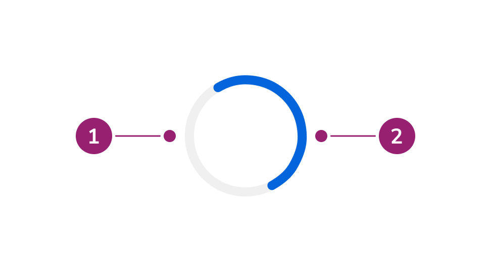
The Spinner consists of two primary elements that work together to indicate loading or processing states.
1. Track (circular background)
2. Arc (animated rotating segment)
## Options
The Spinner supports multiple sizes and color configurations to accommodate various loading indicator scenarios.
#### Size
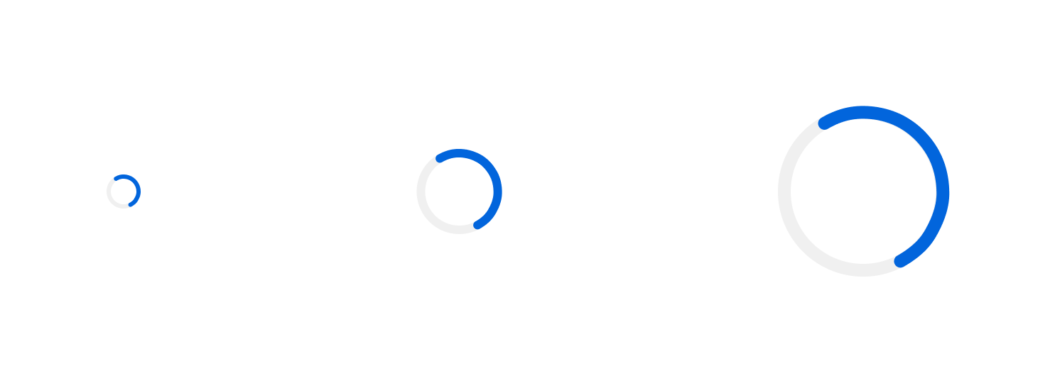
Spinners come in three sizes:
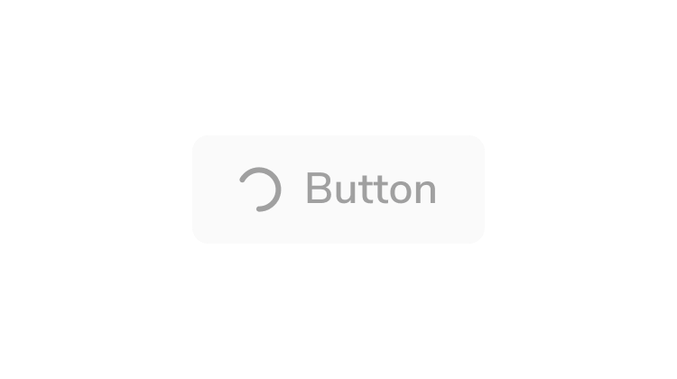
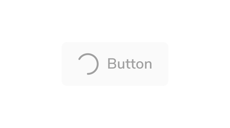
* **Small (16px)**: for inline use with text or inside buttons
* **Medium (40px)**: default size for standalone loading indicators
* **Large (80px)**: for prominent loading states
Custom sizes are also available for scenarios not covered by these existing sizes.
Spinner's track and arc scale with the size of the Spinner.
#### Color
By default, the Spinner uses the primary background color. When inherit is enabled, it inherits the current text color.
## Behavior
The Spinner responds to different size and color requirements while maintaining consistent animation.
#### Animation
The Spinner uses a continuous rotation animation at 1 second per revolution. The arc rotates clockwise around the circular track.
#### Responsive sizing
The Spinner can be resized using the `style` property. The stroke width automatically adjusts proportionally to maintain visual consistency at any size.
## Usage Guidelines
Use the Spinner when a large area of content is loading or an operation is in progress and the duration is indeterminate.
#### Common use cases
* Fetching data from an API
* Submitting a form
* Processing user actions
### When not to use
* For operations with a known duration
* For loading initial content
### Alternatives
#### Spinner vs Skeleton
Use a Spinner for focused loading states (e.g., a form submitting, fetching data from an API). Use a [Skeleton](/docs/web/components/skeleton/design) when loading initial content.
#### Spinner vs Progress Bar
Use a Spinner when the duration of the operation is unknown or indeterminate. Use a [Progress Bar](/docs/web/components/progress-bar/design) when you can track and display the actual progress percentage.
### How to Use
#### Choose the right size
Select a Spinner size appropriate for its context:
* **Small**: Inline with text or inside buttons
* **Medium**: Standalone loading indicators (default)
* **Large**: Full-page or section loading states
 #### Number of spinners
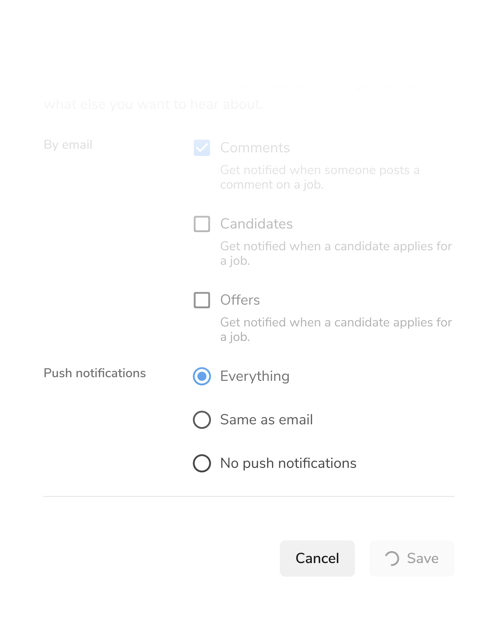
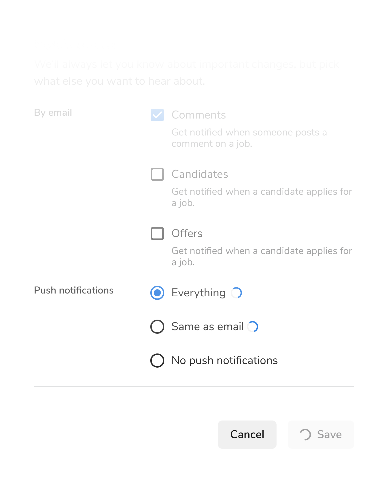
Use one Spinner at a time. Avoid showing multiple Spinners simultaneously.
#### Number of spinners
Use one Spinner at a time. Avoid showing multiple Spinners simultaneously.
 ## Keyboard Interaction
The Spinner is not focusable and does not support keyboard interaction.
### Accessibility
| Feature | Implementation |
| ------- | ----------------------------------------------- |
| Role | `role="status"` for screen reader announcements |
| ARIA | SVG is marked with `aria-hidden="true"` |
| Focus | Not focusable (decorative indicator) |
The Spinner includes `role="status"` which allows screen readers to announce when loading states change. For longer loading operations, consider providing additional context through accompanying text.
For more guidance on loading states and status updates, see [changing content best practices](/docs/accessibility/changing-content).
## Keyboard Interaction
The Spinner is not focusable and does not support keyboard interaction.
### Accessibility
| Feature | Implementation |
| ------- | ----------------------------------------------- |
| Role | `role="status"` for screen reader announcements |
| ARIA | SVG is marked with `aria-hidden="true"` |
| Focus | Not focusable (decorative indicator) |
The Spinner includes `role="status"` which allows screen readers to announce when loading states change. For longer loading operations, consider providing additional context through accompanying text.
For more guidance on loading states and status updates, see [changing content best practices](/docs/accessibility/changing-content).