> ## Documentation Index
> Fetch the complete documentation index at: https://anvil.servicetitan.com/llms.txt
> Use this file to discover all available pages before exploring further.

# Tab – Design

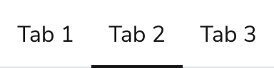
> Tabs organize related content into groups to allow users to move between groups.

export const LiveCode = ({children, customHeight, clickToLoad, example, fullWidth, fullHeight, hideCodeInLiveCode, screenshot, screenshotOnly, showCode: showCodeProp}) => {
  const SCREENSHOTS_BASE = "https://servicetitan.github.io/anvil2-docs-live-code/screenshots";
  const STACKBLITZ_BASE = "https://stackblitz.com/github/servicetitan/anvil2-docs-live-code/tree/main/examples";
  const [showCodeBlock, setShowCodeBlock] = useState(showCodeProp ?? false);
  const [isLocalOverride, setIsLocalOverride] = useState(false);
  useEffect(() => {
    const examplePath = `/images/live-code-screenshots-tmp/${example}.png`;
    fetch(examplePath, {
      method: "HEAD"
    }).then(r => {
      if (r.ok) setIsLocalOverride(true);
    }).catch(() => {});
  }, [example]);
  const screenshotBase = isLocalOverride ? "/images/live-code-screenshots-tmp" : SCREENSHOTS_BASE;
  if (screenshotOnly) {
    return <Frame className="flex flex-col">
        <div className="flex dark:hidden" style={{
      justifyContent: "center",
      alignItems: "center",
      width: fullWidth ? "100%" : "50%",
      minHeight: fullHeight ? "284px" : undefined,
      background: "#FFFFFF"
    }}>
          <img srcset={`${screenshotBase}/${example}.png, ${screenshotBase}/${example}-2x.png 2x`} src={`${screenshotBase}/${example}.png`} alt={example} noZoom />
        </div>
        <div className="hidden dark:flex" style={{
      justifyContent: "center",
      alignItems: "center",
      width: fullWidth ? "100%" : "50%",
      minHeight: fullHeight ? "284px" : undefined,
      background: "#141414"
    }}>
          <img srcset={`${screenshotBase}/${example}-dark.png, ${screenshotBase}/${example}-dark-2x.png 2x`} src={`${screenshotBase}/${example}-dark.png`} alt={example} noZoom />
        </div>
      </Frame>;
  }
  if (screenshot) {
    return <Frame className="flex flex-col -mb-2">
        <div className="flex dark:hidden bg-white dark:bg-codeblock border border-gray-950/10 dark:border-white/10 dark:twoslash-dark rounded-2xl overflow-hidden" style={{
      justifyContent: "center",
      alignItems: "center",
      width: fullWidth ? "100%" : "50%",
      minHeight: fullHeight ? "284px" : undefined
    }}>
          <img srcset={`${screenshotBase}/${example}.png, ${screenshotBase}/${example}-2x.png 2x`} src={`${screenshotBase}/${example}.png`} alt={example} noZoom />
        </div>

        <div className="hidden dark:flex bg-white dark:bg-codeblock border border-gray-950/10 dark:border-white/10 dark:twoslash-dark rounded-2xl overflow-hidden" style={{
      background: "#141414",
      justifyContent: "center",
      alignItems: "center",
      width: fullWidth ? "100%" : "50%",
      minHeight: fullHeight ? "284px" : undefined
    }}>
          <img srcset={`${screenshotBase}/${example}-dark.png, ${screenshotBase}/${example}-dark-2x.png 2x`} src={`${screenshotBase}/${example}-dark.png`} alt={example} noZoom />
        </div>

        <div className="flex justify-end items-center text-xs py-2 px-1 gap-4">
          {!showCodeProp ? <button className="inline-flex justify-end items-center text-gray-700 dark:text-gray-50 hover:text-blue-500 dark:hover:text-blue-300 transition-colors group self-end gap-1 cursor-pointer" onClick={() => setShowCodeBlock(!showCodeBlock)} style={{
      appearance: "none"
    }}>
              <Icon icon="code" size="12px" className="group-hover:bg-blue-500 dark:group-hover:bg-blue-300" />
              <span>{showCodeBlock ? "Hide code" : "Show code"}</span>
            </button> : null}

          <a className="inline-flex justify-end items-center hover:text-blue-500 dark:hover:text-blue-300 transition-colors group self-end gap-1" href={`${STACKBLITZ_BASE}/${example}?file=src/App.tsx`} target="_blank" rel="noreferrer">
            <Icon icon="bolt" size="12px" className="group-hover:bg-blue-500 dark:group-hover:bg-blue-300" />
            <span>StackBlitz demo</span>
          </a>
        </div>

        <div className="grid transition-[grid-template-rows] duration-300 ease-in-out overflow-auto overflow-y-hidden overflow-x-auto" style={showCodeBlock ? {
      gridTemplateRows: "1fr"
    } : {
      gridTemplateRows: "0fr"
    }}>
          <div style={{
      minHeight: 0,
      overflowX: "auto",
      overflowY: "hidden",
      marginBlockStart: "-1.25rem",
      marginBlockEnd: "-1.5rem"
    }}>
            {children}
          </div>
        </div>
      </Frame>;
  } else {
    return <div style={{
      display: "flex",
      width: fullWidth ? "100%" : "50%",
      minHeight: customHeight ? customHeight : "316px",
      resize: "vertical",
      overflow: "auto"
    }}>
        <iframe title={example} style={{
      flex: 1,
      width: fullWidth ? "100%" : "50%",
      minHeight: customHeight ? customHeight : "316px"
    }} src={`${STACKBLITZ_BASE}/${example}?embed=1&hideNavigation=1&hideExplorer=1&terminalHeight=0&file=src/App.tsx${clickToLoad ? "&ctl=1" : ""}${hideCodeInLiveCode ? "&view=preview" : ""}`} allow="accelerometer; ambient-light-sensor; camera; encrypted-media; geolocation; gyroscope; hid; microphone; midi; payment; usb; vr; xr-spatial-tracking" sandbox="allow-forms allow-modals allow-popups allow-presentation allow-same-origin allow-scripts" />
      </div>;
  }
};

export const CodePreviewPlaceholder = ({double, fullWidth}) => {
  const single = <div style={{
    width: fullWidth ? "100%" : "50%",
    borderRadius: "1rem",
    display: "flex",
    padding: "1rem",
    flexDirection: "column",
    gap: "0.5rem",
    height: "10rem",
    marginBlockEnd: "1rem"
  }} className="border-width-default border-color-subdued">
      <div className="bg-strong border-radius-large" style={{
    width: "100%",
    flexGrow: "1"
  }} />
      <div className="bg-strong border-radius-large" style={{
    width: "100%",
    flexGrow: "1"
  }} />
    </div>;
  return double ? <div style={{
    display: "flex",
    gap: "1rem"
  }}>
      {single}
      {single}
    </div> : single;
};

<Frame>
  <div className="w-full h-full bg-[#FFFFFF] p-2 rounded flex items-center justify-center">
    <img noZoom src="https://mintcdn.com/servicetitan/H5FwKyiqhPVZ1UJQ/images/docs/web/components/shared/tab-overview.png?fit=max&auto=format&n=H5FwKyiqhPVZ1UJQ&q=85&s=2ba572fa3b1df54371aefcec4ce30b44" width="384" height="96" data-path="images/docs/web/components/shared/tab-overview.png" />
  </div>
</Frame>

## Anatomy

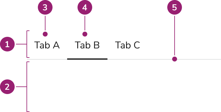
The Tab consists of five primary elements that work together to organize related content into groups.

<Frame>
  <div className="w-full h-full bg-[#FFFFFF] p-2 rounded flex items-center justify-center">
    <img
      src="https://mintcdn.com/servicetitan/usDdQzJfkl6jYYLR/images/docs/web/components/tab/design/anatomy-of-a-tab.png?fit=max&auto=format&n=usDdQzJfkl6jYYLR&q=85&s=72db99c92390267c197bca549fc2e725"
      alt="Anatomy of a
Tab"
      width="724"
      height="368"
      data-path="images/docs/web/components/tab/design/anatomy-of-a-tab.png"
    />
  </div>
</Frame>

1. Tablist
2. Tab content or panel
3. Tab
4. Active Tab
5. Divider

## Options

The Tab supports active state, label, and width configurations to accommodate various content organization scenarios.

### Active

Tabs always have exactly one active Tab at a time. Typically, the first Tab in a group is the default active Tab.

<Frame>
  <div className="w-full h-full bg-[#FFFFFF] p-2 rounded flex items-center justify-center">
    <img
      src="https://mintcdn.com/servicetitan/usDdQzJfkl6jYYLR/images/docs/web/components/tab/design/example-of-an-active-tab.png?fit=max&auto=format&n=usDdQzJfkl6jYYLR&q=85&s=1404e9f1e377dff20adb75a82409eee5"
      alt="Example of an active
tab"
      width="1248"
      height="96"
      data-path="images/docs/web/components/tab/design/example-of-an-active-tab.png"
    />
  </div>
</Frame>

### Label

<Frame>
  <div className="w-full h-full bg-[#FFFFFF] p-2 rounded flex items-center justify-center">
    <img
      src="https://mintcdn.com/servicetitan/ar8TJanaRSxOpbCO/images/docs/web/components/tab/design/example-of-tabs-with-different-label-widths.png?fit=max&auto=format&n=ar8TJanaRSxOpbCO&q=85&s=335611fc6aa10b76323c77087a69aeeb"
      alt="Example of tabs with different label
widths"
      width="1248"
      height="96"
      data-path="images/docs/web/components/tab/design/example-of-tabs-with-different-label-widths.png"
    />
  </div>
</Frame>

#### Custom labels

The Tab label can be replaced as needed with custom, non-interactive content.

### Width options

#### Fixed width

By default, an individual Tab will be as wide as its text, with a minimum width of 48px. This is useful when Tabs are in wide containers.

<Frame>
  <div className="w-full h-full bg-[#FFFFFF] p-2 rounded flex items-center justify-center">
    <img
      src="https://mintcdn.com/servicetitan/ar8TJanaRSxOpbCO/images/docs/web/components/tab/design/example-of-tabs-with-a-fixed-width.png?fit=max&auto=format&n=ar8TJanaRSxOpbCO&q=85&s=bb6c9a77cc5bca36864412a2b244861b"
      alt="Example of Tabs with a fixed
width"
      width="1102"
      height="96"
      data-path="images/docs/web/components/tab/design/example-of-tabs-with-a-fixed-width.png"
    />
  </div>
</Frame>

#### Filled width

Tabs can also fill all available width in its container. This is useful in smaller containers.

<Frame>
  <div className="w-full h-full bg-[#FFFFFF] p-2 rounded flex items-center justify-center">
    <img
      src="https://mintcdn.com/servicetitan/usDdQzJfkl6jYYLR/images/docs/web/components/tab/design/example-of-tabs-with-a-filled-width.png?fit=max&auto=format&n=usDdQzJfkl6jYYLR&q=85&s=a458a4100d2869178e7da2a6df4880ec"
      alt="Example of Tabs with a filled
width"
      width="1102"
      height="96"
      data-path="images/docs/web/components/tab/design/example-of-tabs-with-a-filled-width.png"
    />
  </div>
</Frame>

## Behavior

The Tab responds to space constraints with compression and overflow behaviors while maintaining consistent visual states.

### Visual States

Visual states apply independently of the active state.

<Frame>
  <div className="w-full h-full bg-[#FFFFFF] p-2 rounded flex items-center justify-center">
    <img
      src="https://mintcdn.com/servicetitan/ar8TJanaRSxOpbCO/images/docs/web/components/tab/design/tab-visual-states.png?fit=max&auto=format&n=ar8TJanaRSxOpbCO&q=85&s=4d5a9a7fe9fa2e05f2cde145ad23efd5"
      alt="Tab visual
states"
      width="1248"
      height="96"
      data-path="images/docs/web/components/tab/design/tab-visual-states.png"
    />
  </div>
</Frame>

#### Disabled

Disabled Tabs are not supported. Consider either removing the Tab, or disabling the Tab's content in some way instead.

### Tab compression

With both fixed and filled Tab widths, when not enough space is available, the Tabs will shrink, but not truncate, to fit the container. A minimum of `1rem` of space will exist between Tab labels.

<Frame>
  <div className="w-full h-full bg-[#FFFFFF] p-2 rounded flex items-center justify-center">
    <img
      src="https://mintcdn.com/servicetitan/usDdQzJfkl6jYYLR/images/docs/web/components/tab/design/behavior-of-filled-tabs-with-minimal-space-available.png?fit=max&auto=format&n=usDdQzJfkl6jYYLR&q=85&s=7e98db96ea14381674e80b63c0eefa70"
      alt="Behavior of filled Tabs with minimal space
available"
      width="1248"
      height="96"
      data-path="images/docs/web/components/tab/design/behavior-of-filled-tabs-with-minimal-space-available.png"
    />
  </div>
</Frame>

### Tab group overflow

When compression is not enough, the Tab group will scroll overflow, rather than truncate. A user can both scroll to reveal (either by keyboard or mouse), or use the next / previous buttons provided by the group.

<Frame>
  <div className="w-full h-full bg-[#FFFFFF] p-2 rounded flex items-center justify-center">
    <img
      src="https://mintcdn.com/servicetitan/usDdQzJfkl6jYYLR/images/docs/web/components/tab/design/example-of-tab-scrolling-behavior.png?fit=max&auto=format&n=usDdQzJfkl6jYYLR&q=85&s=206bdf8a7ef2655bb6afdff1fca08ed7"
      alt="Example of Tab scrolling
behavior"
      width="1248"
      height="96"
      data-path="images/docs/web/components/tab/design/example-of-tab-scrolling-behavior.png"
    />
  </div>
</Frame>

## Usage Guidelines

Use the Tab to organize content into multiple sections. Tabs help to break up content into easier to process information.

### When not to use

Tabs should not be used:

* To represent the primary method of navigation. A side or top nav is used instead.
* To directly start an action, such as a flow.
* When content cannot be organized in a way a user would understand.
* When information between tabs is being directly compared.
* For filtering content on the page.

### Alternatives

#### Tab vs Details

Details are used to show additional information around a sub-topic on a page, while a Tab categorizes information. The context of Details is small, non-essential information, while Tabs can categorize both small and large, essential and non-essential information.

#### Tab vs Segmented Control

Segmented Control allows users to change the presentation format of displayed content or to filter it. Tabs changes the view to show new content.

#### Tab vs Side Nav

Side Navs and Tabs perform similar tasks of organizing content. In most situations, Side Navs are a higher level of the navigation structure compared to Tabs. Side Navs are also able to organize less related items together compared to Tabs.

#### Tab vs Stepper

Tabs help organize information about a subject on the page, while a Stepper helps complete a flow. They can't substitute for each other, although both could be used on the same page.

### How to Use

#### Always have one Tab active

Exactly one Tab should always be active in a Tab list.

<LiveCode example="tab-active-single-do" screenshot fullWidth>
  ```tsx lines theme={null}
  import { Tab } from "@servicetitan/anvil2";

  function App() {
    return (
      <Tab defaultIndex={0} style={{ minWidth: "55rem" }}>
        <Tab.List>
          <Tab.Button id="t1" controls="p1" onClick={console.log}>
            Tab A
          </Tab.Button>
          <Tab.Button id="t2" controls="p2" onClick={console.log}>
            Tab B
          </Tab.Button>
          <Tab.Button id="t3" controls="p3" onClick={console.log}>
            Tab C
          </Tab.Button>
        </Tab.List>
      </Tab>
    );
  }

  export default App;
  ```
</LiveCode>

<Check>**Do**</Check>

<LiveCode example="tab-active-none-dont" screenshot fullWidth>
  ```tsx lines theme={null}
  import { Tab } from "@servicetitan/anvil2";

  function App() {
    return (
      <Tab.List style={{ minWidth: "55rem" }}>
        <Tab.Button id="t1" controls="p1" onClick={console.log}>
          Tab A
        </Tab.Button>
        <Tab.Button id="t2" controls="p2" onClick={console.log}>
          Tab B
        </Tab.Button>
        <Tab.Button id="t3" controls="p3" onClick={console.log}>
          Tab C
        </Tab.Button>
      </Tab.List>
    );
  }

  export default App;
  ```
</LiveCode>

<Danger>**Don't**</Danger>

Don't have a tab list where no tab is active.

<LiveCode example="tab-active-multiple-dont" screenshot fullWidth>
  ```tsx lines theme={null}
  import { Tab } from "@servicetitan/anvil2";

  function App() {
    return (
      <Tab defaultIndex={0} style={{ minWidth: "55rem" }}>
        <Tab.List>
          <Tab.Button id="t5" controls="p1" onClick={console.log}>
            Tab A
          </Tab.Button>
          <Tab.Button id="t3" controls="p2" onClick={console.log}>
            Tab B
          </Tab.Button>
          <Tab.Button id="t5" controls="p3" onClick={console.log}>
            Tab C
          </Tab.Button>
        </Tab.List>
      </Tab>
    );
  }

  export default App;
  ```
</LiveCode>

<Danger>**Don't**</Danger>

Don't show multiple tabs as selected

#### Make the scope of Tabs clear

A user should be able to understand what is and isn't part of a Tab list. This usually means content below the Tabs, extending across the Tab's divider line. Additional visual consideration may be needed if the Tab scope is a sub section of a page.

<LiveCode example="tab-scope-do" screenshot fullWidth>
  ```tsx lines theme={null}
  import { Tab, Text, Button } from "@servicetitan/anvil2";

  function App() {
    return (
      <div style={{ minWidth: "55rem", padding: 24 }}>
        <div
          style={{
            display: "flex",
            justifyContent: "space-between",
            alignItems: "center",
            marginBottom: 16,
          }}
        >
          <Text variant="headline" el="h1" style={{ marginBottom: 0 }}>
            Page title
          </Text>
          <Button appearance="primary">Create</Button>
        </div>
        <Tab defaultIndex={0}>
          <Tab.List>
            <Tab.Button id="t1" controls="p1" onClick={console.log}>
              Tab A
            </Tab.Button>
            <Tab.Button id="t2" controls="p2" onClick={console.log}>
              Tab B
            </Tab.Button>
            <Tab.Button id="t3" controls="p3" onClick={console.log}>
              Tab C
            </Tab.Button>
          </Tab.List>
          <Tab.Panel id="p1">Scope of Tab A</Tab.Panel>
          <Tab.Panel id="p2">Scope of Tab B</Tab.Panel>
          <Tab.Panel id="p3">Scope of Tab C</Tab.Panel>
        </Tab>
      </div>
    );
  }

  export default App;
  ```
</LiveCode>

<Check>**Do**</Check>

Keep the scope of content change to inside the boundaries of Tabs.

<LiveCode example="tab-scope-dont" screenshot fullWidth>
  ```tsx lines theme={null}
  import { Tab, Text, Button } from "@servicetitan/anvil2";

  function App() {
    return (
      <div style={{ minWidth: "55rem", padding: 24 }}>
        <Tab defaultIndex={0}>
          <Tab.Panel id="p1">
            <div
              style={{
                display: "flex",
                justifyContent: "space-between",
                alignItems: "center",
                marginBottom: 16,
              }}
            >
              <Text variant="headline" el="h1" style={{ marginBottom: 0 }}>
                Page title A
              </Text>
              <Button appearance="primary">Create</Button>
            </div>
          </Tab.Panel>
          <Tab.Panel id="p2">
            <div
              style={{
                display: "flex",
                justifyContent: "space-between",
                alignItems: "center",
                marginBottom: 16,
              }}
            >
              <Text variant="headline" el="h1" style={{ marginBottom: 0 }}>
                Page title B
              </Text>
              <Button appearance="primary">Edit</Button>
            </div>
          </Tab.Panel>
          <Tab.Panel id="p3">
            <div
              style={{
                display: "flex",
                justifyContent: "space-between",
                alignItems: "center",
                marginBottom: 16,
              }}
            >
              <Text variant="headline" el="h1" style={{ marginBottom: 0 }}>
                Page title C
              </Text>
              <Button appearance="danger">Delete</Button>
            </div>
          </Tab.Panel>
          <Tab.List>
            <Tab.Button id="t1" controls="p1" onClick={console.log}>
              Tab A
            </Tab.Button>
            <Tab.Button id="t2" controls="p2" onClick={console.log}>
              Tab B
            </Tab.Button>
            <Tab.Button id="t3" controls="p3" onClick={console.log}>
              Tab C
            </Tab.Button>
          </Tab.List>
          <Tab.Panel id="p1">Scope of Tab A</Tab.Panel>
          <Tab.Panel id="p2">Scope of Tab B</Tab.Panel>
          <Tab.Panel id="p3">Scope of Tab C</Tab.Panel>
        </Tab>
      </div>
    );
  }

  export default App;
  ```
</LiveCode>

<Danger>**Don't**</Danger>

Don't change content outside of the Tab scope between Tabs.

#### Showing numerical values

Tabs can utilize small [Chips](/docs/web/components/chip/design) to convey value. Pair a Tab with a Chip when the number value is informational in nature.

<LiveCode example="tab-chips-do" screenshot fullWidth>
  ```tsx lines theme={null}
  import { Tab, Flex, Chip } from "@servicetitan/anvil2";

  function App() {
    return (
      <Tab defaultIndex={0} style={{ minWidth: "55rem" }}>
        <Tab.List>
          <Tab.Button id="t1" controls="p1" onClick={console.log}>
            <Flex gap={2} alignItems="center">
              All
              <Chip label="55" size="small" />
            </Flex>
          </Tab.Button>
          <Tab.Button id="t2" controls="p2" onClick={console.log}>
            <Flex gap={2} alignItems="center">
              Foo
              <Chip label="18" size="small" />
            </Flex>
          </Tab.Button>
          <Tab.Button id="t3" controls="p3" onClick={console.log}>
            <Flex gap={2} alignItems="center">
              Bar
              <Chip label="37" size="small" />
            </Flex>
          </Tab.Button>
        </Tab.List>
      </Tab>
    );
  }

  export default App;
  ```
</LiveCode>

<Check>**Do**</Check>

If a numerical value is relevant, it may be optionally added to a Tab.

<LiveCode example="tab-chips-dont" screenshot fullWidth>
  ```tsx lines theme={null}
  import { Tab, Flex, Chip } from "@servicetitan/anvil2";
  import { core } from "@servicetitan/anvil2/token";

  function App() {
    return (
      <Tab defaultIndex={0} style={{ minWidth: "55rem" }}>
        <Tab.List>
          <Tab.Button id="t1" controls="p1" onClick={console.log}>
            <Flex gap={2} alignItems="center">
              All
              <Chip label="55" size="small" />
            </Flex>
          </Tab.Button>
          <Tab.Button id="t2" controls="p2" onClick={console.log}>
            <Flex gap={2} alignItems="center">
              Foo
              <Chip label="18" size="small" />
            </Flex>
          </Tab.Button>
          <Tab.Button id="t3" controls="p3" onClick={console.log}>
            <Flex gap={2} alignItems="center">
              Bar
              <Chip
                label="37"
                size="small"
                color={core.semantic?.StatusColorDanger?.value}
              />
            </Flex>
          </Tab.Button>
        </Tab.List>
      </Tab>
    );
  }

  export default App;
  ```
</LiveCode>

<Danger>**Don't**</Danger>

Don't add color to Chips when used in Tabs.

#### Representing status

When a status, typically an error, needs representation at the Tab level, pair it with an [Alert](/docs/web/components/alert/design), either below the Tab or above the Tab depending on how critical it is a user should know about the status. As a rule, place it below the Tabs.

Don't represent status directly in the Tabs. Status in Tabs directly is not a common experience in apps, in addition to accessibility concerns for keyboard and screenreader users.

<LiveCode example="tab-error-inside-do" screenshot fullWidth>
  ```tsx lines theme={null}
  import { Tab, Alert } from "@servicetitan/anvil2";

  function App() {
    return (
      <>
        <Tab defaultIndex={0} style={{ minWidth: "55rem" }}>
          <Tab.List>
            <Tab.Button id="t1" controls="p1" onClick={console.log}>
              Tab A
            </Tab.Button>
            <Tab.Button id="t2" controls="p2" onClick={console.log}>
              Tab B
            </Tab.Button>
            <Tab.Button id="t3" controls="p3" onClick={console.log}>
              Tab C
            </Tab.Button>
          </Tab.List>
          <Tab.Panel id="p1">
            <Alert
              title="Error Alert scoped to the Tab"
              status="danger"
              onClose={console.log}
            >
              Place an Alert below the Tab when its scope is limited to just this
              Tab content.
            </Alert>
          </Tab.Panel>
          <Tab.Panel id="p2">Scope of Tab B</Tab.Panel>
          <Tab.Panel id="p3">Scope of Tab C</Tab.Panel>
        </Tab>
      </>
    );
  }

  export default App;
  ```
</LiveCode>

<Check>**Do**</Check>

<LiveCode example="tab-error-outside-do" screenshot fullWidth>
  ```tsx lines theme={null}
  import { Tab, Flex, Alert } from "@servicetitan/anvil2";

  function App() {
    return (
      <Flex direction="column" gap={2} style={{ minWidth: "55rem" }}>
        <Alert
          title="Error Alert scoped above the Tab"
          status="danger"
          onClose={console.log}
        >
          Place an Alert above the Tabs when its scope is across Tabs.
        </Alert>
        <Tab defaultIndex={0}>
          <Tab.List>
            <Tab.Button id="t1" controls="p1" onClick={console.log}>
              Tab A
            </Tab.Button>
            <Tab.Button id="t2" controls="p2" onClick={console.log}>
              Tab B
            </Tab.Button>
            <Tab.Button id="t3" controls="p3" onClick={console.log}>
              Tab C
            </Tab.Button>
          </Tab.List>
          <Tab.Panel id="p1">Scope of Tab A</Tab.Panel>
          <Tab.Panel id="p2">Scope of Tab B</Tab.Panel>
          <Tab.Panel id="p3">Scope of Tab C</Tab.Panel>
        </Tab>
      </Flex>
    );
  }

  export default App;
  ```
</LiveCode>

<Check>**Do**</Check>

<LiveCode example="tab-error-dont" screenshot fullWidth>
  ```tsx lines theme={null}
  import { Tab, Flex, Icon } from "@servicetitan/anvil2";
  import { core } from "@servicetitan/anvil2/token";
  import Warning from "@servicetitan/anvil2/assets/icons/material/round/warning.svg";

  function App() {
    return (
      <Flex gap={2}>
        <Tab defaultIndex={0} style={{ minWidth: "55rem" }}>
          <Tab.List>
            <Tab.Button id="t1" controls="p1" onClick={console.log}>
              Tab A
            </Tab.Button>
            <Tab.Button id="t2" controls="p2" onClick={console.log}>
              Tab B
            </Tab.Button>
            <Tab.Button id="t3" controls="p3" onClick={console.log}>
              <Flex gap={2} alignItems="center">
                Tab C
                <Icon
                  size="medium"
                  svg={Warning}
                  color={core.semantic?.StatusColorDanger?.value}
                />
              </Flex>
            </Tab.Button>
          </Tab.List>
        </Tab>
      </Flex>
    );
  }

  export default App;
  ```
</LiveCode>

<Danger>**Don't**</Danger>

#### Nested Tabs

Use caution when nesting Tabs within Tabs, as they can be difficult to use simultaneously. Consider alternative ways of organizing information, such as a Side Nav, Details, or Stepper.

## Content

Content within the Tab should clearly communicate each section through descriptive labels.

## Keyboard Interaction

Users can navigate the Tab using standard keyboard controls.

| Key            | Description                                                                                                |
| -------------- | ---------------------------------------------------------------------------------------------------------- |
| Tab            | Moves focus to the next focusable element outside of the Tab Group.                                        |
| Right Arrow    | Moves focus to the next Tab. If on the last Tab in the group, it focuses on the first Tabbed element.      |
| Left Arrow     | Moves focus to the previous Tab. If on the first Tab in the group, it focuses on the right Tabbed element. |
| Space or Enter | Selects the focused Tab.                                                                                   |

#### Manual activation only

Tab groups only support manual tab activation, meaning keyboard users can cycle through tab focus, but must also activate the tab with a separate key.

### Accessibility

Anvil provides all the accessibility pieces needed. There are some additional accessibility considerations if new behavior is added on top of the design system.

#### Automatic tab activation

This refers to tabs being automatically activates on focus. This is considered an acceptable behavior, but is not provided by Anvil. If a design needs this feature, consider following the [W3C ARIA implementation of automatic activation](https://www.w3.org/WAI/ARIA/apg/patterns/tabs/examples/tabs-automatic/), including how it handles keyboard interaction. Automatic tabs do not need a new visual treatment.

#### Use caution when adding actions in Tabs

Be sure that when adding an action of any kind to Tabs that it is still reachable by keyboard. This is especially true if your Tab action also uses arrow keys.

For more guidance on custom tab behaviors and keyboard interaction, see [changing content best practices](/docs/accessibility/changing-content).