> ## Documentation Index
> Fetch the complete documentation index at: https://anvil.servicetitan.com/llms.txt
> Use this file to discover all available pages before exploring further.

# Text – Design

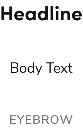
> The text component enables designers and developers to use properly styled typography.

export const LiveCode = ({children, customHeight, clickToLoad, example, fullWidth, fullHeight, hideCodeInLiveCode, screenshot, screenshotOnly, showCode: showCodeProp}) => {
  const SCREENSHOTS_BASE = "https://servicetitan.github.io/anvil2-docs-live-code/screenshots";
  const STACKBLITZ_BASE = "https://stackblitz.com/github/servicetitan/anvil2-docs-live-code/tree/main/examples";
  const [showCodeBlock, setShowCodeBlock] = useState(showCodeProp ?? false);
  const [isLocalOverride, setIsLocalOverride] = useState(false);
  useEffect(() => {
    const examplePath = `/images/live-code-screenshots-tmp/${example}.png`;
    fetch(examplePath, {
      method: "HEAD"
    }).then(r => {
      if (r.ok) setIsLocalOverride(true);
    }).catch(() => {});
  }, [example]);
  const screenshotBase = isLocalOverride ? "/images/live-code-screenshots-tmp" : SCREENSHOTS_BASE;
  if (screenshotOnly) {
    return <Frame className="flex flex-col">
        <div className="flex dark:hidden" style={{
      justifyContent: "center",
      alignItems: "center",
      width: fullWidth ? "100%" : "50%",
      minHeight: fullHeight ? "284px" : undefined,
      background: "#FFFFFF"
    }}>
          <img srcset={`${screenshotBase}/${example}.png, ${screenshotBase}/${example}-2x.png 2x`} src={`${screenshotBase}/${example}.png`} alt={example} noZoom />
        </div>
        <div className="hidden dark:flex" style={{
      justifyContent: "center",
      alignItems: "center",
      width: fullWidth ? "100%" : "50%",
      minHeight: fullHeight ? "284px" : undefined,
      background: "#141414"
    }}>
          <img srcset={`${screenshotBase}/${example}-dark.png, ${screenshotBase}/${example}-dark-2x.png 2x`} src={`${screenshotBase}/${example}-dark.png`} alt={example} noZoom />
        </div>
      </Frame>;
  }
  if (screenshot) {
    return <Frame className="flex flex-col -mb-2">
        <div className="flex dark:hidden bg-white dark:bg-codeblock border border-gray-950/10 dark:border-white/10 dark:twoslash-dark rounded-2xl overflow-hidden" style={{
      justifyContent: "center",
      alignItems: "center",
      width: fullWidth ? "100%" : "50%",
      minHeight: fullHeight ? "284px" : undefined
    }}>
          <img srcset={`${screenshotBase}/${example}.png, ${screenshotBase}/${example}-2x.png 2x`} src={`${screenshotBase}/${example}.png`} alt={example} noZoom />
        </div>

        <div className="hidden dark:flex bg-white dark:bg-codeblock border border-gray-950/10 dark:border-white/10 dark:twoslash-dark rounded-2xl overflow-hidden" style={{
      background: "#141414",
      justifyContent: "center",
      alignItems: "center",
      width: fullWidth ? "100%" : "50%",
      minHeight: fullHeight ? "284px" : undefined
    }}>
          <img srcset={`${screenshotBase}/${example}-dark.png, ${screenshotBase}/${example}-dark-2x.png 2x`} src={`${screenshotBase}/${example}-dark.png`} alt={example} noZoom />
        </div>

        <div className="flex justify-end items-center text-xs py-2 px-1 gap-4">
          {!showCodeProp ? <button className="inline-flex justify-end items-center text-gray-700 dark:text-gray-50 hover:text-blue-500 dark:hover:text-blue-300 transition-colors group self-end gap-1 cursor-pointer" onClick={() => setShowCodeBlock(!showCodeBlock)} style={{
      appearance: "none"
    }}>
              <Icon icon="code" size="12px" className="group-hover:bg-blue-500 dark:group-hover:bg-blue-300" />
              <span>{showCodeBlock ? "Hide code" : "Show code"}</span>
            </button> : null}

          <a className="inline-flex justify-end items-center hover:text-blue-500 dark:hover:text-blue-300 transition-colors group self-end gap-1" href={`${STACKBLITZ_BASE}/${example}?file=src/App.tsx`} target="_blank" rel="noreferrer">
            <Icon icon="bolt" size="12px" className="group-hover:bg-blue-500 dark:group-hover:bg-blue-300" />
            <span>StackBlitz demo</span>
          </a>
        </div>

        <div className="grid transition-[grid-template-rows] duration-300 ease-in-out overflow-auto overflow-y-hidden overflow-x-auto" style={showCodeBlock ? {
      gridTemplateRows: "1fr"
    } : {
      gridTemplateRows: "0fr"
    }}>
          <div style={{
      minHeight: 0,
      overflowX: "auto",
      overflowY: "hidden",
      marginBlockStart: "-1.25rem",
      marginBlockEnd: "-1.5rem"
    }}>
            {children}
          </div>
        </div>
      </Frame>;
  } else {
    return <div style={{
      display: "flex",
      width: fullWidth ? "100%" : "50%",
      minHeight: customHeight ? customHeight : "316px",
      resize: "vertical",
      overflow: "auto"
    }}>
        <iframe title={example} style={{
      flex: 1,
      width: fullWidth ? "100%" : "50%",
      minHeight: customHeight ? customHeight : "316px"
    }} src={`${STACKBLITZ_BASE}/${example}?embed=1&hideNavigation=1&hideExplorer=1&terminalHeight=0&file=src/App.tsx${clickToLoad ? "&ctl=1" : ""}${hideCodeInLiveCode ? "&view=preview" : ""}`} allow="accelerometer; ambient-light-sensor; camera; encrypted-media; geolocation; gyroscope; hid; microphone; midi; payment; usb; vr; xr-spatial-tracking" sandbox="allow-forms allow-modals allow-popups allow-presentation allow-same-origin allow-scripts" />
      </div>;
  }
};

export const CodePreviewPlaceholder = ({double, fullWidth}) => {
  const single = <div style={{
    width: fullWidth ? "100%" : "50%",
    borderRadius: "1rem",
    display: "flex",
    padding: "1rem",
    flexDirection: "column",
    gap: "0.5rem",
    height: "10rem",
    marginBlockEnd: "1rem"
  }} className="border-width-default border-color-subdued">
      <div className="bg-strong border-radius-large" style={{
    width: "100%",
    flexGrow: "1"
  }} />
      <div className="bg-strong border-radius-large" style={{
    width: "100%",
    flexGrow: "1"
  }} />
    </div>;
  return double ? <div style={{
    display: "flex",
    gap: "1rem"
  }}>
      {single}
      {single}
    </div> : single;
};

<Frame>
  <div className="w-full h-full bg-[#FFFFFF] p-2 rounded flex items-center justify-center">
    <img noZoom src="https://mintcdn.com/servicetitan/H5FwKyiqhPVZ1UJQ/images/docs/web/components/shared/text-overview.png?fit=max&auto=format&n=H5FwKyiqhPVZ1UJQ&q=85&s=2cd54400ec5f4b325d0370c987b99c11" width="166" height="256" data-path="images/docs/web/components/shared/text-overview.png" />
  </div>
</Frame>

## Options

Text supports body text, headline, and eyebrow configurations with multiple sizing options to accommodate various typography scenarios.

### Body Text

<LiveCode screenshot example="text-body-playground" fullWidth>
  ```tsx lines theme={null}
  import { Text, Grid } from "@servicetitan/anvil2";

  function App() {
    return (
      <Grid
        alignContent="center"
        style={{
          height: "80px",
        }}
      >
        <Text size="xlarge">Body Text</Text>
      </Grid>
    );
  }

  export default App;
  ```
</LiveCode>

#### Body Text sizing

<LiveCode screenshot example="text-body" fullWidth>
  ```tsx lines theme={null}
  import { Text, Flex } from "@servicetitan/anvil2";

  function App() {
    return (
      <Flex direction="column">
        <Text size="small" variant="body">
          Small body text
        </Text>
        <Text size="medium" variant="body">
          Medium body text
        </Text>
        <Text size="large" variant="body">
          Large body text
        </Text>
        <Text size="xlarge" variant="body">
          X-Large body text
        </Text>
      </Flex>
    );
  }

  export default App;
  ```
</LiveCode>

| Value            | Size            |
| ---------------- | --------------- |
| Small            | 0.875rem / 14px |
| Medium (Default) | 1rem / 16px     |
| Large            | 1.25rem / 20px  |
| Extra Large      | 1.5rem / 24px   |

#### Styling

<LiveCode screenshot example="text-body-style" fullWidth>
  ```tsx lines theme={null}
  import { Text, Grid } from "@servicetitan/anvil2";

  function App() {
    return (
      <Grid gap="6">
        <Text variant="body" size="medium">
          Body text with a <strong>bold styling</strong> applied to it.
        </Text>
        <Text variant="body" size="medium">
          Body text with a <i>italic styling</i> applied to it.
        </Text>
        <Text variant="body" size="medium">
          Body text with a{" "}
          <Text inline subdued>
            subdued styling
          </Text>{" "}
          applied to it.
        </Text>
      </Grid>
    );
  }

  export default App;
  ```
</LiveCode>

### Headline

<LiveCode screenshot example="text-headline-playground" fullWidth>
  ```tsx lines theme={null}
  import { Text, Grid } from "@servicetitan/anvil2";

  function App() {
    return (
      <Grid
        alignContent="center"
        style={{
          height: "80px",
        }}
      >
        <Text variant="headline" size="xlarge" el="h1">
          Headline
        </Text>
      </Grid>
    );
  }

  export default App;
  ```
</LiveCode>

#### Headline sizing

<LiveCode screenshot example="text-headline" fullWidth>
  ```tsx lines theme={null}
  import { Text, Flex } from "@servicetitan/anvil2";

  function App() {
    return (
      <Flex direction="column">
        <Text el="h4" size="small" variant="headline">
          H4 Headline
        </Text>
        <Text el="h3" size="medium" variant="headline">
          H3 Headline
        </Text>
        <Text el="h2" size="large" variant="headline">
          H2 Headline
        </Text>
        <Text el="h1" size="xlarge" variant="headline">
          H1 Headline
        </Text>
      </Flex>
    );
  }

  export default App;
  ```
</LiveCode>

| Value            | Size           |
| ---------------- | -------------- |
| Small            | 1rem / 16px    |
| Medium (Default) | 1.25rem / 20px |
| Large            | 1.5rem / 24px  |
| Extra Large      | 2rem / 32px    |

### Eyebrow

<LiveCode screenshot example="text-eyebrow-playground" fullWidth>
  ```tsx lines theme={null}
  import { Text, Grid } from "@servicetitan/anvil2";

  function App() {
    return (
      <Grid
        alignContent="center"
        style={{
          height: "80px",
        }}
      >
        <Text variant="eyebrow" size="large">
          Eyebrow
        </Text>
      </Grid>
    );
  }

  export default App;
  ```
</LiveCode>

#### Eyebrow sizing

<LiveCode screenshot example="text-eyebrow" fullWidth>
  ```tsx lines theme={null}
  import { Text, Flex } from "@servicetitan/anvil2";

  function App() {
    return (
      <Flex direction="column">
        <Text size="small" variant="eyebrow">
          Eyebrow text
        </Text>
        <Text size="medium" variant="eyebrow">
          Eyebrow text
        </Text>
        <Text size="large" variant="eyebrow">
          Eyebrow text
        </Text>
      </Flex>
    );
  }

  export default App;
  ```
</LiveCode>

| Value            | Size            |
| ---------------- | --------------- |
| Small            | 0.625rem / 10px |
| Medium (Default) | 0.75rem / 12px  |
| Large            | 1rem / 16px     |

## Behavior

Text responds to different style and size requirements while maintaining consistent typography.

## Usage Guidelines

The text component should be regularly used to convey text throughout a page. Each of the major text styles used in the design system are options within Text.

### When not to use

Text is not directly used in most components. In those cases, the built-in type opinions of the component are used instead.

### How to Use

#### Type pairing and sizing

Refer to the [typography foundations](/docs/web/foundations/typography) for suggested type pairing and size configurations.

#### Apply heading levels to headline text

The headline variant of Text should apply an appropriate HTML section heading (e.g., `h1`, `h2`). This value is independent of the size option applied to headlines.

## Content

Content within Text should follow typography best practices for readability and hierarchy.

### Accessibility

Out of the box, text provides necessary accessibility around sizing and color contrast.

#### Text color contrast with backgrounds

Text should follow the [WCAG AA guidance on color contrast](https://www.w3.org/TR/WCAG22/#contrast-minimum). By default, Anvil's Text will provide at least 4.5:1 contrast with a white background.

Use caution when using subdued on other background values, or when using custom color values in general, as they may not meet contrast guidance.

For more guidance on text hierarchy and semantic markup, see [semantic markup best practices](/docs/accessibility/semantic-markup).