> ## Documentation Index
> Fetch the complete documentation index at: https://anvil.servicetitan.com/llms.txt
> Use this file to discover all available pages before exploring further.

# Textarea – Design

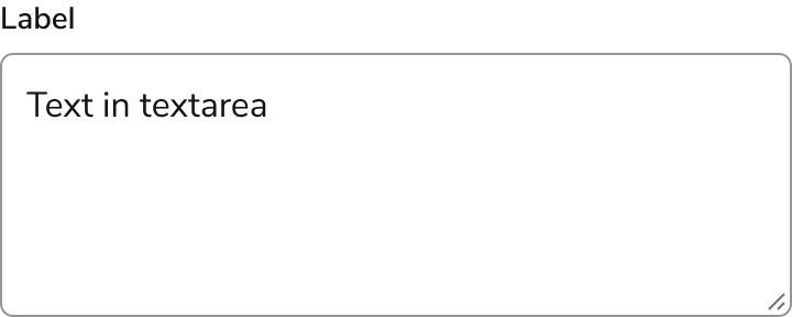
> Textareas are form elements that allow users type multiple lines of text.

export const LiveCode = ({children, customHeight, clickToLoad, example, fullWidth, fullHeight, hideCodeInLiveCode, screenshot, screenshotOnly, showCode: showCodeProp}) => {
  const SCREENSHOTS_BASE = "https://servicetitan.github.io/anvil2-docs-live-code/screenshots";
  const STACKBLITZ_BASE = "https://stackblitz.com/github/servicetitan/anvil2-docs-live-code/tree/main/examples";
  const [showCodeBlock, setShowCodeBlock] = useState(showCodeProp ?? false);
  const [isLocalOverride, setIsLocalOverride] = useState(false);
  useEffect(() => {
    const examplePath = `/images/live-code-screenshots-tmp/${example}.png`;
    fetch(examplePath, {
      method: "HEAD"
    }).then(r => {
      if (r.ok) setIsLocalOverride(true);
    }).catch(() => {});
  }, [example]);
  const screenshotBase = isLocalOverride ? "/images/live-code-screenshots-tmp" : SCREENSHOTS_BASE;
  if (screenshotOnly) {
    return <Frame className="flex flex-col">
        <div className="flex dark:hidden" style={{
      justifyContent: "center",
      alignItems: "center",
      width: fullWidth ? "100%" : "50%",
      minHeight: fullHeight ? "284px" : undefined,
      background: "#FFFFFF"
    }}>
          <img srcset={`${screenshotBase}/${example}.png, ${screenshotBase}/${example}-2x.png 2x`} src={`${screenshotBase}/${example}.png`} alt={example} noZoom />
        </div>
        <div className="hidden dark:flex" style={{
      justifyContent: "center",
      alignItems: "center",
      width: fullWidth ? "100%" : "50%",
      minHeight: fullHeight ? "284px" : undefined,
      background: "#141414"
    }}>
          <img srcset={`${screenshotBase}/${example}-dark.png, ${screenshotBase}/${example}-dark-2x.png 2x`} src={`${screenshotBase}/${example}-dark.png`} alt={example} noZoom />
        </div>
      </Frame>;
  }
  if (screenshot) {
    return <Frame className="flex flex-col -mb-2">
        <div className="flex dark:hidden bg-white dark:bg-codeblock border border-gray-950/10 dark:border-white/10 dark:twoslash-dark rounded-2xl overflow-hidden" style={{
      justifyContent: "center",
      alignItems: "center",
      width: fullWidth ? "100%" : "50%",
      minHeight: fullHeight ? "284px" : undefined
    }}>
          <img srcset={`${screenshotBase}/${example}.png, ${screenshotBase}/${example}-2x.png 2x`} src={`${screenshotBase}/${example}.png`} alt={example} noZoom />
        </div>

        <div className="hidden dark:flex bg-white dark:bg-codeblock border border-gray-950/10 dark:border-white/10 dark:twoslash-dark rounded-2xl overflow-hidden" style={{
      background: "#141414",
      justifyContent: "center",
      alignItems: "center",
      width: fullWidth ? "100%" : "50%",
      minHeight: fullHeight ? "284px" : undefined
    }}>
          <img srcset={`${screenshotBase}/${example}-dark.png, ${screenshotBase}/${example}-dark-2x.png 2x`} src={`${screenshotBase}/${example}-dark.png`} alt={example} noZoom />
        </div>

        <div className="flex justify-end items-center text-xs py-2 px-1 gap-4">
          {!showCodeProp ? <button className="inline-flex justify-end items-center text-gray-700 dark:text-gray-50 hover:text-blue-500 dark:hover:text-blue-300 transition-colors group self-end gap-1 cursor-pointer" onClick={() => setShowCodeBlock(!showCodeBlock)} style={{
      appearance: "none"
    }}>
              <Icon icon="code" size="12px" className="group-hover:bg-blue-500 dark:group-hover:bg-blue-300" />
              <span>{showCodeBlock ? "Hide code" : "Show code"}</span>
            </button> : null}

          <a className="inline-flex justify-end items-center hover:text-blue-500 dark:hover:text-blue-300 transition-colors group self-end gap-1" href={`${STACKBLITZ_BASE}/${example}?file=src/App.tsx`} target="_blank" rel="noreferrer">
            <Icon icon="bolt" size="12px" className="group-hover:bg-blue-500 dark:group-hover:bg-blue-300" />
            <span>StackBlitz demo</span>
          </a>
        </div>

        <div className="grid transition-[grid-template-rows] duration-300 ease-in-out overflow-auto overflow-y-hidden overflow-x-auto" style={showCodeBlock ? {
      gridTemplateRows: "1fr"
    } : {
      gridTemplateRows: "0fr"
    }}>
          <div style={{
      minHeight: 0,
      overflowX: "auto",
      overflowY: "hidden",
      marginBlockStart: "-1.25rem",
      marginBlockEnd: "-1.5rem"
    }}>
            {children}
          </div>
        </div>
      </Frame>;
  } else {
    return <div style={{
      display: "flex",
      width: fullWidth ? "100%" : "50%",
      minHeight: customHeight ? customHeight : "316px",
      resize: "vertical",
      overflow: "auto"
    }}>
        <iframe title={example} style={{
      flex: 1,
      width: fullWidth ? "100%" : "50%",
      minHeight: customHeight ? customHeight : "316px"
    }} src={`${STACKBLITZ_BASE}/${example}?embed=1&hideNavigation=1&hideExplorer=1&terminalHeight=0&file=src/App.tsx${clickToLoad ? "&ctl=1" : ""}${hideCodeInLiveCode ? "&view=preview" : ""}`} allow="accelerometer; ambient-light-sensor; camera; encrypted-media; geolocation; gyroscope; hid; microphone; midi; payment; usb; vr; xr-spatial-tracking" sandbox="allow-forms allow-modals allow-popups allow-presentation allow-same-origin allow-scripts" />
      </div>;
  }
};

export const CodePreviewPlaceholder = ({double, fullWidth}) => {
  const single = <div style={{
    width: fullWidth ? "100%" : "50%",
    borderRadius: "1rem",
    display: "flex",
    padding: "1rem",
    flexDirection: "column",
    gap: "0.5rem",
    height: "10rem",
    marginBlockEnd: "1rem"
  }} className="border-width-default border-color-subdued">
      <div className="bg-strong border-radius-large" style={{
    width: "100%",
    flexGrow: "1"
  }} />
      <div className="bg-strong border-radius-large" style={{
    width: "100%",
    flexGrow: "1"
  }} />
    </div>;
  return double ? <div style={{
    display: "flex",
    gap: "1rem"
  }}>
      {single}
      {single}
    </div> : single;
};

<Frame>
  <div className="w-full h-full bg-[#FFFFFF] p-2 rounded flex items-center justify-center">
    <img noZoom src="https://mintcdn.com/servicetitan/H5FwKyiqhPVZ1UJQ/images/docs/web/components/shared/overview-of-textarea.png?fit=max&auto=format&n=H5FwKyiqhPVZ1UJQ&q=85&s=302920ca27acf24c08b3cf11318311bf" width="720" height="288" data-path="images/docs/web/components/shared/overview-of-textarea.png" />
  </div>
</Frame>

## Anatomy

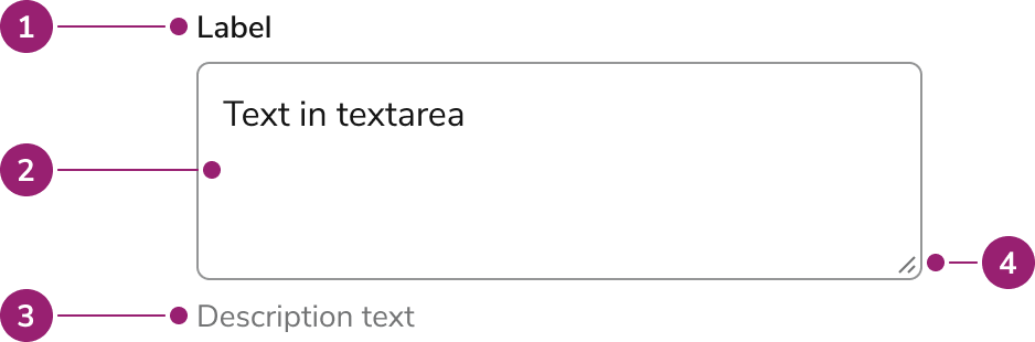
The Textarea consists of four primary elements that work together to allow users to type multiple lines of text.

<Frame>
  <div className="w-full h-full bg-[#FFFFFF] p-2 rounded flex items-center justify-center">
    <img
      src="https://mintcdn.com/servicetitan/ar8TJanaRSxOpbCO/images/docs/web/components/textarea/design/anatomy-of-a-textarea.png?fit=max&auto=format&n=ar8TJanaRSxOpbCO&q=85&s=8de0c27c0f8523a54f2f5e890a9cb5b4"
      alt="Anatomy of a
Textarea"
      width="938"
      height="310"
      data-path="images/docs/web/components/textarea/design/anatomy-of-a-textarea.png"
    />
  </div>
</Frame>

1. Label
2. Help text
3. Field
4. Resize element

## Options

Textarea supports label, description text, counter, required, placeholder, and user resizing configurations to accommodate various multi-line text input scenarios.

### Label

<LiveCode example="textarea-label" screenshot fullWidth>
  ```tsx lines theme={null}
  import { Textarea } from "@servicetitan/anvil2";

  function App() {
    return <Textarea label="Label" />;
  }

  export default App;
  ```
</LiveCode>

A Textarea should almost always have a label, as it provides essential information about what to do with the Textarea.

### Description text

<LiveCode example="textarea-description" screenshot fullWidth>
  ```tsx lines theme={null}
  import { Textarea } from "@servicetitan/anvil2";

  function App() {
    return <Textarea label="Label" description="Description text" />;
  }

  export default App;
  ```
</LiveCode>

Description text provides information to help the user avoid errors.

### Counter

<LiveCode example="textarea-showcounter" screenshot fullWidth>
  ```tsx lines theme={null}
  import { Textarea } from "@servicetitan/anvil2";

  function App() {
    return <Textarea label="Label" showCounter maxLength={100} />;
  }

  export default App;
  ```
</LiveCode>

A counter can be displayed if there is a max length.

### Required

<LiveCode example="textarea-required" screenshot fullWidth>
  ```tsx lines theme={null}
  import { Textarea } from "@servicetitan/anvil2";

  function App() {
    return <Textarea label="Label" labelProps={{ required: true }} />;
  }

  export default App;
  ```
</LiveCode>

A visual indicator applied to the label.

### Placeholder text

<LiveCode example="textarea-placeholder" screenshot fullWidth />

While generally not recommended to use, the Textarea can utilize placeholder text if needed. Don't use placeholder as a replacement for the label.

### User resizing

<LiveCode example="textarea-disableresize-false" screenshot fullWidth>
  ```tsx lines expandable theme={null}
  import { Textarea } from "@servicetitan/anvil2";

  function App() {
    return <Textarea label="Resize enabled" />;
  }

  export default App;
  ```
</LiveCode>

<LiveCode example="textarea-disableresize-true" screenshot fullWidth>
  ```tsx lines theme={null}
  import { Textarea } from "@servicetitan/anvil2";

  function App() {
    return <Textarea label="Resize disabled" disableResize />;
  }

  export default App;
  ```
</LiveCode>

By default, a user can resize the Textarea in any direction, as is the standard for normal Textareas. This can also be turned off if there are problems with allowing a user to resize, such as in a tight layout.

## Behavior

Textarea responds to user interaction with distinct visual states, height control, and overflow handling.

### Visual States

#### Default

<LiveCode example="textarea-defaultvalue" screenshot fullWidth>
  ```tsx lines theme={null}
  import { Textarea } from "@servicetitan/anvil2";

  function App() {
    return <Textarea label="Label" defaultValue="Text in Textarea" />;
  }

  export default App;
  ```
</LiveCode>

#### Disabled

<LiveCode example="textarea-disabled" screenshot fullWidth>
  ```tsx lines theme={null}
  import { Textarea } from "@servicetitan/anvil2";

  function App() {
    return <Textarea label="Label" defaultValue="Text in Textarea" disabled />;
  }

  export default App;
  ```
</LiveCode>

#### Readonly

<LiveCode example="textarea-readonly" screenshot fullWidth>
  ```tsx lines theme={null}
  import { Textarea } from "@servicetitan/anvil2";

  function App() {
    return <Textarea label="Label" defaultValue="Text in Textarea" readOnly />;
  }

  export default App;
  ```
</LiveCode>

Readonly prevents edits to the Textarea, but still allows a user to copy text and focus the element, unlike with disabled styling.

#### Error

<LiveCode example="textarea-error" screenshot fullWidth>
  ```tsx lines theme={null}
  import { Textarea } from "@servicetitan/anvil2";

  function App() {
    return (
      <Textarea
        label="Label"
        defaultValue="Text in Textarea"
        error="Error message"
      />
    );
  }

  export default App;
  ```
</LiveCode>

The error message provided would replace any help text that might exist below the label.

### Height (Rows)

<LiveCode example="textarea-height" screenshot fullWidth>
  ```tsx lines theme={null}
  import { Textarea, Flex } from "@servicetitan/anvil2";

  function App() {
    return (
      <Flex direction="column" gap="6">
        <Textarea label="Label" defaultValue="Height set to 1 row" rows={1} />
        <Textarea
          label="Label"
          defaultValue={"Height set to" + "\n" + "3" + "\n" + "rows of text"}
          rows={3}
        />
      </Flex>
    );
  }

  export default App;
  ```
</LiveCode>

The height of the Textarea is controlled by the rows property native to the Textarea, and is by default 3 rows tall. See Overflow handling for additional row options.

### Overflow

The Textarea overflows like a typical html textarea. When the rows of text exceed the Textarea's height or row count, it will scroll.

<LiveCode example="textarea-overflow" screenshot fullWidth>
  ```tsx lines theme={null}
  import { Textarea } from "@servicetitan/anvil2";

  function App() {
    return (
      <Textarea
        label="Label"
        defaultValue={
          "Row text 1" +
          "\n" +
          "Row text 2" +
          "\n" +
          "Row text 3" +
          "\n" +
          "Row text 4" +
          "\n" +
          "Row text 5"
        }
        rows={3}
      />
    );
  }

  export default App;
  ```
</LiveCode>

A Textarea with 3 rows and no additional properties. A scrollbar appears with 4 or more row items.

## Usage Guidelines

Use the Textarea when a user needs to add a longer, freeform amount of text, typically spanning over multiple lines. They are usually used as part of a [Form](/docs/web/patterns/forms).

## Content

Content within Textarea should clearly communicate the expected input through labels and descriptions.

Most of the content guidelines from [Forms](/docs/web/patterns/forms) applies to Textareas.

#### Use a label for all Textareas

A label is a short, meaningful description that clearly indicates what the user is expected to enter. Labels should be 1 to 3 words and written in title case. Labels should primarily be nouns. Avoid using labels as CTAs. A label is not inline help and shouldn't be used to provide instruction.

#### Avoid using placeholder text

Placeholder text has several accessibility issues:

* Text has low contrast which makes the text hard to read
* Text disappears as soon as the user starts typing
* Can't accommodate additional context due to limited space
* Unreliable for screen readers
* Use inline help to provide hints, formatting, and requirements

#### Show descriptions, formatting, and requirements

Description text should explain a feature or the outcome of the actions the user is about to take.

The description should adapt to the situation and context. The guidance could be focused on what is needed, or it could describe how to enter it.

<LiveCode example="textarea-description-do" screenshot fullWidth>
  ```tsx lines theme={null}
  import { Textarea } from "@servicetitan/anvil2";

  function App() {
    return (
      <Textarea
        label="Job description"
        description="Description will be visible to the customer"
      />
    );
  }

  export default App;
  ```
</LiveCode>

<Check>**Do**</Check>

<LiveCode example="textarea-description-dont" screenshot fullWidth>
  ```tsx lines theme={null}
  import { Textarea } from "@servicetitan/anvil2";

  function App() {
    return <Textarea label="Job description" description="Enter a description" />;
  }

  export default App;
  ```
</LiveCode>

<Danger>**Don't**</Danger>

### Keep more info short, simple, and scannable

More info should be short and easily scannable, no longer than a single phrase or short sentence.

Avoid repeating the UI text. Use sentence case, and only include period if more than one sentence is used.

For more complex or important information, consider another method of presentation, e.g., description or a link to the knowledge base.

<LiveCode example="textarea-moreinfo-do" screenshot fullWidth>
  ```tsx lines theme={null}
  import { Textarea } from "@servicetitan/anvil2";

  function App() {
    return (
      <Textarea
        label="Job description"
        moreInfo="Regional settings are numbers, dates, and currencies related to your region"
      />
    );
  }

  export default App;
  ```
</LiveCode>

<Check>**Do**</Check>

<LiveCode example="textarea-moreinfo-dont" screenshot fullWidth>
  ```tsx lines theme={null}
  import { Textarea } from "@servicetitan/anvil2";

  function App() {
    return (
      <Textarea
        label="Job description"
        moreInfo="The numbers, dates, and currencies related to your region are important because they can affect the way that your organization will make decisions for that region. Choose a regional setting that makes the most sense for your area."
      />
    );
  }

  export default App;
  ```
</LiveCode>

<Danger>**Don't**</Danger>

## Keyboard Interaction

Users can navigate Textarea using standard keyboard controls.

| Key | Interaction          |
| --- | -------------------- |
| Tab | Focuses the Textarea |

### Accessibility

* Placeholder text is not a substitute for a label.
* When the label is not directly used for whatever reason, an annotated label should still be provided.
  * If the label exists, but is an element separate from the Textarea, these should be linked through aria-labelledby. [Refer to W3C's on how to implement this](https://www.w3.org/WAI/WCAG21/Techniques/aria/ARIA7).
  * If no label exists at all on the page, provide an annotated text label, which would utilize an aria-label. [Refer to W3C's on how to implement this](https://www.w3.org/WAI/WCAG21/Techniques/aria/ARIA8).

For more guidance on form field labels and context, see [input field context association best practices](/docs/accessibility/labels-and-ctas#input-field-context-association).