> ## Documentation Index
> Fetch the complete documentation index at: https://anvil.servicetitan.com/llms.txt
> Use this file to discover all available pages before exploring further.

# Time Field – Design

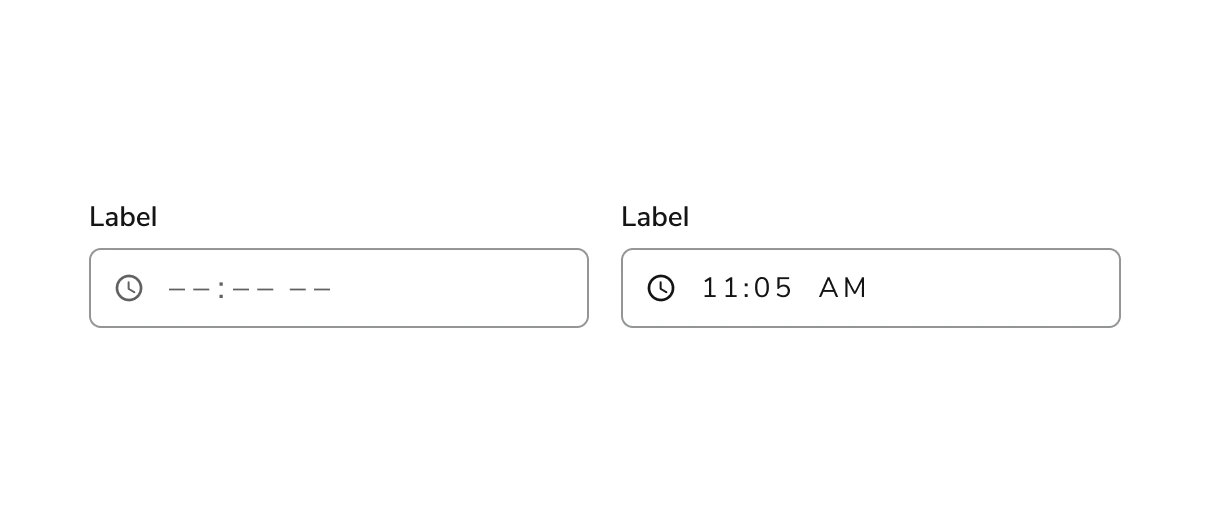
> Allows users to enter a time into an input, potentially with predefined stops.

export const LiveCode = ({children, customHeight, clickToLoad, example, fullWidth, fullHeight, hideCodeInLiveCode, screenshot, screenshotOnly, showCode: showCodeProp}) => {
  const SCREENSHOTS_BASE = "https://servicetitan.github.io/anvil2-docs-live-code/screenshots";
  const STACKBLITZ_BASE = "https://stackblitz.com/github/servicetitan/anvil2-docs-live-code/tree/main/examples";
  const [showCodeBlock, setShowCodeBlock] = useState(showCodeProp ?? false);
  const [isLocalOverride, setIsLocalOverride] = useState(false);
  useEffect(() => {
    const examplePath = `/images/live-code-screenshots-tmp/${example}.png`;
    fetch(examplePath, {
      method: "HEAD"
    }).then(r => {
      if (r.ok) setIsLocalOverride(true);
    }).catch(() => {});
  }, [example]);
  const screenshotBase = isLocalOverride ? "/images/live-code-screenshots-tmp" : SCREENSHOTS_BASE;
  if (screenshotOnly) {
    return <Frame className="flex flex-col">
        <div className="flex dark:hidden" style={{
      justifyContent: "center",
      alignItems: "center",
      width: fullWidth ? "100%" : "50%",
      minHeight: fullHeight ? "284px" : undefined,
      background: "#FFFFFF"
    }}>
          <img srcset={`${screenshotBase}/${example}.png, ${screenshotBase}/${example}-2x.png 2x`} src={`${screenshotBase}/${example}.png`} alt={example} noZoom />
        </div>
        <div className="hidden dark:flex" style={{
      justifyContent: "center",
      alignItems: "center",
      width: fullWidth ? "100%" : "50%",
      minHeight: fullHeight ? "284px" : undefined,
      background: "#141414"
    }}>
          <img srcset={`${screenshotBase}/${example}-dark.png, ${screenshotBase}/${example}-dark-2x.png 2x`} src={`${screenshotBase}/${example}-dark.png`} alt={example} noZoom />
        </div>
      </Frame>;
  }
  if (screenshot) {
    return <Frame className="flex flex-col -mb-2">
        <div className="flex dark:hidden bg-white dark:bg-codeblock border border-gray-950/10 dark:border-white/10 dark:twoslash-dark rounded-2xl overflow-hidden" style={{
      justifyContent: "center",
      alignItems: "center",
      width: fullWidth ? "100%" : "50%",
      minHeight: fullHeight ? "284px" : undefined
    }}>
          <img srcset={`${screenshotBase}/${example}.png, ${screenshotBase}/${example}-2x.png 2x`} src={`${screenshotBase}/${example}.png`} alt={example} noZoom />
        </div>

        <div className="hidden dark:flex bg-white dark:bg-codeblock border border-gray-950/10 dark:border-white/10 dark:twoslash-dark rounded-2xl overflow-hidden" style={{
      background: "#141414",
      justifyContent: "center",
      alignItems: "center",
      width: fullWidth ? "100%" : "50%",
      minHeight: fullHeight ? "284px" : undefined
    }}>
          <img srcset={`${screenshotBase}/${example}-dark.png, ${screenshotBase}/${example}-dark-2x.png 2x`} src={`${screenshotBase}/${example}-dark.png`} alt={example} noZoom />
        </div>

        <div className="flex justify-end items-center text-xs py-2 px-1 gap-4">
          {!showCodeProp ? <button className="inline-flex justify-end items-center text-gray-700 dark:text-gray-50 hover:text-blue-500 dark:hover:text-blue-300 transition-colors group self-end gap-1 cursor-pointer" onClick={() => setShowCodeBlock(!showCodeBlock)} style={{
      appearance: "none"
    }}>
              <Icon icon="code" size="12px" className="group-hover:bg-blue-500 dark:group-hover:bg-blue-300" />
              <span>{showCodeBlock ? "Hide code" : "Show code"}</span>
            </button> : null}

          <a className="inline-flex justify-end items-center hover:text-blue-500 dark:hover:text-blue-300 transition-colors group self-end gap-1" href={`${STACKBLITZ_BASE}/${example}?file=src/App.tsx`} target="_blank" rel="noreferrer">
            <Icon icon="bolt" size="12px" className="group-hover:bg-blue-500 dark:group-hover:bg-blue-300" />
            <span>StackBlitz demo</span>
          </a>
        </div>

        <div className="grid transition-[grid-template-rows] duration-300 ease-in-out overflow-auto overflow-y-hidden overflow-x-auto" style={showCodeBlock ? {
      gridTemplateRows: "1fr"
    } : {
      gridTemplateRows: "0fr"
    }}>
          <div style={{
      minHeight: 0,
      overflowX: "auto",
      overflowY: "hidden",
      marginBlockStart: "-1.25rem",
      marginBlockEnd: "-1.5rem"
    }}>
            {children}
          </div>
        </div>
      </Frame>;
  } else {
    return <div style={{
      display: "flex",
      width: fullWidth ? "100%" : "50%",
      minHeight: customHeight ? customHeight : "316px",
      resize: "vertical",
      overflow: "auto"
    }}>
        <iframe title={example} style={{
      flex: 1,
      width: fullWidth ? "100%" : "50%",
      minHeight: customHeight ? customHeight : "316px"
    }} src={`${STACKBLITZ_BASE}/${example}?embed=1&hideNavigation=1&hideExplorer=1&terminalHeight=0&file=src/App.tsx${clickToLoad ? "&ctl=1" : ""}${hideCodeInLiveCode ? "&view=preview" : ""}`} allow="accelerometer; ambient-light-sensor; camera; encrypted-media; geolocation; gyroscope; hid; microphone; midi; payment; usb; vr; xr-spatial-tracking" sandbox="allow-forms allow-modals allow-popups allow-presentation allow-same-origin allow-scripts" />
      </div>;
  }
};

export const CodePreviewPlaceholder = ({double, fullWidth}) => {
  const single = <div style={{
    width: fullWidth ? "100%" : "50%",
    borderRadius: "1rem",
    display: "flex",
    padding: "1rem",
    flexDirection: "column",
    gap: "0.5rem",
    height: "10rem",
    marginBlockEnd: "1rem"
  }} className="border-width-default border-color-subdued">
      <div className="bg-strong border-radius-large" style={{
    width: "100%",
    flexGrow: "1"
  }} />
      <div className="bg-strong border-radius-large" style={{
    width: "100%",
    flexGrow: "1"
  }} />
    </div>;
  return double ? <div style={{
    display: "flex",
    gap: "1rem"
  }}>
      {single}
      {single}
    </div> : single;
};

<Frame>
  <div className="w-full h-full bg-[#FFFFFF] p-2 rounded flex items-center justify-center">
    <img noZoom src="https://mintcdn.com/servicetitan/uz2PQSvO75TRhQ38/images/docs/web/components/shared/image-of-the-time-field-component-both-with-placeholder-and-the-entered-time-of-1105am.png?fit=max&auto=format&n=uz2PQSvO75TRhQ38&q=85&s=c717abfc082368523d714cd156c2448e" width="1210" height="528" data-path="images/docs/web/components/shared/image-of-the-time-field-component-both-with-placeholder-and-the-entered-time-of-1105am.png" />
  </div>
</Frame>

## Anatomy

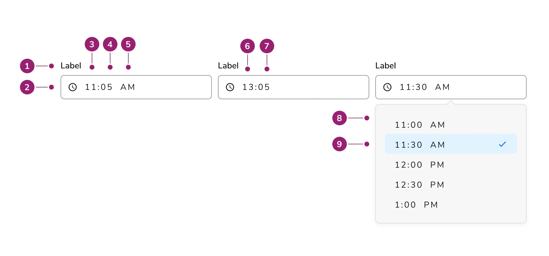
The Time Field consists of nine primary elements that work together to allow users to enter a time into an input.

<Frame>
  <div className="w-full h-full bg-[#FFFFFF] p-2 rounded flex items-center justify-center">
    <img
      src="https://mintcdn.com/servicetitan/ar8TJanaRSxOpbCO/images/docs/web/components/time-field/design/anatomy-of-the-time-field-component.png?fit=max&auto=format&n=ar8TJanaRSxOpbCO&q=85&s=027e21b9b1bffe01e75daa656c1b44b5"
      alt="Anatomy of the Time Field
component"
      width="1814"
      height="846"
      data-path="images/docs/web/components/time-field/design/anatomy-of-the-time-field-component.png"
    />
  </div>
</Frame>

1. Label
2. Clock icon (permanent)
3. Hours (AM/PM variant)
4. Minutes (AM/PM variant)
5. AM/PM marker
6. Hours (24hr variant)
7. Minutes (24hr variant)
8. Options panel
9. Selected option

## Options

The Time Field supports 12-hour and 24-hour format configurations to accommodate various time entry scenarios.

### 12hr vs. 24 hour

Time Field supports 12-hour and 24-hour formats. 12-hour format is the default.

<LiveCode example="timefield-format" screenshot fullWidth>
  ```tsx lines theme={null}
  import { TimeField, Grid } from "@servicetitan/anvil2";

  function App() {
    return (
      <Grid templateColumns="repeat(2, 1fr)" gap={4}>
        <TimeField
          label="Label"
          onChange={(change) => {
            console.log("Time changed:", change.time);
          }}
        />

        <TimeField
          label="Field with 24 hour format"
          format={24}
          onChange={(change) => {
            console.log("Time changed:", change.time);
          }}
        />
      </Grid>
    );
  }

  export default App;
  ```
</LiveCode>

## Behavior

The Time Field responds to user interaction with distinct visual states, error handling, and min/max constraints.

### Visual States

<LiveCode example="timefield-data-interactive" screenshot fullWidth>
  ```tsx lines theme={null}
  import { TimeField, Grid } from "@servicetitan/anvil2";

  function App() {
    return (
      <Grid templateColumns="repeat(2, 1fr)" gap={4}>
        <TimeField
          label="Label"
          onChange={(change) => {
            console.log("Time changed:", change.time);
          }}
        />

        <TimeField
          label="Label"
          disabled
          onChange={(change) => {
            console.log("Time changed:", change.time);
          }}
        />

        <TimeField
          label="Label"
          data-interactive="focus-visible"
          onChange={(change) => {
            console.log("Time changed:", change.time);
          }}
        />

        <TimeField
          label="Label"
          description="An example description"
          onChange={(change) => {
            console.log("Time changed:", change.time);
          }}
        />

        <TimeField
          label="Label"
          error="Time out of bounds"
          onChange={(change) => {
            console.log("Time changed:", change.time);
          }}
        />
      </Grid>
    );
  }

  export default App;
  ```
</LiveCode>

### Erroring

* Errors occur when the field is required and the developer has added definitions for `isInputInvalid` and `isInputEmpty` properties on blur.
* When auto-rounding is set to `true` and the user enters a non-rounded value, the value updates on blur without erroring.
* When users must enter a time at a particular interval, use an input with suggestions and steps instead of erroring to guide the user.
* Read more about validation in the [code tab](/docs/web/components/time-field/code#validation).

### Min/max setting

* Input accepts both min and max values.
* For option time fields, this sets the available options to a min and max based on the increment step.
* Times outside the time frame constraints cannot be entered into the field.
* Read more about min/max setting in the [code tab](/docs/web/components/time-field/code#min-and-max-constraints).

## Usage Guidelines

Use the Time Field when users need to input a time, such as recording when an event occurred or setting an appointment time.

### How to Use

When possible, provide an initial value in the Time Field. For example, if appointments are only possible on a particular day between noon and 3pm, provide the time "12:00 PM" and allow the user to change it from there.

<LiveCode example="timefield-value-do" screenshot fullWidth>
  ```tsx lines theme={null}
  import { TimeField } from "@servicetitan/anvil2";

  function App() {
    return (
      <TimeField
        label="Time Field with Initial Value"
        step={60}
        value="09:00AM"
        onChange={(change) => {
          // change function
          console.log("Time changed:", change.time);
        }}
      />
    );
  }

  export default App;
  ```
</LiveCode>

When possible, provide min and max values in the Time Field. For example, if appointments are only possible during business hours, add the opening and closing times as min and max values, so the user cannot make selections outside of the allotted time frame. Here, the Time Picker displays values between 9am and 5pm.

<LiveCode example="timefield-minmax-do" screenshot fullWidth>
  ```tsx lines theme={null}
  import { TimeField } from "@servicetitan/anvil2";

  function App() {
    return (
      <TimeField
        label="Field with min/max/autoround"
        min="09:00 AM"
        max="05:00 PM"
        description="Enter a time between 09:00 AM and 05:00 PM."
        onChange={(change) => {
          console.log("Time changed:", change.time);
        }}
      />
    );
  }

  export default App;
  ```
</LiveCode>

Provide intelligent time stops for the user when selecting time if possible. For example, if the user can only input time(s) in 15 minute intervals, provide the options dropdown with that stop to help the user input their times correctly.

<LiveCode example="timefield-step-do" screenshot fullWidth>
  ```tsx lines theme={null}
  import { TimeField } from "@servicetitan/anvil2";

  function App() {
    return (
      <TimeField
        label="Field with step suggestions"
        step={30}
        onChange={(change) => {
          console.log("Time changed:", change.time);
        }}
      />
    );
  }

  export default App;
  ```
</LiveCode>

## Content

Content within the Time Field should clearly communicate the expected time format through labels and placeholder text.

## Keyboard Interaction

Users can navigate the Time Field using standard keyboard controls.

| Key                | Action                                                          |
| ------------------ | --------------------------------------------------------------- |
| Up and down arrows | Moves up and down between options and the AM/PM in the dropdown |
| Enter              | Selects the time and closes the dropdown selector               |