## Anatomy
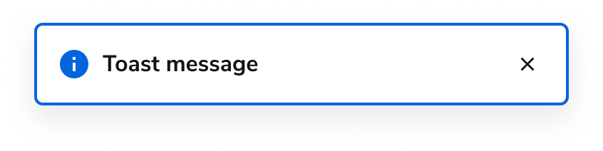
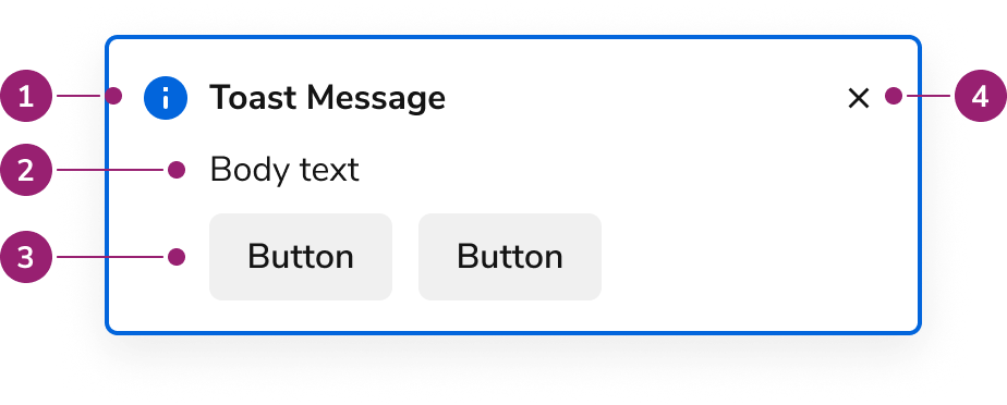
The Toast consists of four primary elements that work together to create temporary alerts that appear as a direct result of a user action.
1. Title
2. Body content
3. Actions
4. Close button
## Options
The Toast supports the following configurations to accommodate various notification scenarios.
### Status
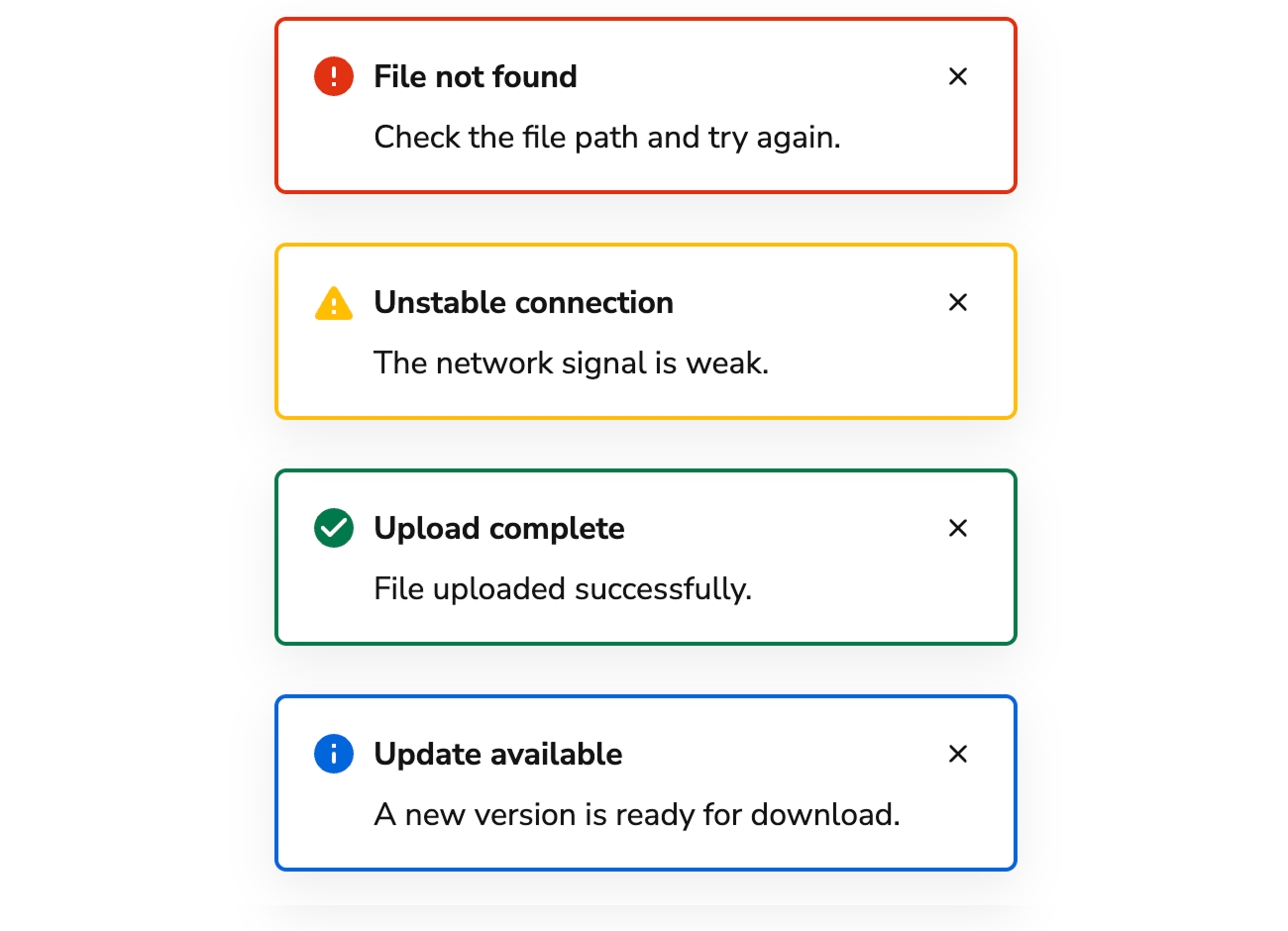
| Type | Description |
| -------------- | ----------------------------------------------------------------------------------------------------------------------------- |
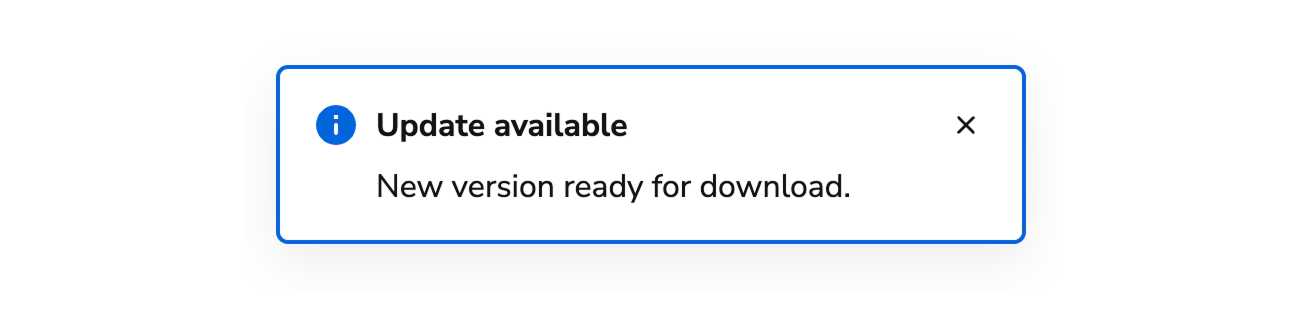
| Informational | Non-essential information as the result of a user action. |
| Success | Confirmation that a task was successfully completed. |
| Warning | Information to warn users of a potential issue as the result of an action. Often paired with an action to help users recover. |
| Critical/Error | Used to communicate an error or other failure. Often paired with an action to help users recover. |
### Content Area
At minimum, a Toast consists of a title. Toasts also support body content, including a body message, actions, or progress bar.
### AI Mark
```tsx lines theme={null}
import { toast, Flex, Grid, Button } from "@servicetitan/anvil2";
function App() {
const config = {
title: "AI dispatch digest",
message:
"Today: 6 jobs—2 AC tune-ups, 2 drain calls, 1 heat-pump startup, and 1 panel inspection. Two are marked urgent.",
duration: 8000,
aiMark: true,
};
return (
);
}
export default App;
```
Include an [AI Mark](/docs/web/components/ai-mark/code) in a Toast when the title should indicate AI-generated content.
## Usage Guidelines
Use the Toast when the user does not need to be interrupted and is being informed of an event with the option to take action.
### When to Use
Toast notifications are used when:
* The user does not need to be interrupted.
* The user is being informed of an event, with the option to take action.
* The results of an action are delayed.
* The notification could appear anywhere in the application.
See the notification pattern for additional guidance.
#### Status Variations
##### Informational
Communicates operational information to the user. These are commonly used to denote the start of an operation, and usually includes follow-up notifications.
##### Success
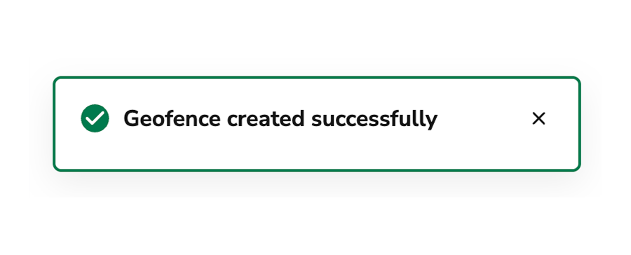
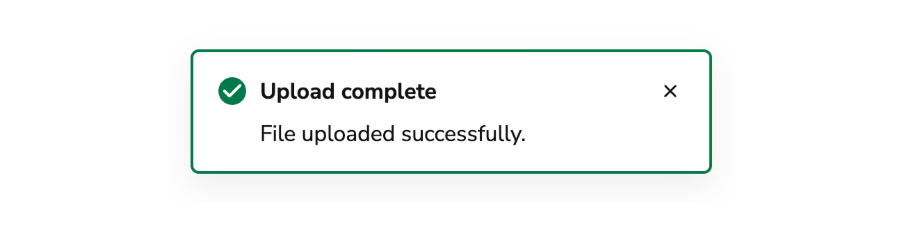
Communicates the success of an operation, e.g., user preferences were updated.
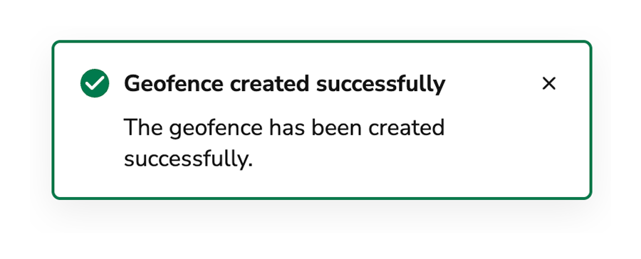
Avoid including the term "successfully" in success Toasts as it duplicates information.
##### Critical/Error
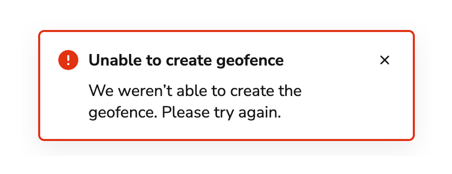
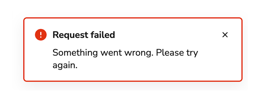
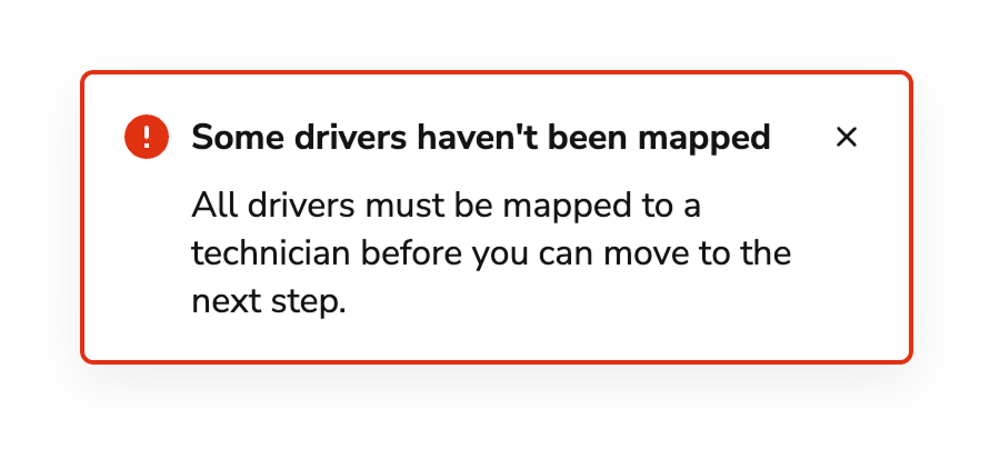
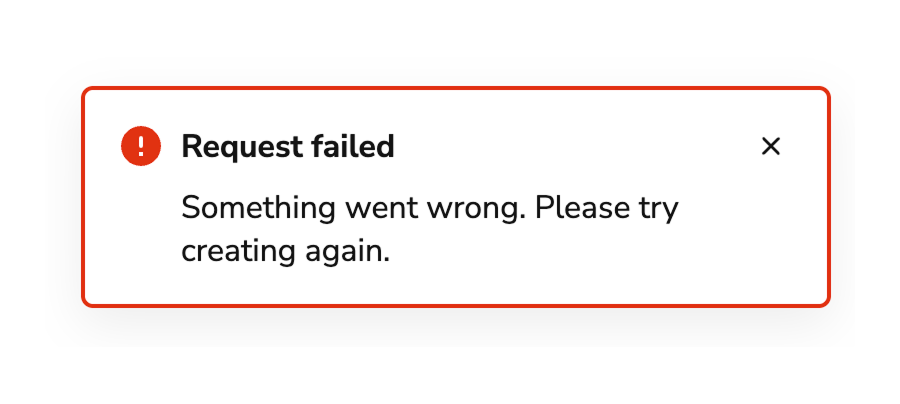
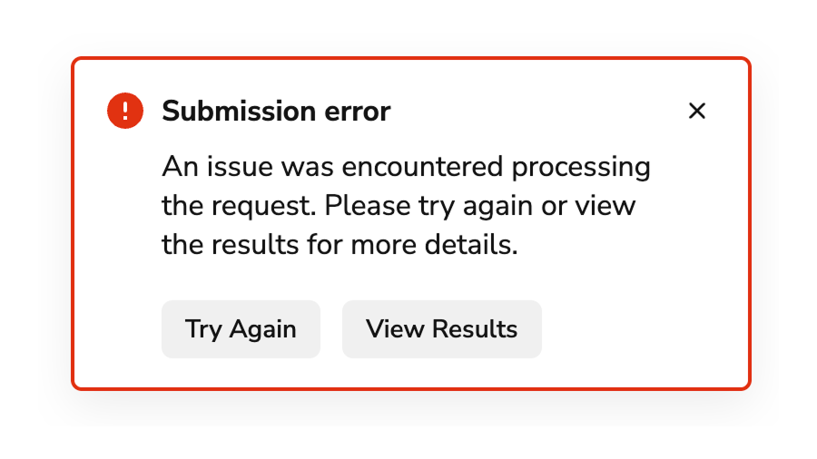
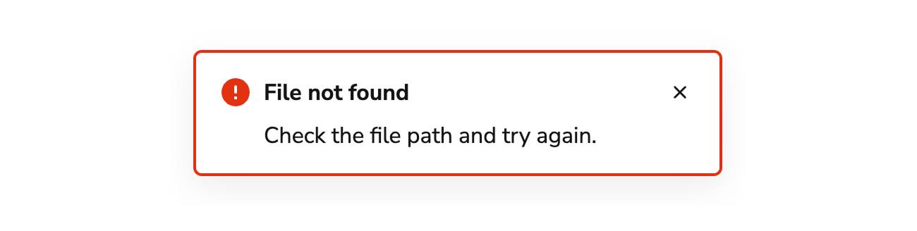
Critical Toasts are used when an operation was unable to be performed or has failed. Page-specific and form errors should utilize the Alert notification. When applicable, users should be able to take action on an operation.
##### Warning
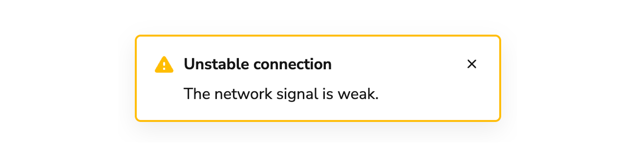
Warnings are distinct from errors and represent issues that do not need an immediate resolution, but still need to be addressed. Unintended consequences in an operation and fallback choices are common examples. In general, users should be able to take action on a warning.
### Alternatives
#### Toast vs Alert
Alerts are used to communicate information about either part of a page or a whole page. Alerts can be used to summarize information, such as a summary of errors.
Toasts are brief pieces of information and usually appear as the result of user action.
#### Toast vs Announcement
Announcements are used to convey app-wide messages, such as a new release being available, application maintenance, or sandbox information.
Toasts are short pieces of information usually prompted by user action.
## Behavior
The Toast responds to timing requirements and positioning constraints while maintaining consistent notification appearance.
### How to Use
#### Positioning
Toasts are positioned in the top-right of the screen on top of application UI. Toasts do not cover any part of the global navigation.
#### Timing
By default, Toasts are persistent until dismissed by a user. An optional timeout is available. The recommended duration is 8 seconds, but this can be customized.
Toasts are always persistent in the following cases:
* When there are any actions within the Toast.
* When a Toast contains a Progress Bar.
* When a Toast is in an error state.
Avoid adding a timeout when a Toast contains information that users may need to copy or remember.
#### Progress Bar
When the time to complete a task can be calculated, pair a Toast with a [Progress Bar](/docs/web/components/progress-bar/design).
## Content
Content within the Toast should be brief, scannable, and actionable.
### Titles should be brief and scannable and as specific as possible.
Use sentence case. Don't use periods and exclamation points, and avoid articles: a, an, the.
### Write titles as verbs
Titles should have a clear verb + noun question or statement.
**Do**
**Don't**
### Messages that can be communicated in a single header don't require body text.
Body text should only provide information that is not included in the header. Do not repeat information that's already in the header.
**Do**
**Don't**
### Make body content concise, informative, and actionable
Use imperative verbs when telling users what they need to know or do. Avoid permissive language like "you can".
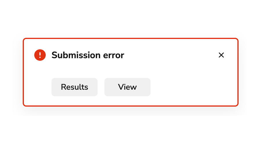
Whenever possible, include an in-line action for a user to take so that they can readily address the issue explained in the message.
**Do**
**Don't**
### Buttons should be clear, predictable, and action-oriented
Users should be able to predict what will happen when they click a button.
Lead with a strong verb that encourages action. Use a verb/noun pair on actions in most cases. Common actions like Save, Close, or Cancel do not require an accompanying noun.


 | Type | Description |
| -------------- | ----------------------------------------------------------------------------------------------------------------------------- |
| Informational | Non-essential information as the result of a user action. |
| Success | Confirmation that a task was successfully completed. |
| Warning | Information to warn users of a potential issue as the result of an action. Often paired with an action to help users recover. |
| Critical/Error | Used to communicate an error or other failure. Often paired with an action to help users recover. |
### Content Area
| Type | Description |
| -------------- | ----------------------------------------------------------------------------------------------------------------------------- |
| Informational | Non-essential information as the result of a user action. |
| Success | Confirmation that a task was successfully completed. |
| Warning | Information to warn users of a potential issue as the result of an action. Often paired with an action to help users recover. |
| Critical/Error | Used to communicate an error or other failure. Often paired with an action to help users recover. |
### Content Area
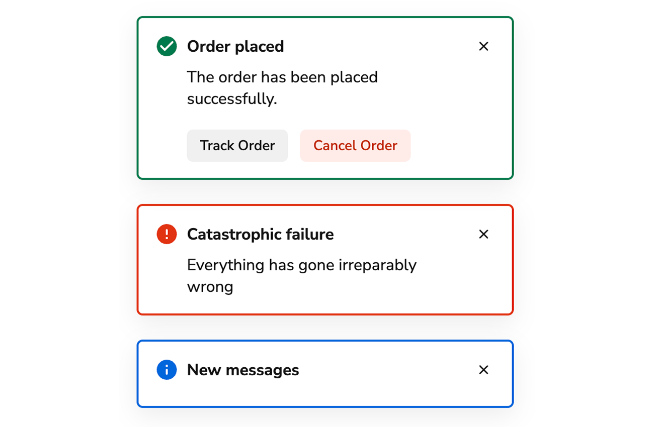 At minimum, a Toast consists of a title. Toasts also support body content, including a body message, actions, or progress bar.
### AI Mark
At minimum, a Toast consists of a title. Toasts also support body content, including a body message, actions, or progress bar.
### AI Mark
 ##### Success
Communicates the success of an operation, e.g., user preferences were updated.
Avoid including the term "successfully" in success Toasts as it duplicates information.
##### Success
Communicates the success of an operation, e.g., user preferences were updated.
Avoid including the term "successfully" in success Toasts as it duplicates information.
 ##### Critical/Error
Critical Toasts are used when an operation was unable to be performed or has failed. Page-specific and form errors should utilize the Alert notification. When applicable, users should be able to take action on an operation.
##### Critical/Error
Critical Toasts are used when an operation was unable to be performed or has failed. Page-specific and form errors should utilize the Alert notification. When applicable, users should be able to take action on an operation.
 ##### Warning
Warnings are distinct from errors and represent issues that do not need an immediate resolution, but still need to be addressed. Unintended consequences in an operation and fallback choices are common examples. In general, users should be able to take action on a warning.
##### Warning
Warnings are distinct from errors and represent issues that do not need an immediate resolution, but still need to be addressed. Unintended consequences in an operation and fallback choices are common examples. In general, users should be able to take action on a warning.
 ### Alternatives
#### Toast vs Alert
Alerts are used to communicate information about either part of a page or a whole page. Alerts can be used to summarize information, such as a summary of errors.
Toasts are brief pieces of information and usually appear as the result of user action.
#### Toast vs Announcement
Announcements are used to convey app-wide messages, such as a new release being available, application maintenance, or sandbox information.
Toasts are short pieces of information usually prompted by user action.
## Behavior
The Toast responds to timing requirements and positioning constraints while maintaining consistent notification appearance.
### How to Use
#### Positioning
Toasts are positioned in the top-right of the screen on top of application UI. Toasts do not cover any part of the global navigation.
#### Timing
By default, Toasts are persistent until dismissed by a user. An optional timeout is available. The recommended duration is 8 seconds, but this can be customized.
Toasts are always persistent in the following cases:
* When there are any actions within the Toast.
* When a Toast contains a Progress Bar.
* When a Toast is in an error state.
Avoid adding a timeout when a Toast contains information that users may need to copy or remember.
#### Progress Bar
When the time to complete a task can be calculated, pair a Toast with a [Progress Bar](/docs/web/components/progress-bar/design).
## Content
Content within the Toast should be brief, scannable, and actionable.
### Titles should be brief and scannable and as specific as possible.
Use sentence case. Don't use periods and exclamation points, and avoid articles: a, an, the.
### Write titles as verbs
Titles should have a clear verb + noun question or statement.
### Alternatives
#### Toast vs Alert
Alerts are used to communicate information about either part of a page or a whole page. Alerts can be used to summarize information, such as a summary of errors.
Toasts are brief pieces of information and usually appear as the result of user action.
#### Toast vs Announcement
Announcements are used to convey app-wide messages, such as a new release being available, application maintenance, or sandbox information.
Toasts are short pieces of information usually prompted by user action.
## Behavior
The Toast responds to timing requirements and positioning constraints while maintaining consistent notification appearance.
### How to Use
#### Positioning
Toasts are positioned in the top-right of the screen on top of application UI. Toasts do not cover any part of the global navigation.
#### Timing
By default, Toasts are persistent until dismissed by a user. An optional timeout is available. The recommended duration is 8 seconds, but this can be customized.
Toasts are always persistent in the following cases:
* When there are any actions within the Toast.
* When a Toast contains a Progress Bar.
* When a Toast is in an error state.
Avoid adding a timeout when a Toast contains information that users may need to copy or remember.
#### Progress Bar
When the time to complete a task can be calculated, pair a Toast with a [Progress Bar](/docs/web/components/progress-bar/design).
## Content
Content within the Toast should be brief, scannable, and actionable.
### Titles should be brief and scannable and as specific as possible.
Use sentence case. Don't use periods and exclamation points, and avoid articles: a, an, the.
### Write titles as verbs
Titles should have a clear verb + noun question or statement.