> ## Documentation Index
> Fetch the complete documentation index at: https://anvil.servicetitan.com/llms.txt
> Use this file to discover all available pages before exploring further.

# Toolbar – Design

> Toolbars are containers for grouping a set of controls, such as buttons, menubuttons, or checkboxes.

export const LiveCode = ({children, customHeight, clickToLoad, example, fullWidth, fullHeight, hideCodeInLiveCode, screenshot, screenshotOnly, showCode: showCodeProp}) => {
  const SCREENSHOTS_BASE = "https://servicetitan.github.io/anvil2-docs-live-code/screenshots";
  const STACKBLITZ_BASE = "https://stackblitz.com/github/servicetitan/anvil2-docs-live-code/tree/main/examples";
  const [showCodeBlock, setShowCodeBlock] = useState(showCodeProp ?? false);
  const [isLocalOverride, setIsLocalOverride] = useState(false);
  useEffect(() => {
    const examplePath = `/images/live-code-screenshots-tmp/${example}.png`;
    fetch(examplePath, {
      method: "HEAD"
    }).then(r => {
      if (r.ok) setIsLocalOverride(true);
    }).catch(() => {});
  }, [example]);
  const screenshotBase = isLocalOverride ? "/images/live-code-screenshots-tmp" : SCREENSHOTS_BASE;
  if (screenshotOnly) {
    return <Frame className="flex flex-col">
        <div className="flex dark:hidden" style={{
      justifyContent: "center",
      alignItems: "center",
      width: fullWidth ? "100%" : "50%",
      minHeight: fullHeight ? "284px" : undefined,
      background: "#FFFFFF"
    }}>
          <img srcset={`${screenshotBase}/${example}.png, ${screenshotBase}/${example}-2x.png 2x`} src={`${screenshotBase}/${example}.png`} alt={example} noZoom />
        </div>
        <div className="hidden dark:flex" style={{
      justifyContent: "center",
      alignItems: "center",
      width: fullWidth ? "100%" : "50%",
      minHeight: fullHeight ? "284px" : undefined,
      background: "#141414"
    }}>
          <img srcset={`${screenshotBase}/${example}-dark.png, ${screenshotBase}/${example}-dark-2x.png 2x`} src={`${screenshotBase}/${example}-dark.png`} alt={example} noZoom />
        </div>
      </Frame>;
  }
  if (screenshot) {
    return <Frame className="flex flex-col -mb-2">
        <div className="flex dark:hidden bg-white dark:bg-codeblock border border-gray-950/10 dark:border-white/10 dark:twoslash-dark rounded-2xl overflow-hidden" style={{
      justifyContent: "center",
      alignItems: "center",
      width: fullWidth ? "100%" : "50%",
      minHeight: fullHeight ? "284px" : undefined
    }}>
          <img srcset={`${screenshotBase}/${example}.png, ${screenshotBase}/${example}-2x.png 2x`} src={`${screenshotBase}/${example}.png`} alt={example} noZoom />
        </div>

        <div className="hidden dark:flex bg-white dark:bg-codeblock border border-gray-950/10 dark:border-white/10 dark:twoslash-dark rounded-2xl overflow-hidden" style={{
      background: "#141414",
      justifyContent: "center",
      alignItems: "center",
      width: fullWidth ? "100%" : "50%",
      minHeight: fullHeight ? "284px" : undefined
    }}>
          <img srcset={`${screenshotBase}/${example}-dark.png, ${screenshotBase}/${example}-dark-2x.png 2x`} src={`${screenshotBase}/${example}-dark.png`} alt={example} noZoom />
        </div>

        <div className="flex justify-end items-center text-xs py-2 px-1 gap-4">
          {!showCodeProp ? <button className="inline-flex justify-end items-center text-gray-700 dark:text-gray-50 hover:text-blue-500 dark:hover:text-blue-300 transition-colors group self-end gap-1 cursor-pointer" onClick={() => setShowCodeBlock(!showCodeBlock)} style={{
      appearance: "none"
    }}>
              <Icon icon="code" size="12px" className="group-hover:bg-blue-500 dark:group-hover:bg-blue-300" />
              <span>{showCodeBlock ? "Hide code" : "Show code"}</span>
            </button> : null}

          <a className="inline-flex justify-end items-center hover:text-blue-500 dark:hover:text-blue-300 transition-colors group self-end gap-1" href={`${STACKBLITZ_BASE}/${example}?file=src/App.tsx`} target="_blank" rel="noreferrer">
            <Icon icon="bolt" size="12px" className="group-hover:bg-blue-500 dark:group-hover:bg-blue-300" />
            <span>StackBlitz demo</span>
          </a>
        </div>

        <div className="grid transition-[grid-template-rows] duration-300 ease-in-out overflow-auto overflow-y-hidden overflow-x-auto" style={showCodeBlock ? {
      gridTemplateRows: "1fr"
    } : {
      gridTemplateRows: "0fr"
    }}>
          <div style={{
      minHeight: 0,
      overflowX: "auto",
      overflowY: "hidden",
      marginBlockStart: "-1.25rem",
      marginBlockEnd: "-1.5rem"
    }}>
            {children}
          </div>
        </div>
      </Frame>;
  } else {
    return <div style={{
      display: "flex",
      width: fullWidth ? "100%" : "50%",
      minHeight: customHeight ? customHeight : "316px",
      resize: "vertical",
      overflow: "auto"
    }}>
        <iframe title={example} style={{
      flex: 1,
      width: fullWidth ? "100%" : "50%",
      minHeight: customHeight ? customHeight : "316px"
    }} src={`${STACKBLITZ_BASE}/${example}?embed=1&hideNavigation=1&hideExplorer=1&terminalHeight=0&file=src/App.tsx${clickToLoad ? "&ctl=1" : ""}${hideCodeInLiveCode ? "&view=preview" : ""}`} allow="accelerometer; ambient-light-sensor; camera; encrypted-media; geolocation; gyroscope; hid; microphone; midi; payment; usb; vr; xr-spatial-tracking" sandbox="allow-forms allow-modals allow-popups allow-presentation allow-same-origin allow-scripts" />
      </div>;
  }
};

export const CodePreviewPlaceholder = ({double, fullWidth}) => {
  const single = <div style={{
    width: fullWidth ? "100%" : "50%",
    borderRadius: "1rem",
    display: "flex",
    padding: "1rem",
    flexDirection: "column",
    gap: "0.5rem",
    height: "10rem",
    marginBlockEnd: "1rem"
  }} className="border-width-default border-color-subdued">
      <div className="bg-strong border-radius-large" style={{
    width: "100%",
    flexGrow: "1"
  }} />
      <div className="bg-strong border-radius-large" style={{
    width: "100%",
    flexGrow: "1"
  }} />
    </div>;
  return double ? <div style={{
    display: "flex",
    gap: "1rem"
  }}>
      {single}
      {single}
    </div> : single;
};

<Frame>
  <div className="w-full h-full bg-[#FFFFFF] p-2 rounded flex items-center justify-center">
    <img noZoom src="https://mintcdn.com/servicetitan/uz2PQSvO75TRhQ38/images/docs/web/components/shared/image-of-a-toolbar.png?fit=max&auto=format&n=uz2PQSvO75TRhQ38&q=85&s=05d4ef34abf258e0219c35c6f7152eee" width="1848" height="234" data-path="images/docs/web/components/shared/image-of-a-toolbar.png" />
  </div>
</Frame>

## Anatomy

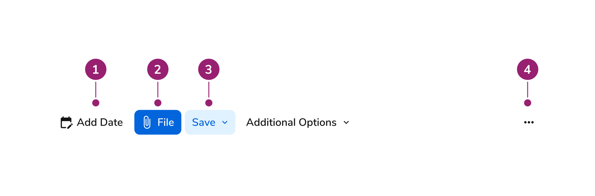
The Toolbar consists of four primary elements that work together to group a set of controls.

<Frame>
  <div className="w-full h-full bg-[#FFFFFF] p-2 rounded flex items-center justify-center">
    <img
      src="https://mintcdn.com/servicetitan/ar8TJanaRSxOpbCO/images/docs/web/components/toolbar/design/image-of-the-anatomy-of-the-toolbar-split-into-five-subsections-details-below.png?fit=max&auto=format&n=ar8TJanaRSxOpbCO&q=85&s=c628a1b3275ec94ba9a93ff4d5d74fbd"
      alt="Image of the anatomy of the toolbar, split into five subsections details
below"
      width="2013"
      height="666"
      data-path="images/docs/web/components/toolbar/design/image-of-the-anatomy-of-the-toolbar-split-into-five-subsections-details-below.png"
    />
  </div>
</Frame>

1. Individual tools
2. Button
3. Select
4. Additional tools overflow menu

## Options

The Toolbar supports the following configurations to accommodate various control grouping scenarios.

### Direction

#### Horizontal Toolbar

<LiveCode example="toolbar-horizontal" screenshot fullWidth>
  ```tsx lines theme={null}
  import { Toolbar } from "@servicetitan/anvil2";

  function App() {
    return (
      <div style={{ padding: "20px" }}>
        <div>
          <Toolbar associatedContent="basic toolbar" direction="horizontal">
            <Toolbar.Button
              onClick={() => console.log("File button default clicked")}
            >
              File
            </Toolbar.Button>
            <Toolbar.Button
              appearance="primary"
              onClick={() => console.log("File button default clicked")}
            >
              File
            </Toolbar.Button>

            <Toolbar.ButtonToggle
              defaultChecked
              onClick={() =>
                console.log("Bold button toggle uncontrolled clicked")
              }
            >
              Bold
            </Toolbar.ButtonToggle>

            <Toolbar.ButtonLink
              href="#"
              onClick={() => console.log("View Report default clicked")}
            >
              View Report
            </Toolbar.ButtonLink>

            <Toolbar.Select
              accessibleLabel="Status"
              appearance="primary"
              items={[
                { id: "status1", label: "Active" },
                { id: "status2", label: "Pending" },
                { id: "status3", label: "Completed" },
                { id: "status4", label: "Cancelled", disabled: true },
              ]}
              onChange={() => console.log("Status select changed")}
            />

            <Toolbar.Select
              accessibleLabel="Status"
              items={[
                { id: "status1", label: "Active" },
                { id: "status2", label: "Pending" },
                { id: "status3", label: "Completed" },
                { id: "status4", label: "Cancelled", disabled: true },
              ]}
              onChange={() => console.log("Status select changed")}
            />
          </Toolbar>
        </div>
      </div>
    );
  }

  export default App;
  ```
</LiveCode>

#### Vertical Toolbar

<LiveCode example="toolbar-vertical" screenshot fullWidth>
  ```tsx lines theme={null}
  import { Toolbar } from "@servicetitan/anvil2";

  function App() {
    return (
      <div style={{ padding: "20px" }}>
        <div>
          <Toolbar associatedContent="basic toolbar" direction="vertical">
            <Toolbar.Button
              onClick={() => console.log("File button default clicked")}
            >
              File
            </Toolbar.Button>

            <Toolbar.ButtonToggle
              defaultChecked
              onClick={() =>
                console.log("Bold button toggle uncontrolled clicked")
              }
            >
              Bold
            </Toolbar.ButtonToggle>

            <Toolbar.ButtonLink
              href="#"
              onClick={() => console.log("View Report default clicked")}
            >
              View Report
            </Toolbar.ButtonLink>

            <Toolbar.Select
              accessibleLabel="Status"
              items={[
                { id: "status1", label: "Active" },
                { id: "status2", label: "Pending" },
                { id: "status3", label: "Completed" },
                { id: "status4", label: "Cancelled", disabled: true },
              ]}
              onChange={() => console.log("Status select changed")}
            />
          </Toolbar>
        </div>
      </div>
    );
  }

  export default App;
  ```
</LiveCode>

| Direction  | Description                                              |
| ---------- | -------------------------------------------------------- |
| Horizontal | The default behavior, which lays out tools horizontally. |
| Vertical   | Lays out tools vertically.                               |

### Size

Toolbar supports four size options that control the dimensions of all child components. The size propagates to buttons, toggles, links, and selects within the toolbar via context.

| Size   | Description                                                      |
| ------ | ---------------------------------------------------------------- |
| XSmall | Minimal sizing for highly compact or space-constrained layouts.  |
| Small  | Compact sizing for dense layouts or secondary toolbars.          |
| Medium | The default size, suitable for most toolbar use cases.           |
| Large  | Larger sizing for increased touch targets or prominent toolbars. |

## Behavior

The Toolbar responds to space constraints with wrapping and collapse behaviors while maintaining consistent control grouping.

### Wrapping

#### Toolbar with Wrapping Behavior

<LiveCode example="toolbar-overflow-wrap" screenshot fullWidth>
  ```tsx lines theme={null}
  import { Toolbar } from "@servicetitan/anvil2";

  function App() {
    return (
      <div style={{ padding: "20px" }}>
        <div
          style={{
            maxWidth: "220px",
          }}
        >
          <Toolbar associatedContent="basic toolbar">
            <Toolbar.Button
              onClick={() => console.log("File button default clicked")}
            >
              File
            </Toolbar.Button>

            <Toolbar.ButtonToggle
              defaultChecked
              onClick={() =>
                console.log("Bold button toggle uncontrolled clicked")
              }
            >
              Bold
            </Toolbar.ButtonToggle>

            <Toolbar.ButtonLink
              href="#"
              onClick={() => console.log("View Report default clicked")}
            >
              View Report
            </Toolbar.ButtonLink>

            <Toolbar.Select
              accessibleLabel="Status"
              items={[
                { id: "status1", label: "Active" },
                { id: "status2", label: "Pending" },
                { id: "status3", label: "Completed" },
                { id: "status4", label: "Cancelled", disabled: true },
              ]}
              onChange={() => console.log("Status select changed")}
            />
          </Toolbar>
        </div>
      </div>
    );
  }

  export default App;
  ```
</LiveCode>

#### Toolbar with Collapse Behavior

<LiveCode example="toolbar-overflow-collapse" screenshot fullWidth>
  ```tsx lines theme={null}
  import { Toolbar } from "@servicetitan/anvil2";

  function App() {
    return (
      <div style={{ padding: "20px" }}>
        <div
          style={{
            maxWidth: "220px",
          }}
        >
          <Toolbar associatedContent="basic toolbar" overflow="collapse">
            <Toolbar.Button
              onClick={() => console.log("File button default clicked")}
            >
              File
            </Toolbar.Button>

            <Toolbar.ButtonToggle
              defaultChecked
              onClick={() =>
                console.log("Bold button toggle uncontrolled clicked")
              }
            >
              Bold
            </Toolbar.ButtonToggle>

            <Toolbar.ButtonLink
              href="#"
              onClick={() => console.log("View Report default clicked")}
            >
              View Report
            </Toolbar.ButtonLink>

            <Toolbar.Select
              accessibleLabel="Status"
              items={[
                { id: "status1", label: "Active" },
                { id: "status2", label: "Pending" },
                { id: "status3", label: "Completed" },
                { id: "status4", label: "Cancelled", disabled: true },
              ]}
              onChange={() => console.log("Status select changed")}
            />
          </Toolbar>
        </div>
      </div>
    );
  }

  export default App;
  ```
</LiveCode>

| Overflow Handling | Description                                          |
| ----------------- | ---------------------------------------------------- |
| Wrap              | The default behavior, which wraps filters on resize. |
| Collapse          | Collapses filters on resize behind an overflow menu. |

### Collapse Overflow

Overflow collapses in the same order as the DOM. The topmost item in the overflow menu is the first to reappear in the DOM when resizing to a wider width.

## Usage Guidelines

Use the Toolbar when providing contextual actions to a user on the items below it.

### When to Use

Use Toolbar in multiple places such as WYSIWYGs, table quick actions, page header actions, or the Toolbelt experience.

Use Toolbar to provide contextual actions to users on the items below it, such as an emoji reaction to a comment or a font-styling option in a rich text editor.

### When Not to Use

Avoid using Toolbar when there are many actions users can take on the items below. Use Toolbar to provide quick, contextual, and relevant actions.

Avoid using Toolbar when you need to batch filter API calls based on user actions.

Avoid using Toolbar for complex filters.

## Content

Content within the Toolbar should provide clear, contextual actions through grouped controls.

## Keyboard Interaction

Users can navigate the Toolbar using standard keyboard controls.

| Key                     | Interaction                                                                                                                                                  |
| ----------------------- | ------------------------------------------------------------------------------------------------------------------------------------------------------------ |
| Tab and Shift + Tab     | Move focus into and out of the toolbar                                                                                                                       |
| Left Arrow / Up Arrow   | Moves focus to the previous control. This wraps to last control if current control is the first. Note that this is on DOM level so direction doesn't matter. |
| Right Arrow/ Down Arrow | Moves focus to the next control. This wraps to first control if current control is the last. Note that this is on DOM level so direction doesn't matter.     |
| Home                    | Moves focus to the first control                                                                                                                             |
| End                     | Moves focus to the last control                                                                                                                              |

### Accessibility

#### Accessibility

Keyboard interaction and aria guideline to follow [WCAG Toolbar pattern](https://www.w3.org/WAI/ARIA/apg/patterns/toolbar/).

Since some ScreenReaders do not read disabled elements properly, we will enable focus for disabled controls using `disabled` as prop but internal assigning that to `aria-disabled` with style and function to block user interaction.

For more guidance on form field labels and context, see [input field context association best practices](/docs/accessibility/labels-and-ctas#input-field-context-association).