> ## Documentation Index
> Fetch the complete documentation index at: https://anvil.servicetitan.com/llms.txt
> Use this file to discover all available pages before exploring further.

# Tooltip – Design

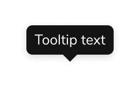
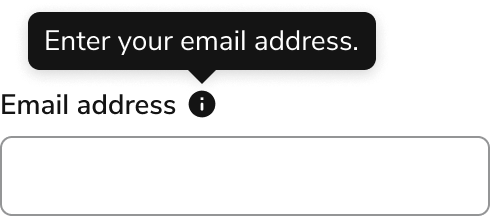
> Tooltips are floating labels that add quick clarity to an element.

export const CodePreviewPlaceholder = ({double, fullWidth}) => {
  const single = <div style={{
    width: fullWidth ? "100%" : "50%",
    borderRadius: "1rem",
    display: "flex",
    padding: "1rem",
    flexDirection: "column",
    gap: "0.5rem",
    height: "10rem",
    marginBlockEnd: "1rem"
  }} className="border-width-default border-color-subdued">
      <div className="bg-strong border-radius-large" style={{
    width: "100%",
    flexGrow: "1"
  }} />
      <div className="bg-strong border-radius-large" style={{
    width: "100%",
    flexGrow: "1"
  }} />
    </div>;
  return double ? <div style={{
    display: "flex",
    gap: "1rem"
  }}>
      {single}
      {single}
    </div> : single;
};

<Frame>
  <div className="w-full h-full bg-[#FFFFFF] p-2 rounded flex items-center justify-center">
    <img noZoom src="https://mintcdn.com/servicetitan/uz2PQSvO75TRhQ38/images/docs/web/components/shared/overview-of-a-tooltip.png?fit=max&auto=format&n=uz2PQSvO75TRhQ38&q=85&s=1d030723c589e28470ff04c45cb3893b" width="272" height="170" data-path="images/docs/web/components/shared/overview-of-a-tooltip.png" />
  </div>
</Frame>

## Anatomy

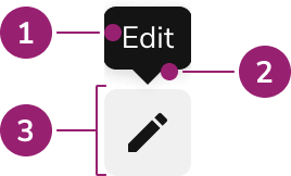
The Tooltip consists of three primary elements that work together to add quick clarity to an element.

<Frame>
  <div className="w-full h-full bg-[#FFFFFF] p-2 rounded flex items-center justify-center">
    <img
      src="https://mintcdn.com/servicetitan/ar8TJanaRSxOpbCO/images/docs/web/components/tooltip/design/anatomy-of-a-tooltip.png?fit=max&auto=format&n=ar8TJanaRSxOpbCO&q=85&s=8bca80c134d7b4733603eed7b252c942"
      alt="Anatomy of a
Tooltip"
      width="268"
      height="162"
      data-path="images/docs/web/components/tooltip/design/anatomy-of-a-tooltip.png"
    />
  </div>
</Frame>

1. Tooltip background, content
2. Caret
3. Trigger

## Options

The Tooltip supports the following configurations to accommodate various supplementary information scenarios.

### Content

#### Text content

<Frame>
  <div className="w-full h-full bg-[#FFFFFF] p-2 rounded flex items-center justify-center">
    <img
      src="https://mintcdn.com/servicetitan/q4u7k_VQHH_NqAgi/images/docs/web/components/tooltip/design/tooltip-options-text.png?fit=max&auto=format&n=q4u7k_VQHH_NqAgi&q=85&s=507f6ed133049251e82e7ab4152495c0"
      alt="Tooltip options
text"
      width="576"
      height="132"
      data-path="images/docs/web/components/tooltip/design/tooltip-options-text.png"
    />
  </div>
</Frame>

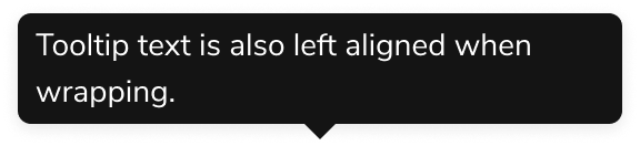
By default, Tooltips support a basic string of text, with only minimal additions that can be added, such as emojis.

#### Custom content

<Frame>
  <div className="w-full h-full bg-[#FFFFFF] p-2 rounded flex items-center justify-center">
    <img
      src="https://mintcdn.com/servicetitan/ar8TJanaRSxOpbCO/images/docs/web/components/tooltip/design/text-options-custom-content.png?fit=max&auto=format&n=ar8TJanaRSxOpbCO&q=85&s=1b09d04729805f788e87ce40b65453d7"
      alt="Text options custom
content"
      width="272"
      height="170"
      data-path="images/docs/web/components/tooltip/design/text-options-custom-content.png"
    />
  </div>
</Frame>

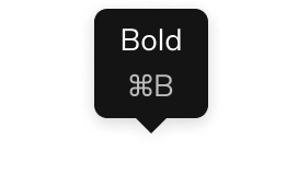
Content within the Tooltip can be customized beyond text, but only with non-interactive elements.

### Placement

<Frame>
  <div className="w-full h-full bg-[#FFFFFF] p-2 rounded flex items-center justify-center">
    <img
      src="https://mintcdn.com/servicetitan/q4u7k_VQHH_NqAgi/images/docs/web/components/tooltip/design/tooltip-options-placement.png?fit=max&auto=format&n=q4u7k_VQHH_NqAgi&q=85&s=7098559e5cff3f0b4acc560bc3cc412b"
      alt="Tooltip options
placement"
      width="820"
      height="916"
      data-path="images/docs/web/components/tooltip/design/tooltip-options-placement.png"
    />
  </div>
</Frame>

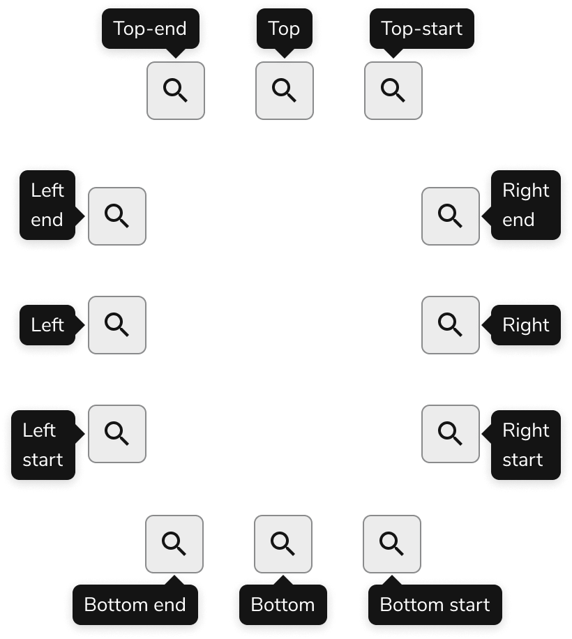
Tooltip placement adjusts automatically when insufficient space is available. See behaviors for details.

### Visual States

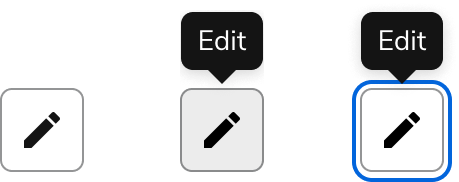
Tooltips open when the trigger element is in a hover or focus state. Avoid removing opening on focus, as this prevents keyboard-only users from viewing Tooltips.

<Frame>
  <div className="w-full h-full bg-[#FFFFFF] p-2 rounded flex items-center justify-center">
    <img
      src="https://mintcdn.com/servicetitan/q4u7k_VQHH_NqAgi/images/docs/web/components/tooltip/design/tooltip-visual-states.png?fit=max&auto=format&n=q4u7k_VQHH_NqAgi&q=85&s=b34e60db2d40031236faf755d95f7b8e"
      alt="Tooltip visual
states"
      width="459"
      height="182"
      data-path="images/docs/web/components/tooltip/design/tooltip-visual-states.png"
    />
  </div>
</Frame>

A Tooltip appearing on both the hover and focus state of a Button.

## Behavior

The Tooltip responds to space constraints with automatic positioning adjustments and overflow handling.

### Overflow handling

<Frame>
  <div className="w-full h-full bg-[#FFFFFF] p-2 rounded flex items-center justify-center">
    <img
      src="https://mintcdn.com/servicetitan/ar8TJanaRSxOpbCO/images/docs/web/components/tooltip/design/tooltip-behavior-overflow-handling.png?fit=max&auto=format&n=ar8TJanaRSxOpbCO&q=85&s=c6bbf6620dd34337b7de42019e269418"
      alt="Tooltip behavior overflow
handling"
      width="576"
      height="214"
      data-path="images/docs/web/components/tooltip/design/tooltip-behavior-overflow-handling.png"
    />
  </div>
</Frame>

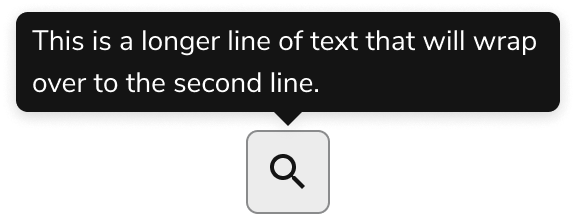
Text in a Tooltip will wrap. The max-width of a Tooltip is 272px or 17rem, while the text region is 256px or 16rem.

## Usage Guidelines

Use the Tooltip as supplementary information for interactive elements on the page.

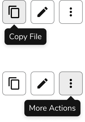
#### Use Tooltips to describe Button Icons

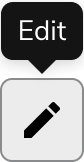
The meaning behind icons is usually not universally understood. Adding a Tooltip can support the understanding of a Button Icon.

<Frame>
  <div className="w-full h-full bg-[#FFFFFF] p-2 rounded flex items-center justify-center">
    <img
      src="https://mintcdn.com/servicetitan/q4u7k_VQHH_NqAgi/images/docs/web/components/tooltip/design/tooltip-when-do-button-icons.png?fit=max&auto=format&n=q4u7k_VQHH_NqAgi&q=85&s=2a3f9ceeeafbca4d47a88a9ad6b36848"
      alt="Tooltip when do button
icons"
      width="84"
      height="162"
      data-path="images/docs/web/components/tooltip/design/tooltip-when-do-button-icons.png"
    />
  </div>
</Frame>

<Check>**Do**</Check>

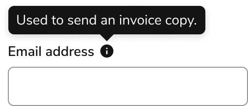
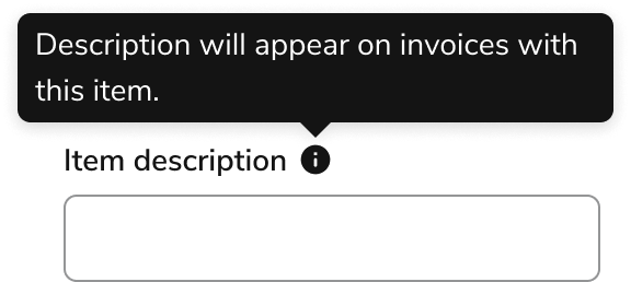
#### Use Tooltips for supplementary information

When space is constrained, use Tooltips for supplemental information such as definitions and contextual help. Consider inline text as an alternative in most cases.

<Frame>
  <div className="w-full h-full bg-[#FFFFFF] p-2 rounded flex items-center justify-center">
    <img
      src="https://mintcdn.com/servicetitan/q4u7k_VQHH_NqAgi/images/docs/web/components/tooltip/design/tooltip-when-supplement-do.png?fit=max&auto=format&n=q4u7k_VQHH_NqAgi&q=85&s=e1d80a9b20e23606bf3ec12c26d272d3"
      alt="Tooltip when supplement
do"
      width="506"
      height="216"
      data-path="images/docs/web/components/tooltip/design/tooltip-when-supplement-do.png"
    />
  </div>
</Frame>

<Check>**Do**</Check>

### When not to use

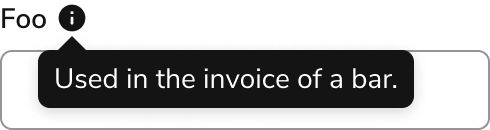
Tooltips are generally difficult to both discover and use on the page, particularly for touch device users. Alternatives to Tooltips should generally be explored.

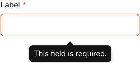
#### Don't use Tooltips for error messaging

Avoid using Tooltips for error messaging. Use inline error messages or Field Message components instead.

<Frame>
  <div className="w-full h-full bg-[#FFFFFF] p-2 rounded flex items-center justify-center">
    <img
      src="https://mintcdn.com/servicetitan/q4u7k_VQHH_NqAgi/images/docs/web/components/tooltip/design/tooltip-when-not-error-messaging.png?fit=max&auto=format&n=q4u7k_VQHH_NqAgi&q=85&s=6d11d655e53a5b85ecc96a1b4af1d7d3"
      alt="Tooltip when not error
messaging"
      width="494"
      height="222"
      data-path="images/docs/web/components/tooltip/design/tooltip-when-not-error-messaging.png"
    />
  </div>
</Frame>

<Danger>**Don't**</Danger>

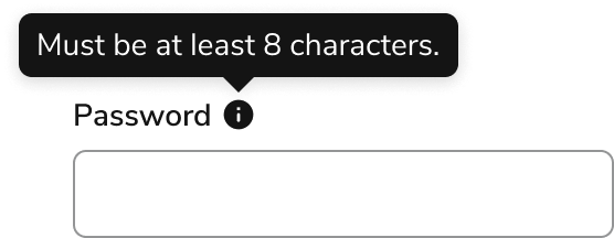
#### Don't use Tooltips for critical information

Information essential to the completion of the task should be visible on the page.

<Frame>
  <div className="w-full h-full bg-[#FFFFFF] p-2 rounded flex items-center justify-center">
    <img
      src="https://mintcdn.com/servicetitan/ar8TJanaRSxOpbCO/images/docs/web/components/tooltip/design/tooltip-how-critical-dont.png?fit=max&auto=format&n=ar8TJanaRSxOpbCO&q=85&s=db93642c9777f0a3e93810fed4705eda"
      alt="Tooltip how critical
dont"
      width="556"
      height="216"
      data-path="images/docs/web/components/tooltip/design/tooltip-how-critical-dont.png"
    />
  </div>
</Frame>

<Danger>**Don't**</Danger>

### Alternatives

#### Tooltip vs Popover

Tooltip is the component of choice for tips and other informational overlays. Popovers may be used in place of a Tooltip when actions are needed.

| Usage                                | Tooltip                              | Popover                                |
| ------------------------------------ | ------------------------------------ | -------------------------------------- |
| Can have a link?                     | Should not have interactive elements | Yes                                    |
| Can have other interactive elements? | Should not have interactive elements | Yes                                    |
| Open mechanic?                       | Hover or Focus                       | Click/Press, option for Hover or Focus |
| Can trap user focus?                 | No                                   | Yes                                    |

### How to Use

#### Positioning a Tooltip

Tooltips automatically flip and shift to stay in view by default. Consider a defined starting position.

* When elements are placed toward a screen edge, position Tooltips to open in the opposite direction.
* Position Tooltips to minimize obstruction of important elements.
* When the above considerations do not apply, use top position as the default placement.

<Frame>
  <div className="w-full h-full bg-[#FFFFFF] p-2 rounded flex items-center justify-center">
    <img
      src="https://mintcdn.com/servicetitan/ar8TJanaRSxOpbCO/images/docs/web/components/tooltip/design/tooltip-how-position-do.png?fit=max&auto=format&n=ar8TJanaRSxOpbCO&q=85&s=85a5679f278470fe065eeffd1ad0ebd2"
      alt="Tooltip how position
do"
      width="300"
      height="430"
      data-path="images/docs/web/components/tooltip/design/tooltip-how-position-do.png"
    />
  </div>
</Frame>

<Check>**Do**</Check>

<Frame>
  <div className="w-full h-full bg-[#FFFFFF] p-2 rounded flex items-center justify-center">
    <img
      src="https://mintcdn.com/servicetitan/q4u7k_VQHH_NqAgi/images/docs/web/components/tooltip/design/tooltip-how-position-dont.png?fit=max&auto=format&n=q4u7k_VQHH_NqAgi&q=85&s=61f3fc121b1810440705e2a291e8bf1b"
      alt="Tooltip how position
dont"
      width="490"
      height="130"
      data-path="images/docs/web/components/tooltip/design/tooltip-how-position-dont.png"
    />
  </div>
</Frame>

<Danger>**Don't**</Danger>

#### Always apply a Tooltip to an interactive element

For a Tooltip to be accessible by keyboard and screen readers, the element it is tied to must be keyboard accessible. This typically means the element should be some form of button or link.

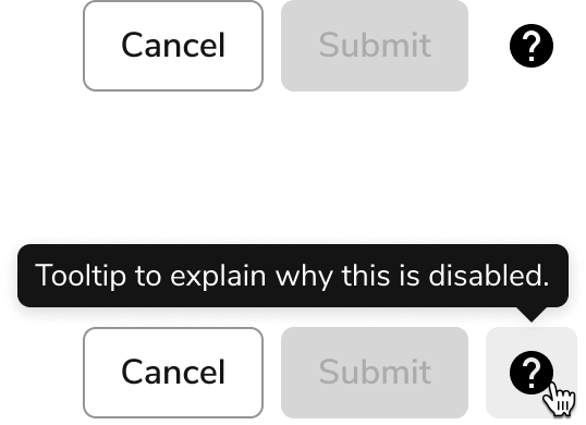
Avoid adding Tooltips to disabled elements. Disabled elements are not keyboard accessible. Add the Tooltip information on the page itself, or provide a dedicated help Button Icon.

<LiveCode example="tooltip-disabled-dont" screenshot fullWidth>
  ```tsx lines theme={null}
  import { Tooltip, Flex, Button } from "@servicetitan/anvil2";

  function App() {
    return (
      <Flex
        gap={3}
        style={{
          paddingBlockStart: "2.5rem",
          paddingInlineStart: "5rem",
        }}
        justifyContent="center"
      >
        <Button>Cancel</Button>
        <Tooltip open placement="top-end">
          <Tooltip.Trigger>
            <Button appearance="primary" disabled>
              Submit
            </Button>
          </Tooltip.Trigger>
          <Tooltip.Content>
            Tooltip to explain why this is disabled.
          </Tooltip.Content>
        </Tooltip>
      </Flex>
    );
  }

  export default App;
  ```
</LiveCode>

<Danger>**Don't**</Danger>

<Frame>
  <div className="w-full h-full bg-[#FFFFFF] p-2 rounded flex items-center justify-center">
    <img
      src="https://mintcdn.com/servicetitan/ar8TJanaRSxOpbCO/images/docs/web/components/tooltip/design/tooltip-how-explain-alt.png?fit=max&auto=format&n=ar8TJanaRSxOpbCO&q=85&s=d291821a84b34377c9a1784adfc2151a"
      alt="Tooltip how explain
alt"
      width="538"
      height="390"
      data-path="images/docs/web/components/tooltip/design/tooltip-how-explain-alt.png"
    />
  </div>
</Frame>

<Check>**Do**</Check>

An example approach to surfacing an explanation in relation to a disabled element.

#### Interactive elements within Tooltips

Limit interactive elements within Tooltips. If an overlay needs interactive elements, use the [Popover](/docs/web/components/popover/design) instead. For other interactive elements, add this information on the page itself, or provide a dedicated help Button Icon.

<LiveCode example="tooltip-content-interactive-do" screenshot fullWidth>
  ```tsx lines theme={null}
  import { Tooltip, Flex, Button } from "@servicetitan/anvil2";

  function App() {
    return (
      <Flex
        gap={3}
        style={{ paddingBlockStart: "2.5rem" }}
        justifyContent="center"
      >
        <Tooltip open placement="top">
          <Tooltip.Trigger>
            <Button>Foo Button</Button>
          </Tooltip.Trigger>
          <Tooltip.Content>Used in the invoice of a bar.</Tooltip.Content>
        </Tooltip>
      </Flex>
    );
  }

  export default App;
  ```
</LiveCode>

<Check>**Do**</Check>

<LiveCode example="tooltip-content-interactive-dont" screenshot fullWidth>
  ```tsx lines theme={null}
  import { Tooltip, Flex, Button } from "@servicetitan/anvil2";

  function App() {
    return (
      <Flex
        gap={3}
        style={{ paddingBlockStart: "5.5rem", paddingInline: "3rem" }}
        justifyContent="center"
      >
        <Tooltip open placement="top">
          <Tooltip.Trigger>
            <Button>Foo Button</Button>
          </Tooltip.Trigger>
          <Tooltip.Content>
            <Flex
              gap="3"
              direction="column"
              style={{
                color: "inherit",
                padding: "4px",
              }}
            >
              Used in the invoice of a bar.
              <Button size="small" appearance="primary">
                Learn more
              </Button>
            </Flex>
          </Tooltip.Content>
        </Tooltip>
      </Flex>
    );
  }

  export default App;
  ```
</LiveCode>

<Danger>**Don't**</Danger>

## Content

Content within the Tooltip should be brief, clear, and supplementary to the trigger element.

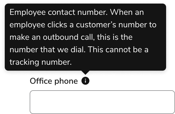
### Keep content 1-2 lines

When content extends to 3+ lines, it is strongly encouraged to find another method of conveying the information.

<Frame>
  <div className="w-full h-full bg-[#FFFFFF] p-2 rounded flex items-center justify-center">
    <img
      src="https://mintcdn.com/servicetitan/ar8TJanaRSxOpbCO/images/docs/web/components/tooltip/design/tooltip-content-short-do.png?fit=max&auto=format&n=ar8TJanaRSxOpbCO&q=85&s=3777709b8c94315d18427d7910d4e2e7"
      alt="Tooltip content short
do"
      width="576"
      height="258"
      data-path="images/docs/web/components/tooltip/design/tooltip-content-short-do.png"
    />
  </div>
</Frame>

<Check>**Do**</Check>

<Frame>
  <div className="w-full h-full bg-[#FFFFFF] p-2 rounded flex items-center justify-center">
    <img
      src="https://mintcdn.com/servicetitan/ar8TJanaRSxOpbCO/images/docs/web/components/tooltip/design/tooltip-content-short-dont.png?fit=max&auto=format&n=ar8TJanaRSxOpbCO&q=85&s=3d3094fd02ceea6bd980265e8f327ec5"
      alt="Tooltip content short
don't"
      width="590"
      height="384"
      data-path="images/docs/web/components/tooltip/design/tooltip-content-short-dont.png"
    />
  </div>
</Frame>

<Danger>**Don't**</Danger>

### Don't repeat the content of the Tooltip's trigger

Avoid repeating the trigger's content in the Tooltip, even in UIs that heavily use Tooltips. Omitting a redundant Tooltip is preferred over consistent Tooltip usage in the UI.

<Frame>
  <div className="w-full h-full bg-[#FFFFFF] p-2 rounded flex items-center justify-center">
    <img
      src="https://mintcdn.com/servicetitan/ar8TJanaRSxOpbCO/images/docs/web/components/tooltip/design/tooltip-content-repeat-dont.png?fit=max&auto=format&n=ar8TJanaRSxOpbCO&q=85&s=b8950ed7c69e41b1f68e8097ee4f4585"
      alt="Tooltip content repeat
don't"
      width="490"
      height="216"
      data-path="images/docs/web/components/tooltip/design/tooltip-content-repeat-dont.png"
    />
  </div>
</Frame>

<Danger>**Don't**</Danger>

## Keyboard Interaction

Users can navigate the Tooltip using standard keyboard controls.

| Key    | Description                                         |
| ------ | --------------------------------------------------- |
| Tab    | When focusing on the trigger, activates the Tooltip |
| Escape | Hides the Tooltip                                   |

### Accessibility

Anvil provides accessibility needs out of the box. Annotating labels is the main piece needed in a design.

#### Provide Tooltip labels for Icon Buttons

Provide a label to describe the action for both screen readers and users who focus on the element, regardless of whether a label is visible on the page.

For more guidance on labels and context, see [input field context association best practices](/docs/accessibility/labels-and-ctas#input-field-context-association).