> ## Documentation Index
> Fetch the complete documentation index at: https://anvil.servicetitan.com/llms.txt
> Use this file to discover all available pages before exploring further.
# Accessibility
> It is of utmost importance to create an accessible experience for all. This guide shows you how.
## Background Tone for Totals
When a chart includes a background neutral tone to indicate the total of a field, such as in a progress bar, but does not need to represent a specific data set, use Blue-Grey 100.

 ## Contrast
Our monochrome color palette adheres to the 3:1 AA contrast standard for
graphical objects. This references the color to the chart background (white) as
well as a 3:1 contrast between the colors. This is why we recommend 4px spacing
between spacing on charts.
## Contrast
Our monochrome color palette adheres to the 3:1 AA contrast standard for
graphical objects. This references the color to the chart background (white) as
well as a 3:1 contrast between the colors. This is why we recommend 4px spacing
between spacing on charts.

 Our categorical color palette meets 3:1 against our chart background, but since
they do not all meet 3:1 against each other, we require direct labeling and 4px
spacing between colors.
Our categorical color palette meets 3:1 against our chart background, but since
they do not all meet 3:1 against each other, we require direct labeling and 4px
spacing between colors.

 ## Direct Labeling
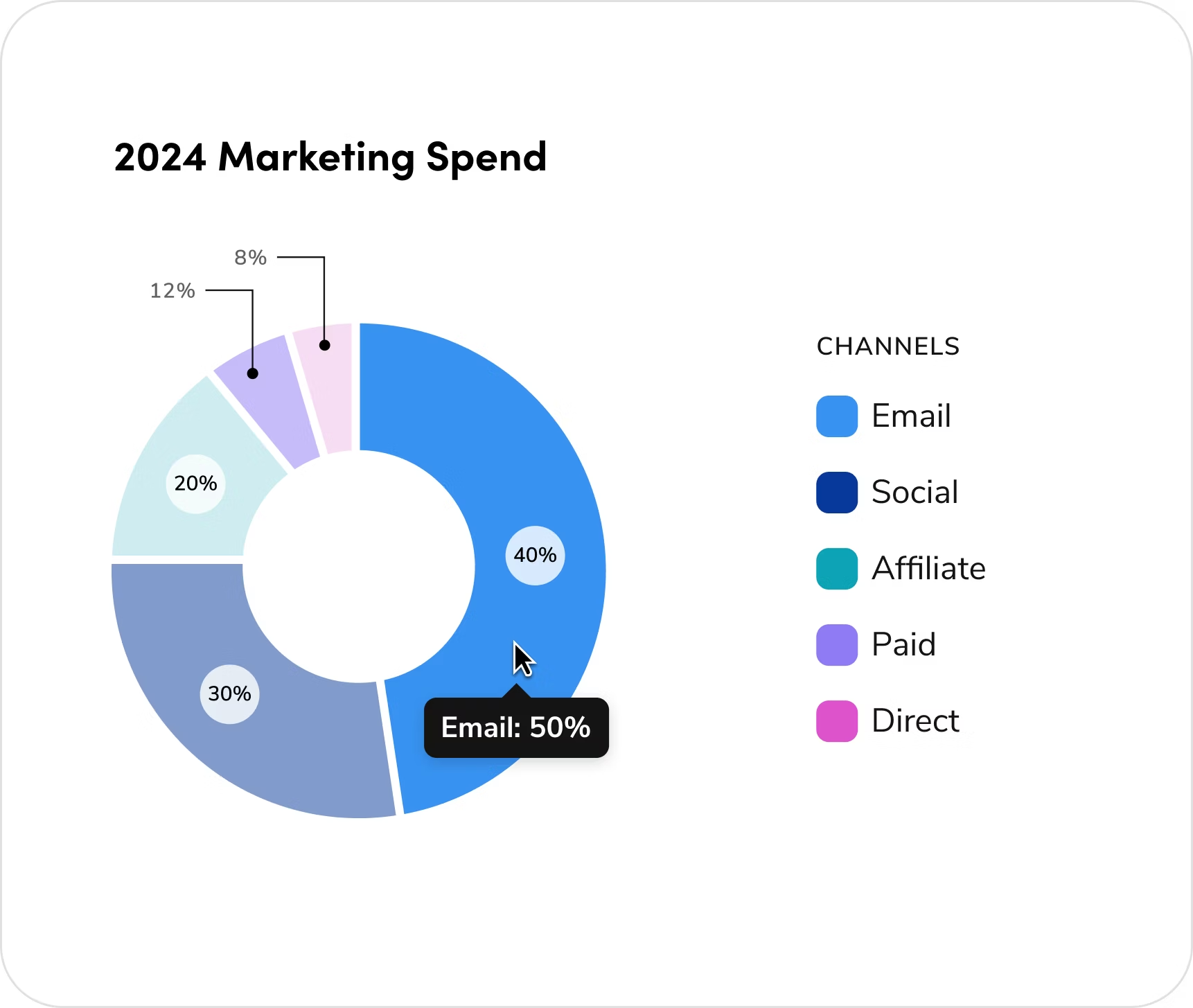
There are three primary approaches for applying direct labeling in charts, each
offering varying levels of visibility and user interaction depending on the
complexity of the data.
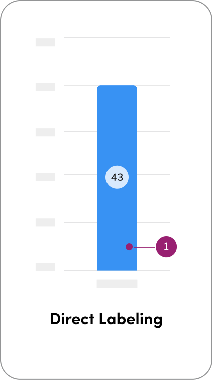
1. Direct labeling on values places the label directly on or adjacent to each
data point. This approach provides immediate visibility and quick
readability, making it ideal for dense datasets where users need to interpret
values at a glance without additional interaction.
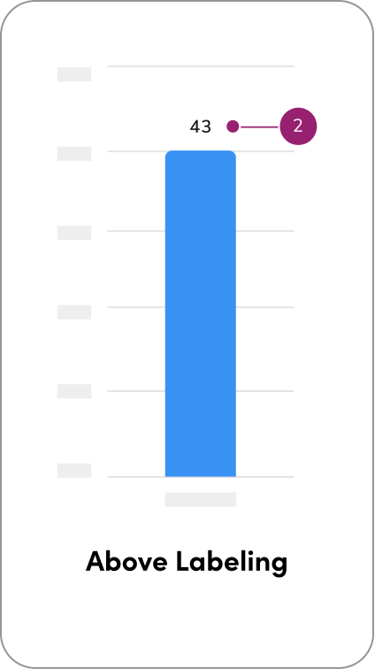
2. Above labeling positions labels around the chart rather than directly on the
data points. This method is useful when visual clarity or spacing is a
concern, such as in cases where labels may overlap or obscure the chart
elements. Above labeling maintains legibility while preserving the visual
integrity of the chart.
## Direct Labeling
There are three primary approaches for applying direct labeling in charts, each
offering varying levels of visibility and user interaction depending on the
complexity of the data.
1. Direct labeling on values places the label directly on or adjacent to each
data point. This approach provides immediate visibility and quick
readability, making it ideal for dense datasets where users need to interpret
values at a glance without additional interaction.
2. Above labeling positions labels around the chart rather than directly on the
data points. This method is useful when visual clarity or spacing is a
concern, such as in cases where labels may overlap or obscure the chart
elements. Above labeling maintains legibility while preserving the visual
integrity of the chart.
 Contact the Visual Design team on the #ask-vizd channel
## Hover states
**Hover State Tooltip**: hows additional or detailed information only when a user hovers or focuses on a specific element. It helps keep the visualization clean and uncluttered while still providing access to precise data on demand.
### Hover State Tooltip
Contact the Visual Design team on the #ask-vizd channel
## Hover states
**Hover State Tooltip**: hows additional or detailed information only when a user hovers or focuses on a specific element. It helps keep the visualization clean and uncluttered while still providing access to precise data on demand.
### Hover State Tooltip
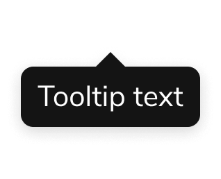 A tooltip is a brief, informative message that appears when a user interacts with an element in a graphical user interface. [Tooltips](/docs/web/components/tooltip/design) are small containers that appear on hover, showing extra details like values or labels for specific chart elements. They help reveal data insights without cluttering the visualization. ([Anvil tooltip](/docs/web/components/tooltip/design)).
**Tooltips are the default overlay for data visualization messaging. They are used to show hover-based, non-interactive information. If you need interactive elements (e.g., buttons) or custom-styled content with colors or visuals, use a popover instead. Always be consistent by using the same overlay component throughout a given data set rather than mixing tooltips and popovers.**
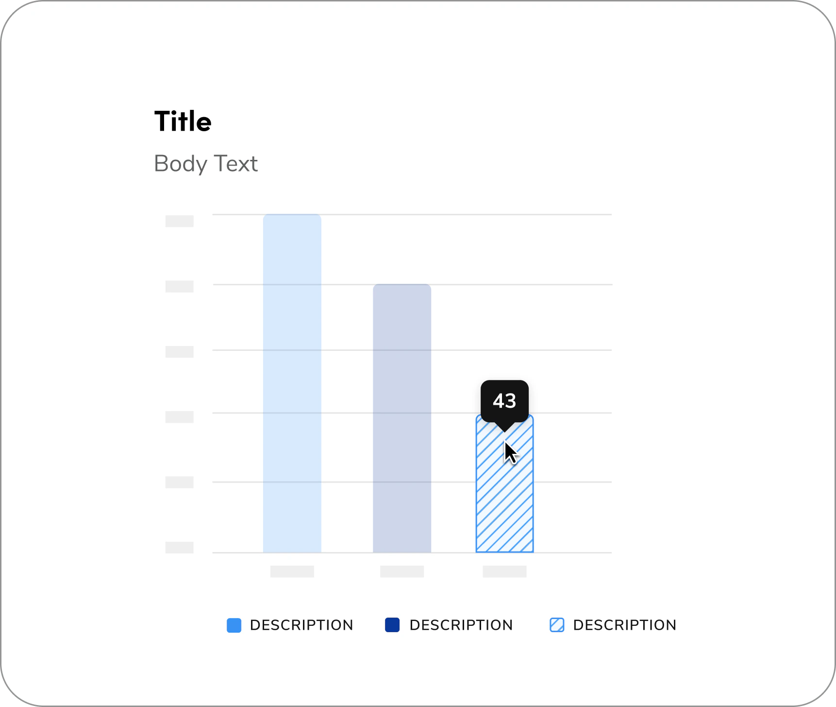
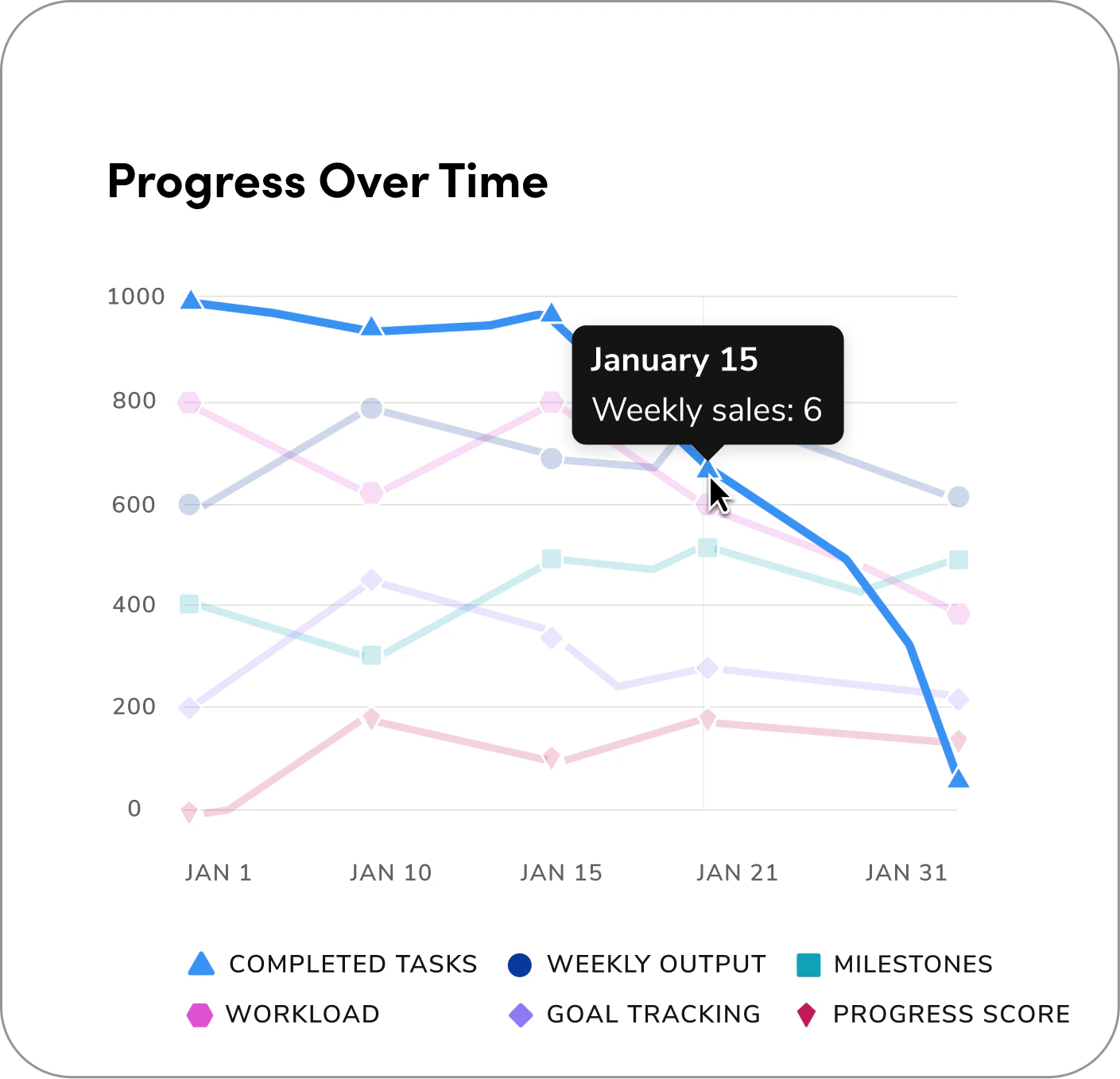
Note: When hovering over a data point, all other colors (besides the hovered one) should have 20% opacity to keep the focus on the selected element.
A tooltip is a brief, informative message that appears when a user interacts with an element in a graphical user interface. [Tooltips](/docs/web/components/tooltip/design) are small containers that appear on hover, showing extra details like values or labels for specific chart elements. They help reveal data insights without cluttering the visualization. ([Anvil tooltip](/docs/web/components/tooltip/design)).
**Tooltips are the default overlay for data visualization messaging. They are used to show hover-based, non-interactive information. If you need interactive elements (e.g., buttons) or custom-styled content with colors or visuals, use a popover instead. Always be consistent by using the same overlay component throughout a given data set rather than mixing tooltips and popovers.**
Note: When hovering over a data point, all other colors (besides the hovered one) should have 20% opacity to keep the focus on the selected element.
 Contact the Visual Design team on the #ask-vizd channel