




> ## Documentation Index
> Fetch the complete documentation index at: https://anvil.servicetitan.com/llms.txt
> Use this file to discover all available pages before exploring further.

# Area Charts

> An area chart is similar to a line chart, but with one key difference: it fills the space under the line with color or shading. This makes it useful not just for showing how values change over time, but also for helping you quickly understand the volume or size of those values.

export const DoDont = ({text, type, children}) => {
  return <>
      {type === "do" && <div className="do-dont do">
          {children && <div className="do-dont-content">{children}</div>}
          <Check>
            <p>
              <strong>Do</strong>
              {text && <span className="m-inline-start-1">{text}</span>}
            </p>
          </Check>
        </div>}
      {type === "dont" && <div className="do-dont dont">
          {children && <div className="do-dont-content">{children}</div>}
          <Danger>
            <p>
              <strong>Don't</strong>
              {text && <span className="m-inline-start-1">{text}</span>}
            </p>
          </Danger>
        </div>}
      {type === "caution" && <div className="do-dont caution">
          {children && <div className="do-dont-content">{children}</div>}
          <Warning>
            <p>
              <strong>Caution</strong>
              {text && <span className="m-inline-start-1">{text}</span>}
            </p>
          </Warning>
        </div>}
    </>;
};

## Area charts include two main types:

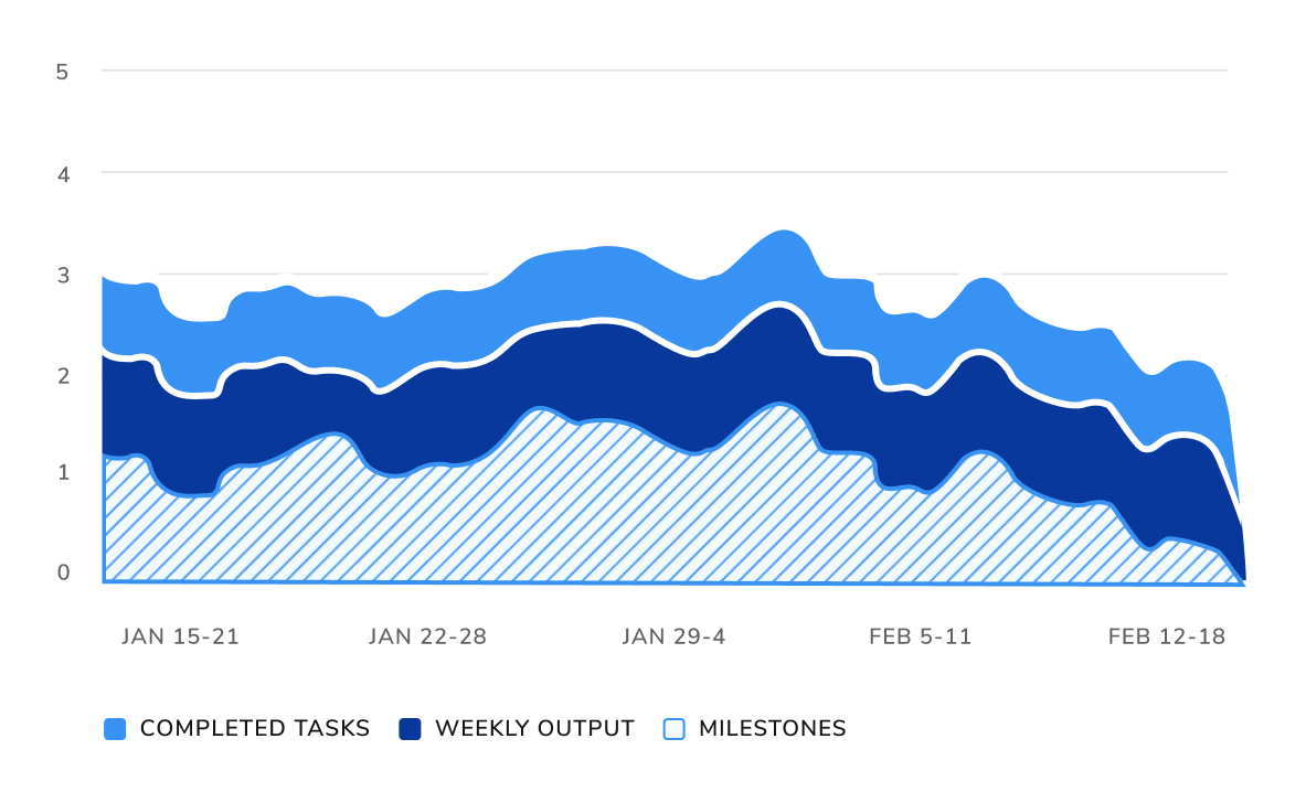
* Stacked area charts show how multiple series add up to a total over time, highlighting the contribution of each part.
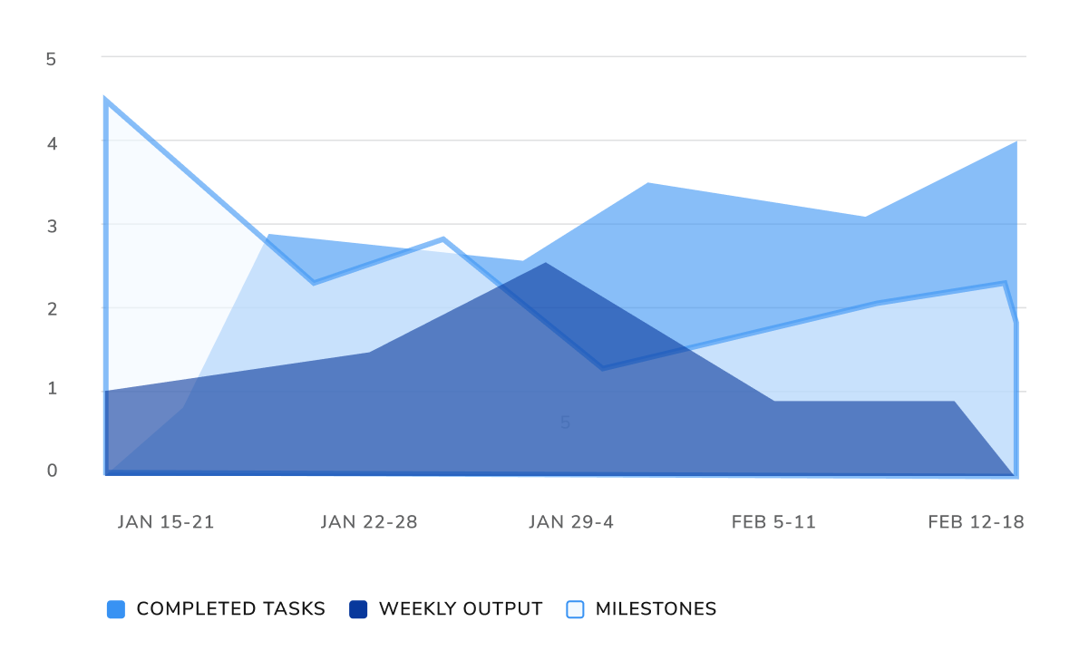
* Overlapped area charts display individual series on top of each other with transparency, making it easier to compare trends, but harder to read when there are many categories.

<Note>We do not use overlapped area charts to avoid visual clutter and misinterpretation.</Note>

## Variable Ordering

<Note>Each color has its assigned stroke.</Note>

<table>
  <tr>
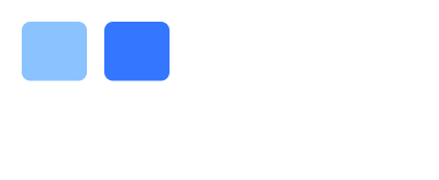
    <td className="pr-2"><strong>1 Variable</strong></td>
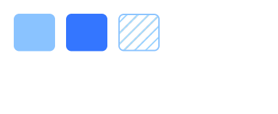
    <td className="pr-2"><strong>2 Variables</strong></td>
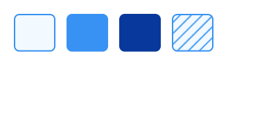
    <td className="pr-2"><strong>3 Variables</strong></td>
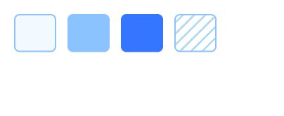
    <td className="pr-2"><strong>4 Variables</strong></td>
    <td className="pr-2"><strong>5+ Variables</strong></td>
  </tr>

  <tr>
    <td className="pr-2">If your chart has <strong>one</strong> variable, start with the default hue in the palette.</td>
    <td className="pr-2">If your chart has <strong>two</strong> variables, use the default and dark blue.</td>
    <td className="pr-2">If your chart has <strong>three</strong> variables, add the diagonal pattern.</td>
    <td className="pr-2">If your chart has <strong>four</strong> variables, add the lightest blue with a stroke.</td>
    <td className="pr-2">For <strong>five +</strong> variables, see our extended color palette.</td>
  </tr>

  <tr>
    <td className="pr-2">
      <img src="https://mintcdn.com/servicetitan/xuNyaefLU8rAWiT_/images/docs/web/data-visualization/introduction/1-variable-light.png?fit=max&auto=format&n=xuNyaefLU8rAWiT_&q=85&s=3578af7a0c5765cf0700ec92344a2f93" alt="1 variable, blue palette" className="block dark:hidden" width="404" height="166" data-path="images/docs/web/data-visualization/introduction/1-variable-light.png" />

      <img src="https://mintcdn.com/servicetitan/xuNyaefLU8rAWiT_/images/docs/web/data-visualization/introduction/1-variable-dark.png?fit=max&auto=format&n=xuNyaefLU8rAWiT_&q=85&s=7387e2c1ccc1a8b000a63c4511bd6d57" alt="1 variable, blue palette" className="hidden dark:block" width="404" height="166" data-path="images/docs/web/data-visualization/introduction/1-variable-dark.png" />
    </td>

    <td className="pr-2">
      <img src="https://mintcdn.com/servicetitan/CeN0_C35yWeoo5-G/images/docs/web/data-visualization/introduction/2-variables-light.png?fit=max&auto=format&n=CeN0_C35yWeoo5-G&q=85&s=ced539ea631eceba3e085dbb8c45b97e" alt="2 variables, blue palette" className="block dark:hidden" width="404" height="166" data-path="images/docs/web/data-visualization/introduction/2-variables-light.png" />

      <img src="https://mintcdn.com/servicetitan/xuNyaefLU8rAWiT_/images/docs/web/data-visualization/introduction/2-variables-dark.png?fit=max&auto=format&n=xuNyaefLU8rAWiT_&q=85&s=525cc152456a82ed49afa0fe1a23dbe7" alt="2 variables, blue palette" className="hidden dark:block" width="404" height="166" data-path="images/docs/web/data-visualization/introduction/2-variables-dark.png" />
    </td>

    <td className="pr-2">
      <img src="https://mintcdn.com/servicetitan/CeN0_C35yWeoo5-G/images/docs/web/data-visualization/introduction/3-variables-light.png?fit=max&auto=format&n=CeN0_C35yWeoo5-G&q=85&s=ac35215bbd10537983f95ca463ad9f6b" alt="3 variables, blue palette" className="block dark:hidden" width="404" height="166" data-path="images/docs/web/data-visualization/introduction/3-variables-light.png" />

      <img src="https://mintcdn.com/servicetitan/CeN0_C35yWeoo5-G/images/docs/web/data-visualization/introduction/3-variables-dark.png?fit=max&auto=format&n=CeN0_C35yWeoo5-G&q=85&s=3b378b5527d6757dbb1ef8be9757645b" alt="3 variables, blue palette" className="hidden dark:block" width="404" height="166" data-path="images/docs/web/data-visualization/introduction/3-variables-dark.png" />
    </td>

    <td className="pr-2">
      <img src="https://mintcdn.com/servicetitan/CeN0_C35yWeoo5-G/images/docs/web/data-visualization/introduction/4-variables-light.png?fit=max&auto=format&n=CeN0_C35yWeoo5-G&q=85&s=cce2951a318a67402a1c28539a3490ff" alt="4 variables, blue palette" className="block dark:hidden" width="404" height="166" data-path="images/docs/web/data-visualization/introduction/4-variables-light.png" />

      <img src="https://mintcdn.com/servicetitan/CeN0_C35yWeoo5-G/images/docs/web/data-visualization/introduction/4-variables-dark.png?fit=max&auto=format&n=CeN0_C35yWeoo5-G&q=85&s=b9e32042421df83127e59deb46d071ee" alt="4 variables, blue palette" className="hidden dark:block" width="404" height="166" data-path="images/docs/web/data-visualization/introduction/4-variables-dark.png" />
    </td>

    <td className="pr-2">
      <img src="https://mintcdn.com/servicetitan/CeN0_C35yWeoo5-G/images/docs/web/data-visualization/introduction/5-plus-variables-light.png?fit=max&auto=format&n=CeN0_C35yWeoo5-G&q=85&s=1a0916fe81302e500dc4d7b9c7859eeb" alt="5 plus variables, categorical palette" className="block dark:hidden" width="404" height="166" data-path="images/docs/web/data-visualization/introduction/5-plus-variables-light.png" />

      <img src="https://mintcdn.com/servicetitan/CeN0_C35yWeoo5-G/images/docs/web/data-visualization/introduction/5-plus-variables-dark.png?fit=max&auto=format&n=CeN0_C35yWeoo5-G&q=85&s=00636365fae484bf924c01ca3fbc74b3" alt="5 plus variables, categorical palette" className="hidden dark:block" width="404" height="166" data-path="images/docs/web/data-visualization/introduction/5-plus-variables-dark.png" />
    </td>
  </tr>
</table>

## How to incorporate color:

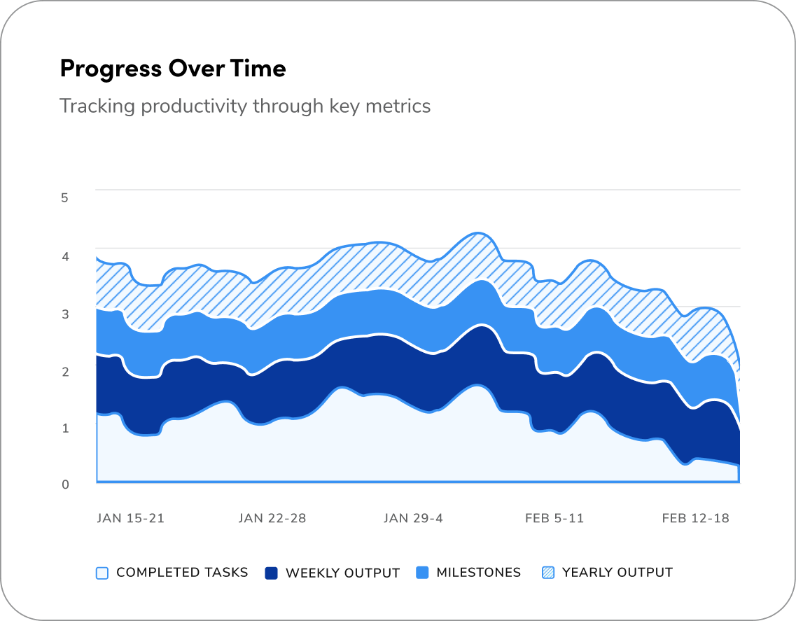
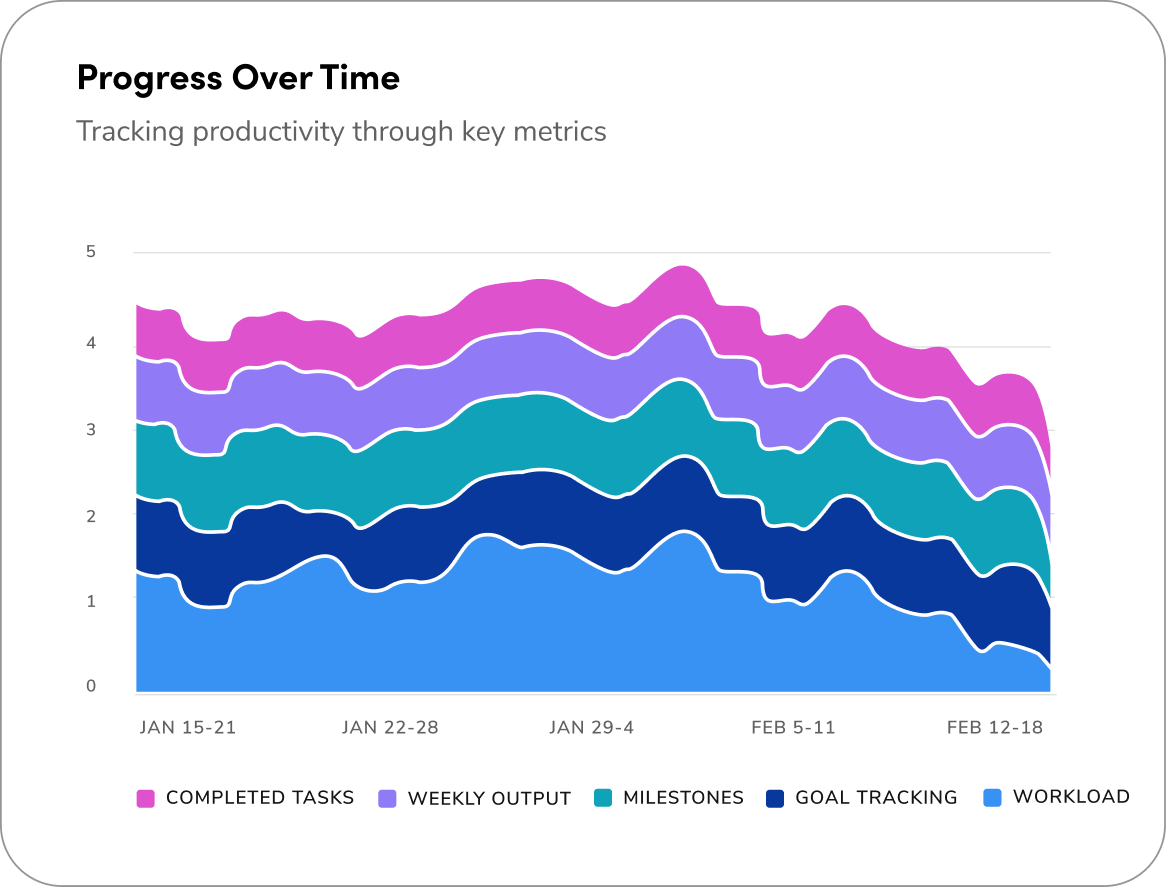
Below are example sof Area of Focus charts that use both monochrome and categorical color palettes. See examples on how to implement color below.

### Monochrome palette for area charts

Use the monochromatic color palette for charts that have 4 variables or less.

<div className="w-1/2">
  <img src="https://mintcdn.com/servicetitan/LXKsjszJQqtNIgup/images/docs/web/data-visualization/area-charts/area-charts-monochrome.png?fit=max&auto=format&n=LXKsjszJQqtNIgup&q=85&s=d46d6b4db945a0927d1237f022791e50" alt="Monochrome area chart with progress over time" width="1137" height="887" data-path="images/docs/web/data-visualization/area-charts/area-charts-monochrome.png" />
</div>

### Categorical palette for area charts

Use the monochromatic color palette for charts that have 4 variables or less.

<div className="w-1/2">
  <img src="https://mintcdn.com/servicetitan/UjzR2VvA6ZE_Niqw/images/docs/web/data-visualization/area-charts/area-charts-categorical.png?fit=max&auto=format&n=UjzR2VvA6ZE_Niqw&q=85&s=78015f747f474ba5e82d3df4e5a745c6" alt="Categorical area chart with progress over time" width="1166" height="887" data-path="images/docs/web/data-visualization/area-charts/area-charts-categorical.png" />
</div>

## How to Use

<Columns cols={2}>
  <DoDont type="do" text="use a stacked area chart when you want to clearly show how individual parts contribute to the total over time - it's visually easier to compare both overall trends and segment sizes.">
    <img src="https://mintcdn.com/servicetitan/LXKsjszJQqtNIgup/images/docs/web/data-visualization/area-charts/area-charts-do.png?fit=max&auto=format&n=LXKsjszJQqtNIgup&q=85&s=da373d8a050f51d29ec470022db3c97f" alt="area chart showing how individual parts contribute to total over time" width="1183" height="728" data-path="images/docs/web/data-visualization/area-charts/area-charts-do.png" />
  </DoDont>

  <DoDont type="dont" text="use an overlapped area chart when comparing multiple categories overlapping can make it hard to see individual values and leads to visual confusion.">
    <img src="https://mintcdn.com/servicetitan/UjzR2VvA6ZE_Niqw/images/docs/web/data-visualization/area-charts/area-charts-dont.png?fit=max&auto=format&n=UjzR2VvA6ZE_Niqw&q=85&s=7827835f00cd99ac8288b37c8447ad90" alt="area chart with overlapping, multiple categories" width="1190" height="739" data-path="images/docs/web/data-visualization/area-charts/area-charts-dont.png" />
  </DoDont>
</Columns>

<Card title="Questions? Challenges?" icon="link" href="https://servicetitan.enterprise.slack.com/archives/C0881LFTGDR" arrow="true" cta="Click here">
  Contact the Visual Design team on the #ask-vizd channel
</Card>