> ## Documentation Index
> Fetch the complete documentation index at: https://anvil.servicetitan.com/llms.txt
> Use this file to discover all available pages before exploring further.
# Bar Charts
export const DoDont = ({text, type, children}) => {
return <>
{type === "do" &&
{children &&
{children}
}
Do
{text && {text}}
{children &&
{children}
}
Don't
{text && {text}}
{children &&
{children}
}
Caution
{text && {text}}
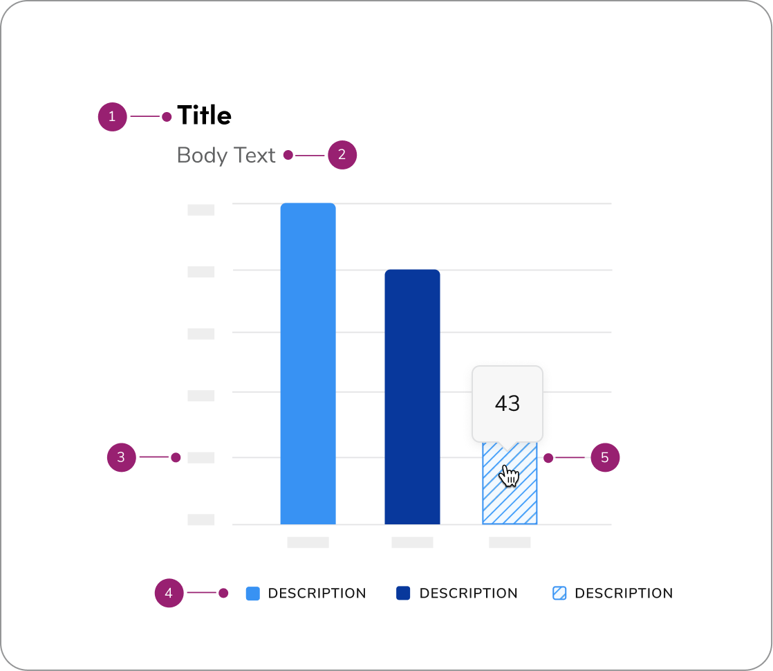
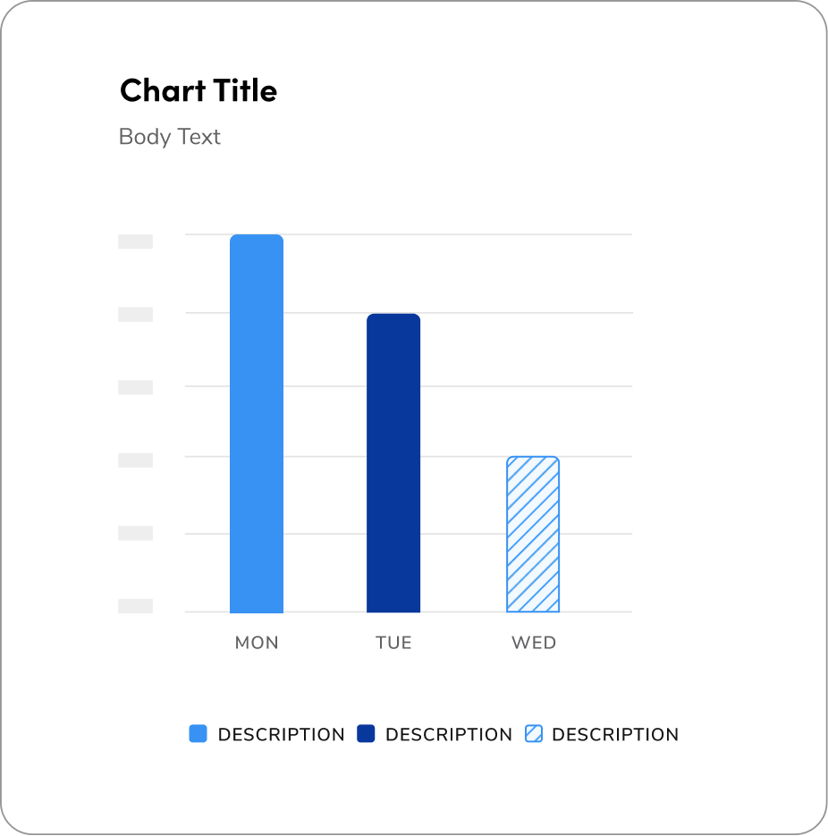
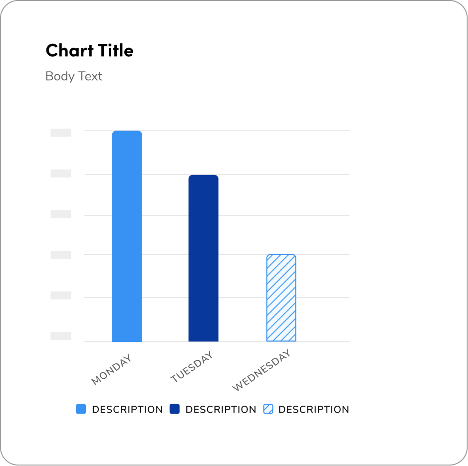
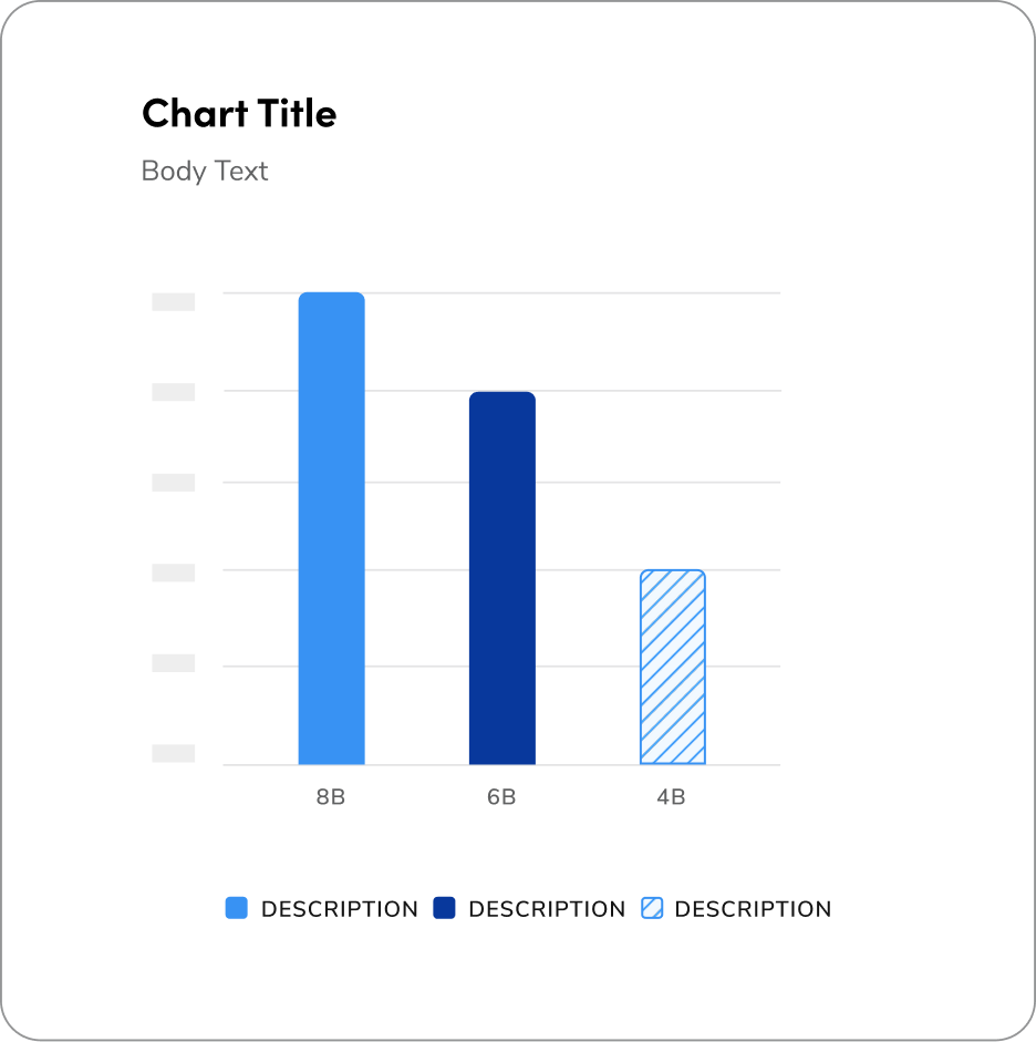
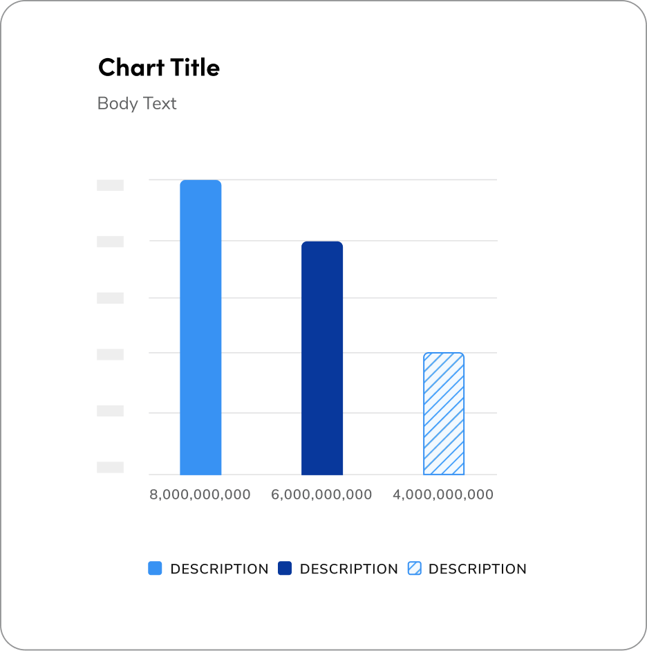
- Headline
- Body text or subtitle
- Axis label
- Legend label
- Hover state tooltip
## Rules on the usage of Bar Charts
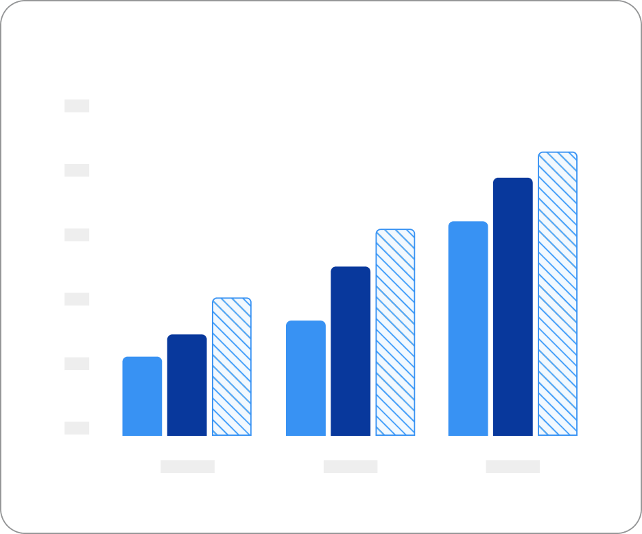
Grouped bar charts are best for showing a distribution of data points or making
comparisons across different categories of data. This chart shows a division of
data points across three different categorical variables (months), not just one.
**Note:** If comparing the totals for a categorical variable are important, then
a different chart type like a standard bar chart or stacked bar chart will be
better at performing the task.
## Rules on the usage of Grouped Bar Charts
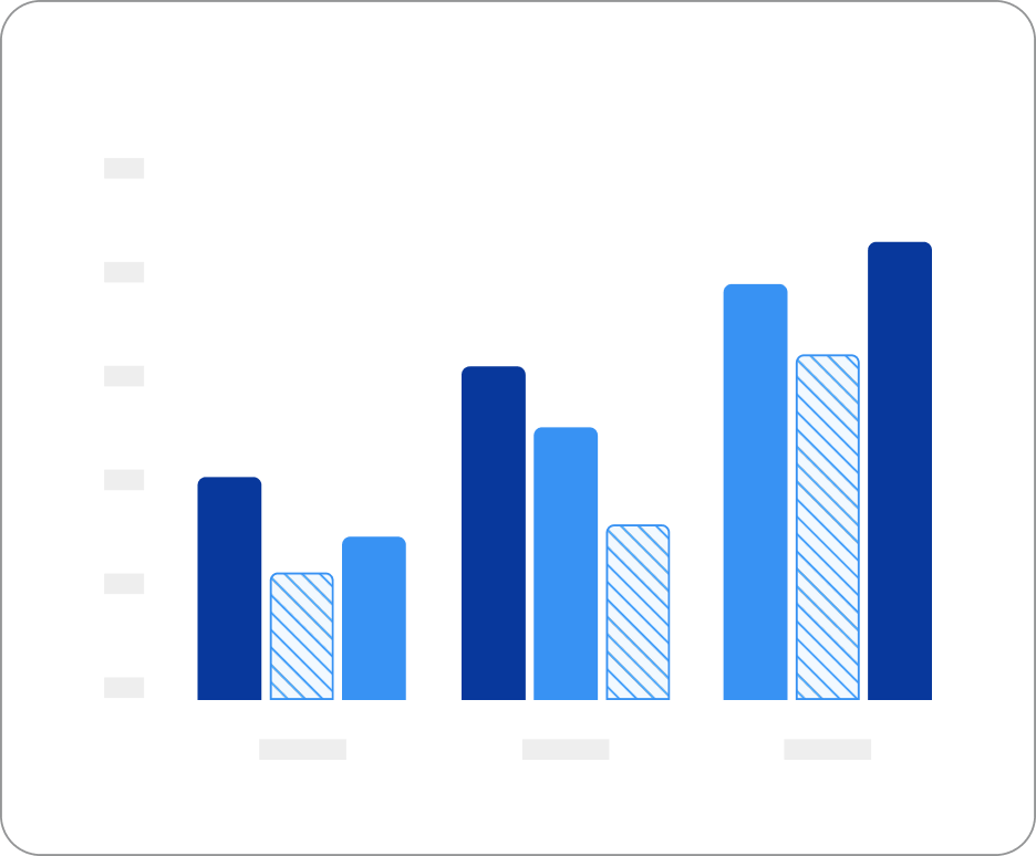
Grouped bar charts are best for showing a distribution of data points or making
comparisons across different categories of data. This chart shows a division of
data points across three different categorical variables (months), not just one.
**Note:** If comparing the totals for a categorical variable are important, then
a different chart type like a standard bar chart or stacked bar chart will be
better at performing the task.
 ## Rules on the usage of Stacked Bar Charts
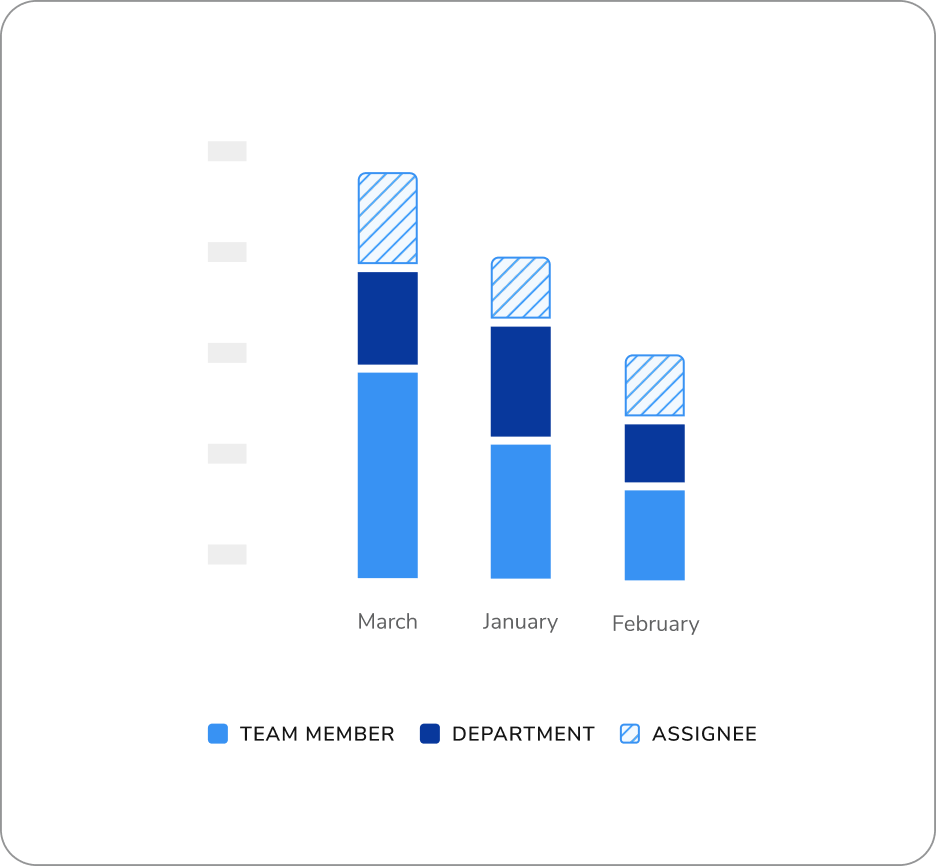
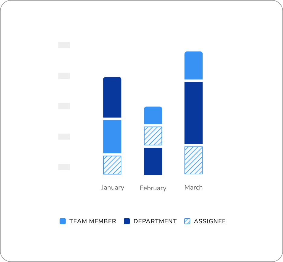
Used to compare numeric values between levels of a categorical variable.
We use a stacked bar chart when we want to see how each main bar is broken down
into parts based on a second or third category. Each bar is split into sections
that represent the levels of the other categories. The total length of the bar
stays the same, but now we can see how the parts add up to the total.
## Rules on the usage of Stacked Bar Charts
Used to compare numeric values between levels of a categorical variable.
We use a stacked bar chart when we want to see how each main bar is broken down
into parts based on a second or third category. Each bar is split into sections
that represent the levels of the other categories. The total length of the bar
stays the same, but now we can see how the parts add up to the total.
 ### Real Example
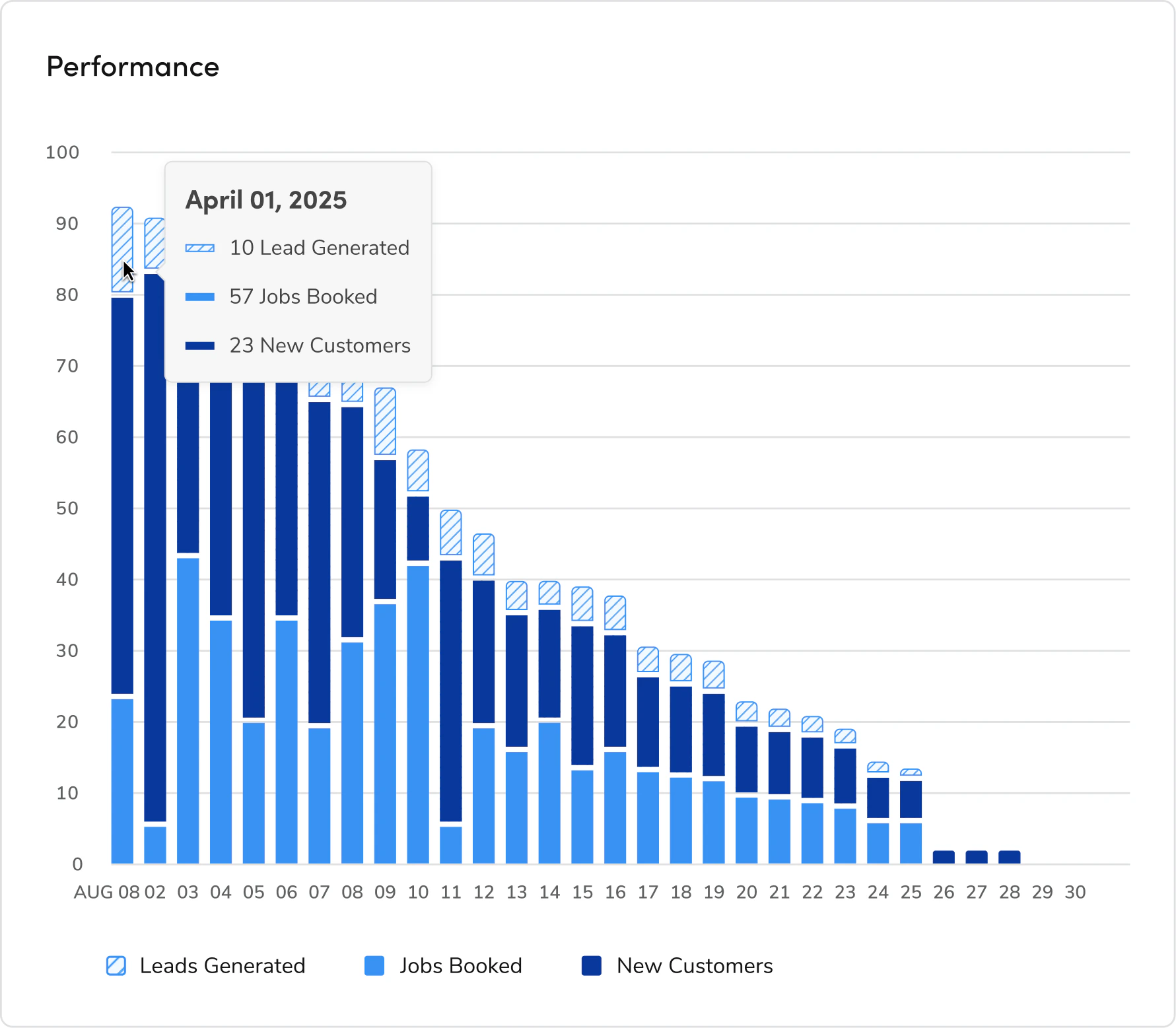
The stacked bar chart shown below demonstrates the correct application of a
monochrome color palette. This visualization compares leads generated, jobs
booked, and new customers over time, making it an ideal candidate for a
monochromatic approach to maintain clarity and reduce cognitive load.
In this chart, the highest (tallest) value segment utilizes the lightest shade
with a pattern, outlined with a 1px stroke for definition. The mid-range value
is represented using the default blue, while the lowest value is displayed in
the darkest shade of blue. To preserve visual consistency and readability, apply
a 4px corner radius to the top of each bar and maintain a 4px vertical
separation between each stacked segment.
### Real Example
The stacked bar chart shown below demonstrates the correct application of a
monochrome color palette. This visualization compares leads generated, jobs
booked, and new customers over time, making it an ideal candidate for a
monochromatic approach to maintain clarity and reduce cognitive load.
In this chart, the highest (tallest) value segment utilizes the lightest shade
with a pattern, outlined with a 1px stroke for definition. The mid-range value
is represented using the default blue, while the lowest value is displayed in
the darkest shade of blue. To preserve visual consistency and readability, apply
a 4px corner radius to the top of each bar and maintain a 4px vertical
separation between each stacked segment.
 ### How to Use:
Contact the Visual Design team on the #ask-vizd channel
### How to Use:
Contact the Visual Design team on the #ask-vizd channel