> ## Documentation Index
> Fetch the complete documentation index at: https://anvil.servicetitan.com/llms.txt
> Use this file to discover all available pages before exploring further.

# Donut Charts

> A donut chart shows how a total is divided among categories, with each slice representing a category’s proportion of the whole. They are best for illustrating part-to-whole relationships, but they are less effective for making precise comparisons between categories.

export const DoDont = ({text, type, children}) => {
  return <>
      {type === "do" && <div className="do-dont do">
          {children && <div className="do-dont-content">{children}</div>}
          <Check>
            <p>
              <strong>Do</strong>
              {text && <span className="m-inline-start-1">{text}</span>}
            </p>
          </Check>
        </div>}
      {type === "dont" && <div className="do-dont dont">
          {children && <div className="do-dont-content">{children}</div>}
          <Danger>
            <p>
              <strong>Don't</strong>
              {text && <span className="m-inline-start-1">{text}</span>}
            </p>
          </Danger>
        </div>}
      {type === "caution" && <div className="do-dont caution">
          {children && <div className="do-dont-content">{children}</div>}
          <Warning>
            <p>
              <strong>Caution</strong>
              {text && <span className="m-inline-start-1">{text}</span>}
            </p>
          </Warning>
        </div>}
    </>;
};

There is no practical difference between placing legends labels on the left or right. Placement should be chosen based on what fits best with the surrounding UI and layout.

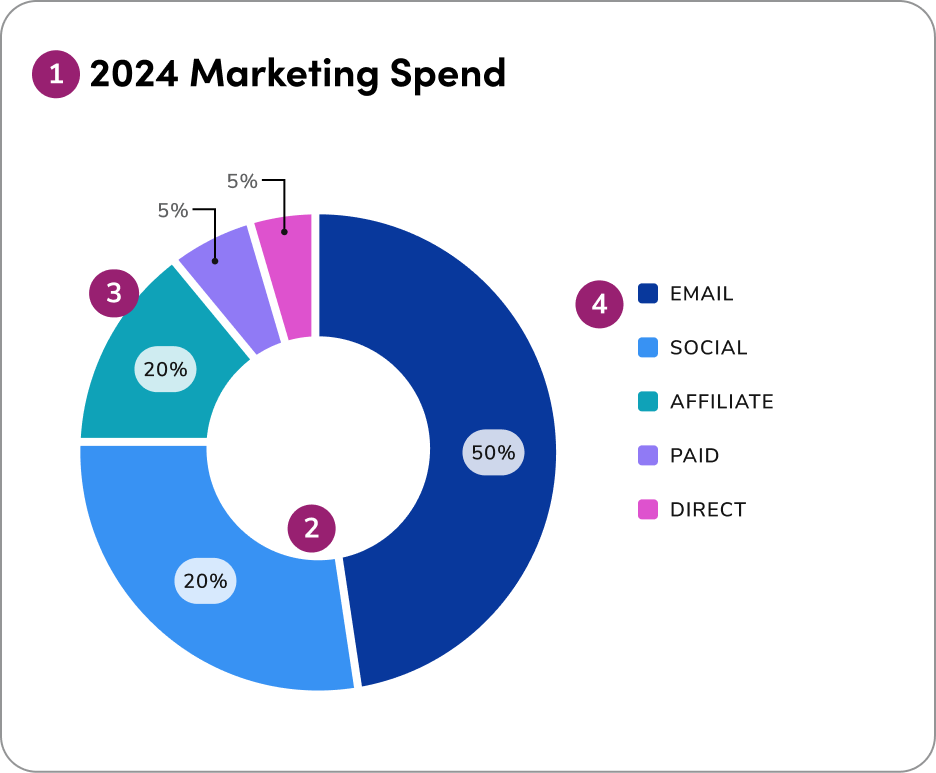
Example of a donut chart using 4px spacing and direct labeling:

<Columns cols={2}>
  <img src="https://mintcdn.com/servicetitan/UjzR2VvA6ZE_Niqw/images/docs/web/data-visualization/donut-charts/donut-charts-example.png?fit=max&auto=format&n=UjzR2VvA6ZE_Niqw&q=85&s=c5bdac8078dfadaae3c449eb036455cc" alt="A donut chart with direct labeling (#1)" width="936" height="773" data-path="images/docs/web/data-visualization/donut-charts/donut-charts-example.png" />

  <ol>
    <li><strong>Headline</strong></li>
    <li><strong>Spacing:</strong> The space (1.4px) between donut sections</li>
    <li><strong>Direct labeling</strong></li>
    <li><strong>Legend label</strong></li>
  </ol>
</Columns>

## 1. Show parts of a whole

Donut charts illustrate proportions of a total and work best for showing how
each slice contributes to the whole, not for making detailed comparisons between
categories.

<Columns cols={2}>
  <DoDont type="do" text="use donut charts to show how each category contributes to a whole. They are most effective for illustrating proportions and giving users a high-level view of the overall data distribution.">
    <img src="https://mintcdn.com/servicetitan/YcfNafH0AarHq5nu/images/docs/web/data-visualization/donut-charts/donut-charts-do-category-to-whole.png?fit=max&auto=format&n=YcfNafH0AarHq5nu&q=85&s=5e155c4a72b543f564a46b98c237a9e3" alt="donut chart using 4 variables for each slice, each representing a quarter" className="m-block-0" width="936" height="773" data-path="images/docs/web/data-visualization/donut-charts/donut-charts-do-category-to-whole.png" />
  </DoDont>

  <DoDont type="dont" text="use donut charts when the goal is to make precise comparisons between categories. Their circular layout makes it difficult to judge small differences in size accurately.">
    <img src="https://mintcdn.com/servicetitan/YcfNafH0AarHq5nu/images/docs/web/data-visualization/donut-charts/donut-charts-dont-precise-comparisons.png?fit=max&auto=format&n=YcfNafH0AarHq5nu&q=85&s=e8279688a52ee9e04f549b8a5e1867c5" alt="donut chart using 4 variables for each slice, each representing a month" className="m-block-0" width="936" height="773" data-path="images/docs/web/data-visualization/donut-charts/donut-charts-dont-precise-comparisons.png" />
  </DoDont>
</Columns>

## 2. Total must equal 100%

Ensure all slices together represent the full dataset and form a meaningful
whole. Donut charts should only be used when all parts add up to 100% and
clearly show how each category contributes to the total.

<Columns cols={2}>
  <DoDont type="do" text="use donut charts only when all slices represent a complete dataset, ensuring each segment clearly shows its proportional contribution for accuracy and quick interpretation.">
    <img src="https://mintcdn.com/servicetitan/YcfNafH0AarHq5nu/images/docs/web/data-visualization/donut-charts/donut-charts-do-complete-dataset.png?fit=max&auto=format&n=YcfNafH0AarHq5nu&q=85&s=e44fd1fc35250085d73bf4d605b95721" alt="donut chart using 4 variables for each slice, each representing a quarter" className="m-block-0" width="936" height="773" data-path="images/docs/web/data-visualization/donut-charts/donut-charts-do-complete-dataset.png" />
  </DoDont>

  <DoDont type="dont" text="use a donut chart when the data doesn’t represent parts of a whole or fails to add up to 100%. This can mislead users and reduce the clarity of the visualization.">
    <img src="https://mintcdn.com/servicetitan/YcfNafH0AarHq5nu/images/docs/web/data-visualization/donut-charts/donut-charts-dont-not-100.png?fit=max&auto=format&n=YcfNafH0AarHq5nu&q=85&s=30c9bb11ccaead543d44dbd81f72af0d" alt="donut chart using 4 variables for each slice, each representing a month" className="m-block-0" width="936" height="773" data-path="images/docs/web/data-visualization/donut-charts/donut-charts-dont-not-100.png" />
  </DoDont>
</Columns>

## 3. Group small slices

Combine minor categories into an "Other" slice, and sort the remaining slices
logically — either clockwise from largest to smallest, or in a meaningful order
like time or category flow. Always place "Other" at the end to keep the chart
organized and easy to interpret.

<Columns cols={2}>
  <DoDont type="do" text="combine minor categories into a single 'Other' slice to maintain clarity. Sort the remaining slices logically - either clockwise from largest to smallest or by a meaningful sequence like time or category flow. Always position the 'Other' slice at the end to keep the chart clean and easy to read.">
    <img src="https://mintcdn.com/servicetitan/YcfNafH0AarHq5nu/images/docs/web/data-visualization/donut-charts/donut-charts-group-others.png?fit=max&auto=format&n=YcfNafH0AarHq5nu&q=85&s=560123b645efcd102017db76f4b47385" alt="donut chart using 8 variables with an 'Other' slice" className="m-block-0" width="938" height="820" data-path="images/docs/web/data-visualization/donut-charts/donut-charts-group-others.png" />
  </DoDont>

  <DoDont type="dont" text="display too many small slices or scatter them randomly throughout the chart. This creates visual clutter and makes it difficult for users to interpret the data.">
    <img src="https://mintcdn.com/servicetitan/YcfNafH0AarHq5nu/images/docs/web/data-visualization/donut-charts/donut-charts-dont-scatter.png?fit=max&auto=format&n=YcfNafH0AarHq5nu&q=85&s=a759cea3ee34ecbbd1dab507576cffe4" alt="donut chart with too many small slices" className="m-block-end-0 m-block-start-10" width="938" height="820" data-path="images/docs/web/data-visualization/donut-charts/donut-charts-dont-scatter.png" />
  </DoDont>
</Columns>

## 4. Use color wisely

Use color wisely in donut charts-apply the extended palette to differentiate
categories when more than 5 are required, always ensuring clarity and
accessibility.

<Columns cols={2}>
  <DoDont type="do" text="apply color intentionally use the categorical palette to differentiate distinct categories with 5+ variables. Always ensure color choices support clarity, maintain accessibility, and reinforce the chart’s purpose.">
    <img src="https://mintcdn.com/servicetitan/YcfNafH0AarHq5nu/images/docs/web/data-visualization/donut-charts/donut-charts-apply-color-intentionally.png?fit=max&auto=format&n=YcfNafH0AarHq5nu&q=85&s=6af7225b039572d63fa30f38c04f34b0" alt="donut chart using 5 variables with contrasting colors" className="m-block-0" width="936" height="773" data-path="images/docs/web/data-visualization/donut-charts/donut-charts-apply-color-intentionally.png" />
  </DoDont>

  <DoDont type="dont" text="use color arbitrarily or apply too many similar shades in a donut chart, as this can confuse users and make it hard to distinguish between categories or interpret meaning.">
    <img src="https://mintcdn.com/servicetitan/YcfNafH0AarHq5nu/images/docs/web/data-visualization/donut-charts/donut-charts-dont-use-color-arbitrarily.png?fit=max&auto=format&n=YcfNafH0AarHq5nu&q=85&s=c122f8814b870f05bf54d2dd65d13d84" alt="donut chart using 5 variables with similar colors" className="m-block-end-0 m-block-start-5" width="936" height="773" data-path="images/docs/web/data-visualization/donut-charts/donut-charts-dont-use-color-arbitrarily.png" />
  </DoDont>
</Columns>

## 5. Donut vs. Pie

Donut charts are often preferred over pie charts in dashboards, as they provide
a cleaner, more streamlined layout, allow for central labeling of key metrics,
and help users interpret data proportions more easily at a glance.

<Columns cols={2}>
  <DoDont type="do" text="use donut charts in dashboards to provide a cleaner, more efficient layout. The open center allows for labeling important metrics, and the circular format helps users quickly understand data proportions at a glance.">
    <img src="https://mintcdn.com/servicetitan/YcfNafH0AarHq5nu/images/docs/web/data-visualization/donut-charts/donut-charts-efficient-layouts.png?fit=max&auto=format&n=YcfNafH0AarHq5nu&q=85&s=dc73117390cb68200be9da0398858832" alt="donut chart using 3 variables" className="m-block-0" width="936" height="773" data-path="images/docs/web/data-visualization/donut-charts/donut-charts-efficient-layouts.png" />
  </DoDont>

  <DoDont type="dont" text="default to pie charts in dashboard designs, as their layout can appear cluttered and limit space for key metrics or contextual labeling.">
    <img src="https://mintcdn.com/servicetitan/YcfNafH0AarHq5nu/images/docs/web/data-visualization/donut-charts/donut-charts-dont-default-to-pie.png?fit=max&auto=format&n=YcfNafH0AarHq5nu&q=85&s=7d08da2ec15cee9dedec3cf17827c4d6" alt="pie chart using 3 variables" className="m-block-end-0 m-block-start-5" width="936" height="773" data-path="images/docs/web/data-visualization/donut-charts/donut-charts-dont-default-to-pie.png" />
  </DoDont>
</Columns>

<Card title="Questions? Challenges?" icon="link" href="https://servicetitan.enterprise.slack.com/archives/C0881LFTGDR" arrow="true" cta="Click here">
  Contact the Visual Design team on the #ask-vizd channel
</Card>