> ## Documentation Index
> Fetch the complete documentation index at: https://anvil.servicetitan.com/llms.txt
> Use this file to discover all available pages before exploring further.

# Typography

> Clear and consistent typography plays a key role in making data easy to scan, compare, and understand. This section outlines the font styles, sizes, and spacing rules used across different layouts, ensuring visual hierarchy, legibility, and alignment with the overall design system. All text should use be Anvil Typography tokens and reflect the hierarchy of the overall page.

export const DoDont = ({text, type, children}) => {
  return <>
      {type === "do" && <div className="do-dont do">
          {children && <div className="do-dont-content">{children}</div>}
          <Check>
            <p>
              <strong>Do</strong>
              {text && <span className="m-inline-start-1">{text}</span>}
            </p>
          </Check>
        </div>}
      {type === "dont" && <div className="do-dont dont">
          {children && <div className="do-dont-content">{children}</div>}
          <Danger>
            <p>
              <strong>Don't</strong>
              {text && <span className="m-inline-start-1">{text}</span>}
            </p>
          </Danger>
        </div>}
      {type === "caution" && <div className="do-dont caution">
          {children && <div className="do-dont-content">{children}</div>}
          <Warning>
            <p>
              <strong>Caution</strong>
              {text && <span className="m-inline-start-1">{text}</span>}
            </p>
          </Warning>
        </div>}
    </>;
};

<Card title="Anvil Typography guidelines" icon="link" href="/docs/web/foundations/typography" arrow="true" cta="Click here">
  Read Anvil's in-depth typography guidance
</Card>

## 1. Headline Guidelines

**Keep it concise:** Titles should summarize the main insight or takeaway from
the visualization.

General text recommendation:

* Headline - Medium or Small depending on page hierarchy
* Foreground/default

## 2. Subtitle

Subtitles should be visually secondary to the headline.

General text recommendation:

* Body text - default
* Foreground/subdued

### 3. Axis Label Text

Axis label is the descriptive text next to a chart’s x- or y-axis that explains
what the axis represents, such as units, categories, or metrics. It helps users
interpret the data accurately and should be clear, concise, and consistently
styled.

General text recommendation:

* Eyebrow text - small or medium depending on page hierarchy
* Foreground/subdued

### 4. Legend Label Text

Legend label is the text used within a chart’s legend to identify what each
color, shape, or line represents. It maps visual elements to data categories,
helping users quickly understand and differentiate between series or groups in
the visualization.

General text recommendation:

* Eyebrow text - small
* Foreground/subdued

### 5. Direct Labeling

There are three primary approaches for applying direct labeling in charts, each
offering varying levels of visibility and user interaction depending on the
complexity of the data.

1. Direct labeling - Background/default at 80% with 4px padding all around
2. Above labeling - Recommend Eyebrow/small text
3. Hover-based labeling - Utilize Anvil’s popover or tooltip component
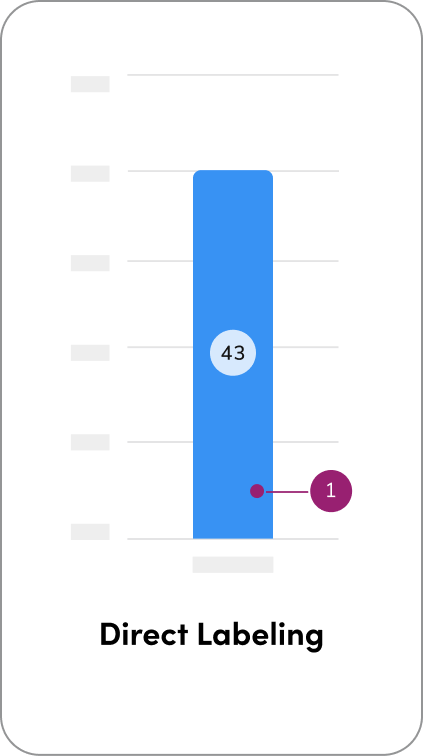
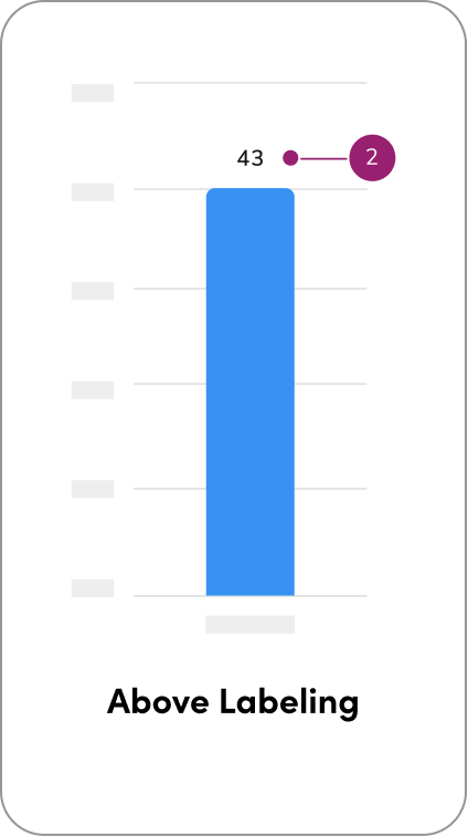
<Columns cols={3}>
  <img src="https://mintcdn.com/servicetitan/X7UCc5xRXSxfS9Y-/images/docs/web/data-visualization/accessibility/accessibility-direct-labeling.png?fit=max&auto=format&n=X7UCc5xRXSxfS9Y-&q=85&s=5d7d19cd98e9a892e1e90b530b1c0d35" alt="A bar chart with direct labeling (#1)" width="424" height="756" data-path="images/docs/web/data-visualization/accessibility/accessibility-direct-labeling.png" />

  <img src="https://mintcdn.com/servicetitan/X7UCc5xRXSxfS9Y-/images/docs/web/data-visualization/accessibility/accessibility-above-labeling.png?fit=max&auto=format&n=X7UCc5xRXSxfS9Y-&q=85&s=6cd3f3a0188c315b96a20eaa3b5a2542" alt="A bar chart with above labeling (#2)" width="424" height="756" data-path="images/docs/web/data-visualization/accessibility/accessibility-above-labeling.png" />
</Columns>

### How to Use:

<Columns cols={2}>
  <DoDont
    type="do"
    text="keep text labels short in charts to improve readability and maintain a
clean, uncluttered layout."
  >
    <img src="https://mintcdn.com/servicetitan/mzb8vUC8QRJt2y_W/images/docs/web/data-visualization/typography/typography-do-short-labels.png?fit=max&auto=format&n=mzb8vUC8QRJt2y_W&q=85&s=ae205d65a43e3eaa8c608299655fc6fd" alt="bar chart with short labels" className="m-block-end-0 m-block-start-5" width="926" height="935" data-path="images/docs/web/data-visualization/typography/typography-do-short-labels.png" />
  </DoDont>

  <DoDont
    type="dont"
    text="use rotated text. Keep all text horizontal for
better readability. If labels overlap, try adjusting the chart type or intervals
instead of rotating—this helps maintain clarity and accessibility."
  >
    <img src="https://mintcdn.com/servicetitan/cBm7KXEGzmK35qoE/images/docs/web/data-visualization/typography/typography-dont-rotated-labels.png?fit=max&auto=format&n=cBm7KXEGzmK35qoE&q=85&s=a3539e41acb6898f4579d85fee0e7f5e" alt="bar chart with long labels that are rotated" className="m-block-0" width="938" height="935" data-path="images/docs/web/data-visualization/typography/typography-dont-rotated-labels.png" />
  </DoDont>

  <DoDont
    type="do"
    text="use compact number formats for large values (e.g., write 7B instead of
7,000,000,000) to keep charts clean and easy to read. Use $, %, km to show
meaning, and add units or timeframes near the data for clarity."
  >
    <img src="https://mintcdn.com/servicetitan/mzb8vUC8QRJt2y_W/images/docs/web/data-visualization/typography/typography-do-large-number-formats.png?fit=max&auto=format&n=mzb8vUC8QRJt2y_W&q=85&s=c31b552b4b3d1fd7fd36a224dbf9de84" alt="bar chart with abbreviated number values, e.g., '6B' for '6 billion'" className="m-block-0" width="936" height="941" data-path="images/docs/web/data-visualization/typography/typography-do-large-number-formats.png" />
  </DoDont>

  <DoDont type="dont" text="display long numbers in full like 7,000,000,000.">
    <img src="https://mintcdn.com/servicetitan/cBm7KXEGzmK35qoE/images/docs/web/data-visualization/typography/typography-dont-large-number-formats.png?fit=max&auto=format&n=cBm7KXEGzmK35qoE&q=85&s=4997cbdbc9ec9bf6c77eeff800701568" alt="bar chart with large number values spelled out in full" className="m-block-end-0 m-block-start-12" width="936" height="941" data-path="images/docs/web/data-visualization/typography/typography-dont-large-number-formats.png" />
  </DoDont>

  <DoDont type="do" text="adjust the layout to fit the text—use horizontal labels or a stacked bar chart when it improves readability. Clear, full labels make the chart easier to understand.">
    <img src="https://mintcdn.com/servicetitan/mzb8vUC8QRJt2y_W/images/docs/web/data-visualization/typography/typography-do-adjust-layout.png?fit=max&auto=format&n=mzb8vUC8QRJt2y_W&q=85&s=6fb86994241bb33b9d9576eeaf8e36f9" alt="bar chart with long labels, turned on its side" className="m-block-0" width="929" height="941" data-path="images/docs/web/data-visualization/typography/typography-do-adjust-layout.png" />
  </DoDont>

  <DoDont
    type="dont"
    text="force long labels in layouts that make the text difficult to
read."
  >
    <img src="https://mintcdn.com/servicetitan/cBm7KXEGzmK35qoE/images/docs/web/data-visualization/typography/typography-dont-force-labels.png?fit=max&auto=format&n=cBm7KXEGzmK35qoE&q=85&s=4ad9cf86bd24b2aa64a9073703c6e7d1" alt="bar chart with long labels that are rotated" className="m-block-end-0 m-block-start-10" width="936" height="941" data-path="images/docs/web/data-visualization/typography/typography-dont-force-labels.png" />
  </DoDont>
</Columns>

<Card title="Questions? Challenges?" icon="link" href="https://servicetitan.enterprise.slack.com/archives/C0881LFTGDR" arrow="true" cta="Click here">
  Contact the Visual Design team on the #ask-vizd channel
</Card>
