> ## Documentation Index
> Fetch the complete documentation index at: https://anvil.servicetitan.com/llms.txt
> Use this file to discover all available pages before exploring further.

# Colors

export const LiveCode = ({children, customHeight, clickToLoad, example, fullWidth, fullHeight, hideCodeInLiveCode, screenshot, screenshotOnly, showCode: showCodeProp}) => {
  const SCREENSHOTS_BASE = "https://servicetitan.github.io/anvil2-docs-live-code/screenshots";
  const STACKBLITZ_BASE = "https://stackblitz.com/github/servicetitan/anvil2-docs-live-code/tree/main/examples";
  const [showCodeBlock, setShowCodeBlock] = useState(showCodeProp ?? false);
  const [isLocalOverride, setIsLocalOverride] = useState(false);
  useEffect(() => {
    const examplePath = `/images/live-code-screenshots-tmp/${example}.png`;
    fetch(examplePath, {
      method: "HEAD"
    }).then(r => {
      if (r.ok) setIsLocalOverride(true);
    }).catch(() => {});
  }, [example]);
  const screenshotBase = isLocalOverride ? "/images/live-code-screenshots-tmp" : SCREENSHOTS_BASE;
  if (screenshotOnly) {
    return <Frame className="flex flex-col">
        <div className="flex dark:hidden" style={{
      justifyContent: "center",
      alignItems: "center",
      width: fullWidth ? "100%" : "50%",
      minHeight: fullHeight ? "284px" : undefined,
      background: "#FFFFFF"
    }}>
          <img srcset={`${screenshotBase}/${example}.png, ${screenshotBase}/${example}-2x.png 2x`} src={`${screenshotBase}/${example}.png`} alt={example} noZoom />
        </div>
        <div className="hidden dark:flex" style={{
      justifyContent: "center",
      alignItems: "center",
      width: fullWidth ? "100%" : "50%",
      minHeight: fullHeight ? "284px" : undefined,
      background: "#141414"
    }}>
          <img srcset={`${screenshotBase}/${example}-dark.png, ${screenshotBase}/${example}-dark-2x.png 2x`} src={`${screenshotBase}/${example}-dark.png`} alt={example} noZoom />
        </div>
      </Frame>;
  }
  if (screenshot) {
    return <Frame className="flex flex-col -mb-2">
        <div className="flex dark:hidden bg-white dark:bg-codeblock border border-gray-950/10 dark:border-white/10 dark:twoslash-dark rounded-2xl overflow-hidden" style={{
      justifyContent: "center",
      alignItems: "center",
      width: fullWidth ? "100%" : "50%",
      minHeight: fullHeight ? "284px" : undefined
    }}>
          <img srcset={`${screenshotBase}/${example}.png, ${screenshotBase}/${example}-2x.png 2x`} src={`${screenshotBase}/${example}.png`} alt={example} noZoom />
        </div>

        <div className="hidden dark:flex bg-white dark:bg-codeblock border border-gray-950/10 dark:border-white/10 dark:twoslash-dark rounded-2xl overflow-hidden" style={{
      background: "#141414",
      justifyContent: "center",
      alignItems: "center",
      width: fullWidth ? "100%" : "50%",
      minHeight: fullHeight ? "284px" : undefined
    }}>
          <img srcset={`${screenshotBase}/${example}-dark.png, ${screenshotBase}/${example}-dark-2x.png 2x`} src={`${screenshotBase}/${example}-dark.png`} alt={example} noZoom />
        </div>

        <div className="flex justify-end items-center text-xs py-2 px-1 gap-4">
          {!showCodeProp ? <button className="inline-flex justify-end items-center text-gray-700 dark:text-gray-50 hover:text-blue-500 dark:hover:text-blue-300 transition-colors group self-end gap-1 cursor-pointer" onClick={() => setShowCodeBlock(!showCodeBlock)} style={{
      appearance: "none"
    }}>
              <Icon icon="code" size="12px" className="group-hover:bg-blue-500 dark:group-hover:bg-blue-300" />
              <span>{showCodeBlock ? "Hide code" : "Show code"}</span>
            </button> : null}

          <a className="inline-flex justify-end items-center hover:text-blue-500 dark:hover:text-blue-300 transition-colors group self-end gap-1" href={`${STACKBLITZ_BASE}/${example}?file=src/App.tsx`} target="_blank" rel="noreferrer">
            <Icon icon="bolt" size="12px" className="group-hover:bg-blue-500 dark:group-hover:bg-blue-300" />
            <span>StackBlitz demo</span>
          </a>
        </div>

        <div className="grid transition-[grid-template-rows] duration-300 ease-in-out overflow-auto overflow-y-hidden overflow-x-auto" style={showCodeBlock ? {
      gridTemplateRows: "1fr"
    } : {
      gridTemplateRows: "0fr"
    }}>
          <div style={{
      minHeight: 0,
      overflowX: "auto",
      overflowY: "hidden",
      marginBlockStart: "-1.25rem",
      marginBlockEnd: "-1.5rem"
    }}>
            {children}
          </div>
        </div>
      </Frame>;
  } else {
    return <div style={{
      display: "flex",
      width: fullWidth ? "100%" : "50%",
      minHeight: customHeight ? customHeight : "316px",
      resize: "vertical",
      overflow: "auto"
    }}>
        <iframe title={example} style={{
      flex: 1,
      width: fullWidth ? "100%" : "50%",
      minHeight: customHeight ? customHeight : "316px"
    }} src={`${STACKBLITZ_BASE}/${example}?embed=1&hideNavigation=1&hideExplorer=1&terminalHeight=0&file=src/App.tsx${clickToLoad ? "&ctl=1" : ""}${hideCodeInLiveCode ? "&view=preview" : ""}`} allow="accelerometer; ambient-light-sensor; camera; encrypted-media; geolocation; gyroscope; hid; microphone; midi; payment; usb; vr; xr-spatial-tracking" sandbox="allow-forms allow-modals allow-popups allow-presentation allow-same-origin allow-scripts" />
      </div>;
  }
};

<Frame>
  <div className="w-full h-full bg-[#FFFFFF] p-2 rounded flex items-center justify-center">
    <img src="https://mintcdn.com/servicetitan/KE7wVYXA9MgEh_Ye/images/docs/web/foundations/shared/palette-icon.png?fit=max&auto=format&n=KE7wVYXA9MgEh_Ye&q=85&s=a266f03553e53dda84f0e3d5f94ab720" alt="Palette icon" width="72" height="72" data-path="images/docs/web/foundations/shared/palette-icon.png" />
  </div>
</Frame>

## Color Guidelines

### Our Principles

Use our experience principles to help guide your thinking of color as you’re designing:

<Columns cols={2}>
  <img src="https://mintcdn.com/servicetitan/KE7wVYXA9MgEh_Ye/images/docs/web/foundations/colors/picture-of-a-mountain-with-a-flag-at-the-top-with-the-word-prescriptive-below.png?fit=max&auto=format&n=KE7wVYXA9MgEh_Ye&q=85&s=60d571b8285c10a2fcc4ada39a7b9532" alt="Picture of a mountain with a flag at the top, with the word &#x22;prescriptive&#x22; below" width="316" height="249" data-path="images/docs/web/foundations/colors/picture-of-a-mountain-with-a-flag-at-the-top-with-the-word-prescriptive-below.png" />

  **High ROI & Prescriptive**\
  Intentional use of color allows a user to focus on the task at hand, achieving business goals quicker.
  Prescriptive color use helps users understand what to expect when seeing and interacting with certain hues. This consistency helps users navigate the product with ease.
  <img src="https://mintcdn.com/servicetitan/KE7wVYXA9MgEh_Ye/images/docs/web/foundations/colors/a-paper-plane-traveling-in-an-infinitely-loop-with-the-words-end-to-end.png?fit=max&auto=format&n=KE7wVYXA9MgEh_Ye&q=85&s=aafef3d4ba4d7ed464318eee2a657e1e" alt="A paper plane traveling in an infinitely loop with the words &#x22;End to end&#x22;" width="316" height="262" data-path="images/docs/web/foundations/colors/a-paper-plane-traveling-in-an-infinitely-loop-with-the-words-end-to-end.png" />

  **End to end, tailored, integrated**\
  Tailored use of color ensures that the colors in the UI do not compete with each other. Color throughout the UI is integrated, creating a connected visual system, helping users easily recognize important elements, reducing confusion, and making navigation more intuitive.

  <img src="https://mintcdn.com/servicetitan/KE7wVYXA9MgEh_Ye/images/docs/web/foundations/colors/a-series-of-settings-cogs-with-the-word-intuitive.png?fit=max&auto=format&n=KE7wVYXA9MgEh_Ye&q=85&s=9cb405cfafcf7d196b46522f98694210" alt="A series of settings cogs with the word &#x22;intuitive&#x22;" width="266" height="294" data-path="images/docs/web/foundations/colors/a-series-of-settings-cogs-with-the-word-intuitive.png" />

  **Automatic, intuitive, efficient**Color in the product should help the user understand actions or statuses without a lot of thought. Color helps the user navigate intuitively, recognizing what actions to take or how to feel about elements on the screen. When color maps semantically, users feel a familiarity with the color that associates it to something common, and intuitive.\
  Color choices have an intentional hierarchy and clear point of view. Users are efficiently guided to the most important aspect on every page.

  <img src="https://mintcdn.com/servicetitan/KE7wVYXA9MgEh_Ye/images/docs/web/foundations/colors/an-atom-with-the-word-smart-above-it.png?fit=max&auto=format&n=KE7wVYXA9MgEh_Ye&q=85&s=e074a49e71a80b4fc1f6a66fbe29bba1" alt="An atom with the word &#x22;Smart&#x22; above it" width="300" height="280" data-path="images/docs/web/foundations/colors/an-atom-with-the-word-smart-above-it.png" />

  **Insightful, smart**\
  As designers, we use color when and where it makes the most sense and avoid using color in situations where it does not provide meaningful value.

  <img src="https://mintcdn.com/servicetitan/KE7wVYXA9MgEh_Ye/images/docs/web/foundations/colors/two-hands-clasped-with-the-word-truthworthy-above-them.png?fit=max&auto=format&n=KE7wVYXA9MgEh_Ye&q=85&s=a8e0a03b23d3715e9026052995c482a0" alt="Two hands clasped with the word &#x22;truthworthy&#x22; above them" width="301" height="279" data-path="images/docs/web/foundations/colors/two-hands-clasped-with-the-word-truthworthy-above-them.png" />

  **Trustworthy, secure, performant**\
  Consistent color use in the product creates a trustworthy experience as our user’s navigate throughout. Our user’s can trust that the software call’s their attention accordingly.

  <img src="https://mintcdn.com/servicetitan/KE7wVYXA9MgEh_Ye/images/docs/web/foundations/colors/a-rockship-with-the-words-evolving-quickly-around-it.png?fit=max&auto=format&n=KE7wVYXA9MgEh_Ye&q=85&s=20dae27d1378347836aae48f90d04477" alt="A rockship with the words &#x22;Evolving Quickly&#x22; around it" width="300" height="285" data-path="images/docs/web/foundations/colors/a-rockship-with-the-words-evolving-quickly-around-it.png" />

  **Evolving Quickly**\
  As our product evolves quickly, the color system in our UI is easy to adjust for quick updates to meet industry, customer, and design trends without disrupting the larger design system.

  <img src="https://mintcdn.com/servicetitan/KE7wVYXA9MgEh_Ye/images/docs/web/foundations/colors/a-pencil-and-paint-brush-crossed-with-the-word-polished-below.png?fit=max&auto=format&n=KE7wVYXA9MgEh_Ye&q=85&s=7f4de23d00a575ee0b3b9c6b46d80465" alt="A pencil and paint brush crossed, with the word &#x22;Polished&#x22; below" width="300" height="279" data-path="images/docs/web/foundations/colors/a-pencil-and-paint-brush-crossed-with-the-word-polished-below.png" />

  **Polished**\
  When we use intentional color guided by our principles above, the outcome is a polished, professional UI.

</Columns>

### Purposeful

Our palettes are used to convey meaning to the information they present.

### Brings Attention

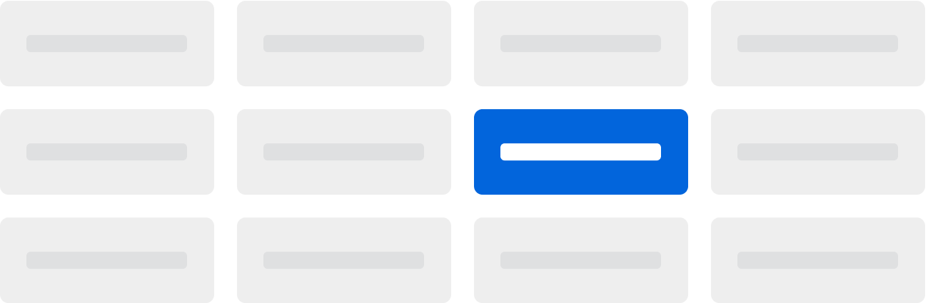
Color, when used with purpose and sparingly, brings attention to the important elements in the UI.

<img src="https://mintcdn.com/servicetitan/KE7wVYXA9MgEh_Ye/images/docs/web/foundations/colors/two-alerts-without-text-one-red-and-one-green-to-illustrate-purpose-with-color.png?fit=max&auto=format&n=KE7wVYXA9MgEh_Ye&q=85&s=e87ba903dbd35b6165c53964a61202ba" alt="Two alerts without text, one red and one green, to illustrate purpose with color" width="1344" height="169" data-path="images/docs/web/foundations/colors/two-alerts-without-text-one-red-and-one-green-to-illustrate-purpose-with-color.png" />

<img src="https://mintcdn.com/servicetitan/KE7wVYXA9MgEh_Ye/images/docs/web/foundations/colors/a-series-of-gray-boxes-with-one-blue-to-show-high-color-contrast-among-items.png?fit=max&auto=format&n=KE7wVYXA9MgEh_Ye&q=85&s=9dfe139e556fe336fb4db2626d113b8a" alt="A series of gray boxes, with one blue, to show high color contrast among items" width="1300" height="425" data-path="images/docs/web/foundations/colors/a-series-of-gray-boxes-with-one-blue-to-show-high-color-contrast-among-items.png" />

## Functional vs Decorative Color

There are two types of color in the product: functional color and decorative color.

Functional color is the color we mainly see in the UI, color that has meaning and communicates meaning to our users. This color use in the product should be accessible, intentional, and impactful. The consistent use of color throughout conveys stability, builds trust, and reinforces reliability of our product.

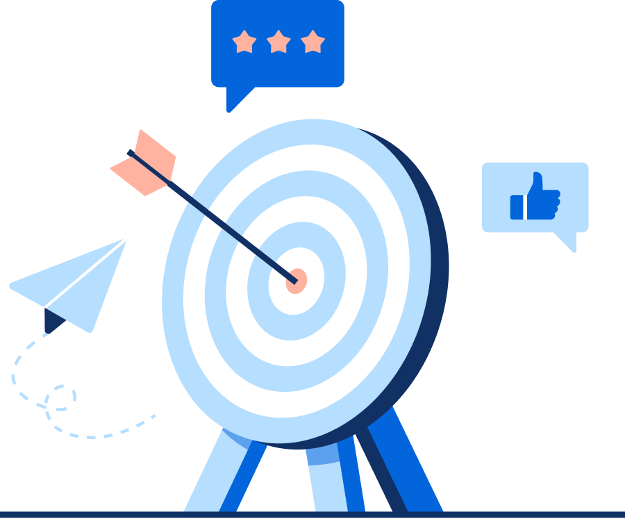
Decorative color should be used carefully and sparingly. A rule of thumb for decorative color is that it can be swapped to any color and the meaning and impact would not change. When designing with decorative colors, less is more. They shouldn’t compete with functional color.

As designers, we have the responsibility to use color in an intentional way to guide our users to the most important aspects of the product. Color use is a delicate balance, as too little color creates a one dimensional experience, and too much color causes confusion and increases cognitive load.
<LiveCode example="colors-functional" screenshot fullWidth>
  ```tsx lines theme={null}
  import { Alert } from "@servicetitan/anvil2";

  function App() {
    return (
      <Alert
        status="success"
        title="Success!"
        onClose={() => console.log("You closed the alert")}
      >
        Alert Title
      </Alert>
    );
  }

  export default App;
  ```
</LiveCode>

Functional color example: Toast message

<img src="https://mintcdn.com/servicetitan/KE7wVYXA9MgEh_Ye/images/docs/web/foundations/colors/an-arrow-hitting-its-mark-on-a-target-used-for-marketing.png?fit=max&auto=format&n=KE7wVYXA9MgEh_Ye&q=85&s=2f1e11948b9a44c05ff0752d3ad73e47" alt="An arrow hitting its mark on a target, used for &#x22;Marketing&#x22;" width="900" height="747" data-path="images/docs/web/foundations/colors/an-arrow-hitting-its-mark-on-a-target-used-for-marketing.png" />

Decorative color example: marketing illustration

## Accessibility and Contrast

Colors should be readable and supplement the presentation of information.

Learn more about [Color Accessibility](https://www.figma.com/proto/xDpwL1pomsuEb4vd8X42PT/Anvil-Color-Accessibility-Guide?page-id=22%3A49\&type=design\&node-id=464-7989\&viewport=4366%2C2246%2C0.82\&t=6W5Wffz4XHQk3t0U-1\&scaling=min-zoom\&starting-point-node-id=464%3A8185)

When using color, it is required to meet minimum contrast ratios with text and background colors. At minimum, text contrast should meet the WCAG 2.2 AA Large guidelines (4.5:1).

<LiveCode example="colors-contrast-do" screenshot fullWidth>
  ```tsx lines theme={null}
  import { Grid, Flex, Text } from "@servicetitan/anvil2";

  function App() {
    const passGuidelines = {
      1: {
        description: "Foreground on background",
        foreground: "--foreground-color",
        background: "--background-color",
      },
      2: {
        description: "Foreground/subdued on background",
        foreground: "--foreground-color-subdued",
        background: "--background-color",
      },
      3: {
        description: "Foreground on background/primary",
        foreground: "--foreground-color-inverted",
        background: "--status-color-info",
      },
    };

    return (
      <Grid gap="2" templateColumns="repeat(auto-fit, minmax(186px, 1fr))">
        {Object.entries(passGuidelines).map(([key, color]) => (
          <Flex key={key} gap="3" direction="column">
            <div
              style={{
                backgroundColor: `var(${color.background})`,
                borderColor: "var(--border-color)",
                borderWidth: "1px",
                borderStyle: "solid",
                borderRadius: "12px",
                padding: "24px",
                width: "100px",
              }}
            >
              <Flex gap="3" direction="column">
                <div
                  style={{
                    backgroundColor: `var(${color.foreground})`,
                    height: "12px",
                    width: "62%",
                    borderRadius: "3px",
                  }}
                ></div>
                <div
                  style={{
                    backgroundColor: `var(${color.foreground})`,
                    height: "12px",
                    width: "100%",
                    borderRadius: "3px",
                  }}
                ></div>
                <div
                  style={{
                    backgroundColor: `var(${color.foreground})`,
                    height: "12px",
                    width: "100%",
                    borderRadius: "3px",
                  }}
                ></div>
                <div
                  style={{
                    backgroundColor: `var(${color.foreground})`,
                    height: "12px",
                    width: "100%",
                    borderRadius: "3px",
                  }}
                ></div>
              </Flex>
            </div>
            <Text variant="eyebrow">{color.description}</Text>
          </Flex>
        ))}
      </Grid>
    );
  }

  export default App;
  ```
</LiveCode>

<Check>**Do**</Check>

Create color combinations that pass AA guidelines

<LiveCode example="colors-contrast-dont" screenshot fullWidth>
  ```tsx lines theme={null}
  import { Grid, Flex, Text } from "@servicetitan/anvil2";

  function App() {
    const failGuidelines = {
      1: {
        description: "Foreground/subdued on background/strong",
        foreground: "--foreground-color-subdued",
        background: "--background-color-strong",
      },
      2: {
        description: "White on Background/warning",
        foreground: "--foreground-color-inverted",
        background: "--background-color-warning",
      },
      3: {
        description: "Foreground/default on background/Danger",
        foreground: "--foreground-color",
        background: "--status-color-danger",
      },
      4: {
        description: "Foreground/default on background/primary",
        foreground: "--foreground-color",
        background: "--status-color-info",
      },
    };

    return (
      <Grid gap="2" templateColumns="repeat(auto-fit, minmax(186px, 1fr))">
        {Object.entries(failGuidelines).map(([key, color]) => (
          <Flex key={key} gap="3" direction="column">
            <div
              style={{
                backgroundColor: `var(${color.background})`,
                borderColor: "var(--border-color)",
                borderWidth: "1px",
                borderStyle: "solid",
                borderRadius: "12px",
                padding: "24px",
                width: "100px",
              }}
            >
              <Flex gap="3" direction="column">
                <div
                  style={{
                    backgroundColor: `var(${color.foreground})`,
                    height: "12px",
                    width: "62%",
                    borderRadius: "3px",
                  }}
                ></div>
                <div
                  style={{
                    backgroundColor: `var(${color.foreground})`,
                    height: "12px",
                    width: "100%",
                    borderRadius: "3px",
                  }}
                ></div>
                <div
                  style={{
                    backgroundColor: `var(${color.foreground})`,
                    height: "12px",
                    width: "100%",
                    borderRadius: "3px",
                  }}
                ></div>
                <div
                  style={{
                    backgroundColor: `var(${color.foreground})`,
                    height: "12px",
                    width: "100%",
                    borderRadius: "3px",
                  }}
                ></div>
              </Flex>
            </div>
            <Text variant="eyebrow">{color.description}</Text>
          </Flex>
        ))}
      </Grid>
    );
  }
  export default App;
  ```
</LiveCode>

<Danger>**Don't**</Danger>

Create color combinations that fail AA guidelines

**Icon exception**

Icons are able to have less contrast than text at a ratio of 3:1. For example, an icon can be ‘foreground/subdued’ on a ‘background/strong’. This should be avoided with icon-only interfaces and with small icons.

## Semantic Colors

### Foreground Colors

<LiveCode example="colors-semantic-foreground" screenshot fullWidth>
  ```tsx lines theme={null}
  import { Tooltip, Flex, Text, Grid } from "@servicetitan/anvil2";

  const darkGuidance = "Works with white text or background";
  const lightGuidance = "Works with black text or background";

  const colors = {
    foregroundColors: {
      default: {
        name: "Default",
        token: "Foreground/Color/Default",
        hexCode: "#141414",
        cssVariable: "--foreground-color",
        description: darkGuidance,
      },
      primary: {
        name: "Primary",
        token: "Foreground/Color/Primary",
        hexCode: "#0265DC",
        cssVariable: "--foreground-color-primary",
        description: darkGuidance,
      },
      subdued: {
        name: "Subdued",
        token: "Foreground/Color/Subdued",
        hexCode: "#737475",
        cssVariable: "--foreground-color-subdued",
        description: darkGuidance,
      },
      danger: {
        name: "Danger",
        token: "Foreground/Color/Danger",
        hexCode: "#E13212",
        cssVariable: "--foreground-color-danger",
        description: darkGuidance,
      },
      inverted: {
        name: "Inverted",
        token: "Foreground/Color/Inverted",
        hexCode: "#FFFFFF",
        cssVariable: "--foreground-color-inverted",
        description: lightGuidance,
      },
      onPrimary: {
        name: "On-Primary",
        token: "Foreground/Color/On-Primary",
        hexCode: "#FFFFFF",
        cssVariable: "--foreground-color-on-primary",
        description: lightGuidance,
      },
      onDanger: {
        name: "On-Danger",
        token: "Foreground/Color/On-Danger",
        hexCode: "#737475",
        cssVariable: "--foreground-color-on-danger",
        description: darkGuidance,
      },
      onWarning: {
        name: "On-Warning",
        token: "Foreground/Color/On-Warning",
        hexCode: "#141414",
        cssVariable: "--foreground-color-on-warning",
        description: darkGuidance,
      },
    },
  };

  type TooltipTriggerProps = {
    color: {
      cssVariable?: string;
      description?: string;
      hexCode: string;
      name?: string;
      token: string;
    };
  };

  function App() {
    const TooltipTrigger = ({ color }: TooltipTriggerProps) => (
      <div
        style={{
          backgroundColor: color.hexCode,
          boxSizing: "border-box",
          padding: "16px",
          borderColor: "#DFE0E1",
          width: "100%",
          height: "140px",
          borderRadius: "12px",
          marginBottom: "16px",
          borderWidth: "1px",
          borderStyle: "solid",
          display: "flex",
          flexDirection: "column-reverse",
          alignItems: "start",
        }}
      >
        {color.description && (
          <Tooltip>
            <Tooltip.Trigger>
              <div
                style={{
                  borderRadius: "100%",
                  width: "24px",
                  height: "24px",
                  backgroundColor:
                    color.description === darkGuidance ? "white" : "black",
                }}
              />
            </Tooltip.Trigger>
            <Tooltip.Content>{color.description}</Tooltip.Content>
          </Tooltip>
        )}
      </div>
    );

    interface CardLockupProps extends TooltipTriggerProps {
      key: React.Key;
    }

    const CardLockup = ({ color, key }: CardLockupProps) => (
      <div key={key}>
        <TooltipTrigger color={color} />
        <Flex gap="2" direction="column">
          <Text variant="body" inline style={{ fontWeight: 700 }}>
            {color.name}
          </Text>
          <Flex gap="4">
            <Text>{color.token}</Text>
            <Text variant="body" subdued>
              {color.hexCode}
            </Text>
          </Flex>
        </Flex>
      </div>
    );

    return (
      <Grid templateColumns="repeat(4, 1fr)" gap="4">
        {Object.entries(colors.foregroundColors).map(([key, color]) => (
          <CardLockup key={key} color={color} />
        ))}
      </Grid>
    );
  }

  export default App;
  ```
</LiveCode>

### Background Colors

<LiveCode example="colors-semantic-background" screenshot fullWidth>
  ```tsx lines theme={null}
  import { Tooltip, Flex, Text, Grid } from "@servicetitan/anvil2";

  const darkGuidance = "Works with white text or background";
  const lightGuidance = "Works with black text or background";

  const colors = {
    backgroundColors: {
      default: {
        name: "Default",
        token: "Background/Color/Default",
        hexCode: "#FFFFFF",
        cssVariable: "--colorsSurfaceDefault",
        description: lightGuidance,
      },
      inverted: {
        name: "Inverted",
        token: "Background/Color/Inverted",
        hexCode: "#2D2E31",
        cssVariable: "--colorsSurfaceInverted",
        description: darkGuidance,
      },
      invertedStrong: {
        name: "Inverted-Strong",
        token: "Background/Color/Inverted-Strong",
        hexCode: "#141414",
        cssVariable: "--colorsSurfaceInvertedStrong",
        description: darkGuidance,
      },
      strong: {
        name: "Strong",
        token: "Background/Color/Strong",
        hexCode: "#F7F7F7",
        cssVariable: "--colorsSurfaceGreySubdued",
        description: lightGuidance,
      },
      stronger: {
        name: "Stronger",
        token: "Background/Color/Stronger",
        hexCode: "#F7F7F7",
        cssVariable: "--colorsSurfaceGreySubdued",
        description: lightGuidance,
      },
      strongest: {
        name: "Strongest",
        token: "Background/Color/Strongest",
        hexCode: "#EEEEEE",
        cssVariable: "--colorsSurfaceGrey",
        description: lightGuidance,
      },
      primary: {
        name: "Primary",
        token: "Background/Color/Primary",
        hexCode: "#0265DC",
        cssVariable: "--colorsSurfacePrimary",
        description: darkGuidance,
      },
      primarySubdued: {
        name: "Primary Subdued",
        token: "Background/Color/Primary-Subdued",
        hexCode: "#E0F2FF",
        cssVariable: "--colorsSurfacePrimarySubdued",
        description: lightGuidance,
      },
      danger: {
        name: "Danger",
        token: "Background/Color/Danger",
        hexCode: "#E13212",
        cssVariable: "--colorsSurfaceCritical",
        description: darkGuidance,
      },
      dangerSubdued: {
        name: "Danger Subdued",
        token: "Background/Color/Danger-Subdued",
        hexCode: "#FFECE9",
        cssVariable: "--colorsSurfaceCriticalSubdued",
        description: lightGuidance,
      },
      warning: {
        name: "Warning",
        token: "Background/Color/Warning",
        hexCode: "#FFBE00",
        cssVariable: "--colorsStatusWarning",
        description: lightGuidance,
      },
      warningSubdued: {
        name: "Warning Subdued",
        token: "Background/Color/Warning-Subdued",
        hexCode: "#FFF9E3",
        cssVariable: "--colorsSurfaceWarningSubdued",
        description: lightGuidance,
      },
      disabled: {
        name: "Disabled",
        token: "Background/Color/Disabled",
        hexCode: "#606162",
        cssVariable: "--colorsSurfaceDisabled",
        description: darkGuidance,
      },
    },
  };

  type TooltipTriggerProps = {
    color: {
      cssVariable?: string;
      description?: string;
      hexCode: string;
      name?: string;
      token: string;
    };
  };

  function App() {
    const TooltipTrigger = ({ color }: TooltipTriggerProps) => (
      <div
        style={{
          backgroundColor: color.hexCode,
          boxSizing: "border-box",
          padding: "16px",
          borderColor: "#DFE0E1",
          width: "100%",
          height: "140px",
          borderRadius: "12px",
          marginBottom: "16px",
          borderWidth: "1px",
          borderStyle: "solid",
          display: "flex",
          flexDirection: "column-reverse",
          alignItems: "start",
        }}
      >
        {color.description && (
          <Tooltip>
            <Tooltip.Trigger>
              <div
                style={{
                  borderRadius: "100%",
                  width: "24px",
                  height: "24px",
                  backgroundColor:
                    color.description === darkGuidance ? "white" : "black",
                }}
              />
            </Tooltip.Trigger>
            <Tooltip.Content>{color.description}</Tooltip.Content>
          </Tooltip>
        )}
      </div>
    );

    interface CardLockupProps extends TooltipTriggerProps {
      key: React.Key;
    }

    const CardLockup = ({ color, key }: CardLockupProps) => (
      <div key={key}>
        <TooltipTrigger color={color} />
        <Flex gap="2" direction="column">
          <Text variant="body" inline style={{ fontWeight: 700 }}>
            {color.name}
          </Text>
          <Flex gap="4">
            <Text>{color.token}</Text>
            <Text variant="body" subdued>
              {color.hexCode}
            </Text>
          </Flex>
        </Flex>
      </div>
    );

    return (
      <Grid templateColumns="repeat(4, 1fr)" gap="4">
        {Object.entries(colors.backgroundColors).map(([key, color]) => (
          <CardLockup key={key} color={color} />
        ))}
      </Grid>
    );
  }

  export default App;
  ```
</LiveCode>

### Border Colors

<LiveCode example="colors-semantic-border" screenshot fullWidth>
  ```tsx lines theme={null}
  import { Tooltip, Flex, Text, Grid } from "@servicetitan/anvil2";

  const darkGuidance = "Works with white text or background";
  const lightGuidance = "Works with black text or background";

  const colors = {
    borderColors: {
      default: {
        name: "Default",
        token: "Border/Color/Default",
        hexCode: "#949596",
        cssVariable: "--border-color",
      },
      strong: {
        name: "Strong",
        token: "Border/Color/Strong",
        hexCode: "#444445",
        cssVariable: "--border-color-strong",
      },
      primary: {
        name: "Primary",
        token: "Border/Color/Primary",
        hexCode: "#0265DC",
        cssVariable: "--border-color-primary",
      },
      danger: {
        name: "Danger",
        token: "Border/Color/Danger",
        hexCode: "#E13212",
        cssVariable: "--border-color-danger",
      },
      subdued: {
        name: "Subdued",
        token: "Border/Color/Subdued",
        hexCode: "#DFE0E1",
        cssVariable: "--border-color-subdued",
        description: lightGuidance,
      },
    },
  };

  type TooltipTriggerProps = {
    color: {
      cssVariable?: string;
      description?: string;
      hexCode: string;
      name?: string;
      token: string;
    };
  };

  function App() {
    const TooltipTrigger = ({ color }: TooltipTriggerProps) => (
      <div
        style={{
          backgroundColor: color.hexCode,
          boxSizing: "border-box",
          padding: "16px",
          borderColor: "#DFE0E1",
          width: "100%",
          height: "140px",
          borderRadius: "12px",
          marginBottom: "16px",
          borderWidth: "1px",
          borderStyle: "solid",
          display: "flex",
          flexDirection: "column-reverse",
          alignItems: "start",
        }}
      >
        {color.description && (
          <Tooltip>
            <Tooltip.Trigger>
              <div
                style={{
                  borderRadius: "100%",
                  width: "24px",
                  height: "24px",
                  backgroundColor:
                    color.description === darkGuidance ? "white" : "black",
                }}
              />
            </Tooltip.Trigger>
            <Tooltip.Content>{color.description}</Tooltip.Content>
          </Tooltip>
        )}
      </div>
    );

    interface CardLockupProps extends TooltipTriggerProps {
      key: React.Key;
    }

    const CardLockup = ({ color, key }: CardLockupProps) => (
      <div key={key}>
        <TooltipTrigger color={color} />
        <Flex gap="2" direction="column">
          <Text variant="body" inline style={{ fontWeight: 700 }}>
            {color.name}
          </Text>
          <Flex gap="4">
            <Text>{color.token}</Text>
            <Text variant="body" subdued>
              {color.hexCode}
            </Text>
          </Flex>
        </Flex>
      </div>
    );

    return (
      <Grid templateColumns="repeat(3, 1fr)" gap="4">
        {Object.entries(colors.borderColors).map(([key, color]) => (
          <CardLockup key={key} color={color} />
        ))}
      </Grid>
    );
  }

  export default App;
  ```
</LiveCode>

### Status Colors

<LiveCode example="colors-semantic-status" screenshot fullWidth>
  ```tsx lines theme={null}
  import { Tooltip, Flex, Text, Grid } from "@servicetitan/anvil2";

  const darkGuidance = "Works with white text or background";
  const lightGuidance = "Works with black text or background";

  const colors = {
    statusColors: {
      info: {
        name: "Info",
        token: "Status/Color/Info",
        hexCode: "#0265DC",
        cssVariable: "--status-color-info",
        description: darkGuidance,
      },
      danger: {
        name: "Danger",
        token: "Status/Color/Danger",
        hexCode: "#E13212",
        cssVariable: "--status-color-danger",
        description: darkGuidance,
      },
      success: {
        name: "Success",
        token: "Status/Color/Success",
        hexCode: "#007A4D",
        cssVariable: "--status-color-success",
        description: darkGuidance,
      },
      warning: {
        name: "Warning",
        token: "Status/Color/Warning",
        hexCode: "#FFBE00",
        cssVariable: "--status-color-warning",
        description: lightGuidance,
      },
    },
  };

  type TooltipTriggerProps = {
    color: {
      cssVariable?: string;
      description?: string;
      hexCode: string;
      name?: string;
      token: string;
    };
  };

  function App() {
    const TooltipTrigger = ({ color }: TooltipTriggerProps) => (
      <div
        style={{
          backgroundColor: color.hexCode,
          boxSizing: "border-box",
          padding: "16px",
          borderColor: "#DFE0E1",
          width: "100%",
          height: "140px",
          borderRadius: "12px",
          marginBottom: "16px",
          borderWidth: "1px",
          borderStyle: "solid",
          display: "flex",
          flexDirection: "column-reverse",
          alignItems: "start",
        }}
      >
        {color.description && (
          <Tooltip>
            <Tooltip.Trigger>
              <div
                style={{
                  borderRadius: "100%",
                  width: "24px",
                  height: "24px",
                  backgroundColor:
                    color.description === darkGuidance ? "white" : "black",
                }}
              />
            </Tooltip.Trigger>
            <Tooltip.Content>{color.description}</Tooltip.Content>
          </Tooltip>
        )}
      </div>
    );

    interface CardLockupProps extends TooltipTriggerProps {
      key: React.Key;
    }

    const CardLockup = ({ color, key }: CardLockupProps) => (
      <div key={key}>
        <TooltipTrigger color={color} />
        <Flex gap="2" direction="column">
          <Text variant="body" inline style={{ fontWeight: 700 }}>
            {color.name}
          </Text>
          <Flex gap="4">
            <Text>{color.token}</Text>
            <Text variant="body" subdued>
              {color.hexCode}
            </Text>
          </Flex>
        </Flex>
      </div>
    );

    return (
      <Grid templateColumns="repeat(2, 1fr)" gap="4">
        {Object.entries(colors.statusColors).map(([key, color]) => (
          <CardLockup key={key} color={color} />
        ))}
      </Grid>
    );
  }

  export default App;
  ```
</LiveCode>

## Interaction States

### Hover

Hover states are typically one shade lighter on dark background colors, and one shade darker on light background colors.

<LiveCode example="colors-interaction-hover" screenshot fullWidth>
  ```tsx lines theme={null}
  import { Button } from "@servicetitan/anvil2";

  function App() {
    return (
      <Button appearance="primary" data-interactive="hover">
        Hover
      </Button>
    );
  }

  export default App;
  ```
</LiveCode>

### Focus

A blue border is typically used to indicate focus states.

<LiveCode example="colors-interaction-focus" screenshot fullWidth>
  ```tsx lines theme={null}
  import { Button } from "@servicetitan/anvil2";

  function App() {
    return (
      <Button appearance="primary" data-interactive="focus-visible">
        Focus Visible
      </Button>
    );
  }

  export default App;
  ```
</LiveCode>

### Active

A button is in it’s active state when it’s being pressed. The treatment is to give it a darker or lighter shade depending on appearance.

<LiveCode example="colors-interaction-active" screenshot fullWidth>
  ```tsx lines theme={null}
  import { Button } from "@servicetitan/anvil2";

  function App() {
    return (
      <Button appearance="primary" data-interactive="active">
        Active
      </Button>
    );
  }

  export default App;
  ```
</LiveCode>

### Disabled

In general, disabled states typically utilize neutral colors with a 40% or 60% opacity applied to the element.

<LiveCode example="colors-interaction-disabled" screenshot fullWidth>
  ```tsx lines theme={null}
  import { Grid, Flex, TextField, Radio, Button } from "@servicetitan/anvil2";

  function App() {
    return (
      <Grid templateColumns="repeat(2, max-content)" gap="8">
        <Flex direction="column" gap="8">
          <TextField label="Label" placeholder="Placeholder" />
          <Radio name="fruit" value="Apple" label="Apple" />
          <Button appearance="primary">Button</Button>
          <Button>Button</Button>
          <Button appearance="danger-secondary">Button</Button>
          <Button appearance="danger">Button</Button>
          <Button appearance="ghost">Button</Button>
        </Flex>
        <Flex direction="column" gap="8">
          <TextField label="Label" placeholder="Placeholder" disabled />
          <Radio name="fruit" value="Apple" label="Apple" disabled />
          <Button appearance="primary" disabled>
            Button
          </Button>
          <Button disabled>Button</Button>
          <Button appearance="danger-secondary" disabled>
            Button
          </Button>
          <Button appearance="danger" disabled>
            Button
          </Button>
          <Button appearance="ghost" disabled>
            Button
          </Button>
        </Flex>
      </Grid>
    );
  }

  export default App;
  ```
</LiveCode>

## Emphasis

Emphasis is a design tool we use to highlight hierarchy and importance with hues.

When deciding on which color to use, think about the hierarchy of the element you are looking to highlight. If the element is of high importance, you’ll want to use a color of high contrast and emphasis. If the element is of low importance, pick a color of less prominence and contrast.

To select a color for high emphasis, use a color in the **500** or **600** color ramp.\
To select a color for medium emphasis, use a color in the **200-400** color ramp.\
To select a color for low emphasis, use a color in the **100** color ramp.

<LiveCode example="colors-emphasis-playground" screenshot fullWidth>
  ```tsx lines theme={null}
  import { Grid, Tooltip, Text } from "@servicetitan/anvil2";

  function App() {
    const table = {
      high: {
        color: {
          blue: {
            "500": {
              value: "#0265dcff",
            },
            "600": {
              value: "#004491ff",
            },
          },
          red: {
            "500": {
              value: "#e13212ff",
            },
            "600": {
              value: "#bf2a00ff",
            },
          },
          yellow: {
            "500": {
              value: "#ffbe00ff",
            },
            "600": {
              value: "#de9500ff",
            },
          },
          green: {
            "500": {
              value: "#007a4dff",
            },
            "600": {
              value: "#005132ff",
            },
          },
          "blue-grey": {
            "500": {
              value: "#6a7a85ff",
            },
            "600": {
              value: "#576671ff",
            },
          },
          orange: {
            "500": {
              value: "#b14c00ff",
            },
            "600": {
              value: "#7a2f00ff",
            },
          },
          cyan: {
            "500": {
              value: "#0ca5c0ff",
            },
            "600": {
              value: "#038299ff",
            },
          },
          purple: {
            "500": {
              value: "#4f3a9eff",
            },
            "600": {
              value: "#422799ff",
            },
          },
          magenta: {
            "500": {
              value: "#982071ff",
            },
            "600": {
              value: "#7d165bff",
            },
          },
        },
      },
      medium: {
        color: {
          blue: {
            "200": { value: "#b5deffff" },
            "300": { value: "#78bbfaff" },
            "400": { value: "#3892f3ff" },
          },
          red: {
            "200": { value: "#ffb2a0ff" },
            "300": { value: "#ff745fff" },
            "400": { value: "#f94d32ff" },
          },
          yellow: {
            "200": { value: "#fff0b1ff" },
            "300": { value: "#ffe278ff" },
            "400": { value: "#ffc902ff" },
          },
          green: {
            "200": { value: "#89ecbcff" },
            "300": { value: "#49cc93ff" },
            "400": { value: "#15a46eff" },
          },
          "blue-grey": {
            "200": { value: "#d0d8ddff" },
            "300": { value: "#b4c1c8ff" },
            "400": { value: "#8c9ca5ff" },
          },
          orange: {
            "200": { value: "#fdd291ff" },
            "300": { value: "#ffa037ff" },
            "400": { value: "#e46f00ff" },
          },
          cyan: {
            "200": { value: "#b1f3faff" },
            "300": { value: "#13ceeaff" },
            "400": { value: "#08bfdfff" },
          },
          purple: {
            "200": { value: "#c1b6f2ff" },
            "300": { value: "#8772e5ff" },
            "400": { value: "#6954c0ff" },
          },
          magenta: {
            "200": { value: "#faafe2ff" },
            "300": { value: "#d949a9ff" },
            "400": { value: "#b52d88ff" },
          },
        },
      },
      low: {
        color: {
          blue: {
            "100": {
              value: "#e0f2ffff",
            },
          },
          red: {
            "100": {
              value: "#ffece9ff",
            },
          },
          yellow: {
            "100": {
              value: "#fff9e2ff",
            },
          },
          green: {
            "100": {
              value: "#cef8e0ff",
            },
          },
          "blue-grey": {
            "100": {
              value: "#eaeff2ff",
            },
          },
          orange: {
            "100": {
              value: "#ffecccff",
            },
          },
          cyan: {
            "100": {
              value: "#e3fcffff",
            },
          },
          purple: {
            "100": {
              value: "#f1edffff",
            },
          },
          magenta: {
            "100": {
              value: "#fbeaf5ff",
            },
          },
        },
      },
    };

    const ColorBox = ({
      color,
      shade,
      value,
    }: {
      color: string;
      shade: string;
      value: string;
    }) => (
      <Tooltip>
        <Tooltip.Trigger>
          <div
            key={`${color}-${shade}`}
            style={{
              backgroundColor: value,
              borderRadius: "6px",
              width: "60px",
              height: "30px",
              display: "flex",
              alignItems: "center",
              justifyContent: "center",
              color: "#fff",
              fontWeight: "bold",
            }}
          />
        </Tooltip.Trigger>
        <Tooltip.Content>
          color/{color}/{shade}
        </Tooltip.Content>
      </Tooltip>
    );

    return (
      <div
        style={{
          display: "flex",
          flexDirection: "column",
          gap: "2rem",
          placeItems: "center",
          padding: "1rem",
          margin: "auto",
          minWidth: "600px",
          overflowX: "scroll",
        }}
      >
        <Grid templateColumns="repeat(3, 1fr)" gap="14">
          <div
            style={{
              backgroundColor: "var(--background-color-stronger)",
              color: "var(--foreground-color)",
              borderRadius: "12px",
              display: "grid",
              gridTemplateColumns: "subgrid",
              gridColumn: "1 / 4",
              padding: "16px 16px 8px 16px",
            }}
          >
            <Text variant="headline" size="small" el="h5">
              Emphasis
            </Text>
            <Text variant="headline" size="small" el="h5">
              Color Ramp
            </Text>
            <Text variant="headline" size="small" el="h5">
              Examples
            </Text>
          </div>
          <div style={{ paddingLeft: "16px" }}>High</div>
          <div>Colors 500—600</div>
          <Grid templateColumns="repeat(4, 1fr)" gap="4">
            {Object.entries(table.high.color).map(([color, shades]) =>
              Object.entries(shades).map(([shade, { value }]) => (
                <ColorBox
                  key={`${color}-${shade}`}
                  color={color}
                  shade={shade}
                  value={value}
                />
              )),
            )}
          </Grid>
          <div style={{ paddingLeft: "16px" }}>Medium</div>
          <div>Colors 200—400</div>
          <Grid templateColumns="repeat(4, 1fr)" gap="4">
            {Object.entries(table.medium.color).map(([color, shades]) =>
              Object.entries(shades).map(([shade, { value }]) => (
                <ColorBox
                  key={`${color}-${shade}`}
                  color={color}
                  shade={shade}
                  value={value}
                />
              )),
            )}
          </Grid>
          <div style={{ paddingLeft: "16px" }}>Low</div>
          <div>Colors 100</div>
          <Grid templateColumns="repeat(4, 1fr)" gap="4">
            {Object.entries(table.low.color).map(([color, shades]) =>
              Object.entries(shades).map(([shade, { value }]) => (
                <ColorBox
                  key={`${color}-${shade}`}
                  color={color}
                  shade={shade}
                  value={value}
                />
              )),
            )}
          </Grid>
        </Grid>
      </div>
    );
  }

  export default App;
  ```
</LiveCode>

**High emphasis examples**

<LiveCode example="colors-emphasis-high" screenshot fullWidth>
  ```tsx lines theme={null}
  import { Flex, Announcement, Button } from "@servicetitan/anvil2";

  function App() {
    return (
      <Flex direction="column" gap="4">
        <Announcement
          status="danger"
          title="Announcement title"
          onClose={console.log}
        />
        <Button appearance="primary">Button</Button>
      </Flex>
    );
  }

  export default App;
  ```
</LiveCode>

**Medium emphasis examples**

<LiveCode example="colors-emphasis-medium" screenshot fullWidth>
  ```tsx lines theme={null}
  import { Flex, Chip, Button } from "@servicetitan/anvil2";

  function App() {
    return (
      <Flex direction="column" gap="4">
        <Chip label="Beta" size="medium" color="#C1B6F2" />
        <Chip label="Active" size="medium" color="#89ECBC" />
        <Button>Button</Button>
      </Flex>
    );
  }

  export default App;
  ```
</LiveCode>

**Low emphasis examples**

<LiveCode example="colors-emphasis-low" screenshot fullWidth>
  ```tsx lines theme={null}
  import { Flex, Chip, Button } from "@servicetitan/anvil2";

  function App() {
    return (
      <Flex direction="column" gap="4">
        <Chip label="Draft" size="medium" />
        <Button appearance="ghost">Button</Button>
      </Flex>
    );
  }

  export default App;
  ```
</LiveCode>

## Status Color Groups

In order to standardize statuses globally across desktop and mobile, we want to assign certain hues to particular groups of statuses.

### Greens

Greens represents completion, success, and activation.

<LiveCode example="colors-status-green" screenshot fullWidth>
  ```tsx lines theme={null}
  import { Flex, Chip } from "@servicetitan/anvil2";
  import { core } from "@servicetitan/anvil2/token";

  function App() {
    return (
      <Flex gap={2}>
        <Chip label="Active" color={core.primitive.ColorGreen200.value} />
        <Chip label="Fully Serviced" color={core.primitive.ColorGreen200.value} />
        <Chip label="Received" color={core.primitive.ColorGreen200.value} />
        <Chip label="Completed" color={core.primitive.ColorGreen300.value} />
        <Chip label="Done" color={core.primitive.ColorGreen200.value} />
        <Chip label="Working" color={core.primitive.ColorGreen200.value} />
      </Flex>
    );
  }

  export default App;
  ```
</LiveCode>

### Blues

Blues represent something we want to highlight, celebrate, or call out.

<LiveCode example="colors-status-blue" screenshot fullWidth>
  ```tsx lines theme={null}
  import { Flex, Chip } from "@servicetitan/anvil2";
  import { core } from "@servicetitan/anvil2/token";

  function App() {
    return (
      <Flex gap={2}>
        <Chip label="Recommended" color={core.primitive.ColorBlue600.value} />
        <Chip label="New!" color={core.primitive.ColorBlue400.value} />
        <Chip label="Best" color={core.primitive.ColorBlue500.value} />
        <Chip label="Good" color={core.primitive.ColorBlue300.value} />
        <Chip label="Better" color={core.primitive.ColorBlue200.value} />
      </Flex>
    );
  }

  export default App;
  ```
</LiveCode>

### Cyans

Cyans represent something in progress, upcoming, or scheduled. If the status is somewhere in between not started and complete, Cyan would be a great color choice.

<LiveCode example="colors-status-cyan" screenshot fullWidth>
  ```tsx lines theme={null}
  import { Flex, Chip } from "@servicetitan/anvil2";
  import { core } from "@servicetitan/anvil2/token";

  function App() {
    return (
      <Flex gap={2}>
        <Chip label="Confirmed" color={core.primitive.ColorCyan600.value} />
        <Chip label="Scheduled" color={core.primitive.ColorCyan200.value} />
        <Chip label="In progress" color={core.primitive.ColorCyan100.value} />
        <Chip
          label="Upcoming within 7 days"
          color={core.primitive.ColorCyan100.value}
        />
      </Flex>
    );
  }

  export default App;
  ```
</LiveCode>

### Reds

Reds represent an error and immediate attention needed

<LiveCode example="colors-status-red" screenshot fullWidth>
  ```tsx lines theme={null}
  import { Flex, Chip } from "@servicetitan/anvil2";
  import { core } from "@servicetitan/anvil2/token";

  function App() {
    return (
      <Flex gap={2}>
        <Chip label="Error" color={core.primitive.ColorRed500.value} />
        <Chip label="Rejected" color={core.primitive.ColorRed400.value} />
        <Chip label="Canceled" color={core.primitive.ColorRed200.value} />
        <Chip
          label="Not in compliance"
          color={core.primitive.ColorRed300.value}
        />
        <Chip label="Not Serviced" color={core.primitive.ColorRed200.value} />
        <Chip label="Returned" color={core.primitive.ColorRed200.value} />
      </Flex>
    );
  }

  export default App;
  ```
</LiveCode>

### Yellows

Yellows represent a warning or something that needs your attention that isn’t as pressing as red.

<LiveCode example="colors-status-yellow" screenshot fullWidth>
  ```tsx lines theme={null}
  import { Flex, Chip } from "@servicetitan/anvil2";
  import { core } from "@servicetitan/anvil2/token";

  function App() {
    return (
      <Flex gap={2}>
        <Chip label="To Do 1/5" color={core.primitive.ColorYellow200.value} />
        <Chip label="Paused" color={core.primitive.ColorYellow200.value} />
        <Chip label="Hold" color={core.primitive.ColorOrange200.value} />
        <Chip
          label="Partially Serviced"
          color={core.primitive.ColorYellow200.value}
        />
      </Flex>
    );
  }

  export default App;
  ```
</LiveCode>

## Primitive Colors

### Blue

Blue is used to denote primary and most interactive elements on the page.

<LiveCode example="colors-primitive-blue" screenshot fullWidth>
  ```tsx lines theme={null}
  import { Tooltip, Flex, Text, Grid } from "@servicetitan/anvil2";

  const darkGuidance = "Works with white text or background";
  const lightGuidance = "Works with black text or background";

  const colors = {
    blues: {
      Blue100: {
        hexCode: "#E0F2FF",
        token: "Blue100",
        description: lightGuidance,
      },
      Blue200: {
        hexCode: "#B5DEFF",
        token: "Blue200",
        description: lightGuidance,
      },
      Blue300: {
        hexCode: "#78BBFA",
        token: "Blue300",
        description: lightGuidance,
      },
      Blue400: {
        hexCode: "#3892F3",
        token: "Blue400",
        description: darkGuidance,
      },
      Blue500: {
        hexCode: "#0265DC",
        token: "Blue500",
        description: darkGuidance,
      },
      Blue600: {
        hexCode: "#004491",
        token: "Blue600",
        description: darkGuidance,
      },
    },
  };

  type TooltipTriggerProps = {
    color: {
      cssVariable?: string;
      description?: string;
      hexCode: string;
      name?: string;
      token: string;
    };
  };

  function App() {
    const TooltipTrigger = ({ color }: TooltipTriggerProps) => (
      <div
        style={{
          backgroundColor: color.hexCode,
          boxSizing: "border-box",
          padding: "16px",
          borderColor: "#DFE0E1",
          width: "100%",
          height: "140px",
          borderRadius: "12px",
          marginBottom: "16px",
          borderWidth: "1px",
          borderStyle: "solid",
          display: "flex",
          flexDirection: "column-reverse",
          alignItems: "start",
        }}
      >
        {color.description && (
          <Tooltip>
            <Tooltip.Trigger>
              <div
                style={{
                  borderRadius: "100%",
                  width: "24px",
                  height: "24px",
                  backgroundColor:
                    color.description === darkGuidance ? "white" : "black",
                }}
              />
            </Tooltip.Trigger>
            <Tooltip.Content>{color.description}</Tooltip.Content>
          </Tooltip>
        )}
      </div>
    );

    interface CardLockupProps extends TooltipTriggerProps {
      key: React.Key;
    }

    const CardLockup = ({ color, key }: CardLockupProps) => (
      <div key={key}>
        <TooltipTrigger color={color} />
        <Flex gap="2" direction="column">
          <Text variant="body" inline style={{ fontWeight: 700 }}>
            {color.name}
          </Text>
          <Flex gap="4">
            <Text>{color.token}</Text>
            <Text variant="body" subdued>
              {color.hexCode}
            </Text>
          </Flex>
        </Flex>
      </div>
    );

    return (
      <Grid templateColumns="repeat(3, 1fr)" gap="4">
        {Object.entries(colors.blues).map(([key, color]) => (
          <CardLockup key={key} color={color} />
        ))}
      </Grid>
    );
  }

  export default App;
  ```
</LiveCode>

### Neutrals

Neutral shades represent the foundation of interfaces. They are used to represent most a page's layout, information, and non-interactive elements.

<LiveCode example="colors-primitive-neutral" screenshot fullWidth>
  ```tsx lines theme={null}
  import { Tooltip, Flex, Text, Grid } from "@servicetitan/anvil2";

  const darkGuidance = "Works with white text or background";
  const lightGuidance = "Works with black text or background";

  const colors = {
    neutrals: {
      Neutral0: {
        hexCode: "#FFFFFF",
        token: "Neutral0",
        description: lightGuidance,
      },
      Neutral10: {
        hexCode: "#FCFCFC",
        token: "Neutral10",
        description: lightGuidance,
      },
      Neutral20: {
        hexCode: "#FAFAFA",
        token: "Neutral20",
        description: lightGuidance,
      },
      Neutral30: {
        hexCode: "#F7F7F7",
        token: "Neutral30",
        description: lightGuidance,
      },
      Neutral40: {
        hexCode: "#F5F5F5",
        token: "Neutral40",
        description: lightGuidance,
      },
      Neutral50: {
        hexCode: "#EEEEEE",
        token: "Neutral50",
        description: lightGuidance,
      },
      Neutral60: {
        hexCode: "#DFE0E1",
        token: "Neutral60",
        description: lightGuidance,
      },
      Neutral70: {
        hexCode: "#BCBCBD",
        token: "Neutral70",
        description: lightGuidance,
      },
      Neutral80: {
        hexCode: "#949596",
        token: "Neutral80",
        description: darkGuidance,
      },
      Neutral90: {
        hexCode: "#737475",
        token: "Neutral90",
        description: darkGuidance,
      },
      Neutral100: {
        hexCode: "#606162",
        token: "Neutral100",
        description: darkGuidance,
      },
      Neutral200: {
        hexCode: "#444445",
        token: "Neutral200",
        description: darkGuidance,
      },
      Neutral300: {
        hexCode: "#2D2E31",
        token: "Neutral300",
        description: darkGuidance,
      },
      Neutral400: {
        hexCode: "#141414",
        token: "Neutral400",
        description: darkGuidance,
      },
      Neutral500: {
        hexCode: "#040404",
        token: "Neutral500",
        description: darkGuidance,
      },
    },
  };

  type TooltipTriggerProps = {
    color: {
      cssVariable?: string;
      description?: string;
      hexCode: string;
      name?: string;
      token: string;
    };
  };

  function App() {
    const TooltipTrigger = ({ color }: TooltipTriggerProps) => (
      <div
        style={{
          backgroundColor: color.hexCode,
          boxSizing: "border-box",
          padding: "16px",
          borderColor: "#DFE0E1",
          width: "100%",
          height: "140px",
          borderRadius: "12px",
          marginBottom: "16px",
          borderWidth: "1px",
          borderStyle: "solid",
          display: "flex",
          flexDirection: "column-reverse",
          alignItems: "start",
        }}
      >
        {color.description && (
          <Tooltip>
            <Tooltip.Trigger>
              <div
                style={{
                  borderRadius: "100%",
                  width: "24px",
                  height: "24px",
                  backgroundColor:
                    color.description === darkGuidance ? "white" : "black",
                }}
              />
            </Tooltip.Trigger>
            <Tooltip.Content>{color.description}</Tooltip.Content>
          </Tooltip>
        )}
      </div>
    );

    interface CardLockupProps extends TooltipTriggerProps {
      key: React.Key;
    }

    const CardLockup = ({ color, key }: CardLockupProps) => (
      <div key={key}>
        <TooltipTrigger color={color} />
        <Flex gap="2" direction="column">
          <Text variant="body" inline style={{ fontWeight: 700 }}>
            {color.name}
          </Text>
          <Flex gap="4">
            <Text>{color.token}</Text>
            <Text variant="body" subdued>
              {color.hexCode}
            </Text>
          </Flex>
        </Flex>
      </div>
    );

    return (
      <Grid templateColumns="repeat(4, 1fr)" gap="4">
        {Object.entries(colors.neutrals).map(([key, color]) => (
          <CardLockup key={key} color={color} />
        ))}
      </Grid>
    );
  }

  export default App;
  ```
</LiveCode>

### Reds

Red is used to indicate negative trends, critical/error messages, and destructive events. It should be used sparingly on high priority situations. Lower priority warnings should utilize yellow.

<LiveCode example="colors-primitive-red" screenshot fullWidth>
  ```tsx lines theme={null}
  import { Tooltip, Flex, Text, Grid } from "@servicetitan/anvil2";

  const darkGuidance = "Works with white text or background";
  const lightGuidance = "Works with black text or background";

  const colors = {
    reds: {
      Red100: { hexCode: "#FFECE9", description: lightGuidance, token: "Red100" },
      Red200: { hexCode: "#FFB2A0", description: lightGuidance, token: "Red200" },
      Red300: { hexCode: "#FF745F", description: lightGuidance, token: "Red300" },
      Red400: { hexCode: "#F94D32", description: darkGuidance, token: "Red400" },
      Red500: { hexCode: "#E13212", description: darkGuidance, token: "Red500" },
      Red600: { hexCode: "#BF2A00", description: darkGuidance, token: "Red600" },
    },
  };

  type TooltipTriggerProps = {
    color: {
      cssVariable?: string;
      description?: string;
      hexCode: string;
      name?: string;
      token: string;
    };
  };

  function App() {
    const TooltipTrigger = ({ color }: TooltipTriggerProps) => (
      <div
        style={{
          backgroundColor: color.hexCode,
          boxSizing: "border-box",
          padding: "16px",
          borderColor: "#DFE0E1",
          width: "100%",
          height: "140px",
          borderRadius: "12px",
          marginBottom: "16px",
          borderWidth: "1px",
          borderStyle: "solid",
          display: "flex",
          flexDirection: "column-reverse",
          alignItems: "start",
        }}
      >
        {color.description && (
          <Tooltip>
            <Tooltip.Trigger>
              <div
                style={{
                  borderRadius: "100%",
                  width: "24px",
                  height: "24px",
                  backgroundColor:
                    color.description === darkGuidance ? "white" : "black",
                }}
              />
            </Tooltip.Trigger>
            <Tooltip.Content>{color.description}</Tooltip.Content>
          </Tooltip>
        )}
      </div>
    );

    interface CardLockupProps extends TooltipTriggerProps {
      key: React.Key;
    }

    const CardLockup = ({ color, key }: CardLockupProps) => (
      <div key={key}>
        <TooltipTrigger color={color} />
        <Flex gap="2" direction="column">
          <Text variant="body" inline style={{ fontWeight: 700 }}>
            {color.name}
          </Text>
          <Flex gap="4">
            <Text>{color.token}</Text>
            <Text variant="body" subdued>
              {color.hexCode}
            </Text>
          </Flex>
        </Flex>
      </div>
    );

    return (
      <Grid templateColumns="repeat(3, 1fr)" gap="4">
        {Object.entries(colors.reds).map(([key, color]) => (
          <CardLockup key={key} color={color} />
        ))}
      </Grid>
    );
  }

  export default App;
  ```
</LiveCode>

### Yellow

Yellow is used to indicate warnings that users should be aware of, but do not require immediate action.

<LiveCode example="colors-primitive-yellow" screenshot fullWidth>
  ```tsx lines theme={null}
  import { Tooltip, Flex, Text, Grid } from "@servicetitan/anvil2";

  const darkGuidance = "Works with white text or background";
  const lightGuidance = "Works with black text or background";

  const colors = {
    yellows: {
      Yellow100: {
        hexCode: "#FFF9E2",
        description: lightGuidance,
        token: "Yellow100",
      },
      Yellow200: {
        hexCode: "#FFF0B1",
        description: lightGuidance,
        token: "Yellow200",
      },
      Yellow300: {
        hexCode: "#FFE278",
        description: lightGuidance,
        token: "Yellow300",
      },
      Yellow400: {
        hexCode: "#FFC902",
        description: lightGuidance,
        token: "Yellow400",
      },
      Yellow500: {
        hexCode: "#FFBE00",
        description: lightGuidance,
        token: "Yellow500",
      },
      Yellow600: {
        hexCode: "#DE9500",
        description: lightGuidance,
        token: "Yellow600",
      },
    },
  };

  type TooltipTriggerProps = {
    color: {
      cssVariable?: string;
      description?: string;
      hexCode: string;
      name?: string;
      token: string;
    };
  };

  function App() {
    const TooltipTrigger = ({ color }: TooltipTriggerProps) => (
      <div
        style={{
          backgroundColor: color.hexCode,
          boxSizing: "border-box",
          padding: "16px",
          borderColor: "#DFE0E1",
          width: "100%",
          height: "140px",
          borderRadius: "12px",
          marginBottom: "16px",
          borderWidth: "1px",
          borderStyle: "solid",
          display: "flex",
          flexDirection: "column-reverse",
          alignItems: "start",
        }}
      >
        {color.description && (
          <Tooltip>
            <Tooltip.Trigger>
              <div
                style={{
                  borderRadius: "100%",
                  width: "24px",
                  height: "24px",
                  backgroundColor:
                    color.description === darkGuidance ? "white" : "black",
                }}
              />
            </Tooltip.Trigger>
            <Tooltip.Content>{color.description}</Tooltip.Content>
          </Tooltip>
        )}
      </div>
    );

    interface CardLockupProps extends TooltipTriggerProps {
      key: React.Key;
    }

    const CardLockup = ({ color, key }: CardLockupProps) => (
      <div key={key}>
        <TooltipTrigger color={color} />
        <Flex gap="2" direction="column">
          <Text variant="body" inline style={{ fontWeight: 700 }}>
            {color.name}
          </Text>
          <Flex gap="4">
            <Text>{color.token}</Text>
            <Text variant="body" subdued>
              {color.hexCode}
            </Text>
          </Flex>
        </Flex>
      </div>
    );

    return (
      <Grid templateColumns="repeat(3, 1fr)" gap="4">
        {Object.entries(colors.yellows).map(([key, color]) => (
          <CardLockup key={key} color={color} />
        ))}
      </Grid>
    );
  }

  export default App;
  ```
</LiveCode>

### Green

Green is used to indicate positive trends, success states.

<LiveCode example="colors-primitive-green" screenshot fullWidth>
  ```tsx lines theme={null}
  import { Tooltip, Flex, Text, Grid } from "@servicetitan/anvil2";

  const darkGuidance = "Works with white text or background";
  const lightGuidance = "Works with black text or background";

  const colors = {
    greens: {
      Green100: {
        hexCode: "#CEF8E0",
        hsl: "hsl(144, 78%, 85%)",
        description: lightGuidance,
        token: "Green100",
      },
      Green200: {
        hexCode: "#89ECBC",
        hsl: "hsl(152, 72%, 72%)",
        description: lightGuidance,
        token: "Green200",
      },
      Green300: {
        hexCode: "#49CC93",
        hsl: "hsl(152, 55%, 54%)",
        description: lightGuidance,
        token: "Green300",
      },
      Green400: {
        hexCode: "#15A46E",
        hsl: "hsl(156, 78%, 36%)",
        description: darkGuidance,
        token: "Green400",
      },
      Green500: {
        hexCode: "#007A4D",
        hsl: "hsl(164, 100%, 24%)",
        description: darkGuidance,
        token: "Green500",
      },
      Green600: {
        hexCode: "#005132",
        hsl: "hsl(164, 100%, 16%)",
        description: darkGuidance,
        token: "Green600",
      },
    },
  };

  type TooltipTriggerProps = {
    color: {
      cssVariable?: string;
      description?: string;
      hexCode: string;
      name?: string;
      token: string;
    };
  };

  function App() {
    const TooltipTrigger = ({ color }: TooltipTriggerProps) => (
      <div
        style={{
          backgroundColor: color.hexCode,
          boxSizing: "border-box",
          padding: "16px",
          borderColor: "#DFE0E1",
          width: "100%",
          height: "140px",
          borderRadius: "12px",
          marginBottom: "16px",
          borderWidth: "1px",
          borderStyle: "solid",
          display: "flex",
          flexDirection: "column-reverse",
          alignItems: "start",
        }}
      >
        {color.description && (
          <Tooltip>
            <Tooltip.Trigger>
              <div
                style={{
                  borderRadius: "100%",
                  width: "24px",
                  height: "24px",
                  backgroundColor:
                    color.description === darkGuidance ? "white" : "black",
                }}
              />
            </Tooltip.Trigger>
            <Tooltip.Content>{color.description}</Tooltip.Content>
          </Tooltip>
        )}
      </div>
    );

    interface CardLockupProps extends TooltipTriggerProps {
      key: React.Key;
    }

    const CardLockup = ({ color, key }: CardLockupProps) => (
      <div key={key}>
        <TooltipTrigger color={color} />
        <Flex gap="2" direction="column">
          <Text variant="body" inline style={{ fontWeight: 700 }}>
            {color.name}
          </Text>
          <Flex gap="4">
            <Text>{color.token}</Text>
            <Text variant="body" subdued>
              {color.hexCode}
            </Text>
          </Flex>
        </Flex>
      </div>
    );

    return (
      <Grid templateColumns="repeat(3, 1fr)" gap="4">
        {Object.entries(colors.greens).map(([key, color]) => (
          <CardLockup key={key} color={color} />
        ))}
      </Grid>
    );
  }

  export default App;
  ```
</LiveCode>

### Blue Grey

<LiveCode example="colors-primitive-bluegrey" screenshot fullWidth>
  ```tsx lines theme={null}
  import { Tooltip, Flex, Text, Grid } from "@servicetitan/anvil2";

  const darkGuidance = "Works with white text or background";
  const lightGuidance = "Works with black text or background";

  const colors = {
    bluegreys: {
      BlueGrey100: {
        hexCode: "#EAEFF2",
        description: lightGuidance,
        token: "BlueGrey100",
      },
      BlueGrey200: {
        hexCode: "#D0D8DD",
        description: lightGuidance,
        token: "BlueGrey200",
      },
      BlueGrey300: {
        hexCode: "#B4C1C8",
        description: lightGuidance,
        token: "BlueGrey300",
      },
      BlueGrey400: {
        hexCode: "#8C9CA5",
        description: darkGuidance,
        token: "BlueGrey400",
      },
      BlueGrey500: {
        hexCode: "#6A7A85",
        description: darkGuidance,
        token: "BlueGrey500",
      },
      BlueGrey600: {
        hexCode: "#576671",
        description: darkGuidance,
        token: "BlueGrey600",
      },
    },
  };

  type TooltipTriggerProps = {
    color: {
      cssVariable?: string;
      description?: string;
      hexCode: string;
      name?: string;
      token: string;
    };
  };

  function App() {
    const TooltipTrigger = ({ color }: TooltipTriggerProps) => (
      <div
        style={{
          backgroundColor: color.hexCode,
          boxSizing: "border-box",
          padding: "16px",
          borderColor: "#DFE0E1",
          width: "100%",
          height: "140px",
          borderRadius: "12px",
          marginBottom: "16px",
          borderWidth: "1px",
          borderStyle: "solid",
          display: "flex",
          flexDirection: "column-reverse",
          alignItems: "start",
        }}
      >
        {color.description && (
          <Tooltip>
            <Tooltip.Trigger>
              <div
                style={{
                  borderRadius: "100%",
                  width: "24px",
                  height: "24px",
                  backgroundColor:
                    color.description === darkGuidance ? "white" : "black",
                }}
              />
            </Tooltip.Trigger>
            <Tooltip.Content>{color.description}</Tooltip.Content>
          </Tooltip>
        )}
      </div>
    );

    interface CardLockupProps extends TooltipTriggerProps {
      key: React.Key;
    }

    const CardLockup = ({ color, key }: CardLockupProps) => (
      <div key={key}>
        <TooltipTrigger color={color} />
        <Flex gap="2" direction="column">
          <Text variant="body" inline style={{ fontWeight: 700 }}>
            {color.name}
          </Text>
          <Flex gap="4">
            <Text>{color.token}</Text>
            <Text variant="body" subdued>
              {color.hexCode}
            </Text>
          </Flex>
        </Flex>
      </div>
    );

    return (
      <Grid templateColumns="repeat(3, 1fr)" gap="4">
        {Object.entries(colors.bluegreys).map(([key, color]) => (
          <CardLockup key={key} color={color} />
        ))}
      </Grid>
    );
  }

  export default App;
  ```
</LiveCode>

### Orange

<LiveCode example="colors-primitive-orange" screenshot fullWidth>
  ```tsx lines theme={null}
  import { Tooltip, Flex, Text, Grid } from "@servicetitan/anvil2";

  const darkGuidance = "Works with white text or background";
  const lightGuidance = "Works with black text or background";

  const colors = {
    oranges: {
      Orange100: {
        hexCode: "#FFECCC",
        hsl: "hsl(36, 100%, 90%)",
        description: lightGuidance,
        token: "Orange100",
      },
      Orange200: {
        hexCode: "#FDD291",
        hsl: "hsl(36, 97%, 78%)",
        description: lightGuidance,
        token: "Orange200",
      },
      Orange300: {
        hexCode: "#FFA037",
        hsl: "hsl(33, 100%, 62%)",
        description: lightGuidance,
        token: "Orange300",
      },
      Orange400: {
        hexCode: "#E46F00",
        hsl: "hsl(30, 100%, 45%)",
        description: darkGuidance,
        token: "Orange400",
      },
      Orange500: {
        hexCode: "#B14C00",
        hsl: "hsl(30, 100%, 35%)",
        description: darkGuidance,
        token: "Orange500",
      },
      Orange600: {
        hexCode: "#7A2F00",
        hsl: "hsl(30, 100%, 24%)",
        description: darkGuidance,
        token: "Orange600",
      },
    },
  };

  type TooltipTriggerProps = {
    color: {
      cssVariable?: string;
      description?: string;
      hexCode: string;
      name?: string;
      token: string;
    };
  };

  function App() {
    const TooltipTrigger = ({ color }: TooltipTriggerProps) => (
      <div
        style={{
          backgroundColor: color.hexCode,
          boxSizing: "border-box",
          padding: "16px",
          borderColor: "#DFE0E1",
          width: "100%",
          height: "140px",
          borderRadius: "12px",
          marginBottom: "16px",
          borderWidth: "1px",
          borderStyle: "solid",
          display: "flex",
          flexDirection: "column-reverse",
          alignItems: "start",
        }}
      >
        {color.description && (
          <Tooltip>
            <Tooltip.Trigger>
              <div
                style={{
                  borderRadius: "100%",
                  width: "24px",
                  height: "24px",
                  backgroundColor:
                    color.description === darkGuidance ? "white" : "black",
                }}
              />
            </Tooltip.Trigger>
            <Tooltip.Content>{color.description}</Tooltip.Content>
          </Tooltip>
        )}
      </div>
    );

    interface CardLockupProps extends TooltipTriggerProps {
      key: React.Key;
    }

    const CardLockup = ({ color, key }: CardLockupProps) => (
      <div key={key}>
        <TooltipTrigger color={color} />
        <Flex gap="2" direction="column">
          <Text variant="body" inline style={{ fontWeight: 700 }}>
            {color.name}
          </Text>
          <Flex gap="4">
            <Text>{color.token}</Text>
            <Text variant="body" subdued>
              {color.hexCode}
            </Text>
          </Flex>
        </Flex>
      </div>
    );

    return (
      <Grid templateColumns="repeat(3, 1fr)" gap="4">
        {Object.entries(colors.oranges).map(([key, color]) => (
          <CardLockup key={key} color={color} />
        ))}
      </Grid>
    );
  }

  export default App;
  ```
</LiveCode>

### Cyan

<LiveCode example="colors-primitive-cyan" screenshot fullWidth>
  ```tsx lines theme={null}
  import { Tooltip, Flex, Text, Grid } from "@servicetitan/anvil2";

  const darkGuidance = "Works with white text or background";
  const lightGuidance = "Works with black text or background";

  const colors = {
    cyans: {
      Cyan100: {
        hexCode: "#E3FCFF",
        description: lightGuidance,
        token: "Cyan100",
      },
      Cyan200: {
        hexCode: "#B1F3FA",
        description: lightGuidance,
        token: "Cyan200",
      },
      Cyan300: {
        hexCode: "#13CEEA",
        description: lightGuidance,
        token: "Cyan300",
      },
      Cyan400: {
        hexCode: "#08BFDF",
        description: lightGuidance,
        token: "Cyan400",
      },
      Cyan500: {
        hexCode: "#0CA5C0",
        description: lightGuidance,
        token: "Cyan500",
      },
      Cyan600: {
        hexCode: "#038299",
        description: darkGuidance,
        token: "Cyan600",
      },
    },
  };

  type TooltipTriggerProps = {
    color: {
      cssVariable?: string;
      description?: string;
      hexCode: string;
      name?: string;
      token: string;
    };
  };

  function App() {
    const TooltipTrigger = ({ color }: TooltipTriggerProps) => (
      <div
        style={{
          backgroundColor: color.hexCode,
          boxSizing: "border-box",
          padding: "16px",
          borderColor: "#DFE0E1",
          width: "100%",
          height: "140px",
          borderRadius: "12px",
          marginBottom: "16px",
          borderWidth: "1px",
          borderStyle: "solid",
          display: "flex",
          flexDirection: "column-reverse",
          alignItems: "start",
        }}
      >
        {color.description && (
          <Tooltip>
            <Tooltip.Trigger>
              <div
                style={{
                  borderRadius: "100%",
                  width: "24px",
                  height: "24px",
                  backgroundColor:
                    color.description === darkGuidance ? "white" : "black",
                }}
              />
            </Tooltip.Trigger>
            <Tooltip.Content>{color.description}</Tooltip.Content>
          </Tooltip>
        )}
      </div>
    );

    interface CardLockupProps extends TooltipTriggerProps {
      key: React.Key;
    }

    const CardLockup = ({ color, key }: CardLockupProps) => (
      <div key={key}>
        <TooltipTrigger color={color} />
        <Flex gap="2" direction="column">
          <Text variant="body" inline style={{ fontWeight: 700 }}>
            {color.name}
          </Text>
          <Flex gap="4">
            <Text>{color.token}</Text>
            <Text variant="body" subdued>
              {color.hexCode}
            </Text>
          </Flex>
        </Flex>
      </div>
    );

    return (
      <Grid templateColumns="repeat(3, 1fr)" gap="4">
        {Object.entries(colors.cyans).map(([key, color]) => (
          <CardLockup key={key} color={color} />
        ))}
      </Grid>
    );
  }

  export default App;
  ```
</LiveCode>

### Purple

<LiveCode example="colors-primitive-purple" screenshot fullWidth>
  ```tsx lines theme={null}
  import { Tooltip, Flex, Text, Grid } from "@servicetitan/anvil2";

  const darkGuidance = "Works with white text or background";
  const lightGuidance = "Works with black text or background";

  const colors = {
    purples: {
      Purple100: {
        hexCode: "#F1EDFF",
        description: lightGuidance,
        token: "Purple100",
      },
      Purple200: {
        hexCode: "#C1B6F2",
        description: lightGuidance,
        token: "Purple200",
      },
      Purple300: {
        hexCode: "#8772E5",
        description: darkGuidance,
        token: "Purple300",
      },
      Purple400: {
        hexCode: "#6954C0",
        description: darkGuidance,
        token: "Purple400",
      },
      Purple500: {
        hexCode: "#4F3A9E",
        description: darkGuidance,
        token: "Purple500",
      },
      Purple600: {
        hexCode: "#422799",
        description: darkGuidance,
        token: "Purple600",
      },
    },
  };

  type TooltipTriggerProps = {
    color: {
      cssVariable?: string;
      description?: string;
      hexCode: string;
      name?: string;
      token: string;
    };
  };

  function App() {
    const TooltipTrigger = ({ color }: TooltipTriggerProps) => (
      <div
        style={{
          backgroundColor: color.hexCode,
          boxSizing: "border-box",
          padding: "16px",
          borderColor: "#DFE0E1",
          width: "100%",
          height: "140px",
          borderRadius: "12px",
          marginBottom: "16px",
          borderWidth: "1px",
          borderStyle: "solid",
          display: "flex",
          flexDirection: "column-reverse",
          alignItems: "start",
        }}
      >
        {color.description && (
          <Tooltip>
            <Tooltip.Trigger>
              <div
                style={{
                  borderRadius: "100%",
                  width: "24px",
                  height: "24px",
                  backgroundColor:
                    color.description === darkGuidance ? "white" : "black",
                }}
              />
            </Tooltip.Trigger>
            <Tooltip.Content>{color.description}</Tooltip.Content>
          </Tooltip>
        )}
      </div>
    );

    interface CardLockupProps extends TooltipTriggerProps {
      key: React.Key;
    }

    const CardLockup = ({ color, key }: CardLockupProps) => (
      <div key={key}>
        <TooltipTrigger color={color} />
        <Flex gap="2" direction="column">
          <Text variant="body" inline style={{ fontWeight: 700 }}>
            {color.name}
          </Text>
          <Flex gap="4">
            <Text>{color.token}</Text>
            <Text variant="body" subdued>
              {color.hexCode}
            </Text>
          </Flex>
        </Flex>
      </div>
    );

    return (
      <Grid templateColumns="repeat(3, 1fr)" gap="4">
        {Object.entries(colors.purples).map(([key, color]) => (
          <CardLockup key={key} color={color} />
        ))}
      </Grid>
    );
  }

  export default App;
  ```
</LiveCode>

### Magenta

<LiveCode example="colors-primitive-magenta" screenshot fullWidth>
  ```tsx lines theme={null}
  import { Tooltip, Flex, Text, Grid } from "@servicetitan/anvil2";

  const darkGuidance = "Works with white text or background";
  const lightGuidance = "Works with black text or background";

  const colors = {
    magentas: {
      Magenta100: {
        hexCode: "#FBEAF5",
        description: lightGuidance,
        token: "Magenta100",
      },
      Magenta200: {
        hexCode: "#FAAFE2",
        description: lightGuidance,
        token: "Magenta200",
      },
      Magenta300: {
        hexCode: "#D949A9",
        description: darkGuidance,
        token: "Magenta300",
      },
      Magenta400: {
        hexCode: "#B52D88",
        description: darkGuidance,
        token: "Magenta400",
      },
      Magenta500: {
        hexCode: "#982071",
        description: darkGuidance,
        token: "Magenta500",
      },
      Magenta600: {
        hexCode: "#7D165B",
        description: darkGuidance,
        token: "Magenta600",
      },
    },
  };

  type TooltipTriggerProps = {
    color: {
      cssVariable?: string;
      description?: string;
      hexCode: string;
      name?: string;
      token: string;
    };
  };

  function App() {
    const TooltipTrigger = ({ color }: TooltipTriggerProps) => (
      <div
        style={{
          backgroundColor: color.hexCode,
          boxSizing: "border-box",
          padding: "16px",
          borderColor: "#DFE0E1",
          width: "100%",
          height: "140px",
          borderRadius: "12px",
          marginBottom: "16px",
          borderWidth: "1px",
          borderStyle: "solid",
          display: "flex",
          flexDirection: "column-reverse",
          alignItems: "start",
        }}
      >
        {color.description && (
          <Tooltip>
            <Tooltip.Trigger>
              <div
                style={{
                  borderRadius: "100%",
                  width: "24px",
                  height: "24px",
                  backgroundColor:
                    color.description === darkGuidance ? "white" : "black",
                }}
              />
            </Tooltip.Trigger>
            <Tooltip.Content>{color.description}</Tooltip.Content>
          </Tooltip>
        )}
      </div>
    );

    interface CardLockupProps extends TooltipTriggerProps {
      key: React.Key;
    }

    const CardLockup = ({ color, key }: CardLockupProps) => (
      <div key={key}>
        <TooltipTrigger color={color} />
        <Flex gap="2" direction="column">
          <Text variant="body" inline style={{ fontWeight: 700 }}>
            {color.name}
          </Text>
          <Flex gap="4">
            <Text>{color.token}</Text>
            <Text variant="body" subdued>
              {color.hexCode}
            </Text>
          </Flex>
        </Flex>
      </div>
    );

    return (
      <Grid templateColumns="repeat(3, 1fr)" gap="4">
        {Object.entries(colors.magentas).map(([key, color]) => (
          <CardLockup key={key} color={color} />
        ))}
      </Grid>
    );
  }

  export default App;
  ```
</LiveCode>